
【共创季稿事节】鸿蒙原生 ArkTS 布局方式之 Stack + Offset 偏移微调布局
摘要:本文深入剖析 HarmonyOS NEXT 中 Stack 容器与 offset 属性的协作机制,通过一个可交互的方块偏移演示工程,系统讲解 .position() 绝对定位与 .offset() 相对微调的区别与叠加用法,并结合源码分析、避坑指南、性能考量和实际场景给出完整实践路径。
目录
布局基础:Stack 容器的定位哲学
核心 API 解析:position 与 offset
完整示例工程:StackOffsetDemo
代码逐段精讲
position + offset 叠加效应深度分析
典型应用场景
性能考量与最佳实践
踩坑实录:ArkTS 语法约束与兼容性
与其他布局方式的对比选型
总结
一、布局基础:Stack 容器的定位哲学
1.1 什么是 Stack?
在鸿蒙 ArkUI 框架中,Stack 是一种层叠容器,其核心语义是:
所有子组件在三维空间的 Z 轴(深度方向) 上重叠排列,同时可以在 X 轴(水平) 和 Y 轴(垂直) 上自由定位。
这类似于素描中的"图层"概念——每张透明纸叠在一起,每张纸上画不同的元素,调整每张纸的偏移就能拼出完整的画面。
1.2 Stack 解决了什么问题?
在传统的线性布局(Column / Row / Flex)中,子组件按顺序排列,彼此之间存在依赖关系:
Column {
  Text('标题')     // 占一行
  Image('图片')    // 排在标题下方
  Text('描述')     // 排在图片下方
}
这种"流式布局"简单直观,但遇到以下场景时就力不从心:
一个浮动按钮需要固定在页面右下角
一个弹窗遮罩需要盖在所有内容之上
一个**徽标(Badge)**需要叠加在头像的右上角
一组标注点需要在地图背景上自由摆放
Stack 正是为这些"自由定位"和"层叠覆盖"场景而生的容器。
1.3 Stack 的三个核心能力
能力 API 类比
绝对定位 .position({ x, y }) 像在地图上钉图钉,指定经纬度
相对微调 .offset({ x, y }) 在图钉位置上轻推一下,微调几像素
层叠顺序 .zIndex(value) 决定哪张纸在上、哪张在下
本文聚焦前两个能力——position 与 offset 的配合使用。
二、核心 API 解析:position 与 offset
2.1 .position({ x: Length, y: Length }) — 绝对定位
语义:将组件的左上角锚定到父容器的坐标 (x, y) 处。
Stack() {
  Text('Hello')
    .position({ x: 100, y: 200 })
}
参数 类型 单位 说明
x Length vp(虚拟像素) 距容器左边界的距离
y Length vp(虚拟像素) 距容器上边界的距离
关键特性:
脱离文档流:设置了 .position() 的组件不再参与父容器的尺寸计算
参考系:坐标原点为 Stack 容器的内容区左上角(不包括 padding 区域)
默认值:不设置时,组件按 Stack 的默认规则排列(居中或依次排列,取决于 alignContent)
2.2 .offset({ x: Length, y: Length }) — 相对偏移
语义:在组件的当前位置基础上,沿 X 轴和 Y 轴做额外偏移。
Stack() {
  Text('Hello')
    .position({ x: 100, y: 200 })
    .offset({ x: 10, y: -5 })  // 右移 10vp,上移 5vp
}
参数 类型 单位 说明
x Length vp 正值向右偏移,负值向左
y Length vp 正值向下偏移,负值向上
关键特性:
不影响布局:offset 不会改变其他组件的位置,也不会影响父容器的尺寸
可叠加:offset 是在 position 确定的位置基础上再偏移,两者效果叠加
负值支持:可以向左、向上偏移(负值)
动画友好:offset 非常适合做过渡动画,因为它不触发布局重排
2.3 两者的核心区别
┌─────────────────────────────────────────────────────────┐
│ Stack 容器 │
│ │
│ ┌──── position(20, 40) → 锚定在这里 ────┐ │
│ │ 方块 A │ │
│ │ offset(+0, +0) │ │
│ └────────────────────────────────────────┘ │
│ │
│ ┌── position(100, 90) ──┐ ← 锚点位置 │
│ │ 方块 B │ │
│ │ offset(+30, +20) │ ← 从锚点先右移30再下移20 │
│ └────────────────────────┘ │
│ ↑ │
│ ← 橙色圆点标记 position 锚点 │
└─────────────────────────────────────────────────────────┘
维度 .position() .offset()
参考基准 父容器左上角 组件当前所在位置
是否脱离文档流 ✅ 是 ❌ 否
是否影响兄弟组件 ❌ 否 ❌ 否
典型用途 初始定位、锚定坐标 像素级微调、hover 浮动、动画
负值支持 ✅ 支持 ✅ 支持
动画过渡 效果较生硬(跳变) 平滑自然
2.4 叠加效果数学表达
假设组件最终渲染位置为 (renderX, renderY),则:
renderX = (position?.x ?? 0) + (offset?.x ?? 0)
renderY = (position?.y ?? 0) + (offset?.y ?? 0)
其中 position?.x ?? 0 表示:如果设置了 position.x 则用它,否则为 0。offset 同理。
这意味着:
只用 position({ x: 50, y: 50 }) → 组件锚定在 (50, 50)
只用 offset({ x: 50, y: 50 }) → 组件在当前默认位置基础上偏移 (50, 50)
两者都用 → 先锚定到 (50, 50),再偏移 (50, 50),实际渲染在 (100, 100)
三、完整示例工程:StackOffsetDemo
3.1 工程结构
entry/src/main/ets/pages/
├── Index.ets # 首页(导航入口)
├── StackZIndexDemo.ets # 上一篇:zIndex 层叠演示
└── StackOffsetDemo.ets # 本文:Offset 偏移微调演示(新文件)
3.2 路由配置
修改 entry/src/main/resources/base/profile/main_pages.json:
{
“src”: [
“pages/Index”,
“pages/StackZIndexDemo”,
“pages/StackOffsetDemo”
]
}
3.3 完整代码
/**
- Stack + Offset 偏移微调布局演示
- ====================================
- 核心概念:
-
- Stack 容器 — 所有子组件在 Z 轴上重叠,提供定位参考系
-
- .position({ x, y }) — 绝对定位,相对于 Stack 左上角
-
- .offset({ x, y }) — 相对偏移,在当前位置基础上做微调
- 区别要点:
-
- position:将组件"钉"在容器中的固定坐标
-
- offset:在组件已确定的位置上再做偏移微调(不影响其他组件布局)
- 交互方式:
-
- 点击方块选中它
-
- 拖动滑块调整 offsetX / offsetY,实时观察方块偏移
-
- 点击「重置偏移」恢复所有偏移为 0
-
- 点击「切换参考模式」对比 position 与 offset 的效果差异
*/
- 点击「切换参考模式」对比 position 与 offset 的效果差异
import promptAction from '@ohos.promptAction';
/** 方块数据接口 */
interface BlockItem {
id: number;
label: string;
color: Color | string;
posX: number; // position 的 X 坐标(固定值,不可调)
posY: number; // position 的 Y 坐标(固定值,不可调)
offsetX: number; // offset.x 当前值(可调)
offsetY: number; // offset.y 当前值(可调)
w: number;
h: number;
}
@Entry
@Component
struct StackOffsetDemo {
/** 方块列表 */
@State private blocks: BlockItem[] = [
{ id: 1, label: '方块 A', color: '#FF6B6B', posX: 20, posY: 40, offsetX: 0, offsetY: 0, w: 140, h: 110 },
{ id: 2, label: '方块 B', color: '#4ECDC4', posX: 100, posY: 90, offsetX: 0, offsetY: 0, w: 140, h: 110 },
{ id: 3, label: '方块 C', color: '#FFE66D', posX: 180, posY: 140, offsetX: 0, offsetY: 0, w: 140, h: 110 },
{ id: 4, label: '方块 D', color: '#A78BFA', posX: 260, posY: 190, offsetX: 0, offsetY: 0, w: 140, h: 110 },
];
/** 当前选中的方块 id */
@State private selectedId: number = -1;
/** 滑块值(用于调整 offsetX/Y) */
@State private sliderValueX: number = 0;
@State private sliderValueY: number = 0;
/** 是否显示"position 锚点"参考线 */
@State private showAnchorLines: boolean = true;
/** 选中方块在 blocks 中的索引 */
private get selectedIdx(): number {
return this.blocks.findIndex((b) => b.id === this.selectedId);
}
/** 当前选中的方块对象 */
private get selectedBlock(): BlockItem | undefined {
return this.blocks.find((b) => b.id === this.selectedId);
}
/**
* 选中或取消选中方块
* 选中时同步滑块值为该方块的 offsetX / offsetY
*/
private toggleSelect(id: number): void {
if (this.selectedId === id) {
this.selectedId = -1;
this.sliderValueX = 0;
this.sliderValueY = 0;
} else {
this.selectedId = id;
const sel = this.selectedBlock;
if (sel) {
this.sliderValueX = sel.offsetX;
this.sliderValueY = sel.offsetY;
}
}
}
/**
* 更新 offsetX
* 说明:ArkTS 不允许展开运算符,通过 for 循环深拷贝数组
*/
private updateOffsetX(value: number): void {
const idx = this.selectedIdx;
if (idx === -1) return;
const newBlocks: BlockItem[] = [];
for (let i = 0; i < this.blocks.length; i++) {
const b = this.blocks[i];
if (i === idx) {
newBlocks.push({
id: b.id, label: b.label, color: b.color,
posX: b.posX, posY: b.posY,
offsetX: value,
offsetY: b.offsetY,
w: b.w, h: b.h,
});
} else {
newBlocks.push(b);
}
}
this.blocks = newBlocks;
this.sliderValueX = value;
if (Math.abs(value) % 5 === 0 || Math.abs(value) <= 3) {
promptAction.showToast({
message: `offsetX = ${value > 0 ? '+' : ''}${value}`,
duration: 600,
});
}
}
/**
* 更新 offsetY
*/
private updateOffsetY(value: number): void {
const idx = this.selectedIdx;
if (idx === -1) return;
const newBlocks: BlockItem[] = [];
for (let i = 0; i < this.blocks.length; i++) {
const b = this.blocks[i];
if (i === idx) {
newBlocks.push({
id: b.id, label: b.label, color: b.color,
posX: b.posX, posY: b.posY,
offsetX: b.offsetX,
offsetY: value,
w: b.w, h: b.h,
});
} else {
newBlocks.push(b);
}
}
this.blocks = newBlocks;
this.sliderValueY = value;
if (Math.abs(value) % 5 === 0 || Math.abs(value) <= 3) {
promptAction.showToast({
message: `offsetY = ${value > 0 ? '+' : ''}${value}`,
duration: 600,
});
}
}
/**
* 重置所有方块的偏移为 0
*/
private resetAllOffset(): void {
const newBlocks: BlockItem[] = [];
for (let i = 0; i < this.blocks.length; i++) {
const b = this.blocks[i];
newBlocks.push({
id: b.id, label: b.label, color: b.color,
posX: b.posX, posY: b.posY,
offsetX: 0, offsetY: 0,
w: b.w, h: b.h,
});
}
this.blocks = newBlocks;
if (this.selectedId !== -1) {
this.sliderValueX = 0;
this.sliderValueY = 0;
}
promptAction.showToast({ message: '已重置所有 offset', duration: 1000 });
}
/**
* 切换 position 锚点参考线的显示状态
*/
private toggleAnchorMode(): void {
this.showAnchorLines = !this.showAnchorLines;
promptAction.showToast({
message: this.showAnchorLines ? '已显示 position 参考线' : '已隐藏 position 参考线',
duration: 1000,
});
}
/** 获取选中方块的偏移描述文字 */
private getOffsetDesc(): string {
const sel = this.selectedBlock;
if (!sel) return '请点击上方一个方块选中它';
return `${sel.label} → offset(${sel.offsetX >= 0 ? '+' : ''}${sel.offsetX}, ${sel.offsetY >= 0 ? '+' : ''}${sel.offsetY}) position(${sel.posX}, ${sel.posY})`;
}
build() {
Scroll() {
Column() {
// ===================== 标题区 =====================
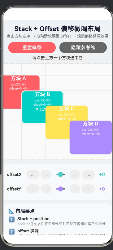
Text('Stack + Offset 偏移微调布局')
.fontSize(22).fontWeight(FontWeight.Bold)
.fontColor('#1a1a2e').margin({ top: 16, bottom: 4 })
Text('点击方块选中 → 拖动滑块调整 offset → 观察偏移微调效果')
.fontSize(13).fontColor('#666').margin({ bottom: 12 })
// ===================== 操作栏 =====================
Row() {
Button('重置偏移')
.type(ButtonType.Capsule).height(36).layoutWeight(1)
.margin({ right: 6 })
.backgroundColor('#FF6B6B').fontColor(Color.White)
.onClick(() => this.resetAllOffset())
Button(this.showAnchorLines ? '隐藏参考线' : '显示参考线')
.type(ButtonType.Capsule).height(36).layoutWeight(1)
.margin({ left: 6 })
.backgroundColor('#666').fontColor(Color.White)
.onClick(() => this.toggleAnchorMode())
}
.width('100%').padding({ left: 16, right: 16, bottom: 4 })
// ===================== 当前选中状态 =====================
Text(this.getOffsetDesc())
.fontSize(14).fontColor('#333')
.backgroundColor('#F0F0F0').borderRadius(6)
.padding({ top: 4, bottom: 4, left: 12, right: 12 })
.margin({ bottom: 2 })
// ===================== 【核心区域】Stack + position + offset 演示 =====================
Column() {
Stack() {
// 背景网格
Row().width(440).height(1).backgroundColor('#E8E8E8')
.position({ x: 0, y: 40 }).zIndex(-2)
Row().width(440).height(1).backgroundColor('#E8E8E8')
.position({ x: 0, y: 90 }).zIndex(-2)
Row().width(440).height(1).backgroundColor('#E8E8E8')
.position({ x: 0, y: 140 }).zIndex(-2)
Row().width(440).height(1).backgroundColor('#E8E8E8')
.position({ x: 0, y: 190 }).zIndex(-2)
Column().width(1).height(350).backgroundColor('#E8E8E8')
.position({ x: 20, y: 0 }).zIndex(-2)
Column().width(1).height(350).backgroundColor('#E8E8E8')
.position({ x: 100, y: 0 }).zIndex(-2)
Column().width(1).height(350).backgroundColor('#E8E8E8')
.position({ x: 180, y: 0 }).zIndex(-2)
Column().width(1).height(350).backgroundColor('#E8E8E8')
.position({ x: 260, y: 0 }).zIndex(-2)
// position 锚点标记
if (this.showAnchorLines) {
ForEach(this.blocks, (item: BlockItem) => {
Circle({ width: 8, height: 8 })
.fill('#FF9800')
.position({ x: item.posX - 4, y: item.posY - 4 })
.zIndex(-1)
.opacity(0.7)
})
}
// 动态渲染方块
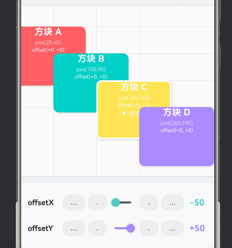
ForEach(this.blocks, (item: BlockItem) => {
Column() {
Text(item.label)
.fontSize(17).fontWeight(FontWeight.Bold)
.fontColor(Color.White)
Text(`pos(${item.posX},${item.posY})`)
.fontSize(10).fontColor('rgba(255,255,255,0.7)')
.margin({ top: 4 })
Text(`offset(${item.offsetX >= 0 ? '+' : ''}${item.offsetX}, ${item.offsetY >= 0 ? '+' : ''}${item.offsetY})`)
.fontSize(10).fontColor('rgba(255,255,255,0.9)')
.margin({ top: 2 })
if (this.selectedId === item.id) {
Text('▼ 已选中')
.fontSize(11).fontColor(Color.White)
.margin({ top: 4 })
}
}
.width(item.w).height(item.h)
// 【关键点①】.position() — 设置方块在 Stack 中的固定锚点
.position({ x: item.posX, y: item.posY })
// 【关键点②】.offset() — 在 position 基础上做微调偏移
.offset({ x: item.offsetX, y: item.offsetY })
.backgroundColor(item.color)
.borderRadius(10)
.border({
width: this.selectedId === item.id ? 3 : 0,
color: Color.White,
style: BorderStyle.Solid,
})
.onClick(() => this.toggleSelect(item.id))
.shadow({
radius: 6,
color: 'rgba(0,0,0,0.20)',
offsetX: 2,
offsetY: 3,
})
})
}
.width(440).height(320)
.backgroundColor('#FAFAFA')
.border({ width: 1, color: '#CCC', style: BorderStyle.Dashed })
.borderRadius(8)
.margin({ top: 4, bottom: 8 })
}
.width('100%')
.alignItems(HorizontalAlign.Center)
// ===================== Offset 控制面板 =====================
if (this.selectedId !== -1) {
Column() {
// --- offsetX 控制 ---
Row() {
Text('offsetX').fontSize(14).fontWeight(FontWeight.Bold)
.fontColor('#333').width(60)
Button('-10').type(ButtonType.Capsule).height(30)
.width(44).margin({ left: 4, right: 4 })
.backgroundColor('#EEE').fontColor('#333').fontSize(12)
.onClick(() => {
const newVal = this.sliderValueX - 10;
this.sliderValueX = newVal;
this.updateOffsetX(newVal);
})
Button('-1').type(ButtonType.Capsule).height(30)
.width(36).margin({ right: 4 })
.backgroundColor('#EEE').fontColor('#333').fontSize(12)
.onClick(() => {
const newVal = this.sliderValueX - 1;
this.sliderValueX = newVal;
this.updateOffsetX(newVal);
})
Slider({
value: this.sliderValueX,
min: -50,
max: 50,
step: 1,
style: SliderStyle.OutSet,
})
.layoutWeight(1)
.showSteps(true)
.showTips(true)
.blockColor('#4ECDC4')
.trackColor('#DDD')
.selectedColor('#4ECDC4')
.onChange((val: number) => {
this.sliderValueX = val;
this.updateOffsetX(val);
})
Button('+1').type(ButtonType.Capsule).height(30)
.width(36).margin({ left: 4 })
.backgroundColor('#EEE').fontColor('#333').fontSize(12)
.onClick(() => {
const newVal = this.sliderValueX + 1;
this.sliderValueX = newVal;
this.updateOffsetX(newVal);
})
Button('+10').type(ButtonType.Capsule).height(30)
.width(44).margin({ left: 4, right: 4 })
.backgroundColor('#EEE').fontColor('#333').fontSize(12)
.onClick(() => {
const newVal = this.sliderValueX + 10;
this.sliderValueX = newVal;
this.updateOffsetX(newVal);
})
Text(`${this.sliderValueX >= 0 ? '+' : ''}${this.sliderValueX}`)
.fontSize(16).fontWeight(FontWeight.Bold)
.fontColor('#4ECDC4').width(40)
.textAlign(TextAlign.Center)
}
.width('100%').height(40)
.margin({ top: 4, bottom: 4 })
// --- offsetY 控制 ---
Row() {
Text('offsetY').fontSize(14).fontWeight(FontWeight.Bold)
.fontColor('#333').width(60)
Button('-10').type(ButtonType.Capsule).height(30)
.width(44).margin({ left: 4, right: 4 })
.backgroundColor('#EEE').fontColor('#333').fontSize(12)
.onClick(() => {
const newVal = this.sliderValueY - 10;
this.sliderValueY = newVal;
this.updateOffsetY(newVal);
})
Button('-1').type(ButtonType.Capsule).height(30)
.width(36).margin({ right: 4 })
.backgroundColor('#EEE').fontColor('#333').fontSize(12)
.onClick(() => {
const newVal = this.sliderValueY - 1;
this.sliderValueY = newVal;
this.updateOffsetY(newVal);
})
Slider({
value: this.sliderValueY,
min: -50,
max: 50,
step: 1,
style: SliderStyle.OutSet,
})
.layoutWeight(1)
.showSteps(true)
.showTips(true)
.blockColor('#A78BFA')
.trackColor('#DDD')
.selectedColor('#A78BFA')
.onChange((val: number) => {
this.sliderValueY = val;
this.updateOffsetY(val);
})
Button('+1').type(ButtonType.Capsule).height(30)
.width(36).margin({ left: 4 })
.backgroundColor('#EEE').fontColor('#333').fontSize(12)
.onClick(() => {
const newVal = this.sliderValueY + 1;
this.sliderValueY = newVal;
this.updateOffsetY(newVal);
})
Button('+10').type(ButtonType.Capsule).height(30)
.width(44).margin({ left: 4, right: 4 })
.backgroundColor('#EEE').fontColor('#333').fontSize(12)
.onClick(() => {
const newVal = this.sliderValueY + 10;
this.sliderValueY = newVal;
this.updateOffsetY(newVal);
})
Text(`${this.sliderValueY >= 0 ? '+' : ''}${this.sliderValueY}`)
.fontSize(16).fontWeight(FontWeight.Bold)
.fontColor('#A78BFA').width(40)
.textAlign(TextAlign.Center)
}
.width('100%').height(40)
.margin({ top: 4, bottom: 4 })
}
.width('100%')
.padding(12)
.backgroundColor('#F8F9FA')
.borderRadius(8)
.margin({ top: 4, bottom: 12 })
} else {
Text('👆 点击上方方块,展开 offset 控制面板')
.fontSize(13).fontColor('#999').fontStyle(FontStyle.Italic)
.margin({ top: 8, bottom: 12 })
}
// ===================== 布局要点说明 =====================
Column() {
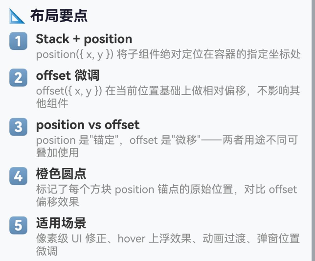
Text('📐 布局要点')
.fontSize(16).fontWeight(FontWeight.Bold)
.fontColor('#1a1a2e').width('100%').margin({ bottom: 8 })
this.buildTipRow('1️⃣', 'Stack + position',
'position({ x, y }) 将子组件绝对定位在容器的指定坐标处')
this.buildTipRow('2️⃣', 'offset 微调',
'offset({ x, y }) 在当前位置基础上做相对偏移,不影响其他组件')
this.buildTipRow('3️⃣', 'position vs offset',
'position 是"锚定",offset 是"微移"——两者用途不同可叠加使用')
this.buildTipRow('4️⃣', '橙色圆点',
'标记了每个方块 position 锚点的原始位置,对比 offset 偏移效果')
this.buildTipRow('5️⃣', '适用场景',
'像素级 UI 修正、hover 上浮效果、动画过渡、弹窗位置微调')
}
.width('100%').padding(16)
.backgroundColor('#F8F9FA').borderRadius(12)
.margin({ left: 16, right: 16, bottom: 24 })
}
.width('100%').backgroundColor('#F0F2F5')
}
.width('100%').height('100%').scrollable(ScrollDirection.Vertical)
}
@Builder
private buildTipRow(icon: string, title: string, desc: string) {
Row() {
Text(icon).fontSize(18).margin({ right: 8 })
Column() {
Text(title).fontSize(14).fontWeight(FontWeight.Bold)
.fontColor('#333').width('100%')
Text(desc).fontSize(12).fontColor('#888')
.width('100%').margin({ top: 2 })
}
.layoutWeight(1).alignItems(HorizontalAlign.Start)
}
.width('100%').alignItems(VerticalAlign.Top).margin({ bottom: 8 })
}
}
四、代码逐段精讲
4.1 数据模型设计
interface BlockItem {
id: number;
label: string;
color: Color | string;
posX: number; // position 的 X 坐标(固定值)
posY: number; // position 的 Y 坐标(固定值)
offsetX: number; // offset.x 当前值(可调)
offsetY: number; // offset.y 当前值(可调)
w: number;
h: number;
}
这个接口将 position 和 offset 作为独立的数据字段分开存储,目的是在 UI 中分别展示两者的数值,让用户直观理解它们的区别。posX/posY 是"锚点"固定不变,offsetX/offsetY 通过滑块动态调节。
4.2 @State 状态驱动
@State private blocks: BlockItem[] = [ ... ];
@State private selectedId: number = -1;
@State private sliderValueX: number = 0;
@State private sliderValueY: number = 0;
@State private showAnchorLines: boolean = true;
四个 @State 变量各自负责不同的 UI 片段:
blocks — 方块数据数组,修改后驱动 Stack 内方块重渲染
selectedId — 控制白色选中边框的显示/隐藏
sliderValueX/Y — 滑块的值(双向绑定)
showAnchorLines — 切换橙色锚点参考线的可见性
4.3 深拷贝实现(避免展开运算符)
private updateOffsetX(value: number): void {
const idx = this.selectedIdx;
if (idx === -1) return;
const newBlocks: BlockItem[] = [];
for (let i = 0; i < this.blocks.length; i++) {
const b = this.blocks[i];
if (i === idx) {
newBlocks.push({
id: b.id, label: b.label, color: b.color,
posX: b.posX, posY: b.posY,
offsetX: value,
offsetY: b.offsetY,
w: b.w, h: b.h,
});
} else {
newBlocks.push(b); // 未选中的方块直接引用(浅拷贝即可)
}
}
this.blocks = newBlocks;
this.sliderValueX = value;
}
这是整个工程中最关键的代码模式。ArkTS 禁止使用 ... 展开运算符,因此通过 for 循环构建新数组。注意两点:
被修改的元素必须创建新对象(逐属性拷贝),因为 ArkUI 通过引用变化来检测 @State 变更
未修改的元素可以直接复用引用,因为它们的值没有变化,ArkUI 不会重新渲染
4.4 build() 方法中的条件渲染
// 条件渲染控制面板
if (this.selectedId !== -1) {
Column() {
// offsetX 控制行
// offsetY 控制行
}
} else {
Text('👆 点击上方方块,展开 offset 控制面板')
}
这种模式避免了在 build() 内部声明变量(ArkTS 不允许),而是通过 if/else 分支渲染不同的 UI 片段。
4.5 @Builder 装饰器复用 UI
@Builder
private buildTipRow(icon: string, title: string, desc: string) {
  Row() {
    Text(icon).fontSize(18).margin({ right: 8 })
    Column() {
      Text(title).fontSize(14).fontWeight(FontWeight.Bold)
        .fontColor('#333').width('100%')
      Text(desc).fontSize(12).fontColor('#888')
        .width('100%').margin({ top: 2 })
    }
    .layoutWeight(1).alignItems(HorizontalAlign.Start)
  }
  .width('100%').alignItems(VerticalAlign.Top).margin({ bottom: 8 })
}
@Builder 是 ArkTS 提供的自定义构建函数,用于提取可复用的 UI 片段。5 个要点提示行通过同一 Builder 构建,避免重复代码。
五、position + offset 叠加效应深度分析
5.1 单独使用 position
// 方块被"钉"在 (100, 90) 处
.position({ x: 100, y: 90 })
// 不设置 offset → 无偏移
效果:方块的左上角精确对齐到容器的 (100vp, 90vp) 坐标。无论其他组件如何变化,这个方块始终在 (100, 90)。
5.2 单独使用 offset
// 不设置 position → 按 Stack 默认规则排列
// Stack 默认 alignContent 为 Center,所以方块居中
.offset({ x: 30, y: -20 })
效果:先从 Stack 默认布局计算出方块的"自然位置"(居中),然后在此基础上 右移 30vp、上移 20vp。注意:这种方式不会让方块脱离文档流,父容器仍然认为它占据原来的空间。
5.3 position + offset 叠加
.position({ x: 100, y: 90 })
.offset({ x: 30, y: -20 })
效果:
第一步:position 将方块锚定到 (100, 90)
第二步:offset 在 (100, 90) 基础上 +30, -20
最终渲染位置:(130, 70)
5.4 叠加效应的可视化
在演示工程中,橙色圆点标记了 position 的锚点位置,方块本身则显示 offset 后的实际位置。两者之间的"距离"就是 offset 的偏移量。
橙色● → (100, 90) ← position 锚点
│
│ offsetX = +30 (→)
│ offsetY = -20 (↑)
│
方块 → (130, 70) ← 最终渲染位置
5.5 偏移方向速查
offset 参数 正值 负值
offsetX 向右偏移 → 向左偏移 ←
offsetY 向下偏移 ↓ 向上偏移 ↑
六、典型应用场景
6.1 徽标(Badge)位置微调
Stack() {
  Image($r('app.media.avatar'))
    .width(48).height(48)
    .borderRadius(24)

  Text('3')
    .fontSize(10).fontColor(Color.White)
    .backgroundColor(Color.Red).borderRadius(8)
    .width(16).height(16).textAlign(TextAlign.Center)
    .position({ x: 36, y: -4 })       // 锚定到头像右上角
    .offset({ x: 2, y: 0 })           // 微调右移 2vp
}
实际的 UI 设计中,徽标的位置往往不是精确的整数坐标,需要通过 offset 进行 1~3vp 的像素级微调。
6.2 弹窗关闭按钮偏移
Stack() {
// 弹窗主体
Column() { /* … */ }
.width(300).height(200)
.backgroundColor(Color.White).borderRadius(16)
// 关闭按钮 — 在弹窗右上角稍偏移一点
  Image($r('app.media.close'))
    .width(32).height(32)
    .position({ x: 300 - 16, y: -16 })  // 锚定到弹窗右上角
    .offset({ x: 8, y: -8 })            // 往外侧微调
}
6.3 hover 上浮效果
@State private hoverOffset: number = 0;

Stack() {
  Column() {
    Text('悬浮卡片').fontSize(16)
  }
  .width(200).height(120)
  .backgroundColor(Color.White).borderRadius(12)
  .position({ x: 100, y: 200 })
  .offset({ x: 0, y: this.hoverOffset })
  .shadow({ radius: 12 + this.hoverOffset })
  .onHover((isHover: boolean) => {
    this.hoverOffset = isHover ? -8 : 0;  // hover 时上浮 8vp
  })
}
6.4 加载骨架屏偏移
// 模拟数据加载中的"闪烁块"动画
@State private pulseOffset: number = 0;
private timer: number = 0;

aboutToAppear() {
  this.timer = setInterval(() => {
    this.pulseOffset = this.pulseOffset === 0 ? 2 : 0;
  }, 800);
}

build() {
  Stack() {
    // 骨架块 1
    Column()
      .width(100).height(14)
      .position({ x: 20, y: 30 })
      .offset({ x: 0, y: this.pulseOffset })
      .backgroundColor('#E0E0E0').borderRadius(4)

    // 骨架块 2
    Column()
      .width(200).height(14)
      .position({ x: 20, y: 54 })
      .offset({ x: 0, y: this.pulseOffset })
      .backgroundColor('#E0E0E0').borderRadius(4)
  }
}
6.5 多语言适配中的文本偏移
不同语言的文字长度和基线不同,使用 offset 可以在不改变布局结构的前提下微调位置:

Text(this.getString('submit'))
  .position({ x: 50, y: 100 })
  .offset({
    x: 0,
    y: this.getLanguage() === 'zh' ? 0 : -2,  // 英文文本上移 2 像素
  })
七、性能考量与最佳实践
7.1 性能对比
操作 是否触发布局重排 是否触发重绘
修改 .position() ✅ 是 ✅ 是
修改 .offset() ❌ 否 ✅ 是
修改 .width() / .height() ✅ 是 ✅ 是
修改 .backgroundColor() ❌ 否 ✅ 是
修改 .opacity() ❌ 否 ✅ 是
结论:offset 的性能优于 position,因为它只触发重绘(repaint)而不触发布局重排(relayout)。特别是在动画场景中,使用 offset 可以实现 60fps 的流畅动画,而频繁修改 position 可能导致帧率下降。
7.2 动画场景选择
// ✅ 推荐:用 offset 做平移动画
.offset({
  x: this.animValue,
  y: 0,
})
// ❌ 不推荐:用 position 做平移动画
.position({
  x: 100 + this.animValue,
  y: 90,
})
7.3 布局层级控制
// ✅ 好的实践:将频繁变动的元素放在 Stack 上层
// 这样它们的重绘不会影响下层元素
Stack() {
// 稳定层:背景、网格、静态文字
Column() { /* 背景 */ }
// 动态层:可交互、可动画的浮动元素
  Column() { /* 浮动按钮 */ }
    .offset({ x: this.dx, y: this.dy })
}
7.4 避免过度使用 Stack
Stack 虽然强大,但不要滥用。以下场景应优先考虑其他容器:
简单列表 → List / Column + ForEach
网格排列 → Grid
响应式布局 → Flex / RelativeContainer
Stack 最适合自由定位和层叠覆盖的场景,对于规整排列的内容,用线性容器性能更好且语义更清晰。
7.5 单位使用建议
// ✅ 推荐:使用具体数值(vp 单位)
.position({ x: 20, y: 40 })
// ✅ 推荐:使用百分比(相对父容器)
.position({ x: '50%', y: '50%' })
// ✅ 推荐:使用 $r 资源引用(适合多分辨率)
.position({ x: $r(‘app.float.margin_medium’), y: 40 })
在多分辨率适配中,结合 $r() 资源引用和百分比单位可以更好地适配不同屏幕。
7.6 调试技巧
// 技巧1:临时给 Stack 加虚线边框,观察容器范围
Stack() {
  // ...
}
.border({ width: 1, color: Color.Red, style: BorderStyle.Dashed })

// 技巧2:给每个子组件不同背景色,区分层级
Column()
  .backgroundColor('#FF6B6B') // 红色半透明
  .opacity(0.8)

// 技巧3:使用 Inspector 工具查看布局层级
// DevEco Studio → View → Tool Windows → ArkUI Inspector
八、踩坑实录:ArkTS 语法约束与兼容性
8.1 坑位一:禁止展开运算符
// ❌ 编译错误:arkts-no-spread
const newBlocks = [...this.blocks];
newBlocks[0] = { ...newBlocks[0], offsetX: 10 };

// ✅ 正确:for 循环 + 逐属性拷贝
const newBlocks: BlockItem[] = [];
for (let i = 0; i < this.blocks.length; i++) {
  const b = this.blocks[i];
  newBlocks.push({
    id: b.id, label: b.label,
    // ... 逐属性复制
  });
}
这是 ArkTS 开发者最常遇到的错误。ArkTS 作为 TypeScript 的严格子集,为了运行时安全和性能优化,禁用了动态特性如 … 展开运算符和 Proxy。
8.2 坑位二:build() 内禁止声明变量
// ❌ 编译错误
build() {
  Column() {
    if (this.selectedId !== -1) {
      const sel = this.blocks.find(...);  // 不允许
      Text(sel.label);
    }
  }
}
// ✅ 正确:通过计算方法返回
build() {
  Column() {
    if (this.selectedId !== -1) {
      Text(this.getSelectedLabel());
    }
  }
}
private getSelectedLabel(): string {
  const sel = this.blocks.find(b => b.id === this.selectedId);
  return sel ? `${sel.label} | zIndex = ${sel.z}` : '';
}
8.3 坑位三:Column 没有 scrollable 属性
// ❌ 编译错误:scrollable 不是 Column 的属性
Column() { /* 大量内容 */ }
.scrollable(ScrollDirection.Vertical)
// ✅ 正确:Scroll 包裹
Scroll() {
Column() { /* 大量内容 */ }
}
.scrollable(ScrollDirection.Vertical)
8.4 坑位四:@State 数组修改必须新引用
// ❌ 不会触发 UI 刷新
this.blocks[0].offsetX = 10;
// ❌ 虽然新数组但对象没变,也不行
this.blocks[0].offsetX = 10;
this.blocks = […this.blocks]; // 展开运算符已被禁止
// ✅ 正确:被修改的元素必须是新对象
const copy = [];
for (let i = 0; i < this.blocks.length; i++) {
if (i === 0) {
copy.push({ …this.blocks[i], offsetX: 10 }); // 展开运算符也被禁止
// 所以用逐属性拷贝
} else {
copy.push(this.blocks[i]);
}
}
this.blocks = copy;
8.5 坑位五:offset 和 translate 的区别
有些开发者会混淆 offset 和 translate,这里做一个清晰区分:
// .offset() — 修改布局位置,影响点击区域
.offset({ x: 20, y: 0 })
// .translate() — 仅视觉效果移动,不影响点击区域
.translate({ x: 20, y: 0 })
行为 .offset() .translate()
视觉位置改变 ✅ ✅
点击区域跟随移动 ✅ ❌(仍在原位)
布局空间保留 ✅ ❌(不保留)
如果你的按钮通过 translate 移动了位置,用户仍然需要点击原来的位置才能触发事件——这通常不是你想要的效果。所以 UI 交互元素用 offset,纯视觉效果用 translate。
8.6 坑位六:position 与 Stack.alignContent 的交互
Stack({ alignContent: Alignment.Center }) {
Text(‘默认居中’)
// 没有 position,受 alignContent 影响居中显示
Text(‘绝对定位’)
.position({ x: 0, y: 0 })
// 设置了 position,不受 alignContent 影响
}
一旦给子组件设置了 .position(),它就不再受 Stack 的 alignContent 属性控制。这是设计预期的行为——如果既想受 alignContent 管、又想自由定位,就会带来语义冲突。
九、与其他布局方式的对比选型
9.1 Stack + position/offset vs RelativeContainer
HarmonyOS NEXT 在 API 11+ 引入了 RelativeContainer(相对布局),它与 Stack 的定位方式有本质区别:
维度 Stack + position/offset RelativeContainer
定位基准 父容器左上角 任意锚点组件或容器边界
定位方式 绝对坐标 (x, y) 相对规则 (alignRules)
适用场景 自由层叠、浮动元素 复杂对齐、响应式布局
动画友好度 ⭐⭐⭐⭐ (offset) ⭐⭐⭐
学习曲线 ⭐ 简单 ⭐⭐⭐ 中等
选型建议:
需要层叠覆盖? → Stack + zIndex
需要自由定位+微调? → Stack + position + offset
需要组件间相对对齐? → RelativeContainer
需要流式排列? → Column / Row / Flex
9.2 Stack + position/offset vs Flex
场景 推荐方案
两个元素叠在一起 Stack + position
浮动按钮在右下角 Stack + position({ x: …, y: … })
卡片列表 Flex / Column
导航栏 + 内容 + 底部栏 Flex + Column
游戏角色 + 道具叠加 Stack + position + zIndex
9.3 何时只用 offset 不用 position?
// 场景:一个可拖拽的浮动按钮
// 初始时用 position 锚定到右下角
// 用户拖拽后只需修改 offset,不需要动 position
@State private dragOffsetX: number = 0;
@State private dragOffsetY: number = 0;
Stack() {
Button(‘浮动’)
.position({ x: ‘80%’, y: ‘90%’ }) // 初始锚点
.offset({ x: this.dragOffsetX, y: this.dragOffsetY })
.gesture(
PanGesture({ distance: 5 })
.onActionUpdate((event: GestureEvent) => {
this.dragOffsetX += event.offsetX;
this.dragOffsetY += event.offsetY;
})
)
}
这种模式将"锚定"和"偏移"分离,逻辑清晰且性能更好。
十、总结
10.1 核心要点回顾
Stack 容器提供 Z 轴重叠的布局空间,子组件通过 .position() 和 .offset() 自由定位
.position({ x, y }) 将子组件"锚定"到绝对坐标,脱离文档流,不受 alignContent 控制
.offset({ x, y }) 在当前位置基础上做相对微调,不影响其他组件,性能优于 position
两者叠加:最终位置 = position 锚点 + offset 偏移量
ArkTS 语法约束:禁止展开运算符、build 内变量声明,需用 for 循环 + 逐属性拷贝
性能优化:动画优先使用 offset,避免频繁修改 position
10.2 一句话记住 offset 的用途
offset 是"微调器",不是"定位器"——定位用 position,微调用 offset,两者各司其职。
10.3 后续学习路径
掌握了 Stack + Offset 之后,建议按以下顺序继续学习鸿蒙布局:
Stack + zIndex — 控制层叠顺序(已掌握)
Stack + position + offset — 定位与微调(本文)
RelativeContainer — 相对布局(进阶)
Flex — 弹性布局(响应式)
Grid — 网格布局(规整排列)
List + GridItem — 长列表与瀑布流
配套源码:Demo062203 — entry/src/main/ets/pages/StackOffsetDemo.ets
运行环境:HarmonyOS NEXT / API 12+ / DevEco Studio 5.0+
作者:AtomCode (deepseek-v4-flash)
版权声明:本文为 HarmonyOS NEXT 技术分享,欢迎转载,请注明出处。

作为“人工智能6S店”的官方数字引擎,为AI开发者与企业提供一个覆盖软硬件全栈、一站式门户。
更多推荐
 0
0 0
0- 0


 已为社区贡献2条内容

所有评论(0)