
鸿蒙ArkTS实战:手把手实现饮食营养管理
鸿蒙ArkTS实战:手把手实现饮食营养管理
运行截图: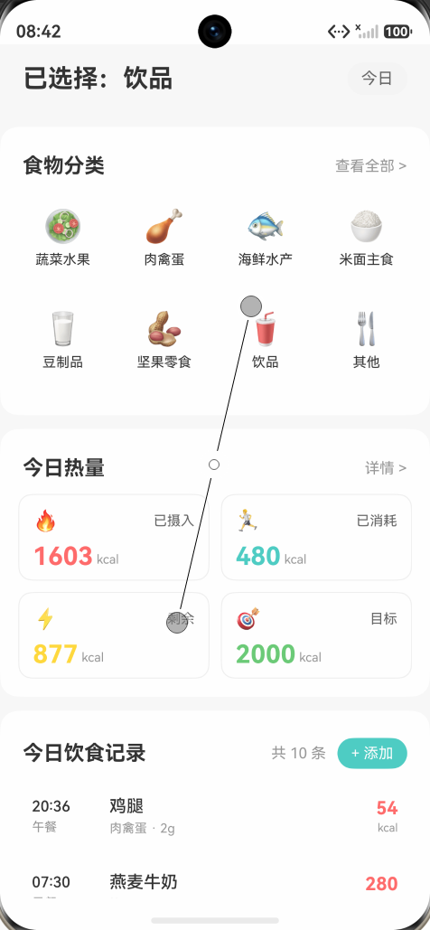
一、前言
在万物互联的时代背景下,鸿蒙操作系统凭借其"一次开发,多端部署"的核心理念迅速崛起。鸿蒙生态主推的 ArkTS 语言既保留了 TypeScript 的开发体验,又针对鸿蒙场景做了大量扩展,让前端和移动开发者能够以极低的学习成本进入鸿蒙应用开发领域。
本文以一个完整的"饮食营养管理"应用为案例,从零开始讲解如何使用 ArkTS 与声明式 UI(ArkUI)构建一个集数据展示、交互录入、状态联动于一体的现代化应用。案例的核心交互包含三部分:
- 使用 Grid 网格布局 展示"食物分类"和"今日热量"卡片;
- 使用 List 长列表 展示"每日饮食记录";
- 通过 @CustomDialog 自定义弹窗 实现新增记录,并通过 @State 响应式状态 让热量统计与列表实时联动。
阅读完本文,你将掌握 ArkTS 中最常用的几类组件与模式,能够独立完成中等复杂度的鸿蒙应用页面。
二、应用功能概览
本案例的应用场景是个人饮食营养追踪,主要包含三大功能模块:
-
食物分类入口:以 4 列 Grid 网格展示 8 大食物分类(蔬菜水果、肉禽蛋、海鲜水产、米面主食、豆制品、坚果零食、饮品、其他),每个分类配有 emoji 图标和主题色,支持点击交互反馈。
-
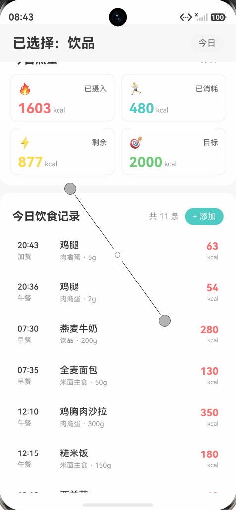
今日热量卡片:以 2 列 Grid 网格展示 4 张热量卡片,分别显示"已摄入"、“已消耗”、“剩余”、"目标"四个维度的数值。其中"已摄入"和"剩余"会随着新增饮食记录动态计算,让用户随时掌握能量平衡。
-
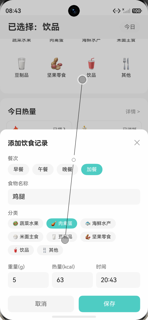
每日饮食记录:以 List 列表展示每条饮食记录,包含时间、餐次、食物名称、分类、重量、热量等信息。点击右上角"+ 添加"按钮可弹出底部对话框,填写表单后保存,新记录自动插入到列表顶部,列表为空时显示空状态。
UI 整体采用"卡片式"风格:外层为浅灰色背景(#F8F8F8),每个功能区为白色圆角卡片,模块之间通过留白和分组营造呼吸感,整体观感简洁、现代。
三、技术栈与开发环境
- 操作系统:HarmonyOS 4.0 及以上(API 9+)
- 开发语言:ArkTS(基于 TypeScript 的扩展)
- IDE:DevEco Studio 4.0+
- UI 框架:ArkUI(声明式 UI)
- 核心组件:Column、Row、Grid、List、TextInput、@CustomDialog
- 状态装饰器:@State、@Prop、@Builder
ArkTS 是鸿蒙生态主推的应用开发语言,它在 TypeScript 的基础上强化了静态检查,并提供了更丰富的 UI 描述能力。学习 ArkTS 的关键在于理解它的"声明式 + 状态驱动"范式:UI = f(state)。一旦掌握了这种思维方式,从 React、Vue、SwiftUI 转过来都会非常顺畅。
四、项目结构
整个工程是一个标准的鸿蒙 Stage 模型工程,核心代码集中在两个文件:
entry/src/main/ets/model/NutritionModel.ets:定义数据结构entry/src/main/ets/pages/Index.ets:页面 UI 与交互
五、数据模型设计
良好的数据模型是应用可维护性的基础。我们将所有数据结构集中到 NutritionModel.ets:
export class FoodCategory {
  id: number;
  name: string;
  icon: string;
  color: string;
  constructor(id: number, name: string, icon: string, color: string) {
    this.id = id;
    this.name = name;
    this.icon = icon;
    this.color = color;
  }
}

export class CalorieCard {
  id: number;
  title: string;
  value: number;
  unit: string;
  color: string;
  icon: string;
  constructor(id: number, title: string, value: number, unit: string, color: string, icon: string) {
    this.id = id;
    this.title = title;
    this.value = value;
    this.unit = unit;
    this.color = color;
    this.icon = icon;
  }
}

export class DietRecord {
  id: number;
  mealType: string;
  foodName: string;
  weight: number;
  calorie: number;
  time: string;
  category: string;
  constructor(id: number, mealType: string, foodName: string, weight: number, calorie: number, time: string, category: string) {
    this.id = id;
    this.mealType = mealType;
    this.foodName = foodName;
    this.weight = weight;
    this.calorie = calorie;
    this.time = time;
    this.category = category;
  }
}
设计要点
- id 唯一标识:所有数据都带有
id,作为ForEach的 key,保证列表更新时 Diff 算法能正确识别每一项,避免不必要的重建。 - 扁平字段:避免嵌套对象,方便在模板中直接绑定,符合 ArkTS 的使用习惯。
- 构造器注入:通过
new FoodCategory(...)创建实例,语义清晰,便于阅读。 - 可扩展性强:未来如需增加"备注"、“图片”、"评分"等字段,只需要在类中追加即可。
六、主页布局骨架
Index.ets 是 @Entry 入口组件,整个 build() 方法返回一个外层 Column:
build() {
  Column() {
    // 顶部标题栏
    Row() {
      Text(this.message).fontSize(22).fontWeight(FontWeight.Bold)
      Blank()
      Text('今日').fontSize(14).backgroundColor('#F5F5F5')
    }
    .width('100%')
    .padding({ left: 20, right: 20, top: 16, bottom: 16 })

    // 滚动内容
    Scroll() {
      Column() {
        this.CategoryGrid()
        this.CalorieGrid()
        this.DietList()
      }
    }
    .layoutWeight(1)
    .scrollBar(BarState.Off)
  }
  .width('100%')
  .height('100%')
  .backgroundColor('#F8F8F8')
}
外层 Column 占满整个屏幕,顶部 Row 固定显示标题,剩余空间交给 Scroll 包裹一个 Column,让三大模块在内容超长时可滚动。这里有几个关键 API:layoutWeight(1) 让 Scroll 占据 Column 剩余空间;scrollBar(BarState.Off) 关闭滚动条。
七、食物分类 Grid 实现
ArkUI 的 Grid 是一个二维布局容器,通过 columnsTemplate 指定列模板,columnsGap / rowsGap 设置间距:
Grid() {
  ForEach(this.foodCategories, (item: FoodCategory) => {
    GridItem() {
      Column() {
        Text(item.icon).fontSize(28)
        Text(item.name).fontSize(12)
      }
      .width('100%')
      .height(80)
      .backgroundColor('#FFFFFF')
      .borderRadius(12)
      .onClick(() => { this.message = '已选择:' + item.name; })
    }
  }, (item: FoodCategory) => item.id.toString())
}
.columnsTemplate('1fr 1fr 1fr 1fr')
.columnsGap(10)
.rowsGap(10)
.width('100%')
.height(180)
关键点解读
columnsTemplate('1fr 1fr 1fr 1fr'):4 列等宽,是 Grid 最常用的语法;ForEach第二参数必须是返回字符串的 key 函数,这里用item.id.toString()保证数据稳定;GridItem是 Grid 的直接子节点,不能省略;- 高度设为 180 是因为 2 行 × 80 + 间距 10 = 170,再留点 buffer。
八、热量卡片 Grid 实现
热量卡片与分类 Grid 类似,但只显示 2 列,结构更复杂:每张卡片上下分两行,第一行是图标和标题,第二行是大数字与单位。
getCalorieCards() 的妙用
private getCalorieCards(): CalorieCard[] {
  const consumed = this.getConsumed();
  const remaining = this.GOAL_CAL - consumed + this.BURNED_CAL;
  return [
    new CalorieCard(1, '已摄入', consumed, 'kcal', '#FF6B6B', '🔥'),
    new CalorieCard(2, '已消耗', this.BURNED_CAL, 'kcal', '#4ECDC4', '🏃'),
    new CalorieCard(3, '剩余', remaining, 'kcal', '#FFD93D', '⚡'),
    new CalorieCard(4, '目标', this.GOAL_CAL, 'kcal', '#6BCB77', '🎯')
  ];
}

private getConsumed(): number {
  let sum = 0;
  for (let i = 0; i < this.dietRecords.length; i++) {
    sum += this.dietRecords[i].calorie;
  }
  return sum;
}
ArkTS 的响应式机制会追踪 @State 的变化。当 dietRecords 变化时,整个 build() 会重新执行,重新调用 getCalorieCards(),生成新数组,进而触发 Grid 重新渲染。这就是"UI = f(state)"的体现——你不需要手动调用 setState,状态一变,UI 自动跟上。
九、饮食记录 List 实现
List 是 ArkUI 中的长列表组件,比单纯的 Column 性能更好(自带懒加载机制):
List() {
  ForEach(this.dietRecords, (item: DietRecord) => {
    ListItem() {
      Row() {
        Column() { Text(item.time); Text(item.mealType) }
          .width(56)
        Column() { Text(item.foodName); Row() { Text(item.category); Text(' · ' + item.weight + 'g') } }
          .layoutWeight(1)
        Column() { Text(item.calorie.toString()); Text('kcal') }
      }
      .padding(12)
      .backgroundColor('#FFFFFF')
      .borderRadius(12)
      .margin({ bottom: 8 })
    }
  }, (item: DietRecord) => item.id.toString())
}
.listDirection(Axis.Vertical)
.scrollBar(BarState.Off)
布局技巧
- 三段式 Row 布局:左侧固定宽度
width(56),中间layoutWeight(1)自适应,右侧自适应; - 卡片间使用
margin({ bottom: 8 })而非divider分隔线,更精致。
空状态
if (this.dietRecords.length === 0) {
  Column() {
    Text('🍽').fontSize(40).fontColor('#CCCCCC')
    Text('还没有饮食记录,点击右上角添加吧').fontSize(13)
  }
  .height(160)
  .justifyContent(FlexAlign.Center)
} else {
  List() { ... }
}
这是 ArkTS 中常见的条件渲染写法(注意:ArkTS 的 if 不能直接放在 build() 顶层,必须放在某个容器组件内)。
十、自定义弹窗:新增饮食记录
ArkTS 的 @CustomDialog 用于在父组件之外定义可复用的弹窗。
@CustomDialog
struct AddDietDialog {
  controller: CustomDialogController;
  @Prop categories: FoodCategory[] = [];
  @State mealType: string = '早餐';
  @State foodName: string = '';
  @State selectedCategory: FoodCategory | null = null;
  @State weight: string = '';
  @State calorie: string = '';
  @State time: string = '';

  aboutToAppear() {
    if (this.categories.length > 0 && !this.selectedCategory) {
      this.selectedCategory = this.categories[0];
    }
    const now = new Date();
    this.time = `${now.getHours().toString().padStart(2, '0')}:${now.getMinutes().toString().padStart(2, '0')}`;
  }

  onConfirm: (record: DietRecord) => void = () => {};
  // build() 中实现完整 UI:餐次/名称/分类/重量/热量/时间/取消保存按钮
}
关键点解读
controller: CustomDialogController是必须的,由父组件注入;@Prop接收父组件传入的categories(复杂类型必须用@Prop或@Link);- 弹窗内部用
@State管理表单字段; aboutToAppear生命周期:在弹窗显示前执行,用于初始化默认值(如默认时间 = 当前时刻);onConfirm回调:弹窗本身不持有父组件引用,通过函数回调方式把数据传回去,这是 ArkTS 中常用的"反向传值"模式。
父组件的使用
dialogController: CustomDialogController = new CustomDialogController({
  builder: AddDietDialog({
    categories: this.foodCategories,
    onConfirm: (record: DietRecord) => {
      this.dietRecords = [record, ...this.dietRecords];
    }
  }),
  customStyle: true,
  alignment: DialogAlignment.Bottom
});

// 触发
this.dialogController.open();
customStyle: true 表示使用自定义样式(而不是系统默认弹窗),alignment: DialogAlignment.Bottom 让弹窗从底部弹出,符合移动端操作习惯。
十一、表单交互细节
11.1 餐次单选
通过 this.mealType 状态决定高亮,点击切换,无需额外变量。Text 配合 backgroundColor 条件切换即可。
11.2 分类多选一
用 Flex({ wrap: FlexWrap.Wrap }) 实现自动换行的标签选择。注意:Flex 不会自动换行(需要 wrap: FlexWrap.Wrap),而 Grid 也不能直接做这种"按内容宽度排列"的效果,Flex 是更合适的选择。
11.3 数字输入
TextInput 设置 .type(InputType.Number) 会在移动端弹出纯数字键盘,提升输入体验。配合 onChange 回调实时更新 state。
十二、状态管理核心
整个应用的状态流是单向的:
用户点击「+ 添加」
       ↓
CustomDialogController.open()
       ↓
AddDietDialog 显示
       ↓
用户填写表单并点击保存
       ↓
onConfirm(record) 回调
       ↓
父组件 dietRecords = [record, ...dietRecords]
       ↓
build() 自动重新执行
       ↓
getCalorieCards() 重新计算
       ↓
Grid + List 重新渲染
ArkTS 内部使用 Proxy 机制追踪 @State 的变化。一旦检测到 dietRecords 被重新赋值,就会标记该组件为脏,下一帧重新执行 build()。这种"数据流单向 + 自动脏检查"的模式,是现代 UI 框架的共同选择。
十三、样式与设计建议
- 配色:以白底 + 灰底为主,主题色采用青色
#4ECDC4(按钮)和红色#FF6B6B(热量),中性灰#999999(辅助文字)。 - 圆角:卡片统一 12~16 圆角,胶囊按钮 14 圆角,数字输入框 8 圆角。
- 间距:外层模块间距 12,卡片内边距 16,元素间 6~8。
- 字体:标题 18 Bold,正文 13~15 Medium,辅助 11。
- 图标:暂用 emoji,未来可替换为 SVG 或 IconFont 资源。
十四、常见问题与解决方案
- ForEach 渲染不更新? 检查 key 函数是否稳定,避免用 index;嵌套对象必须整体替换。
- @Prop 数组不响应? 复杂对象属性变化不会触发,需要整个数组重新赋值。
- List 滚动卡顿? ListItem 内部避免复杂计算,可拆出 @Builder。
- 弹窗回调 this 指向? 箭头函数继承外层 this,但
@CustomDialog是单独 struct,回调必须显式传。 - build 报错 if 写法? ArkTS 不允许 build 顶层写
if包裹多个组件,要包在 Column/Row 内。 - Grid 不显示? 检查是否有
GridItem,且父容器是否给了明确高度或 layoutWeight。
十五、进阶方向
- 持久化:使用
@ohos.data.preferences或@ohos.data.relationalStore将dietRecords持久化到本地。 - 日期分组:按早/午/晚/加餐对 ListItem 进行分组(ListItemGroup)。
- 数据可视化:使用
Canvas或第三方库绘制每日热量曲线、周/月热量趋势。 - 路由跳转:通过
router模块实现"分类详情页",展示该分类下的所有食物。 - 多端适配:开启
main_pages.json中的 tablet 配置,让 Grid 在大屏上自动变 6 列。 - 服务卡片:将"今日已摄入"做成鸿蒙服务卡片(Form),让用户桌面也能查看。
- AI 推荐:接入大模型,根据用户历史饮食推荐下一餐。
十六、结语
本文通过一个完整案例,演示了 ArkTS 开发中最常用的"Grid 网格 + List 长列表 + @CustomDialog 弹窗 + @State 状态管理"组合拳。希望能帮助你快速理解鸿蒙应用开发的范式与最佳实践。
鸿蒙生态仍在快速演进,作为开发者保持学习热情,拥抱声明式 UI 的思维方式,是适应未来多端开发的关键。无论是手机、平板、手表还是车机,掌握 ArkTS 都能让你在鸿蒙世界里游刃有余。
Happy coding! 🚀

作为“人工智能6S店”的官方数字引擎,为AI开发者与企业提供一个覆盖软硬件全栈、一站式门户。
更多推荐
 10
10 0
0- 0


 已为社区贡献1条内容

所有评论(0)