
鸿蒙 ArkUI 八大常用基础组件完整详解
前言
在 HarmonyOS ArkUI 声明式开发中,所有页面都是由基础组件组合而成。本文结合课堂全部实训案例,完整讲解 8 大高频组件:Swiper 轮播、Video 视频、Image 图片、Tabs 选项卡、Text/TextInput 文本输入、Button 按钮、Radio 单选、Toggle 开关,每个组件配套实战代码、效果展示、核心属性与开发场景。
一、Swiper 轮播图组件
组件作用
实现横向自动滑动轮播,常用于首页 Banner、活动宣传图,支持自动播放、无限循环、底部指示器。
案例 1:基础色块轮播(静态子组件写法)
完整代码
@Entry
@Component
struct SwiperDemo{
  build() {
    Column(){
      Swiper(){
        Text('0')
          .backgroundColor(Color.Gray)
          .fontSize(30)
        Text('1')
          .backgroundColor(Color.Green)
          .fontSize(30)
        Text('2')
          .backgroundColor(Color.Orange)
          .fontSize(30)
        Text('3')
          .backgroundColor(Color.Pink)
          .fontSize(30)
      }
      .width('100%')
      .height('30%')
      .autoPlay(true)  // 开启自动播放
      .interval(2000)   // 2秒切换一页
      .loop(true)       // 循环轮播
    }
  }
}
效果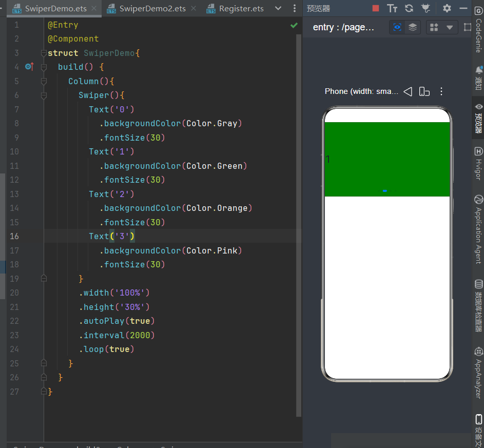
案例 2:图片数组动态轮播
完整代码
@Entry
@Component
struct SwiperDemo2{
  // 图片资源数组,存放media文件夹
  private bannerList:Resource[]=[
    $r('app.media.1'),
    $r('app.media.2'),
    $r('app.media.3')
  ]
  build() {
    Column(){
      Swiper(){
        ForEach(this.bannerList,(item:Resource)=>{
          Image(item)
            .width('98%')
            .height('100%')
            .objectFit(ImageFit.Cover) // 图片等比例铺满
        })
      }
      .width('100%')
      .height('30%')
      .autoPlay(true)
      .interval(2000)
      .loop(true)
    }
  }
}
效果
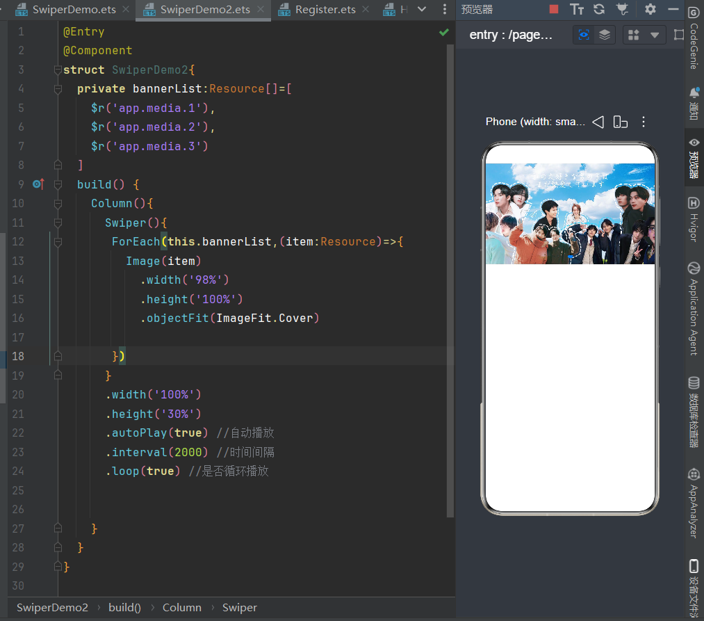
核心属性
autoPlay:是否自动播放interval:切换间隔(单位毫秒)loop:是否无限循环indicator(true):显示底部小圆点指示器
适用场景
APP 首页广告、校园宣传横幅、商品推荐轮播。
二、Video 视频播放组件
组件作用
ArkUI 原生视频播放器,支持本地 rawfile 视频、网络在线视频两种播放模式。
完整代码
@Entry
@Component
struct Index{
  // rawfile目录下本地视频
  private videoSrc:Resource=$rawfile('1.mp4')
  build() {
    Column(){
      Video({
        src:this.videoSrc
      })
      .width('100%')
      .height('100%')
      .padding(20)
    }
  }
}
效果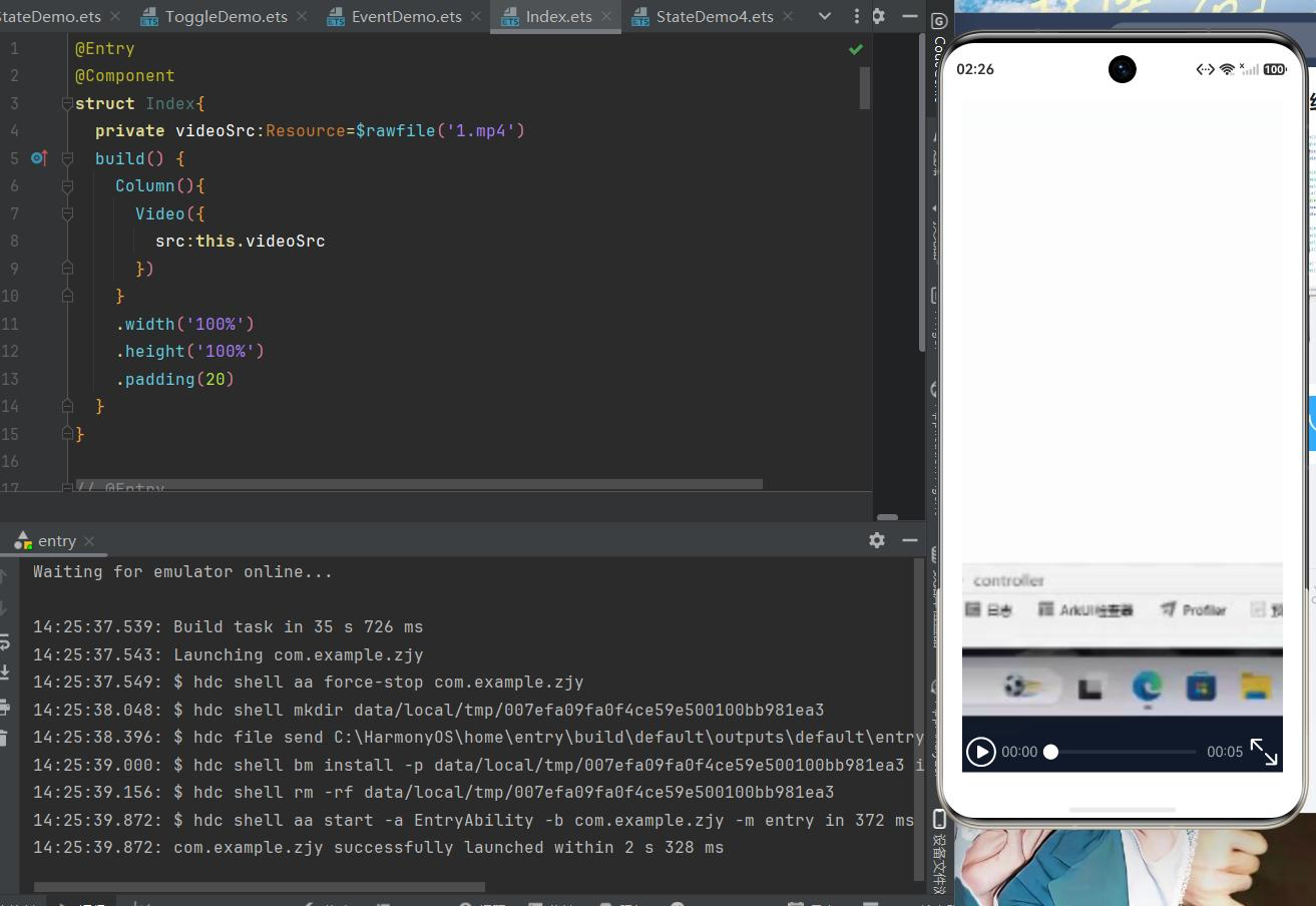
开发重点
- 本地视频:视频文件放入
entry/src/main/resources/rawfile;视频需用 ffmpeg 转码为 H.264+AAC 编码,否则时长显示 00:00; - 网络视频:
module.json5添加网络权限ohos.permission.INTERNET,src 传入 http 视频链接; - 配套
VideoController控制器,可代码控制start()播放、pause()暂停;
适用场景
课程教学视频、开屏引导视频、在线短视频。
三、Image 图片渲染组件
组件作用
渲染本地静态图片、网络图片,支持圆角、等比例缩放、尺寸自定义。
完整代码
@Entry
@Component
struct ImageDemo1{
  build() {
    Column(){
      Text('欢迎来到河北软件职业技术学院')
        .fontSize(30)
        .fontWeight(FontWeight.Bolder)
        .width('100%')
        .textAlign(TextAlign.Center)
        .padding(20)
      // 大图展示,圆角裁剪
      Image($r('app.media.7'))
        .width('90%')
        .height(320)
        .borderRadius(15)
        .objectFit(ImageFit.Cover)
      Row(){
        Column(){
          Text("鸿蒙应用开发")
            .fontSize(25)
            .width('45%')
            .textAlign(TextAlign.Center)
          Text("ArkUI实战开发")
            .fontSize(20)
            .width('45%')
            .textAlign(TextAlign.Center)
        }
        Image($r('app.media.2'))
          .width('50%')
      }
      .width('100%')
    }
    .width('100%')
    .height('100%')
  }
}
效果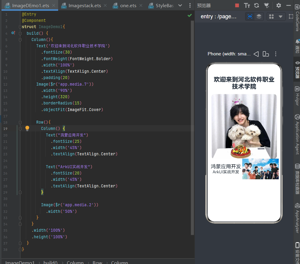
核心属性
$r('app.media.图片名'):读取本地 media 文件夹图片;.borderRadius():设置圆角头像 / 卡片;.objectFit(ImageFit.Cover):图片铺满容器不变形;
适用场景
用户头像、页面配图、轮播素材、卡片装饰图。
四、Tabs 选项卡切换组件
组件作用
原生多页面切换容器,顶部 / 底部标签栏点击切换独立内容,无需手动编写显隐逻辑。
完整代码
@Entry
@Component
struct TableBase2{
  private tabList:string[]=['首页','分类','个人中心','关于我们']
  build() {
    Tabs(){
      TabContent(){Text('首页页面').fontSize(24)}
      TabContent(){Text('分类页面').fontSize(24)}
      TabContent(){Text('个人中心页面').fontSize(24)}
      TabContent(){Text('关于我们页面').fontSize(24)}
    }
    .barPosition(BarPosition.Start) // Start=顶部标签,End=底部导航
  }
}
效果
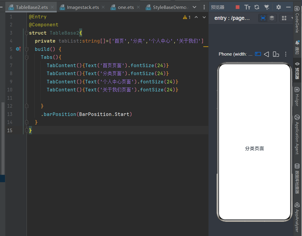
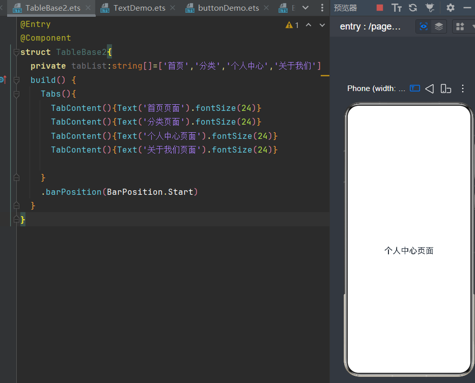
结构说明
Tabs:外层总容器;TabContent:每一个标签对应的独立页面;.tabBar('文字'):自定义标签显示文字;
适用场景
APP 底部导航栏、商品分类标签、多模块内容切换。
五、Text / TextInput 文本与输入框组件
1. Text:静态文字展示
用于页面标题、说明文字,可自定义字号、颜色、加粗、居中对齐。
2. TextInput:表单输入框(用户交互)
接收用户输入,搭配@State实现双向数据绑定,支持多种输入类型。
完整代码
@Entry
@Component
struct TextDemo{
  build() {
    Column({space:50}){
      Text('个人信息采集页面')
        .fontSize(30)
        .fontColor(0xd5d5)
        .fontWeight(FontWeight.Bold)
        .textAlign(TextAlign.Center)
        .width('100%')

      TextInput({placeholder:"请输入姓名"})
        .type(InputType.Normal)
        .height(70)
        .width(300)
        .backgroundColor(0xd5d5d5)
        .borderRadius(20)
      TextInput({placeholder:"请输入年龄"})
        .type(InputType.Number)
        .height(70)
        .width(300)
        .backgroundColor(0xd5d5d5)
        .borderRadius(20)
      TextInput({placeholder:"请输入手机"})
        .type(InputType.Number)
        .height(70)
        .width(300)
        .backgroundColor(0xd5d5d5)
        .borderRadius(20)
      TextInput({placeholder:"请输入电子邮箱"})
        .type(InputType.Email)
        .height(70)
        .width(300)
        .backgroundColor(0xd5d5d5)
        .borderRadius(20)
      TextInput({placeholder:"请输入所在班级"})
        .type(InputType.Normal)
        .height(70)
        .width(300)
        .backgroundColor(0xd5d5d5)
        .borderRadius(20)
    }
    .height('100%')
    .width('100%')
  }
}
效果
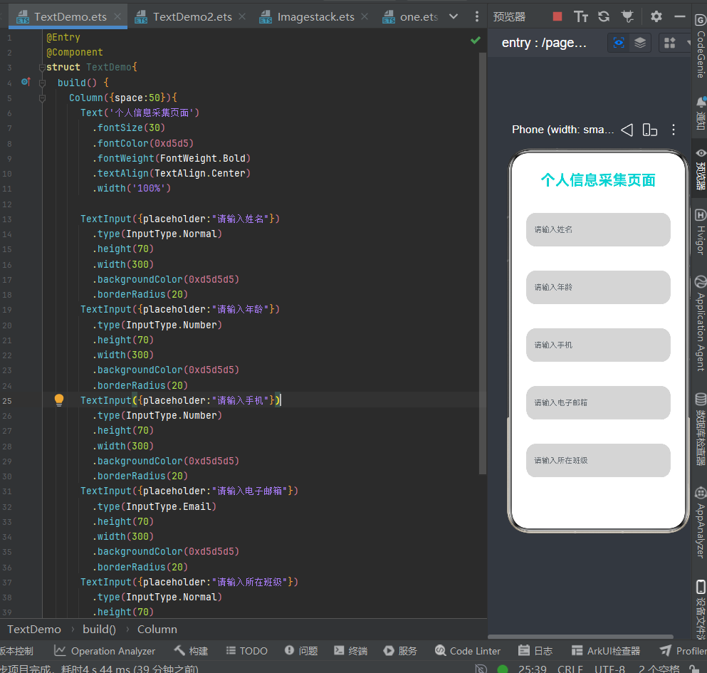
输入类型 type 枚举
Normal普通文字、Number数字、Email邮箱、Password密码隐藏。
适用场景
页面标题、登录表单、信息采集、搜索框。
六、Button 按钮交互组件
组件作用
页面核心交互载体,点击onClick执行业务逻辑(弹窗、修改变量、表单提交、视频播放等),支持多种样式自定义。
完整代码
@Entry
@Component
struct ButtonDemo{
  build() {
    Column({space:20}){
      // 基础圆角按钮
      Button('确认提交')
        .height(50)
        .width(150)
        .fontSize(26)
        .borderRadius(30)
      // 胶囊灰色按钮
      Button('取消操作',{type:ButtonType.Capsule})
        .height(50)
        .backgroundColor(0x999999)
        .width(150)
        .fontSize(26)
      // 红色删除按钮
      Button('确认删除')
        .height(50)
        .backgroundColor(0xf53f3f)
        .width(150)
        .fontSize(26)
        .borderRadius(30)
      // 边框透明按钮
      Button('登录')
        .height(50)
        .backgroundColor(Color.Transparent)
        .width(150)
        .fontSize(26)
        .fontColor(Color.Black)
        .border({width:4,color:0x009ff})
        .borderRadius(30)
    }
    .width('100%')
    .height('100%')
    .justifyContent(FlexAlign.Center)
    .alignItems(HorizontalAlign.Center)
  }
}
效果
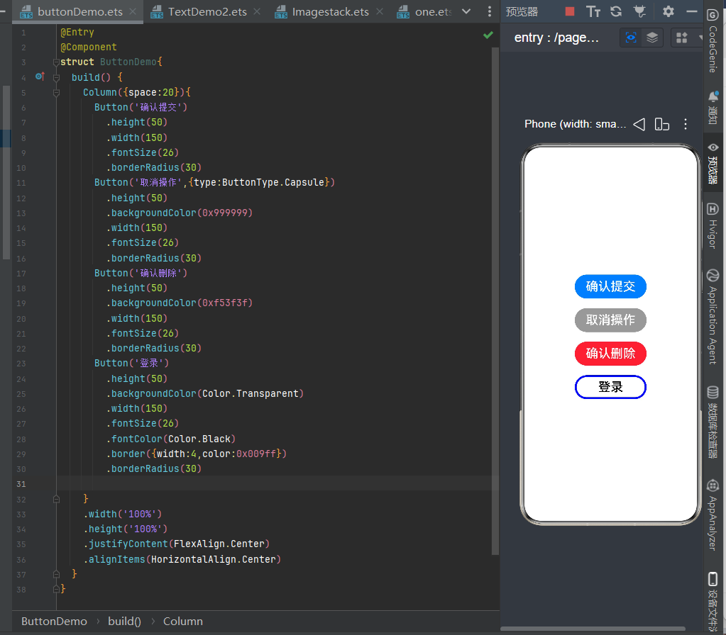
四种常用按钮风格
- 实心圆角提交按钮;
- Capsule 胶囊按钮;
- 危险红色删除按钮;
- 透明边框线框按钮;
适用场景
登录、提交、清空、切换状态、视频播放触发。
七、Radio 单选框组件
组件作用
同组多选一选择控件,同一个group分组内只能选中一个选项,适合单选题、性别选择。
完整代码
@Entry
@Component
struct RadioDemo{
  build() {
    Column({space:20}){
      Text('第一题')
      Radio({value:'Redio1',group:'radioGroup'})
        .checked(false)
        .height(30)
        .width(30)
      Radio({value:'Redio2',group:'radioGroup'})
        .checked(false)
      Radio({value:'Redio3',group:'radioGroup'})
        .checked(true)
      Radio({value:'Redio4',group:'radioGroup'})
        .checked(false)
      Radio({value:'Redio5',group:'radioGroup'})
        .checked(false)

      Text('第二题')
      Radio({value:'男',group:'radioGroup1'})
        .checked(false)
        .height(30)
        .width(30)
      Text('A')
      Radio({value:'女',group:'radioGroup1'})
        .checked(true)
        .height(30)
        .width(30)
      Text('B')
      Row(){
        Text('性别:')
          .fontSize(24)
        Radio({value:'男',group:'sex'})
          .checked(false)
          .height(30)
          .width(30)
        Text('男')
          .fontSize(20)
        Radio({value:'女',group:'sex'})
          .checked(true)
          .height(30)
          .width(30)
        Text('女')
          .fontSize(20)
      }
    }
    .width('100%')
    .height('100%')
  }
}
效果
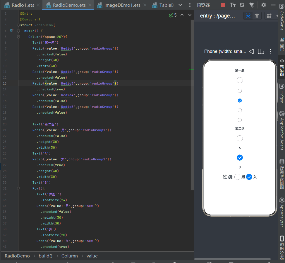
核心规则
group值相同的 Radio 为同一组,仅能单选;不同 group 分组互不影响。
适用场景
考试单选题、性别选择、身份单项选择、偏好设置。
八、Toggle 开关组件
组件作用
布尔状态切换控件,两种样式:Switch滑动开关、Checkbox勾选框,绑定@State布尔变量控制开启 / 关闭。
完整代码
@Entry
@Component
struct toggleDemo{
  build() {
    Column({space:50}){
      // 滑动开关样式
      Toggle({
        type:ToggleType.Switch,
        isOn:true
      })
      .width(150)
      .height(50)
      .selectedColor(Color.Red)
      .id('n1')

      // 勾选框样式
      Toggle({
        type:ToggleType.Checkbox,
        isOn:false
      })
      .width(150)
      .height(50)
      .selectedColor(Color.Red)
      .id('n2')
    }
    .width('100%')
    .height('100%')
  }
}
效果
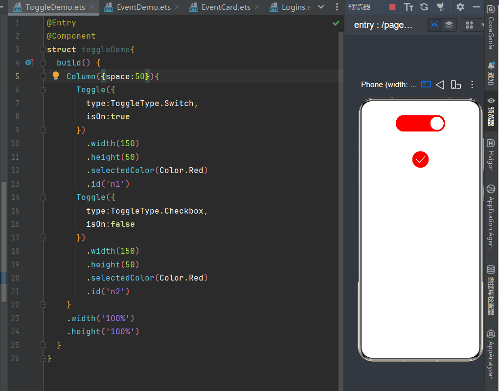
两种 type 类型
ToggleType.Switch:手机设置类滑动开关;ToggleType.Checkbox:方框勾选框;
总结
- 多图滚动横幅优先
Swiper,静态图片展示用Image; - 视频播放区分本地 rawfile 与网络视频,网络务必配置互联网权限;
- 多页面切换直接使用
Tabs,无需手动控制组件显隐; - 表单采集搭配
TextInput,结合@State实现双向数据绑定; - 所有点击交互统一使用
Button,支持多种自定义样式; - 单选题、性别选择用
Radio分组单选;功能开关、勾选同意使用Toggle。

作为“人工智能6S店”的官方数字引擎,为AI开发者与企业提供一个覆盖软硬件全栈、一站式门户。
更多推荐


 0
0 0
0- 0


 已为社区贡献5条内容

所有评论(0)