
鸿蒙原生ArkTS布局方式之TimePickerDialog时间弹窗
鸿蒙原生ArkTS布局方式之TimePickerDialog时间弹窗
一、引言
在鸿蒙HarmonyOS NEXT应用开发中,时间选择是一个非常常见的交互场景。无论是日程管理、闹钟设置、会议预约还是时间记录,都需要用户选择特定的时间。为了提供良好的用户体验,鸿蒙系统提供了原生的时间选择器弹窗组件——TimePickerDialog。
本文将详细介绍TimePickerDialog的使用方法、核心API、布局要点、常见问题及解决方案,帮助开发者快速掌握这一重要组件的使用技巧。
二、TimePickerDialog概述
2.1 组件定义
TimePickerDialog是鸿蒙ArkUI框架提供的时间滑动选择器弹窗组件,允许用户在24小时时间区间内选择具体的小时和分钟。该组件以弹窗形式呈现,提供直观的滚动选择界面,是构建时间输入功能的首选方案。
2.2 核心特性
- 原生系统风格:采用系统统一的时间选择器样式,确保应用与系统风格一致
- 24小时制支持:支持12小时制和24小时制切换
- 实时反馈:滚动选择时提供实时的时间变化反馈
- 生命周期回调:提供确定、取消和时间变化等多个回调接口
- UIContext关联:依赖UI上下文,确保在正确的UI实例中显示
2.3 使用场景
TimePickerDialog适用于以下常见场景:
| 场景 | 说明 |
|---|---|
| 日程安排 | 用户设置会议、提醒等时间 |
| 闹钟设置 | 用户设置闹钟触发时间 |
| 时间记录 | 用户记录事件发生的时间 |
| 预约系统 | 用户选择服务预约时间 |
| 表单填写 | 表单中的时间字段输入 |
三、开发环境准备
3.1 DevEco Studio安装
在开始开发之前,需要安装鸿蒙官方开发工具DevEco Studio:
- 访问鸿蒙开发者官网下载DevEco Studio安装包
- 运行安装程序,按照向导完成安装
- 配置SDK路径,确保安装了HarmonyOS NEXT SDK
3.2 项目创建
创建一个新的HarmonyOS NEXT项目:
# 使用hvigor创建项目(命令行方式)
hvigor create -t ohos-app -n TimePickerDemo
或者在DevEco Studio中通过图形界面创建项目:
- 打开DevEco Studio
- 选择"Create HarmonyOS Project"
- 选择"Empty Ability"模板
- 配置项目名称和保存路径
3.3 项目结构
创建完成后,项目结构如下:
TimePickerDemo/
├── AppScope/                    # 应用全局配置
│   ├── resources/               # 全局资源文件
│   └── app.json5                # 应用配置文件
├── entry/                       # 应用入口模块
│   ├── src/
│   │   └── main/
│   │       ├── ets/             # ArkTS源代码
│   │       │   ├── entryability/# 应用入口能力
│   │       │   │   └── EntryAbility.ets
│   │       │   └── pages/       # 页面文件
│   │       │       └── Index.ets
│   │       └── resources/       # 模块资源文件
│   ├── build-profile.json5      # 构建配置
│   └── hvigorfile.ts            # 构建脚本
├── build-profile.json5          # 全局构建配置
├── hvigorfile.ts                # 全局构建脚本
└── oh-package.json5             # 依赖配置
四、核心API详解
4.1 调用方式演变
在HarmonyOS的不同版本中,TimePickerDialog的调用方式经历了以下演变:
API Version 8-17:直接使用静态方法
TimePickerDialog.show({
  selectedTime: new Date(),
  onAccept: (value) => {}
});
API Version 10+:通过UIContext调用(推荐)
let context = this.getUIContext();
context.showTimePickerDialog({
  selected: new Date(),
  onAccept: (value) => {}
});
API Version 18+:TimePickerDialog.show()已废弃,必须使用UIContext方式
4.2 UIContext获取方式
在组件中获取UIContext的方式有以下几种:
方式一:组件内置方法(推荐)
@Entry
@Component
struct MyPage {
  build() {
    Column() {
      Button('打开弹窗')
        .onClick(() => {
          let context = this.getUIContext();
          context.showTimePickerDialog({});
        })
    }
  }
}
方式二:通过getContext转换
import { getContext } from '@kit.ArkUI';

@Entry
@Component
struct MyPage {
  build() {
    Column() {
      Button('打开弹窗')
        .onClick(() => {
          let context = getContext(this) as UIContext;
          context.showTimePickerDialog({});
        })
    }
  }
}
注意:在HarmonyOS NEXT SDK 6.1.0中,
getContext(this)返回的是Context类型,需要先转换为unknown再转换为UIContext,或者直接使用this.getUIContext()方法。
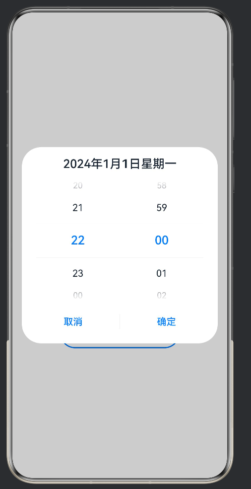
4.3 showTimePickerDialog参数详解
showTimePickerDialog方法接受一个TimePickerDialogOptions对象作为参数,包含以下属性:
4.3.1 核心属性
| 属性名 | 类型 | 必填 | 说明 |
|---|---|---|---|
| selected | Date | 是 | 初始选中的时间 |
| useMilitaryTime | boolean | 否 | 是否使用24小时制,默认true |
| start | Date | 否 | 可选时间范围的开始时间 |
| end | Date | 否 | 可选时间范围的结束时间 |
4.3.2 回调函数
| 属性名 | 类型 | 必填 | 说明 |
|---|---|---|---|
| onAccept | (value: TimePickerResult) => void | 否 | 点击确定按钮时触发 |
| onCancel | () => void | 否 | 点击取消按钮时触发 |
| onChange | (value: TimePickerResult) => void | 否 | 时间变化时实时触发 |
4.3.3 样式属性
| 属性名 | 类型 | 必填 | 说明 |
|---|---|---|---|
| disappearTextStyle | PickerTextStyle | 否 | 消失文本样式 |
| textStyle | PickerTextStyle | 否 | 普通文本样式 |
| selectedTextStyle | PickerTextStyle | 否 | 选中文本样式 |
| acceptButtonStyle | DialogButtonStyle | 否 | 确定按钮样式 |
| cancelButtonStyle | DialogButtonStyle | 否 | 取消按钮样式 |
4.4 TimePickerResult类型
回调函数中的value参数是TimePickerResult类型,包含以下属性:
| 属性名 | 类型 | 说明 |
|---|---|---|
| hour | number | 选中的小时(0-23) |
| minute | number | 选中的分钟(0-59) |
| isMilitaryTime | boolean | 是否为24小时制 |
五、完整代码示例
5.1 基础示例
以下是一个完整的TimePickerDialog使用示例:
@Entry
@Component
struct TimePickerDialogExample {
@State selectedHour: number = 12;
@State selectedMinute: number = 0;
build() {
Column() {
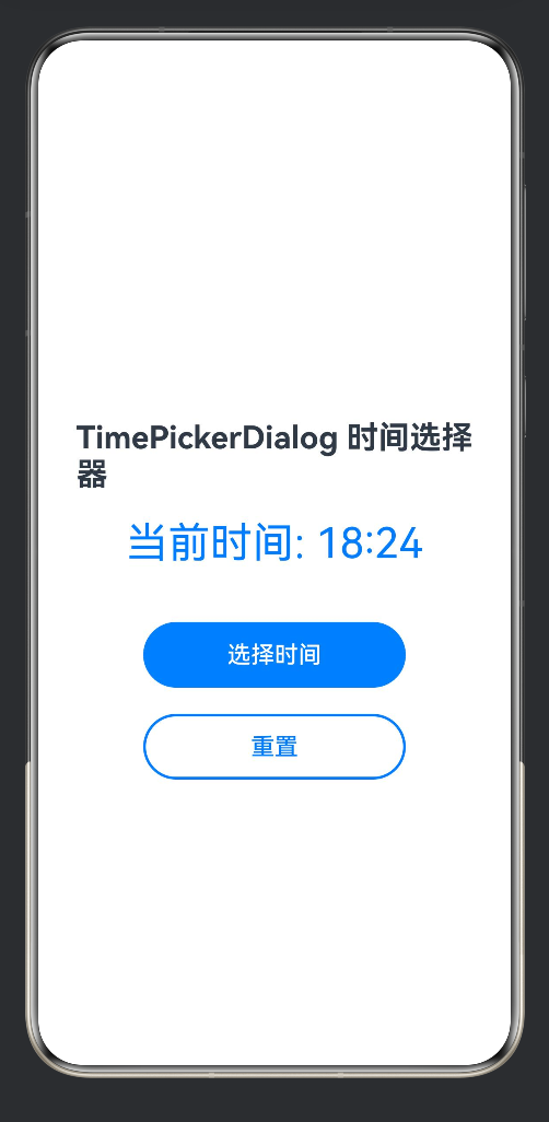
Text('TimePickerDialog 时间选择器')
.fontSize(24)
.fontWeight(FontWeight.Bold)
.margin({ top: 60, bottom: 20 })
Text(`当前时间: ${this.formatNumber(this.selectedHour)}:${this.formatNumber(this.selectedMinute)}`)
.fontSize(32)
.fontColor('#007DFF')
.margin({ bottom: 40 })
Button('选择时间')
.width(200)
.height(50)
.fontSize(18)
.backgroundColor('#007DFF')
.borderRadius(25)
.onClick(() => {
this.showTimePickerDialog();
})
Button('重置')
.width(200)
.height(50)
.fontSize(18)
.fontColor('#007DFF')
.backgroundColor('#FFFFFF')
.border({ width: 2, color: '#007DFF' })
.borderRadius(25)
.margin({ top: 20 })
.onClick(() => {
let now = new Date();
this.selectedHour = now.getHours();
this.selectedMinute = now.getMinutes();
})
}
.width('100%')
.height('100%')
.padding(20)
.backgroundColor('#FFFFFF')
.justifyContent(FlexAlign.Center)
.alignItems(HorizontalAlign.Center)
}
private showTimePickerDialog() {
let context = this.getUIContext();
context.showTimePickerDialog({
selected: new Date(2024, 0, 1, this.selectedHour, this.selectedMinute),
useMilitaryTime: true,
onAccept: (value: TimePickerResult) => {
this.selectedHour = value.hour as number;
this.selectedMinute = value.minute as number;
},
onCancel: () => {},
onChange: (value: TimePickerResult) => {}
});
}
private formatNumber(num: number): string {
return num < 10 ? `0${num}` : `${num}`;
}
}
5.2 代码解析
5.2.1 状态变量定义
@State selectedHour: number = 12;
@State selectedMinute: number = 0;
使用@State装饰器定义响应式状态变量,当变量值改变时,UI会自动更新。
5.2.2 布局结构
Column() {
  // 标题
  Text('TimePickerDialog 时间选择器')
    .fontSize(24)
    .fontWeight(FontWeight.Bold)

  // 时间显示
  Text(`当前时间: ${this.formatNumber(this.selectedHour)}:${this.formatNumber(this.selectedMinute)}`)
    .fontSize(32)
    .fontColor('#007DFF')

  // 选择按钮
  Button('选择时间')
    .onClick(() => {
      this.showTimePickerDialog();
    })

  // 重置按钮
  Button('重置')
    .onClick(() => {
      let now = new Date();
      this.selectedHour = now.getHours();
      this.selectedMinute = now.getMinutes();
    })
}
.width('100%')
.height('100%')
.justifyContent(FlexAlign.Center)
.alignItems(HorizontalAlign.Center)
布局要点:
- 使用
Column垂直布局容器 - 设置
justifyContent(FlexAlign.Center)使内容垂直居中 - 设置
alignItems(HorizontalAlign.Center)使内容水平居中 - 设置
width('100%')和height('100%')占满整个屏幕
5.2.3 弹窗调用
private showTimePickerDialog() {
  let context = this.getUIContext();
  context.showTimePickerDialog({
    selected: new Date(2024, 0, 1, this.selectedHour, this.selectedMinute),
    useMilitaryTime: true,
    onAccept: (value: TimePickerResult) => {
      this.selectedHour = value.hour as number;
      this.selectedMinute = value.minute as number;
    },
    onCancel: () => {},
    onChange: (value: TimePickerResult) => {}
  });
}
调用流程:
- 通过
this.getUIContext()获取UI上下文 - 调用
showTimePickerDialog()方法 - 设置
selected参数为当前选中的时间 - 在
onAccept回调中更新状态变量
5.2.4 格式化函数
private formatNumber(num: number): string {
  return num < 10 ? `0${num}` : `${num}`;
}
将数字格式化为两位数,确保时间显示格式统一(如05:09而非5:9)。
六、高级特性
6.1 时间范围限制
通过start和end参数可以限制可选的时间范围:
context.showTimePickerDialog({
  selected: new Date(2024, 0, 1, 14, 30),
  start: new Date(2024, 0, 1, 9, 0),      // 最早可选9:00
  end: new Date(2024, 0, 1, 18, 0),        // 最晚可选18:00
  useMilitaryTime: true,
  onAccept: (value: TimePickerResult) => {
    console.info(`选中时间: ${value.hour}:${value.minute}`);
  }
});
6.2 自定义样式
可以通过样式属性自定义时间选择器的外观:
context.showTimePickerDialog({
  selected: new Date(),
  useMilitaryTime: true,
  selectedTextStyle: {
    color: '#007DFF',
    fontSize: 24,
    fontWeight: FontWeight.Bold
  },
  textStyle: {
    color: '#666666',
    fontSize: 18
  },
  disappearTextStyle: {
    color: '#CCCCCC',
    fontSize: 14
  },
  acceptButtonStyle: {
    fontColor: '#007DFF',
    fontSize: 18
  },
  cancelButtonStyle: {
    fontColor: '#999999',
    fontSize: 18
  },
  onAccept: (value: TimePickerResult) => {}
});
6.3 12小时制模式
设置useMilitaryTime为false启用12小时制:
context.showTimePickerDialog({
  selected: new Date(2024, 0, 1, 14, 30),
  useMilitaryTime: false,  // 使用12小时制
  onAccept: (value: TimePickerResult) => {
    console.info(`小时: ${value.hour}, 分钟: ${value.minute}`);
    console.info(`是否24小时制: ${value.isMilitaryTime}`);
  }
});
6.4 实时监听时间变化
通过onChange回调实时监听用户的选择:
context.showTimePickerDialog({
  selected: new Date(),
  useMilitaryTime: true,
  onChange: (value: TimePickerResult) => {
    console.info(`时间变化: ${value.hour}:${value.minute}`);
    // 可以在这里实时更新预览显示
  },
  onAccept: (value: TimePickerResult) => {
    console.info(`最终选择: ${value.hour}:${value.minute}`);
  }
});
七、布局要点总结
7.1 响应式状态管理
使用@State装饰器管理时间状态,确保UI与数据同步:
@State selectedHour: number = 12;
@State selectedMinute: number = 0;
7.2 容器布局
选择合适的容器组件构建页面布局:
Column() {
  // 内容
}
.width('100%')
.height('100%')
.justifyContent(FlexAlign.Center)
.alignItems(HorizontalAlign.Center)
7.3 按钮交互
为按钮添加点击事件触发弹窗:
Button('选择时间')
  .onClick(() => {
    this.showTimePickerDialog();
  })
7.4 弹窗调用
通过UIContext调用时间选择器弹窗:
let context = this.getUIContext();
context.showTimePickerDialog({
  selected: new Date(2024, 0, 1, this.selectedHour, this.selectedMinute),
  useMilitaryTime: true,
  onAccept: (value: TimePickerResult) => {
    this.selectedHour = value.hour as number;
    this.selectedMinute = value.minute as number;
  }
});
八、常见问题与解决方案
8.1 编译错误:Module ‘@kit.ArkUI’ has no exported member ‘TimePickerDialog’
问题描述:在HarmonyOS NEXT SDK 6.1.0中,直接导入TimePickerDialog会报错。
解决方案:使用UIContext.showTimePickerDialog()替代:
// 错误写法(已废弃)
import { TimePickerDialog } from '@kit.ArkUI';
TimePickerDialog.show({});

// 正确写法
let context = this.getUIContext();
context.showTimePickerDialog({});
8.2 编译错误:Conversion of type ‘Context’ to type ‘UIContext’ may be a mistake
问题描述:使用getContext(this)转换类型时报错。
解决方案:使用this.getUIContext()方法获取UIContext:
// 错误写法
let context = getContext(this) as UIContext;

// 正确写法
let context = this.getUIContext();
8.3 编译错误:Object literal may only specify known properties, but ‘selectedTime’ does not exist
问题描述:参数名错误,旧API使用selectedTime,新API使用selected。
解决方案:将selectedTime改为selected:
// 错误写法(旧API)
selectedTime: new Date()

// 正确写法(新API)
selected: new Date()
8.4 预览空白问题
问题描述:页面预览时显示空白。
解决方案:
- 检查
EntryAbility.ets中loadContent方法是否加载正确的页面:
windowStage.loadContent('pages/TimePickerDialogExample', (err) => {
  // ...
});
- 检查页面布局是否设置了宽高:
Column() {
  // 内容
}
.width('100%')
.height('100%')
- 检查是否使用了正确的对齐方式:
.justifyContent(FlexAlign.Center)
.alignItems(HorizontalAlign.Center)
8.5 弹窗不显示
问题描述:点击按钮后弹窗不显示。
解决方案:
- 确保在UI组件内调用:
Button('选择时间')
  .onClick(() => {
    // 正确:在组件事件回调中调用
    let context = this.getUIContext();
    context.showTimePickerDialog({});
  })
- 确保获取到正确的UIContext:
let context = this.getUIContext();
if (context) {
  context.showTimePickerDialog({});
}
8.6 时间格式显示问题
问题描述:时间显示为5:9而非05:09。
解决方案:使用格式化函数补零:
private formatNumber(num: number): string {
  return num < 10 ? `0${num}` : `${num}`;
}

// 使用
Text(`${this.formatNumber(this.selectedHour)}:${this.formatNumber(this.selectedMinute)}`)
九、最佳实践
9.1 状态管理
使用@State装饰器管理时间状态,确保响应式更新:
@Entry
@Component
struct TimePickerPage {
  @State hour: number = 9;
  @State minute: number = 0;

  // ...
}
9.2 时间验证
在onAccept回调中验证时间有效性:
onAccept: (value: TimePickerResult) => {
  let hour = value.hour as number;
  let minute = value.minute as number;

  // 验证时间是否在有效范围内
  if (hour >= 9 && hour <= 18) {
    this.selectedHour = hour;
    this.selectedMinute = minute;
  } else {
    // 提示用户选择有效时间
    console.info('请选择9:00-18:00之间的时间');
  }
}
9.3 错误处理
添加错误处理逻辑,增强应用稳定性:
private showTimePickerDialog() {
  try {
    let context = this.getUIContext();
    if (!context) {
      console.error('获取UIContext失败');
      return;
    }

    context.showTimePickerDialog({
      selected: new Date(2024, 0, 1, this.selectedHour, this.selectedMinute),
      useMilitaryTime: true,
      onAccept: (value: TimePickerResult) => {
        this.selectedHour = value.hour as number;
        this.selectedMinute = value.minute as number;
      },
      onCancel: () => {
        console.info('用户取消选择');
      }
    });
  } catch (error) {
    console.error('显示时间选择器失败:', error);
  }
}
9.4 代码复用
将时间选择器逻辑封装为工具函数:
export class TimePickerUtil {
  static show(context: UIContext, options: {
    selectedHour: number;
    selectedMinute: number;
    onConfirm: (hour: number, minute: number) => void;
  }) {
    context.showTimePickerDialog({
      selected: new Date(2024, 0, 1, options.selectedHour, options.selectedMinute),
      useMilitaryTime: true,
      onAccept: (value: TimePickerResult) => {
        options.onConfirm(value.hour as number, value.minute as number);
      }
    });
  }
}

// 使用
Button('选择时间')
  .onClick(() => {
    TimePickerUtil.show(this.getUIContext(), {
      selectedHour: this.selectedHour,
      selectedMinute: this.selectedMinute,
      onConfirm: (hour, minute) => {
        this.selectedHour = hour;
        this.selectedMinute = minute;
      }
    });
  })
十、综合示例:日程安排应用
以下是一个完整的日程安排应用示例,展示TimePickerDialog在实际场景中的应用:
@Entry
@Component
struct SchedulePage {
  @State schedules: Array<{ id: number; title: string; hour: number; minute: number }> = [];
  @State newTitle: string = '';
  @State newHour: number = 9;
  @State newMinute: number = 0;
  @State showTimePicker: boolean = false;

  build() {
    Column() {
      // 标题
      Text('日程安排')
        .fontSize(28)
        .fontWeight(FontWeight.Bold)
        .margin({ top: 40, bottom: 20 })

      // 添加日程区域
      Column({ space: 15 }) {
        TextInput({ placeholder: '输入日程标题' })
          .width('80%')
          .height(40)
          .backgroundColor('#F5F5F5')
          .borderRadius(8)
          .onChange((value: string) => {
            this.newTitle = value;
          })

        Row({ space: 10 }) {
          Text(`时间: ${this.formatNumber(this.newHour)}:${this.formatNumber(this.newMinute)}`)
            .fontSize(16)
            .fontColor('#333333')

          Button('选择')
            .width(80)
            .height(36)
            .fontSize(14)
            .backgroundColor('#007DFF')
            .borderRadius(18)
            .onClick(() => {
              this.showTimePickerDialog();
            })
        }

        Button('添加日程')
          .width('80%')
          .height(44)
          .fontSize(16)
          .backgroundColor('#007DFF')
          .borderRadius(22)
          .onClick(() => {
            this.addSchedule();
          })
      }
      .margin({ bottom: 30 })

      // 日程列表
      Text('我的日程')
        .fontSize(20)
        .fontWeight(FontWeight.Bold)
        .margin({ bottom: 15 })

      List({ space: 10 }) {
        ForEach(this.schedules, (item: { id: number; title: string; hour: number; minute: number }) => {
          ListItem() {
            Row() {
              Column() {
                Text(this.formatNumber(item.hour))
                  .fontSize(24)
                  .fontWeight(FontWeight.Bold)
                  .fontColor('#007DFF')
                Text(this.formatNumber(item.minute))
                  .fontSize(24)
                  .fontWeight(FontWeight.Bold)
                  .fontColor('#007DFF')
              }
              .width(60)
              .padding(10)
              .backgroundColor('#F0F7FF')
              .borderRadius(8)

              Column({ space: 5 }) {
                Text(item.title)
                  .fontSize(16)
                  .fontWeight(FontWeight.Medium)
                  .fontColor('#333333')
                Text(`提醒时间`)
                  .fontSize(12)
                  .fontColor('#999999')
              }
              .margin({ left: 15 })

              Blank()

              Button('删除')
                .width(60)
                .height(32)
                .fontSize(12)
                .fontColor('#FF4D4F')
                .backgroundColor('#FFF1F0')
                .borderRadius(16)
                .onClick(() => {
                  this.deleteSchedule(item.id);
                })
            }
            .width('100%')
            .padding(15)
            .backgroundColor('#FFFFFF')
            .borderRadius(12)
            .shadow({ radius: 4, color: '#00000010', offsetY: 2 })
          }
        })
      }
      .width('90%')
      .height('40%')

      Blank()
    }
    .width('100%')
    .height('100%')
    .padding(20)
    .backgroundColor('#F5F5F5')
  }

  private showTimePickerDialog() {
    let context = this.getUIContext();
    context.showTimePickerDialog({
      selected: new Date(2024, 0, 1, this.newHour, this.newMinute),
      useMilitaryTime: true,
      onAccept: (value: TimePickerResult) => {
        this.newHour = value.hour as number;
        this.newMinute = value.minute as number;
      }
    });
  }

  private addSchedule() {
    if (!this.newTitle.trim()) {
      console.info('请输入日程标题');
      return;
    }

    this.schedules.push({
      id: Date.now(),
      title: this.newTitle,
      hour: this.newHour,
      minute: this.newMinute
    });

    this.newTitle = '';
    this.newHour = 9;
    this.newMinute = 0;
  }

  private deleteSchedule(id: number) {
    this.schedules = this.schedules.filter(item => item.id !== id);
  }

  private formatNumber(num: number): string {
    return num < 10 ? `0${num}` : `${num}`;
  }
}
十一、总结
TimePickerDialog是鸿蒙HarmonyOS NEXT中实现时间选择功能的核心组件,具有以下优势:
- 原生体验:提供系统级的时间选择器界面,确保用户体验一致性
- 功能完善:支持24小时制、时间范围限制、自定义样式等多种功能
- 易于集成:通过UIContext调用,代码简洁明了
- 响应式设计:与ArkTS状态管理完美配合,实现数据与UI的双向绑定
在使用过程中,需要注意以下几点:
- API版本兼容性:HarmonyOS NEXT SDK 6.1.0中需使用
UIContext.showTimePickerDialog()方法 - 参数名称变更:新API使用
selected而非旧API的selectedTime - UIContext获取:在组件内使用
this.getUIContext()获取UI上下文 - 布局设置:确保页面根容器设置了正确的宽高和对齐方式
通过本文的介绍,相信开发者已经掌握了TimePickerDialog的使用方法和最佳实践,可以在实际项目中灵活应用这一组件,为用户提供优秀的时间选择交互体验。
十二、参考资料
- HarmonyOS官方文档 - TimePickerDialog
- HarmonyOS官方文档 - UIContext
- HarmonyOS开发指南 - 使用弹窗
- HarmonyOS API参考 - TimePicker
本文由鸿蒙开发者社区整理,欢迎转载和分享。
项目文件清单
| 文件路径 | 说明 |
|---|---|
entry/src/main/ets/pages/TimePickerDialogExample.ets |
TimePickerDialog示例页面 |
entry/src/main/ets/entryability/EntryAbility.ets |
应用入口能力 |
entry/src/main/resources/base/profile/main_pages.json |
页面路由配置 |
entry/src/main/resources/base/element/string.json |
字符串资源配置 |
AppScope/app.json5 |
应用全局配置 |

作为“人工智能6S店”的官方数字引擎,为AI开发者与企业提供一个覆盖软硬件全栈、一站式门户。
更多推荐

 0
0 0
0- 0


 已为社区贡献12条内容

所有评论(0)