
鸿蒙 NEXT 实战|从零开发计数器应用(API 23 + Stage 模型 + 响应式状态管理)
🎯 项目前言:为什么新手首选计数器应用?
很多鸿蒙初学者学完基础组件后,都会遇到一个问题:会写静态 UI,但不知道如何让界面"动起来"。
计数器应用是鸿蒙入门最经典的第一个交互项目。网上已有的教程大多停留在"加1减1归零"的基础层面,本文在此基础上做了功能增强,新增了步长控制、范围限制、@Watch 状态监听、@Builder 组件封装等进阶内容,帮你一次性吃透 ArkUI 声明式开发的核心模式。
学完本文,你将掌握:
✅ @State 响应式状态 — 数据驱动 UI 的核心思想
✅ @Watch 状态监听 — 状态变化时自动执行副作用逻辑
✅ @Builder 组件封装 — 将 UI 模块拆分为可复用的构建函数
✅ 事件绑定与输入校验 — 处理用户交互的完整流程
✅ 动态样式与动画 — 根据状态实时改变 UI 表现
✅ 组件命名规范 — 避免与内置组件冲突的实战经验
一、项目需求与功能设计
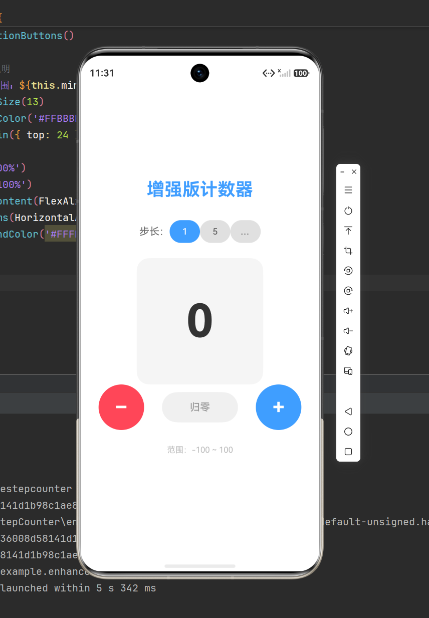
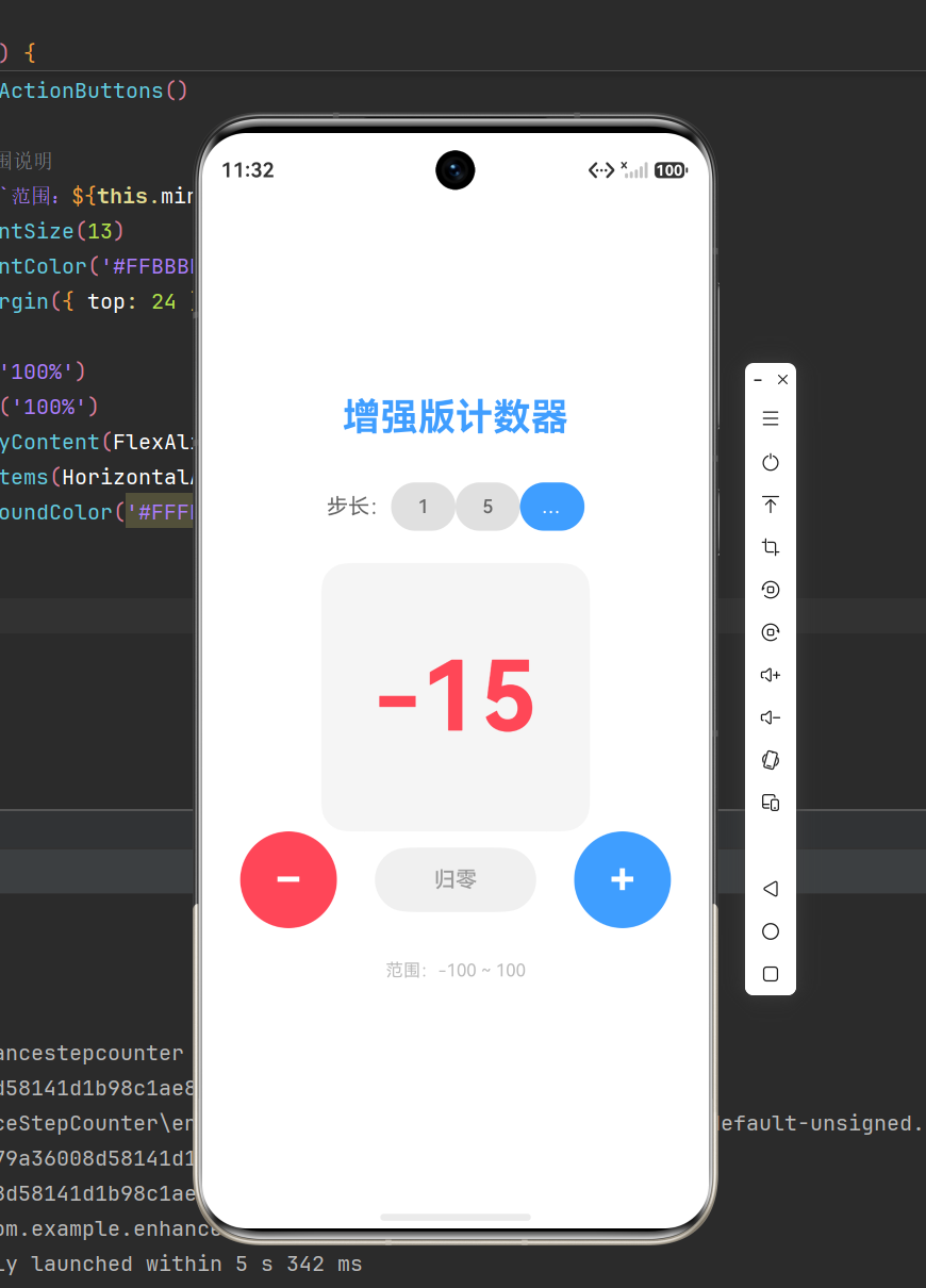
1.1 增强版功能清单
| 功能 | 触发方式 | 视觉反馈 |
|---|---|---|
| 加 N | 点击蓝色 +N 按钮 | 数字 +N,正数显示蓝色 |
| 减 N | 点击红色 −N 按钮 | 数字 −N,负数显示红色 |
| 归零 | 点击灰色 归零 按钮 | 数字归 0,显示灰色 |
| 步长切换 | 点击步长按钮组(1/5/10) | 当前步长高亮,按钮文字动态更新 |
| 范围限制 | 自动拦截 | 到达边界时显示提示文字 |
| 颜色联动 | 自动 | 正数蓝 / 负数红 / 零灰 |
| 状态监听提示 | 自动 | 数值变化时控制台输出日志 |
1.2 与基础版对比
| 对比项 | 基础版(常见教程) | 本文增强版 |
|---|---|---|
| 步长 | 固定为 1 | 可选 1 / 5 / 10 |
| 范围 | 无限制 | −100 ~ 100 范围限制 |
| 状态监听 | 无 | @Watch 自动记录变化 |
| 组件封装 | 全部写在 build() 里 | @Builder 拆分复用 |
| 边界反馈 | 无 | 到达边界时文字提示 |
1.3 技术要点
- 单一状态源:
@State count: number = 0 - 状态监听:
@Watch('onCountChange') - 步长状态:
@State step: number = 1 - 动态颜色:嵌套三目运算符
- 过渡动画:
.animation({ duration: 200 }) - 组件封装:
@Builder CountDisplay()、@Builder StepSelector()
二、项目创建与结构解析
2.1 创建项目
- 打开 DevEco Studio,点击 Create HarmonyOS Project
- 选择 Empty Ability 空白模板
- 项目名称:CounterApp
- API 版本:API 23+
- 模型:Stage 模型
- 语言:ArkTS
- 点击 Finish,等待项目初始化完成
2.2 核心目录结构
code
CounterApp/
├── AppScope/ # 应用全局配置
│ ├── app.json5 # bundleName、版本号
│ └── resources/ # 全局资源(图标、启动页)
│
├── entry/ # 主模块(核心开发区域)
│ └── src/main/
│ ├── ets/
│ │ ├── entryability/
│ │ │ └── EntryAbility.ets # 应用入口
│ │ └── pages/
│ │ └── Index.ets # ★ 首页(计数器主界面)
│ ├── module.json5 # 模块配置
│ └── resources/ # 模块资源
│
├── build-profile.json5 # 构建配置
└── oh-package.json5 # 依赖管理
核心开发位置:entry/src/main/ets/pages/Index.ets
三、核心知识点精讲
3.1 @State 响应式状态
@State 是鸿蒙声明式 UI 的核心装饰器。被 @State 修饰的变量一旦发生变化,ArkUI 框架会自动追踪所有依赖该变量的组件并触发重新渲染,无需手动调用任何刷新方法。
typescript
@State count: number = 0;
与 Android 命令式 UI 的对比:
| 对比维度 | Android View(命令式) | ArkUI(声明式) |
|---|---|---|
| 状态同步 | 手动调用 invalidate() / setText() |
@State 变量修改即刷新 |
| 更新粒度 | 整棵 View 树或手动 findViewById |
框架智能识别依赖子树,增量更新 |
| 代码组织 | XML 布局 + Java 逻辑分离 | 代码即布局,一处维护 |
3.2 @Watch 状态监听器(⭐ 本文新增)
@Watch 是本文新增的核心知识点。它允许你在状态变量变化时自动触发一个回调函数,类似于 Vue 的 watch 或 React 的 useEffect。
语法:
typescript
@State @Watch('onCountChanged') count: number = 0;

// 当 count 变化时自动调用
onCountChanged() {
 console.info(`[计数器] 数值变化:${this.count}`);
}
核心概念:
- 回调函数名必须与
@Watch('函数名')中的字符串一致 - 回调在状态值实际发生变化后执行(值相同不会触发)
- 一个状态变量可以监听多个回调:
@Watch('fn1, fn2') - 回调函数不接受参数,通过
this.变量名读取最新值
应用场景:
typescript
onCountChanged() {
 // 范围边界提示
 if (this.count >= this.maxValue) {
 this.tipText = '已达上限';
 this.tipVisible = true;
 } else if (this.count <= this.minValue) {
 this.tipText = '已达下限';
 this.tipVisible = true;
 } else {
 this.tipVisible = false;
 }
}
3.3 @Builder 组件封装(⭐ 本文新增)
当页面 UI 较复杂时,把所有代码堆在 build() 里会导致可读性下降。@Builder 允许将 UI 片段封装为独立的构建函数,实现模块化拆分和复用。
语法:
typescript
// 定义构建函数
@Builder CountDisplay() {
 Column() {
 Text(this.count.toString())
 .fontSize(72)
 .fontWeight(FontWeight.Bold)
 }
 .width(200)
 .height(200)
 .justifyContent(FlexAlign.Center)
}

// 在 build() 中调用
build() {
 Column() {
 this.CountDisplay() // 像普通函数一样调用
 }
}
关键规则:
| 规则 | 说明 |
|---|---|
| 函数名大写开头 | ArkUI 约定,区分普通方法和构建函数 |
内部可访问 this |
直接使用组件内的 @State 变量 |
| 不返回值 | 构建函数只负责生成 UI,不 return |
| 不写渲染逻辑 | 只描述 UI 结构,框架负责实际渲染 |
本文用 @Builder 拆分了三个模块:
| 构建函数 | 职责 |
|---|---|
CountDisplay() |
数字展示区(圆角卡片 + 动态颜色 + 动画) |
StepSelector() |
步长选择按钮组 |
ActionButtons() |
加减按钮 + 归零按钮 |
3.4 @Entry 和 @Component 装饰器
| 装饰器 | 作用 |
|---|---|
| @Entry | 标记页面入口,框架启动时自动加载渲染 |
| @Component | 声明 UI 组件,可与 @Entry 配合或单独作为子组件使用 |
3.5 链式调用语法
ArkUI 的声明式语法允许对组件进行点链式属性设置,所有样式和逻辑集中在一处:
typescript
Button('+')
 .width(80)
 .height(80)
 .fontSize(36)
 .fontWeight(FontWeight.Bold)
 .fontColor(Color.White)
 .backgroundColor('#FF409EFF')
 .borderRadius(40)
 .onClick(() => { this.count += this.step; })
3.6 动态样式:嵌套三目运算符
typescript
.fontColor(
 this.count > 0 ? '#FF409EFF' // 正数 → 蓝色
 : this.count < 0 ? '#FFFF4757' // 负数 → 红色
 : '#FF333333' // 零 → 深灰
)
执行逻辑:先判断正数,再判断负数,都不满足则为零值。
3.7 过渡动画
typescript
.animation({ duration: 200 })
数值变化时,字体颜色在 200ms 内平滑过渡,无需引入额外动画库。
四、数据结构与状态设计
4.1 状态变量总览
typescript
// 当前计数值(带状态监听)
@State @Watch('onCountChanged') count: number = 0;

// 当前步长
@State step: number = 1;

// 范围限制
private minValue: number = -100;
private maxValue: number = 100;

// 边界提示
@State tipText: string = '';
@State tipVisible: boolean = false;
设计思路:
count和step使用@State,因为它们直接参与 UI 渲染minValue和maxValue不需要驱动 UI,使用普通属性即可tipText和tipVisible控制边界提示的显示/隐藏
4.2 @Watch 回调实现
typescript复制
onCountChanged() {
 if (this.count >= this.maxValue) {
 this.tipText = `⚠️ 已达上限 ${this.maxValue}`;
 this.tipVisible = true;
 } else if (this.count <= this.minValue) {
 this.tipText = `⚠️ 已达下限 ${this.minValue}`;
 this.tipVisible = true;
 } else {
 this.tipVisible = false;
 }
 console.info(`[计数器] 当前值:${this.count},步长:${this.step}`);
}
五、完整可运行源码
5.1 应用入口:EntryAbility.ets
typescript
import window from '@ohos.window';
import UIAbility from '@ohos.app.ability.UIAbility';
import hilog from '@ohos.hilog';

export default class EntryAbility extends UIAbility {
 onCreate(want, launchParam) {
 hilog.info(0x0000, 'testTag', '%{public}s', 'Ability onCreate');
 }

 onDestroy() {
 hilog.info(0x0000, 'testTag', '%{public}s', 'Ability onDestroy');
 }

 onWindowStageCreate(windowStage: window.WindowStage) {
 hilog.info(0x0000, 'testTag', '%{public}s', 'Ability onWindowStageCreate');
 windowStage.loadContent('pages/Index', (err, data) => {
 if (err.code) {
 hilog.error(0x0000, 'testTag', 'Failed to load content: %{public}s',
 JSON.stringify(err) ?? '');
 return;
 }
 hilog.info(0x0000, 'testTag', 'Succeeded in loading content: %{public}s',
 JSON.stringify(data) ?? '');
 });
 }

 onWindowStageDestroy() {
 hilog.info(0x0000, 'testTag', '%{public}s', 'Ability onWindowStageDestroy');
 }

 onForeground() {
 hilog.info(0x0000, 'testTag', '%{public}s', 'Ability onForeground');
 }

 onBackground() {
 hilog.info(0x0000, 'testTag', '%{public}s', 'Ability onBackground');
 }
}
5.2 首页:Index.ets(核心业务)
typescript
/**
 * 鸿蒙增强版计数器应用
 * 新增功能:步长控制、范围限制、@Watch 状态监听、@Builder 组件封装
 * 核心知识点:@State、@Watch、@Builder、链式调用、动态样式、事件绑定
 */

@Entry
@Component
struct Index {
 // ═══════ 响应式状态 ═══════
 @State @Watch('onCountChanged') count: number = 0; // 当前计数值(带监听)
 @State step: number = 1; // 当前步长
 @State tipText: string = ''; // 边界提示文案
 @State tipVisible: boolean = false; // 边界提示是否可见

 // ═══════ 常量配置 ═══════
 private minValue: number = -100; // 最小值
 private maxValue: number = 100; // 最大值
 private readonly STEP_OPTIONS: number[] = [1, 5, 10]; // 可选步长

 // ═══════ @Watch 回调:count 变化时自动触发 ═══════
 onCountChanged() {
 if (this.count >= this.maxValue) {
 this.tipText = `⚠️ 已达上限 ${this.maxValue}`;
 this.tipVisible = true;
 } else if (this.count <= this.minValue) {
 this.tipText = `⚠️ 已达下限 ${this.minValue}`;
 this.tipVisible = true;
 } else {
 this.tipVisible = false;
 }
 console.info(`[计数器] 当前值:${this.count},步长:${this.step}`);
 }

 // ═══════ @Builder:数字展示区 ═══════
 @Builder CountDisplay() {
 Column() {
 Text(this.count.toString())
 .fontSize(72)
 .fontWeight(FontWeight.Bold)
 .fontColor(
 this.count > 0 ? '#FF409EFF'
 : this.count < 0 ? '#FFFF4757'
 : '#FF333333'
 )
 .animation({ duration: 200 })
 }
 .width(200)
 .height(200)
 .backgroundColor('#FFF5F5F5')
 .borderRadius(20)
 .justifyContent(FlexAlign.Center)
 .alignItems(HorizontalAlign.Center)
 }

 // ═══════ @Builder:步长选择器 ═══════
 @Builder StepSelector() {
 Row() {
 Text('步长:')
 .fontSize(16)
 .fontColor('#FF666666')
 ForEach(this.STEP_OPTIONS, (item: number) => {
 Button(item.toString())
 .width(48)
 .height(36)
 .fontSize(14)
 .backgroundColor(this.step === item ? '#FF409EFF' : '#FFE0E0E0')
 .fontColor(this.step === item ? Color.White : '#FF666666')
 .borderRadius(18)
 .onClick(() => { this.step = item; })
 }, (item: number) => item.toString())
 }
 .width('100%')
 .justifyContent(FlexAlign.Center)
 .margin({ bottom: 24 })
 }

 // ═══════ @Builder:操作按钮区 ═══════
 @Builder ActionButtons() {
 Row() {
 Button('−')
 .width(72)
 .height(72)
 .fontSize(32)
 .fontWeight(FontWeight.Bold)
 .fontColor(Color.White)
 .backgroundColor('#FFFF4757')
 .borderRadius(36)
 .onClick(() => { this.count -= this.step; })

 Button('归零')
 .width(120)
 .height(48)
 .fontSize(16)
 .fontColor('#FF999999')
 .backgroundColor('#FFF0F0F0')
 .borderRadius(24)
 .onClick(() => { this.count = 0; })

 Button('+')
 .width(72)
 .height(72)
 .fontSize(32)
 .fontWeight(FontWeight.Bold)
 .fontColor(Color.White)
 .backgroundColor('#FF409EFF')
 .borderRadius(36)
 .onClick(() => { this.count += this.step; })
 }
 .width('100%')
 .justifyContent(FlexAlign.SpaceEvenly)
 }

 // ═══════ 页面构建 ═══════
 build() {
 Column() {
 // 标题
 Text('增强版计数器')
 .fontSize(28)
 .fontWeight(FontWeight.Bold)
 .fontColor('#FF409EFF')
 .margin({ bottom: 32 })

 // 步长选择
 this.StepSelector()

 // 数字展示
 this.CountDisplay()

 // 范围提示
 if (this.tipVisible) {
 Text(this.tipText)
 .fontSize(14)
 .fontColor('#FFE67E22')
 .margin({ bottom: 16 })
 }

 // 操作按钮
 this.ActionButtons()

 // 范围说明
 Text(`范围:${this.minValue} ~ ${this.maxValue}`)
 .fontSize(13)
 .fontColor('#FFBBBBBB')
 .margin({ top: 24 })
 }
 .width('100%')
 .height('100%')
 .justifyContent(FlexAlign.Center)
 .alignItems(HorizontalAlign.Center)
 .backgroundColor('#FFFFFFFF')
 }
}
六、代码解析:增强版 vs 基础版
6.1 状态变量对比
code
基础版(1 个状态) 增强版(4 个状态)
┌──────────────┐ ┌────────────────────────┐
│ @State count │ │ @State @Watch count │
└──────────────┘ │ @State step │
 │ @State tipText │
 │ @State tipVisible │
 └────────────────────────┘
基础版只有 1 个状态变量,增强版增加到 4 个,实现了步长切换、边界提示等新功能。
6.2 @Watch 执行流程
code
用户点击 "+" 按钮
 │
 ▼
 this.count += this.step ← 修改状态
 │
 ▼
 ArkUI 检测到 count 变化
 │
 ▼
 自动触发 onCountChanged() ← @Watch 回调
 │
 ├─ count >= 100 ? → 显示 "已达上限"
 ├─ count <= -100 ? → 显示 "已达下限"
 └─ 其他 → 隐藏提示
 │
 ▼
 UI 重新渲染(数字颜色、提示文字同步更新)
6.3 @Builder 拆分逻辑
code
build() 方法结构:
┌────────────────────────────┐
│ Column(全屏垂直布局) │
│ ├── Tex
...(truncated)...
作为“人工智能6S店”的官方数字引擎,为AI开发者与企业提供一个覆盖软硬件全栈、一站式门户。
更多推荐

 3
3 0
0- 0


 已为社区贡献10条内容

所有评论(0)