
HarmonyOS ArkTS 原生布局-自适应高度:内容撑开与固定高度
SDK 版本: HarmonyOS NEXT 6.1.1(API 24)
语言框架: ArkTS
核心组件: Column
目录
- 引言
- Column 高度计算概述
- 模式一:内容撑开高度(默认行为)
- 模式二:固定高度(.height() 显式设置)
- 模式三:constraintSize 约束高度
- 高度优先级全图谱
- 常见陷阱与最佳实践
- 总结
1. 引言
在鸿蒙 ArkTS 的布局体系中,Column 是最基础也是最常用的垂直布局容器。它负责在纵轴方向上排列子组件,而高度计算规则是理解 Column 行为的关键。在实际开发中,90% 以上的布局问题都根源于对 Column 高度计算规则的误解。
本教程通过一个可交互的演示应用,系统地讲解 Column 的三种高度模式——内容撑开、固定高度、constraintSize 约束——以及它们之间的优先级关系。阅读完本文后,您将能精准控制 Column 的高度行为,避免布局溢出、空白留白等常见问题。
1.1 预备知识
在深入之前,请确保您了解以下概念:
- @Entry / @Component 装饰器:ArkTS 页面入口和组件声明方式
- @State 装饰器:响应式状态管理
- @Builder 装饰器:自定义构建函数,用于拆分 UI 代码
- FlexAlign / justifyContent:主轴对齐方式
- Scroll 组件:可滚动容器
1.2 演示整体结构
我们的演示页面 ColumnHeightPage 由四个 Demo 区块组成:
┌─ 固定顶栏(标题 + 副标题)
├─ Scroll
│  ├─ Demo A — 内容撑开高度
│  ├─ Demo B — 固定高度
│  ├─ Demo C — constraintSize 约束
│  └─ Demo D — 四种模式对比总结
└─(Scroll 自动获取剩余空间)
外层骨架代码如下:
// ColumnHeightPage.ets — 外层骨架
build() {
  Column() {
    // ── 区域1:固定顶栏 ──
    Column() { /* 标题 */ }
      .width('100%')
      .padding({ top: 16, bottom: 12, left: 16, right: 16 })
      .backgroundColor('#FFFFFF')

    Divider().width('100%').height(1).color('#E8E8E8')

    // ── 区域2:可滚动内容区 ──
    Scroll() {
      Column() {
        this.DemoSectionA()      // 内容撑开
        Divider().width('100%').height(1).color('#F0F0F0')
        this.DemoSectionB()      // 固定高度
        Divider().width('100%').height(1).color('#F0F0F0')
        this.DemoSectionC()      // constraintSize 约束
        Divider().width('100%').height(1).color('#F0F0F0')
        this.ComparisonSection() // 对比总结
        Column().height(32)      // 底部留白
      }
      .width('100%')
      .padding(16)
    }
    .layoutWeight(1)             // ← 关键:Scroll 填满剩余空间
    .width('100%')
    .scrollable(ScrollDirection.Vertical)
    .scrollBar(BarState.Auto)
  }
  .width('100%')
  .height('100%')
  .backgroundColor('#F7F8FA')
}
设计要点:
- 最外层
Column充满全屏(width: 100%+height: 100%) - 顶栏固定高度(由内容撑开),下方使用
Divider分隔 Scroll通过.layoutWeight(1)填满剩余空间——这是鸿蒙布局中常用的「固定顶栏 + 可滚动内容区」模式- Scroll 内部的 Column 负责组织四个 Demo 区块,每个区块之间用 Divider 分隔
2. Column 高度计算概述
在 ArkTS 中,Column 的高度计算遵循一套明确的优先级规则。理解这套规则是正确使用 Column 的前提。
2.1 核心计算规则(优先级从高到低)
| 优先级 | 设置方式 | 行为描述 |
|---|---|---|
| 1(最高) | .height(value) |
严格按设定值渲染,不受子组件影响 |
| 2 | .constraintSize({ maxHeight }) |
防止 Column 无限撑高,超出部分截断 |
| 3 | .constraintSize({ minHeight }) |
防止 Column 缩得过小,内容少时保证最小高度 |
| 4 | .constraintSize({ minHeight, maxHeight }) |
同时在最小值和最大值之间自适应 |
| 5(最低) | 不设任何高度属性 | 高度完全由子组件内容决定(内容撑开) |
2.2 两条底层原则
- 父约束原则:Column 的高度最终不能超过父容器的可用空间。例如,若父容器只有 400px 可用高度,Column 设置
.height(600)仍会被裁剪。 - 内容决定原则:在「内容撑开」模式下,Column 的高度是所有子组件的高度总和 + padding。如果 Column 没有任何子节点,高度为 0。
2.3 数据模型
演示页面使用了一个简单的卡片模型:
interface CardItem {
  id: number;
  color: string;
  label: string;
}
每个卡片高度固定为 30px + margin-bottom 8px,因此每张卡片占 38px 空间。Column 的总高度计算公式为:
总高度 = cardCount × 38 + padding
这个公式贯穿三个 Demo 区块,方便我们验证和对比不同模式下的高度行为。
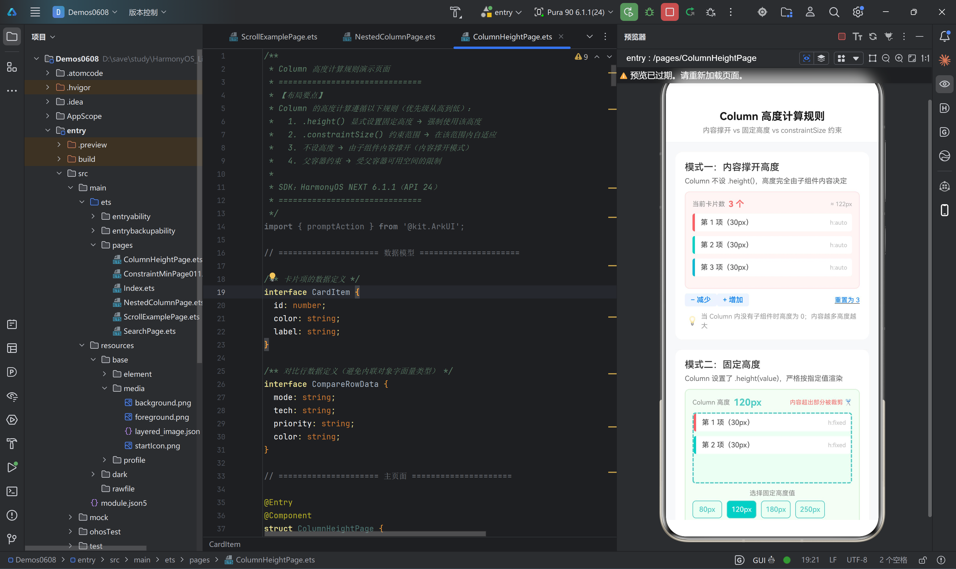
3. 模式一:内容撑开高度(默认行为)
3.1 原理说明
当 Column 不设置任何高度属性(既没有 .height(),也没有 .constraintSize())时,其高度由内部子组件的总高度决定。这是 Column 的默认行为,也是最自然、最灵活的布局方式。
适用场景:
- 列表或动态内容区域,元素数量不固定
- 内部子组件高度之和已知且可控
- 不需要 Column 占据固定空间
3.2 完整代码
@Builder
DemoSectionA() {
  Column() {
    // ── 标题 ──
    Text('模式一:内容撑开高度')
      .fontSize(16)
      .fontWeight(FontWeight.Medium)
      .fontColor('#333')
      .width('100%')

    Text('Column 不设 .height(),高度完全由子组件内容决定')
      .fontSize(12)
      .fontColor('#666')
      .lineHeight(18)
      .width('100%')
      .margin({ top: 4 })

    // ── 演示区 ──
    Column() {
      // 高度状态指示器
      Row() {
        Text('当前卡片数')
          .fontSize(11)
          .fontColor('#888')

        Text(`${this.cardCount} 个`)
          .fontSize(14)
          .fontWeight(FontWeight.Bold)
          .fontColor('#FF6B6B')
          .margin({ left: 6 })

        Row().layoutWeight(1)

        // 实时显示 Column 当前高度
        Text(`≈ ${this.cardCount * 38 + 8}px`)
          .fontSize(10)
          .fontColor('#AAA')
          .fontFamily('Courier New')
      }
      .width('100%')
      .padding({ bottom: 8 })

      // ▸ 核心演示:不设高度的 Column ◂
      // 关键:没有设置 .height()!
      // Column 的高度 = 子组件总高度 + padding
      Column() {
        ForEach(this.generateCards(this.cardCount), (card: CardItem) => {
          Row() {
            // 颜色标识块(左侧竖条)
            Column()
              .width(4)
              .height('100%')
              .backgroundColor(card.color)
              .borderRadius({ topLeft: 4, bottomLeft: 4 })

            Text(card.label)
              .fontSize(12)
              .fontColor('#444')
              .margin({ left: 10 })
              .layoutWeight(1)

            Text('h:auto')
              .fontSize(10)
              .fontColor('#BBB')
              .fontFamily('Courier New')
          }
          .width('100%')
          .height(30)
          .backgroundColor('#FFFFFF')
          .borderRadius(4)
          .margin({ bottom: 8 })
          .padding({ right: 8 })
        }, (card: CardItem) => card.id.toString())
      }
      .width('100%')
      // ← 关键:没有设置 .height()!
      // Column 的高度 = cardCount × 38 + padding
    }
    .width('100%')
    .padding(12)
    .backgroundColor('#FFF5F5')
    .borderRadius(8)
    .border({ width: 1, color: '#FFE0E0' })
    .margin({ top: 10 })

    // ── 控制按钮:增减卡片数量 ──
    Row() {
      this.InlineBtn('− 减少', this.cardCount > 0, () => { this.cardCount-- })
      this.InlineBtn('+ 增加', this.cardCount < 8, () => { this.cardCount++ })
      Row().layoutWeight(1)
      Text('重置为 3')
        .fontSize(11)
        .fontColor('#007AFF')
        .decoration({ type: TextDecorationType.Underline })
        .onClick(() => { this.cardCount = 3 })
    }
    .width('100%')
    .padding({ top: 8 })

    // ── 提示 ──
    Row() {
      Text('💡').fontSize(14).margin({ right: 6 })
      Text('当 Column 内没有子组件时高度为 0;内容越多高度越大')
        .fontSize(11).fontColor('#999').lineHeight(16).layoutWeight(1)
    }
    .width('100%')
    .padding({ top: 8, left: 4 })
  }
  .width('100%')
  .padding(16)
  .backgroundColor('#FFFFFF')
  .borderRadius(12)
  .margin({ bottom: 16 })
}
3.3 交互验证
Demo A 提供了 「− 减少」、「+ 增加」 和 「重置为 3」 三个控制按钮。当您点击操作时:
- 卡片数量为 0:Column 高度 ≈ 8px(仅 padding),不可见
- 卡片数量为 3:Column 高度 ≈ 3 × 38 + 8 = 122px
- 卡片数量为 8:Column 高度 ≈ 8 × 38 + 8 = 312px
每次操作,右上角会实时显示 ≈ Npx 的计算值,直观地反映「内容撑开」的本质。
3.4 关键注意事项
- 空 Column 高度为 0:如果 Column 内部没有任何子组件,其高度为 0,即使设置了 padding 也会发生「塌陷」效果,padding 不一定能撑开高度。
- 父容器约束仍然生效:虽然 Column 不设高度,但如果父容器有固定高度限制,Column 的最大高度仍受父容器约束。此时内容超出父容器时会溢出。
- 避免与固定高度混淆:初学者容易在 Column 上既想「自动撑开」又误写了
.height('100%'),导致行为异常。务必检查是否无意中设置了高度。
4. 模式二:固定高度(.height() 显式设置)
4.1 原理说明
当 Column 通过 .height(value) 设置了一个明确的高度后,无论内部有多少子组件,Column 的渲染高度严格等于设定的值。
两种后果:
- 内容 < 高度:Column 底部出现空白「留白」(背景区域可见)
- 内容 > 高度:超出 Column 高度的部分被裁剪,用户看不到
4.2 完整代码
@Builder
DemoSectionB() {
  Column() {
    // ── 标题 ──
    Text('模式二:固定高度')
      .fontSize(16).fontWeight(FontWeight.Medium)
      .fontColor('#333').width('100%')

    Text('Column 设置了 .height(value),严格按指定值渲染')
      .fontSize(12).fontColor('#666')
      .lineHeight(18).width('100%').margin({ top: 4 })

    // ── 演示区 ──
    Column() {
      // 高度状态指示器
      Row() {
        Text('Column 高度').fontSize(11).fontColor('#888')
        Text(`${this.fixedHeightValue}px`)
          .fontSize(16).fontWeight(FontWeight.Bold)
          .fontColor('#4ECDC4').margin({ left: 6 })
        Row().layoutWeight(1)
        Text('内容超出部分被裁剪 ✂️')
          .fontSize(10).fontColor('#FF6B6B')
      }
      .width('100%').padding({ bottom: 8 })

      // ▸ 核心演示:固定高度的 Column ◂
      Column() {
        ForEach(this.generateCards(this.fixedCardCount), (card: CardItem) => {
          Row() { /* 卡片内容 */ }
            .width('100%').height(30)
            .backgroundColor('#FFFFFF').borderRadius(4)
            .margin({ bottom: 8 }).padding({ right: 8 })
        }, (card: CardItem) => card.id.toString())
      }
      .width('100%')
      .height(this.fixedHeightValue)     // ← 关键:固定高度!
      .backgroundColor('#F0FFF4')        // 浅绿色背景便于观察「留白」
      .borderRadius(4)
      .border({ width: 2, color: '#4ECDC4', style: BorderStyle.Dashed })
      // 内容高度 < fixedHeightValue → 底部出现空白留白
      // 内容高度 > fixedHeightValue → 超出部分被裁剪

      // ── 高度选择器 ──
      Column() {
        Text('选择固定高度值').fontSize(11).fontColor('#888').margin({ bottom: 6 })
        Row() {
          ForEach(this.heightOptions, (h: number) => {
            Column() {
              Text(`${h}px`)
                .fontSize(12)
                .fontColor(this.fixedHeightValue === h ? '#FFFFFF' : '#4ECDC4')
                .fontWeight(FontWeight.Medium)
            }
            .width(50).height(30)
            .backgroundColor(this.fixedHeightValue === h ? '#4ECDC4' : '#F0FFF4')
            .borderRadius(6)
            .border({ width: 1, color: '#4ECDC4' })
            .justifyContent(FlexAlign.Center)
            .margin({ right: 8 })
            .onClick(() => { this.fixedHeightValue = h })
          }, (h: number) => h.toString())
        }
        .width('100%')

        // 内容数量控制
        Row() {
          Text('内容卡片数:').fontSize(11).fontColor('#888')
          this.InlineBtn('−', this.fixedCardCount > 1, () => { this.fixedCardCount-- })
          Text(`${this.fixedCardCount} 个`)
            .fontSize(13).fontWeight(FontWeight.Bold)
            .fontColor('#4ECDC4').margin({ left: 8, right: 8 })
          this.InlineBtn('+', this.fixedCardCount < 8, () => { this.fixedCardCount++ })
        }
        .width('100%').margin({ top: 8 })
      }
      .width('100%').padding({ top: 10 })
    }
    .width('100%').padding(12)
    .backgroundColor('#F5FFF5').borderRadius(8)
    .border({ width: 1, color: '#D0F0D0' }).margin({ top: 10 })

    Row() {
      Text('💡').fontSize(14).margin({ right: 6 })
      Text('内容超出时溢出不显示;内容不足时底部留白')
        .fontSize(11).fontColor('#999').lineHeight(16).layoutWeight(1)
    }
    .width('100%').padding({ top: 8, left: 4 })
  }
  .width('100%').padding(16)
  .backgroundColor('#FFFFFF').borderRadius(12).margin({ bottom: 16 })
}
4.3 交互验证
Demo B 提供了两组控制:
| 控件 | 用途 | 范围 |
|---|---|---|
高度选择器 [80px][120px][180px][250px] |
切换固定高度值 | 四档可选 |
内容卡片数 [−] N 个 [+] |
增减内部卡片数量 | 1 ~ 8 |
典型验证场景:
场景一:内容不足留白
- 固定高度:180px
- 卡片数量:2(总内容 ≈ 2 × 38 = 76px)
- 效果:Column 高度依然为 180px,底部出现 104px 的浅绿色背景留白
场景二:内容超出裁剪
- 固定高度:80px
- 卡片数量:5(总内容 ≈ 5 × 38 = 190px)
- 效果:Column 高度只有 80px,底部的 110px 内容完全不可见
4.4 固定高度的实际用途
- 卡片/轮播图容器:图片轮播等场景需要一个固定的可视窗口,内部图片可滑动切换。
- 固定操作栏:底部的提交按钮区域需要固定在某个位置,不受上方内容影响。
- Skeleton 加载占位:在数据加载前,用固定高度的灰色块占位,防止页面布局跳动。
- 等高的列表项容器:配合
ListItem的height属性实现等高的列表。
4.5 注意事项
- 固定高度 ≠ 固定内容区:如果子组件的
margin或padding占用空间超出固定高度,内容仍会溢出。 - 百分比高度需父容器明确:
.height('50%')只有在父容器有明确高度时才有效。若父容器也是内容撑开,50%会退化为 0。 - 长内容截断处理:如果固定高度 Column 内有关键内容被裁剪,考虑加「展开全部」按钮,或改用
.constraintSize()。
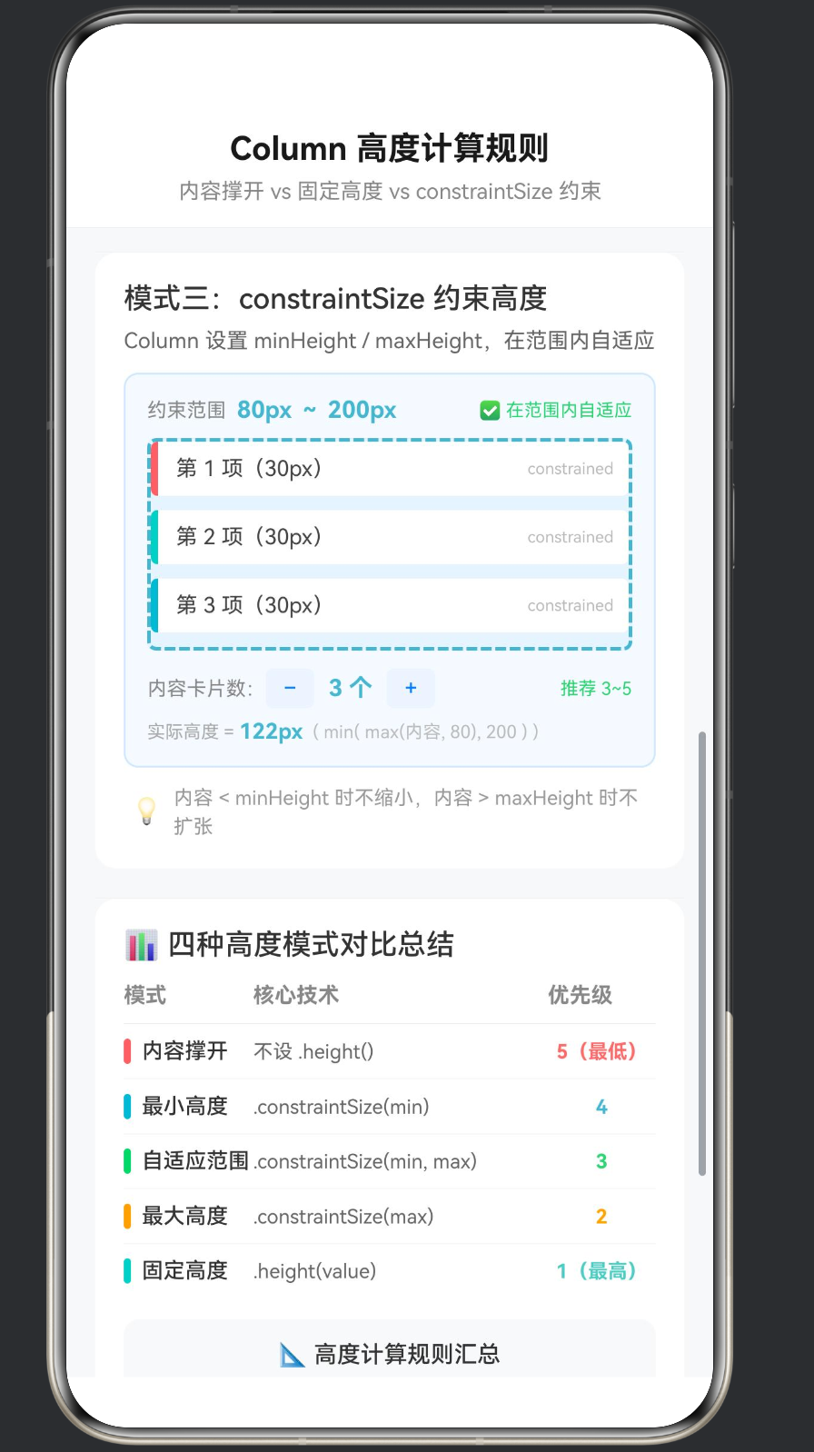
5. 模式三:constraintSize 约束高度
5.1 原理说明
constraintSize 是 Column 高度计算的「折中方案」,它在「内容撑开」和「固定高度」之间提供了一个可控的范围:
.clip() // 默认裁剪超出部分
.constraintSize({
  minHeight: 80,   // 最小高度:内容再少也不低于此值
  maxHeight: 200   // 最大高度:内容再多也不超过此值
})
三种行为:
| 内容高度 | Column 实际高度 | 说明 |
|---|---|---|
| < minHeight | minHeight | 取最小值约束,底部可能出现留白 |
| minHeight ~ maxHeight | 内容高度 | 在范围内自由自适应 |
| > maxHeight | maxHeight | 取最大值约束,超出部分被裁剪 |
5.2 完整代码
@Builder
DemoSectionC() {
  Column() {
    // ── 标题 ──
    Text('模式三:constraintSize 约束高度')
      .fontSize(16).fontWeight(FontWeight.Medium)
      .fontColor('#333').width('100%')

    Text('Column 设置 minHeight / maxHeight,在范围内自适应')
      .fontSize(12).fontColor('#666')
      .lineHeight(18).width('100%').margin({ top: 4 })

    // ── 演示区 ──
    Column() {
      Row() {
        Text('约束范围').fontSize(11).fontColor('#888')
        Text('80px ~ 200px')
          .fontSize(13).fontWeight(FontWeight.Bold)
          .fontColor('#45B7D1').margin({ left: 6 })
        Row().layoutWeight(1)

        if (this.constrainedCardCount <= 2) {
          Text('📏 处于最小值约束').fontSize(10).fontColor('#45B7D1')
        } else if (this.constrainedCardCount >= 6) {
          Text('⚠️ 超出最大值被截断').fontSize(10).fontColor('#FF6B6B')
        } else {
          Text('✅ 在范围内自适应').fontSize(10).fontColor('#2ED573')
        }
      }
      .width('100%').padding({ bottom: 8 })

      // ▸ 核心演示:constraintSize 约束的 Column ◂
      // 参数:{ minHeight: 80, maxHeight: 200 }
      // 1~2 张卡片 → 实际高度 = max(内容, 80) = 80(取最小值约束)
      // 3~5 张卡片 → 实际高度 = 内容高度(在范围内自由扩展)
      // 6~8 张卡片 → 实际高度 = min(内容, 200) = 200(超出截断)
      Column() {
        ForEach(this.generateCards(this.constrainedCardCount), (card: CardItem) => {
          Row() { /* 卡片内容 */ }
            .width('100%').height(30)
            .backgroundColor('#FFFFFF').borderRadius(4)
            .margin({ bottom: 8 }).padding({ right: 8 })
        }, (card: CardItem) => card.id.toString())
      }
      .width('100%')
      .constraintSize({ minHeight: 80, maxHeight: 200 }) // ← 关键:约束范围!
      .backgroundColor('#E8F4FD')  // 浅蓝色背景观察约束边界
      .borderRadius(4)
      .border({ width: 2, color: '#45B7D1', style: BorderStyle.Dashed })

      // ── 控制区域 ──
      Column() {
        Row() {
          Text('内容卡片数:').fontSize(11).fontColor('#888')
          this.InlineBtn('−', this.constrainedCardCount > 0, () => { this.constrainedCardCount-- })
          Text(`${this.constrainedCardCount} 个`)
            .fontSize(13).fontWeight(FontWeight.Bold)
            .fontColor('#45B7D1').margin({ left: 8, right: 8 })
          this.InlineBtn('+', this.constrainedCardCount < 8, () => { this.constrainedCardCount++ })
          Row().layoutWeight(1)
          Text('推荐 3~5').fontSize(10).fontColor('#2ED573')
        }
        .width('100%')

        Row() {
          Text('实际高度 = ').fontSize(10).fontColor('#AAA')
          Text(`${Math.max(80, Math.min(this.constrainedCardCount * 38 + 8, 200))}px`)
            .fontSize(12).fontWeight(FontWeight.Bold).fontColor('#45B7D1')
          Text('  ( min( max(内容, 80), 200 ) )')
            .fontSize(10).fontColor('#BBB').fontFamily('Courier New')
        }
        .width('100%').margin({ top: 6 })
      }
      .width('100%').padding({ top: 10 })
    }
    .width('100%').padding(12)
    .backgroundColor('#F5FAFF').borderRadius(8)
    .border({ width: 1, color: '#D0E8FF' }).margin({ top: 10 })

    Row() {
      Text('💡').fontSize(14).margin({ right: 6 })
      Text('内容 < minHeight 时不缩小,内容 > maxHeight 时不扩张')
        .fontSize(11).fontColor('#999').lineHeight(16).layoutWeight(1)
    }
    .width('100%').padding({ top: 8, left: 4 })
  }
  .width('100%').padding(16)
  .backgroundColor('#FFFFFF').borderRadius(12).margin({ bottom: 16 })
}
5.3 交互验证
Demo C 的约束范围固定为 minHeight: 80px ~ maxHeight: 200px,状态文本会动态变化:
| 卡片数 | 内容高度 | 实际 Column 高度 | 状态文本 |
|---|---|---|---|
| 0 | 8px(仅 padding) | 80px(取 min) | 📏 处于最小值约束 |
| 1 | 46px | 80px(取 min) | 📏 处于最小值约束 |
| 2 | 84px | 84px(自适应) | ✅ 在范围内自适应 |
| 3 | 122px | 122px(自适应) | ✅ 在范围内自适应 |
| 4 | 160px | 160px(自适应) | ✅ 在范围内自适应 |
| 5 | 198px | 198px(接近 max) | ✅ 在范围内自适应 |
| 6 | 236px | 200px(取 max) | ⚠️ 超出最大值被截断 |
| 7 | 274px | 200px(取 max) | ⚠️ 超出最大值被截断 |
| 8 | 312px | 200px(取 max) | ⚠️ 超出最大值被截断 |
底部还实时显示计算公式结果,帮助理解 min(max(内容, 80), 200) 的计算过程。
5.4 constraintSize 的适用场景
- 评论区 / 回复框:展开后最小高度足够输入,最大高度限制防止撑破屏幕。
- 可收起/展开的面板:折叠时用 minHeight 保留标题行,展开时用 maxHeight 控制最大展开高度。
- 卡片摘要区域:在首页列表卡片中,摘要内容应该在 2-4 行范围内,超过时显示「…查看更多」。
- 搜索建议列表:最少显示 2 条建议(minHeight 保证),最多显示 8 条(maxHeight 控制)。
5.5 与固定高度的关键区别
| 方面 | 固定高度 .height() |
约束范围 .constraintSize() |
|---|---|---|
| 内容 < 容器 | 底部留白 | 可能留白(低于 min 时) |
| 内容在范围内 | 固定不变 | 随内容自适应 |
| 内容 > 容器 | 截断 | 截断(达到 max 时) |
| 优先级 | 1(最高) | 2~4(中等) |
6. 高度优先级全图谱
6.1 综合对比表
Demo D 使用一个结构化的对比表格来呈现五种高度模式的完整对比:
@Builder
ComparisonSection() {
  Column() {
    Text('📊 四种高度模式对比总结')
      .fontSize(16).fontWeight(FontWeight.Medium)
      .fontColor('#333').width('100%')
      .margin({ bottom: 12 })

    // ── 表头 ──
    Row() {
      Text('模式').width(72).fontSize(12).fontColor('#888').fontWeight(FontWeight.Bold)
      Text('核心技术').layoutWeight(1).fontSize(12).fontColor('#888').fontWeight(FontWeight.Bold)
      Text('优先级').width(60).fontSize(12).fontColor('#888').fontWeight(FontWeight.Bold)
    }
    .width('100%').padding({ bottom: 8 })

    Divider().width('100%').height(1).color('#E8E8E8')

    this.CompareRow({ mode: '内容撑开', tech: '不设 .height()', priority: '5(最低)', color: '#FF6B6B' })
    Divider().width('100%').height(0.5).color('#F0F0F0')
    this.CompareRow({ mode: '最小高度', tech: '.constraintSize(min)', priority: '4', color: '#45B7D1' })
    Divider().width('100%').height(0.5).color('#F0F0F0')
    this.CompareRow({ mode: '自适应范围', tech: '.constraintSize(min, max)', priority: '3', color: '#2ED573' })
    Divider().width('100%').height(0.5).color('#F0F0F0')
    this.CompareRow({ mode: '最大高度', tech: '.constraintSize(max)', priority: '2', color: '#FFA502' })
    Divider().width('100%').height(0.5).color('#F0F0F0')
    this.CompareRow({ mode: '固定高度', tech: '.height(value)', priority: '1(最高)', color: '#4ECDC4' })

    // ── 详细规则 ──
    Column() {
      Text('📐 高度计算规则汇总')
        .fontSize(13).fontWeight(FontWeight.Medium)
        .fontColor('#333').margin({ bottom: 8 })
      this.RuleItem('① .height() 显式设置 → 最高优先级,强制使用该高度')
      this.RuleItem('② .constraintSize({ maxHeight }) → 防止 Column 无限撑高')
      this.RuleItem('③ .constraintSize({ minHeight }) → 防止 Column 缩得过小')
      this.RuleItem('④ .constraintSize({ min, max }) → 两者同时约束')
      this.RuleItem('⑤ 不设任何高度 → 最低优先级,完全由内容撑开')
      this.RuleItem('⑥ 父容器固定高度时,子 Column 的 % 值参照父容器计算')
    }
    .width('100%').padding(12)
    .backgroundColor('#F8F9FA').borderRadius(8).margin({ top: 12 })
  }
  .width('100%').padding(16)
  .backgroundColor('#FFFFFF').borderRadius(12)
}
6.2 优先级记忆口诀
「固定最高,约束居中,不设最低」
具体展开:.height() 优先级最高 → .constraintSize(max) 次高 → .constraintSize(min, max) 居中 → .constraintSize(min) 次低 → 什么都不设最低。
6.3 优先级叠加示例
下面通过几个组合场景来说明优先级规则如何在实际中影响布局:
场景一:同时设置 .height() 和 .constraintSize()
Column() {
  // 内容...
}
.height(300)                          // 优先级 1 — 生效
.constraintSize({ minHeight: 100 })   // 优先级 4 — 无效
.constraintSize({ maxHeight: 200 })   // 优先级 2 — 无效
// 结果:高度 = 300px(.height() 胜出)
constraintSize 在 .height() 存在时被「覆盖」,不会产生影响。
场景二:父容器固定 + 子 Column 百分比
// 父容器
Column() {
  Column() {
    Text('子 Column 高度 50%')
  }
  .height('50%')     // 参照父容器计算 → 父容器高度 × 50%
  .backgroundColor('#E0E0E0')
}
.height(400)   // 父容器固定 400px
.backgroundColor('#F0F0F0')
// 结果:子 Column 高度 = 400 × 50% = 200px
场景三:constraintSize 在 Scroll 内部的行为
当 Column 放在 Scroll 内部时(如本演示的布局),Scroll 不限制子组件在滚动方向上的尺寸,因此 Column 可以自由撑开。这是一个重要的例外——Scroll 内部的 Column 不受「父约束原则」中高度方面的限制,可以无限撑高。
7. 常见陷阱与最佳实践
7.1 陷阱一:错误使用百分比高度
错误写法:
// ❌ 父容器没有明确高度,50% 无效
Column() {
  Column() {
    Text('我的高度应该是 50%')
  }
  .height('50%')  // 父容器高度为 0,此值无效
}
正确写法:
// ✅ 父容器设置明确高度
Column() {
  Column() {
    Text('我的高度是父容器的 50%')
  }
  .height('50%')
}
.height(400)
7.2 陷阱二:忽略 padding 对高度的影响
// ❌ 误解:10 个子组件各高 30,总高 300
Column() {
  ForEach(items, (item) => {
    Text(item).height(30)
  })
}
// 实际:10 × 30 + padding(top + bottom) = 300 + 16 + 16 = 332px
.padding(16)
计算时务必包含自身的 padding 和子组件的 margin。
7.3 陷阱三:固定高度 Column 中的内容溢出
问题: 固定高度的 Column 默认不显示溢出部分。如果内容超出,用户无法看到。
解决方案:
| 方案 | 适用场景 | 代码 |
|---|---|---|
| 使用 Scroll | 需要浏览全部内容 | Scroll { Column{...} }.height(200) |
| 使用 constraintSize | 希望自适应 | .constraintSize({ maxHeight: 200 }) |
使用 .clip(false) |
允许视觉溢出 | .clip(false)(不常用) |
7.4 最佳实践清单
- 明确设计意图:在写 Column 的 height 之前,先问自己「这个 Column 的高度应该由什么决定?」
- 优先使用内容撑开:除非有明确的设计要求,否则优先使用默认的「内容撑开」模式。
- 约束优于固定:需要限制高度时,优先选择
constraintSize而非height,前者更灵活。 - 百分比高度慎用:确保父容器有显式的
height值。 - 测试边界情况:测试内容为 0、内容很少、内容很多三种情况,确保布局不崩溃。
- 配合 Scroll:Column 内容可能超出时,外层包一层 Scroll 是最可靠的兜底方案。
7.5 辅助工具:InlineBtn Builder
在整个演示中,我们反复使用了一个自定义的 @Builder InlineBtn 来创建简洁的控制按钮。这是 ArkTS 拆分 UI 逻辑的好方式:
@Builder
InlineBtn(label: string, enabled: boolean, action: () => void) {
  Text(label)
    .fontSize(12)
    .fontColor(enabled ? '#007AFF' : '#CCC')
    .fontWeight(FontWeight.Medium)
    .padding({ left: 10, right: 10, top: 4, bottom: 4 })
    .backgroundColor(enabled ? '#EEF5FF' : '#F5F5F5')
    .borderRadius(4)
    .onClick(() => {
      if (enabled) {
        action();
      }
    })
}
这个 Builder 接受三个参数:
- label:按钮文本
- enabled:是否可点击(禁用时显示灰色)
- action:点击回调函数
在调用时传递箭头函数:
this.InlineBtn('+ 增加', this.cardCount < 8, () => { this.cardCount++ })
8. 总结
8.1 核心知识点回顾
| 模式 | API | 行为 | 优先级 |
|---|---|---|---|
| 内容撑开 | 不设置 | 高度 = 子组件总和 | 最低 |
| 最小值约束 | constraintSize({ minHeight }) |
保底高度 | 次低 |
| 范围约束 | constraintSize({ min, max }) |
范围内自适应 | 中 |
| 最大值约束 | constraintSize({ maxHeight }) |
阻止无限撑高 | 次高 |
| 固定高度 | height(value) |
严格固定 | 最高 |
8.2 一句话记忆
高度选择口诀:能撑开就不固定,需要约束用 constraintSize,必须固定才用 height。
8.3 完整页面结构回顾
本演示应用的 ColumnHeightPage.ets 整体结构如下:
ColumnHeightPage (@Entry @Component)
├── @State cardCount: number = 3          // 演示A 状态
├── @State fixedCardCount: number = 2     // 演示B 状态
├── @State fixedHeightValue: number = 120 // 演示B 高度值
├── @State constrainedCardCount: number = 3 // 演示C 状态
│
├── build()                               // 主构建函数
│   ├── 外层 Column(全屏背景)
│   ├── 固定顶栏(标题 + Divider)
│   └── Scroll(可滚动区)
│       └── 内部 Column
│           ├── DemoSectionA()            // 内容撑开
│           ├── DemoSectionB()            // 固定高度
│           ├── DemoSectionC()            // constraintSize
│           └── ComparisonSection()       // 对比总结
│
├── @Builder DemoSectionA()               // 演示A Builder
├── @Builder DemoSectionB()               // 演示B Builder
├── @Builder DemoSectionC()               // 演示C Builder
├── @Builder ComparisonSection()          // 对比总结 Builder
├── @Builder InlineBtn()                  // 行内按钮 Builder
├── @Builder CompareRow()                 // 对比行 Builder
├── @Builder RuleItem()                   // 规则条目 Builder
│
└── generateCards(count): CardItem[]      // 数据生成方法
8.4 下一步学习
掌握 Column 高度计算后,您可以继续探索:
- Row 的宽度计算:Column 是垂直方向,Row 是水平方向,两者规则对称
- Flex 布局的高级用法:
justifyContent、alignItems对子组件尺寸的影响 - Stack 层叠布局:层叠容器的尺寸由最大子组件决定
- Grid 网格布局:行列尺寸的显式与隐式计算
- 自定义测量(onMeasure):高级场景下的自定义尺寸计算

作为“人工智能6S店”的官方数字引擎,为AI开发者与企业提供一个覆盖软硬件全栈、一站式门户。
更多推荐

 0
0 0
0- 0


 已为社区贡献8条内容

所有评论(0)