
Column 垂直排列入门:从 Hello World 到纵向布局——鸿蒙 HarmonyOS ArkTS 原生学习应用
本文介绍了HarmonyOS NEXT 6.1.1中ArkTS框架的Column组件,作为实现纵向布局的核心容器。文章从基础概念入手,详细解析了Column的主轴与交叉轴特性,以及alignItems和justifyContent等关键属性。通过Hello World示例展示了ColumnStart左对齐布局的代码实现,并对比了不同对齐方式的效果差异,帮助开发者掌握Column在表单、列表等常见场
SDK 版本:HarmonyOS NEXT 6.1.1(API 24)
开发语言:ArkTS(基于 TypeScript/JavaScript 的鸿蒙原生声明式 UI 框架)
一、引言
在移动端应用开发中,纵向布局(Vertical Layout)是最基础、最常用的页面结构。无论是社交 App 的消息列表、电商 App 的商品信息流、还是工具 App 的设置页面,几乎每一屏界面都可以拆解为「从上到下」的排列结构。
在鸿蒙 HarmonyOS NEXT 的 ArkTS 开发框架中,Column 组件承担了纵向布局的核心角色。理解 Column 的工作原理和使用技巧,是掌握鸿蒙 ArkTS 布局体系的第一个重要台阶。
本文将从最简单的 Hello World 示例开始,逐步深入到 Column 在实际业务场景中的应用:纵向列表、表单注册页面、个人信息流展示。全程基于真实的可运行代码,并配有详细的中文注释,帮助你从零掌握 ColumnStart(左对齐)布局方式的全部要点。
二、Column 组件基础概念
2.1 Column 是什么
Column 是 ArkUI(Ark Graphics UI)提供的一个容器组件,用于将子组件沿垂直方向(主轴) 依次排列。它类似于 Web Flex 布局中的 flex-direction: column,也类似于 Android 中的 LinearLayout(orientation 为 vertical)。
ArkUI 的布局体系包含三个核心容器:
| 容器 | 排列方向 | 常见用途 |
|---|---|---|
| Column | 垂直(从上到下) | 纵向列表、表单、文章详情 |
| Row | 水平(从左到右) | 导航栏、操作按钮组 |
| Flex | 灵活方向 | 需要自定义主轴方向的场景 |
2.2 主轴与交叉轴
理解 Column 布局,必须先理解两个核心轴的概念:
- 主轴(Main Axis):Column 的主轴方向是垂直方向(从上到下)。子组件沿主轴依次排列。
- 交叉轴(Cross Axis):Column 的交叉轴方向是水平方向(从左到右)。子组件在交叉轴上的对齐方式由
alignItems属性控制。
  主轴方向(从上到下)
       │
       ▼
  ┌──────────────┐
  │  子组件 ①     │  ← 交叉轴(水平方向)
  ├──────────────┤
  │  子组件 ②     │
  ├──────────────┤
  │  子组件 ③     │
  └──────────────┘
2.3 Column 的核心属性
Column 组件的关键布局属性有三个:
Column() {
  // 子组件列表
}
.width('100%')
.height('100%')
.alignItems(HorizontalAlign.Start)
.justifyContent(FlexAlign.Start)
alignItems —— 交叉轴对齐(水平方向)
控制所有子组件在水平方向上的对齐关系:
| 值 | 效果 | 说明 |
|---|---|---|
HorizontalAlign.Start |
左对齐 | 所有子组件靠左排列,ColumnStart 的核心 |
HorizontalAlign.Center |
居中对齐 | 所有子组件水平居中 |
HorizontalAlign.End |
右对齐 | 所有子组件靠右排列 |
justifyContent —— 主轴对齐(垂直方向)
控制子组件在垂直方向上的排列方式:
| 值 | 效果 | 说明 |
|---|---|---|
FlexAlign.Start |
顶部对齐(默认值) | 子组件从容器顶部开始排列 |
FlexAlign.Center |
垂直居中 | 子组件在容器垂直方向居中 |
FlexAlign.End |
底部对齐 | 子组件在容器底部排列 |
FlexAlign.SpaceBetween |
两端对齐 | 子组件均匀分布,首尾贴边 |
FlexAlign.SpaceAround |
环绕分布 | 子组件均匀分布,两侧间距相等 |
FlexAlign.SpaceEvenly |
等距分布 | 所有间距(含两端)完全相等 |
三、Hello World:第一个 Column 纵向布局
让我们从最基础的示例开始。下面是一个简单的 Hello World 页面,展示 Column 的基本用法。
3.1 基础代码
// HelloWorldColumn.ets
// 第一个 Column 纵向布局示例
// SDK: HarmonyOS NEXT 6.1.1 (API 24)

@Entry
@Component
struct HelloWorldColumn {
  build() {
    // 最外层 Column:垂直排列,左对齐
    Column() {
      // 子组件①:标题文字
      Text('Hello, HarmonyOS!')
        .fontSize(28)
        .fontWeight(FontWeight.Bold)
        .fontColor('#3A7BFF')
        .width('100%')
        .padding(16);

      // 子组件②:说明文字
      Text('这是第一个 Column 纵向布局示例')
        .fontSize(16)
        .fontColor('#666666')
        .width('100%')
        .padding({ left: 16, right: 16 });

      // 子组件③:装饰方块
      Row() {
        Circle()
          .width(60)
          .height(60)
          .fill('#3A7BFF');
      }
      .width('100%')
      .justifyContent(FlexAlign.Center)
      .padding(24);

      // 子组件④:底部按钮
      Button('点击体验')
        .width('90%')
        .height(48)
        .type(ButtonType.Capsule)
        .backgroundColor('#3A7BFF')
        .fontColor('#FFFFFF')
        .fontSize(16);
    }
    .width('100%')
    .height('100%')
    .padding(16)
    .alignItems(HorizontalAlign.Start)
    .backgroundColor('#F5F5F5');
  }
}
3.2 运行效果
这段代码运行后,屏幕上会呈现:
- 最顶部:蓝色粗体标题 “Hello, HarmonyOS!”
- 紧接着:灰色说明文字
- 中间:一个居中的蓝色圆形
- 底部附近:一个胶囊形按钮
所有内容从上到下依次排列,每条内容都靠左对齐。这就是 ColumnStart 最基础的呈现效果。
3.3 关键代码解析
.alignItems(HorizontalAlign.Start) 是 ColumnStart 布局的灵魂。它告诉容器:所有的子组件,请都靠在左边排列。
如果不设置这一行,Column 的默认对齐方式也是 Start(左对齐),但在实际开发中建议显式写出,以提高代码的可读性和维护性。
四、深入理解 Column 的布局行为
要真正用好 Column,需要理解它在不同场景下的布局行为。下面通过对比实验来深入理解。
4.1 不同 alignItems 的效果对比
同一个 Column,仅改变 alignItems 的值,三个子组件的排列位置会截然不同:
// 实验一:Start(左对齐)
Column() {
  Text('左对齐').backgroundColor('#FFE0E0')
  Text('左对齐也是').backgroundColor('#E0FFE0')
  Text('左对齐默认').backgroundColor('#E0E0FF')
}
.width('100%')
.alignItems(HorizontalAlign.Start)
// 实验二:Center(居中对齐)
Column() {
  Text('居中对齐').backgroundColor('#FFE0E0')
  Text('居中对齐也是').backgroundColor('#E0FFE0')
  Text('居中对齐一样').backgroundColor('#E0E0FF')
}
.width('100%')
.alignItems(HorizontalAlign.Center)
// 实验三:End(右对齐)
Column() {
  Text('右对齐').backgroundColor('#FFE0E0')
  Text('右对齐也是').backgroundColor('#E0FFE0')
  Text('右对齐一样').backgroundColor('#E0E0FF')
}
.width('100%')
.alignItems(HorizontalAlign.End)
4.2 不同 justifyContent 的效果对比
当 Column 的高度超过所有子组件高度之和时,justifyContent 决定子组件在垂直方向上的分布方式:
// 实验四:顶部排列(默认)
Column() {
  Text('顶部').backgroundColor('#FFE0E0')
  Text('排列').backgroundColor('#E0FFE0')
}
.height(300)
.width('100%')
.justifyContent(FlexAlign.Start)
// 实验五:垂直居中
Column() {
  Text('垂直').backgroundColor('#FFE0E0')
  Text('居中').backgroundColor('#E0FFE0')
}
.height(300)
.width('100%')
.justifyContent(FlexAlign.Center)
// 实验六:底部排列
Column() {
  Text('底部').backgroundColor('#FFE0E0')
  Text('排列').backgroundColor('#E0FFE0')
}
.height(300)
.width('100%')
.justifyContent(FlexAlign.End)
4.3 核心结论
- Column + alignItems(Start):子组件左对齐,从上到下排列。这是 90% 以上纵向布局页面的选择。
- Column + justifyContent(Start):子组件从顶部开始排列。这是 Column 的默认行为,但在正式开发中建议显式声明。
- 当子组件总高度小于容器高度时,
justifyContent的效果才会体现出来。如果子组件占满了容器,四种Start/Center/End/SpaceBetween在视觉上没有区别。
五、实战场景一:纵向列表(消息通知列表)
掌握了基础概念后,我们开始实战。第一个场景是消息通知列表——这是 ColumnStart 布局最典型的应用场景。
5.1 需求分析
假设我们需要实现一个消息通知列表页面:
- 顶部有导航栏
- 下方是消息列表,每条消息包含:头像、发送者名称、内容摘要、时间
- 未读消息有蓝色标记
- 每条消息以卡片形式展示,从上到下一次排列
- 列表可滚动
这正是 ColumnStart 布局的「主场」——纵向列表天然的从上到下的结构。
5.2 数据模型
首先定义消息的数据结构:
interface MessageItem {
  id: number;
  sender: string;
  content: string;
  time: string;
  unread: boolean;
}
5.3 数据初始化
@State messageList: MessageItem[] = [
  { id: 1, sender: '系统通知', content: '您的账号已在其他设备登录,请注意账号安全。', time: '10:32', unread: true },
  { id: 2, sender: '张三', content: '好的,明天下午三点见,我到时候带资料过去。', time: '昨天', unread: true },
  { id: 3, sender: '工作群', content: '@所有人 提醒:明天上午10点召开项目评审会议。', time: '昨天', unread: false },
  { id: 4, sender: '李四', content: '文件我已经发到你邮箱了,麻烦查收一下。', time: '周三', unread: false },
  { id: 5, sender: '订阅通知', content: '您关注的专栏"HarmonyOS开发实战"已更新。', time: '周二', unread: false },
];
5.4 消息卡片组件
每条消息独立封装为一个 @Builder 函数,便于复用和维护:
@Builder messageCard(item: MessageItem) {
  Row() {
    // 头像
    Circle()
      .width(40)
      .height(40)
      .fill(item.unread ? '#3A7BFF' : '#CCCCCC')

    // 消息内容区
    Column() {
      // 第一行:发送者 + 时间
      Row() {
        Text(item.sender)
          .fontSize(15)
          .fontColor('#1A1A1A')
          .fontWeight(item.unread ? FontWeight.Bold : FontWeight.Normal)
          .layoutWeight(1);

        Text(item.time)
          .fontSize(12)
          .fontColor('#999999');
      }
      .width('100%')
      .alignItems(VerticalAlign.Center);

      // 第二行:消息内容
      Text(item.content)
        .fontSize(14)
        .fontColor('#666666')
        .width('100%')
        .textAlign(TextAlign.Start)
        .maxLines(2)
        .padding({ top: 4 });

      // 未读标记
      if (item.unread) {
        Row() {
          Circle().width(6).height(6).fill('#FF4D4F');
          Text('未读').fontSize(11).fontColor('#FF4D4F').padding({ left: 4 });
        }
        .alignItems(VerticalAlign.Center)
        .padding({ top: 4 });
      }
    }
    .alignItems(HorizontalAlign.Start)
    .padding({ left: 12 })
    .layoutWeight(1);
  }
  .width('100%')
  .padding(12)
  .backgroundColor(item.unread ? '#F5F8FF' : '#FFFFFF')
  .borderRadius(8)
  .margin({ bottom: 2 });
}
5.5 列表容器
列表容器采用「Column 嵌套 Column」的典型模式:
Column() {
  ForEach(this.messageList, (item: MessageItem) => {
    this.messageCard(item);
  }, (item: MessageItem) => item.id.toString());
}
.width('100%')
.alignItems(HorizontalAlign.Start)
.padding(10)
.backgroundColor('#FFFFFF')
.borderRadius(12)
.shadow({
  radius: 4,
  color: 'rgba(0,0,0,0.08)',
  offsetX: 0,
  offsetY: 2
});
六、实战场景二:表单布局(注册信息表单)
第二个场景是表单注册页面,这是 ColumnStart 的另一个经典应用场景。表单天然具有「从上到下、逐行填写」的特性。
6.1 需求分析
- 多个表单项纵向排列:用户名、手机号、密码、确认密码
- 每个表单项包含:左对齐的标签 + 输入框
- 底部有提交按钮
6.2 数据模型
interface FormField {
  label: string;
  placeholder: string;
  value: string;
  type: string; // 'text' | 'password' | 'phone'
}
6.3 表单渲染
@State formData: FormField[] = [
  { label: '用户名', placeholder: '请输入用户名', value: '', type: 'text' },
  { label: '手机号', placeholder: '请输入手机号码', value: '', type: 'phone' },
  { label: '密码', placeholder: '请输入登录密码', value: '', type: 'password' },
  { label: '确认密码', placeholder: '请再次输入密码', value: '', type: 'password' },
];

Column() {
  ForEach(this.formData, (field: FormField) => {
    Column() {
      Text(field.label)
        .fontSize(15).fontColor('#333333')
        .fontWeight(FontWeight.Medium)
        .width('100%').textAlign(TextAlign.Start)
        .padding({ bottom: 6 });

      TextInput({ placeholder: field.placeholder, text: field.value })
        .width('100%').height(44)
        .type(field.type === 'password' ? InputType.Password :
              field.type === 'phone' ? InputType.PhoneNumber : InputType.Normal)
        .backgroundColor('#F5F5F5').borderRadius(8)
        .padding({ left: 12 })
        .onChange((val: string) => { field.value = val; });
    }
    .width('100%')
    .alignItems(HorizontalAlign.Start)
    .padding({ top: 8, bottom: 8 });
  });

  Button('提交注册')
    .width('100%').height(44).type(ButtonType.Capsule)
    .backgroundColor('#3A7BFF').fontColor('#FFFFFF')
    .fontSize(16).fontWeight(FontWeight.Bold)
    .margin({ top: 16 })
    .onClick(() => {
      this.feedbackMessage = '表单提交成功(演示效果)';
    });

  if (this.feedbackMessage.length > 0) {
    Text(this.feedbackMessage)
      .fontSize(14).fontColor('#52C41A')
      .width('100%').textAlign(TextAlign.Start)
      .padding({ top: 8 });
  }
}
.width('100%')
.alignItems(HorizontalAlign.Start)
.padding(16)
.backgroundColor('#FFFFFF')
.borderRadius(12)
.shadow({ radius: 4, color: 'rgba(0,0,0,0.08)', offsetX: 0, offsetY: 2 });
七、实战场景三:信息流(个人资料展示)
第三个场景是个人资料展示,适合在个人主页、商品详情等场景中使用。
7.1 需求分析
- 展示用户的个人资料信息
- 每行一个字段:字段名 + 字段值
- 行与行之间有分割线
- 信息行按从上到下的顺序纵向排列
7.2 信息行组件
@Builder infoRow(label: string, value: string) {
  Row() {
    Text(label)
      .fontSize(14)
      .fontColor('#888888')
      .width(80);

    Text(value)
      .fontSize(15)
      .fontColor('#1A1A1A')
      .fontWeight(FontWeight.Medium);
  }
  .width('100%')
  .alignItems(VerticalAlign.Center)
  .padding({ top: 12, bottom: 12 });
}
7.3 分割线组件
@Builder dividerLine() {
  Divider()
    .width('100%')
    .height(1)
    .color('#F0F0F0');
}
7.4 组合使用
Column() {
  this.infoRow('姓名', '张明阳');
  this.dividerLine();
  this.infoRow('手机号', '138****5678');
  this.dividerLine();
  this.infoRow('邮箱', 'zhangmingyang@example.com');
  this.dividerLine();
  this.infoRow('部门', '技术研发中心 · 移动端组');
  this.dividerLine();
  this.infoRow('入职时间', '2024年3月15日');
}
.width('100%')
.alignItems(HorizontalAlign.Start)
.padding(16)
.backgroundColor('#FFFFFF')
.borderRadius(12)
.shadow({
  radius: 4,
  color: 'rgba(0,0,0,0.08)',
  offsetX: 0,
  offsetY: 2
});
八、完整代码
完整的 ColumnStartPage.ets 代码整合了上述三个实战场景,外加一个布局要点总结卡片。
// ColumnStartPage.ets
// SDK: HarmonyOS NEXT 6.1.1 (API 24)

import { router } from '@kit.ArkUI';

interface MessageItem {
  id: number;
  sender: string;
  content: string;
  time: string;
  unread: boolean;
}

interface FormField {
  label: string;
  placeholder: string;
  value: string;
  type: string;
}

@Entry
@Component
struct ColumnStartPage {

  @State messageList: MessageItem[] = [
    { id: 1, sender: '系统通知', content: '您的账号已在其他设备登录,请注意账号安全。', time: '10:32', unread: true },
    { id: 2, sender: '张三', content: '好的,明天下午三点见,我到时候带资料过去。', time: '昨天', unread: true },
    { id: 3, sender: '工作群', content: '@所有人 提醒:明天上午10点召开项目评审会议。', time: '昨天', unread: false },
    { id: 4, sender: '李四', content: '文件我已经发到你邮箱了,麻烦查收一下。', time: '周三', unread: false },
    { id: 5, sender: '订阅通知', content: '您关注的专栏「HarmonyOS开发实战」已更新。', time: '周二', unread: false },
  ];

  @State formData: FormField[] = [
    { label: '用户名', placeholder: '请输入用户名', value: '', type: 'text' },
    { label: '手机号', placeholder: '请输入手机号码', value: '', type: 'phone' },
    { label: '密码', placeholder: '请输入登录密码', value: '', type: 'password' },
    { label: '确认密码', placeholder: '请再次输入密码', value: '', type: 'password' },
  ];

  @State feedbackMessage: string = '';

  build() {
    Column() {
      // 顶部导航栏
      Row() {
        Button() {
          Row() {
            Text('<-').fontSize(18).fontColor('#FFFFFF');
            Text('返回首页').fontSize(16).fontColor('#FFFFFF');
          }.alignItems(VerticalAlign.Center);
        }
        .type(ButtonType.Normal)
        .backgroundColor('transparent')
        .onClick(() => { router.back(); });

        Text('ColumnStart 布局演示')
          .fontSize(18).fontWeight(FontWeight.Bold)
          .fontColor('#FFFFFF').layoutWeight(1).textAlign(TextAlign.Center);
      }
      .width('100%').height(56)
      .padding({ left: 16, right: 16 })
      .backgroundColor('#3A7BFF');

      Scroll() {
        Column() {
          // 场景一:纵向列表
          this.sectionTitle('场景一:纵向列表(消息通知)');

          Column() {
            ForEach(this.messageList, (item: MessageItem) => {
              this.messageCard(item);
            }, (item: MessageItem) => item.id.toString());
          }
          .width('100%')
          .alignItems(HorizontalAlign.Start)
          .padding(10)
          .backgroundColor('#FFFFFF').borderRadius(12)
          .shadow({ radius: 4, color: 'rgba(0,0,0,0.08)', offsetX: 0, offsetY: 2 });

          // 场景二:表单布局
          this.sectionTitle('场景二:表单布局(注册信息)');

          Column() {
            ForEach(this.formData, (field: FormField) => {
              Column() {
                Text(field.label).fontSize(15).fontColor('#333333')
                  .fontWeight(FontWeight.Medium)
                  .width('100%').textAlign(TextAlign.Start).padding({ bottom: 6 });

                TextInput({ placeholder: field.placeholder, text: field.value })
                  .width('100%').height(44)
                  .type(field.type === 'password' ? InputType.Password :
                        field.type === 'phone' ? InputType.PhoneNumber : InputType.Normal)
                  .backgroundColor('#F5F5F5').borderRadius(8).padding({ left: 12 })
                  .onChange((val: string) => { field.value = val; });
              }
              .width('100%').alignItems(HorizontalAlign.Start)
              .padding({ top: 8, bottom: 8 });
            });

            Button('提交注册').width('100%').height(44).type(ButtonType.Capsule)
              .backgroundColor('#3A7BFF').fontColor('#FFFFFF')
              .fontSize(16).fontWeight(FontWeight.Bold).margin({ top: 16 })
              .onClick(() => { this.feedbackMessage = '表单提交成功'; });

            if (this.feedbackMessage.length > 0) {
              Text(this.feedbackMessage).fontSize(14).fontColor('#52C41A')
                .width('100%').textAlign(TextAlign.Start).padding({ top: 8 });
            }
          }
          .width('100%').alignItems(HorizontalAlign.Start).padding(16)
          .backgroundColor('#FFFFFF').borderRadius(12)
          .shadow({ radius: 4, color: 'rgba(0,0,0,0.08)', offsetX: 0, offsetY: 2 });

          // 场景三:信息流
          this.sectionTitle('场景三:信息流(个人资料展示)');

          Column() {
            this.infoRow('姓名', '张明阳');
            this.dividerLine();
            this.infoRow('手机号', '138****5678');
            this.dividerLine();
            this.infoRow('邮箱', 'zhangmingyang@example.com');
            this.dividerLine();
            this.infoRow('部门', '技术研发中心');
            this.dividerLine();
            this.infoRow('入职时间', '2024年3月15日');
          }
          .width('100%').alignItems(HorizontalAlign.Start).padding(16)
          .backgroundColor('#FFFFFF').borderRadius(12)
          .shadow({ radius: 4, color: 'rgba(0,0,0,0.08)', offsetX: 0, offsetY: 2 });

          Blank().height(40);
        }
        .width('100%')
        .alignItems(HorizontalAlign.Start)
        .justifyContent(FlexAlign.Start)
        .padding(16);
      }
      .width('100%').layoutWeight(1)
      .backgroundColor('#F0F4F8');
    }
    .width('100%').height('100%')
    .backgroundColor('#F0F4F8');
  }

  @Builder sectionTitle(title: string) {
    Text(title).fontSize(20).fontWeight(FontWeight.Bold)
      .fontColor('#1A1A1A').width('100%').textAlign(TextAlign.Start)
      .padding({ top: 20, bottom: 4 });
  }

  @Builder messageCard(item: MessageItem) {
    Row() {
      Circle().width(40).height(40).fill(item.unread ? '#3A7BFF' : '#CCCCCC');
      Column() {
        Row() {
          Text(item.sender).fontSize(15).fontColor('#1A1A1A')
            .fontWeight(item.unread ? FontWeight.Bold : FontWeight.Normal).layoutWeight(1);
          Text(item.time).fontSize(12).fontColor('#999999');
        }.width('100%').alignItems(VerticalAlign.Center);

        Text(item.content).fontSize(14).fontColor('#666666')
          .width('100%').textAlign(TextAlign.Start)
          .maxLines(2).padding({ top: 4 });

        if (item.unread) {
          Row() {
            Circle().width(6).height(6).fill('#FF4D4F');
            Text('未读').fontSize(11).fontColor('#FF4D4F').padding({ left: 4 });
          }.alignItems(VerticalAlign.Center).padding({ top: 4 });
        }
      }.alignItems(HorizontalAlign.Start).padding({ left: 12 }).layoutWeight(1);
    }.width('100%').padding(12)
      .backgroundColor(item.unread ? '#F5F8FF' : '#FFFFFF')
      .borderRadius(8).margin({ bottom: 2 });
  }

  @Builder infoRow(label: string, value: string) {
    Row() {
      Text(label).fontSize(14).fontColor('#888888').width(80);
      Text(value).fontSize(15).fontColor('#1A1A1A').fontWeight(FontWeight.Medium);
    }.width('100%').alignItems(VerticalAlign.Center).padding({ top: 12, bottom: 12 });
  }

  @Builder dividerLine() {
    Divider().width('100%').height(1).color('#F0F0F0');
  }
}
九、ColumnStart 布局的常见问题与解决方案
9.1 子组件宽度不一致
问题:当 Column 的子组件没有设置宽度时,它们的宽度可能不一致,导致左对齐后视觉上参差不齐。
解决方案:将需要对齐的子组件都设置为 .width('100%')。
9.2 内容溢出容器
问题:当 Column 内的子组件总高度超过屏幕高度时,部分内容被截断。
解决方案:用 Scroll 包裹 Column 内容区域。
9.3 子组件间距不均
问题:子组件之间的间距不一致。
解决方案:使用 Column 的 space 属性统一设置间距,或通过 Blank() 弹性分隔。
Column({ space: 12 }) {
  Text('项目一');
  Text('项目二');
  Text('项目三');
}
9.4 Column 嵌套过深
问题:Column 嵌套太多层,影响代码可读性和渲染性能。
解决方案:将子组件抽取为独立的 @Builder 函数,控制嵌套深度不超过 5-7 层。
9.5 被遗忘的 justifyContent 默认行为
问题:justifyContent 的默认值是 FlexAlign.Start,但当 Column 高度等于所有子组件总高度时,更改 justifyContent 不会有视觉变化。
解决方案:justifyContent 只在容器高度大于所有子组件总高度时生效。
十、ColumnStart 与其他布局方式的组合使用
10.1 Column + Row 嵌套
Column 中嵌套 Row 是最常见的组合模式,用于实现「纵向列表中的横向内容」。
Column() {
  Row() {
    Text('姓名').width(80);
    Text('张三').fontWeight(FontWeight.Medium);
  }.width('100%').padding(12);

  Row() {
    Text('年龄').width(80);
    Text('28');
  }.width('100%').padding(12);
}
.alignItems(HorizontalAlign.Start);
10.2 Column + Scroll 实现完整页面
Column() {
  // 固定顶部
  Row() { /* 导航栏 */ }.height(56);

  // 可滚动的中间内容
  Scroll() {
    Column() {
      // 所有内容
    }.alignItems(HorizontalAlign.Start);
  }.layoutWeight(1);

  // 固定底部
  Row() { /* 底部操作栏 */ }.height(56);
}
.height('100%');
十一、性能优化建议
11.1 使用 LazyForEach 替代 ForEach
当列表数据量较大(超过 50 项)时,使用 LazyForEach 替代 ForEach 可以大幅提升性能。LazyForEach 只会渲染当前可视区域内的子组件。
11.2 避免不必要的 Column 嵌套
每层 Column 都会增加布局计算的开销。在保证功能的前提下,尽量减少嵌套深度。
不推荐:
Column() {
  Column() {
    Column() {
      Text('Hello World');
    }
  }
}
推荐:
Column() {
  Text('Hello World');
}
11.3 合理使用 @Builder
当 Column 内部有多个重复结构时,用 @Builder 封装可以提升代码复用性和可维护性。
十二、总结
12.1 ColumnStart 布局的核心公式
ColumnStart 布局 = Column 容器
                  + alignItems(HorizontalAlign.Start)
                  + justifyContent(FlexAlign.Start)
                  + Scroll (内容超长时)
12.2 适合的场景
| 场景类型 | 示例 | 说明 |
|---|---|---|
| 列表 | 消息列表、通知列表、菜单列表 | 项与项之间垂直排列 |
| 表单 | 注册、登录、信息填写 | 表单项逐行排列,标签左对齐 |
| 信息流 | 个人资料、商品详情 | 信息行左对齐展示 |
| 评论区 | 评论列表、问答列表 | 评论卡片纵向排列 |
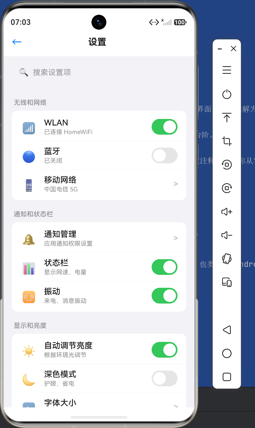
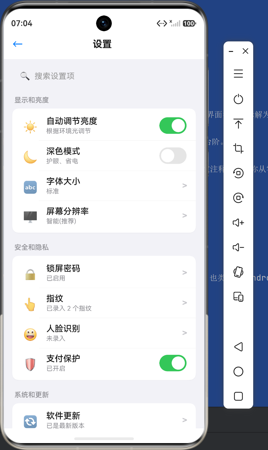
| 设置页面 | 系统设置、个人设置 | 设置分组纵向排列 |
12.3 五个核心记忆点
- Column 主轴 = 垂直:子组件从上到下排列
- alignItems(Start) = 左对齐:所有子组件在水平方向靠左
- justifyContent(Start) = 顶对齐:子组件从顶部开始排列(默认值)
- Scroll 包裹 = 可滚动:内容超屏时可以滚动查看
- Column 嵌套 Row = 灵活布局:实现「纵向列表+横向内容」的复杂布局
12.4 下一步学习方向
掌握了 ColumnStart 布局之后,建议继续学习:
- Row 布局:Column 的「兄弟组件」,用于横向排列
- Flex 弹性布局:更灵活的主轴方向控制
- Stack 层叠布局:用于重叠元素的场景
- Grid 网格布局:用于复杂的二维网格结构
写在最后
Column 是鸿蒙 ArkTS 布局体系中最基础也最重要的组件之一。掌握 ColumnStart(左对齐垂直排列)布局方式,就相当于掌握了 80% 以上页面布局的核心逻辑。
在实际开发中,你会发现绝大多数业务页面——从简单的设置页面到复杂的社交信息流——都可以用 Column + alignItems(Start) 来构建。当你遇到「从上到下、左对齐」的页面结构需求时,第一时间想到 ColumnStart,你的布局设计就已经走在正确的道路上了。
从一个 Hello World 开始,到三个完整实战场景的深入拆解,希望本文能够帮助你扎实掌握 Column 纵向布局的每一个要点。在实际项目中多加练习、多写多试,ColumnStart 布局最终会成为你手中最得心应手的工具。
Happy Coding with HarmonyOS ArkTS!

作为“人工智能6S店”的官方数字引擎,为AI开发者与企业提供一个覆盖软硬件全栈、一站式门户。
更多推荐


 0
0 0
0- 0


 已为社区贡献14条内容

所有评论(0)