
【鸿蒙原生开发实战】第三篇:UI组件与主页开发——ArkUI 声明式组件化实践
摘要:鸿蒙原生开发实战第三篇聚焦ArkUI组件化开发,通过构建4个核心自定义组件实现笔记应用主页。文章首先回顾ArkUI基础概念,包括@Component装饰器、状态管理(@State、@Prop、@Link)等。随后详细讲解CategoryBadge分类标签、StatsCard统计卡片、NoteCard笔记卡片等组件的开发过程,重点介绍样式技巧如圆角、阴影、文本省略等处理,以及相对时间格式化等实
【鸿蒙原生开发实战】第三篇:UI组件与主页开发——ArkUI 声明式组件化实践
前言
前两篇我们完成了工程搭建和数据层架构。现在是时候让「知墨」笔记应用真正"看起来像个应用"了。
本篇会聚焦 ArkUI 的组件化开发思想,从零构建 4 个核心自定义组件,然后组合出应用的主页面——包括统计栏、分类筛选器、笔记列表和浮动操作按钮(FAB)。
核心思想:ArkUI 的组件化思路和 Flutter Widget、Jetpack Compose 类似——一切皆组件,组件嵌套组件。
一、ArkUI 组件基础回顾
在开始之前,快速回顾 ArkUI 的组件核心概念:
@Component 装饰器
@Component
export struct MyComponent {
  build() {
    // 返回 UI 描述
  }
}
@Component标记这是一个自定义组件struct是 ArkTS 中组件结构的定义方式(不是 class)build()方法返回 UI 树
@State 装饰器
@Component
struct Counter {
  @State count: number = 0;

  build() {
    Button(`点击: ${this.count}`)
      .onClick(() => { this.count++; })
  }
}
@State 装饰的变量变化时,框架自动重绘关联的 UI。这是声明式 UI 的核心——你只管改数据,框架负责更新 UI。
@Prop vs @State vs @Link
| 装饰器 | 作用 | 数据流向 |
|---|---|---|
@State |
组件内部状态 | 内部驱动 |
@Prop |
从父组件传入的不可变属性 | 父→子(单向) |
@Link |
与父组件共享的引用 | 双向同步 |
在「知墨」中,我们大量使用
@Prop让父组件向子组件传递数据,保持数据单向流动。
二、构建自定义组件库
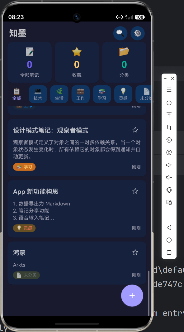
2.1 CategoryBadge 分类标签
这是应用中最小但最常用的组件——显示笔记的分类徽章:
@Component
export struct CategoryBadge {
  categoryId: string = 'uncategorized';
  categoryName: string = '未分类';
  categoryIcon: string = '📄';
  categoryColor: ResourceColor = '#636e72';

  build() {
    Row({ space: 4 }) {
      Text(this.categoryIcon).fontSize(12)
      Text(this.categoryName).fontSize(11)
        .fontColor(this.categoryColor)
    }
    .padding({ left: 8, right: 8, top: 3, bottom: 3 })
    .backgroundColor(this.categoryColor + '20')
    .borderRadius(10)
    .alignItems(VerticalAlign.Center)
  }
}
设计要点:
ResourceColor类型支持直接传颜色字符串(如'#6c5ce7')- 背景色使用
颜色值 + '20'这种方式实现 20% 透明度('20'是十六进制的约 12% 透明度) borderRadius(10)实现圆角标签效果
2.2 StatsCard 统计卡片
主页顶部的三个统计卡片组件:
@Component
export struct StatsCard {
  label: string = '';
  value: string = '0';
  icon: string = '';
  color: ResourceColor = '#6c5ce7';

  build() {
    Column({ space: 6 }) {
      Text(this.icon).fontSize(22)
      Text(this.value).fontSize(24).fontWeight(FontWeight.Bold)
        .fontColor(this.color)
      Text(this.label).fontSize(12)
        .fontColor($r('app.color.text_secondary'))
    }
    .width('100%')
    .padding(12)
    .backgroundColor($r('app.color.surface'))
    .borderRadius(12)
    .alignItems(HorizontalAlign.Center)
    .shadow({
      radius: 3,
      color: $r('app.color.shadow'),
      offsetY: 2,
    })
  }
}
样式技巧:
$r('app.color.xxx')引用资源文件中定义的颜色,方便主题切换.shadow()是 ArkUI 的阴影 API,offsetY: 2表示向下偏移 2px
2.3 NoteCard 笔记卡片
笔记卡片是列表中最核心的组件,展示笔记标题、内容摘要、分类和时间:
@Component
export struct NoteCard {
  note: Note | null = null;
  onTap?: (id: string) => void;
  onToggleFavorite?: (id: string) => void;

  build() {
    if (this.note === null) {
      Text('').height(0) // 占位
    } else {
      Column({ space: 8 }) {
        // 标题行
        Row() {
          Text(this.note!.title)
            .fontSize(16).fontWeight(600)
            .lineHeight(22).maxLines(1)
            .textOverflow({ overflow: TextOverflow.Ellipsis })
            .layoutWeight(1)

          // 收藏按钮
          Button({ type: ButtonType.Circle, stateEffect: true }) {
            Text(this.note!.isFavorite ? '⭐' : '☆').fontSize(16)
          }
          .width(28).height(28)
          .backgroundColor('transparent')
          .onClick(() => { this.onToggleFavorite?.(this.note!.id); })
        }
        .width('100%')
        .alignItems(VerticalAlign.Center)

        // 内容摘要
        if (this.note!.content.length > 0) {
          Text(this.note!.content)
            .fontSize(13).fontColor($r('app.color.text_secondary'))
            .lineHeight(18).maxLines(3)
            .textOverflow({ overflow: TextOverflow.Ellipsis })
            .width('100%')
        }

        // 底部:分类 + 时间
        Row() {
          CategoryBadge({ ... })
          Text(formatRelativeTime(this.note!.updatedAt))
            .fontSize(11).fontColor($r('app.color.text_secondary'))
        }
        .width('100%')
      }
      // 卡片样式
      .padding(14)
      .backgroundColor($r('app.color.surface'))
      .borderRadius(12)
      .shadow({ radius: 3, color: $r('app.color.shadow'), offsetY: 1 })
      .onClick(() => { this.onTap?.(this.note!.id); })
    }
  }
}
关键技巧:
maxLines(1)+textOverflow(Ellipsis)实现单行省略号?.(this.note!.id)是 ArkTS 的可选链调用,安全调用回调- 内容区域
maxLines(3)展示三行摘要,超过自动省略
相对时间格式化函数:
function formatRelativeTime(timestamp: number): string {
  const diffMin = Math.floor((Date.now() - timestamp) / 60000);
  if (diffMin < 1) return '刚刚';
  if (diffMin < 60) return `${diffMin}分钟前`;
  const diffHour = Math.floor(diffMin / 60);
  if (diffHour < 24) return `${diffHour}小时前`;
  const diffDay = Math.floor(diffHour / 24);
  if (diffDay < 30) return `${diffDay}天前`;
  // 超过30天显示完整日期
  const d = new Date(timestamp);
  return `${d.getFullYear()}-${...}`;
}
2.4 EmptyState 空状态占位
当没有笔记时,不能直接显示空白页面——这就需要 EmptyState 组件:
@Component
export struct EmptyState {
  icon: string = '📝';
  message: string = '暂无内容';
  subMessage: string = '';

  build() {
    Column({ space: 12 }) {
      Text(this.icon).fontSize(48)
      Text(this.message).fontSize(16).fontWeight(500)
      if (this.subMessage.length > 0) {
        Text(this.subMessage).fontSize(13)
          .fontColor($r('app.color.text_secondary'))
      }
    }
    .width('100%')
    .padding(40)
    .alignItems(HorizontalAlign.Center)
    .justifyContent(FlexAlign.Center)
  }
}
三、搭建主页面 Index
有了上面的组件积木,我们来搭建应用的主页面。先看完整结构,再逐块分析:
@Entry
@Component
struct Index {
  @State notes: Note[] = [];
  @State stats: NoteStats | null = null;
  @State isLoading: boolean = true;
  @State activeFilter: string = 'all';
  @State isDark: boolean = false;
  @State showStats: boolean = true;

  aboutToAppear(): void {
    AppStorage.setOrCreate('appContext', getContext(this));
    this.initData();
  }
  // ...
}
3.1 生命周期初始化
aboutToAppear() 是 ArkUI 组件生命周期方法,类似于 Flutter 的 initState() 或 Android Compose 的 LaunchedEffect。
我们在这里做了三件事:
- 保存全局上下文:
AppStorage.setOrCreate('appContext', getContext(this)),这是 ArkUI 提供的跨组件共享存储,后续 ThemeService 需要用到这个 Context 来切换系统主题 - 初始化 Preferences:
preferencesService.init(ctx),加载持久化数据 - 初始化主题:
themeService.init(ctx),恢复上次使用的主题模式
3.2 顶部导航栏
Row() {
  Text('知墨').fontSize(22).fontWeight(FontWeight.Bold)
    .layoutWeight(1)

  Button({ type: ButtonType.Circle, stateEffect: true }) {
    Text('🔍').fontSize(18)
  }
  .width(36).height(36)
  .backgroundColor($r('app.color.surface_variant'))
  .onClick(() => { this.onSearch(); })

  Button({ type: ButtonType.Circle, stateEffect: true }) {
    Text('⚙️').fontSize(16)
  }
  .width(36).height(36)
  .backgroundColor($r('app.color.surface_variant'))
  .onClick(() => { this.onOpenSettings(); })
}
ArkUI 的 Button({ type: ButtonType.Circle }) 可以直接创建圆形按钮,不用自己写圆角样式。搭配 stateEffect: true 开启按下状态反馈。
3.3 统计栏
if (this.showStats && this.stats) {
  Row({ space: 8 }) {
    StatsCard({ label: '全部笔记', value: this.stats.total.toString(), icon: '📝', color: '#6c5ce7' })
      .layoutWeight(1)
    StatsCard({ label: '收藏', value: this.stats.favorites.toString(), icon: '⭐', color: '#fdcb6e' })
      .layoutWeight(1)
    StatsCard({ label: '分类', value: Object.keys(this.stats.categoryDist).length.toString(), icon: '📂', color: '#00b894' })
      .layoutWeight(1)
  }
  .width('100%')
}
layoutWeight(1) 在 Row 中的作用和 Flexbox 的 flex: 1 类似,三个卡片等分宽度。
3.4 分类筛选器
分类筛选器是一个水平滚动的 Chip 列表:
Scroll() {
  Row({ space: 8 }) {
    // "全部" Chip
    Column() {
      Text('📋').fontSize(16)
      Text('全部').fontSize(11)
        .fontColor(this.activeFilter === 'all' ? $r('app.color.primary') : $r('app.color.text_secondary'))
    }
    .padding({ left: 12, right: 12, top: 6, bottom: 6 })
    .backgroundColor(this.activeFilter === 'all'
      ? $r('app.color.primary') + '18'
      : $r('app.color.surface_variant'))
    .borderRadius(12)
    .onClick(() => { this.onFilterChange('all'); })

    ForEach(this.categories, (cat: Category) => {
      Column() {
        Text(cat.icon).fontSize(16)
        Text(cat.name).fontSize(11)
          .fontColor(this.activeFilter === cat.id ? cat.color : ...)
      }
      .backgroundColor(this.activeFilter === cat.id
        ? cat.color + '20'
        : $r('app.color.surface_variant'))
      .borderRadius(12)
      .onClick(() => { this.onFilterChange(cat.id); })
    })

    // "收藏" Chip(同上)
  }
}
.scrollable(ScrollDirection.Horizontal) // 关键:开启水平滚动
.width('100%')
.height(54)
关键点:Scroll + scrollable(ScrollDirection.Horizontal) 实现横向滚动,Chip 样式通过 activeFilter === id 控制选中态高亮。
3.5 笔记列表
笔记列表是三种状态:加载中、空数据、正常列表:
if (this.isLoading) {
  // 加载中:LoadingProgress 动画
  Column() {
    LoadingProgress().width(32).height(32)
      .color($r('app.color.primary'))
    Text('加载中...').fontSize(13)
  }
} else if (this.notes.length === 0) {
  // 空数据:EmptyState 占位
  EmptyState({
    icon: this.activeFilter === 'favorites' ? '⭐' : '📝',
    message: this.activeFilter === 'favorites' ? '还没有收藏的笔记' : '还没有笔记',
    subMessage: this.activeFilter === 'all' ? '点击右下角按钮创建第一篇笔记' : '',
  })
} else {
  // 有数据:滚动列表
  Scroll() {
    Column({ space: 10 }) {
      ForEach(this.notes, (item: Note) => {
        NoteCard({
          note: item,
          onTap: (id: string) => this.onNoteTap(id),
          onToggleFavorite: (id: string) => this.onToggleFavorite(id),
        })
      })
    }
    .padding({ bottom: 80 }) // 为 FAB 留空间
  }
  .layoutWeight(1)
}
3.6 浮动操作按钮(FAB)
Button({ type: ButtonType.Circle, stateEffect: true }) {
  Text('+').fontSize(28).fontColor(Color.White)
}
.width(56).height(56)
.backgroundColor($r('app.color.primary'))
.shadow({ radius: 8, color: '#306c5ce7', offsetY: 4 })
.position({ bottom: 24, right: 20 })
.onClick(() => { this.onNoteTap(); })
position() 使用绝对定位锚定在右下角,不管列表内容多少都悬浮在页面底部,这是 FAB 的标准实现。
四、状态管理:数据流梳理
整个主页的数据流如下:
aboutToAppear()
    ↓
initData() → preferencesService.init() + themeService.init()
    ↓
loadNotes() → noteUseCases.getAllNotes()
    ↓                 ↓
    this.notes     this.stats ← @State 驱动 UI 更新
    ↓
build() 渲染 NoteCard 列表
当用户操作时:
用户点击分类 Chip
    ↓
onFilterChange('tech')
    ↓
this.activeFilter = 'tech'  ← @State 触发重绘
    ↓
loadNotes() → noteUseCases.getAllNotes() → filter(n => n.categoryId === 'tech')
    ↓
this.notes = filteredNotes  ← @State 再次触发 UI 更新
五、本阶段小结
本篇我们完成了:
| 组件/功能 | 代码位置 | 核心知识点 |
|---|---|---|
| CategoryBadge | ui/core/CategoryBadge.ets |
@Prop 传参、ResourceColor |
| StatsCard | ui/core/StatsCard.ets |
阴影、圆角、主题色引用 |
| NoteCard | ui/core/NoteCard.ets |
回调函数、省略号、相对时间 |
| EmptyState | ui/core/EmptyState.ets |
条件渲染 |
| Index 主页面 | pages/Index.ets |
@State 驱动、生命周期、滚动容器 |
| FAB 按钮 | 同上 | 绝对定位 position() |
下一篇预告:进入多页面开发——我们将实现笔记详情页、新建/编辑页、搜索页,打通完整的页面路由和交互逻辑链。

作为“人工智能6S店”的官方数字引擎,为AI开发者与企业提供一个覆盖软硬件全栈、一站式门户。
更多推荐

 0
0 0
0- 0


 已为社区贡献9条内容

所有评论(0)