
营养分布饼形图实现技术深度解析 - 从鸿蒙PC用Electron框架到Canvas的完整指南
欢迎加入开源鸿蒙PC社区:https://harmonypc.csdn.net/atomgit仓库地址:https://atomgit.com/Math_teacher_fan/tanshuiyudanbaizhi饼形图是一种常用的数据可视化图表,通过圆形的扇形分割来展示各部分占总体的比例关系。在营养分析中,饼形图可以直观地展示碳水化合物、蛋白质、脂肪三大营养素的热量占比。1.2 营养分布饼形图需
·
欢迎加入开源鸿蒙PC社区:
https://harmonypc.csdn.net/
atomgit仓库地址:https://atomgit.com/Math_teacher_fan/tanshuiyudanbaizhi
一、饼形图可视化概述
1.1 什么是饼形图
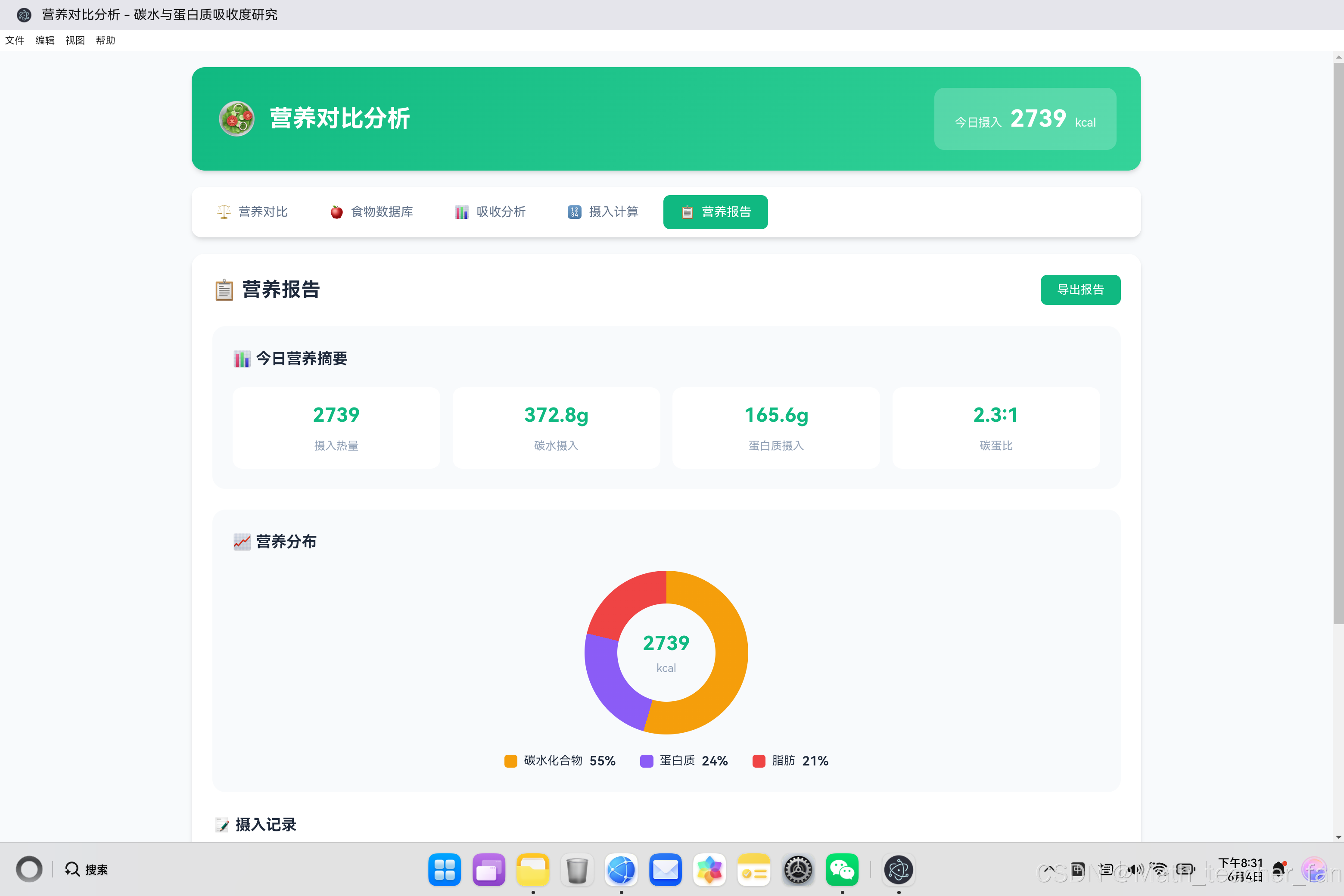
饼形图是一种常用的数据可视化图表,通过圆形的扇形分割来展示各部分占总体的比例关系。在营养分析中,饼形图可以直观地展示碳水化合物、蛋白质、脂肪三大营养素的热量占比。
饼形图结构示意

        碳水 30%
           ╱──────╲
          ╱        ╲
    脂肪  ╲   核    ╱ 蛋白质
    25%   ╲  心    ╱   45%
           ╲      ╱
            ╲────╱

各扇形面积 = 对应数据占总体的比例
圆心角 = 比例 × 360°
1.2 营养分布饼形图需求分析
在营养对比分析应用中,我们需要展示:
| 营养素 | 热量(kcal) | 占比 | 圆心角 |
|---|---|---|---|
| 碳水化合物 | X | X% | X × 3.6° |
| 蛋白质 | X | X% | X × 3.6° |
| 脂肪 | X | X% | X × 3.6° |
核心需求:
- 根据实时数据动态生成饼形图
- 支持3个扇形的比例展示
- 中心显示总热量数值
- 带有图例说明
- 平滑的过渡动画效果
1.3 技术方案对比
| 技术方案 | 优点 | 缺点 | 适用场景 |
|---|---|---|---|
| CSS conic-gradient | 简单直接,无需JS计算 | 过渡不灵活 | 静态或简单动画 |
| CSS 伪元素 + transform | 完全可控 | 实现复杂 | 需要复杂效果 |
| SVG | 矢量清晰,可交互 | 语法复杂 | 专业图表 |
| Canvas | 性能优秀 | 需要JavaScript | 动态数据 |
| 第三方库(Chart.js) | 功能强大 | 依赖较大 | 复杂图表 |
本项目选择:CSS conic-gradient(简单高效,适合3个扇形的场景)
二、CSS conic-gradient 核心技术
2.1 conic-gradient 语法详解
/* 基础语法 */
.element {
    background: conic-gradient(
        <color-stop-1> <angle-1>,
        <color-stop-2> <angle-2>,
        ...
    );
}
参数说明:
color-stop:颜色值angle:角度或百分比
2.2 基础饼形图实现
<!DOCTYPE html>
<html>
<head>
<style>
    .pie-basic {
        width: 200px;
        height: 200px;
        border-radius: 50%;
        background: conic-gradient(
            #f59e0b 0deg,      /* 碳水:起始角度0° */
            #f59e0b 108deg,    /* 碳水:结束角度108° (30%) */
            #8b5cf6 108deg,    /* 蛋白质:起始角度108° */
            #8b5cf6 270deg,    /* 蛋白质:结束角度270° (45%) */
            #ef4444 270deg,    /* 脂肪:起始角度270° */
            #ef4444 360deg     /* 脂肪:结束角度360° */
        );
    }
</style>
</head>
<body>
    <div class="pie-basic"></div>
</body>
</html>
角度计算公式:
扇形角度 = 数据占比 × 360°

碳水 30%:30% × 360° = 108°
蛋白质 45%:45% × 360° = 162°
脂肪 25%:25% × 360° = 90°

累计角度:108° + 162° + 90° = 360°
2.3 带中心圆孔的饼形图(环形图)
.pie-donut {
    width: 200px;
    height: 200px;
    border-radius: 50%;
    background: conic-gradient(
        #f59e0b 0deg,
        #f59e0b 108deg,
        #8b5cf6 108deg,
        #8b5cf6 270deg,
        #ef4444 270deg,
        #ef4444 360deg
    );
}

.pie-center {
    width: 120px;
    height: 120px;
    background: #f8fafc;
    border-radius: 50%;
    position: absolute;
    top: 50%;
    left: 50%;
    transform: translate(-50%, -50%);
}
<div class="pie-donut">
    <div class="pie-center">
        <span class="pie-value">1850</span>
        <span class="pie-label">kcal</span>
    </div>
</div>
环形图效果:
环形图结构

    ┌─────────────────┐
   ╱                   ╲
  │   ╱───────┐         │
  │  │  1850  │         │
  │  │  kcal  │  外圆    │
  │  ╲───────┘  内圆    │
   ╲      内圆半径为外圆60%    │
    └─────────────────┘
三、动态饼形图实现
3.1 数据驱动的饼形图
function updatePieChart(stats) {
    // 计算各营养素的热量
    const carbCalories = stats.carb * 4;       // 碳水:4 kcal/g
    const proteinCalories = stats.protein * 4; // 蛋白质:4 kcal/g
    const fatCalories = stats.fat * 9;         // 脂肪:9 kcal/g

    // 计算总热量
    const totalCalories = carbCalories + proteinCalories + fatCalories;

    if (totalCalories === 0) return;

    // 计算各扇形角度
    const carbDegree = (carbCalories / totalCalories) * 360;
    const proteinDegree = (proteinCalories / totalCalories) * 360;
    const fatDegree = (fatCalories / totalCalories) * 360;

    // 构建conic-gradient字符串
    const gradient = `conic-gradient(
        #f59e0b 0deg,
        #f59e0b ${carbDegree}deg,
        #8b5cf6 ${carbDegree}deg,
        #8b5cf6 ${carbDegree + proteinDegree}deg,
        #ef4444 ${carbDegree + proteinDegree}deg,
        #ef4444 360deg
    )`;

    // 应用样式
    const pieChart = document.getElementById('pieChart');
    pieChart.style.background = gradient;

    // 更新中心数值
    document.getElementById('pieValue').textContent = Math.round(totalCalories);
}
3.2 角度计算详解
/**
 * 将营养数据转换为饼形图角度
 * @param {Object} stats - 营养统计数据
 * @returns {Object} 各扇形角度
 */
function calculateDegrees(stats) {
    const carbCalories = stats.carb * 4;
    const proteinCalories = stats.protein * 4;
    const fatCalories = stats.fat * 9;
    const total = carbCalories + proteinCalories + fatCalories;

    if (total === 0) {
        return { carb: 0, protein: 0, fat: 0, total: 0 };
    }

    return {
        carb: (carbCalories / total) * 360,
        protein: (proteinCalories / total) * 360,
        fat: (fatCalories / total) * 360,
        total: 360
    };
}

/**
 * 示例计算
 */
const stats = {
    carb: 100,      // 100g碳水
    protein: 80,    // 80g蛋白质
    fat: 50         // 50g脂肪
};

// 热量计算
const carbCalories = 100 * 4 = 400 kcal
const proteinCalories = 80 * 4 = 320 kcal
const fatCalories = 50 * 9 = 450 kcal
const total = 400 + 320 + 450 = 1170 kcal

// 角度计算
const carbDegree = (400 / 1170) * 360 = 123.08°
const proteinDegree = (320 / 1170) * 360 = 98.46°
const fatDegree = (450 / 1170) * 360 = 138.46°
3.3 动态CSS变量方案
// 使用CSS变量实现更灵活的饼形图
function updatePieChartWithCSSVars(stats) {
    const carbCalories = stats.carb * 4;
    const proteinCalories = stats.protein * 4;
    const fatCalories = stats.fat * 9;
    const total = carbCalories + proteinCalories + fatCalories;

    if (total === 0) return;

    const pieChart = document.getElementById('pieChart');

    // 设置CSS变量
    pieChart.style.setProperty('--carb-degree', (carbCalories / total) * 360 + 'deg');
    pieChart.style.setProperty('--protein-degree', (proteinCalories / total) * 360 + 'deg');
    pieChart.style.setProperty('--fat-degree', (fatCalories / total) * 360 + 'deg');

    // 应用样式
    pieChart.style.background = `conic-gradient(
        var(--carb-color) 0deg,
        var(--carb-color) var(--carb-degree),
        var(--protein-color) var(--carb-degree),
        var(--protein-color) calc(var(--carb-degree) + var(--protein-degree)),
        var(--fat-color) calc(var(--carb-degree) + var(--protein-degree)),
        var(--fat-color) 360deg
    )`;
}
.pie-chart {
    /* CSS变量定义 */
    --carb-color: #f59e0b;
    --protein-color: #8b5cf6;
    --fat-color: #ef4444;
    --carb-degree: 0deg;
    --protein-degree: 0deg;
    --fat-degree: 0deg;

    /* 饼形图样式 */
    width: 200px;
    height: 200px;
    border-radius: 50%;
    background: conic-gradient(
        var(--carb-color) 0deg,
        var(--carb-color) var(--carb-degree),
        var(--protein-color) var(--carb-degree),
        var(--protein-color) calc(var(--carb-degree) + var(--protein-degree)),
        var(--fat-color) calc(var(--carb-degree) + var(--protein-degree)),
        var(--fat-color) 360deg
    );
    transition: background 0.5s ease;
}
四、饼形图动画效果
4.1 基础过渡动画
.pie-chart {
    width: 200px;
    height: 200px;
    border-radius: 50%;
    transition: background 0.5s ease;
}

/* 当数据更新时,背景渐变效果 */
.pie-chart.updating {
    background: conic-gradient(
        #ccc 0deg,
        #ccc 360deg
    ) !important;
}
// 带动画的数据更新
function updatePieChartAnimated(stats) {
    const pieChart = document.getElementById('pieChart');

    // 触发动画效果
    pieChart.classList.add('updating');

    // 延迟更新数据
    setTimeout(() => {
        updatePieChart(stats);
        pieChart.classList.remove('updating');
    }, 50);
}
4.2 中心数字滚动动画
// 数字滚动动画
function animateNumber(element, targetValue, duration = 500) {
    const startValue = parseInt(element.textContent) || 0;
    const startTime = performance.now();

    function update(currentTime) {
        const elapsed = currentTime - startTime;
        const progress = Math.min(elapsed / duration, 1);

        // 使用easeOutExpo缓动函数
        const easeProgress = 1 - Math.pow(1 - progress, 3);

        const currentValue = startValue + (targetValue - startValue) * easeProgress;
        element.textContent = Math.round(currentValue);

        if (progress < 1) {
            requestAnimationFrame(update);
        }
    }

    requestAnimationFrame(update);
}

// 使用示例
const pieValue = document.getElementById('pieValue');
animateNumber(pieValue, 1850, 1000);
4.3 CSS动画方案
/* 饼形图旋转入场动画 */
@keyframes pieSpin {
    from {
        transform: rotate(-90deg) scale(0);
        opacity: 0;
    }
    to {
        transform: rotate(0deg) scale(1);
        opacity: 1;
    }
}

.pie-chart.animate {
    animation: pieSpin 0.6s ease-out forwards;
}

/* 扇形发光效果 */
@keyframes sectorGlow {
    0%, 100% {
        filter: brightness(1);
    }
    50% {
        filter: brightness(1.1);
    }
}

.pie-chart:hover {
    animation: sectorGlow 2s ease-in-out infinite;
}
4.4 渐变加载动画
/* 模拟加载中的饼形图 */
@keyframes loadingPie {
    0% {
        background: conic-gradient(
            #f59e0b 0deg,
            #f59e0b 90deg,
            #8b5cf6 90deg,
            #8b5cf6 180deg,
            #ef4444 180deg,
            #ef4444 270deg,
            #ccc 270deg,
            #ccc 360deg
        );
    }
    25% {
        background: conic-gradient(
            #f59e0b 0deg,
            #f59e0b 180deg,
            #8b5cf6 180deg,
            #8b5cf6 270deg,
            #ef4444 270deg,
            #ef4444 360deg
        );
    }
    50% {
        background: conic-gradient(
            #f59e0b 0deg,
            #f59e0b 270deg,
            #8b5cf6 270deg,
            #8b5cf6 360deg
        );
    }
    75% {
        background: conic-gradient(
            #f59e0b 0deg,
            #f59e0b 360deg
        );
    }
    100% {
        background: conic-gradient(
            #f59e0b 0deg,
            #f59e0b 108deg,
            #8b5cf6 108deg,
            #8b5cf6 270deg,
            #ef4444 270deg,
            #ef4444 360deg
        );
    }
}

.pie-chart.loading {
    animation: loadingPie 2s ease-in-out infinite;
}
五、响应式饼形图设计
5.1 自适应尺寸
.pie-container {
    display: flex;
    justify-content: center;
    align-items: center;
    width: 100%;
    max-width: 400px;
    margin: 0 auto;
}

.pie-chart {
    width: min(200px, 80%);
    height: min(200px, 80%);
    border-radius: 50%;
    position: relative;
}

.pie-center {
    width: 60%;
    height: 60%;
    /* 保持圆形 */
    aspect-ratio: 1 / 1;
}
5.2 移动端适配
@media (max-width: 768px) {
    .pie-chart {
        width: 180px;
        height: 180px;
    }

    .pie-center {
        width: 100px;
        height: 100px;
    }

    .pie-value {
        font-size: 1.8rem;
    }

    .pie-legend {
        flex-direction: column;
        gap: 10px;
    }
}

@media (max-width: 480px) {
    .pie-chart {
        width: 150px;
        height: 150px;
    }

    .pie-center {
        width: 80px;
        height: 80px;
    }

    .pie-value {
        font-size: 1.5rem;
    }
}
5.3 暗色模式支持
/* 亮色模式 */
:root {
    --pie-bg: #f8fafc;
    --pie-text: #1e293b;
}

/* 暗色模式 */
@media (prefers-color-scheme: dark) {
    :root {
        --pie-bg: #1e293b;
        --pie-text: #f8fafc;
    }

    .pie-center {
        background: var(--pie-bg);
    }

    .pie-value {
        color: var(--pie-text);
    }
}
六、高级饼形图技术
6.1 多个饼形图对比
<div class="pie-comparison">
    <div class="pie-item">
        <div class="pie-chart" id="pieToday"></div>
        <div class="pie-label">今日摄入</div>
    </div>
    <div class="pie-item">
        <div class="pie-chart" id="pieWeek"></div>
        <div class="pie-label">本周平均</div>
    </div>
</div>
function renderComparisonPies(todayStats, weekStats) {
    renderPieChart('pieToday', todayStats);
    renderPieChart('pieWeek', weekStats);
}

function renderPieChart(elementId, stats) {
    const pieChart = document.getElementById(elementId);

    const carbCalories = stats.carb * 4;
    const proteinCalories = stats.protein * 4;
    const fatCalories = stats.fat * 9;
    const total = carbCalories + proteinCalories + fatCalories;

    if (total === 0) {
        pieChart.style.background = '#e2e8f0';
        return;
    }

    const carbDegree = (carbCalories / total) * 360;
    const proteinDegree = (proteinCalories / total) * 360;

    pieChart.style.background = `conic-gradient(
        #f59e0b 0deg,
        #f59e0b ${carbDegree}deg,
        #8b5cf6 ${carbDegree}deg,
        #8b5cf6 ${carbDegree + proteinDegree}deg,
        #ef4444 ${carbDegree + proteinDegree}deg,
        #ef4444 360deg
    )`;
}
6.2 饼形图与进度条结合
<div class="nutrition-card">
    <div class="pie-chart-small" id="carbPie"></div>
    <div class="nutrition-info">
        <h4>碳水化合物</h4>
        <div class="progress-bar">
            <div class="progress-fill carb" id="carbProgress"></div>
        </div>
        <div class="nutrition-values">
            <span id="carbCurrent">0g</span>
            <span class="separator">/</span>
            <span id="carbTarget">200g</span>
        </div>
    </div>
</div>
.pie-chart-small {
    width: 80px;
    height: 80px;
    border-radius: 50%;
    background: conic-gradient(
        #f59e0b 0deg,
        #f59e0b 90deg,  /* 示例:当前进度 */
        #e2e8f0 90deg,  /* 灰色表示未完成 */
        #e2e8f0 360deg
    );
    flex-shrink: 0;
}
6.3 可交互饼形图
// 为饼形图添加交互效果
const pieChart = document.getElementById('pieChart');
const sectors = [];

function createInteractivePie(stats) {
    const carbCalories = stats.carb * 4;
    const proteinCalories = stats.protein * 4;
    const fatCalories = stats.fat * 9;
    const total = carbCalories + proteinCalories + fatCalories;

    if (total === 0) return;

    const carbDegree = (carbCalories / total) * 360;
    const proteinDegree = (proteinCalories / total) * 360;

    pieChart.innerHTML = '';

    // 创建碳水扇形
    const carbSector = createSector('carb', carbDegree, '#f59e0b');
    carbSector.addEventListener('mouseenter', () => showTooltip('碳水化合物', carbCalories, total));
    pieChart.appendChild(carbSector);

    // 创建蛋白质扇形
    const proteinSector = createSector('protein', proteinDegree, '#8b5cf6');
    proteinSector.style.transform = `rotate(${carbDegree}deg)`;
    proteinSector.addEventListener('mouseenter', () => showTooltip('蛋白质', proteinCalories, total));
    pieChart.appendChild(proteinSector);

    // 创建脂肪扇形
    const fatSector = createSector('fat', 360 - carbDegree - proteinDegree, '#ef4444');
    fatSector.style.transform = `rotate(${carbDegree + proteinDegree}deg)`;
    fatSector.addEventListener('mouseenter', () => showTooltip('脂肪', fatCalories, total));
    pieChart.appendChild(fatSector);
}

function createSector(name, degree, color) {
    const sector = document.createElement('div');
    sector.className = `sector sector-${name}`;
    sector.style.cssText = `
        position: absolute;
        width: 100%;
        height: 100%;
        border-radius: 50%;
        clip-path: polygon(50% 50%, 50% 0%, ${degree <= 180 ? '100% 0%' : '100% 100%'} 50% ${degree <= 90 ? '0% 0%' : degree <= 180 ? '0% 0%' : degree <= 270 ? '0% 100%' : '0% 0%'});
        background: ${color};
        transition: transform 0.3s ease;
    `;

    sector.addEventListener('mouseenter', () => {
        sector.style.transform += ' scale(1.05)';
    });

    sector.addEventListener('mouseleave', () => {
        sector.style.transform = sector.style.transform.replace(' scale(1.05)', '');
    });

    return sector;
}
七、性能优化策略
7.1 避免频繁重绘
// 节流更新
let updateTimeout = null;

function throttledUpdate(stats) {
    if (updateTimeout) {
        clearTimeout(updateTimeout);
    }

    updateTimeout = setTimeout(() => {
        updatePieChart(stats);
    }, 100);
}

// 使用示例:频繁的数据更新会被合并
element.addEventListener('input', (e) => {
    throttledUpdate(calculateStats(e.target.value));
});
7.2 使用will-change提示
.pie-chart {
    will-change: background;
    contain: layout style paint;
}

.pie-center {
    will-change: contents;
}
7.3 GPU加速
.pie-chart {
    transform: translateZ(0);
    backface-visibility: hidden;
}
八、完整实现示例
8.1 营养饼形图组件
<!DOCTYPE html>
<html>
<head>
<style>
    .nutrition-pie-container {
        display: flex;
        flex-direction: column;
        align-items: center;
        gap: 20px;
        padding: 30px;
    }

    .nutrition-pie {
        position: relative;
        width: 200px;
        height: 200px;
        border-radius: 50%;
        transition: background 0.5s ease;
    }

    .nutrition-pie-center {
        position: absolute;
        top: 50%;
        left: 50%;
        transform: translate(-50%, -50%);
        width: 120px;
        height: 120px;
        background: #f8fafc;
        border-radius: 50%;
        display: flex;
        flex-direction: column;
        align-items: center;
        justify-content: center;
        box-shadow: 0 2px 8px rgba(0, 0, 0, 0.1);
    }

    .nutrition-pie-value {
        font-size: 1.8rem;
        font-weight: 700;
        color: #10b981;
    }

    .nutrition-pie-label {
        font-size: 0.9rem;
        color: #64748b;
    }

    .nutrition-legend {
        display: flex;
        gap: 20px;
        justify-content: center;
    }

    .nutrition-legend-item {
        display: flex;
        align-items: center;
        gap: 8px;
    }

    .nutrition-legend-color {
        width: 16px;
        height: 16px;
        border-radius: 4px;
    }

    .nutrition-legend-color.carb { background: #f59e0b; }
    .nutrition-legend-color.protein { background: #8b5cf6; }
    .nutrition-legend-color.fat { background: #ef4444; }

    .nutrition-legend-percent {
        font-weight: 600;
        min-width: 40px;
    }
</style>
</head>
<body>
    <div class="nutrition-pie-container">
        <div class="nutrition-pie" id="nutritionPie">
            <div class="nutrition-pie-center">
                <span class="nutrition-pie-value" id="pieValue">0</span>
                <span class="nutrition-pie-label">kcal</span>
            </div>
        </div>
        <div class="nutrition-legend">
            <div class="nutrition-legend-item">
                <span class="nutrition-legend-color carb"></span>
                <span>碳水</span>
                <span class="nutrition-legend-percent" id="legendCarb">0%</span>
            </div>
            <div class="nutrition-legend-item">
                <span class="nutrition-legend-color protein"></span>
                <span>蛋白</span>
                <span class="nutrition-legend-percent" id="legendProtein">0%</span>
            </div>
            <div class="nutrition-legend-item">
                <span class="nutrition-legend-color fat"></span>
                <span>脂肪</span>
                <span class="nutrition-legend-percent" id="legendFat">0%</span>
            </div>
        </div>
    </div>

    <script>
        class NutritionPieChart {
            constructor(elementId) {
                this.pieChart = document.getElementById(elementId);
                this.pieValue = document.getElementById('pieValue');
                this.legendCarb = document.getElementById('legendCarb');
                this.legendProtein = document.getElementById('legendProtein');
                this.legendFat = document.getElementById('legendFat');
            }

            update(stats) {
                // 计算热量
                const carbCalories = stats.carb * 4;
                const proteinCalories = stats.protein * 4;
                const fatCalories = stats.fat * 9;
                const total = carbCalories + proteinCalories + fatCalories;

                // 计算角度
                const carbDegree = total > 0 ? (carbCalories / total) * 360 : 0;
                const proteinDegree = total > 0 ? (proteinCalories / total) * 360 : 0;

                // 更新饼形图
                this.pieChart.style.background = `conic-gradient(
                    #f59e0b 0deg,
                    #f59e0b ${carbDegree}deg,
                    #8b5cf6 ${carbDegree}deg,
                    #8b5cf6 ${carbDegree + proteinDegree}deg,
                    #ef4444 ${carbDegree + proteinDegree}deg,
                    #ef4444 360deg
                )`;

                // 更新中心数值
                this.pieValue.textContent = Math.round(total);

                // 更新图例
                this.legendCarb.textContent = total > 0 ? Math.round((carbCalories / total) * 100) + '%' : '0%';
                this.legendProtein.textContent = total > 0 ? Math.round((proteinCalories / total) * 100) + '%' : '0%';
                this.legendFat.textContent = total > 0 ? Math.round((fatCalories / total) * 100) + '%' : '0%';
            }
        }

        // 使用示例
        const pieChart = new NutritionPieChart('nutritionPie');

        // 模拟数据更新
        const testStats = {
            carb: 150,    // 150g碳水
            protein: 80,  // 80g蛋白质
            fat: 60       // 60g脂肪
        };

        pieChart.update(testStats);
    </script>
</body>
</html>
九、总结
9.1 技术要点回顾
饼形图实现核心要点

┌─────────────────────────────────────────────────────┐
│                                                     │
│  基础语法                                           │
│  └─ conic-gradient(color angle, ...)                │
│                                                     │
│  角度计算                                           │
│  └─ 扇形角度 = (数据 / 总数据) × 360°              │
│                                                     │
│  热量转换                                           │
│  └─ 碳水 4kcal/g | 蛋白质 4kcal/g | 脂肪 9kcal/g   │
│                                                     │
│  环形图实现                                         │
│  └─ 中心用伪元素覆盖                                │
│                                                     │
│  动画效果                                           │
│  └─ CSS transition + JavaScript动态更新            │
│                                                     │
│  响应式设计                                         │
│  └─ min() + 媒体查询 + 百分比布局                   │
│                                                     │
└─────────────────────────────────────────────────────┘
9.2 最佳实践
| 场景 | 推荐方案 | 原因 |
|---|---|---|
| 简单静态饼图 | CSS conic-gradient | 实现简单,性能优秀 |
| 动态数据 | JavaScript + CSS变量 | 灵活可控 |
| 需要交互 | SVG 或 Canvas | 事件处理更方便 |
| 复杂图表 | Chart.js / ECharts | 功能完善 |
| 移动端优先 | CSS + 响应式 | 性能优先 |
9.3 浏览器兼容性
浏览器支持情况

┌─────────────────────────────────────────────────────┐
│  Chrome 99+  ✅  完全支持                           │
│  Firefox 88+ ✅  完全支持                           │
│  Safari 16+  ✅  完全支持                           │
│  Edge 99+    ✅  完全支持                           │
│  IE 11       ❌  不支持(使用图片或SVG fallback)    │
└─────────────────────────────────────────────────────┘
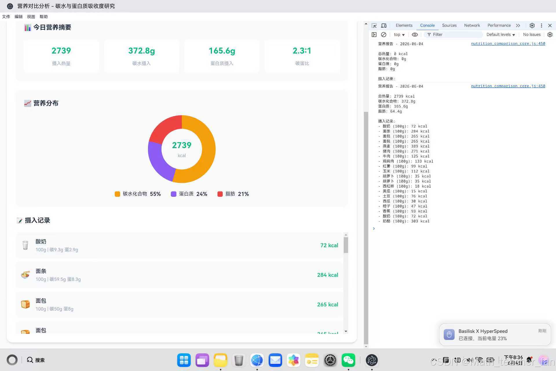
饼形图是数据可视化中的经典图表类型,通过CSS conic-gradient我们可以轻松实现各种饼形图效果。本篇文章从基础语法到高级技巧,全面介绍了饼形图的实现方法,希望对开发者有所帮助。

作为“人工智能6S店”的官方数字引擎,为AI开发者与企业提供一个覆盖软硬件全栈、一站式门户。
更多推荐
 0
0 0
0- 0


 已为社区贡献26条内容

所有评论(0)