
【Flutter for OpenHarmony】Flutter三方库【底部导航栏切换】的鸿蒙化适配与实战指南
Flutter底部导航栏鸿蒙适配实战指南 本文介绍了在OpenHarmony平台上实现Flutter底部导航栏的完整方案。作者选择Flutter原生的BottomNavigationBar+IndexedStack组合,解决了以下几个关键问题: 核心功能实现: 支持4个Tab切换(健康、聊天、商店、我的) 包含图标、文字和未读消息红点提示 当前Tab高亮显示 状态管理优化: 使用ChangeNot
【Flutter for OpenHarmony】Flutter三方库【底部导航栏切换】的鸿蒙化适配与实战指南
欢迎加入开源鸿蒙跨平台社区:https://openharmonycrossplatform.csdn.net
大家好,我是IntMainJhy,上海某高校计算机专业大一学生。终于写到第八篇了,也是这个系列的最后一篇!今天来聊聊底部导航栏的实现。
底部导航栏(BottomNavigationBar)是App中最常见的组件之一,几乎每个有多个Tab的App都会有它。我在做健康App的时候,需要实现:健康、聊天、商店、我的 四个Tab的切换。
说起来简单,但要做得好还是有不少讲究的:
- 切换动画要流畅
- 状态要保持(切换回来不重新加载)
- 红点/数字提示要能动态更新
- 适配深色模式
- 鸿蒙平台的坑……
一、需求分析
我的App底部导航栏需要支持:
- 4个Tab:健康、聊天、商店、我的
- 每个Tab有图标和文字
- 当前Tab高亮显示
- 未读消息数量红点提示
- 切换时保持页面状态
- 支持中间按钮特殊样式(如发布按钮)
二、Flutter原生方案 vs 第三方库
| 方案 | 优点 | 缺点 |
|---|---|---|
| BottomNavigationBar | Flutter原生,无需依赖 | 功能有限,不支持自定义动画 |
| go_router | 功能强大,声明式路由 | 学习成本高 |
| persistent_bottom_nav_bar | 主题丰富 | 体积较大 |
| fluid_nav_bar | 动画炫酷 | 可能与鸿蒙不适配 |
我最终选择了Flutter原生的 BottomNavigationBar + IndexedStack 组合,足够满足需求且稳定性最好。
三、完整代码实现
1. 导航配置模型
import 'package:flutter/material.dart';

// 底部导航项配置
class NavItem {
  final String label;      // 标签文字
  final IconData icon;     // 默认图标
  final IconData activeIcon;  // 激活图标
  final String? badgeText;    // 红点/数字提示

  NavItem({
    required this.label,
    required this.icon,
    required this.activeIcon,
    this.badgeText,
  });

  NavItem copyWith({
    String? label,
    IconData? icon,
    IconData? activeIcon,
    String? badgeText,
  }) {
    return NavItem(
      label: label ?? this.label,
      icon: icon ?? this.icon,
      activeIcon: activeIcon ?? this.activeIcon,
      badgeText: badgeText ?? this.badgeText,
    );
  }
}

// 导航栏状态管理
class NavState extends ChangeNotifier {
  int _currentIndex = 0;
  final List<NavItem> _items = [
    NavItem(
      label: '健康',
      icon: Icons.favorite_outline,
      activeIcon: Icons.favorite,
    ),
    NavItem(
      label: '聊天',
      icon: Icons.chat_bubble_outline,
      activeIcon: Icons.chat_bubble,
    ),
    NavItem(
      label: '商店',
      icon: Icons.store_outlined,
      activeIcon: Icons.store,
    ),
    NavItem(
      label: '我的',
      icon: Icons.person_outline,
      activeIcon: Icons.person,
    ),
  ];

  int get currentIndex => _currentIndex;
  List<NavItem> get items => _items;
  NavItem get currentItem => _items[_currentIndex];

  void setIndex(int index) {
    if (_currentIndex != index && index >= 0 && index < _items.length) {
      _currentIndex = index;
      notifyListeners();
    }
  }

  // 更新某个Tab的badge
  void updateBadge(int index, String? badgeText) {
    if (index >= 0 && index < _items.length) {
      _items[index] = _items[index].copyWith(badgeText: badgeText);
      notifyListeners();
    }
  }

  // 清除所有badge
  void clearAllBadges() {
    for (int i = 0; i < _items.length; i++) {
      _items[i] = _items[i].copyWith(badgeText: null);
    }
    notifyListeners();
  }
}
2. 自定义底部导航栏组件
import 'package:flutter/material.dart';
class CustomBottomNavBar extends StatelessWidget {
final List<NavItem> items;
final int currentIndex;
final Function(int) onTap;
final Color? activeColor;
final Color? inactiveColor;
final double height;
const CustomBottomNavBar({
super.key,
required this.items,
required this.currentIndex,
required this.onTap,
this.activeColor,
this.inactiveColor,
this.height = 60,
});
Widget build(BuildContext context) {
final theme = Theme.of(context);
final active = activeColor ?? theme.primaryColor;
final inactive = inactiveColor ?? const Color(0xFF999999);
return Container(
height: height + MediaQuery.of(context).padding.bottom,
decoration: BoxDecoration(
color: Colors.white,
boxShadow: [
BoxShadow(
color: Colors.black.withOpacity(0.05),
blurRadius: 20,
offset: const Offset(0, -5),
),
],
),
child: SafeArea(
top: false,
child: Row(
mainAxisAlignment: MainAxisAlignment.spaceAround,
children: List.generate(items.length, (index) {
return _buildNavItem(
context,
items[index],
index,
currentIndex == index,
active,
inactive,
);
}),
),
),
);
}
Widget _buildNavItem(
BuildContext context,
NavItem item,
int index,
bool isActive,
Color activeColor,
Color inactiveColor,
) {
return InkWell(
onTap: () => onTap(index),
borderRadius: BorderRadius.circular(12),
child: Container(
padding: const EdgeInsets.symmetric(horizontal: 16, vertical: 8),
child: Column(
mainAxisSize: MainAxisSize.min,
children: [
// 图标 + 徽章
Stack(
clipBehavior: Clip.none,
children: [
AnimatedContainer(
duration: const Duration(milliseconds: 200),
child: Icon(
isActive ? item.activeIcon : item.icon,
size: 26,
color: isActive ? activeColor : inactiveColor,
),
),
// 红点/数字徽章
if (item.badgeText != null)
Positioned(
right: -8,
top: -4,
child: _buildBadge(item.badgeText!),
),
],
),
const SizedBox(height: 4),
// 文字标签
Text(
item.label,
style: TextStyle(
fontSize: 11,
fontWeight: isActive ? FontWeight.w600 : FontWeight.normal,
color: isActive ? activeColor : inactiveColor,
),
),
],
),
),
);
}
// 徽章组件
Widget _buildBadge(String text) {
final isNumber = RegExp(r'^\d+$').hasMatch(text);
final showAsDot = text == 'dot';
final showAsRed = text == 'red';
if (showAsDot || showAsRed) {
// 红点样式
return Container(
width: 8,
height: 8,
decoration: const BoxDecoration(
color: Color(0xFFFF4D4F),
shape: BoxShape.circle,
),
);
}
if (isNumber && text.length <= 2) {
// 数字样式
final count = int.tryParse(text) ?? 0;
final displayText = count > 99 ? '99+' : text;
return Container(
padding: const EdgeInsets.symmetric(horizontal: 5, vertical: 2),
decoration: BoxDecoration(
color: const Color(0xFFFF4D4F),
borderRadius: BorderRadius.circular(10),
),
constraints: const BoxConstraints(
minWidth: 18,
minHeight: 18,
),
child: Text(
displayText,
textAlign: TextAlign.center,
style: const TextStyle(
fontSize: 10,
fontWeight: FontWeight.bold,
color: Colors.white,
),
),
);
}
// 默认红点
return Container(
width: 8,
height: 8,
decoration: const BoxDecoration(
color: Color(0xFFFF4D4F),
shape: BoxShape.circle,
),
);
}
}
3. 主页面(带状态保持)
import 'package:flutter/material.dart';
import 'package:provider/provider.dart';
import 'nav_state.dart';
import 'pages/health_page.dart';
import 'pages/chat_page.dart';
import 'pages/shop_page.dart';
import 'pages/profile_page.dart';
class MainShell extends StatelessWidget {
const MainShell({super.key});
Widget build(BuildContext context) {
return ChangeNotifierProvider(
create: (_) => NavState().._initBadges(),
child: const _MainShellContent(),
);
}
}
class _MainShellContent extends StatelessWidget {
const _MainShellContent();
Widget build(BuildContext context) {
return Scaffold(
body: Consumer<NavState>(
builder: (context, navState, _) {
// 使用IndexedStack保持页面状态
return IndexedStack(
index: navState.currentIndex,
children: const [
HealthPage(),
ChatPage(),
ShopPage(),
ProfilePage(),
],
);
},
),
bottomNavigationBar: Consumer<NavState>(
builder: (context, navState, _) {
return CustomBottomNavBar(
items: navState.items,
currentIndex: navState.currentIndex,
onTap: (index) => navState.setIndex(index),
activeColor: const Color(0xFFFF6600),
);
},
),
);
}
}
extension on NavState {
// 初始化徽章
void _initBadges() {
// 模拟从网络或本地获取未读数
// 聊天有5条未读
updateBadge(1, '5');
// 商店有1条未读
updateBadge(2, '1');
}
}
4. 各个Tab页面(骨架)
// 健康页面
class HealthPage extends StatelessWidget {
const HealthPage({super.key});
Widget build(BuildContext context) {
return Scaffold(
backgroundColor: const Color(0xFFF5F5F5),
appBar: AppBar(
title: const Text('健康'),
backgroundColor: Colors.white,
foregroundColor: const Color(0xFF333333),
elevation: 0,
),
body: const Center(
child: Column(
mainAxisAlignment: MainAxisAlignment.center,
children: [
Text('❤️', style: TextStyle(fontSize: 80)),
SizedBox(height: 20),
Text(
'健康首页',
style: TextStyle(
fontSize: 20,
fontWeight: FontWeight.bold,
color: Color(0xFF333333),
),
),
],
),
),
);
}
}
// 聊天页面
class ChatPage extends StatelessWidget {
const ChatPage({super.key});
Widget build(BuildContext context) {
return Scaffold(
backgroundColor: const Color(0xFFF5F5F5),
appBar: AppBar(
title: const Text('消息'),
backgroundColor: Colors.white,
foregroundColor: const Color(0xFF333333),
elevation: 0,
),
body: const Center(
child: Column(
mainAxisAlignment: MainAxisAlignment.center,
children: [
Text('💬', style: TextStyle(fontSize: 80)),
SizedBox(height: 20),
Text(
'消息列表',
style: TextStyle(
fontSize: 20,
fontWeight: FontWeight.bold,
color: Color(0xFF333333),
),
),
],
),
),
);
}
}
// 商店页面
class ShopPage extends StatelessWidget {
const ShopPage({super.key});
Widget build(BuildContext context) {
return Scaffold(
backgroundColor: const Color(0xFFF5F5F5),
appBar: AppBar(
title: const Text('商店'),
backgroundColor: Colors.white,
foregroundColor: const Color(0xFF333333),
elevation: 0,
),
body: const Center(
child: Column(
mainAxisAlignment: MainAxisAlignment.center,
children: [
Text('🛒', style: TextStyle(fontSize: 80)),
SizedBox(height: 20),
Text(
'商城首页',
style: TextStyle(
fontSize: 20,
fontWeight: FontWeight.bold,
color: Color(0xFF333333),
),
),
],
),
),
);
}
}
// 我的页面
class ProfilePage extends StatelessWidget {
const ProfilePage({super.key});
Widget build(BuildContext context) {
return Scaffold(
backgroundColor: const Color(0xFFF5F5F5),
appBar: AppBar(
title: const Text('我的'),
backgroundColor: Colors.white,
foregroundColor: const Color(0xFF333333),
elevation: 0,
),
body: const Center(
child: Column(
mainAxisAlignment: MainAxisAlignment.center,
children: [
Text('👤', style: TextStyle(fontSize: 80)),
SizedBox(height: 20),
Text(
'个人中心',
style: TextStyle(
fontSize: 20,
fontWeight: FontWeight.bold,
color: Color(0xFF333333),
),
),
],
),
),
);
}
}
5. 带特殊中间按钮的导航栏
有时候App设计会在中间放一个突出的按钮(比如发布按钮):
class FloatingCenterNavBar extends StatelessWidget {
final List<NavItem> items;
final int currentIndex;
final Function(int) onTap;
const FloatingCenterNavBar({
super.key,
required this.items,
required this.currentIndex,
required this.onTap,
});
Widget build(BuildContext context) {
return Container(
decoration: BoxDecoration(
color: Colors.white,
boxShadow: [
BoxShadow(
color: Colors.black.withOpacity(0.05),
blurRadius: 20,
offset: const Offset(0, -5),
),
],
),
child: SafeArea(
top: false,
child: SizedBox(
height: 60,
child: Row(
mainAxisAlignment: MainAxisAlignment.spaceAround,
children: [
// 左半部分(2个tab)
..._buildNormalItems(0, 2),
// 中间浮动按钮
_buildCenterButton(),
// 右半部分(2个tab)
..._buildNormalItems(2, 2),
],
),
),
),
);
}
List<Widget> _buildNormalItems(int start, int count) {
return List.generate(count, (i) {
final index = start + i;
final item = items[index];
final isActive = currentIndex == index;
return Expanded(
child: InkWell(
onTap: () => onTap(index),
child: Column(
mainAxisAlignment: MainAxisAlignment.center,
children: [
Icon(
isActive ? item.activeIcon : item.icon,
size: 26,
color: isActive
? const Color(0xFFFF6600)
: const Color(0xFF999999),
),
const SizedBox(height: 4),
Text(
item.label,
style: TextStyle(
fontSize: 11,
color: isActive
? const Color(0xFFFF6600)
: const Color(0xFF999999),
),
),
],
),
),
);
});
}
Widget _buildCenterButton() {
return GestureDetector(
onTap: () => onTap(2), // 中心按钮
child: Container(
width: 56,
height: 56,
decoration: BoxDecoration(
gradient: const LinearGradient(
colors: [Color(0xFFFF6600), Color(0xFFFF9900)],
),
shape: BoxShape.circle,
boxShadow: [
BoxShadow(
color: const Color(0xFFFF6600).withOpacity(0.3),
blurRadius: 10,
offset: const Offset(0, 4),
),
],
),
child: const Icon(
Icons.add,
color: Colors.white,
size: 30,
),
),
);
}
}
6. 动态更新徽章示例
在应用中动态更新未读消息数:
// 在某个地方(如消息服务)更新badge
class MessageService {
  final NavState navState;

  MessageService(this.navState);

  void onMessageReceived(int unreadCount) {
    if (unreadCount > 0) {
      navState.updateBadge(1, unreadCount.toString());
    } else {
      navState.updateBadge(1, null);  // 清除徽章
    }
  }

  void onAllMessagesRead() {
    navState.updateBadge(1, null);
  }
}
四、鸿蒙平台适配要点
适配点1:安全区域处理
问题描述:鸿蒙设备的底部安全区域(Home Indicator区域)处理与Android不同。
解决方案:使用 SafeArea 正确包裹导航栏内容:
bottomNavigationBar: Container(
  decoration: BoxDecoration(
    color: Colors.white,
    // 顶部添加分隔线
    border: Border(
      top: BorderSide(
        color: Colors.grey.shade200,
        width: 0.5,
      ),
    ),
  ),
  child: SafeArea(
    top: false,  // 只处理底部安全区
    child: BottomNavigationBar(...),
  ),
)
适配点2:键盘弹出时的适配
问题描述:在聊天页面输入时,键盘弹出,底部导航栏被顶上去。
解决方案:使用 resizeToAvoidBottomInset:
Scaffold(
  resizeToAvoidBottomInset: true,  // 键盘弹出时调整布局
  // ...
)
或者监听键盘状态:
class _MainShellState extends State<MainShell> with WidgetsBindingObserver {
void initState() {
super.initState();
WidgetsBinding.instance.addObserver(this);
}
void dispose() {
WidgetsBinding.instance.removeObserver(this);
super.dispose();
}
void didChangeAppLifecycleState(AppLifecycleState state) {
if (state == AppLifecycleState.inactive) {
// 应用进入后台,隐藏键盘
FocusScope.of(context).unfocus();
}
}
}
适配点3:横竖屏切换适配
问题描述:横屏时底部导航栏可能显示异常。
解决方案:使用 OrientationBuilder 调整布局:
OrientationBuilder(
  builder: (context, orientation) {
    if (orientation == Orientation.landscape) {
      return const SizedBox.shrink();  // 横屏时隐藏底部导航
    }
    return CustomBottomNavBar(...);
  },
)
五、踩坑实录
踩坑1:IndexedStack不保持状态
问题描述:切换Tab后回来,页面被重新加载了。
排查过程:我一开始没用IndexedStack,用的是条件渲染(currentIndex==0 ? A : B),这会导致页面重建。
解决方法:用 IndexedStack 包裹所有页面:
IndexedStack(
  index: navState.currentIndex,
  children: const [
    HealthPage(),
    ChatPage(),
    ShopPage(),
    ProfilePage(),
  ],
)
踩坑2:徽章位置偏移
问题描述:红点显示位置不对,有时候被图标遮挡。
解决方法:使用 Positioned 精确定位:
Stack(
  clipBehavior: Clip.none,  // 允许超出边界
  children: [
    Icon(...),
    Positioned(
      right: -8,  // 负值表示向右偏移
      top: -4,
      child: _buildBadge(...),
    ),
  ],
)
踩坑3:切换时动画抖动
问题描述:点击底部导航时,页面内容有轻微抖动。
问题原因:IndexedStack默认会重新计算大小。
解决方法:给IndexedStack设置固定大小或使用 AutomaticKeepAliveClientMixin:
class _HealthPageState extends State<HealthPage>
with AutomaticKeepAliveClientMixin {
bool get wantKeepAlive => true; // 保持页面状态
}
六、功能验证清单
| 序号 | 检查项 | 验证方法 |
|---|---|---|
| 1 | Tab切换 | 点击各Tab验证页面切换 |
| 2 | 状态保持 | 切换后返回,页面内容是否保留 |
| 3 | 高亮显示 | 当前Tab图标和文字是否高亮 |
| 4 | 徽章显示 | 验证红点/数字正确显示 |
| 5 | 键盘适配 | 聊天页面输入时底部导航正常 |
| 6 | 安全区域 | 全面屏设备底部不被遮挡 |
| 7 | 横竖屏 | 横竖屏切换导航栏显示正常 |
| 8 | 鸿蒙真机 | 在真机上测试所有交互 |
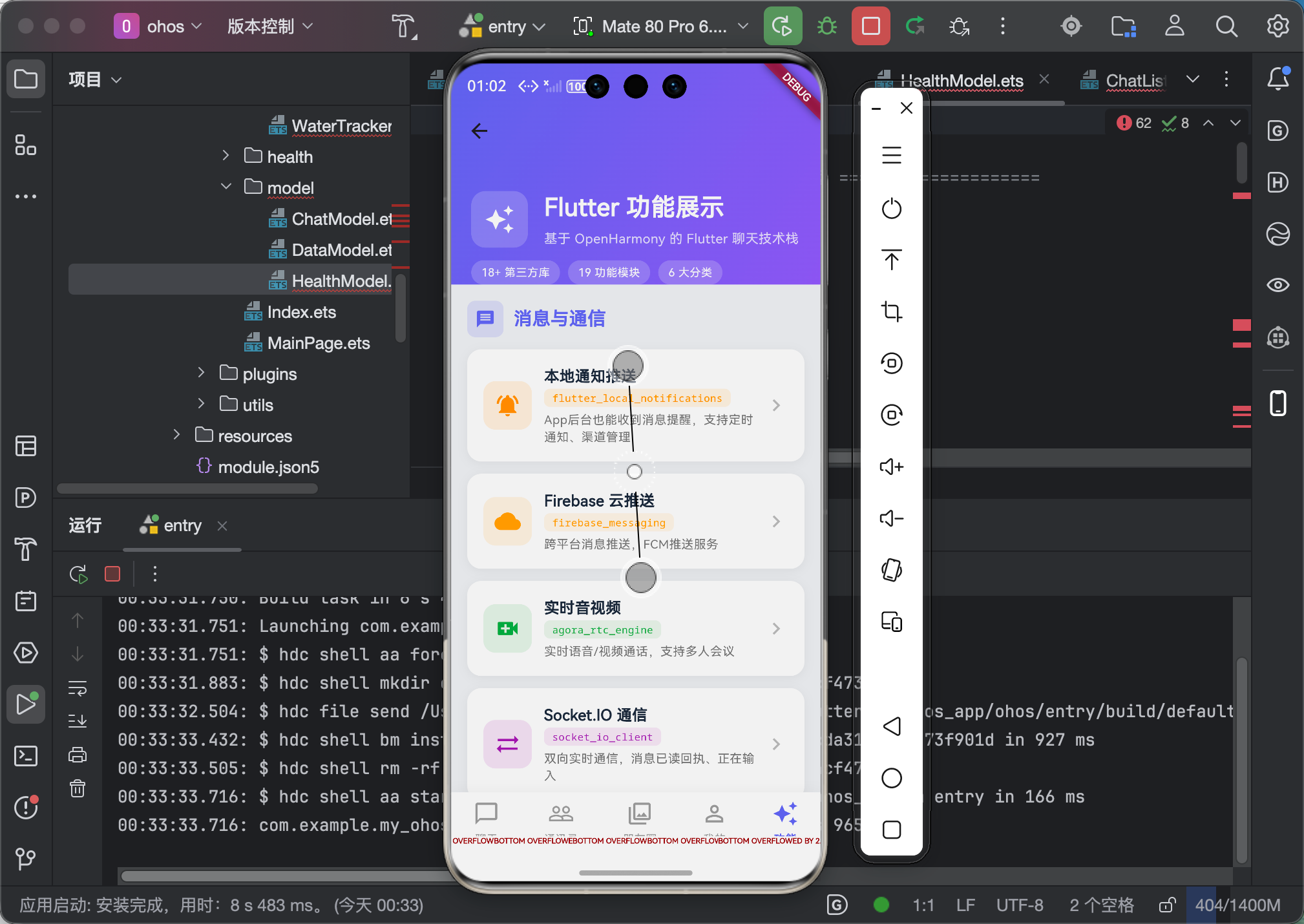
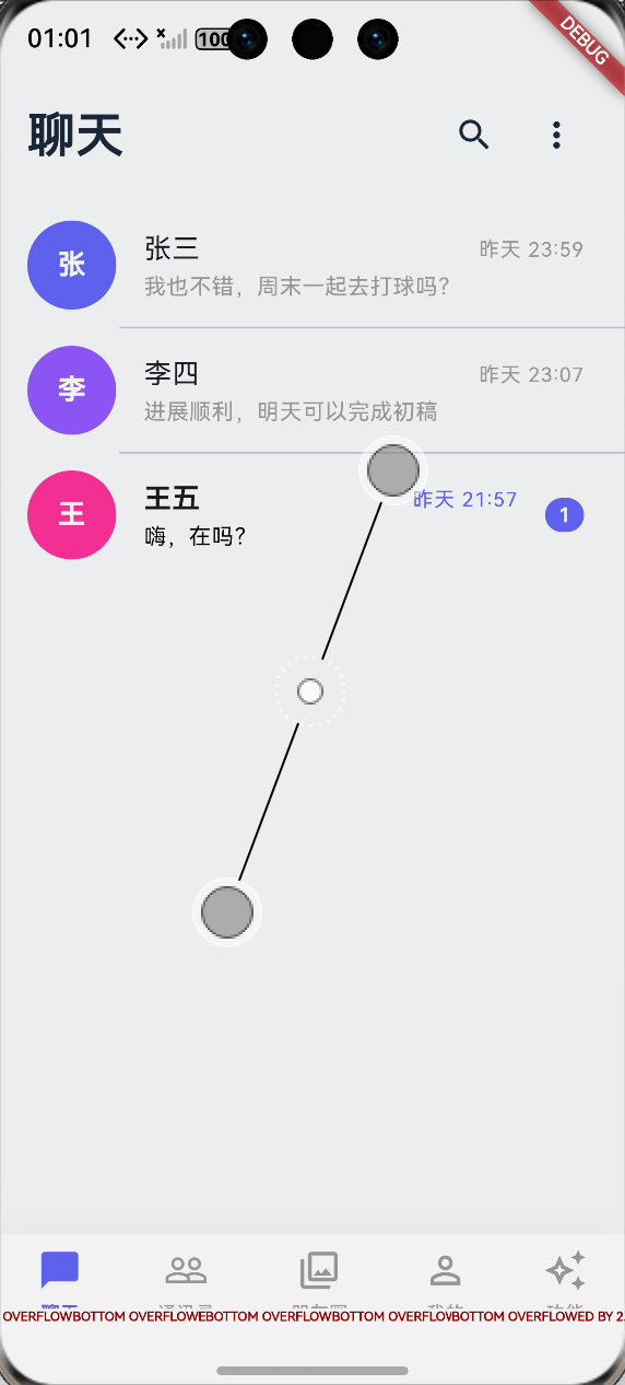
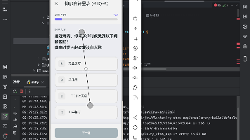
七、运行效果示意【以聊天应用为例下册导航栏】
八、总结
底部导航栏是App的基础组件,虽然不复杂,但要做好还是要考虑很多细节:
技术层面的收获:
IndexedStack是保持页面状态的好帮手ChangeNotifierProvider可以方便地管理导航状态- 徽章组件用
Stack + Positioned实现最灵活 - 安全区域处理要使用
SafeArea
用户体验层面的思考:
- 切换动画要流畅但不要太花哨
- 徽章提示要适度,太多会干扰用户
- 状态保持很重要,用户不想每次切换都要重新加载
给新手的建议:
- 先用原生
BottomNavigationBar实现基本功能 - 再根据需求逐步添加自定义效果
- 注意页面状态的保持,这是用户最容易感知的问题
- 各种设备的安全区域要实际测试
好啦!这就是这个系列的最后一篇文章了!感谢大家一直以来的支持!
回顾这8篇文章,我涵盖了Flutter鸿蒙开发中很多常见的场景:
- 图表展示(fl_chart)
- 日历组件(table_calendar)
- 本地存储(hive)
- 滑动操作(flutter_slidable)
- 状态管理(Provider)
- 搜索筛选
- 进度动画(percent_indicator)
- 底部导航
这些都是我在实际项目中踩过坑、总结出来的经验,希望能对大家有帮助!
作者:IntMainJhy(上海某大学大一学生)
创作日期:2026年5月
系列文章目录:
- 【Flutter for OpenHarmony】双折线血压图表实战
- 【Flutter for OpenHarmony】月历打卡实战
- 【Flutter for OpenHarmony】Hive本地存储实战
- 【Flutter for OpenHarmony】聊天滑动操作实战
- 【Flutter for OpenHarmony】购物车状态管理实战
- 【Flutter for OpenHarmony】健康数据搜索筛选实战
- 【Flutter for OpenHarmony】环形进度动画实战
- 【Flutter for OpenHarmony】底部导航栏实战
全部完成! 🎉🎉🎉

作为“人工智能6S店”的官方数字引擎,为AI开发者与企业提供一个覆盖软硬件全栈、一站式门户。
更多推荐
 0
0 0
0- 0


 已为社区贡献93条内容

所有评论(0)