
【flutter for open harmony】第三方库Flutter 鸿蒙版 底部导航栏 实战指南(适配 1.0.0)✨
底部导航栏是移动应用中最常见的导航方式,用于在多个主要页面之间切换。Flutter提供了BottomNavigationBar组件,支持图标和文字标签,可自定义样式。底部导航栏基于BottomNavigationBar组件实现,通过索引控制当前显示的页面。本文详细介绍了Flutter鸿蒙应用中BottomNavigationBar底部导航栏的实现方法。支持多页面切换、图标文字标签和选中状态样式。该
【flutter for open harmony】第三方库Flutter 鸿蒙版 底部导航栏 实战指南(适配 1.0.0)✨
Flutter 三方库 cached_network_image 的鸿蒙化适配与实战指南
欢迎加入开源鸿蒙跨平台社区: https://openharmonycrossplatform.csdn.net
本文详细介绍如何在Flutter鸿蒙应用中实现BottomNavigationBar底部导航栏组件。
一、前言
底部导航栏是移动应用中最常见的导航方式,用于在多个主要页面之间切换。Flutter提供了BottomNavigationBar组件,支持图标和文字标签,可自定义样式。
二、效果展示
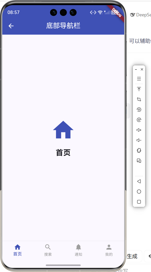
2.1 功能特性
| 功能 | 描述 |
|---|---|
| 多页面切换 | 点击标签切换不同页面 |
| 图标和文字 | 每个标签显示图标和文字 |
| 选中状态 | 当前页面标签高亮显示 |
| 固定模式 | BottomNavigationBarType.fixed |
三、项目背景与目标
3.1 项目背景
底部导航栏是移动应用的标准导航模式,用户可以快速在主要功能模块之间切换。Flutter的BottomNavigationBar组件提供了丰富的定制选项。
3.2 项目目标
- 实现多页面切换
- 支持图标和文字标签
- 提供选中状态样式
- 实现页面内容切换
四、技术架构设计
4.1 架构概述
底部导航栏基于BottomNavigationBar组件实现,通过索引控制当前显示的页面。
4.2 技术原理
BottomNavigationBar -> onTap -> 更新索引 -> 切换页面
核心组件:
- BottomNavigationBar:底部导航栏组件
- BottomNavigationBarItem:导航项
- State:状态管理当前索引
五、详细实现
5.1 Flutter端实现
import 'package:flutter/material.dart';
class BottomNavBarPage extends StatefulWidget {
const BottomNavBarPage({super.key});
State<BottomNavBarPage> createState() => _BottomNavBarPageState();
}
class _BottomNavBarPageState extends State<BottomNavBarPage> {
int _currentIndex = 0;
final List<Widget> _pages = const [
_HomePage(),
_SearchPage(),
_NotificationPage(),
_ProfilePage(),
];
Widget build(BuildContext context) {
return Scaffold(
appBar: AppBar(
title: const Text('底部导航栏'),
centerTitle: true,
backgroundColor: Colors.indigo,
foregroundColor: Colors.white,
),
body: _pages[_currentIndex],
bottomNavigationBar: BottomNavigationBar(
currentIndex: _currentIndex,
onTap: (index) => setState(() => _currentIndex = index),
selectedItemColor: Colors.indigo,
unselectedItemColor: Colors.grey,
type: BottomNavigationBarType.fixed,
items: const [
BottomNavigationBarItem(icon: Icon(Icons.home), label: '首页'),
BottomNavigationBarItem(icon: Icon(Icons.search), label: '搜索'),
BottomNavigationBarItem(icon: Icon(Icons.notifications), label: '通知'),
BottomNavigationBarItem(icon: Icon(Icons.person), label: '我的'),
],
),
);
}
}
5.2 核心功能解析
BottomNavigationBar组件
BottomNavigationBar(
  currentIndex: _currentIndex,
  onTap: (index) => setState(() => _currentIndex = index),
  items: [...],
)
currentIndex控制当前选中项,onTap处理点击事件。
导航项配置
BottomNavigationBarItem(
  icon: Icon(Icons.home),
  label: '首页',
)
BottomNavigationBarItem定义每个导航项的图标和文字。
页面切换
body: _pages[_currentIndex],
根据当前索引显示对应的页面内容。
固定模式
type: BottomNavigationBarType.fixed,
fixed模式确保所有导航项均匀分布,适合4个以上导航项。
六、实际应用场景
6.1 主应用导航
应用主页面的主要导航方式。
6.2 功能模块切换
在多个功能模块之间快速切换。
6.3 内容分类浏览
不同内容分类的导航切换。
七、优化建议
7.1 性能优化
- 使用IndexedStack保持页面状态
- 使用PageView实现滑动切换
- 缓存页面内容
7.2 功能扩展
- 添加角标提示
- 支持自定义图标
- 添加中间凸起按钮
- 支持滑动切换页面
八、常见问题与解决方案
8.1 问题1:超过3个导航项样式变化
问题: 超过3个导航项时,未选中项只显示图标。
解决方案: 设置type为BottomNavigationBarType.fixed。
BottomNavigationBar(
  type: BottomNavigationBarType.fixed,
)
8.2 问题2:页面状态丢失
问题: 切换页面后之前的状态丢失。
解决方案: 使用IndexedStack保持所有页面状态。
body: IndexedStack(
  index: _currentIndex,
  children: _pages,
)
九、总结
本文详细介绍了Flutter鸿蒙应用中BottomNavigationBar底部导航栏的实现方法。支持多页面切换、图标文字标签和选中状态样式。该组件是移动应用导航的核心组件。
十、参考资料
- Flutter官方文档:https://flutter.dev
- HarmonyOS开发者文档:https://developer.harmonyos.com
- Material Design指南:https://material.io/components/bottom-navigation

作为“人工智能6S店”的官方数字引擎,为AI开发者与企业提供一个覆盖软硬件全栈、一站式门户。
更多推荐
 1
1 0
0- 0


 已为社区贡献4条内容

所有评论(0)