
鸿蒙Flutter 搜索栏组件实现详解
Flutter搜索栏组件实现摘要 本文详细介绍了一个功能完善的Flutter搜索栏组件的实现方案。该组件提供四种视觉风格(标准、圆角、填充、极简),具备自动清除按钮、焦点状态反馈和只读模式等核心功能。通过枚举定义样式类型,继承StatefulWidget管理状态,使用FocusNode监听焦点变化,并支持自定义前后组件。组件实现了灵活的样式控制、输入状态管理和生命周期控制,可通过参数配置满足不同设
Flutter 搜索栏组件实现详解
欢迎加入开源鸿蒙跨平台社区→ https://openharmonycrosplatform.csdn.net
一、组件概述
搜索栏是移动应用中最常见的交互组件之一,用户通过它快速查找所需内容。一个优秀的搜索栏不仅要具备基本的输入功能,还需要提供良好的视觉反馈、便捷的清除操作、以及适配不同的设计风格。本文将详细介绍如何在 Flutter 中实现一个功能完善、样式多样的搜索栏组件。
二、核心功能特性
本组件具备以下核心特性:
四种视觉风格 :提供标准、圆角、填充、极简四种风格,满足不同设计需求。
聚焦状态反馈 :输入框获得焦点时,边框颜色和图标颜色会发生变化,提供清晰的视觉反馈。
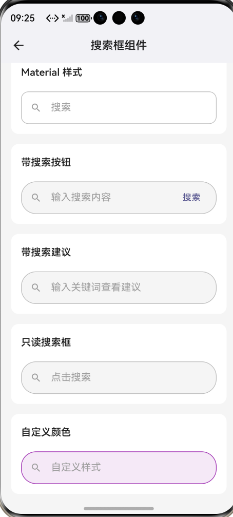
自动清除按钮 :当输入框有内容时自动显示清除按钮,点击即可清空输入。
只读模式 :支持只读模式,点击后跳转到专门的搜索页面。
自定义组件 :支持自定义前导和尾部组件,灵活扩展功能。
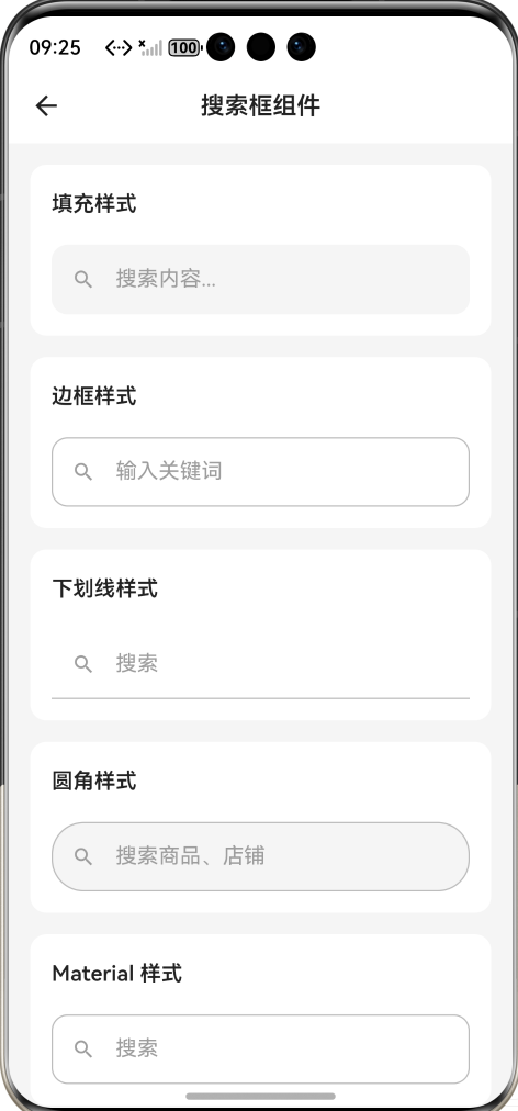
三、样式枚举定义
通过枚举定义四种搜索栏样式:
enum SearchBarStyle { standard,
rounded, filled, minimal }
standard 是标准样式带边框,rounded 是完全圆角样式,filled 是填充背景无显式边框,minimal 是极简下划线样式。
四、组件主体实现
组件继承自 StatefulWidget,因为需要管理输入控制器和焦点状态:
class CustomSearchBar extends
StatefulWidget {
  final String? hintText;
  final ValueChanged<String>?
  onChanged;
  final VoidCallback? onTap;
  final VoidCallback? onClear;
  final ValueChanged<String>?
  onSubmitted;
  final TextEditingController?
  controller;
  final SearchBarStyle style;
  final Color? backgroundColor;
  final Color? borderColor;
  final double height;
  final bool readOnly;
  final bool autoFocus;
  final Widget? leading;
  final Widget? trailing;
  final bool showClearButton;

  const CustomSearchBar({
    super.key,
    this.hintText,
    this.onChanged,
    this.onTap,
    this.onClear,
    this.onSubmitted,
    this.controller,
    this.style = SearchBarStyle.
    standard,
    this.backgroundColor,
    this.borderColor,
    this.height = 48,
    this.readOnly = false,
    this.autoFocus = false,
    this.leading,
    this.trailing,
    this.showClearButton = true,
  });
hintText 是提示文字,onChanged 是输入变化回调,onTap 是点击回调,onClear 是清除回调,onSubmitted 是提交回调,controller 是外部控制器,style 控制样式,readOnly 控制只读模式,autoFocus 控制自动聚焦,leading 和 trailing 用于自定义前后组件。
五、状态管理
State 类中管理控制器和焦点状态:
class _CustomSearchBarState extends
State<CustomSearchBar> {
  late TextEditingController
  _controller;
  bool _hasFocus = false;
  final FocusNode _focusNode =
  FocusNode();

  @override
  void initState() {
    super.initState();
    _controller = widget.
    controller ??
    TextEditingController();
    _focusNode.addListener
    (_onFocusChange);
  }

  @override
  void dispose() {
    _focusNode.removeListener
    (_onFocusChange);
    _focusNode.dispose();
    if (widget.controller == null) {
      _controller.dispose();
    }
    super.dispose();
  }

  void _onFocusChange() {
    setState(() => _hasFocus =
    _focusNode.hasFocus);
  }

  void _onClear() {
    _controller.clear();
    widget.onChanged?.call('');
    widget.onClear?.call();
  }
使用 FocusNode 监听焦点变化,当焦点状态改变时更新 UI。如果外部没有提供控制器,则内部创建并管理其生命周期。
六、构建方法详解
build 方法构建搜索栏的整体布局:
@override
Widget build(BuildContext context) {
  final isDark = Theme.of(context).
  brightness == Brightness.dark;
  final themeColor = Theme.of
  (context).colorScheme.primary;

  return GestureDetector(
    onTap: widget.readOnly ? widget.
    onTap : null,
    child: AnimatedContainer(
      duration: const Duration
      (milliseconds: 200),
      height: widget.height,
      decoration: _getDecoration
      (isDark, themeColor),
      child: Row(
        children: [
          if (widget.leading !=
          null) widget.leading!,
          if (widget.leading ==
          null)
            Padding(
              padding: const
              EdgeInsets.only(left:
              16, right: 12),
              child: Icon(
                Icons.search,
                size: 22,
                color: _hasFocus ?
                themeColor :
                (isDark ? Colors.
                grey[400] : Colors.
                grey[500]),
              ),
            ),
          Expanded(
            child: TextField(
              controller:
              _controller,
              focusNode: _focusNode,
              readOnly: widget.
              readOnly,
              autofocus: widget.
              autoFocus,
              onChanged: widget.
              onChanged,
              onSubmitted: widget.
              onSubmitted,
              onTap: widget.onTap,
              style: TextStyle(
                fontSize: 15,
                color: isDark ?
                Colors.white :
                Colors.black87,
              ),
              decoration:
              InputDecoration(
                border: InputBorder.
                none,
                hintText: widget.
                hintText ?? '搜索',
                hintStyle: TextStyle
                (
                  color: isDark ?
                  Colors.grey[500]
                  : Colors.grey
                  [400],
                  fontSize: 15,
                ),
                contentPadding:
                EdgeInsets.zero,
                isDense: true,
              ),
            ),
          ),
          if (_controller.text.
          isNotEmpty && widget.
          showClearButton &&
          !widget.readOnly)
            GestureDetector(
              onTap: _onClear,
              child: Padding(
                padding: const
                EdgeInsets.symmetric
                (horizontal: 8),
                child: Icon(
                  Icons.cancel,
                  size: 18,
                  color: isDark ?
                  Colors.grey[500]
                  : Colors.grey
                  [400],
                ),
              ),
            ),
          if (widget.trailing !=
          null) widget.trailing!,
          if (widget.trailing ==
          null && !widget.readOnly)
            Padding(
              padding: const
              EdgeInsets.only
              (right: 12),
              child: Icon(
                Icons.mic_none,
                size: 22,
                color: isDark ?
                Colors.grey[400] :
                Colors.grey[500],
              ),
            ),
        ],
      ),
    ),
  );
}
使用 GestureDetector 包裹整个组件,在只读模式下点击触发 onTap 回调。AnimatedContainer 实现边框变化的动画效果。Row 布局依次放置搜索图标、输入框、清除按钮、尾部组件。
七、装饰器样式实现
根据样式返回不同的 BoxDecoration:
BoxDecoration _getDecoration(bool
isDark, Color themeColor) {
  final bgColor = widget.
  backgroundColor ?? (isDark ?
  const Color(0xFF2A2A2A) : Colors.
  grey[100]);
  final bdColor = widget.
  borderColor ?? (isDark ? Colors.
  grey[700]! : Colors.grey[300]!);

  switch (widget.style) {
    case SearchBarStyle.standard:
      return BoxDecoration(
        color: bgColor,
        borderRadius: BorderRadius.
        circular(12),
        border: Border.all(
          color: _hasFocus ?
          themeColor : bdColor,
          width: _hasFocus ? 1.5 :
          1,
        ),
      );
    case SearchBarStyle.rounded:
      return BoxDecoration(
        color: bgColor,
        borderRadius: BorderRadius.
        circular(widget.height / 2),
        border: Border.all(
          color: _hasFocus ?
          themeColor : bdColor,
          width: _hasFocus ? 1.5 :
          1,
        ),
      );
    case SearchBarStyle.filled:
      return BoxDecoration(
        color: bgColor,
        borderRadius: BorderRadius.
        circular(12),
      );
    case SearchBarStyle.minimal:
      return BoxDecoration(
        color: Colors.transparent,
        border: Border(
          bottom: BorderSide(
            color: _hasFocus ?
            themeColor : bdColor,
            width: _hasFocus ? 2 :
            1,
          ),
        ),
      );
  }
}
standard 样式使用圆角矩形边框,rounded 样式使用完全圆角,filled 样式只有背景色无边框,minimal 样式只有底部边框线。
八、聚焦状态视觉反馈
当输入框获得焦点时,会产生以下视觉变化:
边框颜色 :从灰色变为主题色,边框宽度略微增加。
搜索图标颜色 :从灰色变为主题色。
极简样式的下划线 :从灰色变为主题色,线条变粗。
这些变化通过 _hasFocus 状态变量控制,配合 AnimatedContainer 实现平滑过渡。
九、清除按钮逻辑
清除按钮的显示逻辑:
if (_controller.text.isNotEmpty &&
widget.showClearButton && !widget.
readOnly)
  GestureDetector(
    onTap: _onClear,
    child: Icon(Icons.cancel, size:
    18, color: Colors.grey),
  ),
只有当输入框有内容、启用清除按钮、且非只读模式时才显示。点击后清空输入框并触发相关回调。
十、使用示例
基础用法:
CustomSearchBar(
  hintText: '搜索内容...',
  onChanged: (value) => print('搜索
  : $value'),
)
只读模式:
CustomSearchBar(
  hintText: '点击进入搜索页面',
  readOnly: true,
  onTap: () => Navigator.push
  (context, MaterialPageRoute
  (builder: (_) => SearchPage())),
)
自定义前后组件:
CustomSearchBar(
  hintText: '搜索商品',
  leading: Icon(Icons.
  shopping_bag_outlined, color:
  Colors.orange),
  trailing: TextButton(
    onPressed: () => performSearch
    (),
    child: Text('搜索'),
  ),
)
十一、总结
本文实现了一个功能丰富的 Flutter 搜索栏组件,支持四种视觉风格、聚焦状态反馈、自动清除按钮、只读模式、自定义组件等特性。组件设计注重用户体验,通过视觉反馈和便捷操作提升搜索效率,可满足大多数应用的搜索需求。

作为“人工智能6S店”的官方数字引擎,为AI开发者与企业提供一个覆盖软硬件全栈、一站式门户。
更多推荐
 0
0 0
0- 0


 已为社区贡献48条内容

所有评论(0)