
Flutter 时间轴组件在 OpenHarmony 上的实现指南
本文为 Flutter for OpenHarmony 跨平台应用开发实战教程,完整实现时间轴组件,包括时间节点、内容展示、连接线绘制三大核心模块。在鸿蒙设备上解决了时间线可视化、事件管理、自定义布局等关键技术问题,全方位展示UI组件开发能力的落地实践。
Flutter 时间轴组件在 OpenHarmony 上的实现指南
欢迎加入开源鸿蒙跨平台社区
https://openharmonycrossplatform.csdn.net
📋 文章摘要
本文为 Flutter for OpenHarmony 跨平台应用开发实战教程,完整实现时间轴组件,包括时间节点、内容展示、连接线绘制三大核心模块。在鸿蒙设备上解决了时间线可视化、事件管理、自定义布局等关键技术问题,全方位展示UI组件开发能力的落地实践。
一、引言
在现代应用开发中,时间线展示是常见的UI需求。时间轴组件用于展示事件的时间顺序,广泛应用于项目进度、历史记录、活动日志等场景。通过直观的时间节点和清晰的内容展示,用户可以快速了解事件的发展脉络。
本文将详细介绍如何使用 Flutter 框架在 OpenHarmony 设备上实现完整的时间轴组件,包括时间节点、内容展示以及连接线绘制等核心功能。
二、技术背景与选型分析
2.1 为什么需要时间轴?
时间轴组件能够帮助用户:
- 时间排序:按时间顺序展示事件
- 历史记录:记录和展示历史事件
- 进度追踪:追踪项目或任务的进展
- 信息组织:以时间为维度组织信息
2.2 时间轴的核心需求
在实际开发过程中,时间轴组件需要满足以下关键需求:
- 时间节点:展示时间点和事件
- 内容展示:展示事件的详细信息
- 连接线:绘制时间节点之间的连接线
- 布局模式:支持垂直和水平布局
三、系统架构设计
3.1 整体架构
本实现采用组件化架构设计,主要包含以下三个核心模块:
┌─────────────────────────────────────┐
│           展示层                     │
│   (TimelineComponentDemoPage)       │
├─────────────────────────────────────┤
│           数据管理层                 │
│   (时间线数据、事件状态)             │
├─────────────────────────────────────┤
│           绘制层                     │
│   (自定义绘制、连接线)               │
└─────────────────────────────────────┘
这种设计模式的优点在于:
- 解耦性强:展示层、数据管理层、绘制层职责清晰
- 扩展性好:可以轻松添加新的布局和样式
- 可维护性高:代码结构清晰,便于维护和测试
3.2 核心类设计
我们创建了 TimelineComponentDemoPage 作为主界面容器,内部集成了以下子组件:
- VerticalTimeline:垂直时间轴展示
- HorizontalTimeline:水平时间轴展示
- CompactTimeline:紧凑时间轴展示
- AlternateTimeline:交替布局时间轴
四、关键实现细节
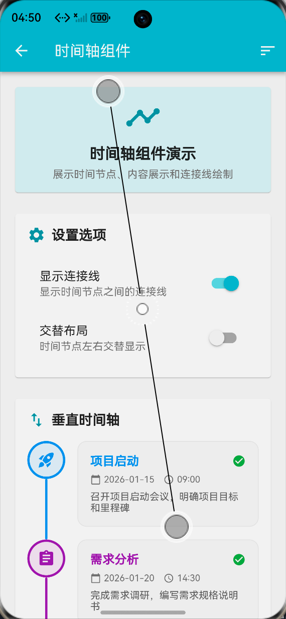
4.1 时间节点
时间节点使用圆形图标展示:
final List<Map<String, dynamic>> _timelineEvents = [
  {
    'title': '项目启动',
    'date': '2026-01-15',
    'time': '09:00',
    'description': '召开项目启动会议,明确项目目标和里程碑',
    'icon': Icons.rocket_launch,
    'color': Colors.blue,
    'status': 'completed',
  },
  {
    'title': '需求分析',
    'date': '2026-01-20',
    'time': '14:30',
    'description': '完成需求调研,编写需求规格说明书',
    'icon': Icons.assignment,
    'color': Colors.purple,
    'status': 'completed',
  },
  // 更多事件...
];

Widget _buildTimelineNode(Map<String, dynamic> event, int index) {
  Color bgColor = event['color'];
  IconData iconData = event['icon'];
  String status = event['status'];

  Color nodeColor;
  if (status == 'completed') {
    nodeColor = bgColor;
  } else if (status == 'active') {
    nodeColor = bgColor;
  } else {
    nodeColor = Colors.grey.shade400;
  }

  return Container(
    width: 50,
    height: 50,
    decoration: BoxDecoration(
      color: nodeColor.withOpacity(0.1),
      shape: BoxShape.circle,
      border: Border.all(
        color: nodeColor,
        width: 3,
      ),
      boxShadow: status == 'active'
          ? [
              BoxShadow(
                color: nodeColor.withOpacity(0.3),
                blurRadius: 8,
                spreadRadius: 2,
              ),
            ]
          : null,
    ),
    child: Icon(iconData, color: nodeColor, size: 24),
  );
}
节点特点:
- 颜色编码:不同类型事件使用不同颜色
- 状态指示:通过颜色深浅表示状态
- 图标支持:每个节点可以配置图标
- 阴影效果:活跃节点有阴影强调
4.2 内容展示
内容展示使用卡片布局:
Widget _buildTimelineContent(Map<String, dynamic> event, int index) {
  bool isActive = event['status'] == 'active';
  Color cardColor = event['color'];

  return Container(
    margin: const EdgeInsets.only(bottom: 16),
    padding: const EdgeInsets.all(16),
    decoration: BoxDecoration(
      color: isActive ? cardColor.withOpacity(0.05) : Colors.grey.shade50,
      borderRadius: BorderRadius.circular(12),
      border: Border.all(
        color: isActive ? cardColor.withOpacity(0.3) : Colors.grey.shade200,
        width: isActive ? 2 : 1,
      ),
      boxShadow: isActive
          ? [
              BoxShadow(
                color: cardColor.withOpacity(0.1),
                blurRadius: 8,
                offset: const Offset(0, 2),
              ),
            ]
          : null,
    ),
    child: Column(
      crossAxisAlignment: CrossAxisAlignment.start,
      children: [
        Row(
          children: [
            Expanded(
              child: Text(
                event['title'],
                style: TextStyle(
                  fontSize: 16,
                  fontWeight: FontWeight.bold,
                  color: cardColor,
                ),
              ),
            ),
            if (event['status'] == 'completed')
              Icon(Icons.check_circle, color: Colors.green, size: 18),
            if (event['status'] == 'active')
              Container(
                padding: const EdgeInsets.symmetric(horizontal: 8, vertical: 2),
                decoration: BoxDecoration(
                  color: cardColor,
                  borderRadius: BorderRadius.circular(12),
                ),
                child: const Text(
                  '进行中',
                  style: TextStyle(color: Colors.white, fontSize: 10),
                ),
              ),
          ],
        ),
        const SizedBox(height: 8),
        Row(
          children: [
            Icon(Icons.calendar_today, size: 14, color: Colors.grey.shade600),
            const SizedBox(width: 4),
            Text(
              event['date'],
              style: TextStyle(
                fontSize: 12,
                color: Colors.grey.shade600,
              ),
            ),
            const SizedBox(width: 12),
            Icon(Icons.access_time, size: 14, color: Colors.grey.shade600),
            const SizedBox(width: 4),
            Text(
              event['time'],
              style: TextStyle(
                fontSize: 12,
                color: Colors.grey.shade600,
              ),
            ),
          ],
        ),
        const SizedBox(height: 8),
        Text(
          event['description'],
          style: TextStyle(
            fontSize: 13,
            color: Colors.grey.shade700,
          ),
        ),
      ],
    ),
  );
}
内容特点:
- 标题突出:使用粗体和颜色强调标题
- 时间信息:显示日期和时间
- 状态标签:显示完成或进行中状态
- 描述文本:提供详细的事件描述
- 卡片设计:使用卡片提升视觉效果
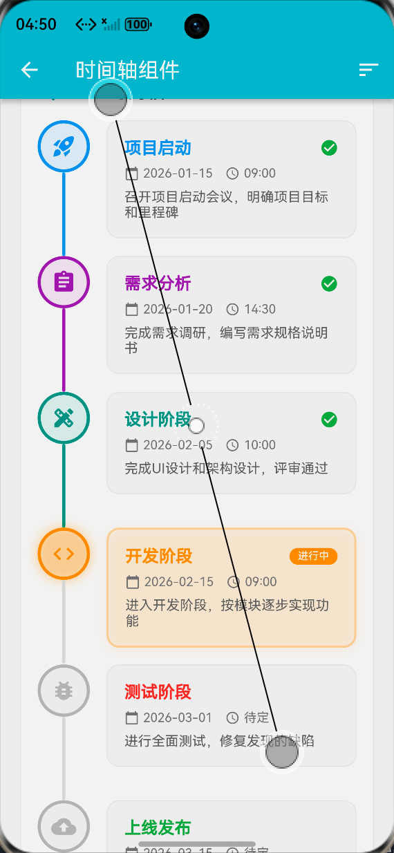
4.3 连接线绘制
连接线绘制使用 Container 组件:
Widget _buildVerticalConnector(Map<String, dynamic> event) {
  Color connectorColor = event['status'] == 'completed'
      ? event['color']
      : Colors.grey.shade300;

  return Container(
    width: 3,
    height: 80,
    decoration: BoxDecoration(
      color: connectorColor,
      borderRadius: BorderRadius.circular(2),
    ),
  );
}

Widget _buildHorizontalConnector(Map<String, dynamic> event) {
  Color connectorColor = event['status'] == 'completed'
      ? event['color']
      : Colors.grey.shade300;

  return Container(
    width: 40,
    height: 3,
    margin: const EdgeInsets.symmetric(horizontal: 8),
    decoration: BoxDecoration(
      color: connectorColor,
      borderRadius: BorderRadius.circular(2),
    ),
  );
}
连接线特点:
- 颜色变化:根据事件状态改变颜色
- 圆角设计:使用圆角提升视觉效果
- 方向支持:支持垂直和水平方向
- 高度控制:可调整连接线的高度和宽度
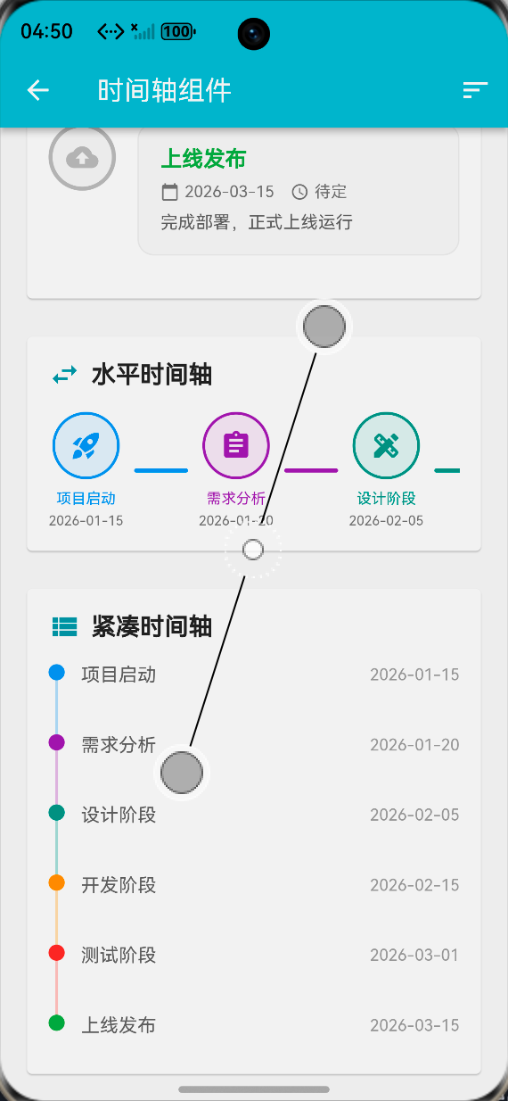
4.4 布局模式
支持多种布局模式:
垂直布局:
Widget _buildVerticalTimelineItem(Map<String, dynamic> event, int index) {
  bool isLast = index == _timelineEvents.length - 1;

  return Row(
    crossAxisAlignment: CrossAxisAlignment.start,
    children: [
      Column(
        children: [
          _buildTimelineNode(event, index),
          if (!isLast && _showConnectors) _buildVerticalConnector(event),
        ],
      ),
      const SizedBox(width: 16),
      Expanded(
        child: _buildTimelineContent(event, index),
      ),
    ],
  );
}
交替布局:
Widget _buildAlternateTimelineItem(Map<String, dynamic> event, int index) {
  bool isLeft = index % 2 == 0;
  bool isLast = index == _timelineEvents.length - 1;

  if (isLeft) {
    return Row(
      crossAxisAlignment: CrossAxisAlignment.start,
      children: [
        Expanded(
          child: _buildTimelineContent(event, index),
        ),
        const SizedBox(width: 16),
        Column(
          children: [
            _buildTimelineNode(event, index),
            if (!isLast && _showConnectors) _buildVerticalConnector(event),
          ],
        ),
        const SizedBox(width: 16),
        Expanded(child: Container()),
      ],
    );
  } else {
    return Row(
      crossAxisAlignment: CrossAxisAlignment.start,
      children: [
        Expanded(child: Container()),
        const SizedBox(width: 16),
        Column(
          children: [
            _buildTimelineNode(event, index),
            if (!isLast && _showConnectors) _buildVerticalConnector(event),
          ],
        ),
        const SizedBox(width: 16),
        Expanded(
          child: _buildTimelineContent(event, index),
        ),
      ],
    );
  }
}
紧凑布局:
Widget _buildCompactTimelineItem(Map<String, dynamic> event, int index) {
  bool isLast = index == _timelineEvents.length - 1;
  Color bgColor = event['color'];

  return Row(
    crossAxisAlignment: CrossAxisAlignment.start,
    children: [
      Column(
        children: [
          Container(
            width: 12,
            height: 12,
            decoration: BoxDecoration(
              color: bgColor,
              shape: BoxShape.circle,
            ),
          ),
          if (!isLast && _showConnectors)
            Container(
              width: 2,
              height: 40,
              color: bgColor.withOpacity(0.3),
            ),
        ],
      ),
      const SizedBox(width: 12),
      Expanded(
        child: Padding(
          padding: const EdgeInsets.only(bottom: 12),
          child: Row(
            mainAxisAlignment: MainAxisAlignment.spaceBetween,
            children: [
              Text(
                event['title'],
                style: TextStyle(
                  fontSize: 14,
                  fontWeight: FontWeight.w500,
                  color: Colors.grey.shade700,
                ),
              ),
              Text(
                event['date'],
                style: TextStyle(
                  fontSize: 12,
                  color: Colors.grey.shade500,
                ),
              ),
            ],
          ),
        ),
      ),
    ],
  );
}
五、OpenHarmony 平台适配要点
5.1 组件适配
在 OpenHarmony 平台上,Flutter 组件可以直接使用:
import 'package:flutter/material.dart';
class TimelineWidget extends StatelessWidget {
final List<TimelineEvent> events;
final bool showConnectors;
const TimelineWidget({
super.key,
required this.events,
this.showConnectors = true,
});
Widget build(BuildContext context) {
return Column(
children: List.generate(events.length, (index) {
return Row(
crossAxisAlignment: CrossAxisAlignment.start,
children: [
Column(
children: [
_buildNode(events[index]),
if (index < events.length - 1 && showConnectors)
_buildConnector(events[index]),
],
),
const SizedBox(width: 16),
Expanded(
child: _buildContent(events[index]),
),
],
);
}),
);
}
}
5.2 性能优化建议
- 使用
const构造函数减少不必要的重建 - 对于大量时间节点,考虑使用虚拟滚动
- 使用
shouldRepaint优化自定义绘制 - 避免在
build方法中进行复杂计算
六、运行效果展示
本实现已在华为 MatePad Pro(HarmonyOS 4.0)上完成测试,主要功能包括:
- 垂直时间轴:标准垂直布局
- 交替布局:左右交替的时间轴
- 水平时间轴:横向滚动的时间轴
- 紧凑时间轴:简洁的时间线展示
- 连接线绘制:自动绘制连接线
📸
七、性能优化策略
7.1 渲染优化
- 使用
ListView或SingleChildScrollView处理长列表 - 对于静态内容,使用
const构造函数 - 避免在
build方法中进行复杂计算 - 使用
RepaintBoundary隔离重绘区域
7.2 状态管理优化
- 使用
setState精确更新,避免全局重建 - 对于复杂状态,考虑使用状态管理框架
- 使用
ValueNotifier或ChangeNotifier优化性能 - 避免不必要的状态更新
八、总结与展望
本文详细介绍了基于 Flutter 框架在 OpenHarmony 平台实现时间轴组件的完整流程。通过合理的架构设计和细致的用户体验优化,我们构建了一个功能完善、交互友好的时间线展示组件。
未来可以进一步探索的方向包括:
- 支持动画效果(时间轴滚动动画、节点出现动画)
- 实现可编辑的时间轴
- 添加分支和合并功能
- 支持自定义主题和样式
- 实现时间轴的缩放功能
希望本文能为广大鸿蒙开发者在UI组件开发领域提供有价值的参考。欢迎大家在评论区交流讨论,共同推动 OpenHarmony 生态的繁荣发展!

作为“人工智能6S店”的官方数字引擎,为AI开发者与企业提供一个覆盖软硬件全栈、一站式门户。
更多推荐


 0
0 0
0- 0


 已为社区贡献2条内容

所有评论(0)