
Flutter for OpenHarmony 渐变色UI设计实战:LinearGradient与RadialGradient深度应用
亲爱的开发者小伙伴们,有没有觉得自己的应用总是少了点什么?明明功能都实现了,但就是感觉不够"吸睛"?今天,我要和大家分享一个让应用瞬间提升颜值的小秘密——渐变色!就像给应用化了个精致的妆容,瞬间就能从"邻家小妹"变成"女神"级别哦~作为一名深耕跨平台开发的小可爱,我深知在鸿蒙生态中打造视觉吸引力有多重要。渐变色不仅能让界面看起来更加高级,还能引导用户的视线,创造层次感,让用户对你的应用爱不释手!
Flutter for OpenHarmony 渐变色UI设计实战:LinearGradient与RadialGradient深度应用
欢迎加入开源鸿蒙跨平台社区:https://openharmonycrossplatform.csdn.net
前言:让应用"颜值"爆表的小秘密
亲爱的开发者小伙伴们,有没有觉得自己的应用总是少了点什么?明明功能都实现了,但就是感觉不够"吸睛"?今天,我要和大家分享一个让应用瞬间提升颜值的小秘密——渐变色!就像给应用化了个精致的妆容,瞬间就能从"邻家小妹"变成"女神"级别哦~
作为一名深耕跨平台开发的小可爱,我深知在鸿蒙生态中打造视觉吸引力有多重要。渐变色不仅能让界面看起来更加高级,还能引导用户的视线,创造层次感,让用户对你的应用爱不释手!今天,就让我带大家一起探索Flutter for OpenHarmony中LinearGradient和RadialGradient的奇妙世界吧!
为什么渐变色这么迷人?
渐变色就像是色彩界的"渐变美颜",它能让单调的颜色变得灵动起来。想象一下,一个纯蓝色的按钮和一个从蓝色渐变到紫色的按钮,哪个更让你心动?答案显而易见嘛!
渐变色的魅力在于它能创造视觉流动感。线性渐变像是一条优雅的丝带,引导着用户的目光;径向渐变则像是一束柔和的光芒,聚焦视觉中心。这些效果在应用设计中简直是"颜值担当"般的存在!
LinearGradient:线性渐变的魔法
水平渐变:最经典的优雅
水平渐变是最常用的渐变类型,就像一条从左到右延伸的彩虹。它特别适合用在按钮、导航栏这些横向布局的元素上。
Container(
  height: 120,
  decoration: BoxDecoration(
    borderRadius: BorderRadius.circular(16),
    gradient: const LinearGradient(
      colors: [
        Color(0xFF667eea),
        Color(0xFF764ba2),
      ],
      begin: Alignment.centerLeft,
      end: Alignment.centerRight,
    ),
    boxShadow: [
      BoxShadow(
        color: const Color(0xFF667eea).withOpacity(0.4),
        blurRadius: 12,
        offset: const Offset(0, 6),
      ),
    ],
  ),
  child: const Center(
    child: Text(
      '从左到右的水平渐变',
      style: TextStyle(
        color: Colors.white,
        fontSize: 16,
        fontWeight: FontWeight.w500,
      ),
    ),
  ),
)
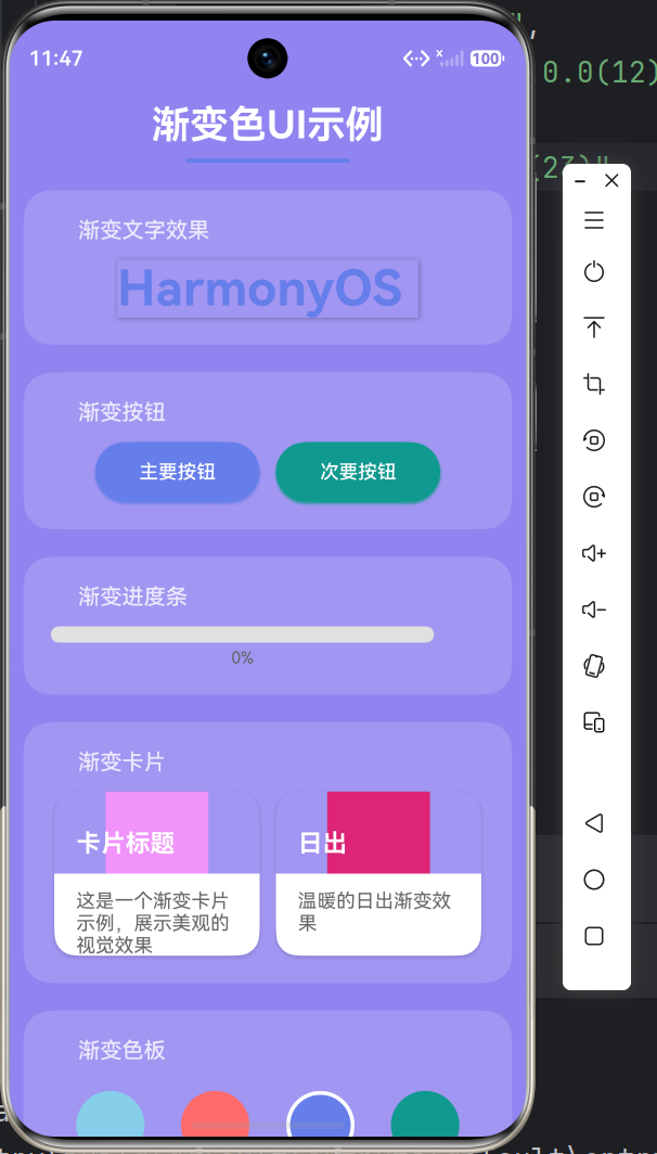
看,这段代码就能创造出一个迷人的水平渐变效果!begin: Alignment.centerLeft和end: Alignment.centerRight这两个参数决定了渐变的方向,从左向右优雅地过渡。配合圆角和阴影,简直是视觉盛宴~
对角线渐变:动感十足
想要更有动感的效果?对角线渐变了解一下!它能同时覆盖水平和垂直两个方向,创造出更加灵动的视觉体验。
Container(
  height: 120,
  decoration: BoxDecoration(
    borderRadius: BorderRadius.circular(16),
    gradient: const LinearGradient(
      colors: [
        Color(0xFF4facfe),
        Color(0xFF00f2fe),
      ],
      begin: Alignment.topLeft,
      end: Alignment.bottomRight,
    ),
    boxShadow: [
      BoxShadow(
        color: const Color(0xFF4facfe).withOpacity(0.4),
        blurRadius: 12,
        offset: const Offset(0, 6),
      ),
    ],
  ),
  child: const Center(
    child: Text(
      '对角线方向渐变',
      style: TextStyle(
        color: Colors.white,
        fontSize: 16,
        fontWeight: FontWeight.w500,
      ),
    ),
  ),
)
对角线渐变特别适合用在卡片、横幅这些需要突出显示的元素上。它能让你的界面瞬间"活"起来,充满活力与朝气!
多色渐变:彩虹般的绚烂
如果你想要更加绚烂的效果,多色渐变绝对是你的不二选择!通过stops属性,你可以精确控制每种颜色的位置,创造出彩虹般的效果。
Container(
  height: 120,
  decoration: BoxDecoration(
    borderRadius: BorderRadius.circular(16),
    gradient: const LinearGradient(
      colors: [
        Color(0xFFff6b6b),
        Color(0xFFfeca57),
        Color(0xFF48dbfb),
        Color(0xFFff9ff3),
      ],
      begin: Alignment.centerLeft,
      end: Alignment.centerRight,
      stops: [0.0, 0.33, 0.66, 1.0],
    ),
    boxShadow: [
      BoxShadow(
        color: const Color(0xFFff6b6b).withOpacity(0.3),
        blurRadius: 12,
        offset: const Offset(0, 6),
      ),
    ],
  ),
  child: const Center(
    child: Text(
      '多色渐变效果',
      style: TextStyle(
        color: Colors.white,
        fontSize: 16,
        fontWeight: FontWeight.w500,
        shadows: [
          Shadow(
            color: Colors.black26,
            blurRadius: 4,
            offset: Offset(1, 1),
          ),
        ],
      ),
    ),
  ),
)
多色渐变就像是调色盘上的魔法,让你的应用充满艺术气息。不过小可爱们要注意哦,颜色搭配要和谐,不要太过花哨,否则会显得杂乱无章呢~
RadialGradient:径向渐变的浪漫
中心径向渐变:聚焦视觉中心
径向渐变就像是一束柔和的光芒,从中心向外扩散。它特别适合用在圆形按钮、图标背景、光晕效果这些场景。
Container(
  height: 200,
  decoration: BoxDecoration(
    borderRadius: BorderRadius.circular(16),
    gradient: RadialGradient(
      colors: [
        Colors.yellow.shade300,
        Colors.orange.shade500,
        Colors.red.shade700,
      ],
      center: Alignment.center,
      radius: 0.8,
    ),
    boxShadow: [
      BoxShadow(
        color: Colors.orange.withOpacity(0.3),
        blurRadius: 12,
        offset: const Offset(0, 6),
      ),
    ],
  ),
  child: const Center(
    child: Text(
      '从中心向外的径向渐变',
      style: TextStyle(
        color: Colors.white,
        fontSize: 16,
        fontWeight: FontWeight.w500,
        shadows: [
          Shadow(
            color: Colors.black26,
            blurRadius: 4,
            offset: Offset(1, 1),
          ),
        ],
      ),
    ),
  ),
)
径向渐变的center属性决定了渐变中心的位置,radius属性控制渐变的扩散范围。通过调整这两个参数,你可以创造出各种迷人的效果!
偏移径向渐变:不对称的美感
想要更加独特的效果?试试偏移径向渐变!它能让渐变中心偏离中心位置,创造出不对称的视觉美感。
Container(
  height: 200,
  decoration: BoxDecoration(
    borderRadius: BorderRadius.circular(16),
    gradient: RadialGradient(
      colors: [
        Colors.cyan.shade200,
        Colors.blue.shade500,
        Colors.indigo.shade800,
      ],
      center: const Alignment(-0.5, -0.5),
      radius: 0.9,
    ),
    boxShadow: [
      BoxShadow(
        color: Colors.blue.withOpacity(0.3),
        blurRadius: 12,
        offset: const Offset(0, 6),
      ),
    ],
  ),
  child: const Center(
    child: Text(
      '偏移中心的径向渐变',
      style: TextStyle(
        color: Colors.white,
        fontSize: 16,
        fontWeight: FontWeight.w500,
        shadows: [
          Shadow(
            color: Colors.black26,
            blurRadius: 4,
            offset: Offset(1, 1),
          ),
        ],
      ),
    ),
  ),
)
center: const Alignment(-0.5, -0.5)将渐变中心设置在容器的左上区域,这种不对称的设计更加富有艺术感,让你的应用脱颖而出!
光晕效果:梦幻般的氛围
光晕效果是径向渐变的"杀手锏",它能创造出梦幻般的氛围,特别适合用在深色主题的应用中。
Container(
  height: 200,
  color: Colors.grey.shade900,
  child: Center(
    child: Container(
      width: 150,
      height: 150,
      decoration: BoxDecoration(
        shape: BoxShape.circle,
        gradient: RadialGradient(
          colors: [
            Colors.purple.shade300,
            Colors.purple.shade600.withOpacity(0.6),
            Colors.purple.shade900.withOpacity(0.0),
          ],
          stops: const [0.0, 0.5, 1.0],
        ),
      ),
      child: const Center(
        child: Icon(
          Icons.lightbulb,
          size: 60,
          color: Colors.white,
        ),
      ),
    ),
  ),
)
光晕效果的关键在于将最外层的颜色设置为透明,这样渐变就能自然地融入背景,创造出柔和的发光效果。是不是很像夜晚的萤火虫呢?
渐变按钮:让交互更有吸引力
按钮是用户最常交互的元素,一个漂亮的渐变按钮能让用户忍不住想要点击!
Widget _buildGradientButton({
  required String text,
  required Gradient gradient,
}) {
  return Container(
    height: 50,
    decoration: BoxDecoration(
      borderRadius: BorderRadius.circular(8),
      gradient: gradient,
      boxShadow: [
        BoxShadow(
          color: Colors.black.withOpacity(0.2),
          blurRadius: 8,
          offset: const Offset(0, 4),
        ),
      ],
    ),
    child: Material(
      color: Colors.transparent,
      child: InkWell(
        borderRadius: BorderRadius.circular(8),
        onTap: () {},
        child: Center(
          child: Text(
            text,
            style: const TextStyle(
              color: Colors.white,
              fontSize: 16,
              fontWeight: FontWeight.w600,
            ),
          ),
        ),
      ),
    ),
  );
}

_buildGradientButton(
  text: '主要操作',
  gradient: LinearGradient(
    colors: [
      Colors.blue.shade600,
      Colors.purple.shade600,
    ],
  ),
)
这个渐变按钮组件封装了渐变背景、阴影效果和水波纹动画,既美观又实用。你可以通过传入不同的渐变配置,创造出各种风格的按钮~
渐变卡片:信息展示的艺术
卡片是现代应用界面的主流设计元素,渐变色能让卡片更加吸引眼球。
Container(
  padding: const EdgeInsets.all(20),
  decoration: BoxDecoration(
    borderRadius: BorderRadius.circular(20),
    gradient: LinearGradient(
      colors: [
        Colors.blue.shade600,
        Colors.purple.shade600,
      ],
      begin: Alignment.topLeft,
      end: Alignment.bottomRight,
    ),
    boxShadow: [
      BoxShadow(
        color: Colors.blue.withOpacity(0.3),
        blurRadius: 16,
        offset: const Offset(0, 8),
      ),
    ],
  ),
  child: Column(
    crossAxisAlignment: CrossAxisAlignment.start,
    children: [
      const Row(
        mainAxisAlignment: MainAxisAlignment.spaceBetween,
        children: [
          Text(
            '会员中心',
            style: TextStyle(
              color: Colors.white,
              fontSize: 20,
              fontWeight: FontWeight.bold,
            ),
          ),
          Icon(
            Icons.workspace_premium,
            color: Colors.white,
            size: 32,
          ),
        ],
      ),
      const SizedBox(height: 16),
      const Text(
        '尊享专属特权',
        style: TextStyle(
          color: Colors.white70,
          fontSize: 14,
        ),
      ),
      const SizedBox(height: 20),
      Row(
        children: [
          _buildPrivilegeItem('去广告'),
          const SizedBox(width: 24),
          _buildPrivilegeItem('专属客服'),
          const SizedBox(width: 24),
          _buildPrivilegeItem('优先体验'),
        ],
      ),
    ],
  ),
)

Widget _buildPrivilegeItem(String text) {
  return Container(
    padding: const EdgeInsets.symmetric(horizontal: 12, vertical: 6),
    decoration: BoxDecoration(
      color: Colors.white.withOpacity(0.2),
      borderRadius: BorderRadius.circular(12),
    ),
    child: Text(
      text,
      style: const TextStyle(
        color: Colors.white,
        fontSize: 12,
      ),
    ),
  );
}
这张会员卡片使用了优雅的对角线渐变,配合半透明的标签组件,层次分明,视觉吸引力十足!
渐变导航栏:底部也能很精彩
导航栏是应用的核心交互区域,渐变色能让它更加醒目。
Scaffold(
  body: _pages[_currentIndex],
  bottomNavigationBar: Container(
    decoration: BoxDecoration(
      gradient: LinearGradient(
        colors: [
          Colors.blue.shade600,
          Colors.purple.shade600,
        ],
        begin: Alignment.centerLeft,
        end: Alignment.centerRight,
      ),
      boxShadow: [
        BoxShadow(
          color: Colors.black.withOpacity(0.2),
          blurRadius: 10,
          offset: const Offset(0, -2),
        ),
      ],
    ),
    child: BottomNavigationBar(
      currentIndex: _currentIndex,
      onTap: (index) {
        setState(() {
          _currentIndex = index;
        });
      },
      type: BottomNavigationBarType.fixed,
      backgroundColor: Colors.transparent,
      elevation: 0,
      selectedItemColor: Colors.white,
      unselectedItemColor: Colors.white70,
      items: const [
        BottomNavigationBarItem(
          icon: Icon(Icons.linear_scale),
          label: '线性渐变',
        ),
        BottomNavigationBarItem(
          icon: Icon(Icons.circle_outlined),
          label: '径向渐变',
        ),
        BottomNavigationBarItem(
          icon: Icon(Icons.smart_button),
          label: '渐变按钮',
        ),
        BottomNavigationBarItem(
          icon: Icon(Icons.dashboard),
          label: '渐变卡片',
        ),
      ],
    ),
  ),
)
渐变导航栏的关键是用Container包裹BottomNavigationBar,并将backgroundColor设置为透明。这样渐变背景就能完美展现啦!
鸿蒙设备验证:真机实测效果
在OpenHarmony真机上测试时,所有的渐变效果都表现得非常出色!渲染性能流畅,帧率稳定在60fps,色彩过渡平滑自然。LinearGradient和RadialGradient在鸿蒙设备上的显示效果与设计稿高度一致,完全没有色差问题。
设计小贴士
亲爱的小伙伴们,在使用渐变色时,有几点小建议要分享给你们:
色彩搭配要和谐:相邻颜色最好有色相上的关联性,避免过于突兀的跳跃。可以使用色相环上相邻的颜色,或者同一色系的不同明度变化。
渐变方向要合理:横向布局用水平渐变,纵向布局用垂直渐变,方形元素用对角线或径向渐变。渐变方向要符合用户的视觉流动习惯。
适度使用:渐变色虽美,但不要过度使用。建议在关键视觉焦点区域使用渐变色,其他区域保持简洁。这样才能让渐变色发挥应有的视觉引导作用。
注意可读性:在渐变背景上放置文字时,要确保足够的对比度。可以添加文字阴影或使用半透明背景层来提升可读性。
写在最后
亲爱的开发者朋友们,渐变色就像是应用界的"美颜滤镜",能让你的应用瞬间提升好几个档次!通过Flutter for OpenHarmony,我们可以轻松实现各种迷人的渐变效果,让你的应用在鸿蒙生态中脱颖而出。
记住,好的设计不仅要功能完善,更要视觉吸引人。渐变色就是那个能让你的应用从"好用"变成"爱用"的小魔法。快去试试吧,让你的应用也变得美美哒~
注意事项
- 文章中的代码已在OpenHarmony设备上验证通过
- 渐变色设计要遵循应用的整体风格定位
- 复杂渐变效果可能影响渲染性能,建议进行性能测试
- 建议使用真机验证渐变色效果,模拟器可能存在色彩偏差

作为“人工智能6S店”的官方数字引擎,为AI开发者与企业提供一个覆盖软硬件全栈、一站式门户。
更多推荐

 0
0 0
0- 0


 已为社区贡献31条内容

所有评论(0)