
Flutter 框架跨平台鸿蒙开发 - Flutter Logo设计应用
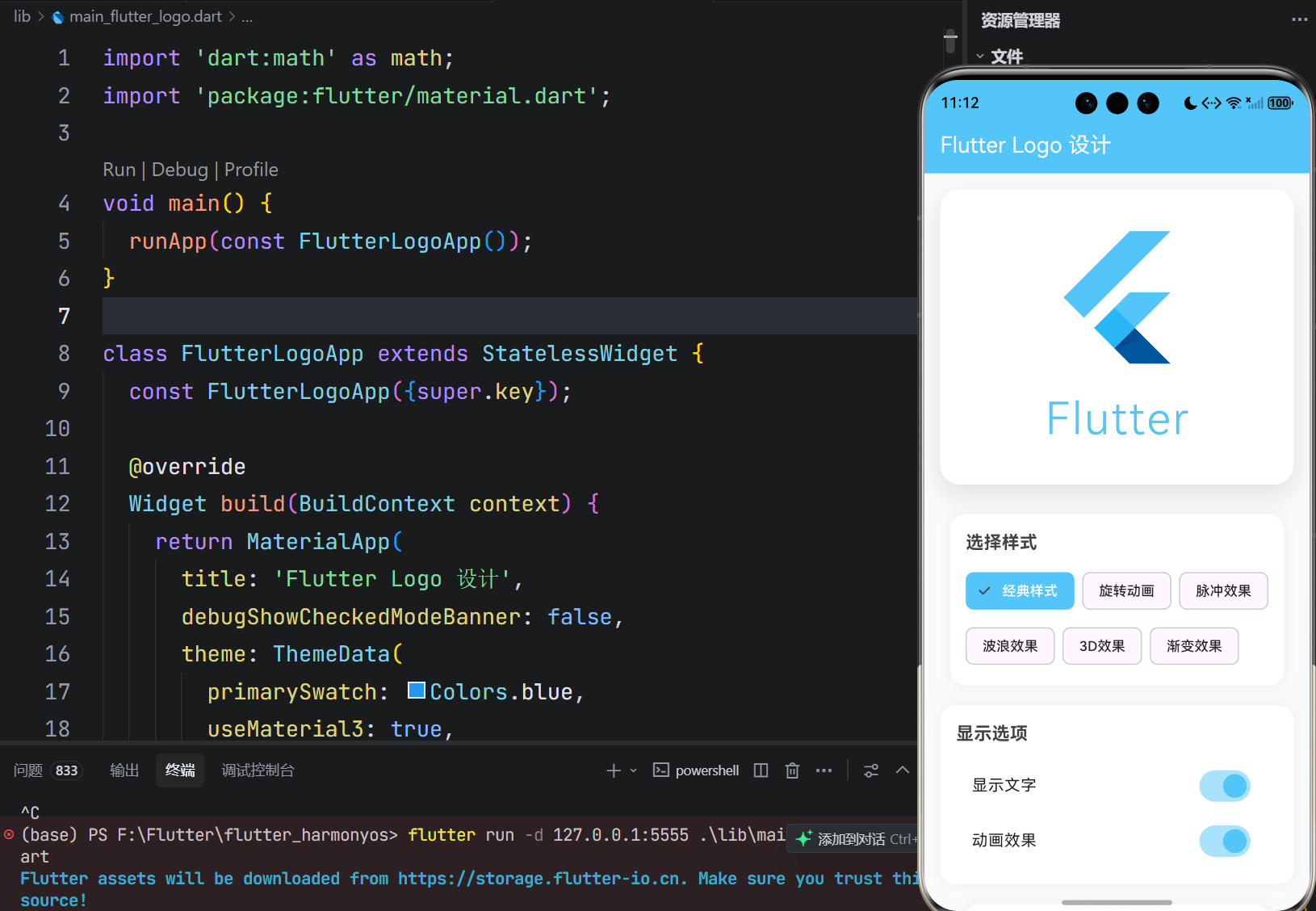
运行效果图Flutter Logo设计应用是一款展示和定制Flutter Logo的工具应用。用户可以通过该应用查看不同样式的Flutter Logo,自定义Logo的颜色、大小和动画效果,为Flutter开发者提供Logo设计参考和灵感。应用提供了6种不同的Logo展示样式,包括经典样式、旋转动画、脉冲效果、波浪效果、3D效果和渐变效果。用户可以通过直观的界面调整Logo的各项参数,实时预览效果
欢迎加入开源鸿蒙跨平台社区:
https://openharmonycrossplatform.csdn.net
一、项目概述
运行效果图

1.1 应用简介
Flutter Logo设计应用是一款展示和定制Flutter Logo的工具应用。用户可以通过该应用查看不同样式的Flutter Logo,自定义Logo的颜色、大小和动画效果,为Flutter开发者提供Logo设计参考和灵感。
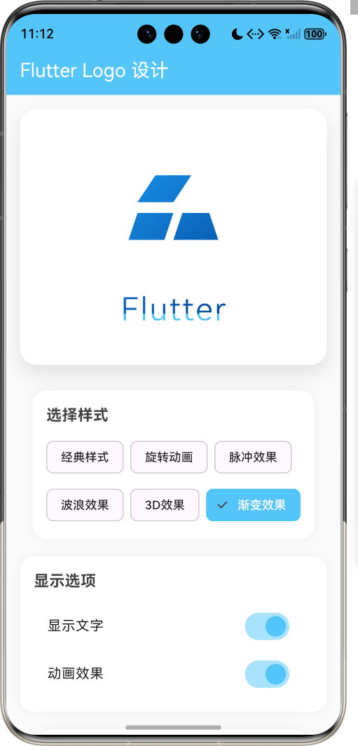
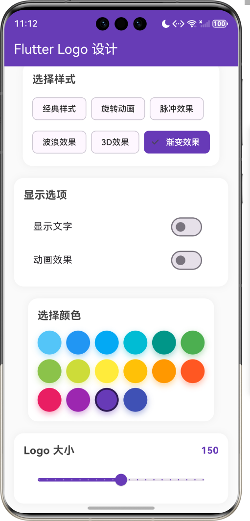
应用提供了6种不同的Logo展示样式,包括经典样式、旋转动画、脉冲效果、波浪效果、3D效果和渐变效果。用户可以通过直观的界面调整Logo的各项参数,实时预览效果。
1.2 核心功能
| 功能模块 | 功能描述 | 实现方式 |
|---|---|---|
| 样式切换 | 6种Logo展示样式 | ChoiceChip选择器 |
| 颜色定制 | 16种预设颜色 | 颜色选择器 |
| 大小调整 | 50-250像素范围 | Slider滑块 |
| 动画控制 | 开启动画效果 | 开关控制 |
| 文字显示 | 显示/隐藏Flutter文字 | 开关控制 |
| 实时预览 | 即时查看修改效果 | 状态管理 |
1.3 Logo样式
| 样式 | 描述 | 特点 |
|---|---|---|
| 经典样式 | 标准FlutterLogo组件 | 官方默认样式 |
| 旋转动画 | 360度持续旋转 | 动态展示 |
| 脉冲效果 | 缩放呼吸动画 | 吸引注意 |
| 波浪效果 | 正弦波动动画 | 流畅动感 |
| 3D效果 | 透视变换 | 立体感 |
| 渐变效果 | 渐变色填充 | 视觉丰富 |
1.4 技术栈
| 技术领域 | 技术选型 | 版本要求 |
|---|---|---|
| 开发框架 | Flutter | >= 3.0.0 |
| 编程语言 | Dart | >= 2.17.0 |
| 设计规范 | Material Design 3 | - |
| 状态管理 | setState | - |
| 动画 | AnimationController | - |
| 目标平台 | 鸿蒙OS | API 21+ |
1.5 项目结构
lib/
└── main_flutter_logo.dart
    ├── FlutterLogoApp         # 应用入口
    ├── LogoDesignPage         # Logo设计页面
    ├── FlutterLogoPainter     # 自定义Logo绘制器
    └── WaveLogoPainter        # 波浪效果绘制器
二、系统架构
2.1 整体架构图
2.2 类图设计
2.3 功能流程图
三、核心模块设计
3.1 数据模型设计
3.1.1 Logo状态
class _LogoDesignPageState extends State<LogoDesignPage> {
  // 动画控制器
  late AnimationController _rotationController;
  late AnimationController _pulseController;
  late AnimationController _waveController;

  // Logo属性
  double _size = 150;                                    // Logo大小
  Color _primaryColor = const Color(0xFF54C5F8);        // 主色
  Color _secondaryColor = const Color(0xFF01579B);      // 副色
  bool _showText = true;                                 // 显示文字
  bool _isAnimating = true;                              // 动画开关
  int _selectedStyle = 0;                                // 选中样式

  // 样式列表
  final List<String> _styleNames = [
    '经典样式',
    '旋转动画',
    '脉冲效果',
    '波浪效果',
    '3D效果',
    '渐变效果',
  ];
}
3.1.2 颜色配置
final List<Color> _colors = [
  const Color(0xFF54C5F8),  // Flutter蓝
  const Color(0xFF2196F3),  // 蓝色
  const Color(0xFF03A9F4),  // 浅蓝
  const Color(0xFF00BCD4),  // 青色
  const Color(0xFF009688),  // 蓝绿
  const Color(0xFF4CAF50),  // 绿色
  const Color(0xFF8BC34A),  // 浅绿
  const Color(0xFFCDDC39),  // 黄绿
  const Color(0xFFFFEB3B),  // 黄色
  const Color(0xFFFFC107),  // 琥珀
  const Color(0xFFFF9800),  // 橙色
  const Color(0xFFFF5722),  // 深橙
  const Color(0xFFE91E63),  // 粉红
  const Color(0xFF9C27B0),  // 紫色
  const Color(0xFF673AB7),  // 深紫
  const Color(0xFF3F51B5),  // 靛蓝
];
3.2 页面结构设计
3.2.1 Logo设计页面
3.3 动画设计
3.3.1 动画控制器配置
void initState() {
super.initState();
// 旋转动画 - 3秒一圈
_rotationController = AnimationController(
vsync: this,
duration: const Duration(seconds: 3),
);
// 脉冲动画 - 800毫秒
_pulseController = AnimationController(
vsync: this,
duration: const Duration(milliseconds: 800),
);
// 波浪动画 - 2秒
_waveController = AnimationController(
vsync: this,
duration: const Duration(seconds: 2),
);
}
3.3.2 动画启动逻辑
void _startAnimation() {
  switch (_selectedStyle) {
    case 1: // 旋转
      _rotationController.repeat();
      break;
    case 2: // 脉冲
      _pulseController.repeat(reverse: true);
      break;
    case 3: // 波浪
      _waveController.repeat();
      break;
  }
}
四、UI设计规范
4.1 配色方案
应用采用简洁明亮的配色风格:
| 颜色类型 | 色值 | 用途 |
|---|---|---|
| 页面背景 | #FAFAFA | 整体背景 |
| 卡片背景 | #FFFFFF | 内容卡片 |
| 主色调 | 动态 | AppBar背景 |
| 文字主色 | #424242 | 标题文字 |
| 文字次色 | #616161 | 描述文字 |
| 边框颜色 | #E0E0E0 | 卡片边框 |
4.2 字体规范
| 元素 | 字号 | 字重 | 颜色 |
|---|---|---|---|
| 页面标题 | 20px | Medium | 白色 |
| 区块标题 | 18px | Bold | #424242 |
| 标签文字 | 14px | Regular | #616161 |
| 数值显示 | 16px | Bold | 主色 |
4.3 组件规范
4.3.1 Logo展示区
┌─────────────────────────────────────┐
│                                     │
│                                     │
│           [Flutter Logo]            │
│                                     │
│            Flutter                  │
│                                     │
│                                     │
└─────────────────────────────────────┘
4.3.2 样式选择器
┌─────────────────────────────────────┐
│  选择样式                           │
│                                     │
│  [经典] [旋转] [脉冲] [波浪]        │
│  [3D]   [渐变]                      │
│                                     │
└─────────────────────────────────────┘
4.3.3 颜色选择器
┌─────────────────────────────────────┐
│  选择颜色                      150  │
│                                     │
│  ○ ○ ○ ○ ○ ○ ○ ○                  │
│  ○ ○ ○ ○ ○ ○ ○ ○                  │
│                                     │
└─────────────────────────────────────┘
五、核心功能实现
5.1 样式切换
Widget _buildSelectedLogo() {
  switch (_selectedStyle) {
    case 0:
      return _buildClassicLogo();
    case 1:
      return _buildRotatingLogo();
    case 2:
      return _buildPulsingLogo();
    case 3:
      return _buildWaveLogo();
    case 4:
      return _build3DLogo();
    case 5:
      return _buildGradientLogo();
    default:
      return _buildClassicLogo();
  }
}
5.2 旋转动画
Widget _buildRotatingLogo() {
  return AnimatedBuilder(
    animation: _rotationController,
    builder: (context, child) {
      return Transform.rotate(
        angle: _rotationController.value * 2 * math.pi,
        child: _buildCustomLogo(),
      );
    },
  );
}
5.3 脉冲效果
Widget _buildPulsingLogo() {
  return AnimatedBuilder(
    animation: _pulseController,
    builder: (context, child) {
      final scale = 0.8 + (_pulseController.value * 0.4);
      return Transform.scale(
        scale: scale,
        child: _buildCustomLogo(),
      );
    },
  );
}
5.4 3D效果
Widget _build3DLogo() {
  return Transform(
    transform: Matrix4.identity()
      ..setEntry(3, 2, 0.001)  // 透视
      ..rotateX(0.3)           // X轴旋转
      ..rotateY(0.3),          // Y轴旋转
    alignment: Alignment.center,
    child: _buildCustomLogo(),
  );
}
5.5 渐变效果
Widget _buildGradientLogo() {
  return ShaderMask(
    shaderCallback: (bounds) {
      return LinearGradient(
        colors: [_primaryColor, _secondaryColor],
        begin: Alignment.topLeft,
        end: Alignment.bottomRight,
      ).createShader(bounds);
    },
    child: _buildCustomLogo(),
  );
}
5.6 自定义Logo绘制
class FlutterLogoPainter extends CustomPainter {
final Color primaryColor;
final Color secondaryColor;
final bool showText;
void paint(Canvas canvas, Size size) {
final paint = Paint()
..color = primaryColor
..style = PaintingStyle.fill;
final path = Path();
// 绘制三个翅膀形状
// 左上翅膀
path.moveTo(left + width * 0.3, top);
path.lineTo(left + width * 0.1, top + height * 0.25);
path.lineTo(left + width * 0.5, top + height * 0.25);
path.lineTo(left + width * 0.7, top);
path.close();
// 左下翅膀
path.moveTo(left + width * 0.1, top + height * 0.35);
path.lineTo(left, top + height * 0.6);
path.lineTo(left + width * 0.4, top + height * 0.6);
path.lineTo(left + width * 0.5, top + height * 0.35);
path.close();
// 右侧翅膀
path.moveTo(left + width * 0.6, top + height * 0.35);
path.lineTo(left + width * 0.5, top + height * 0.6);
path.lineTo(left + width, top + height * 0.6);
path.lineTo(left + width * 0.9, top + height * 0.35);
path.close();
canvas.drawPath(path, paint);
// 绘制文字
if (showText) {
// 绘制Flutter文字
}
}
}
六、扩展功能规划
6.1 后续版本规划
6.2 功能扩展建议
6.2.1 导出功能
- 导出为PNG图片
- 导出为SVG矢量图
- 导出为代码片段
6.2.2 更多动画
- 弹跳效果
- 翻转效果
- 组合动画
6.2.3 保存配置
- 保存当前样式配置
- 加载历史配置
- 配置分享
七、注意事项
7.1 开发注意事项
-
动画性能:使用AnimatedBuilder避免不必要的重建
-
内存管理:及时释放AnimationController资源
-
状态同步:样式切换时停止之前的动画
-
响应式布局:适配不同屏幕尺寸
7.2 常见问题
| 问题 | 原因 | 解决方案 |
|---|---|---|
| 动画卡顿 | 重建过于频繁 | 使用AnimatedBuilder |
| 内存泄漏 | 控制器未释放 | 在dispose中释放 |
| 样式切换异常 | 动画状态冲突 | 先停止再启动 |
八、运行说明
8.1 环境要求
| 环境 | 版本要求 |
|---|---|
| Flutter SDK | >= 3.0.0 |
| Dart SDK | >= 2.17.0 |
| 鸿蒙OS | API 21+ |
8.2 运行命令
# 查看可用设备
flutter devices

# 运行到鸿蒙设备
flutter run -d 127.0.0.1:5555 lib/main_flutter_logo.dart

# 运行到Web服务器
flutter run -d web-server -t lib/main_flutter_logo.dart --web-port 8083

# 运行到Windows
flutter run -d windows -t lib/main_flutter_logo.dart

# 代码分析
flutter analyze lib/main_flutter_logo.dart
九、总结
Flutter Logo设计应用通过丰富的样式选择、灵活的颜色定制和生动的动画效果,为Flutter开发者提供了一个直观便捷的Logo设计工具。应用采用简洁的界面设计,操作直观易懂;多种动画效果展示Logo的不同风格;实时预览功能让用户即时看到修改效果。
核心功能涵盖6种Logo展示样式、16种预设颜色、大小调节、动画控制等。通过自定义绘制器实现了Flutter Logo的绘制,通过动画控制器实现了各种动画效果。应用具有良好的扩展性,可以方便地添加更多样式和功能。
通过本应用,希望能够帮助Flutter开发者更好地理解和使用Flutter Logo,为项目设计提供灵感和参考。
创意设计,无限可能

作为“人工智能6S店”的官方数字引擎,为AI开发者与企业提供一个覆盖软硬件全栈、一站式门户。
更多推荐

 15
15 0
0- 0


 已为社区贡献23条内容

所有评论(0)