
ReactNative for OpenHarmony项目鸿蒙化三方库:react-native-snap-carousel — 轮播组件
通过ref控制轮播跳转。需要手动控制轮播的场景。import {item } : {styles . imageText } > 图片 {ref = {style = {styles . buttonText } > 上一个 < / Text > < / TouchableOpacity > < TouchableOpacitystyle = {
欢迎加入开源鸿蒙跨平台社区:https://openharmonycrossplatform.csdn.net
📌 开发环境声明:本文基于 React Native 0.72.90 版本进行开发适配
🚀 一、开篇引言
轮播图(Carousel)是移动应用中常见的 UI 组件,广泛应用于广告展示、图片浏览、产品推荐等场景。react-native-snap-carousel 是 React Native 社区中最受欢迎的轮播组件之一,提供了流畅的滑动体验、丰富的布局模式和强大的自定义能力。本文将带你深入了解如何在 HarmonyOS 平台上集成和使用这个实用的 UI 组件。
1.1 你将学到什么?
- ✅ SnapCarousel 的核心概念与工作原理
- ✅ HarmonyOS 平台的完整集成流程
- ✅ 基础轮播与自定义布局
- ✅ API 属性的深度解析
- ✅ 实际应用场景的最佳实践
1.2 适用人群
- 正在进行 React Native 鸿蒙化迁移的开发者
- 需要实现轮播图功能的开发者
- 对跨平台 UI 组件开发感兴趣的技术爱好者
1.3 为什么选择 SnapCarousel?
| 特点 | 说明 |
|---|---|
| 流畅滑动 | 原生级别的滑动体验 |
| 多种布局 | 支持 default、stack、tinder 布局 |
| 跨平台一致 | iOS、Android、HarmonyOS 表现一致 |
| 无限循环 | 支持循环轮播模式 |
| 自动播放 | 内置自动播放功能 |
📦 二、库概览
2.1 基本信息
| 项目 | 内容 |
|---|---|
| 库名称 | react-native-snap-carousel |
| 版本信息 | 3.9.1 / 3.10.0 |
| 官方仓库 | https://github.com/meliorence/react-native-snap-carousel |
| 开源协议 | MIT |
2.2 版本兼容性
| 三方库版本 | 支持RN版本 |
|---|---|
| 3.9.1 | 0.72 |
| 3.10.0 | 0.77 |
2.3 依赖说明
本库无特殊依赖,可直接安装使用。
2.4 核心能力矩阵
| 能力项 | 描述 | HarmonyOS 支持 |
|---|---|---|
| 基础轮播 | Carousel | ✅ 完全支持 |
| 滑动动画 | snap 滑动 | ✅ 完全支持 |
| 无限循环 | loop 模式 | ✅ 完全支持 |
| 自动播放 | autoplay | ✅ 完全支持 |
| 多种布局 | default/stack/tinder | ⚠️ 仅 default |
| 自定义插值 | scrollInterpolator | ✅ 完全支持 |
2.5 技术架构图
2.6 典型应用场景
| 场景 | 描述 | 示例 |
|---|---|---|
| 广告轮播 | 首页 Banner | 📢 电商首页、资讯首页 |
| 图片浏览 | 图片画廊 | 🖼️ 商品图片、相册 |
| 卡片滑动 | 产品推荐 | 🃏 推荐列表、精选内容 |
| 引导页 | 新手引导 | 📱 App 首次启动引导 |
📖 三、安装与配置
3.1 安装依赖
进入到工程目录并输入以下命令:
npm
# 0.72
npm install @react-native-oh-tpl/react-native-snap-carousel

# 0.77
npm install @react-native-ohos/react-native-snap-carousel
yarn
# 0.72
yarn add @react-native-oh-tpl/react-native-snap-carousel

# 0.77
yarn add @react-native-ohos/react-native-snap-carousel
3.2 验证安装
安装完成后,检查 package.json 文件中是否包含以下依赖:
{
  "dependencies": {
    "@react-native-oh-tpl/react-native-snap-carousel": "3.9.1"
  }
}
3.3 TypeScript 类型声明
由于该库没有内置 TypeScript 类型声明,需要手动添加类型声明文件。在项目中创建 src/types/react-native-snap-carousel.d.ts 文件:
declare module '@react-native-oh-tpl/react-native-snap-carousel' {
  import { ViewStyle, NativeSyntheticEvent, NativeScrollEvent } from 'react-native';

  export interface CarouselProps<T> {
    data: T[];
    renderItem: (info: { item: T; index: number }) => JSX.Element;
    sliderWidth: number;
    itemWidth: number;
    sliderHeight?: number;
    itemHeight?: number;
    loop?: boolean;
    loopClonesPerSide?: number;
    autoplay?: boolean;
    autoplayDelay?: number;
    autoplayInterval?: number;
    layout?: 'default' | 'stack' | 'tinder';
    inactiveSlideOpacity?: number;
    inactiveSlideScale?: number;
    inactiveSlideShift?: number;
    containerCustomStyle?: ViewStyle;
    contentContainerCustomStyle?: ViewStyle;
    slideStyle?: ViewStyle;
    layoutCardOffset?: number;
    scrollInterpolator?: (index: number) => any;
    slideInterpolatedStyle?: (index: number, animatedValue: any, carouselProps: any) => any;
    activeAnimationOptions?: object | null;
    onSnapToItem?: (index: number) => void;
    onBeforeSnapToItem?: (index: number) => void;
    onScroll?: (event: NativeSyntheticEvent<NativeScrollEvent>) => void;
    enableSnap?: boolean;
    enableMomentum?: boolean;
    lockScrollWhileSnapping?: boolean;
    lockScrollToInterval?: boolean;
    firstItem?: number;
    horizontal?: boolean;
    useScrollView?: boolean;
    removeClippedSubviews?: boolean;
    initialNumToRender?: number;
    maxToRenderPerBatch?: number;
    windowSize?: number;
    shouldOptimizeUpdates?: boolean;
  }

  export default class Carousel<T> extends React.Component<CarouselProps<T>> {
    snapToItem(index: number, animated?: boolean): void;
    snapToNext(animated?: boolean): void;
    snapToPrev(animated?: boolean): void;
    startAutoplay(): void;
    stopAutoplay(): void;
  }
}
3.4 基本导入
import Carousel from '@react-native-oh-tpl/react-native-snap-carousel';
📖 四、API 详解
4.1 Carousel 组件属性
data - 数据源
要循环播放的项目数组。
类型: Array<any>
必填: 是
const ENTRIES = [
  { title: 'Item 1', url: 'https://...' },
  { title: 'Item 2', url: 'https://...' },
];

<Carousel data={ENTRIES} renderItem={renderItem} />
renderItem - 渲染项
从数据中获取一个项目并将其渲染到列表中。
类型: Function
必填: 是
签名: ({ item, index }) => JSX.Element
const renderItem = ({ item, index }) => {
  return (
    <View style={styles.item}>
      <Text>{item.title}</Text>
    </View>
  );
};
sliderWidth - 轮播宽度
轮播图本身的宽度(以像素为单位)。
类型: number
必填: 是
<Carousel sliderWidth={300} itemWidth={250} />
itemWidth - 项目宽度
轮播图项目的宽度(以像素为单位),所有项目必须相同。
类型: number
必填: 是
<Carousel sliderWidth={300} itemWidth={250} />
sliderHeight - 轮播高度
轮播图本身的高度(以像素为单位),用于垂直轮播。
类型: number
<Carousel sliderHeight={400} itemHeight={200} />
itemHeight - 项目高度
轮播图项目的高度(以像素为单位),所有项目必须相同。
类型: number
<Carousel sliderHeight={400} itemHeight={200} />
loop - 无限循环
启用无限循环模式。
类型: boolean
默认值: false
<Carousel loop={true} />
loopClonesPerSide - 循环克隆数量
在原始项目每侧附加的克隆数量。
类型: number
默认值: 4
<Carousel loop={true} loopClonesPerSide={6} />
autoplay - 自动播放
在挂载时触发自动播放。
类型: boolean
默认值: false
<Carousel autoplay={true} autoplayInterval={2000} />
autoplayDelay - 自动播放延迟
启动自动播放前和释放触摸后的延迟时间(毫秒)。
类型: number
默认值: 5000
<Carousel autoplay={true} autoplayDelay={1000} />
autoplayInterval - 自动播放间隔
导航到下一个项目之前的延迟时间(毫秒)。
类型: number
默认值: 3000
<Carousel autoplay={true} autoplayInterval={2000} />
layout - 布局模式
定义项目的渲染和动画方式。
类型: 'default' | 'stack' | 'tinder'
默认值: 'default'
⚠️ HarmonyOS 兼容性说明:
stack和tinder布局在 HarmonyOS 平台上由于 RTL 适配问题暂不支持,建议使用default布局。
<Carousel layout="default" />
inactiveSlideOpacity - 非活动项透明度
应用于非活动幻灯片的透明度效果值。
类型: number
默认值: 1
<Carousel inactiveSlideOpacity={0.5} />
inactiveSlideScale - 非活动项缩放
应用于非活动幻灯片的缩放变换值。
类型: number
默认值: 1
<Carousel inactiveSlideScale={0.8} />
containerCustomStyle - 容器样式
ScrollView 全局包装器的可选样式。
类型: ViewStyle
<Carousel containerCustomStyle={{ height: 200 }} />
contentContainerCustomStyle - 内容容器样式
ScrollView 项目容器的可选样式。
类型: ViewStyle
<Carousel contentContainerCustomStyle={{ padding: 10 }} />
slideStyle - 项目样式
每个项目容器的可选样式。
类型: Animated.ViewStyle
<Carousel slideStyle={{ borderRadius: 8 }} />
layoutCardOffset - 布局卡片偏移
用于增加或减少"堆叠"和"探戈"布局中的默认卡片偏移量。
类型: number
⚠️ 注意:此属性仅在
stack和tinder布局下生效,HarmonyOS 平台暂不支持这两种布局。
<Carousel layout="default" layoutCardOffset={10} />
scrollInterpolator - 滚动插值
用于定义自定义插值。
类型: Function
<Carousel scrollInterpolator={customInterpolator} />
slideInterpolatedStyle - 插值样式
用于定义自定义插值样式。
类型: Function
<Carousel slideInterpolatedStyle={customStyle} />
activeAnimationOptions - 活动动画选项
自定义动画选项。
类型: Object
<Carousel activeAnimationOptions={{ duration: 500 }} />
4.2 回调方法
onSnapToItem - 滑动到项目
滑动到某个项目时触发。
签名: (index: number) => void
<Carousel onSnapToItem={(index) => console.log('Current index:', index)} />
onBeforeSnapToItem - 即将滑动到项目
即将滑动到某个项目时触发。
签名: (index: number) => void
<Carousel onBeforeSnapToItem={(index) => console.log('Snapping to:', index)} />
onScroll - 滚动事件
滚动时触发。
签名: (event: NativeSyntheticEvent<NativeScrollEvent>) => void
<Carousel onScroll={(e) => console.log('Scrolling...')} />
4.3 实例方法
通过 ref 调用以下方法:
snapToItem(index, animated)
跳转到指定索引的项目。
参数:
index: number- 目标索引animated: boolean- 是否使用动画,默认true
const carouselRef = useRef<Carousel<any>>(null);

carouselRef.current?.snapToItem(2);
snapToNext(animated)
跳转到下一个项目。
carouselRef.current?.snapToNext();
snapToPrev(animated)
跳转到上一个项目。
carouselRef.current?.snapToPrev();
startAutoplay()
开始自动播放。
carouselRef.current?.startAutoplay();
stopAutoplay()
停止自动播放。
carouselRef.current?.stopAutoplay();
💡 五、使用示例
5.1 基础轮播
最简单的使用方式,显示图片轮播。
适用场景: 广告 Banner、图片展示。
import React from 'react';
import { View, Image, StyleSheet } from 'react-native';
import Carousel from '@react-native-oh-tpl/react-native-snap-carousel';

const SLIDER_WIDTH = 320;
const ITEM_WIDTH = 280;

const ENTRIES = [
  {
    title: 'Beautiful Canyon',
    url: 'https://picsum.photos/400/200?random=1',
  },
  {
    title: 'Sunset View',
    url: 'https://picsum.photos/400/200?random=2',
  },
  {
    title: 'Mountain Peak',
    url: 'https://picsum.photos/400/200?random=3',
  },
  {
    title: 'Ocean Beach',
    url: 'https://picsum.photos/400/200?random=4',
  },
];

const BasicCarousel = () => {
  const renderItem = ({ item }: { item: any }) => {
    return (
      <View style={styles.itemContainer}>
        <Image source={{ uri: item.url }} style={styles.image} />
      </View>
    );
  };

  return (
    <View style={styles.container}>
      <Carousel
        data={ENTRIES}
        renderItem={renderItem}
        sliderWidth={SLIDER_WIDTH}
        itemWidth={ITEM_WIDTH}
        inactiveSlideScale={0.94}
        inactiveSlideOpacity={0.7}
        enableMomentum={false}
        lockScrollWhileSnapping={true}
      />
    </View>
  );
};

const styles = StyleSheet.create({
  container: {
    flex: 1,
    justifyContent: 'center',
    alignItems: 'center',
    backgroundColor: '#f5f5f5',
  },
  itemContainer: {
    borderRadius: 12,
    overflow: 'hidden',
  },
  image: {
    width: '100%',
    height: 200,
    resizeMode: 'cover',
  },
});

export default BasicCarousel;
代码解析:
SLIDER_WIDTH设置轮播区域宽度(使用固定值)ITEM_WIDTH设置每个项目宽度inactiveSlideScale={0.94}非活动项缩放至 94%inactiveSlideOpacity={0.7}非活动项透明度 70%
5.2 无限循环轮播
启用无限循环模式,自动播放。
适用场景: 首页 Banner、广告轮播。
import React, { useRef } from 'react';
import { View, StyleSheet, Text } from 'react-native';
import Carousel from '@react-native-oh-tpl/react-native-snap-carousel';

const SLIDER_WIDTH = 320;
const ITEM_WIDTH = 280;

const ENTRIES = [
  { id: 1, title: '新品上市', color: '#FF6B6B' },
  { id: 2, title: '限时特惠', color: '#4ECDC4' },
  { id: 3, title: '会员专享', color: '#45B7D1' },
  { id: 4, title: '积分兑换', color: '#96CEB4' },
];

const LoopCarousel = () => {
  const carouselRef = useRef<Carousel<any>>(null);

  const renderItem = ({ item }: { item: any }) => {
    return (
      <View style={[styles.itemContainer, { backgroundColor: item.color }]}>
        <Text style={styles.title}>{item.title}</Text>
      </View>
    );
  };

  return (
    <View style={styles.container}>
      <Carousel
        ref={carouselRef}
        data={ENTRIES}
        renderItem={renderItem}
        sliderWidth={SLIDER_WIDTH}
        itemWidth={ITEM_WIDTH}
        loop={true}
        autoplay={true}
        autoplayInterval={2000}
        inactiveSlideScale={0.94}
        inactiveSlideOpacity={0.7}
        enableMomentum={false}
        lockScrollWhileSnapping={true}
        onSnapToItem={(index) => console.log('Current:', index)}
      />
    </View>
  );
};

const styles = StyleSheet.create({
  container: {
    flex: 1,
    justifyContent: 'center',
    alignItems: 'center',
    backgroundColor: '#fff',
  },
  itemContainer: {
    width: ITEM_WIDTH,
    height: 180,
    borderRadius: 16,
    justifyContent: 'center',
    alignItems: 'center',
  },
  title: {
    fontSize: 24,
    fontWeight: 'bold',
    color: '#fff',
  },
});

export default LoopCarousel;
代码解析:
loop={true}启用无限循环autoplay={true}启用自动播放autoplayInterval设置播放间隔onSnapToItem监听当前索引
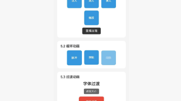
5.3 自定义宽度与控制
通过 ref 控制轮播跳转。
适用场景: 需要手动控制轮播的场景。
import React, { useRef } from 'react';
import { View, Text, StyleSheet, TouchableOpacity } from 'react-native';
import Carousel from '@react-native-oh-tpl/react-native-snap-carousel';

const SLIDER_WIDTH = 320;
const ITEM_WIDTH = 280;

const IMAGE_DATA = [
  { id: 1, url: 'https://picsum.photos/400/250?random=1' },
  { id: 2, url: 'https://picsum.photos/400/250?random=2' },
  { id: 3, url: 'https://picsum.photos/400/250?random=3' },
  { id: 4, url: 'https://picsum.photos/400/250?random=4' },
];

const CustomWidthDemo = () => {
  const carouselRef = useRef<Carousel<any>>(null);

  const renderItem = ({ item }: { item: any }) => (
    <View style={styles.imageItem}>
      <Text style={styles.imageText}>图片 {item.id}</Text>
    </View>
  );

  return (
    <View style={styles.container}>
      <Carousel
        ref={carouselRef}
        data={IMAGE_DATA}
        renderItem={renderItem}
        sliderWidth={SLIDER_WIDTH}
        itemWidth={ITEM_WIDTH}
        inactiveSlideScale={0.94}
        inactiveSlideOpacity={0.7}
        enableMomentum={false}
        lockScrollWhileSnapping={true}
      />
      <View style={styles.buttonRow}>
        <TouchableOpacity
          style={[styles.button, styles.prevButton]}
          onPress={() => carouselRef.current?.snapToPrev()}
        >
          <Text style={styles.buttonText}>上一个</Text>
        </TouchableOpacity>
        <TouchableOpacity
          style={[styles.button, styles.nextButton]}
          onPress={() => carouselRef.current?.snapToNext()}
        >
          <Text style={styles.buttonText}>下一个</Text>
        </TouchableOpacity>
      </View>
    </View>
  );
};

const styles = StyleSheet.create({
  container: {
    flex: 1,
    justifyContent: 'center',
    alignItems: 'center',
    paddingVertical: 40,
  },
  imageItem: {
    width: ITEM_WIDTH,
    height: 180,
    borderRadius: 12,
    backgroundColor: '#e0e0e0',
    justifyContent: 'center',
    alignItems: 'center',
  },
  imageText: {
    fontSize: 24,
    fontWeight: 'bold',
    color: '#666',
  },
  buttonRow: {
    flexDirection: 'row',
    marginTop: 20,
    gap: 16,
  },
  button: {
    paddingHorizontal: 28,
    paddingVertical: 12,
    borderRadius: 24,
  },
  prevButton: {
    backgroundColor: '#FF6B6B',
  },
  nextButton: {
    backgroundColor: '#4ECDC4',
  },
  buttonText: {
    fontSize: 15,
    fontWeight: '600',
    color: '#fff',
  },
});

export default CustomWidthDemo;
代码解析:
- 使用
useRef创建轮播引用 - 通过
carouselRef.current?.snapToPrev()跳转到上一项 - 通过
carouselRef.current?.snapToNext()跳转到下一项 - 使用固定宽度
SLIDER_WIDTH和ITEM_WIDTH
❓ 六、常见问题
6.1 遗留问题
⚠️ 重要提示:当前版本在 HarmonyOS 平台上暂无已知遗留问题。
6.2 常见问题解答
Q1: 为什么轮播不显示?
A: 确保设置了 sliderWidth 和 itemWidth 属性,且值正确。
Q2: 如何实现垂直轮播?
A: 设置 sliderHeight 和 itemHeight 属性,并使用 horizontal={false}。
Q3: 循环模式下数据量有要求吗?
A: 循环模式下建议数据量不少于 3 条,否则效果不佳。
Q4: Stack/Tinder 布局性能问题?
A: 这两种布局会预渲染所有项目,大数据集建议使用 default 布局。
Q5: 报错 “inputRange must be monotonically non-decreasing”?
A: 这是 HarmonyOS 平台上 RTL(从右到左布局)适配的问题。在 HarmonyOS 上,I18nManager.isRTL 可能返回 true,导致索引被反转,从而使 inputRange 变成递减的。
解决方案:
-
避免使用
stack和tinder布局:这两种布局使用内置插值器,在 RTL 模式下会报错。HarmonyOS 平台暂不支持这两种布局,请使用默认的default布局。 -
使用推荐的动画参数:
<Carousel
  data={DATA}
  renderItem={renderItem}
  sliderWidth={360}
  itemWidth={300}
  inactiveSlideScale={0.94}
  inactiveSlideOpacity={0.7}
  enableMomentum={false}
  lockScrollWhileSnapping={true}
/>
6.3 最佳实践
- 宽度设置:
itemWidth应小于sliderWidth,留出边距 - 动画流畅:使用
inactiveSlideScale和inactiveSlideOpacity增强效果 - 自动播放:建议配合
loop={true}使用 - 性能优化:大数据集使用 default 布局
💻 七、完整示例代码

综合示例
本示例整合了前面所有章节的功能点,包括:基础轮播、无限循环、自定义宽度控制等。
import React, { useState, useRef } from 'react';
import {
  View,
  Text,
  StyleSheet,
  SafeAreaView,
  ScrollView,
  TouchableOpacity,
  Image,
} from 'react-native';
import Carousel from '@react-native-oh-tpl/react-native-snap-carousel';

const SLIDER_WIDTH = 320;
const ITEM_WIDTH = 280;

const BANNER_DATA = [
  { id: 1, title: '新品上市', subtitle: '限时优惠', color: '#FF6B6B' },
  { id: 2, title: '会员专享', subtitle: '积分翻倍', color: '#4ECDC4' },
  { id: 3, title: '爆款推荐', subtitle: '热销榜单', color: '#45B7D1' },
  { id: 4, title: '品牌特卖', subtitle: '低至5折', color: '#96CEB4' },
];

const IMAGE_DATA = [
  { id: 1, url: 'https://picsum.photos/400/250?random=1' },
  { id: 2, url: 'https://picsum.photos/400/250?random=2' },
  { id: 3, url: 'https://picsum.photos/400/250?random=3' },
  { id: 4, url: 'https://picsum.photos/400/250?random=4' },
];

type BannerItem = { id: number; title: string; subtitle: string; color: string };
type ImageItem = { id: number; url: string };

const BasicDemo = () => {
  const [activeIndex, setActiveIndex] = useState(0);

  const renderItem = ({ item }: { item: ImageItem }) => (
    <View style={styles.imageItem}>
      <Image source={{ uri: item.url }} style={styles.carouselImage} />
    </View>
  );

  return (
    <View style={styles.section}>
      <Text style={styles.sectionTitle}>5.1 基础轮播</Text>
      <Carousel
        data={IMAGE_DATA}
        renderItem={renderItem}
        sliderWidth={SLIDER_WIDTH}
        itemWidth={ITEM_WIDTH}
        inactiveSlideScale={0.94}
        inactiveSlideOpacity={0.7}
        enableMomentum={false}
        lockScrollWhileSnapping={true}
        onSnapToItem={setActiveIndex}
      />
      <View style={styles.indicatorRow}>
        {IMAGE_DATA.map((_, index) => (
          <View
            key={index}
            style={[
              styles.indicator,
              activeIndex === index && styles.activeIndicator,
            ]}
          />
        ))}
      </View>
    </View>
  );
};

const LoopDemo = () => {
  const renderItem = ({ item }: { item: BannerItem }) => (
    <View style={[styles.bannerItem, { backgroundColor: item.color }]}>
      <Text style={styles.bannerTitle}>{item.title}</Text>
      <Text style={styles.bannerSubtitle}>{item.subtitle}</Text>
    </View>
  );

  return (
    <View style={styles.section}>
      <Text style={styles.sectionTitle}>5.2 无限循环轮播</Text>
      <Carousel
        data={BANNER_DATA}
        renderItem={renderItem}
        sliderWidth={SLIDER_WIDTH}
        itemWidth={ITEM_WIDTH}
        loop={true}
        autoplay={true}
        autoplayInterval={2000}
        inactiveSlideScale={0.94}
        inactiveSlideOpacity={0.7}
        enableMomentum={false}
        lockScrollWhileSnapping={true}
      />
    </View>
  );
};

const CustomWidthDemo = () => {
  const carouselRef = useRef<Carousel<ImageItem>>(null);

  const renderItem = ({ item }: { item: ImageItem }) => (
    <View style={styles.imageItem}>
      <Image source={{ uri: item.url }} style={styles.carouselImage} />
    </View>
  );

  return (
    <View style={styles.section}>
      <Text style={styles.sectionTitle}>5.3 自定义宽度与控制</Text>
      <Carousel
        ref={carouselRef}
        data={IMAGE_DATA}
        renderItem={renderItem}
        sliderWidth={SLIDER_WIDTH}
        itemWidth={280}
        inactiveSlideScale={0.94}
        inactiveSlideOpacity={0.7}
        enableMomentum={false}
        lockScrollWhileSnapping={true}
      />
      <View style={styles.buttonRow}>
        <TouchableOpacity
          style={[styles.navButton, styles.prevButton]}
          onPress={() => carouselRef.current?.snapToPrev()}
        >
          <Text style={styles.navButtonText}>上一个</Text>
        </TouchableOpacity>
        <TouchableOpacity
          style={[styles.navButton, styles.nextButton]}
          onPress={() => carouselRef.current?.snapToNext()}
        >
          <Text style={styles.navButtonText}>下一个</Text>
        </TouchableOpacity>
      </View>
    </View>
  );
};

export default function App() {
  return (
    <SafeAreaView style={styles.container}>
      <ScrollView contentContainerStyle={styles.content}>
        <Text style={styles.title}>SnapCarousel 组件示例</Text>
        <Text style={styles.subtitle}>
          流畅的轮播组件,支持多种布局模式
        </Text>

        <BasicDemo />
        <LoopDemo />
        <CustomWidthDemo />

        <View style={styles.infoSection}>
          <Text style={styles.infoTitle}>功能说明</Text>
          <Text style={styles.infoText}>• 5.1 基础轮播:图片轮播展示</Text>
          <Text style={styles.infoText}>• 5.2 无限循环:自动播放循环</Text>
          <Text style={styles.infoText}>• 5.3 自定义宽度:通过 ref 控制跳转</Text>
        </View>
      </ScrollView>
    </SafeAreaView>
  );
}

const styles = StyleSheet.create({
  container: {
    flex: 1,
    backgroundColor: '#f5f5f5',
  },
  content: {
    padding: 16,
  },
  title: {
    fontSize: 24,
    fontWeight: 'bold',
    color: '#333',
    textAlign: 'center',
  },
  subtitle: {
    fontSize: 14,
    color: '#666',
    textAlign: 'center',
    marginTop: 8,
    marginBottom: 24,
  },
  section: {
    backgroundColor: '#fff',
    borderRadius: 12,
    padding: 16,
    marginBottom: 16,
  },
  sectionTitle: {
    fontSize: 16,
    fontWeight: '600',
    color: '#333',
    marginBottom: 12,
  },
  imageItem: {
    borderRadius: 12,
    overflow: 'hidden',
  },
  carouselImage: {
    width: '100%',
    height: 180,
    resizeMode: 'cover',
  },
  indicatorRow: {
    flexDirection: 'row',
    justifyContent: 'center',
    marginTop: 12,
    gap: 6,
  },
  indicator: {
    width: 8,
    height: 8,
    borderRadius: 4,
    backgroundColor: '#ddd',
  },
  activeIndicator: {
    backgroundColor: '#007AFF',
    width: 20,
  },
  bannerItem: {
    width: ITEM_WIDTH,
    height: 140,
    borderRadius: 16,
    padding: 20,
    justifyContent: 'center',
  },
  bannerTitle: {
    fontSize: 22,
    fontWeight: 'bold',
    color: '#fff',
  },
  bannerSubtitle: {
    fontSize: 14,
    color: 'rgba(255,255,255,0.9)',
    marginTop: 6,
  },
  buttonRow: {
    flexDirection: 'row',
    justifyContent: 'center',
    marginTop: 16,
    gap: 16,
  },
  navButton: {
    paddingHorizontal: 28,
    paddingVertical: 12,
    borderRadius: 24,
  },
  prevButton: {
    backgroundColor: '#FF6B6B',
  },
  nextButton: {
    backgroundColor: '#4ECDC4',
  },
  navButtonText: {
    fontSize: 15,
    fontWeight: '600',
    color: '#fff',
  },
  infoSection: {
    backgroundColor: '#e8f4ff',
    borderRadius: 12,
    padding: 16,
    marginTop: 8,
  },
  infoTitle: {
    fontSize: 16,
    fontWeight: '600',
    color: '#007AFF',
    marginBottom: 8,
  },
  infoText: {
    fontSize: 14,
    color: '#333',
    lineHeight: 22,
  },
});

作为“人工智能6S店”的官方数字引擎,为AI开发者与企业提供一个覆盖软硬件全栈、一站式门户。
更多推荐

 2
2 0
0- 0


 已为社区贡献21条内容

所有评论(0)