
ReactNative for OpenHarmony项目鸿蒙化三方库:react-native-animatable — 动画组件
欢迎加入开源鸿蒙跨平台社区:https://openharmonycrossplatform.csdn.net📌:本文基于 React Native 0.72.90 版本进行开发适配。
欢迎加入开源鸿蒙跨平台社区:https://openharmonycrossplatform.csdn.net
📌 开发环境声明:本文基于 React Native 0.72.90 版本进行开发适配
🚀 一、开篇引言
动画是提升用户体验的重要手段,流畅的动画效果能让应用更加生动有趣。react-native-animatable 是 React Native 社区中广受欢迎的动画库,提供了大量预设动画效果,支持声明式动画配置,无需复杂的 Animated API 即可实现丰富的动画效果。本文将带你深入了解如何在 HarmonyOS 平台上集成和使用这个实用的动画组件库。
1.1 你将学到什么?
- ✅ Animatable 的核心概念与工作原理
- ✅ HarmonyOS 平台的完整集成流程
- ✅ 基础动画与过渡效果
- ✅ API 属性的深度解析
- ✅ 实际应用场景的最佳实践
1.2 适用人群
- 正在进行 React Native 鸿蒙化迁移的开发者
- 需要快速实现动画效果的开发者
- 对跨平台动画组件开发感兴趣的技术爱好者
1.3 为什么选择 Animatable?
| 特点 | 说明 |
|---|---|
| 预设动画 | 60+ 种预设动画效果 |
| 声明式配置 | 无需复杂代码,属性配置即可 |
| 跨平台一致 | iOS、Android、HarmonyOS 表现一致 |
| 灵活扩展 | 支持自定义动画和过渡效果 |
| 原生驱动 | 支持 useNativeDriver 提升性能 |
📦 二、库概览
2.1 基本信息
| 项目 | 内容 |
|---|---|
| 库名称 | react-native-animatable |
| 版本信息 | 1.4.0 |
| 官方仓库 | https://github.com/oblador/react-native-animatable |
| 开源协议 | MIT |
2.2 版本兼容性
| 三方库版本 | 支持RN版本 |
|---|---|
| 1.4.0 | 0.72 / 0.77 |
2.3 核心能力矩阵
| 能力项 | 描述 | HarmonyOS 支持 |
|---|---|---|
| 预设动画 | animation 属性 | ✅ 完全支持 |
| 过渡动画 | transition 属性 | ✅ 完全支持 |
| 动画控制 | duration、delay | ✅ 完全支持 |
| 循环动画 | iterationCount | ✅ 完全支持 |
| 缓动函数 | easing 属性 | ✅ 完全支持 |
| 原生驱动 | useNativeDriver | ✅ 完全支持 |
| 回调事件 | onAnimationEnd | ✅ 完全支持 |
2.4 技术架构图
2.5 典型应用场景
| 场景 | 描述 | 示例 |
|---|---|---|
| 入场动画 | 元素进入视图 | 🎬 淡入、滑入、弹入 |
| 退场动画 | 元素离开视图 | 🚪 淡出、滑出、缩小 |
| 交互动画 | 用户操作反馈 | 👆 点击缩放、摇晃 |
| 过渡动画 | 状态变化过渡 | 🔄 颜色、尺寸变化 |
| 循环动画 | 持续动画效果 | 🔁 旋转、弹跳、脉冲 |
📖 三、安装与配置
3.1 安装依赖
进入到工程目录并输入以下命令:
npm install react-native-animatable@1.4.0
或使用 yarn:
yarn add react-native-animatable@1.4.0
3.2 验证安装
安装完成后,检查 package.json 文件中是否包含以下依赖:
{
  "dependencies": {
    "react-native-animatable": "1.4.0"
  }
}
3.3 基本导入
import * as Animatable from 'react-native-animatable';
📖 四、API 详解
4.1 Animatable 组件
库提供了三个基础动画组件:
| 组件 | 说明 |
|---|---|
| Animatable.View | 动画视图容器 |
| Animatable.Text | 动画文本 |
| Animatable.Image | 动画图片 |
import * as Animatable from 'react-native-animatable';

<Animatable.View animation="fadeIn">
  <Text>淡入动画</Text>
</Animatable.View>
4.2 createAnimatableComponent
创建自定义动画组件的工厂函数。
签名:
createAnimatableComponent(Component: ComponentType): AnimatableComponent
用法:
import * as Animatable from 'react-native-animatable';
import { TouchableOpacity } from 'react-native';

const AnimatableTouchableOpacity = Animatable.createAnimatableComponent(TouchableOpacity);

<AnimatableTouchableOpacity animation="bounceIn">
  <Text>可动画的按钮</Text>
</AnimatableTouchableOpacity>
4.3 属性详解
animation - 动画名称
指定要播放的预设动画名称。
类型: string
常用动画:
| 类别 | 动画名称 |
|---|---|
| 淡入 | fadeIn, fadeInDown, fadeInUp, fadeInLeft, fadeInRight |
| 淡出 | fadeOut, fadeOutDown, fadeOutUp, fadeOutLeft, fadeOutRight |
| 滑入 | slideInDown, slideInUp, slideInLeft, slideInRight |
| 滑出 | slideOutDown, slideOutUp, slideOutLeft, slideOutRight |
| 弹入 | bounceIn, bounceInDown, bounceInUp, bounceInLeft, bounceInRight |
| 弹出 | bounceOut, bounceOutDown, bounceOutUp, bounceOutLeft, bounceOutRight |
| 缩放 | zoomIn, zoomOut, zoomInDown, zoomOutDown |
| 其他 | shake, wobble, swing, pulse, flash, jello, rubberBand |
<Animatable.View animation="bounceIn">
  <Text>弹入动画</Text>
</Animatable.View>
duration - 动画时长
动画持续的时间(毫秒)。
类型: number
默认值: 1000
<Animatable.View animation="fadeIn" duration={2000}>
  <Text>2秒淡入</Text>
</Animatable.View>
delay - 动画延迟
动画开始前的延迟时间(毫秒)。
类型: number
默认值: 0
<Animatable.View animation="fadeIn" delay={500}>
  <Text>延迟0.5秒后开始</Text>
</Animatable.View>
direction - 动画方向
动画播放的方向。
类型: 'normal' | 'reverse' | 'alternate' | 'alternate-reverse'
默认值: 'normal'
<Animatable.View animation="slideInRight" direction="reverse">
  <Text>反向滑入</Text>
</Animatable.View>
iterationCount - 循环次数
动画重复播放的次数。
类型: number | 'infinite'
默认值: 1
<Animatable.View animation="pulse" iterationCount="infinite">
  <Text>无限脉冲</Text>
</Animatable.View>
iterationDelay - 循环延迟
每次循环之间的延迟时间(毫秒)。
类型: number
默认值: 0
<Animatable.View animation="bounce" iterationCount={3} iterationDelay={500}>
  <Text>每次弹跳间隔0.5秒</Text>
</Animatable.View>
easing - 缓动函数
动画的时间曲线函数。
类型: string | function
预设值:
| 名称 | 效果 |
|---|---|
| linear | 线性 |
| ease | 默认缓动 |
| ease-in | 渐入 |
| ease-out | 渐出 |
| ease-in-out | 渐入渐出 |
<Animatable.View animation="slideInRight" easing="ease-out">
  <Text>渐出缓动</Text>
</Animatable.View>
transition - 过渡属性
指定需要过渡动画的样式属性。
类型: string | string[]
支持属性: opacity, backgroundColor, fontSize, rotation, scale, etc.
<Animatable.View transition="backgroundColor" style={{ backgroundColor: 'red' }}>
  <Text>背景色过渡</Text>
</Animatable.View>
useNativeDriver - 原生驱动
是否使用原生动画驱动。
类型: boolean
默认值: false
<Animatable.View animation="fadeIn" useNativeDriver={true}>
  <Text>原生驱动动画</Text>
</Animatable.View>
isInteraction - 交互句柄
是否在 InteractionManager 上创建交互句柄。
类型: boolean
默认值: false
<Animatable.View animation="fadeIn" isInteraction={true}>
  <Text>交互动画</Text>
</Animatable.View>
onAnimationBegin - 动画开始回调
动画开始时调用的函数。
类型: () => void
<Animatable.View
  animation="fadeIn"
  onAnimationBegin={() => console.log('动画开始')}
>
  <Text>淡入</Text>
</Animatable.View>
onAnimationEnd - 动画结束回调
动画结束时调用的函数。
类型: (endState: { finished: boolean }) => void
<Animatable.View
  animation="fadeIn"
  onAnimationEnd={(endState) => {
    if (endState.finished) {
      console.log('动画正常结束');
    }
  }}
>
  <Text>淡入</Text>
</Animatable.View>
onTransitionBegin - 过渡开始回调
过渡动画开始时调用的函数。
类型: (property: string) => void
<Animatable.View
  transition="opacity"
  onTransitionBegin={(prop) => console.log(`${prop} 过渡开始`)}
>
  <Text>透明度过渡</Text>
</Animatable.View>
onTransitionEnd - 过渡结束回调
过渡动画结束时调用的函数。
类型: (property: string) => void
<Animatable.View
  transition="opacity"
  onTransitionEnd={(prop) => console.log(`${prop} 过渡结束`)}
>
  <Text>透明度过渡</Text>
</Animatable.View>
💡 五、使用示例
5.1 基础动画
展示常用的入场动画效果。
适用场景: 页面元素入场、内容展示。
import React from 'react';
import { View, Text, StyleSheet, TouchableOpacity } from 'react-native';
import * as Animatable from 'react-native-animatable';

const BasicAnimation = () => {
  return (
    <View style={styles.container}>
      <Animatable.View animation="fadeIn" style={styles.box}>
        <Text style={styles.text}>淡入 fadeIn</Text>
      </Animatable.View>

      <Animatable.View animation="slideInRight" style={styles.box}>
        <Text style={styles.text}>右滑入 slideInRight</Text>
      </Animatable.View>

      <Animatable.View animation="bounceIn" style={styles.box}>
        <Text style={styles.text}>弹入 bounceIn</Text>
      </Animatable.View>

      <Animatable.View animation="zoomIn" style={styles.box}>
        <Text style={styles.text}>缩放 zoomIn</Text>
      </Animatable.View>
    </View>
  );
};

const styles = StyleSheet.create({
  container: {
    flex: 1,
    justifyContent: 'center',
    alignItems: 'center',
    padding: 20,
    gap: 20,
  },
  box: {
    width: 200,
    height: 60,
    backgroundColor: '#3498db',
    borderRadius: 8,
    justifyContent: 'center',
    alignItems: 'center',
  },
  text: {
    color: '#fff',
    fontSize: 16,
    fontWeight: '600',
  },
});

export default BasicAnimation;
代码解析:
animation属性指定预设动画名称- 支持淡入、滑入、弹入、缩放等多种效果
- 动画自动在组件挂载时播放
5.2 循环动画
实现持续播放的动画效果。
适用场景: 加载指示、注意力引导。
import React from 'react';
import { View, Text, StyleSheet } from 'react-native';
import * as Animatable from 'react-native-animatable';

const LoopAnimation = () => {
  return (
    <View style={styles.container}>
      <Animatable.View
        animation="pulse"
        iterationCount="infinite"
        style={styles.box}
      >
        <Text style={styles.text}>脉冲 pulse</Text>
      </Animatable.View>

      <Animatable.View
        animation="bounce"
        iterationCount="infinite"
        iterationDelay={300}
        style={styles.box}
      >
        <Text style={styles.text}>弹跳 bounce</Text>
      </Animatable.View>

      <Animatable.View
        animation="rotate"
        iterationCount="infinite"
        easing="linear"
        style={styles.box}
      >
        <Text style={styles.text}>旋转 rotate</Text>
      </Animatable.View>

      <Animatable.View
        animation="flash"
        iterationCount="infinite"
        duration={800}
        style={styles.box}
      >
        <Text style={styles.text}>闪烁 flash</Text>
      </Animatable.View>
    </View>
  );
};

const styles = StyleSheet.create({
  container: {
    flex: 1,
    justifyContent: 'center',
    alignItems: 'center',
    padding: 20,
    gap: 20,
  },
  box: {
    width: 150,
    height: 60,
    backgroundColor: '#e74c3c',
    borderRadius: 8,
    justifyContent: 'center',
    alignItems: 'center',
  },
  text: {
    color: '#fff',
    fontSize: 16,
    fontWeight: '600',
  },
});

export default LoopAnimation;
代码解析:
iterationCount="infinite"设置无限循环iterationDelay设置循环间隔easing="linear"使旋转动画更平滑
5.3 过渡动画
实现样式属性的平滑过渡。
适用场景: 状态变化、主题切换。
import React, { useState } from 'react';
import { View, Text, StyleSheet, TouchableOpacity } from 'react-native';
import * as Animatable from 'react-native-animatable';

const TransitionAnimation = () => {
  const [fontSize, setFontSize] = useState(16);
  const [bgColor, setBgColor] = useState('#3498db');
  const [opacity, setOpacity] = useState(1);

  const increaseFontSize = () => {
    setFontSize((prev) => (prev >= 32 ? 16 : prev + 4));
  };

  const changeColor = () => {
    const colors = ['#3498db', '#e74c3c', '#2ecc71', '#9b59b6'];
    const currentIndex = colors.indexOf(bgColor);
    const nextIndex = (currentIndex + 1) % colors.length;
    setBgColor(colors[nextIndex]);
  };

  const toggleOpacity = () => {
    setOpacity((prev) => (prev === 1 ? 0.3 : 1));
  };

  return (
    <View style={styles.container}>
      <Animatable.Text
        transition="fontSize"
        style={[styles.demoText, { fontSize }]}
      >
        字体大小过渡
      </Animatable.Text>
      <TouchableOpacity style={styles.button} onPress={increaseFontSize}>
        <Text style={styles.buttonText}>改变字体大小</Text>
      </TouchableOpacity>

      <Animatable.View
        transition="backgroundColor"
        style={[styles.colorBox, { backgroundColor: bgColor }]}
      >
        <Text style={styles.text}>背景色过渡</Text>
      </Animatable.View>
      <TouchableOpacity style={styles.button} onPress={changeColor}>
        <Text style={styles.buttonText}>改变背景色</Text>
      </TouchableOpacity>

      <Animatable.View
        transition="opacity"
        style={[styles.opacityBox, { opacity }]}
      >
        <Text style={styles.text}>透明度过渡</Text>
      </Animatable.View>
      <TouchableOpacity style={styles.button} onPress={toggleOpacity}>
        <Text style={styles.buttonText}>改变透明度</Text>
      </TouchableOpacity>
    </View>
  );
};

const styles = StyleSheet.create({
  container: {
    flex: 1,
    justifyContent: 'center',
    alignItems: 'center',
    padding: 20,
    gap: 12,
  },
  demoText: {
    color: '#333',
    fontWeight: '600',
    marginBottom: 8,
  },
  colorBox: {
    width: 150,
    height: 50,
    borderRadius: 8,
    justifyContent: 'center',
    alignItems: 'center',
  },
  opacityBox: {
    width: 150,
    height: 50,
    backgroundColor: '#2ecc71',
    borderRadius: 8,
    justifyContent: 'center',
    alignItems: 'center',
  },
  text: {
    color: '#fff',
    fontSize: 16,
    fontWeight: '600',
  },
  button: {
    backgroundColor: '#333',
    paddingHorizontal: 20,
    paddingVertical: 10,
    borderRadius: 8,
    marginBottom: 16,
  },
  buttonText: {
    color: '#fff',
    fontSize: 14,
  },
});

export default TransitionAnimation;
代码解析:
transition指定需要过渡的样式属性- 状态变化时自动触发过渡动画
- 支持多属性同时过渡
5.4 动画回调
使用动画回调实现动画序列。
适用场景: 复杂动画编排、动画链。
import React, { useRef } from 'react';
import { View, Text, StyleSheet, TouchableOpacity } from 'react-native';
import * as Animatable from 'react-native-animatable';

const CallbackAnimation = () => {
  const viewRef = useRef<Animatable.View>(null);

  const playSequence = () => {
    if (viewRef.current) {
      viewRef.current
        .animate('bounceIn', 800)
        .then(() => viewRef.current?.animate('pulse', 500))
        .then(() => viewRef.current?.animate('shake', 500))
        .then(() => viewRef.current?.animate('bounceOut', 800))
        .then(() => viewRef.current?.animate('fadeIn', 500));
    }
  };

  return (
    <View style={styles.container}>
      <Animatable.View
        ref={viewRef}
        animation="fadeIn"
        style={styles.box}
        onAnimationBegin={() => console.log('动画开始')}
        onAnimationEnd={(endState) => {
          if (endState.finished) {
            console.log('动画完成');
          }
        }}
      >
        <Text style={styles.text}>动画序列演示</Text>
      </Animatable.View>

      <TouchableOpacity style={styles.button} onPress={playSequence}>
        <Text style={styles.buttonText}>播放动画序列</Text>
      </TouchableOpacity>
    </View>
  );
};

const styles = StyleSheet.create({
  container: {
    flex: 1,
    justifyContent: 'center',
    alignItems: 'center',
    padding: 20,
    gap: 30,
  },
  box: {
    width: 200,
    height: 100,
    backgroundColor: '#9b59b6',
    borderRadius: 12,
    justifyContent: 'center',
    alignItems: 'center',
  },
  text: {
    color: '#fff',
    fontSize: 18,
    fontWeight: '600',
  },
  button: {
    backgroundColor: '#333',
    paddingHorizontal: 24,
    paddingVertical: 12,
    borderRadius: 8,
  },
  buttonText: {
    color: '#fff',
    fontSize: 16,
  },
});

export default CallbackAnimation;
代码解析:
ref获取组件引用,调用animate方法animate返回 Promise,支持链式调用onAnimationBegin/End监听动画生命周期
六、常见问题
6.1 遗留问题
⚠️ 重要提示:当前版本在 HarmonyOS 平台上暂无已知遗留问题。
6.2 常见问题解答
Q1: 动画不生效怎么办?
A: 确保动画名称拼写正确,检查是否使用了支持的动画类型。
Q2: 如何实现动画序列?
A: 使用 ref 获取组件引用,通过 animate 方法的 Promise 链式调用。
Q3: 如何停止正在播放的动画?
A: 调用 ref.current.stopAnimation() 方法停止当前动画。
Q4: useNativeDriver 有什么限制?
A: 原生驱动只支持 transform 和 opacity 属性的动画。
6.3 最佳实践
- 性能优化:对于简单动画使用
useNativeDriver - 动画时长:保持动画时长在 300-1000ms 之间
- 合理使用:避免过多同时播放的动画
- 用户体验:动画应增强而非干扰用户体验
💻 七、完整示例代码
综合示例
本示例整合了前面所有章节的功能点,包括:基础动画、循环动画、过渡动画、动画回调等。
import React, { useState, useRef } from 'react';
import {
View,
Text,
StyleSheet,
SafeAreaView,
ScrollView,
TouchableOpacity,
} from 'react-native';
import * as Animatable from 'react-native-animatable';
const BasicDemo = () => {
const [key, setKey] = useState(0);
const replay = () => setKey((prev) => prev + 1);
return (
<View style={styles.section}>
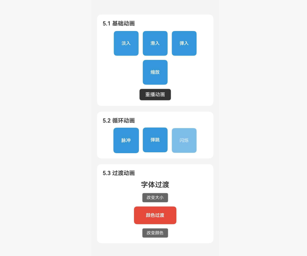
<Text style={styles.sectionTitle}>5.1 基础动画</Text>
<View style={styles.row}>
<Animatable.View key={`fade-${key}`} animation="fadeIn" style={styles.animBox}>
<Text style={styles.animText}>淡入</Text>
</Animatable.View>
<Animatable.View key={`slide-${key}`} animation="slideInRight" style={styles.animBox}>
<Text style={styles.animText}>滑入</Text>
</Animatable.View>
<Animatable.View key={`bounce-${key}`} animation="bounceIn" style={styles.animBox}>
<Text style={styles.animText}>弹入</Text>
</Animatable.View>
<Animatable.View key={`zoom-${key}`} animation="zoomIn" style={styles.animBox}>
<Text style={styles.animText}>缩放</Text>
</Animatable.View>
</View>
<TouchableOpacity style={styles.replayBtn} onPress={replay}>
<Text style={styles.replayText}>重播动画</Text>
</TouchableOpacity>
</View>
);
};
const LoopDemo = () => {
return (
<View style={styles.section}>
<Text style={styles.sectionTitle}>5.2 循环动画</Text>
<View style={styles.row}>
<Animatable.View
animation="pulse"
iterationCount="infinite"
style={styles.animBox}
>
<Text style={styles.animText}>脉冲</Text>
</Animatable.View>
<Animatable.View
animation="bounce"
iterationCount="infinite"
iterationDelay={200}
style={styles.animBox}
>
<Text style={styles.animText}>弹跳</Text>
</Animatable.View>
<Animatable.View
animation="flash"
iterationCount="infinite"
duration={600}
style={styles.animBox}
>
<Text style={styles.animText}>闪烁</Text>
</Animatable.View>
</View>
</View>
);
};
const TransitionDemo = () => {
const [fontSize, setFontSize] = useState(16);
const [bgColor, setBgColor] = useState('#3498db');
const colors = ['#3498db', '#e74c3c', '#2ecc71', '#9b59b6'];
return (
<View style={styles.section}>
<Text style={styles.sectionTitle}>5.3 过渡动画</Text>
<View style={styles.transitionContainer}>
<Animatable.Text
transition="fontSize"
style={[styles.transitionText, { fontSize }]}
>
字体过渡
</Animatable.Text>
<TouchableOpacity
style={styles.smallBtn}
onPress={() => setFontSize((prev) => (prev >= 28 ? 16 : prev + 4))}
>
<Text style={styles.smallBtnText}>改变大小</Text>
</TouchableOpacity>
<Animatable.View
transition="backgroundColor"
style={[styles.colorBox, { backgroundColor: bgColor }]}
>
<Text style={styles.animText}>颜色过渡</Text>
</Animatable.View>
<TouchableOpacity
style={styles.smallBtn}
onPress={() => {
const idx = colors.indexOf(bgColor);
setBgColor(colors[(idx + 1) % colors.length]);
}}
>
<Text style={styles.smallBtnText}>改变颜色</Text>
</TouchableOpacity>
</View>
</View>
);
};
const CallbackDemo = () => {
const viewRef = useRef<Animatable.View>(null);
const [status, setStatus] = useState('等待开始');
const playSequence = () => {
setStatus('动画序列开始');
if (viewRef.current) {
viewRef.current
.animate('bounceIn', 600)
.then(() => {
setStatus('弹入完成,开始脉冲');
return viewRef.current?.animate('pulse', 400);
})
.then(() => {
setStatus('脉冲完成,开始摇晃');
return viewRef.current?.animate('shake', 400);
})
.then(() => {
setStatus('动画序列完成');
});
}
};
return (
<View style={styles.section}>
<Text style={styles.sectionTitle}>5.4 动画回调</Text>
<Animatable.View ref={viewRef} style={styles.callbackBox}>
<Text style={styles.animText}>动画序列</Text>
</Animatable.View>
<Text style={styles.statusText}>{status}</Text>
<TouchableOpacity style={styles.replayBtn} onPress={playSequence}>
<Text style={styles.replayText}>播放序列</Text>
</TouchableOpacity>
</View>
);
};
export default function App() {
return (
<SafeAreaView style={styles.container}>
<ScrollView contentContainerStyle={styles.content}>
<Text style={styles.title}>Animatable 组件示例</Text>
<Text style={styles.subtitle}>
声明式动画库,提供丰富的预设动画效果
</Text>
<BasicDemo />
<LoopDemo />
<TransitionDemo />
<CallbackDemo />
<View style={styles.infoSection}>
<Text style={styles.infoTitle}>功能说明</Text>
<Text style={styles.infoText}>• 5.1 基础动画:淡入、滑入、弹入、缩放</Text>
<Text style={styles.infoText}>• 5.2 循环动画:脉冲、弹跳、闪烁</Text>
<Text style={styles.infoText}>• 5.3 过渡动画:字体、颜色平滑过渡</Text>
<Text style={styles.infoText}>• 5.4 动画回调:动画序列编排</Text>
</View>
</ScrollView>
</SafeAreaView>
);
}
const styles = StyleSheet.create({
container: {
flex: 1,
backgroundColor: '#f5f5f5',
},
content: {
padding: 16,
},
title: {
fontSize: 24,
fontWeight: 'bold',
color: '#333',
textAlign: 'center',
},
subtitle: {
fontSize: 14,
color: '#666',
textAlign: 'center',
marginTop: 8,
marginBottom: 24,
},
section: {
backgroundColor: '#fff',
borderRadius: 12,
padding: 16,
marginBottom: 16,
},
sectionTitle: {
fontSize: 16,
fontWeight: '600',
color: '#333',
marginBottom: 12,
},
row: {
flexDirection: 'row',
flexWrap: 'wrap',
gap: 12,
justifyContent: 'center',
},
animBox: {
width: 70,
height: 70,
backgroundColor: '#3498db',
borderRadius: 8,
justifyContent: 'center',
alignItems: 'center',
},
animText: {
color: '#fff',
fontSize: 13,
fontWeight: '600',
},
replayBtn: {
backgroundColor: '#333',
paddingHorizontal: 16,
paddingVertical: 8,
borderRadius: 6,
alignSelf: 'center',
marginTop: 12,
},
replayText: {
color: '#fff',
fontSize: 14,
},
transitionContainer: {
alignItems: 'center',
gap: 12,
},
transitionText: {
color: '#333',
fontWeight: '600',
},
smallBtn: {
backgroundColor: '#666',
paddingHorizontal: 12,
paddingVertical: 6,
borderRadius: 4,
},
smallBtnText: {
color: '#fff',
fontSize: 12,
},
colorBox: {
width: 120,
height: 50,
borderRadius: 8,
justifyContent: 'center',
alignItems: 'center',
},
callbackBox: {
width: 150,
height: 80,
backgroundColor: '#9b59b6',
borderRadius: 12,
justifyContent: 'center',
alignItems: 'center',
alignSelf: 'center',
},
statusText: {
fontSize: 14,
color: '#666',
marginTop: 12,
textAlign: 'center',
},
infoSection: {
backgroundColor: '#e8f4ff',
borderRadius: 12,
padding: 16,
marginTop: 8,
},
infoTitle: {
fontSize: 16,
fontWeight: '600',
color: '#007AFF',
marginBottom: 8,
},
infoText: {
fontSize: 14,
color: '#333',
lineHeight: 22,
},
});
🔗 八、相关资源

作为“人工智能6S店”的官方数字引擎,为AI开发者与企业提供一个覆盖软硬件全栈、一站式门户。
更多推荐

 1
1 0
0- 0


 已为社区贡献21条内容

所有评论(0)