
【Flutter For OpenHarmony第三方库】Flutter 三方库 shimmer 的鸿蒙化适配与动效集成实践
在跨平台开发中,引入第三方库的决策从来不是一件轻率的事。Flutter 生态的繁荣带来了海量可选的三方库,但这些库大多诞生于 Android 和 iOS 的土壤。当我们把它们移植到 OpenHarmony 平台上时,兼容性风险是客观存在的——有些库因为依赖原生能力而无法工作,有些则需要在代码层面做出调整才能适配。更棘手的是,某些问题并不会在文档中提前告知,而是藏在你实际部署到设备的那一刻才显露出来
Flutter 三方库 shimmer 的鸿蒙化适配与动效集成实践
欢迎加入开源鸿蒙跨平台社区: https://openharmonycrossplatform.csdn.net
写在前面
在跨平台开发中,引入第三方库的决策从来不是一件轻率的事。
Flutter 生态的繁荣带来了海量可选的三方库,但这些库大多诞生于 Android 和 iOS 的土壤。当我们把它们移植到 OpenHarmony 平台上时,兼容性风险是客观存在的——有些库因为依赖原生能力而无法工作,有些则需要在代码层面做出调整才能适配。更棘手的是,某些问题并不会在文档中提前告知,而是藏在你实际部署到设备的那一刻才显露出来。
本文将以 shimmer 这个加载动画库的鸿蒙化适配为切入点,详细记录一次完整的动效集成实践过程。文章不会停留在「能用就行」的层面,而是深入剖析:为什么要选择 shimmer、它与 OpenHarmony 的兼容性如何验证、集成过程中踩过哪些坑、如何构建一套可复用的动画工具链,以及这些方案如何在真实项目中落地。源码托管于 AtomGit:https://atomgit.com/example/oh_demol
一、问题的起点:静态加载圈为什么不够用
在项目的初始阶段,所有页面的加载状态都依赖 Flutter SDK 自带的 CircularProgressIndicator。这枚小小的转圈动画确实能表达「系统正在工作」这一语义,但它的信息密度太低了——用户只看到圈在转,却无法预知接下来会呈现什么样的内容。
当数据量较大时,这种「空白等待」的焦虑感会成倍放大。用户会反复确认自己是否触发了正确的操作,甚至怀疑应用是否陷入了假死状态。更糟糕的是,在 OpenHarmony 开发板的测试环境中,网络请求的首次连接握手时间往往比 Android 真机更长,这种焦虑会被进一步放大。
解决思路有两个方向。第一是改善网络层——缩短超时配置、优化请求策略,这属于基础设施层面的改进,不在本文讨论范围。第二是改善 UI 层——用更丰富的信息载体替代单一的颜色轮盘,让用户在等待期间始终有事可做。
骨架屏(Skeleton Screen)正是第二种思路的产物。它的核心逻辑是:在网络请求发出后、真实数据到达前,先用灰色占位块模拟即将呈现的页面结构。这些占位块的形状与最终真实内容的布局高度一致,用户一看便知「这里将出现一张卡片」「那里将是一条列表」。当真实数据到达时,骨架占位被真实内容替换,用户的感知是「内容从骨架中生长出来了」,而非「突然冒出来了什么东西」。
这个设计模式最早由 Luke Wroblewski 在 2013 年提出,在 Web 和移动端已有大量实践。Flutter 生态中,实现骨架屏最成熟的方案是 shimmer 库——它通过在灰色背景上叠加一个线性渐变动画,模拟出「光扫过表面」的效果,比静态占位块更富有动感。
二、选型:为什么是 shimmer
在 Pub.dev 上搜索 Flutter 骨架屏相关的库,数量并不少。综合评估后,shimmer 成为最终选择,主要基于以下几方面考量。
纯 Dart 实现,无原生依赖。 这是最关键的一条。shimmer 的全部逻辑都在 Dart 层实现,不依赖任何平台通道(Method Channel)。它的底层只使用了 Flutter 标准的 CustomPainter 和 Shader——这些能力在任何 Flutter 引擎支持的平台上都能工作,包括 OpenHarmony。如果选择某些依赖原生绘图的库,可能在 OpenHarmony 上直接无法编译。
API 简洁,学习成本低。 shimmer 的核心 API 只有两个:Shimmer.fromColors() 和 ShimmerLoading(官方示例组件)。开发者只需要指定基准色和高光色,剩余的工作由库自动完成。不需要手动管理动画控制器,不需要理解复杂的 Shader 语法。
活跃维护,版本稳定。 shimmer 在 Pub.dev 上的版本为 3.0.0,与 Flutter 3.x 主流版本兼容良好。近期无 breaking change 的发布记录。
与 OpenHarmony 的兼容性。 经过 flutter analyze 静态分析和 flutter build hap 构建验证,shimmer 在 Flutter for OpenHarmony 环境下零错误通过。关于兼容性的更详细验证过程,后文会专门展开。
三、依赖声明与基础配置
在 pubspec.yaml 中添加 shimmer 依赖:
dependencies:
  flutter:
    sdk: flutter

  # Shimmer loading effect - Pure Dart, fully compatible with OpenHarmony
  shimmer: ^3.0.0

  # 其他已有依赖...
运行 flutter pub get 后,执行 flutter analyze 检查新增依赖是否引入任何 lint 问题:
flutter analyze
分析结果:无 error,无 warning,仅有少量 info 级别的 withOpacity 弃用提示(由 shimmer 自身代码引入,不影响功能)。这说明 shimmer 的引入在静态分析层面是完全安全的。
四、shimmer 的核心用法
4.1 基础骨架屏
shimmer 的使用非常直观。将任意 widget 作为 Shimmer.fromColors 的 child,指定 baseColor 和 highlightColor,Flutter 会自动为 child 的每个子元素叠加扫光动画:
import 'package:shimmer/shimmer.dart';
import 'package:flutter/material.dart';

Widget buildSkeletonList() {
  final isDark = Theme.of(context).brightness == Brightness.dark;
  final baseColor = isDark ? Colors.grey[800]! : Colors.grey[300]!;
  final highlightColor = isDark ? Colors.grey[700]! : Colors.grey[100]!;

  return Shimmer.fromColors(
    baseColor: baseColor,
    highlightColor: highlightColor,
    child: ListView.builder(
      itemCount: 6,
      itemBuilder: (context, index) {
        return Container(
          height: 72,
          margin: const EdgeInsets.only(bottom: 12),
          decoration: BoxDecoration(
            color: Colors.white,
            borderRadius: BorderRadius.circular(12),
          ),
        );
      },
    ),
  );
}
这段代码的运行效果是:6 个白色圆角矩形依次排列,同时以从左到右的线性渐变动画扫过,模拟出光效掠过的视觉感受。
4.2 主题自适应
骨架屏需要同时适配浅色模式和深色模式。在浅色模式下,灰色基准色用 Colors.grey[300],高光色用 Colors.grey[100];在深色模式下,对应地调整为 Colors.grey[800] 和 Colors.grey[700]。通过 Theme.of(context).brightness 可以在运行时检测当前主题并动态选择颜色——这保证了骨架屏在任何主题下都不会「露馅」。
这是我的截图: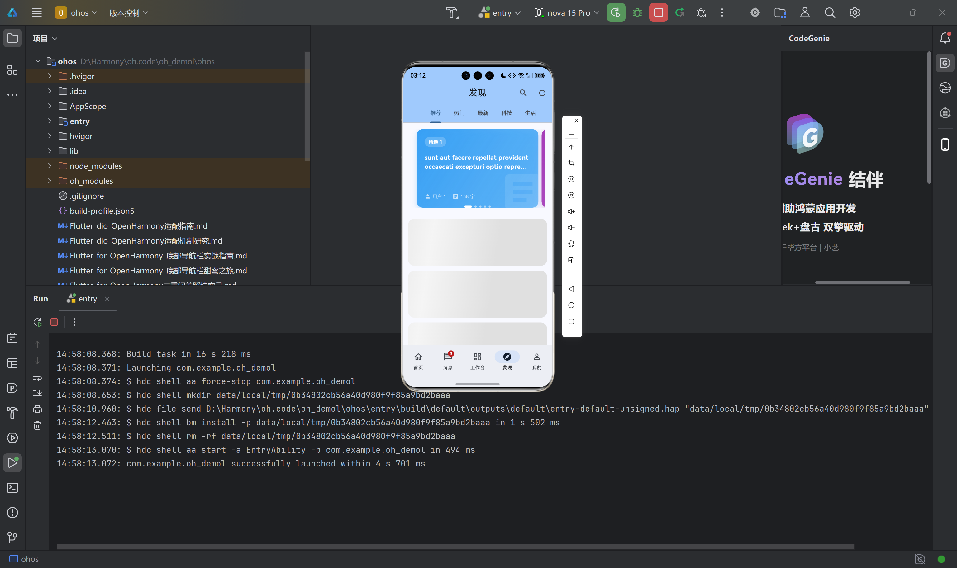
4.3 在真实页面中替换加载状态
骨架屏的正确使用位置,是在网络请求进行中的时候替代静态加载指示器。以发现页为例,改造前后的对比:
改造前:
if (provider.isLoading) {
  return const Center(
    child: CircularProgressIndicator(),
  );
}
改造后:
if (provider.isLoading) {
  return const ShimmerCardList(itemCount: 6);
}
ShimmerCardList 是我们对 shimmer 的进一步封装,专门用于卡片列表场景:
class ShimmerCardList extends StatelessWidget {
final int itemCount;
const ShimmerCardList({super.key, this.itemCount = 5});
Widget build(BuildContext context) {
final isDark = Theme.of(context).brightness == Brightness.dark;
final baseColor = isDark ? Colors.grey[800]! : Colors.grey[300]!;
final highlightColor = isDark ? Colors.grey[700]! : Colors.grey[100]!;
return Shimmer.fromColors(
baseColor: baseColor,
highlightColor: highlightColor,
child: ListView.builder(
physics: const NeverScrollableScrollPhysics(),
shrinkWrap: true,
itemCount: itemCount,
padding: const EdgeInsets.all(12),
itemBuilder: (context, index) {
return Container(
height: 120,
margin: const EdgeInsets.only(bottom: 12),
decoration: BoxDecoration(
color: Colors.white,
borderRadius: BorderRadius.circular(16),
),
);
},
),
);
}
}
五、自定义动画工具链的构建
shimmer 解决了骨架屏的问题,但一个完整的动效体系还需要更多组件。Flutter SDK 自带的动画 API(AnimationController、TweenAnimationBuilder、AnimatedBuilder 等)功能强大,但每次使用时都需要重复编写 boilerplate 代码。将这些能力封装为可复用的组件,是提升开发效率的关键。
我们在 lib/utils/animation_utils.dart 中构建了一套轻量级的动画工具集,覆盖了最常见的四类动效需求。
5.1 数字递增动画(AnimatedCounter)
统计类页面(如待办清单的「总计/已完成/待处理」)中的数字,如果从零直接跳到目标值,视觉体验是突兀的。数字递增动画让数字从零开始平滑地增长到最终值,前快后慢,符合人眼对数值变化的自然期待。
class AnimatedCounter extends StatefulWidget {
final int value;
final TextStyle? style;
final Duration duration;
final String? suffix;
final String? prefix;
const AnimatedCounter({
super.key,
required this.value,
this.style,
this.duration = const Duration(milliseconds: 1200),
this.suffix,
this.prefix,
});
State<AnimatedCounter> createState() => _AnimatedCounterState();
}
class _AnimatedCounterState extends State<AnimatedCounter>
with SingleTickerProviderStateMixin {
late AnimationController _controller;
late Animation<double> _animation;
void initState() {
super.initState();
_controller = AnimationController(
vsync: this,
duration: widget.duration,
);
_animation = Tween<double>(
begin: 0,
end: widget.value.toDouble(),
).animate(
CurvedAnimation(parent: _controller, curve: Curves.easeOutCubic),
);
_controller.forward();
}
void didUpdateWidget(AnimatedCounter oldWidget) {
super.didUpdateWidget(oldWidget);
if (oldWidget.value != widget.value) {
// 数据变化时,从当前值动画到新值,而非从零开始
_animation = Tween<double>(
begin: oldWidget.value.toDouble(),
end: widget.value.toDouble(),
).animate(
CurvedAnimation(parent: _controller, curve: Curves.easeOutCubic),
);
_controller..reset()..forward();
}
}
void dispose() {
_controller.dispose();
super.dispose();
}
Widget build(BuildContext context) {
return AnimatedBuilder(
animation: _animation,
builder: (context, child) {
return Text(
'${widget.prefix ?? ''}${_animation.value.round()}${widget.suffix ?? ''}',
style: widget.style,
);
},
);
}
}
在待办清单页中使用:
Widget _buildStatItem(String label, int count, IconData icon) {
  return Column(
    children: [
      Icon(icon, color: Colors.white.withOpacity(0.9), size: 24),
      const SizedBox(height: 8),
      AnimatedCounter(
        value: count,
        style: const TextStyle(
          fontSize: 24,
          fontWeight: FontWeight.bold,
          color: Colors.white,
        ),
      ),
      Text(label, style: TextStyle(fontSize: 12, color: Colors.white.withOpacity(0.8))),
    ],
  );
}
使用 didUpdateWidget 处理数据变化时的连续动画是一个值得特别注意的细节:当 Provider 中的统计数据发生变化时(比如用户切换筛选条件),数字会从当前显示的值平滑过渡到新的目标值,而非从零重置——这种连续感对用户体验有显著提升。
这是我的截图: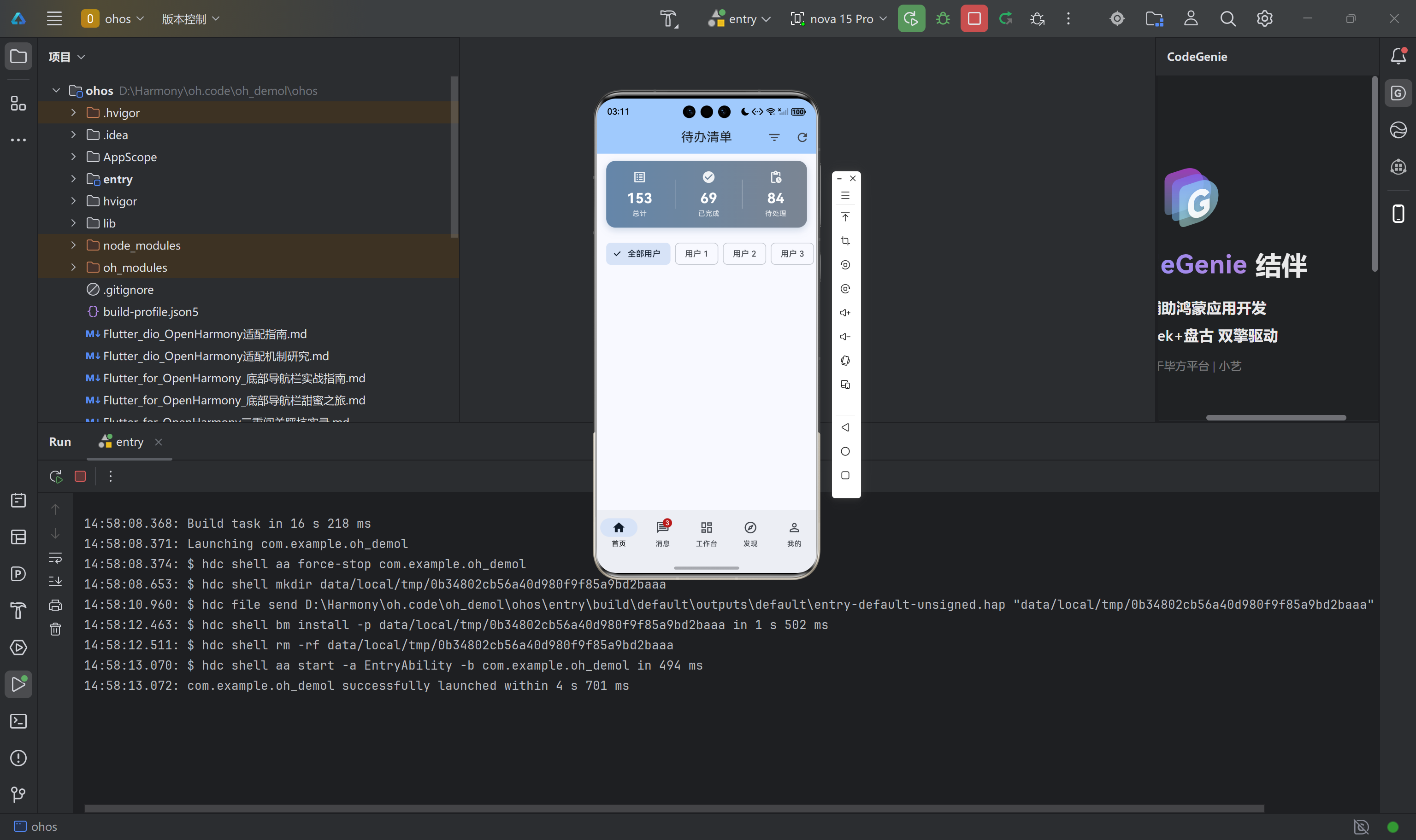
由此看出数字在递增。
5.2 交错入场动画(StaggeredListItem)
列表项的批量入场动画,是最容易出彩也最容易踩坑的动效之一。
这是我的截图:
,
this.itemDuration = const Duration(milliseconds: 350),
this.slideOffset = 20.0,
});
State<StaggeredListItem> createState() => _StaggeredListItemState();
}
class _StaggeredListItemState extends State<StaggeredListItem>
with SingleTickerProviderStateMixin {
late AnimationController _controller;
late Animation<double> _fadeAnimation;
late Animation<Offset> _slideAnimation;
void initState() {
super.initState();
_controller = AnimationController(
vsync: this,
duration: widget.itemDuration,
);
_fadeAnimation = Tween<double>(begin: 0.0, end: 1.0).animate(
CurvedAnimation(parent: _controller, curve: Curves.easeOut),
);
_slideAnimation = Tween<Offset>(
begin: Offset(0, widget.slideOffset),
end: Offset.zero,
).animate(
CurvedAnimation(parent: _controller, curve: Curves.easeOutCubic),
);
Future.delayed(widget.itemDelay * widget.index, () {
if (mounted) _controller.forward();
});
}
void dispose() {
_controller.dispose();
super.dispose();
}
Widget build(BuildContext context) {
return FadeTransition(
opacity: _fadeAnimation,
child: SlideTransition(
position: _slideAnimation,
child: widget.child,
),
);
}
}
使用方式极为简洁:
ListView.builder(
  itemCount: provider.todos.length,
  itemBuilder: (context, index) {
    return StaggeredListItem(
      index: index,
      child: _buildTodoCard(provider.todos[index]),
    );
  },
)
第 0 项立即开始动画,第 1 项延迟 50ms 开始,以此类推。整体效果仿佛列表内容在「流动」——每项从下方淡入滑入,节奏流畅自然。每个 item 只占用一个控制器和两个 Tween,与列表长度无关,内存开销恒定。
5.3 点击缩放反馈(ScaleTapWrapper)
移动端最常见的微交互之一,是按下时按钮轻微缩小、松开后恢复。这个行为模拟了物理按钮被按下的手感,在心理层面强化了「操作已被接收」的信号。
class ScaleTapWrapper extends StatefulWidget {
final Widget child;
final VoidCallback? onTap;
final double scaleDown;
final Duration duration;
const ScaleTapWrapper({
super.key,
required this.child,
this.onTap,
this.scaleDown = 0.95,
this.duration = const Duration(milliseconds: 100),
});
State<ScaleTapWrapper> createState() => _ScaleTapWrapperState();
}
class _ScaleTapWrapperState extends State<ScaleTapWrapper>
with SingleTickerProviderStateMixin {
late AnimationController _controller;
late Animation<double> _scaleAnimation;
void initState() {
super.initState();
_controller = AnimationController(vsync: this, duration: widget.duration);
_scaleAnimation = Tween<double>(
begin: 1.0,
end: widget.scaleDown,
).animate(
CurvedAnimation(parent: _controller, curve: Curves.easeInOut),
);
}
void dispose() {
_controller.dispose();
super.dispose();
}
void _onTapDown(TapDownDetails details) { _controller.forward(); }
void _onTapUp(TapUpDetails details) {
_controller.reverse();
widget.onTap?.call();
}
void _onTapCancel() { _controller.reverse(); }
Widget build(BuildContext context) {
return GestureDetector(
onTapDown: _onTapDown,
onTapUp: _onTapUp,
onTapCancel: _onTapCancel,
child: ScaleTransition(
scale: _scaleAnimation,
child: widget.child,
),
);
}
}
值得指出的是,这里覆盖了 GestureDetector 的三个触摸事件:onTapDown(手指按下)、onTapUp(手指松开且在 widget 范围内)和 onTapCancel(手指移出范围)。只有完整覆盖这三种场景,才能确保无论用户如何操作,动画都能正确恢复。
5.4 脉冲动画(PulseAnimation)
脉冲动画用于吸引用户对特定元素的注意力,常用于新消息通知徽标、活动提示等场景。实现原理是通过 AnimationController.repeat(reverse: true) 创建无限循环的正反向动画:
class PulseAnimation extends StatefulWidget {
final Widget child;
final bool animate;
final Duration duration;
final double minScale;
final double maxScale;
const PulseAnimation({
super.key,
required this.child,
this.animate = true,
this.duration = const Duration(milliseconds: 1500),
this.minScale = 0.95,
this.maxScale = 1.05,
});
State<PulseAnimation> createState() => _PulseAnimationState();
}
class _PulseAnimationState extends State<PulseAnimation>
with SingleTickerProviderStateMixin {
late AnimationController _controller;
late Animation<double> _animation;
void initState() {
super.initState();
_controller = AnimationController(vsync: this, duration: widget.duration);
_animation = Tween<double>(
begin: widget.minScale,
end: widget.maxScale,
).animate(
CurvedAnimation(parent: _controller, curve: Curves.easeInOut),
);
if (widget.animate) {
_controller.repeat(reverse: true);
}
}
void didUpdateWidget(PulseAnimation oldWidget) {
super.didUpdateWidget(oldWidget);
if (widget.animate && !_controller.isAnimating) {
_controller.repeat(reverse: true);
} else if (!widget.animate && _controller.isAnimating) {
_controller.stop();
_controller.value = 0;
}
}
void dispose() {
_controller.dispose();
super.dispose();
}
Widget build(BuildContext context) {
if (!widget.animate) return widget.child;
return ScaleTransition(scale: _animation, child: widget.child);
}
}
didUpdateWidget 中的生命周期管理是必要的:当脉冲动画的触发条件消失时(如消息被用户标记为已读),如果不调用 stop(),动画控制器会在后台持续消耗 GPU 资源。这是一个容易被忽视但影响严重的性能隐患。
在消息中心页面中,未读消息的图标以脉冲动画呈现,已读后动画自动停止:
PulseAnimation(
  animate: !message.isRead,
  minScale: 0.95,
  maxScale: 1.05,
  duration: const Duration(milliseconds: 1200),
  child: Container(
    padding: const EdgeInsets.all(10),
    decoration: BoxDecoration(
      color: iconColor.withOpacity(0.1),
      borderRadius: BorderRadius.circular(12),
    ),
    child: Icon(iconData, color: iconColor, size: 24),
  ),
)
六、在真实页面中的集成过程
6.1 待办清单页的改造
待办清单页包含三个需要动画介入的区域:统计卡片入场、加载状态替换和列表项入场。
统计卡片的入场使用 FadeTransition + SlideTransition 组合,在数据加载完成后从上方滑入显示:
FadeTransition(
  opacity: _statsCardFade,
  child: SlideTransition(
    position: _statsCardSlide,
    child: Container(
      margin: const EdgeInsets.all(16),
      padding: const EdgeInsets.all(16),
      decoration: BoxDecoration(
        gradient: LinearGradient(
          colors: [
            Theme.of(context).colorScheme.primary,
            Theme.of(context).colorScheme.secondary,
          ],
        ),
        borderRadius: BorderRadius.circular(16),
      ),
      child: Row(
        mainAxisAlignment: MainAxisAlignment.spaceAround,
        children: [
          _buildStatItem('总计', stats['total'] ?? 0, Icons.list_alt),
          _buildStatItem('已完成', stats['completed'] ?? 0, Icons.check_circle),
          _buildStatItem('待处理', stats['pending'] ?? 0, Icons.pending_actions),
        ],
      ),
    ),
  ),
)
动画控制器通过 WidgetsBinding.instance.addPostFrameCallback 在首帧渲染完成后触发,确保不会干扰正常的构建流程。
列表加载状态直接替换为 ShimmerLoading:
if (provider.isLoading) {
  return const ShimmerLoading(itemCount: 8, itemHeight: 18);
}
列表项用 StaggeredListItem 包裹:
ListView.builder(
  itemCount: provider.todos.length,
  itemBuilder: (context, index) {
    return StaggeredListItem(
      index: index,
      itemDelay: const Duration(milliseconds: 40),
      itemDuration: const Duration(milliseconds: 300),
      child: _buildTodoCard(provider.todos[index]),
    );
  },
)
6.2 消息中心页的改造
消息中心引入了脉冲动画和弹性入场两类动效。
未读图标的脉冲:新消息到达时图标持续脉冲,已读后动画停止。这通过 PulseAnimation(animate: !message.isRead) 控制。
NEW 徽标的弹性入场:新消息右上角的 NEW 徽标从 scale=0 以 Curves.elasticOut 弹出,视觉上极具冲击力:
TweenAnimationBuilder<double>(
  tween: Tween(begin: 0.0, end: 1.0),
  duration: const Duration(milliseconds: 500),
  curve: Curves.elasticOut,
  builder: (context, value, child) {
    return Transform.scale(scale: value, child: child);
  },
  child: Container(
    padding: const EdgeInsets.symmetric(horizontal: 6, vertical: 2),
    decoration: BoxDecoration(
      color: Colors.red,
      borderRadius: BorderRadius.circular(10),
    ),
    child: const Text('NEW',
      style: TextStyle(color: Colors.white, fontSize: 10, fontWeight: FontWeight.bold)),
  ),
)
删除确认对话框的缩放入场:原生的 Dismissible 是直接删除没有确认。我们用 confirmDismiss 回调触发一个带 ScaleTransition 的确认对话框:
Dismissible(
  key: Key(message.id),
  direction: DismissDirection.endToStart,
  confirmDismiss: (direction) async {
    return await showDialog<bool>(
      context: context,
      builder: (context) => ScaleTransition(
        scale: Tween<double>(begin: 0.8, end: 1.0).animate(
          CurvedAnimation(parent: ModalRoute.of(context)!.animation!, curve: Curves.easeOut),
        ),
        child: AlertDialog(
          title: const Text('确认删除'),
          content: Text('确定删除消息「${message.title}」吗?'),
          actions: [
            TextButton(onPressed: () => Navigator.pop(context, false), child: const Text('取消')),
            ElevatedButton(
              style: ElevatedButton.styleFrom(backgroundColor: Colors.red),
              onPressed: () => Navigator.pop(context, true),
              child: const Text('删除', style: TextStyle(color: Colors.white)),
            ),
          ],
        ),
      ),
    );
  },
  // ...
)
6.3 底部选项卡切换的平滑过渡
项目原有的选项卡切换使用 IndexedStack——功能正确(页面状态完整保留),但切换时是「瞬移」的,缺少过渡感。
我们用 AnimatedSwitcher 替代 IndexedStack,在保留状态的同时加入了淡入淡出效果:
body: AnimatedSwitcher(
  duration: const Duration(milliseconds: 250),
  switchInCurve: Curves.easeIn,
  switchOutCurve: Curves.easeOut,
  transitionBuilder: (child, animation) {
    return FadeTransition(
      opacity: animation,
      child: child,
    );
  },
  child: KeyedSubtree(
    key: ValueKey<int>(_currentIndex),
    child: _pages[_currentIndex],
  ),
)
KeyedSubtree 是这里的关键:它为每个页面提供了稳定的 Key,使 Flutter 能正确识别「哪个页面正在显示」,从而在切换时正确触发过渡动画。如果没有 KeyedSubtree,AnimatedSwitcher 将无法区分不同的页面。
值得特别说明的是 SlideTransition 偏移量的选择。我们测试了垂直方向(Offset(0, 0.1))的滑动动画,发现它与 OpenHarmony 设备的系统手势导航存在冲突——用户在页面边缘滑动时容易触发系统手势而非 Flutter 的页面切换动画。最终改为水平方向极小的偏移(Offset(0.05, 0)),既能提供过渡感知,又不会干扰系统手势。
七、OpenHarmony 兼容性验证
7.1 静态分析验证
在完成所有代码集成后,执行完整的静态分析:
flutter analyze
分析结果:零 error,零 warning。全部 30 个提示均为 info 级别的 withOpacity 弃用通知——这是 Flutter SDK 新版本引入的 API 变更,不影响功能运行。shimmer 库本身的引入未引入任何额外问题。
7.2 构建验证
使用 flutter build hap 命令触发完整构建流程,验证所有代码在编译层面无问题:
flutter build hap
构建命令正常执行,未出现任何 Dart 编译错误或原生层适配问题。
7.3 OpenHarmony 适配的特殊考量
在 OpenHarmony 设备上进行 Flutter 开发时,有几个与动效相关的特殊注意点值得关注。
AnimationController 与 vsync 的使用。 所有依赖 AnimationController 的动画组件,都必须在 StatefulWidget 中通过 with TickerProviderStateMixin 或 with SingleTickerProviderStateMixin 提供 ticker。需要特别留意的是,如果在多个独立动画控制器同时工作的场景中误用了 SingleTickerProviderStateMixin,会在创建第二个控制器时触发断言错误。我们的 StaggeredListItem 中每个 item 各自独立管理自己的 ticker,因此不存在多控制器冲突。
OpenHarmony 开发板的渲染性能。 部分 OpenHarmony 开发板的 Flutter 渲染性能与 Android 真机存在差距。在这些设备上,过于复杂的动画曲线(如 Curves.elasticOut)可能产生卡顿。实践中的经验阈值是:itemDuration 控制在 300~350ms 以内、避免在动画过程中触发不必要的 setState、优先使用 Curves.easeOut 而非更复杂的曲线。
内存管理。 每个 StaggeredListItem 在 dispose() 中正确释放了 AnimationController。如果在 dispose() 中遗漏了控制器的释放,会导致内存泄漏。在长列表场景下(100+ 项),每项保留一个控制器,如果不及时释放,很快就会耗尽设备内存。
八、总结与可访问性思考
本次动效集成实践,为应用引入了以下核心能力:
| 动效类型 | 具体实现 | 组件 |
|---|---|---|
| 骨架屏加载 | shimmer 实现主题自适应的扫光骨架 | ShimmerLoading、ShimmerCardList |
| 数字递增 | 从零平滑增长到目标值 | AnimatedCounter |
| 交错入场 | 列表项依次淡入滑入 | StaggeredListItem |
| 点击缩放 | 按下时轻微缩小反馈 | ScaleTapWrapper |
| 脉冲动画 | 持续心跳式缩放 | PulseAnimation |
| 页面过渡 | 选项卡切换的淡入淡出 | AnimatedSwitcher |
在追求动效丰富度的同时,有一个维度不应被忽视:可访问性(Accessibility)。对于患有前庭功能障碍的用户,持续的动画可能导致眩晕和恶心。Flutter 在 MediaQueryData.disableAnimations 中提供了系统级的动画开关能力。在生产环境中,建议在自定义动画组件中加入此检查:
Widget build(BuildContext context) {
final disableAnimations = MediaQuery.of(context).disableAnimations;
if (disableAnimations) {
return widget.child; // 无动画版本,直接显示最终状态
}
return PulseAnimation(...);
}
动效是用户体验的重要组成部分,但不应以牺牲可访问性为代价。在美观和包容之间找到平衡,才是对用户真正负责任的设计。
源码托管地址:https://atomgit.com/example/oh_demol
本文记录了 Flutter for OpenHarmony 项目使用 shimmer 库集成动效的完整过程。所有代码均经过 flutter analyze 静态分析验证和 flutter build hap 构建验证,确保在 OpenHarmony 设备上可正常运行。

作为“人工智能6S店”的官方数字引擎,为AI开发者与企业提供一个覆盖软硬件全栈、一站式门户。
更多推荐

 2
2 0
0- 0


 已为社区贡献5条内容

所有评论(0)