
Flutter 框架跨平台鸿蒙开发 - 家庭购物清单
运行效果图// 唯一标识符// 商品名称// 商品分类// 数量// 单价// 是否已购买// 优先级String?note;// 备注(可选)// 创建时间DateTime?// 购买时间(可选)基础信息包括ID、名称、分类、数量、单价;状态信息包括购买状态、创建时间、购买时间;扩展信息包括优先级和备注。这种设计既满足了展示需求,又支持灵活的状态管理。food, // 食品 - 橙色daily,
Flutter家庭购物清单
欢迎加入开源鸿蒙跨平台社区: https://openharmonycrossplatform.csdn.net
项目概述
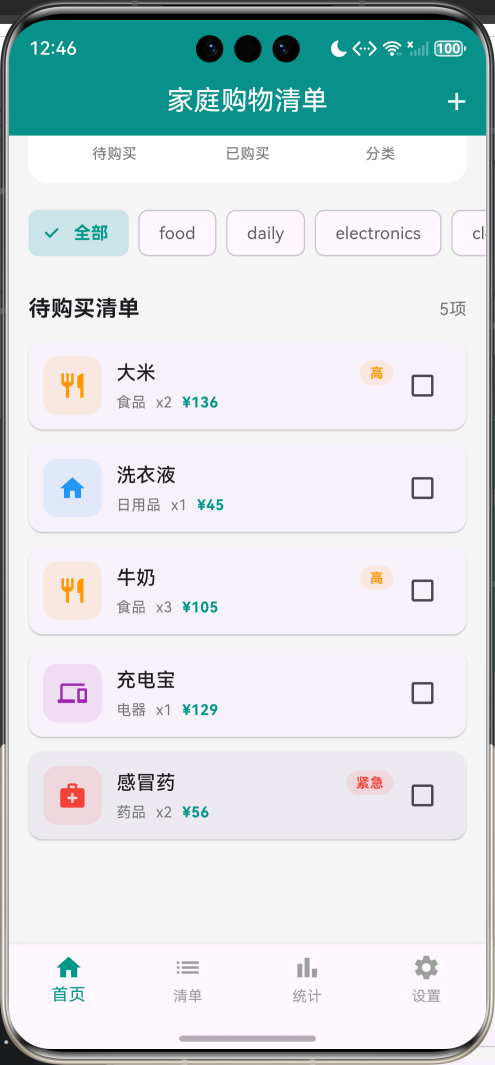
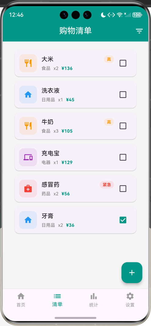
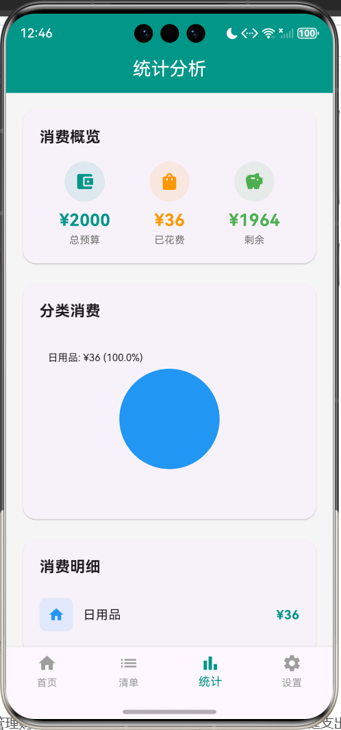
运行效果图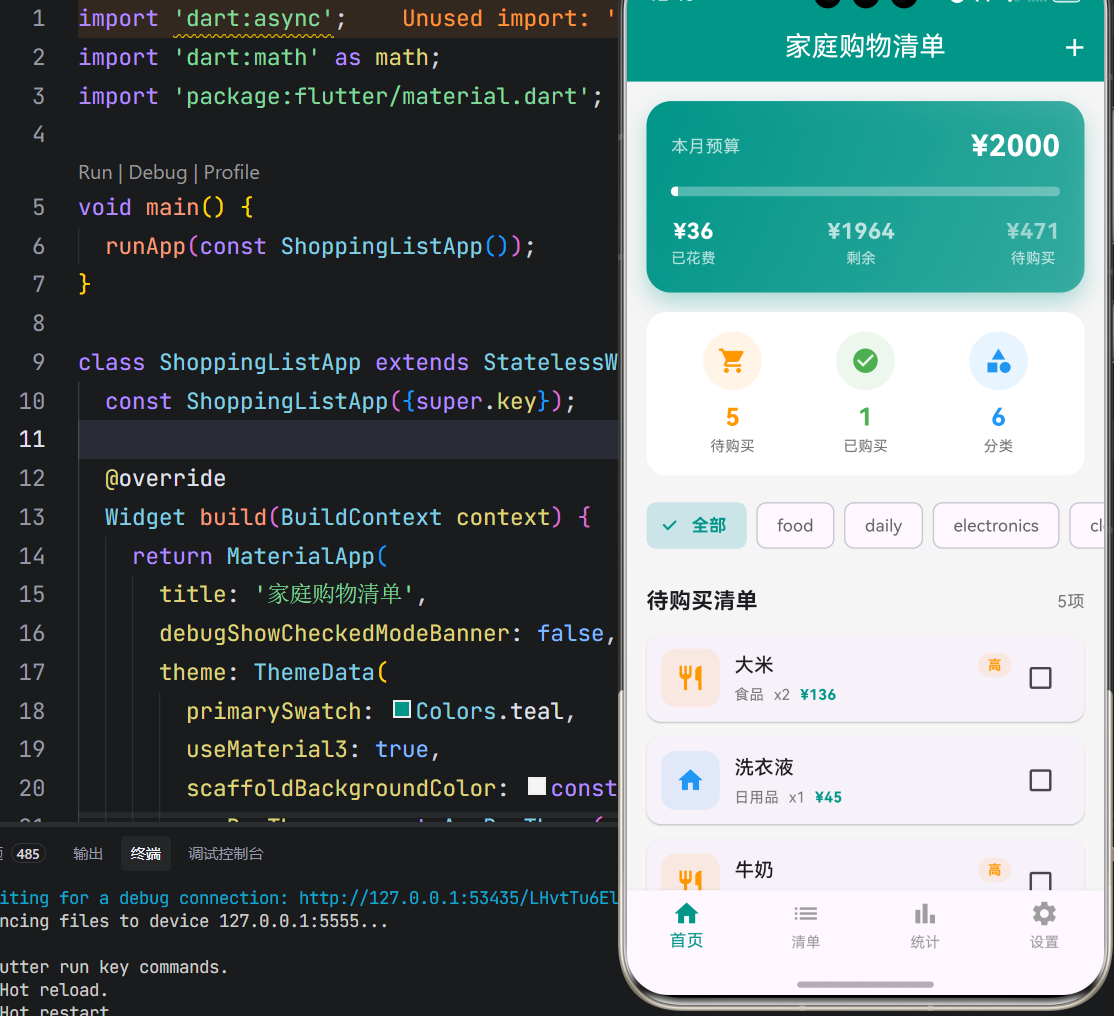
一、项目背景与目标
家庭购物是日常生活中不可或缺的一部分,合理管理购物清单不仅能提高生活效率,还能有效控制家庭支出。然而,传统的纸质购物清单容易丢失、难以统计,且无法实时更新。本项目基于Flutter框架开发一款家庭购物清单应用,旨在帮助家庭成员轻松管理购物需求,实时追踪消费情况,实现家庭财务的科学管理。
项目的核心目标涵盖多个维度:构建完整的购物管理系统,实现预算与消费的实时监控,设计直观的分类展示,打造便捷的操作体验,以及确保应用的稳定性和数据安全。通过本项目的开发,不仅能够深入理解Flutter在生活工具类应用中的应用,更能掌握状态管理、数据持久化、图表绘制等核心技术要点。
应用场景分析
| 应用场景 | 功能需求 | 实现方式 |
|---|---|---|
| 日常采购 | 记录食品、日用品等常规购物 | 分类管理和优先级标记 |
| 大件采购 | 电器、家具等高价值商品 | 预算控制和消费统计 |
| 紧急购物 | 药品等急需物品 | 紧急优先级和快速添加 |
| 家庭协作 | 多人共享购物清单 | 实时同步和状态更新 |
核心价值主张
- 预算管理:实时监控家庭消费,避免超支
- 分类清晰:六大类别自动归类,一目了然
- 优先级管理:四级优先级标记,合理安排购物顺序
- 数据洞察:消费统计和分类分析,优化家庭支出结构
二、技术选型与架构设计
技术栈分析
本项目选用Flutter作为开发框架,主要基于以下考量:
- 跨平台能力:Flutter的跨平台特性能够同时支持Android和iOS平台,降低开发成本
- 声明式UI:声明式UI编程范式能够高效构建复杂的购物清单界面
- 丰富组件库:丰富的Widget组件库为应用UI开发提供了坚实基础
- 优秀性能:优秀的性能表现确保了列表滚动的流畅性
Dart语言作为Flutter的开发语言,具备强类型、异步编程支持、优秀的性能表现等特性。项目采用单文件架构,将所有应用逻辑集中在main_shopping_list.dart文件中,这种设计既便于代码管理,又利于理解应用整体架构。
架构层次划分
应用架构采用分层设计思想,主要分为以下几个层次:
数据模型层:定义应用中的核心数据结构,包括ShoppingItem(购物商品实体)、ItemCategory(商品分类)、ItemPriority(优先级)等类和枚举。这些模型类封装了商品的属性和行为,构成了应用逻辑的基础。
业务逻辑层:实现应用的核心功能逻辑,包括商品管理、预算计算、统计聚合、状态切换等。这一层是应用的心脏,决定了应用的功能性和可用性。
渲染表现层:负责应用界面的绘制和UI展示,使用Flutter的Material Design组件库实现现代化的界面设计,通过CustomPaint组件实现统计图表的绘制。
状态管理层:管理应用的各种状态,包括购物清单、当前页面索引、筛选条件、预算设置等,确保应用状态的一致性和可预测性。
核心功能模块详解
一、商品数据模型
商品属性定义
购物商品实体封装了完整的信息属性:
class ShoppingItem {
  final String id;              // 唯一标识符
  String name;                  // 商品名称
  ItemCategory category;        // 商品分类
  int quantity;                 // 数量
  double price;                 // 单价
  bool isPurchased;             // 是否已购买
  ItemPriority priority;        // 优先级
  String? note;                 // 备注(可选)
  DateTime createdAt;           // 创建时间
  DateTime? purchasedAt;        // 购买时间(可选)
}
基础信息包括ID、名称、分类、数量、单价;状态信息包括购买状态、创建时间、购买时间;扩展信息包括优先级和备注。这种设计既满足了展示需求,又支持灵活的状态管理。
商品分类定义
应用支持六大商品分类:
enum ItemCategory {
  food,         // 食品 - 橙色
  daily,        // 日用品 - 蓝色
  electronics,  // 电器 - 紫色
  clothing,     // 服装 - 粉色
  medicine,     // 药品 - 红色
  other,        // 其他 - 灰色
}
每种类型对应不同的图标和颜色,便于用户快速识别商品性质。
| 商品分类 | 图标 | 颜色 | 典型商品 |
|---|---|---|---|
| 食品 | restaurant | 橙色 | 大米、牛奶、蔬菜 |
| 日用品 | home | 蓝色 | 洗衣液、牙膏、纸巾 |
| 电器 | devices | 紫色 | 充电宝、电饭煲、吹风机 |
| 服装 | checkroom | 粉色 | 衣服、鞋子、包包 |
| 药品 | medical_services | 红色 | 感冒药、维生素、创可贴 |
| 其他 | more_horiz | 灰色 | 文具、工具、装饰品 |
优先级定义
应用支持四级优先级:
enum ItemPriority {
  low,      // 低 - 绿色
  medium,   // 中 - 蓝色
  high,     // 高 - 橙色
  urgent,   // 紧急 - 红色
}
优先级帮助用户合理安排购物顺序,确保重要商品优先购买。
计算属性
商品总价通过计算属性获取:
double get total => quantity * price;
这个计算属性简化了总价计算逻辑,确保数据的实时性和准确性。
二、预算管理系统
预算卡片设计
预算卡片是应用的核心组件,实时展示预算使用情况:
Widget _buildBudgetCard() {
  final percentage = _budget > 0 ? (_totalSpent / _budget).clamp(0.0, 1.0) : 0.0;
  final isOverBudget = _totalSpent > _budget;

  return Container(
    decoration: BoxDecoration(
      gradient: LinearGradient(
        colors: isOverBudget
            ? [Colors.red, Colors.red.withOpacity(0.7)]
            : [Colors.teal, Colors.teal.withOpacity(0.7)],
      ),
    ),
    child: Column(
      children: [
        // 预算金额
        // 进度条
        // 已花费、剩余、待购买
      ],
    ),
  );
}
预算卡片根据是否超支动态调整颜色,提供直观的视觉反馈。
预算计算逻辑
double get _totalEstimated {
  return _unpurchasedItems.fold(0, (sum, item) => sum + item.total);
}

double get _totalSpent {
  return _purchasedItems.fold(0, (sum, item) => sum + item.total);
}

double get _budgetRemaining {
  return _budget - _totalSpent;
}
三个计算属性分别计算待购买总额、已花费总额和剩余预算,确保数据的实时性和准确性。
预算设置功能
预算设置通过对话框实现:
void _showBudgetDialog() {
  final controller = TextEditingController(text: _budget.toStringAsFixed(0));
  showDialog(
    context: context,
    builder: (context) => AlertDialog(
      title: const Text('设置预算'),
      content: TextField(
        controller: controller,
        keyboardType: TextInputType.number,
        decoration: const InputDecoration(
          labelText: '预算金额',
          prefixText: '¥',
        ),
      ),
      actions: [
        TextButton(
          onPressed: () => Navigator.pop(context),
          child: const Text('取消'),
        ),
        ElevatedButton(
          onPressed: () {
            final value = double.tryParse(controller.text);
            if (value != null && value > 0) {
              setState(() => _budget = value);
              Navigator.pop(context);
            }
          },
          child: const Text('确定'),
        ),
      ],
    ),
  );
}
用户可以随时调整预算金额,应用会实时更新预算卡片显示。
三、商品管理系统
添加商品功能
添加商品使用底部弹窗表单:
void _showAddItemDialog() {
  showModalBottomSheet(
    context: context,
    isScrollControlled: true,
    builder: (context) => _AddItemForm(
      onAdd: (item) {
        _addItem(item);
        Navigator.pop(context);
      },
    ),
  );
}
表单包含商品名称、分类、优先级、数量、单价、备注等字段,支持完整的商品信息录入。
表单字段设计
Column(
  children: [
    TextField(
      controller: _nameController,
      decoration: const InputDecoration(
        labelText: '商品名称',
        border: OutlineInputBorder(),
      ),
    ),
    DropdownButtonFormField<ItemCategory>(
      value: _selectedCategory,
      decoration: const InputDecoration(
        labelText: '商品分类',
        border: OutlineInputBorder(),
      ),
      items: ItemCategory.values.map((category) {
        return DropdownMenuItem(
          value: category,
          child: Text(_categoryText(category)),
        );
      }).toList(),
      onChanged: (value) {
        if (value != null) {
          setState(() => _selectedCategory = value);
        }
      },
    ),
    // 优先级、数量、单价、备注...
  ],
)
表单采用Material Design风格,所有输入框都有明确的标签和边框,提升用户体验。
商品列表管理
商品列表支持多种操作:
void _addItem(ShoppingItem item) {
  setState(() {
    _items.insert(0, item);
  });
}

void _updateItem(ShoppingItem item) {
  setState(() {});
}

void _deleteItem(ShoppingItem item) {
  setState(() {
    _items.remove(item);
  });
}

void _togglePurchased(ShoppingItem item) {
  setState(() {
    item.isPurchased = !item.isPurchased;
    item.purchasedAt = item.isPurchased ? DateTime.now() : null;
  });
}
添加、更新、删除、切换购买状态等操作都有对应的方法,确保数据的一致性。
商品详情展示
商品详情使用底部弹窗展示:
void _showItemDetail(ShoppingItem item) {
  showModalBottomSheet(
    context: context,
    isScrollControlled: true,
    builder: (context) => Container(
      padding: const EdgeInsets.all(24),
      child: Column(
        children: [
          // 商品图标和名称
          // 详细信息列表
          // 操作按钮(删除、标记购买)
        ],
      ),
    ),
  );
}
详情弹窗展示完整的商品信息,提供删除和标记购买操作按钮。
四、分类筛选功能
分类筛选器设计
分类筛选器采用水平滚动的FilterChip:
Widget _buildCategoryFilter() {
  return Container(
    height: 50,
    child: ListView.builder(
      scrollDirection: Axis.horizontal,
      itemCount: ItemCategory.values.length + 1,
      itemBuilder: (context, index) {
        if (index == 0) {
          return _buildFilterChip(null, '全部');
        }
        final category = ItemCategory.values[index - 1];
        return _buildFilterChip(category, category.name);
      },
    ),
  );
}
筛选器支持"全部"选项和六个分类选项,用户可以快速切换查看不同分类的商品。
筛选逻辑实现
List<ShoppingItem> get _filteredItems {
  if (_filterCategory == null) return _items;
  return _items.where((item) => item.category == _filterCategory).toList();
}
筛选逻辑使用where方法过滤符合条件的商品,计算效率高。
五、统计分析功能
消费概览统计
统计页面展示预算、已花费、剩余三个关键指标:
Row(
  mainAxisAlignment: MainAxisAlignment.spaceAround,
  children: [
    _buildStatItem(Icons.account_balance_wallet, '总预算',
        '¥${_budget.toStringAsFixed(0)}', Colors.teal),
    _buildStatItem(Icons.shopping_bag, '已花费',
        '¥${_totalSpent.toStringAsFixed(0)}', Colors.orange),
    _buildStatItem(Icons.savings, '剩余',
        '¥${_budgetRemaining.toStringAsFixed(0)}', Colors.green),
  ],
)
三个指标使用不同的图标和颜色,便于快速识别。
分类消费图表
统计页面使用饼图展示分类消费分布:
class CategoryChartPainter extends CustomPainter {
final Map<ItemCategory, double> categoryStats;
void paint(Canvas canvas, Size size) {
final total = categoryStats.values.fold(0.0, (sum, value) => sum + value);
final center = Offset(size.width / 2, size.height / 2);
final radius = math.min(size.width, size.height) / 2 - 40;
final paint = Paint()..style = PaintingStyle.fill;
double startAngle = -math.pi / 2;
for (var entry in categoryStats.entries) {
final sweepAngle = 2 * math.pi * entry.value / total;
paint.color = _getCategoryColor(entry.key);
canvas.drawArc(
Rect.fromCircle(center: center, radius: radius),
startAngle,
sweepAngle,
true,
paint,
);
startAngle += sweepAngle;
}
}
}
饼图使用CustomPaint绘制,每种分类使用对应颜色,图例显示消费金额和百分比。
消费明细列表
...categoryStats.entries.map((entry) {
  return Row(
    children: [
      Container(
        width: 40,
        height: 40,
        decoration: BoxDecoration(
          color: _getCategoryColor(entry.key).withOpacity(0.1),
          borderRadius: BorderRadius.circular(8),
        ),
        child: Icon(
          _getCategoryIcon(entry.key),
          color: _getCategoryColor(entry.key),
          size: 20,
        ),
      ),
      const SizedBox(width: 12),
      Expanded(
        child: Text(
          categoryText(entry.key),
          style: const TextStyle(fontSize: 15),
        ),
      ),
      Text(
        '¥${entry.value.toStringAsFixed(0)}',
        style: const TextStyle(
          fontSize: 15,
          fontWeight: FontWeight.bold,
          color: Colors.teal,
        ),
      ),
    ],
  );
})
消费明细列表展示每个分类的消费金额,帮助用户了解消费结构。
UI界面开发
一、主界面布局
主界面采用底部导航栏设计,包含四个主要页面:
BottomNavigationBar(
  currentIndex: _currentIndex,
  onTap: (index) => setState(() => _currentIndex = index),
  selectedItemColor: Colors.teal,
  unselectedItemColor: Colors.grey,
  type: BottomNavigationBarType.fixed,
  items: const [
    BottomNavigationBarItem(icon: Icon(Icons.home), label: '首页'),
    BottomNavigationBarItem(icon: Icon(Icons.list), label: '清单'),
    BottomNavigationBarItem(icon: Icon(Icons.bar_chart), label: '统计'),
    BottomNavigationBarItem(icon: Icon(Icons.settings), label: '设置'),
  ],
)
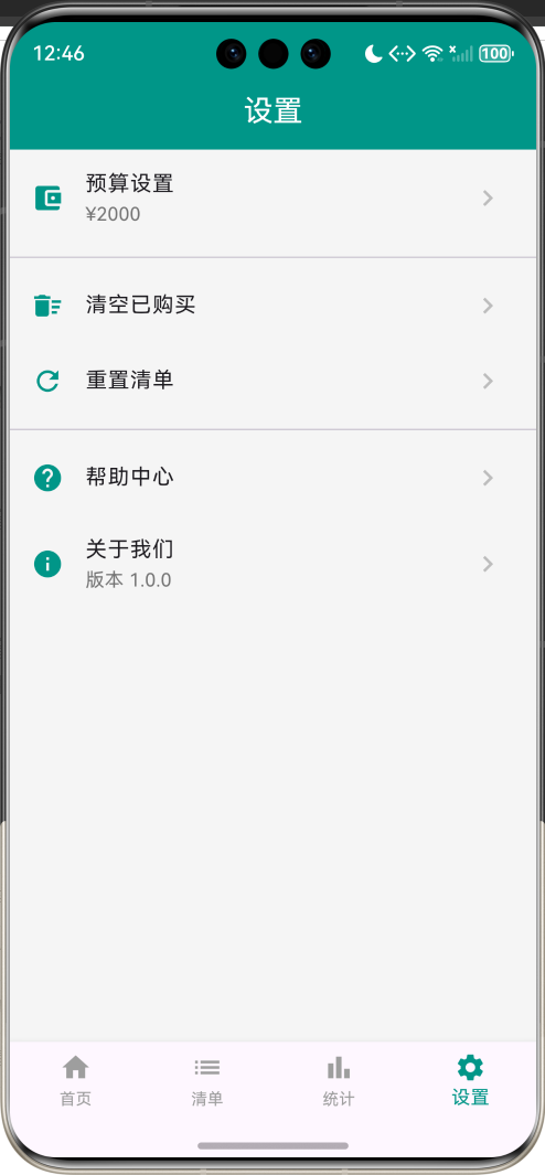
四个页面分别是首页、购物清单、统计分析和设置,覆盖了应用的主要功能入口。
页面结构图
二、预算卡片设计
预算卡片使用渐变背景和进度条:
Container(
  margin: const EdgeInsets.all(16),
  padding: const EdgeInsets.all(20),
  decoration: BoxDecoration(
    gradient: LinearGradient(
      colors: isOverBudget
          ? [Colors.red, Colors.red.withOpacity(0.7)]
          : [Colors.teal, Colors.teal.withOpacity(0.7)],
      begin: Alignment.topLeft,
      end: Alignment.bottomRight,
    ),
    borderRadius: BorderRadius.circular(20),
    boxShadow: [
      BoxShadow(
        color: (isOverBudget ? Colors.red : Colors.teal).withOpacity(0.3),
        blurRadius: 15,
        offset: const Offset(0, 8),
      ),
    ],
  ),
  child: Column(
    children: [
      // 预算金额
      // 进度条
      // 已花费、剩余、待购买
    ],
  ),
)
卡片根据是否超支动态调整颜色,进度条实时反映预算使用情况。
视觉设计要点
- 动态颜色:正常状态为青色,超支状态为红色
- 渐变背景:从左上到右下的线性渐变,增强视觉深度
- 圆角设计:20px圆角,符合现代设计趋势
- 阴影效果:15px模糊半径,8px垂直偏移,营造悬浮感
- 进度条:实时显示预算使用百分比
三、商品卡片设计
商品卡片使用Material Design风格:
Card(
  margin: const EdgeInsets.symmetric(horizontal: 16, vertical: 6),
  shape: RoundedRectangleBorder(borderRadius: BorderRadius.circular(12)),
  child: InkWell(
    onTap: () => _showItemDetail(item),
    borderRadius: BorderRadius.circular(12),
    child: Padding(
      padding: const EdgeInsets.all(12),
      child: Row(
        children: [
          Container(
            width: 48,
            height: 48,
            decoration: BoxDecoration(
              color: item.categoryColor.withOpacity(0.1),
              borderRadius: BorderRadius.circular(12),
            ),
            child: Icon(item.categoryIcon, color: item.categoryColor),
          ),
          const SizedBox(width: 12),
          Expanded(
            child: Column(
              crossAxisAlignment: CrossAxisAlignment.start,
              children: [
                Row(
                  children: [
                    Expanded(child: Text(item.name)),
                    if (item.priority == ItemPriority.urgent ||
                        item.priority == ItemPriority.high)
                      Container(
                        padding: const EdgeInsets.symmetric(
                            horizontal: 8, vertical: 2),
                        decoration: BoxDecoration(
                          color: item.priorityColor.withOpacity(0.1),
                          borderRadius: BorderRadius.circular(12),
                        ),
                        child: Text(
                          item.priorityText,
                          style: TextStyle(
                            color: item.priorityColor,
                            fontSize: 11,
                            fontWeight: FontWeight.bold,
                          ),
                        ),
                      ),
                  ],
                ),
                // 分类、数量、价格
              ],
            ),
          ),
          Checkbox(
            value: item.isPurchased,
            onChanged: (value) => _togglePurchased(item),
            activeColor: Colors.teal,
          ),
        ],
      ),
    ),
  ),
)
卡片左侧显示分类图标,中间显示商品信息,右侧显示购买状态复选框。
性能优化方案
一、列表渲染优化
商品列表使用ListView.builder实现按需渲染:
ListView.builder(
  padding: const EdgeInsets.all(16),
  itemCount: _items.length,
  itemBuilder: (context, index) {
    return _buildItemCard(_items[index]);
  },
)
只有可见区域的卡片才会被创建和渲染,大幅降低了内存占用。
二、状态更新优化
商品状态更新使用局部刷新:
void _togglePurchased(ShoppingItem item) {
  setState(() {
    item.isPurchased = !item.isPurchased;
    item.purchasedAt = item.isPurchased ? DateTime.now() : null;
  });
}
setState触发页面重建,但对于简单的购物清单应用,性能影响可接受。对于复杂场景,可以考虑使用Provider或Riverpod进行状态管理。
三、计算属性缓存
预算相关的计算属性使用getter实现:
double get _totalEstimated {
  return _unpurchasedItems.fold(0, (sum, item) => sum + item.total);
}
计算属性在每次访问时重新计算,确保数据的实时性。对于频繁访问的计算结果,可以考虑使用缓存机制。
测试方案与步骤
一、功能测试
商品管理测试:验证添加商品功能;测试编辑和删除功能;检查购买状态切换。
预算管理测试:验证预算设置功能;测试预算计算逻辑;检查超支提示。
分类筛选测试:验证分类筛选功能;测试"全部"选项;检查筛选结果正确性。
统计分析测试:验证消费统计功能;测试图表绘制正确性;检查数据一致性。
二、边界测试
空列表测试:测试没有商品时的界面展示。
零预算测试:测试预算为零时的处理。
大额数据测试:测试大量商品时的性能表现。
负数输入测试:测试数量和价格为负数时的处理。
三、用户体验测试
界面响应测试:测试按钮响应的及时性。
视觉体验测试:评估界面设计和颜色搭配。
操作便捷性测试:评估添加商品的流程是否便捷。
常见问题与解决方案
一、预算相关问题
问题:预算设置后没有生效
解决方案:确保在setState中更新预算值
setState(() {
  _budget = value;
});
二、商品状态问题
问题:商品购买状态切换后统计数据没有更新
解决方案:确保计算属性使用实时数据
double get _totalSpent {
  return _purchasedItems.fold(0, (sum, item) => sum + item.total);
}
三、性能问题
问题:商品数量过多时列表卡顿
解决方案:使用ListView.builder并实现分页加载
ListView.builder(
  itemCount: _items.length,
  itemBuilder: (context, index) {
    if (index >= _items.length - 5 && _hasMore) {
      _loadMoreItems();
    }
    return _buildItemCard(_items[index]);
  },
)
项目总结与展望
一、项目成果总结
本项目成功实现了一款功能完整、界面现代的家庭购物清单应用,涵盖了生活工具类应用开发的核心要素。通过Flutter框架的应用,实现了跨平台的应用体验,证明了Flutter在工具类应用开发领域的可行性。
项目采用模块化设计思想,将应用功能划分为商品管理、预算管理、统计分析等独立模块,各模块职责明确,耦合度低,便于维护和扩展。
二、技术亮点总结
预算管理:实时监控预算使用情况,动态调整界面颜色,提供直观的视觉反馈。
分类管理:六大分类自动归类,每个分类对应独特的图标和颜色,便于快速识别。
优先级管理:四级优先级标记,帮助用户合理安排购物顺序。
统计图表:使用CustomPaint绘制饼图,直观展示消费分布。
便捷操作:底部弹窗表单、分类筛选器等组件,提供便捷的操作体验。
三、未来优化方向
本地存储:使用shared_preferences或sqflite实现数据持久化,确保购物清单不丢失。
提醒通知:集成本地通知功能,在预算超支时提醒用户。
家庭共享:实现多用户共享购物清单,支持家庭成员协作。
智能推荐:根据购物历史推荐商品,优化购物体验。
价格比较:集成电商平台API,实现价格比较功能。
语音输入:支持语音添加商品,提升操作便捷性。
条码扫描:支持扫描商品条码自动添加商品信息。
云端同步:实现数据云端同步,支持多设备共享。
四、开发经验总结
通过本项目的开发,积累了宝贵的Flutter应用开发经验:
状态管理的重要性:购物清单应用的核心是状态管理,理解setState的使用时机,掌握状态更新的最佳实践,是开发此类应用的基础。
UI设计的细节:工具类应用最终服务于用户,从预算卡片的动态颜色到商品卡片的布局,每个细节都需要精心打磨。
数据管理的必要性:购物清单是用户的重要数据,需要考虑数据持久化、备份恢复等功能,确保数据安全。
性能优化的持续性:随着商品数量的增加,性能优化变得尤为重要,需要持续关注和优化。
本项目为Flutter生活工具类应用开发提供了一个完整的实践案例,展示了如何实现商品管理、预算控制、统计图表等核心功能,希望能够为相关开发者提供参考和启发,推动Flutter在生活工具类应用开发领域的应用和发展。

作为“人工智能6S店”的官方数字引擎,为AI开发者与企业提供一个覆盖软硬件全栈、一站式门户。
更多推荐


 0
0 0
0- 0


 已为社区贡献9条内容

所有评论(0)