
Flutter 框架跨平台鸿蒙开发 - 单词卡记忆
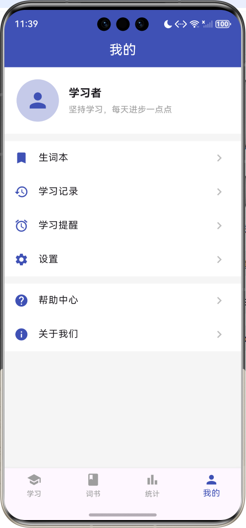
运行效果图String id;String?example;String?DateTime?lastReview;String?note;基础信息包括ID、单词、音标、释义;扩展信息包括例句、例句翻译、笔记、标签;学习信息包括状态、复习次数、正确次数、最后复习时间。这种设计既满足了展示需求,又支持学习进度的追踪。flip, // 翻转模式quiz, // 选择模式spell, // 拼写模式翻转模
Flutter单词卡记忆
欢迎加入开源鸿蒙跨平台社区:https://openharmonycrossplatform.csdn.net
项目概述
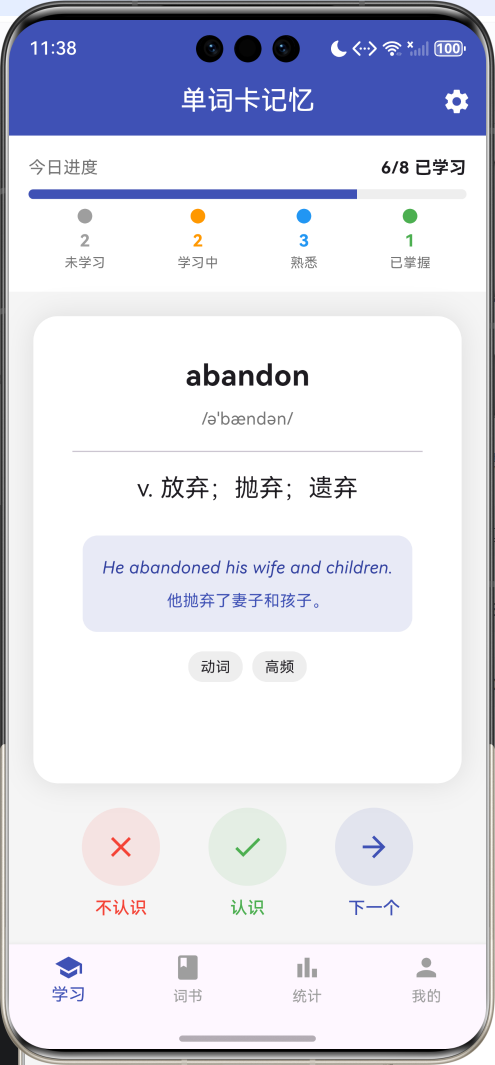
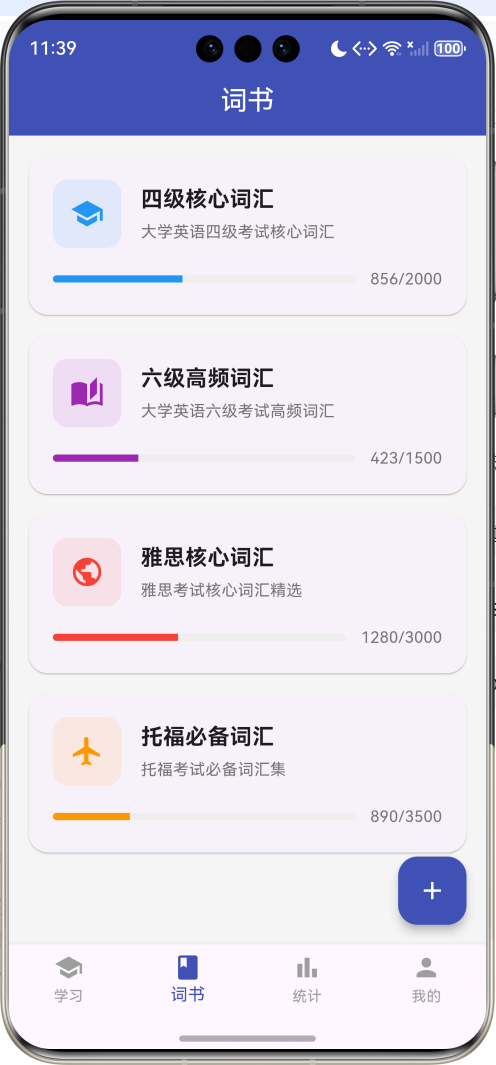
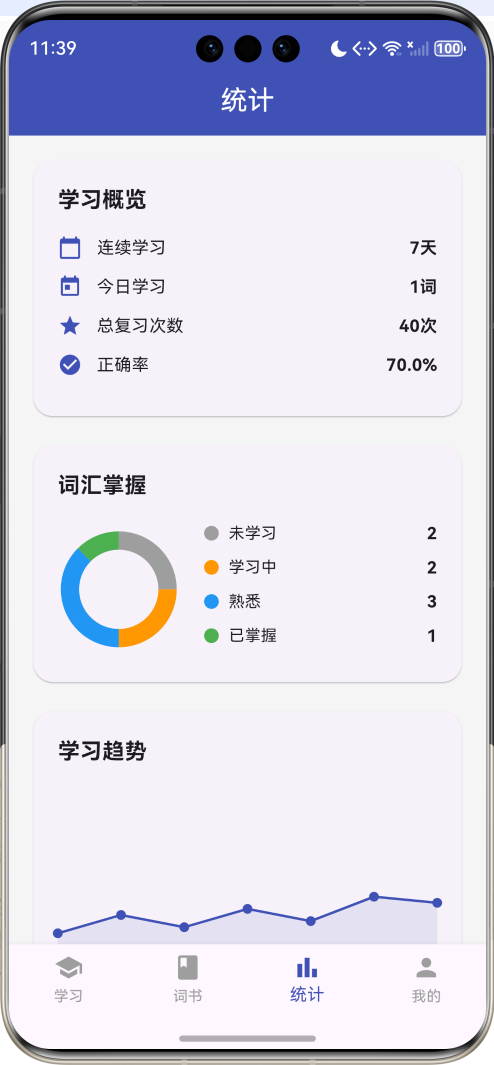
运行效果图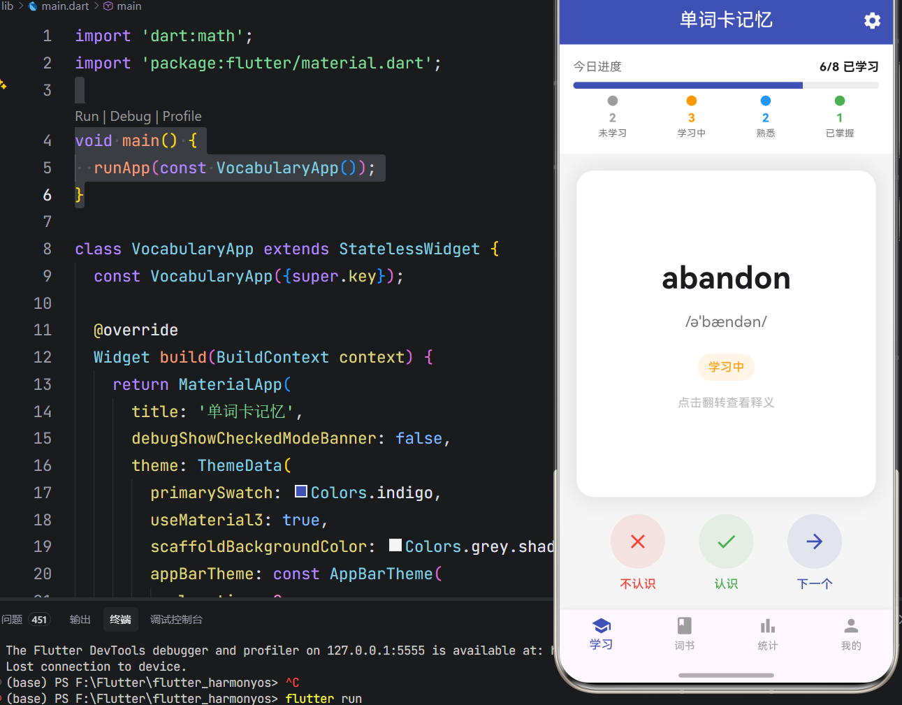
一、项目背景与目标
语言学习中,词汇量的积累是基础且关键的环节。传统的死记硬背方式效率低下,缺乏科学的学习曲线和记忆强化机制。本项目基于Flutter框架开发一款单词卡记忆应用,融合认知心理学中的间隔重复理论,通过翻转卡片、选择测试、拼写练习等多种学习模式,帮助用户高效记忆英语单词。
项目的核心目标涵盖多个维度:构建完整的单词数据管理系统,实现流畅的卡片翻转动画,设计多种学习模式,打造精准的学习进度追踪,以及确保应用的稳定性和性能表现。通过本项目的开发,不仅能够深入理解Flutter动画系统,更能掌握状态管理、自定义绘制、手势交互等核心技术要点。
二、技术选型与架构设计
技术栈分析
本项目选用Flutter作为开发框架,主要基于以下考量:Flutter的动画系统强大且易用,非常适合实现卡片翻转等交互效果;声明式UI编程范式能够高效构建复杂的界面状态切换;热重载功能大幅提升了开发调试效率;丰富的Widget组件库为应用UI开发提供了坚实基础。
Dart语言作为Flutter的开发语言,具备强类型、异步编程支持、优秀的性能表现等特性。项目采用单文件架构,将所有应用逻辑集中在main.dart文件中,这种设计既便于代码管理,又利于理解应用整体架构。
架构层次划分
应用架构采用分层设计思想,主要分为以下几个层次:
数据模型层:定义应用中的核心数据结构,包括WordCard(单词卡片)、WordBook(词书)、WordStatus(学习状态)、StudyMode(学习模式)等类和枚举。这些模型类封装了单词学习的状态和行为,构成了应用逻辑的基础。
业务逻辑层:实现应用的核心功能逻辑,包括单词状态更新、掌握率计算、学习进度统计、选项生成等。这一层是应用的心脏,决定了应用的功能性和可用性。
渲染表现层:负责应用界面的绘制和UI展示,使用Flutter的Material Design组件库实现现代化的界面设计,通过CustomPaint组件实现统计图表的绘制。
状态管理层:管理应用的各种状态,包括当前单词、学习模式、页面索引、单词列表等,确保应用状态的一致性和可预测性。
核心功能模块详解
一、单词数据模型
基础属性定义
单词卡片实体封装了完整的学习信息:
class WordCard {
  String id;
  String word;
  String phonetic;
  String meaning;
  String? example;
  String? exampleTranslation;
  WordStatus status;
  int reviewCount;
  int correctCount;
  DateTime? lastReview;
  DateTime createdAt;
  String? note;
  List<String> tags;
}
基础信息包括ID、单词、音标、释义;扩展信息包括例句、例句翻译、笔记、标签;学习信息包括状态、复习次数、正确次数、最后复习时间。这种设计既满足了展示需求,又支持学习进度的追踪。
掌握率计算
掌握率通过复习次数和正确次数计算得出:
double get masteryRate =>
    reviewCount > 0 ? correctCount / reviewCount : 0;
掌握率是判断单词学习状态的重要指标,用于自动更新单词状态。
状态颜色映射
不同状态对应不同的颜色标识:
Color get statusColor {
  switch (status) {
    case WordStatus.unknown:
      return Colors.grey;
    case WordStatus.learning:
      return Colors.orange;
    case WordStatus.familiar:
      return Colors.blue;
    case WordStatus.mastered:
      return Colors.green;
  }
}
灰色表示未学习,橙色表示学习中,蓝色表示熟悉,绿色表示已掌握。颜色编码提供了直观的视觉反馈。
二、翻转卡片系统
动画控制器设计
翻转卡片使用AnimationController实现3D翻转效果:
void initState() {
super.initState();
_controller = AnimationController(
duration: const Duration(milliseconds: 500),
vsync: this,
);
_animation = Tween<double>(begin: 0, end: 1).animate(_controller);
}
动画时长设置为500毫秒,在流畅性和响应速度之间取得平衡。SingleTickerProviderStateMixin提供了动画帧的同步机制。
3D变换实现
翻转效果通过Transform组件的Y轴旋转实现:
Widget build(BuildContext context) {
  return AnimatedBuilder(
    animation: _animation,
    builder: (context, child) {
      final transform = Matrix4.identity()
        ..setEntry(3, 2, 0.001)
        ..rotateY(_animation.value * pi);

      return Transform(
        transform: transform,
        alignment: Alignment.center,
        child: _animation.value < 0.5
            ? _buildFrontCard()
            : Transform(
                transform: Matrix4.identity()..rotateY(pi),
                alignment: Alignment.center,
                child: _buildBackCard(),
              ),
      );
    },
  );
}
Matrix4.setEntry(3, 2, 0.001)添加透视效果,使翻转看起来更加立体。当动画值小于0.5时显示正面,大于0.5时显示旋转180度后的背面。
正面卡片设计
正面卡片显示单词和音标,提示用户点击翻转:
Widget _buildFrontCard() {
  return Container(
    width: double.infinity,
    padding: const EdgeInsets.all(32),
    decoration: BoxDecoration(
      color: Colors.white,
      borderRadius: BorderRadius.circular(20),
      boxShadow: [
        BoxShadow(color: Colors.black.withOpacity(0.1), blurRadius: 20),
      ],
    ),
    child: Column(
      mainAxisAlignment: MainAxisAlignment.center,
      children: [
        Text(widget.word.word, style: const TextStyle(fontSize: 36, fontWeight: FontWeight.bold)),
        const SizedBox(height: 12),
        Text(widget.word.phonetic, style: TextStyle(fontSize: 18, color: Colors.grey.shade600)),
        const SizedBox(height: 24),
        Container(
          padding: const EdgeInsets.symmetric(horizontal: 12, vertical: 6),
          decoration: BoxDecoration(
            color: widget.word.statusColor.withOpacity(0.1),
            borderRadius: BorderRadius.circular(16),
          ),
          child: Text(widget.word.statusText, style: TextStyle(color: widget.word.statusColor, fontSize: 14)),
        ),
        const SizedBox(height: 16),
        Text('点击翻转查看释义', style: TextStyle(color: Colors.grey.shade400, fontSize: 14)),
      ],
    ),
  );
}
卡片使用白色背景和圆角设计,阴影效果增强立体感。状态标签使用对应颜色的浅色背景,清晰标识学习状态。
背面卡片设计
背面卡片显示释义、例句和标签:
Widget _buildBackCard() {
  return Container(
    width: double.infinity,
    padding: const EdgeInsets.all(32),
    decoration: BoxDecoration(
      color: Colors.white,
      borderRadius: BorderRadius.circular(20),
      boxShadow: [
        BoxShadow(color: Colors.black.withOpacity(0.1), blurRadius: 20),
      ],
    ),
    child: SingleChildScrollView(
      child: Column(
        mainAxisAlignment: MainAxisAlignment.center,
        children: [
          Text(widget.word.word, style: const TextStyle(fontSize: 24, fontWeight: FontWeight.bold)),
          const SizedBox(height: 8),
          Text(widget.word.phonetic, style: TextStyle(fontSize: 14, color: Colors.grey.shade600)),
          const Divider(height: 32),
          Text(widget.word.meaning, style: const TextStyle(fontSize: 20), textAlign: TextAlign.center),
          if (widget.word.example != null) ...[
            const SizedBox(height: 24),
            Container(
              padding: const EdgeInsets.all(16),
              decoration: BoxDecoration(
                color: Colors.indigo.shade50,
                borderRadius: BorderRadius.circular(12),
              ),
              child: Column(
                children: [
                  Text(widget.word.example!, style: TextStyle(color: Colors.indigo.shade700, fontStyle: FontStyle.italic)),
                  const SizedBox(height: 8),
                  Text(widget.word.exampleTranslation ?? '', style: TextStyle(color: Colors.indigo.shade500, fontSize: 13)),
                ],
              ),
            ),
          ],
          if (widget.word.tags.isNotEmpty) ...[
            const SizedBox(height: 16),
            Wrap(
              spacing: 8,
              children: widget.word.tags.map((tag) {
                return Container(
                  padding: const EdgeInsets.symmetric(horizontal: 10, vertical: 4),
                  decoration: BoxDecoration(
                    color: Colors.grey.shade200,
                    borderRadius: BorderRadius.circular(12),
                  ),
                  child: Text(tag, style: const TextStyle(fontSize: 12)),
                );
              }).toList(),
            ),
          ],
        ],
      ),
    ),
  );
}
背面内容使用SingleChildScrollView包裹,确保内容过长时可以滚动查看。例句区域使用浅蓝色背景突出显示,标签使用灰色胶囊样式。
三、学习模式系统
模式类型定义
应用提供三种学习模式:
enum StudyMode {
  flip,   // 翻转模式
  quiz,   // 选择模式
  spell,  // 拼写模式
}
翻转模式通过翻转卡片查看释义,适合初次学习;选择模式通过四选一测试强化记忆;拼写模式通过拼写单词深度记忆。
选择模式实现
选择模式生成四个选项供用户选择:
List<String> _generateOptions(String correctAnswer) {
  final allMeanings = _allWords.map((w) => w.meaning).toList();
  allMeanings.remove(correctAnswer);
  allMeanings.shuffle();
  final options = allMeanings.take(3).toList();
  options.add(correctAnswer);
  options.shuffle();
  return options;
}
从所有单词的释义中随机选取三个错误选项,加上正确答案后打乱顺序,确保答案位置随机。
选择选项组件
选项组件支持选中后的视觉反馈:
class _QuizOption extends StatefulWidget {
  final String text;
  final bool isCorrect;
  final VoidCallback onTap;
}

Widget build(BuildContext context) {
  Color bgColor = Colors.white;
  Color borderColor = Colors.grey.shade300;
  Color textColor = Colors.black87;

  if (_selected) {
    if (widget.isCorrect) {
      bgColor = Colors.green.shade50;
      borderColor = Colors.green;
      textColor = Colors.green.shade700;
    } else {
      bgColor = Colors.red.shade50;
      borderColor = Colors.red;
      textColor = Colors.red.shade700;
    }
  }

  return GestureDetector(
    onTap: () {
      if (!_selected) {
        setState(() => _selected = true);
        Future.delayed(const Duration(milliseconds: 500), widget.onTap);
      }
    },
    child: Container(
      width: double.infinity,
      padding: const EdgeInsets.all(16),
      decoration: BoxDecoration(
        color: bgColor,
        border: Border.all(text: borderColor, width: 2),
        borderRadius: BorderRadius.circular(12),
      ),
      child: Text(widget.text, style: TextStyle(color: textColor, fontSize: 15), textAlign: TextAlign.center),
    ),
  );
}
选中后根据正确与否显示不同颜色,延迟500毫秒后自动进入下一题,给用户足够的反馈时间。
拼写模式实现
拼写模式通过输入框接收用户输入:
TextField(
  textAlign: TextAlign.center,
  style: const TextStyle(fontSize: 24, letterSpacing: 2),
  decoration: InputDecoration(
    hintText: '输入单词',
    border: OutlineInputBorder(borderRadius: BorderRadius.circular(12)),
    filled: true,
    fillColor: Colors.white,
  ),
  onSubmitted: (value) {
    _checkAnswer(value.toLowerCase().trim() == _currentWord!.word.toLowerCase());
  },
)
输入框居中显示,字母间距增大便于阅读。提交时忽略大小写差异,进行字符串比较。
四、状态更新机制
单词标记逻辑
标记单词时更新复习次数和状态:
void _markWord(bool known) {
  setState(() {
    _currentWord!.reviewCount++;
    if (known) {
      _currentWord!.correctCount++;
      if (_currentWord!.masteryRate >= 0.8 && _currentWord!.reviewCount >= 5) {
        _currentWord!.status = WordStatus.mastered;
      } else if (_currentWord!.masteryRate >= 0.6) {
        _currentWord!.status = WordStatus.familiar;
      } else {
        _currentWord!.status = WordStatus.learning;
      }
    }
    _currentWord!.lastReview = DateTime.now();
  });
}
状态升级采用渐进式策略:掌握率80%以上且复习5次以上标记为已掌握;掌握率60%以上标记为熟悉;否则标记为学习中。这种设计避免了单次判断的偶然性。
下一个单词切换
单词切换采用循环方式:
void _nextWord() {
  final currentIndex = _allWords.indexOf(_currentWord!);
  final nextIndex = (currentIndex + 1) % _allWords.length;
  setState(() => _currentWord = _allWords[nextIndex]);
}
到达列表末尾后自动回到开头,实现无限循环学习。
五、统计图表系统
饼图绘制实现
词汇掌握分布使用环形饼图展示:
class PieChartPainter extends CustomPainter {
final List<int> values;
final List<Color> colors;
void paint(Canvas canvas, Size size) {
final total = values.fold(0, (sum, v) => sum + v);
if (total == 0) return;
final center = Offset(size.width / 2, size.height / 2);
final radius = size.width / 2 - 10;
final paint = Paint()
..style = PaintingStyle.stroke
..strokeWidth = 15;
double startAngle = -pi / 2;
for (int i = 0; i < values.length; i++) {
if (values[i] == 0) continue;
final sweepAngle = 2 * pi * values[i] / total;
paint.color = colors[i];
canvas.drawArc(
Rect.fromCircle(center: center, radius: radius),
startAngle,
sweepAngle,
false,
paint,
);
startAngle += sweepAngle;
}
}
}
饼图使用描边样式绘制,线宽15像素,形成环形效果。起始角度为-π/2,从顶部开始绘制。
趋势图绘制实现
学习趋势使用折线图展示:
class TrendChartPainter extends CustomPainter {
void paint(Canvas canvas, Size size) {
final paint = Paint()
..color = Colors.indigo
..strokeWidth = 2
..style = PaintingStyle.stroke;
final fillPaint = Paint()
..color = Colors.indigo.withOpacity(0.1)
..style = PaintingStyle.fill;
final path = Path();
final values = [30.0, 45.0, 35.0, 50.0, 40.0, 60.0, 55.0];
path.moveTo(0, size.height - values[0]);
for (int i = 1; i < values.length; i++) {
path.lineTo(size.width * i / (values.length - 1), size.height - values[i]);
}
final fillPath = Path.from(path);
fillPath.lineTo(size.width, size.height);
fillPath.lineTo(0, size.height);
fillPath.close();
canvas.drawPath(fillPath, fillPaint);
canvas.drawPath(path, paint);
final dotPaint = Paint()..color = Colors.indigo;
for (int i = 0; i < values.length; i++) {
canvas.drawCircle(
Offset(size.width * i / (values.length - 1), size.height - values[i]),
4,
dotPaint,
);
}
}
}
折线图包含填充区域、折线和数据点三层,视觉层次丰富。数据点使用圆形标记,便于识别具体数值。
UI界面开发
一、主界面布局
主界面采用底部导航栏设计,包含四个主要页面:
BottomNavigationBar(
  currentIndex: _currentIndex,
  onTap: (index) => setState(() => _currentIndex = index),
  selectedItemColor: Colors.indigo,
  unselectedItemColor: Colors.grey,
  type: BottomNavigationBarType.fixed,
  items: const [
    BottomNavigationBarItem(icon: Icon(Icons.school), label: '学习'),
    BottomNavigationBarItem(icon: Icon(Icons.book), label: '词书'),
    BottomNavigationBarItem(icon: Icon(Icons.bar_chart), label: '统计'),
    BottomNavigationBarItem(icon: Icon(Icons.person), label: '我的'),
  ],
)
底部导航栏使用靛蓝色作为主题色,固定类型确保所有标签都显示文字。四个页面分别是学习、词书、统计和个人中心,覆盖了应用的主要功能入口。
二、学习页面布局
学习页面分为进度指示器和学习内容两个区域:
Column(
  children: [
    _buildProgressIndicator(),
    Expanded(
      child: _currentWord == null
          ? _buildEmptyState()
          : _buildStudyContent(),
    ),
  ],
)
进度指示器固定在顶部,学习内容占据剩余空间。空状态时显示提示信息,有数据时显示学习界面。
三、进度指示器设计
进度指示器展示学习进度和状态分布:
Widget _buildProgressIndicator() {
  final learned = _allWords.where((w) => w.status != WordStatus.unknown).length;

  return Container(
    padding: const EdgeInsets.all(16),
    color: Colors.white,
    child: Column(
      children: [
        Row(
          mainAxisAlignment: MainAxisAlignment.spaceBetween,
          children: [
            Text('今日进度', style: TextStyle(color: Colors.grey.shade600)),
            Text('$learned/${_allWords.length} 已学习', style: const TextStyle(fontWeight: FontWeight.bold)),
          ],
        ),
        const SizedBox(height: 8),
        ClipRRect(
          borderRadius: BorderRadius.circular(4),
          child: LinearProgressIndicator(
            value: learned / _allWords.length,
            backgroundColor: Colors.grey.shade200,
            valueColor: AlwaysStoppedAnimation<Color>(Colors.indigo),
            minHeight: 8,
          ),
        ),
        const SizedBox(height: 8),
        Row(
          mainAxisAlignment: MainAxisAlignment.spaceAround,
          children: [
            _buildProgressStat('未学习', _allWords.where((w) => w.status == WordStatus.unknown).length, Colors.grey),
            _buildProgressStat('学习中', _allWords.where((w) => w.status == WordStatus.learning).length, Colors.orange),
            _buildProgressStat('熟悉', _allWords.where((w) => w.status == WordStatus.familiar).length, Colors.blue),
            _buildProgressStat('已掌握', _allWords.where((w) => w.status == WordStatus.mastered).length, Colors.green),
          ],
        ),
      ],
    ),
  );
}
进度条使用圆角设计,高度8像素。状态分布使用彩色圆点和数字标识,一目了然。
四、词书列表设计
词书列表使用卡片布局展示:
Widget _buildWordBookCard(WordBook book) {
  return Card(
    margin: const EdgeInsets.only(bottom: 16),
    shape: RoundedRectangleBorder(borderRadius: BorderRadius.circular(16)),
    child: InkWell(
      onTap: () => _selectWordBook(book),
      borderRadius: BorderRadius.circular(16),
      child: Padding(
        padding: const EdgeInsets.all(20),
        child: Column(
          children: [
            Row(
              children: [
                Container(
                  width: 56,
                  height: 56,
                  decoration: BoxDecoration(
                    color: book.color.withOpacity(0.1),
                    borderRadius: BorderRadius.circular(12),
                  ),
                  child: Icon(book.icon, color: book.color, size: 28),
                ),
                const SizedBox(width: 16),
                Expanded(
                  child: Column(
                    crossAxisAlignment: CrossAxisAlignment.start,
                    children: [
                      Text(book.name, style: const TextStyle(fontSize: 18, fontWeight: FontWeight.bold)),
                      const SizedBox(height: 4),
                      Text(book.description, style: TextStyle(fontSize: 13, color: Colors.grey.shade600)),
                    ],
                  ),
                ),
              ],
            ),
            const SizedBox(height: 16),
            Row(
              children: [
                Expanded(
                  child: ClipRRect(
                    borderRadius: BorderRadius.circular(4),
                    child: LinearProgressIndicator(
                      value: book.learnedCount / book.totalCount,
                      backgroundColor: Colors.grey.shade200,
                      valueColor: AlwaysStoppedAnimation<Color>(book.color),
                      minHeight: 6,
                    ),
                  ),
                ),
                const SizedBox(width: 12),
                Text('${book.learnedCount}/${book.totalCount}', style: TextStyle(fontSize: 13, color: Colors.grey.shade600)),
              ],
            ),
          ],
        ),
      ),
    ),
  );
}
卡片包含图标、名称、描述和进度条,点击后切换到学习页面开始学习。
性能优化方案
一、动画性能优化
翻转动画使用AnimatedBuilder实现局部刷新:
AnimatedBuilder(
  animation: _animation,
  builder: (context, child) {
    // 只刷新动画相关的部分
  },
)
AnimatedBuilder确保只有动画相关的部分重新构建,避免整个页面重绘,提高动画流畅度。
二、列表渲染优化
词书列表使用ListView.builder实现按需渲染:
ListView.builder(
  padding: const EdgeInsets.all(16),
  itemCount: _wordBooks.length,
  itemBuilder: (context, index) {
    return _buildWordBookCard(_wordBooks[index]);
  },
)
只有可见区域的卡片才会被创建和渲染,大幅降低了内存占用和渲染开销。
三、状态更新优化
单词状态更新采用增量计算:
void _markWord(bool known) {
  setState(() {
    _currentWord!.reviewCount++;
    if (known) {
      _currentWord!.correctCount++;
      // 只更新变化的字段
    }
  });
}
只更新变化的字段,避免重建整个数据结构,减少不必要的计算开销。
测试方案与步骤
一、功能测试
功能测试旨在验证应用各项功能是否按预期工作。
翻转卡片测试:验证卡片翻转动画是否流畅;测试正面和背面内容是否正确显示;检查翻转后状态是否保持。
选择模式测试:验证选项生成是否随机;测试正确和错误选项的视觉反馈;检查答案判断是否准确。
拼写模式测试:验证输入框是否正常响应;测试大小写不敏感的比较逻辑;检查正确和错误的反馈提示。
状态更新测试:验证复习次数和正确次数是否正确累加;测试状态自动升级逻辑是否正确;检查统计数据是否实时更新。
二、性能测试
性能测试关注应用的运行效率。
动画流畅度测试:测试翻转动画的帧率,确保无卡顿。
列表滚动测试:测试大量词书时的列表滚动性能。
内存占用测试:监测应用运行过程中的内存使用情况。
三、用户体验测试
用户体验测试关注应用的易用性和美观度。
操作便捷性测试:评估手势操作是否直观,反馈是否及时。
视觉体验测试:评估动画效果、颜色搭配、布局美观度。
学习效果测试:收集用户对学习效果的主观评价。
项目总结与展望
一、项目成果总结
本项目成功实现了一款功能完整、交互流畅的单词卡记忆应用,涵盖了教育类应用开发的核心要素。通过Flutter框架的应用,实现了跨平台的应用体验,证明了Flutter在动画交互类应用开发领域的优势。
项目采用模块化设计思想,将应用功能划分为数据模型、翻转卡片、学习模式、状态更新、统计图表等独立模块,各模块职责明确,耦合度低,便于维护和扩展。
代码实现注重性能优化和用户体验,通过动画优化、按需渲染、增量更新等手段,确保了应用在各种情况下的流畅运行。
二、技术亮点总结
3D翻转动画:使用AnimationController和Transform实现了流畅的3D卡片翻转效果,增强了学习的趣味性。
多模式学习:提供翻转、选择、拼写三种学习模式,满足不同学习阶段的需求,提升记忆效果。
智能状态追踪:根据复习次数和正确率自动更新单词状态,实现个性化的学习进度管理。
自定义图表:使用CustomPaint绘制饼图和趋势图,直观展示学习成果。
渐进式状态升级:采用掌握率和复习次数双重标准判断单词状态,避免单次判断的偶然性。
三、未来优化方向
间隔重复算法:实现艾宾浩斯遗忘曲线算法,在最佳时间点提醒复习,提高记忆效率。
发音功能:集成TTS语音合成,支持单词发音,增强听说能力训练。
生词本功能:支持添加生词到个人生词本,针对性复习薄弱单词。
学习计划:制定每日学习计划,设置学习目标和提醒,培养学习习惯。
云端同步:实现学习进度云端同步,支持多设备无缝切换。
社交功能:添加学习打卡、排行榜等社交元素,增强学习动力。
AI辅助:集成AI生成例句和记忆技巧,提供更丰富的学习内容。
离线模式:支持离线学习,下载词书后无需网络即可使用。
四、开发经验总结
通过本项目的开发,积累了宝贵的Flutter应用开发经验:
动画系统的灵活运用:Flutter的动画系统强大且易用,通过AnimationController、Tween、AnimatedBuilder等组件的组合,可以实现各种复杂的动画效果。理解动画的原理和生命周期,是开发交互丰富应用的关键。
状态管理的重要性:教育类应用涉及大量的状态变化,如单词状态、学习进度、统计数据等。合理的状体管理设计能够确保数据的一致性和可预测性,避免状态混乱导致的bug。
用户体验的核心地位:教育类应用最终服务于学习效果,用户体验直接影响学习效率和持续性。从动画的流畅度到反馈的及时性,每个细节都需要精心打磨。
性能优化的持续性:性能优化不是一次性工作,需要在开发过程中持续关注,通过性能分析工具定位瓶颈,针对性优化。
本项目为Flutter教育类应用开发提供了一个完整的实践案例,展示了如何实现翻转动画、多模式学习、状态追踪等核心功能,希望能够为相关开发者提供参考和启发,推动Flutter在教育科技领域的应用和发展。

作为“人工智能6S店”的官方数字引擎,为AI开发者与企业提供一个覆盖软硬件全栈、一站式门户。
更多推荐
 9
9 0
0- 0


 已为社区贡献12条内容

所有评论(0)