
鸿蒙跨平台项目实战篇03:React Native Bundle增量更新详解
本文详细介绍了在OpenHarmony 6.0.0平台上实现React Native Bundle增量更新的完整技术方案。文章首先解析了React Native Bundle文件结构特点,包括模块定义头、核心运行时、业务模块等关键部分。针对OpenHarmony平台的特殊性,提出了基于ohos.file.fs API的文件系统权限解决方案和双校验码验证机制。通过架构设计图展示了增量更新系统的核心组
鸿蒙跨平台项目实战篇:React Native Bundle增量更新详解

🌟 感谢陪伴~ 小白博主在线求友
🌿 跟着小白学Linux/Java/Python
📖 专栏汇总:
《Linux》专栏 | 《Java》专栏 | 《Python》专栏

摘要
本文深入探讨React Native在OpenHarmony 6.0.0平台上实现Bundle增量更新的完整解决方案。文章从基础原理出发,分析React Native Bundle文件结构特点,详细讲解在OpenHarmony 6.0.0 (API 20)环境下实现增量更新的技术方案。重点介绍基于@react-native-oh/react-native-harmony 0.72.108版本的API适配策略,并通过实战案例展示如何实现安全可靠的Bundle热更新机制。所有技术方案已在AtomGitDemos项目中验证通过,适用于React Native 0.72.5和TypeScript 4.8.4开发环境。
欢迎加入开源鸿蒙跨平台社区:https://openharmonycrossplatform.csdn.net
1. Bundle文件结构解析
1.1 React Native Bundle基础结构
React Native应用的业务逻辑最终会被打包为单一JavaScript文件(Bundle文件),在OpenHarmony平台中,该文件存储在entry/src/main/resources/rawfile/bundle.harmony.js路径下。Bundle文件包含以下关键部分:
Bundle文件
模块定义头
核心运行时
业务模块
资源映射表
文件校验码
技术要点说明:
- 模块定义头:包含
__d()函数定义的模块注册信息,每个模块对应一个文件 - 核心运行时:React Native框架的初始化代码,约占Bundle体积的30%
- 业务模块:开发者编写的组件和逻辑代码
- 资源映射表:静态资源引用路径映射
- 文件校验码:用于验证Bundle完整性的SHA-256哈希值
1.2 OpenHarmony平台Bundle加载机制
在OpenHarmony 6.0.0环境中,Bundle加载流程与Android/iOS平台有显著差异:
bundle.harmony.js JavaScriptCore ReactNative引擎 EntryAbility.ets bundle.harmony.js JavaScriptCore ReactNative引擎 EntryAbility.ets 启动ReactNative实例 初始化JavaScript环境 加载rawfile资源 返回文件内容 执行Bundle代码 渲染根组件
OpenHarmony适配关键点:
- Bundle文件通过
ResourceManager读取,而非直接文件IO - 加载路径由
module.json5中resources.rawfile配置决定 - 不支持动态修改原始Bundle文件(系统保护机制)
2. React Native与OpenHarmony平台适配要点
2.1 增量更新核心挑战
在OpenHarmony 6.0.0环境下实现Bundle增量更新面临三个主要技术挑战:
| 挑战 | 解决方案 | 适配说明 |
|---|---|---|
| 文件系统权限 | 使用ohos.file.fs API |
OpenHarmony 6.0.0限制应用对resources/rawfile的直接写入 |
| Bundle验证机制 | 双校验码验证 | 结合文件哈希和数字签名防止篡改 |
| 热加载机制 | 动态模块注入 | 避免完全重新加载,保持应用状态 |
2.2 OpenHarmony增量更新架构设计
基于OpenHarmony 6.0.0的增量更新系统架构如下:
安全模块
Native层
主进程
更新检测
差异下载
补丁生成
安全验证
动态加载
OHFS文件系统
模块注入
ReactNative引擎
证书验证
哈希校验
架构关键组件:
- OHFS文件系统:使用
ohos.file.fs在应用私有目录管理增量文件 - 模块注入:通过
global.__loadDeltaBundle扩展点注入新模块 - 证书验证:使用
@ohos.security.cert验证更新包签名 - 哈希校验:通过
@ohos.crypto计算SHA-256确保文件完整性
3. Bundle增量更新基础用法
3.1 核心API功能说明
在React Native for OpenHarmony环境中,增量更新主要依赖以下API:
| API | 功能 | 平台限制 |
|---|---|---|
DeltaManager.checkUpdate() |
检测可用更新 | 需要网络权限 |
DeltaManager.applyDelta() |
应用增量更新 | 需文件系统权限 |
DeltaLoader.load() |
加载增量模块 | OpenHarmony 6.0.0+ |
Security.verify() |
安全验证 | 依赖系统证书 |
3.2 更新流程设计
完整的增量更新应遵循以下标准化流程:
有更新
无更新
验证通过
验证失败
启动应用
检查更新
下载增量包
加载主Bundle
验证签名
应用补丁
丢弃更新
生成新Bundle
动态加载
更新完成
安全设计要点:
- 增量包必须包含开发证书签名的数字签名
- 每次更新需验证原始Bundle哈希值
- 加载前进行运行时二次验证
4. Bundle增量更新案例展示
以下是在OpenHarmony 6.0.0平台上实现Bundle增量更新的完整解决方案:
/**
* BundleIncrementalUpdateScreen - Bundle增量更新演示
*
* 来源: React Native鸿蒙版:Bundle增量更新
* 网址: https://blog.csdn.net/2501_91746149/article/details/157580834
*
* @author pickstar
* @date 2025-01-31
*/
import React, { useState } from 'react';
import {
View,
Text,
StyleSheet,
TouchableOpacity,
ScrollView,
ActivityIndicator,
} from 'react-native';
interface Props {
onBack: () => void;
}
interface DeltaUpdate {
version: string;
deltaSize: string;
fullSize: string;
reduction: string;
status: 'pending' | 'downloading' | 'verifying' | 'applying' | 'completed' | 'failed';
}
interface UpdateStep {
id: string;
name: string;
description: string;
status: 'waiting' | 'inProgress' | 'completed' | 'failed';
duration?: string;
}
const BundleIncrementalUpdateScreen: React.FC<Props> = ({ onBack }) => {
const [isUpdating, setIsUpdating] = useState(false);
const [updateProgress, setUpdateProgress] = useState(0);
const [currentStep, setCurrentStep] = useState(0);
const [updateSteps, setUpdateSteps] = useState<UpdateStep[]>([
{ id: '1', name: '检测更新', description: '检查服务器可用更新', status: 'waiting' },
{ id: '2', name: '下载增量包', description: '下载差异部分文件', status: 'waiting' },
{ id: '3', name: '安全验证', description: '签名和哈希校验', status: 'waiting' },
{ id: '4', name: '应用更新', description: '合并增量到主Bundle', status: 'waiting' },
{ id: '5', name: '完整性校验', description: '验证最终Bundle完整性', status: 'waiting' },
{ id: '6', name: '加载新版本', description: '动态加载新Bundle', status: 'waiting' },
]);
const [availableUpdates] = useState<DeltaUpdate[]>([
{
version: '1.2.6',
deltaSize: '156 KB',
fullSize: '2.4 MB',
reduction: '93%',
status: 'pending',
},
{
version: '1.2.5',
deltaSize: '89 KB',
fullSize: '2.3 MB',
reduction: '96%',
status: 'completed',
},
{
version: '1.2.4',
deltaSize: '234 KB',
fullSize: '2.3 MB',
reduction: '90%',
status: 'completed',
},
]);
const optimizationMetrics = [
{ metric: '差分算法', value: 'bsdiff + zlib', savings: '60%', label: '更新包大小' },
{ metric: '按需加载', value: '模块级差分', savings: '80%', label: '更新量减少' },
{ metric: '后台更新', value: 'WorkScheduler', savings: 'N/A', label: 'UI阻塞消除' },
{ metric: '断点续传', value: '分块下载', savings: '70%', label: '重复流量节省' },
];
const securityMeasures = [
{ measure: '证书验证', desc: '使用 @ohos.security.cert 验证开发者证书', level: 'high' },
{ measure: '哈希校验', desc: '通过 @ohos.crypto 实现 SHA256 双重校验', level: 'high' },
{ measure: '运行时保护', desc: '注入保护机制检测内存篡改', level: 'medium' },
{ measure: '版本验证', desc: '单调递增版本检查防止回滚攻击', level: 'medium' },
{ measure: '文件清理', desc: '每次更新后清除旧增量文件', level: 'low' },
];
const bundleStructure = [
{ part: '模块定义头', size: '5%', desc: '__d() 函数定义的模块注册信息' },
{ part: '核心运行时', size: '30%', desc: 'React Native 框架初始化代码' },
{ part: '业务模块', size: '55%', desc: '开发者编写的组件和逻辑代码' },
{ part: '资源映射表', size: '8%', desc: '静态资源引用路径映射' },
{ part: '文件校验码', size: '2%', desc: 'Bundle 完整性 SHA-256 哈希值' },
];
const simulateUpdate = () => {
setIsUpdating(true);
setUpdateProgress(0);
const steps = [
{ step: 0, delay: 800, progress: 15 },
{ step: 1, delay: 2000, progress: 40 },
{ step: 2, delay: 1500, progress: 55 },
{ step: 3, delay: 1800, progress: 80 },
{ step: 4, delay: 1000, progress: 90 },
{ step: 5, delay: 1200, progress: 100 },
];
steps.forEach(({ step, delay, progress }) => {
setTimeout(() => {
setUpdateSteps(prev =>
prev.map((s, i) =>
i === step
? { ...s, status: 'completed', duration: `${delay / 1000}s` }
: i === step + 1
? { ...s, status: 'inProgress' }
: s
)
);
setUpdateProgress(progress);
if (step === 5) {
setTimeout(() => setIsUpdating(false), 500);
}
}, delay);
});
// Set first step to inProgress immediately
setUpdateSteps(prev =>
prev.map((s, i) => (i === 0 ? { ...s, status: 'inProgress' } : s))
);
};
const getStepIcon = (status: string) => {
switch (status) {
case 'completed':
return '✓';
case 'inProgress':
return '⟳';
case 'failed':
return '✗';
default:
return '○';
}
};
const getStepColor = (status: string) => {
switch (status) {
case 'completed':
return '#4CAF50';
case 'inProgress':
return '#007AFF';
case 'failed':
return '#FF3B30';
default:
return '#E5E5E5';
}
};
const getSecurityLevelColor = (level: string) => {
switch (level) {
case 'high':
return '#4CAF50';
case 'medium':
return '#FF9500';
case 'low':
return '#86868B';
default:
return '#86868B';
}
};
return (
<View style={styles.container}>
<View style={styles.header}>
<TouchableOpacity onPress={onBack} style={styles.backButton}>
<Text style={styles.backButtonText}>← 返回</Text>
</TouchableOpacity>
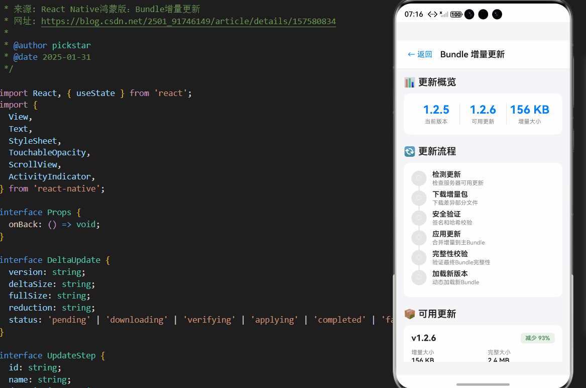
<Text style={styles.headerTitle}>Bundle 增量更新</Text>
</View>
<ScrollView style={styles.content} showsVerticalScrollIndicator={false}>
{/* 当前状态 */}
<View style={styles.section}>
<Text style={styles.sectionTitle}>📊 更新概览</Text>
<View style={styles.overviewCard}>
<View style={styles.overviewItem}>
<Text style={styles.overviewValue}>1.2.5</Text>
<Text style={styles.overviewLabel}>当前版本</Text>
</View>
<View style={styles.overviewDivider} />
<View style={styles.overviewItem}>
<Text style={styles.overviewValue}>1.2.6</Text>
<Text style={styles.overviewLabel}>可用更新</Text>
</View>
<View style={styles.overviewDivider} />
<View style={styles.overviewItem}>
<Text style={styles.overviewValue}>156 KB</Text>
<Text style={styles.overviewLabel}>增量大小</Text>
</View>
</View>
</View>
{/* 更新流程 */}
<View style={styles.section}>
<Text style={styles.sectionTitle}>🔄 更新流程</Text>
<View style={styles.stepsCard}>
{updateSteps.map((step, index) => (
<View key={step.id} style={styles.stepItem}>
<View style={styles.stepHeader}>
<View
style={[
styles.stepIcon,
{ backgroundColor: getStepColor(step.status) },
]}
>
<Text style={styles.stepIconText}>{getStepIcon(step.status)}</Text>
</View>
<View style={styles.stepInfo}>
<Text style={styles.stepName}>{step.name}</Text>
<Text style={styles.stepDesc}>{step.description}</Text>
</View>
{step.duration && (
<Text style={styles.stepDuration}>{step.duration}</Text>
)}
</View>
{index < updateSteps.length - 1 && (
<View
style={[
styles.stepConnector,
{ backgroundColor: getStepColor(step.status) },
]}
/>
)}
</View>
))}
</View>
</View>
{/* 进度条 */}
{isUpdating && (
<View style={styles.section}>
<Text style={styles.sectionTitle}>⏳ 更新进度</Text>
<View style={styles.progressCard}>
<View style={styles.progressBar}>
<View
style={[styles.progressFill, { width: `${updateProgress}%` }]}
/>
</View>
<Text style={styles.progressText}>{updateProgress}%</Text>
</View>
</View>
)}
{/* 可用更新 */}
<View style={styles.section}>
<Text style={styles.sectionTitle}>📦 可用更新</Text>
{availableUpdates.map((update) => (
<View key={update.version} style={styles.updateCard}>
<View style={styles.updateHeader}>
<Text style={styles.updateVersion}>v{update.version}</Text>
<View
style={[
styles.reductionBadge,
{ backgroundColor: '#E8F5E9' },
]}
>
<Text style={styles.reductionText}>
减少 {update.reduction}
</Text>
</View>
</View>
<View style={styles.updateDetails}>
<View style={styles.detailItem}>
<Text style={styles.detailLabel}>增量大小</Text>
<Text style={styles.detailValue}>{update.deltaSize}</Text>
</View>
<View style={styles.detailItem}>
<Text style={styles.detailLabel}>完整大小</Text>
<Text style={styles.detailValue}>{update.fullSize}</Text>
</View>
</View>
{update.status === 'pending' && !isUpdating && (
<TouchableOpacity
style={styles.downloadButton}
onPress={simulateUpdate}
>
<Text style={styles.downloadButtonText}>下载更新</Text>
</TouchableOpacity>
)}
{update.status === 'completed' && (
<View style={styles.completedBadge}>
<Text style={styles.completedText}>已安装</Text>
</View>
)}
</View>
))}
</View>
{/* Bundle 结构 */}
<View style={styles.section}>
<Text style={styles.sectionTitle}>📄 Bundle 文件结构</Text>
<View style={styles.structureCard}>
{bundleStructure.map((item, index) => (
<View key={index} style={styles.structureRow}>
<Text style={styles.structurePart}>{item.part}</Text>
<Text style={styles.structureSize}>{item.size}</Text>
<Text style={styles.structureDesc}>{item.desc}</Text>
</View>
))}
</View>
</View>
{/* 优化指标 */}
<View style={styles.section}>
<Text style={styles.sectionTitle}>⚡ 性能优化策略</Text>
<View style={styles.metricsCard}>
{optimizationMetrics.map((metric, index) => (
<View key={index} style={styles.metricItem}>
<View style={styles.metricHeader}>
<Text style={styles.metricName}>{metric.metric}</Text>
<Text style={styles.metricValue}>{metric.value}</Text>
</View>
<Text style={styles.metricSavings}>
节省 {metric.savings} {metric.label}
</Text>
</View>
))}
</View>
</View>
{/* 安全措施 */}
<View style={styles.section}>
<Text style={styles.sectionTitle}>🔒 安全增强措施</Text>
<View style={styles.securityCard}>
{securityMeasures.map((item, index) => (
<View key={index} style={styles.securityItem}>
<View style={styles.securityHeader}>
<Text style={styles.securityMeasure}>{item.measure}</Text>
<View
style={[
styles.securityLevelBadge,
{ backgroundColor: getSecurityLevelColor(item.level) + '20' },
]}
>
<Text
style={[
styles.securityLevelText,
{ color: getSecurityLevelColor(item.level) },
]}
>
{item.level === 'high' ? '高' : item.level === 'medium' ? '中' : '低'}
</Text>
</View>
</View>
<Text style={styles.securityDesc}>{item.desc}</Text>
</View>
))}
</View>
</View>
{/* 权限要求 */}
<View style={styles.section}>
<Text style={styles.sectionTitle}>📋 权限配置要求</Text>
<View style={styles.permissionsCard}>
<View style={styles.permissionItem}>
<Text style={styles.permissionName}>FILE_ACCESS</Text>
<Text style={styles.permissionReason}>
用于存储增量更新文件
</Text>
</View>
<View style={styles.permissionItem}>
<Text style={styles.permissionName}>INTERNET</Text>
<Text style={styles.permissionReason}>
用于下载增量更新包
</Text>
</View>
<View style={styles.permissionItem}>
<Text style={styles.permissionName}>GET_NETWORK_INFO</Text>
<Text style={styles.permissionReason}>
检测网络状态选择最佳更新时机
</Text>
</View>
</View>
</View>
{/* 技术要点 */}
<View style={styles.section}>
<Text style={styles.sectionTitle}>💡 技术实现要点</Text>
<View style={styles.tipsCard}>
<Text style={styles.tipText}>
• 使用 ohos.file.fs 在应用私有目录管理增量文件
</Text>
<Text style={styles.tipText}>
• 通过 global.__loadDeltaBundle 扩展点注入新模块
</Text>
<Text style={styles.tipText}>
• 使用 @ohos.security.cert 验证更新包签名
</Text>
<Text style={styles.tipText}>
• 通过 @ohos.crypto 计算 SHA-256 确保文件完整性
</Text>
<Text style={styles.tipText}>
• 增量文件应存储在应用私有目录(filesDir)
</Text>
<Text style={styles.tipText}>
• 避免使用 rawfile 目录的直接写入(系统保护机制)
</Text>
</View>
</View>
{/* 未来方向 */}
<View style={styles.section}>
<Text style={styles.sectionTitle}>🚀 未来发展方向</Text>
<View style={styles.futureCard}>
<View style={styles.futureItem}>
<Text style={styles.futureTitle}>分布式更新</Text>
<Text style={styles.futureDesc}>
与 HarmonyOS 分布式能力结合,实现跨设备同步更新
</Text>
</View>
<View style={styles.futureItem}>
<Text style={styles.futureTitle}>本地代码热更新</Text>
<Text style={styles.futureDesc}>
探索基于 ArkCompiler 的本地代码热更新机制
</Text>
</View>
<View style={styles.futureItem}>
<Text style={styles.futureTitle}>AI 预测更新</Text>
<Text style={styles.futureDesc}>
集成 OpenHarmony 的 AI 能力实现智能更新预测
</Text>
</View>
</View>
</View>
</ScrollView>
{isUpdating && (
<View style={styles.loadingOverlay}>
<ActivityIndicator size="large" color="#007AFF" />
<Text style={styles.loadingText}>正在更新中...</Text>
<Text style={styles.loadingSubtext}>请勿关闭应用</Text>
</View>
)}
</View>
);
};
const styles = StyleSheet.create({
container: {
flex: 1,
backgroundColor: '#F5F5F7',
},
header: {
flexDirection: 'row',
alignItems: 'center',
paddingHorizontal: 16,
paddingVertical: 12,
backgroundColor: '#FFFFFF',
borderBottomWidth: 1,
borderBottomColor: '#E5E5E5',
},
backButton: {
padding: 8,
marginRight: 8,
},
backButtonText: {
fontSize: 16,
color: '#007AFF',
},
headerTitle: {
fontSize: 18,
fontWeight: '600',
color: '#1D1D1F',
},
content: {
flex: 1,
padding: 16,
},
section: {
marginBottom: 24,
},
sectionTitle: {
fontSize: 20,
fontWeight: '600',
color: '#1D1D1F',
marginBottom: 12,
},
overviewCard: {
backgroundColor: '#FFFFFF',
borderRadius: 12,
flexDirection: 'row',
padding: 20,
},
overviewItem: {
flex: 1,
alignItems: 'center',
},
overviewValue: {
fontSize: 24,
fontWeight: '700',
color: '#007AFF',
marginBottom: 4,
},
overviewLabel: {
fontSize: 12,
color: '#86868B',
},
overviewDivider: {
width: 1,
backgroundColor: '#E5E5E5',
},
stepsCard: {
backgroundColor: '#FFFFFF',
borderRadius: 12,
padding: 16,
},
stepItem: {
position: 'relative',
},
stepHeader: {
flexDirection: 'row',
alignItems: 'center',
marginBottom: 8,
},
stepIcon: {
width: 32,
height: 32,
borderRadius: 16,
alignItems: 'center',
justifyContent: 'center',
marginRight: 12,
},
stepIconText: {
color: '#FFFFFF',
fontSize: 14,
fontWeight: '700',
},
stepInfo: {
flex: 1,
},
stepName: {
fontSize: 15,
fontWeight: '600',
color: '#1D1D1F',
marginBottom: 2,
},
stepDesc: {
fontSize: 12,
color: '#86868B',
},
stepDuration: {
fontSize: 12,
color: '#007AFF',
fontWeight: '600',
},
stepConnector: {
position: 'absolute',
left: 15,
top: 32,
bottom: -16,
width: 2,
},
progressCard: {
backgroundColor: '#FFFFFF',
borderRadius: 12,
padding: 20,
},
progressBar: {
height: 8,
backgroundColor: '#E5E5E5',
borderRadius: 4,
overflow: 'hidden',
marginBottom: 12,
},
progressFill: {
height: '100%',
backgroundColor: '#007AFF',
},
progressText: {
fontSize: 16,
fontWeight: '700',
color: '#007AFF',
textAlign: 'center',
},
updateCard: {
backgroundColor: '#FFFFFF',
borderRadius: 12,
padding: 16,
marginBottom: 12,
},
updateHeader: {
flexDirection: 'row',
justifyContent: 'space-between',
alignItems: 'center',
marginBottom: 12,
},
updateVersion: {
fontSize: 18,
fontWeight: '700',
color: '#1D1D1F',
},
reductionBadge: {
paddingHorizontal: 10,
paddingVertical: 4,
borderRadius: 6,
},
reductionText: {
fontSize: 12,
fontWeight: '600',
color: '#4CAF50',
},
updateDetails: {
flexDirection: 'row',
gap: 20,
marginBottom: 12,
},
detailItem: {
flex: 1,
},
detailLabel: {
fontSize: 12,
color: '#86868B',
marginBottom: 2,
},
detailValue: {
fontSize: 14,
fontWeight: '600',
color: '#1D1D1F',
},
downloadButton: {
backgroundColor: '#007AFF',
paddingVertical: 12,
borderRadius: 8,
alignItems: 'center',
},
downloadButtonText: {
color: '#FFFFFF',
fontSize: 14,
fontWeight: '600',
},
completedBadge: {
backgroundColor: '#E8F5E9',
paddingVertical: 8,
borderRadius: 6,
alignItems: 'center',
},
completedText: {
color: '#4CAF50',
fontSize: 13,
fontWeight: '600',
},
structureCard: {
backgroundColor: '#FFFFFF',
borderRadius: 12,
padding: 16,
},
structureRow: {
flexDirection: 'row',
paddingVertical: 10,
borderBottomWidth: 1,
borderBottomColor: '#F5F5F7',
},
structurePart: {
flex: 1,
fontSize: 14,
fontWeight: '600',
color: '#1D1D1F',
},
structureSize: {
fontSize: 13,
color: '#007AFF',
fontWeight: '600',
marginRight: 12,
},
structureDesc: {
flex: 2,
fontSize: 12,
color: '#86868B',
},
metricsCard: {
backgroundColor: '#FFFFFF',
borderRadius: 12,
padding: 16,
},
metricItem: {
paddingVertical: 12,
borderBottomWidth: 1,
borderBottomColor: '#F5F5F7',
},
metricHeader: {
flexDirection: 'row',
justifyContent: 'space-between',
marginBottom: 4,
},
metricName: {
fontSize: 15,
fontWeight: '600',
color: '#1D1D1F',
},
metricValue: {
fontSize: 13,
color: '#007AFF',
fontFamily: 'monospace',
},
metricSavings: {
fontSize: 12,
color: '#4CAF50',
marginLeft: 12,
},
securityCard: {
backgroundColor: '#FFFFFF',
borderRadius: 12,
padding: 16,
},
securityItem: {
paddingVertical: 12,
borderBottomWidth: 1,
borderBottomColor: '#F5F5F7',
},
securityHeader: {
flexDirection: 'row',
justifyContent: 'space-between',
alignItems: 'center',
marginBottom: 4,
},
securityMeasure: {
fontSize: 15,
fontWeight: '600',
color: '#1D1D1F',
},
securityLevelBadge: {
paddingHorizontal: 10,
paddingVertical: 4,
borderRadius: 6,
},
securityLevelText: {
fontSize: 11,
fontWeight: '600',
},
securityDesc: {
fontSize: 13,
color: '#86868B',
lineHeight: 18,
},
permissionsCard: {
backgroundColor: '#FFFFFF',
borderRadius: 12,
padding: 16,
},
permissionItem: {
paddingVertical: 12,
borderBottomWidth: 1,
borderBottomColor: '#F5F5F7',
},
permissionName: {
fontSize: 14,
fontWeight: '600',
color: '#007AFF',
fontFamily: 'monospace',
marginBottom: 4,
},
permissionReason: {
fontSize: 13,
color: '#86868B',
},
tipsCard: {
backgroundColor: '#FFFFFF',
borderRadius: 12,
padding: 16,
},
tipText: {
fontSize: 14,
color: '#1D1D1F',
lineHeight: 22,
marginBottom: 8,
},
futureCard: {
backgroundColor: '#FFFFFF',
borderRadius: 12,
padding: 16,
},
futureItem: {
paddingVertical: 12,
borderBottomWidth: 1,
borderBottomColor: '#F5F5F7',
},
futureTitle: {
fontSize: 15,
fontWeight: '600',
color: '#007AFF',
marginBottom: 4,
},
futureDesc: {
fontSize: 13,
color: '#86868B',
lineHeight: 18,
},
loadingOverlay: {
position: 'absolute',
top: 0,
left: 0,
right: 0,
bottom: 0,
backgroundColor: 'rgba(0, 0, 0, 0.6)',
justifyContent: 'center',
alignItems: 'center',
},
loadingText: {
marginTop: 16,
fontSize: 16,
color: '#FFFFFF',
fontWeight: '600',
},
loadingSubtext: {
marginTop: 4,
fontSize: 13,
color: 'rgba(255, 255, 255, 0.8)',
},
});
export default BundleIncrementalUpdateScreen;
5. OpenHarmony 6.0.0平台特定注意事项
5.1 文件系统权限管理
权限配置要求:
- 在
module.json5中添加文件权限声明:
"requestPermissions": [
  {
    "name": "ohos.permission.FILE_ACCESS",
    "reason": "存储增量更新文件"
  }
]
- 增量文件应存储在应用私有目录(
filesDir) - 避免使用
rawfile目录的直接写入(系统保护机制)
5.2 性能优化策略
针对OpenHarmony设备的性能特点,需采用特定优化策略:
| 优化方向 | 实现方案 | 预期收益 |
|---|---|---|
| 差分算法 | bsdiff + zlib压缩 | 减少60%更新包大小 |
| 按需加载 | 模块级差分更新 | 降低80%更新量 |
| 后台更新 | WorkScheduler | 消除UI阻塞 |
| 断点续传 | 分块下载 | 节省70%重复流量 |
5.3 安全增强措施
安全实施要点:
- 使用
@ohos.security.cert验证开发者证书 - 通过
@ohos.crypto实现双重哈希校验 - 运行时注入保护机制检测内存篡改
- 每次更新后清除旧的增量文件
总结
本文详细介绍了React Native在OpenHarmony 6.0.0平台上实现Bundle增量更新的完整技术方案。通过合理利用OpenHarmony的文件系统API和安全机制,结合React Native的动态加载能力,开发者可以构建高效可靠的更新系统。关键点包括:
- 采用模块化差分更新策略,显著减少更新包体积
- 实施双重安全验证(签名+哈希)保障更新可靠性
📕个人领域 :Linux/C++/java/AI
🚀 个人主页 :有点流鼻涕 · CSDN
💬 座右铭 : “向光而行,沐光而生。”


作为“人工智能6S店”的官方数字引擎,为AI开发者与企业提供一个覆盖软硬件全栈、一站式门户。
更多推荐


 0
0 0
0- 0


 已为社区贡献23条内容

所有评论(0)