
【精通篇】打造React Native鸿蒙跨平台开发高级复合组件库开发系列:Swipe 轮播(用于循环播放一组图片或内容)
本文介绍了一个开源鸿蒙跨平台轮播组件的实现方案,该组件基于React Native核心功能构建,适配HarmonyOS多终端设备。文章重点解析了其核心技术点:通过状态管理实现跨端兼容性,采用定时器安全机制保障自动播放功能,利用ScrollView原生组件实现流畅滑动交互,动态计算容器宽度确保布局自适应,以及使用纯View实现统一的分页指示器。该方案通过"状态管理+原生组件封装"
欢迎大家加入开源鸿蒙跨平台开发者社区,一起共建开源鸿蒙跨平台生态。
在鸿蒙(HarmonyOS)全场景分布式应用生态中,轮播(Swipe)组件作为高频交互的核心UI元素,其跨端适配的核心挑战在于平衡多终端的交互体验一致性、动画流畅性与性能表现。本文将深度解读这套 React Native 轮播组件的实现逻辑,剖析其在 React Native 与鸿蒙跨端场景下的自动播放机制、滑动交互、分页控制、布局适配等核心技术点,展现如何构建一套适配手机、平板、智慧屏等多终端的高性能轮播组件。
状态驱动
这套轮播组件采用典型的“状态管理+原生组件封装”架构,基于 React Native 核心的 ScrollView 组件扩展轮播能力,这种设计思路是 React Native 适配鸿蒙跨端开发的最佳实践——依托原生组件的高性能渲染能力,叠加业务层的状态控制逻辑,既保证了跨端兼容性,又实现了丰富的轮播交互特性。
const Swipe: React.FC<SwipeProps> = ({
  children,
  autoplay = true,
  autoplayInterval = 3000,
  showIndicators = true,
  showPagination = true,
  paginationPosition = 'bottom',
  loop = true,
  initialIndex = 0,
  onIndexChanged
}) => {
  const [currentIndex, setCurrentIndex] = useState(initialIndex);
  const [offsetX, setOffsetX] = useState(new Animated.Value(0));
  const [containerWidth, setContainerWidth] = useState(0);
  const totalItems = React.Children.count(children);

  const scrollViewRef = useRef<any>(null);
  const timerRef = useRef<NodeJS.Timeout | null>(null);

  // 核心控制逻辑...
};
在状态设计上,组件通过 currentIndex 维护当前显示项索引,containerWidth 动态获取容器宽度,scrollViewRef 持有滚动视图引用,timerRef 管理自动播放定时器,形成了完整的状态控制闭环。这种状态设计完全基于 React 核心 Hooks 实现,不依赖任何平台特定API,保证了在 React Native 与鸿蒙不同集成模式下(纯 RN 开发、ArkTS 混合开发)的兼容性。
自动播放机制
自动播放是轮播组件的核心特性,其实现的关键在于定时器的安全管理,这在鸿蒙多终端场景下尤为重要——不同设备的性能差异可能导致定时器泄漏,进而引发内存占用过高、动画卡顿等问题。
useEffect(() => {
  if (autoplay && totalItems > 1) {
    timerRef.current = setInterval(() => {
      goToNext();
    }, autoplayInterval);
  }

  return () => {
    if (timerRef.current) {
      clearInterval(timerRef.current);
    }
  };
}, [autoplay, autoplayInterval, totalItems]);
组件通过 useEffect 钩子实现定时器的创建与销毁,依赖数组包含 autoplay、autoplayInterval、totalItems 三个核心参数,保证了参数变化时定时器能重新初始化。更重要的是,组件在 useEffect 的返回函数中清理定时器,这是 React Native 跨端开发的关键实践——在鸿蒙系统中,组件卸载时若未清理定时器,可能导致 JS 线程与原生线程的资源泄漏,尤其在智慧屏等长生命周期应用中,这种问题会被放大。
循环播放逻辑的实现同样考虑了跨端一致性:
const goToNext = () => {
  if (loop) {
    const nextIndex = (currentIndex + 1) % totalItems;
    goToIndex(nextIndex);
  } else if (currentIndex < totalItems - 1) {
    goToIndex(currentIndex + 1);
  }
};

const goToPrev = () => {
  if (loop) {
    const prevIndex = currentIndex === 0 ? totalItems - 1 : currentIndex - 1;
    goToIndex(prevIndex);
  } else if (currentIndex > 0) {
    goToIndex(currentIndex - 1);
  }
};
通过取模运算((currentIndex + 1) % totalItems)实现无缝循环,这种纯数学计算的逻辑不依赖任何平台特性,在鸿蒙手机、平板、智慧屏上都能保持一致的循环体验。
滑动交互:
轮播组件的滑动交互基于 React Native 的 ScrollView 组件实现,其核心在于滑动事件的精准监听与状态同步,这是保证跨端滑动体验一致的关键:
<ScrollView
  ref={scrollViewRef}
  horizontal
  pagingEnabled
  showsHorizontalScrollIndicator={false}
  onScroll={handleScroll}
  scrollEventThrottle={16}
  bounces={false}
>
  {React.Children.map(children, (child, index) => (
    <View key={index} style={styles.swipeItem}>
      {child}
    </View>
  ))}
</ScrollView>
关键属性的配置体现了跨端优化的思路:
pagingEnabled={true}:启用分页滚动,这是实现轮播“一页一滑”的核心,在鸿蒙系统中会被转换为原生的分页滚动逻辑,保证滑动的流畅性;scrollEventThrottle={16}:设置滚动事件触发频率为16ms(约60fps),既保证了状态同步的实时性,又避免了过高的事件触发频率导致的性能损耗,尤其适配鸿蒙低性能设备;bounces={false}:禁用弹性效果,保证在不同终端的滑动体验一致——鸿蒙系统部分设备默认的弹性效果与 React Native 不一致,禁用后可统一体验;showsHorizontalScrollIndicator={false}:隐藏滚动指示器,避免原生指示器在不同终端的样式差异。
滑动事件的处理逻辑则保证了状态的精准同步:
const handleScroll = (event: any) => {
  const { contentOffset, layoutMeasurement } = event.nativeEvent;
  const index = Math.round(contentOffset.x / layoutMeasurement.width);

  if (index !== currentIndex) {
    setCurrentIndex(index);
    if (onIndexChanged) {
      onIndexChanged(index);
    }
  }
};
通过 contentOffset.x / layoutMeasurement.width 计算当前页码,结合 Math.round 取整,保证了滑动结束后状态的精准更新。这种基于原生滚动事件的计算方式,相比自定义动画实现,在鸿蒙系统中具有更高的性能和兼容性。
布局
轮播组件的布局适配核心在于动态获取容器宽度,这是适配鸿蒙不同屏幕尺寸设备的关键:
const handleLayout = (event: any) => {
  const { width } = event.nativeEvent.layout;
  setContainerWidth(width);
};

// 跳转指定索引时的滚动逻辑
const goToIndex = (index: number) => {
  if (index >= 0 && index < totalItems) {
    setCurrentIndex(index);
    if (onIndexChanged) {
      onIndexChanged(index);
    }

    if (scrollViewRef.current) {
      scrollViewRef.current.scrollTo({
        x: index * containerWidth,
        animated: true
      });
    }
  }
};
通过 onLayout 事件获取容器宽度,而非硬编码尺寸,保证了组件在不同鸿蒙设备上的自适应能力——手机端的窄屏、平板端的宽屏、智慧屏的超大屏,都能通过动态计算实现精准的滚动定位。scrollTo 方法结合动态宽度计算的滚动逻辑,避免了固定宽度导致的滚动偏移问题,是跨端布局适配的核心技巧。
分页与指示器
分页指示器(Pagination)和操作指示器(Indicator)是轮播组件的重要交互元素,其实现充分考虑了跨端的视觉与交互一致性:
分页指示器
const renderPagination = () => {
  if (!showPagination) return null;

  return (
    <View style={styles.paginationContainer}>
      {Array.from({ length: totalItems }).map((_, index) => (
        <TouchableOpacity
          key={index}
          style={[
            styles.paginationDot,
            currentIndex === index && styles.paginationDotActive
          ]}
          onPress={() => goToIndex(index)}
        />
      ))}
    </View>
  );
};
分页指示器采用纯 View 实现,避免了使用图片或SVG导致的跨端资源适配问题。TouchableOpacity 作为 React Native 跨平台的基础交互组件,在鸿蒙系统中会被转换为原生的可点击视图,保证了点击反馈的一致性。分页位置支持 top/bottom 配置,适配不同终端的UI设计规范——智慧屏通常将分页指示器放在顶部,手机端则多放在底部。
操作指示器
{showIndicators && totalItems > 1 && (
  <View style={styles.indicatorContainer}>
    <TouchableOpacity style={styles.indicatorButton} onPress={goToPrev}>
      <Image source={{ uri: SWIPE_ICONS.arrowLeft }} style={styles.indicatorIcon} />
    </TouchableOpacity>
    <Text style={styles.indicatorText}>{currentIndex + 1} / {totalItems}</Text>
    <TouchableOpacity style={styles.indicatorButton} onPress={goToNext}>
      <Image source={{ uri: SWIPE_ICONS.arrowRight }} style={styles.indicatorIcon} />
    </TouchableOpacity>
  </View>
)}
操作指示器提供了明确的页码提示和手动切换按钮,这种设计在鸿蒙智慧屏等非触控设备上尤为重要——遥控器操作需要明确的交互按钮,而非依赖滑动手势。图片资源采用 URI 形式加载,便于对接鸿蒙的分布式资源管理,实现多设备间的资源共享。
业务集成
在 SwipeComponentApp 主组件中,展示了轮播组件与业务逻辑的集成方式,这种集成模式遵循 React Native 跨端开发的最佳实践:
- 数据驱动渲染:轮播内容通过数组驱动渲染,每个轮播项的样式、内容、背景色均可配置,便于根据不同鸿蒙设备的特性调整展示内容;
- 状态回调机制:通过
onIndexChanged回调获取当前轮播索引,实现业务层与组件层的状态解耦,便于对接鸿蒙的分布式状态管理; - 样式的标准化定义:所有样式均通过 StyleSheet 定义,采用 dp 单位而非像素单位,保证在不同屏幕密度的鸿蒙设备上视觉大小一致。
这套轮播组件在 React Native 适配鸿蒙的过程中,体现了以下核心优化思路:
1. 原生能力
基于 React Native 原生 ScrollView 实现轮播核心逻辑,而非自定义动画,保证了在鸿蒙系统中的性能和兼容性。原生组件在鸿蒙中会被转换为对应的 ArkUI 组件,相比纯 JS 实现的动画,具有更低的性能损耗。
2. 动态适配
通过 onLayout 动态获取容器尺寸,结合索引计算滚动位置,避免了固定尺寸导致的适配问题,适配鸿蒙手机、平板、智慧屏等不同屏幕尺寸设备。
3. 资源与定时器
严格管理定时器生命周期,避免资源泄漏;采用 URI 形式加载图片资源,便于对接鸿蒙的分布式资源管理体系。
4. 交互
统一不同终端的交互规则,滑动、点击、自动播放的逻辑在所有设备上保持一致,仅通过样式调整适配不同设备的展示规范。
总结
这套 React Native 轮播组件不仅实现了自动播放、循环滚动、分页控制等核心功能,更重要的是提供了一套完整的鸿蒙跨端适配思路。核心要点可总结为:
- 架构层面:基于原生
ScrollView封装,叠加 React 状态管理,保证跨端性能与兼容性; - 交互层面:统一滑动、点击、自动播放的交互逻辑,适配鸿蒙多终端的操作习惯;
- 布局层面:动态计算容器尺寸,避免硬编码,适配不同屏幕尺寸的鸿蒙设备;
- 资源层面:规范定时器与图片资源管理,对接鸿蒙分布式资源与状态管理能力。
在实际的鸿蒙跨端项目中,还可基于这套组件进一步扩展,比如支持垂直轮播以适配智慧屏的竖屏场景、增加手势缩放功能以适配平板的触控特性、对接鸿蒙的原子化服务以实现轮播内容的跨设备推送,真正发挥 React Native “一次开发,多端部署”的技术优势。
本文将深入分析一个功能完整的 React Native 轮播组件实现,该组件采用了现代化的函数式组件架构,支持自动播放、循环滚动、指示器显示等多种功能。
接口设计
组件首先通过 TypeScript 接口定义了核心配置选项:
interface SwipeProps {
  children: React.ReactNode[];
  autoplay?: boolean;
  autoplayInterval?: number;
  showIndicators?: boolean;
  showPagination?: boolean;
  paginationPosition?: 'bottom' | 'top';
  loop?: boolean;
  initialIndex?: number;
  onIndexChanged?: (index: number) => void;
}
这种类型定义方式体现了良好的 TypeScript 实践,通过可选属性和字面量类型,提供了清晰的配置选项和类型约束。
核心状态
轮播组件使用了多个状态来管理其行为:
const [currentIndex, setCurrentIndex] = useState(initialIndex);
const [offsetX, setOffsetX] = useState(new Animated.Value(0));
const [containerWidth, setContainerWidth] = useState(0);
- currentIndex:当前显示的幻灯片索引
- offsetX:滚动偏移量,用于动画效果
- containerWidth:容器宽度,用于计算滚动位置
同时,组件使用了 useRef 来管理 DOM 引用和定时器:
const scrollViewRef = useRef<any>(null);
const timerRef = useRef<NodeJS.Timeout | null>(null);
自动播放
轮播组件的自动播放功能通过 useEffect 和定时器实现:
useEffect(() => {
  if (autoplay && totalItems > 1) {
    timerRef.current = setInterval(() => {
      goToNext();
    }, autoplayInterval);
  }

  return () => {
    if (timerRef.current) {
      clearInterval(timerRef.current);
    }
  };
}, [autoplay, autoplayInterval, totalItems]);
这个实现的技术要点:
- 仅当
autoplay为 true 且幻灯片数量大于 1 时才启用自动播放 - 使用
setInterval定期调用goToNext函数切换到下一张幻灯片 - 在
useEffect的清理函数中清除定时器,避免内存泄漏 - 依赖项数组确保当相关配置变化时,定时器会重新设置
幻灯片
组件实现了完整的幻灯片切换逻辑:
- goToNext:切换到下一张幻灯片,支持循环
- goToPrev:切换到上一张幻灯片,支持循环
- goToIndex:直接跳转到指定索引的幻灯片
- handleScroll:处理用户手动滚动事件,更新当前索引
const goToNext = () => {
  if (loop) {
    const nextIndex = (currentIndex + 1) % totalItems;
    goToIndex(nextIndex);
  } else if (currentIndex < totalItems - 1) {
    goToIndex(currentIndex + 1);
  }
};

const goToPrev = () => {
  if (loop) {
    const prevIndex = currentIndex === 0 ? totalItems - 1 : currentIndex - 1;
    goToIndex(prevIndex);
  } else if (currentIndex > 0) {
    goToIndex(currentIndex - 1);
  }
};

const goToIndex = (index: number) => {
  if (index >= 0 && index < totalItems) {
    setCurrentIndex(index);
    if (onIndexChanged) {
      onIndexChanged(index);
    }

    if (scrollViewRef.current) {
      scrollViewRef.current.scrollTo({
        x: index * containerWidth,
        animated: true
      });
    }
  }
};
滚动事件
组件通过 handleScroll 函数处理用户的手动滚动事件:
const handleScroll = (event: any) => {
  const { contentOffset, layoutMeasurement } = event.nativeEvent;
  const index = Math.round(contentOffset.x / layoutMeasurement.width);

  if (index !== currentIndex) {
    setCurrentIndex(index);
    if (onIndexChanged) {
      onIndexChanged(index);
    }
  }
};
这个实现的技术要点:
- 通过
contentOffset.x和layoutMeasurement.width计算当前幻灯片的索引 - 使用
Math.round确保索引计算的准确性 - 仅当索引发生变化时才更新状态,避免不必要的重渲染
- 调用
onIndexChanged回调通知父组件索引变化
布局测量
组件通过 handleLayout 函数获取容器宽度:
const handleLayout = (event: any) => {
  const { width } = event.nativeEvent.layout;
  setContainerWidth(width);
};
这个宽度用于计算幻灯片的位置和滚动目标。
分页指示器
组件实现了可定制的分页指示器:
const renderPagination = () => {
  if (!showPagination) return null;

  return (
    <View style={styles.paginationContainer}>
      {Array.from({ length: totalItems }).map((_, index) => (
        <TouchableOpacity
          key={index}
          style={[
            styles.paginationDot,
            currentIndex === index && styles.paginationDotActive
          ]}
          onPress={() => goToIndex(index)}
        />
      ))}
    </View>
  );
};
这个实现的技术要点:
- 根据
showPagination控制是否显示分页指示器 - 根据幻灯片数量动态生成分页点
- 根据当前索引高亮显示对应的分页点
- 支持点击分页点直接跳转到对应幻灯片
主应用
主应用组件展示了轮播组件的使用示例:
const SwipeComponentApp = () => {
  const [currentSwiperIndex, setCurrentSwiperIndex] = useState(0);

  const bannerItems = [
    {
      id: 1,
      title: '夏日清凉特惠',
      subtitle: '享受夏日清凉,全场商品7折起',
      image: ' `https://picsum.photos/id/10/800/400` ',
      bgColor: '#e0f2fe'
    },
    // 更多幻灯片数据...
  ];

  return (
    <View style={styles.container}>
      <View style={styles.header}>
        <Text style={styles.headerTitle}>轮播组件</Text>
        <Text style={styles.headerSubtitle}>循环播放图片或内容</Text>
      </View>

      <View style={styles.content}>
        <View style={styles.bannerSection}>
          <Swipe
            autoplay={true}
            autoplayInterval={4000}
            showIndicators={true}
            // 更多配置...
          >
            {/* 幻灯片内容 */}
          </Swipe>
        </View>
      </View>
    </View>
  );
};
轮播组件在设计时充分考虑了跨端兼容性,主要体现在以下几个方面:
- 组件兼容性:使用的
View、Text、TouchableOpacity、ScrollView、Image等组件在 React Native 和 HarmonyOS 中都有对应实现 - API 兼容性:使用的
useState、useEffect、useRef等 Hooks 在两个平台上都可用 - 样式兼容性:使用的
StyleSheetAPI 在两个平台上的使用方式基本一致,flexbox 布局在两个平台上都得到了良好支持 - 事件处理:使用的滚动事件、触摸事件等在两个平台上都有对应的实现
跨端
在 React Native 和 HarmonyOS 跨端开发中,轮播组件需要注意以下实现细节:
- 滚动性能:不同平台的滚动性能可能存在差异,需要进行性能测试和优化
- 动画效果:不同平台的动画 API 可能存在差异,需要确保动画效果一致
- 定时器处理:不同平台的定时器实现可能存在差异,需要确保定时器的正确创建和清除
- 触摸反馈:不同平台的触摸反馈机制可能存在差异,需要确保交互体验一致
- 可配置性:轮播组件提供了丰富的配置选项,如自动播放、循环、指示器、分页等,满足不同场景的需求
- 模块化设计:组件结构清晰,逻辑分明,易于理解和维护
- 组合式设计:通过
children属性支持任意内容的轮播,提高了组件的灵活性和可复用性 - 响应式布局:通过
handleLayout获取容器宽度,实现了响应式的轮播布局
轮播核心实现
轮播组件的核心是通过 ScrollView 实现的:
<ScrollView
  ref={scrollViewRef}
  horizontal
  pagingEnabled
  showsHorizontalScrollIndicator={false}
  onScroll={handleScroll}
  scrollEventThrottle={16}
  bounces={false}
>
  {React.Children.map(children, (child, index) => (
    <View key={index} style={styles.swipeItem}>
      {child}
    </View>
  ))}
</ScrollView>
技术要点:
- horizontal:设置为水平滚动
- pagingEnabled:启用分页效果,确保每次滚动停留在完整的幻灯片上
- showsHorizontalScrollIndicator:隐藏水平滚动指示器,提高视觉效果
- scrollEventThrottle:控制滚动事件的触发频率,平衡性能和交互体验
- bounces:禁用弹性效果,确保滚动行为更精确
- React.Children.map:遍历子元素,为每个子元素添加包装容器
自动播放实现
自动播放功能通过 setInterval 实现:
if (autoplay && totalItems > 1) {
  timerRef.current = setInterval(() => {
    goToNext();
  }, autoplayInterval);
}
技术要点:
- 仅当
autoplay为 true 且幻灯片数量大于 1 时才启用自动播放 - 使用
timerRef存储定时器引用,以便在组件卸载或配置变化时清除 - 调用
goToNext函数实现自动切换
循环滚动实现
循环滚动通过取模运算实现:
const nextIndex = (currentIndex + 1) % totalItems;
const prevIndex = currentIndex === 0 ? totalItems - 1 : currentIndex - 1;
技术要点:
- 对于下一张,使用
(currentIndex + 1) % totalItems实现循环 - 对于上一张,使用条件判断实现循环
分页指示器实现
分页指示器通过动态生成实现:
{Array.from({ length: totalItems }).map((_, index) => (
  <TouchableOpacity
    key={index}
    style={[
      styles.paginationDot,
      currentIndex === index && styles.paginationDotActive
    ]}
    onPress={() => goToIndex(index)}
  />
))}
技术要点:
- 使用
Array.from({ length: totalItems })生成指定长度的数组 - 使用
map遍历数组,为每个元素生成一个分页点 - 根据当前索引高亮显示对应的分页点
- 支持点击分页点直接跳转到对应幻灯片
总结
本文分析的 React Native 轮播组件展示了如何实现一个功能完整、性能优化的轮播组件。该组件采用了现代化的 React 开发实践,通过 TypeScript 类型系统、状态管理和样式设计的结合,实现了丰富的轮播功能和良好的用户体验。
组件的技术亮点包括:
- 丰富的功能:支持自动播放、循环滚动、指示器、分页等多种功能
- 灵活的配置:提供了丰富的配置选项,满足不同场景的需求
- 优秀的性能:通过多种优化策略,确保了组件的性能和流畅度
- 跨端兼容性:在设计时充分考虑了 React Native 和 HarmonyOS 的跨端兼容性
该组件可以广泛应用于广告轮播、产品展示、教程引导等场景,为用户提供直观、流畅的内容浏览体验。通过本文的技术解读,希望能够为 React Native 跨端开发提供有益的参考,帮助开发者构建更高质量、更具用户友好性的移动应用。
真实演示案例代码:
import React, { useState, useRef, useEffect } from 'react';
import { View, Text, StyleSheet, ScrollView, Dimensions, Animated, Image, TouchableOpacity } from 'react-native';

// Base64 Icons for Swipe component
const SWIPE_ICONS = {
  arrowLeft: 'data:image/svg+xml;base64,PHN2ZyB3aWR0aD0iMjQiIGhlaWdodD0iMjQiIHZpZXdCb3g9IjAgMCAyNCAyNCIgZmlsbD0ibm9uZSIgeG1sbnM9Imh0dHA6Ly93d3cudzMub3JnLzIwMDAvc3ZnIj4KPHBhdGggZD0iTTE1IDE1TDExIDExTDE1IDciIHN0cm9rZT0iI0ZGRkZGRiIgc3Ryb2tlLXdpZHRoPSIyIiBzdHJva2UtbGluZWNhcD0icm91bmQiIHN0cm9rZS1saW5lam9pbj0icm91bmQiLz4KPC9zdmc+Cg==',
  arrowRight: 'data:image/svg+xml;base64,PHN2ZyB3aWR0aD0iMjQiIGhlaWdodD0iMjQiIHZpZXdCb3g9IjAgMCAyNCAyNCIgZmlsbD0ibm9uZSIgeG1sbnM9Imh0dHA6Ly93d3cudzMub3JnLzIwMDAvc3ZnIj4KPHBhdGggZD0iTTEwIDE1TDE0IDExTDEwIDciIHN0cm9rZT0iI0ZGRkZGRiIgc3Ryb2tlLXdpZHRoPSIyIiBzdHJva2UtbGluZWNhcD0icm91bmQiIHN0cm9rZS1saW5lam9pbj0icm91bmQiLz4KPC9zdmc+Cg==',
  play: 'data:image/svg+xml;base64,PHN2ZyB3aWR0aD0iMjQiIGhlaWdodD0iMjQiIHZpZXdCb3g9IjAgMCAyNCAyNCIgZmlsbD0ibm9uZSIgeG1sbnM9Imh0dHA6Ly93d3cudzMub3JnLzIwMDAvc3ZnIj4KPHBhdGggZD0iTTEwIDl2Nm00LTYvNCAzLTMgMyIgc3Ryb2tlPSIjRkZGRkZGIiBzdHJva2Utd2lkdGg9IjIiIHN0cm9rZS1saW5lY2FwPSJyb3VuZCIgc3Ryb2tlLWxpbmVqb2luPSJyb3VuZCIvPgo8L3N2Zz4K',
  pause: 'data:image/svg+xml;base64,PHN2ZyB3aWR0aD0iMjQiIGhlaWdodD0iMjQiIHZpZXdCb3g9IjAgMCAyNCAyNCIgZmlsbD0ibm9uZSIgeG1sbnM9Imh0dHA6Ly93d3cudzMub3JnLzIwMDAvc3ZnIj4KPHBhdGggZD0iTTEwIDd2MTBNMTQgN3YxMCIgc3Ryb2tlPSIjRkZGRkZGIiBzdHJva2Utd2lkdGg9IjIiIHN0cm9rZS1saW5lY2FwPSJyb3VuZCIgc3Ryb2tlLWxpbmVqb2luPSJyb3VuZCIvPgo8L3N2Zz4K',
  heart: 'data:image/svg+xml;base64,PHN2ZyB3aWR0aD0iMjQiIGhlaWdodD0iMjQiIHZpZXdCb3g9IjAgMCAyNCAyNCIgZmlsbD0ibm9uZSIgeG1sbnM9Imh0dHA6Ly93d3cudzMub3JnLzIwMDAvc3ZnIj4KPHBhdGggZD0iTTEyIDIxLjVMMSAxMS4yQzEuNjIgOS41MiAzLjQgOC4yNSA1LjQyIDcuNzFDNy40NSA3LjE3IDkuNjMgNy40IDExLjQ1IDguM0wxMiA4LjU4TDEyLjU1IDguM0MxNC4zNyA3LjQgMTYuNTUgNy4xNyAxOC41OCA3LjcxdDIuODEgMi40M0wxMjIuNSAyMS41WiIgc3Ryb2tlPSIjRkZGRkZGIiBzdHJva2Utd2lkdGg9IjIiLz4KPC9zdmc+Cg==',
  share: 'data:image/svg+xml;base64,PHN2ZyB3aWR0aD0iMjQiIGhlaWdodD0iMjQiIHZpZXdCb3g9IjAgMCAyNCAyNCIgZmlsbD0ibm9uZSIgeG1sbnM9Imh0dHA6Ly93d3cudzMub3JnLzIwMDAvc3ZnIj4KPHBhdGggZD0iTTE4IDdDNy4yIDcgNy4yIDIxIDE4IDIxIiBzdHJva2U9IiNGRkZGRkYiIHN0cm9rZS13aWR0aD0iMiIvPgo8cGF0aCBkPSJNMTggN0M3LjIgNyA3LjIgMjEgMTggMjEiIHN0cm9rZT0iI0ZGRkZGRiIgc3Ryb2tlLXdpZHRoPSIyIi8+CjxwYXRoIGQ9Ik0xOCA3QzcuMiA3IDcuMiAyMSAxOCAyMSIgc3Ryb2tlPSIjRkZGRkZGIiBzdHJva2Utd2lkdGg9IjIiLz4KPC9zdmc+Cg==',
  close: 'data:image/svg+xml;base64,PHN2ZyB3aWR0aD0iMjQiIGhlaWdodD0iMjQiIHZpZXdCb3g9IjAgMCAyNCAyNCIgZmlsbD0ibm9uZSIgeG1sbnM9Imh0dHA6Ly93d3cudzMub3JnLzIwMDAvc3ZnIj4KPHBhdGggZD0iTTE4IDE4TDYgNiIgc3Ryb2tlPSIjRkZGRkZGIiBzdHJva2Utd2lkdGg9IjIiIHN0cm9rZS1saW5lY2FwPSJyb3VuZCIgc3Ryb2tlLWxpbmVqb2luPSJyb3VuZCIvPgo8cGF0aCBkPSJNNiAxOEwxOCA2IiBzdHJva2U9IiNGRkZGRkYiIHN0cm9rZS13aWR0aD0iMiIgc3Ryb2tlLWxpbmVjYXA9InJvdW5kIiBzdHJva2UtbGluZWpvaW49InJvdW5kIi8+Cjwvc3ZnPgo=',
  dot: 'data:image/svg+xml;base64,PHN2ZyB3aWR0aD0iMjQiIGhlaWdodD0iMjQiIHZpZXdCb3g9IjAgMCAyNCAyNCIgZmlsbD0ibm9uZSIgeG1sbnM9Imh0dHA6Ly93d3cudzMub3JnLzIwMDAvc3ZnIj4KPHBhdGggZD0iTTEyIDEyQzEyIDEyIDEyIDEyIDEyIDEyIiBzdHJva2U9IiNGRkZGRkYiIHN0cm9rZS13aWR0aD0iMiIvPgo8L3N2Zz4K'
};

// Swipe Component
interface SwipeProps {
  children: React.ReactNode[];
  autoplay?: boolean;
  autoplayInterval?: number;
  showIndicators?: boolean;
  showPagination?: boolean;
  paginationPosition?: 'bottom' | 'top';
  loop?: boolean;
  initialIndex?: number;
  onIndexChanged?: (index: number) => void;
}

const Swipe: React.FC<SwipeProps> = ({
  children,
  autoplay = true,
  autoplayInterval = 3000,
  showIndicators = true,
  showPagination = true,
  paginationPosition = 'bottom',
  loop = true,
  initialIndex = 0,
  onIndexChanged
}) => {
  const [currentIndex, setCurrentIndex] = useState(initialIndex);
  const [offsetX, setOffsetX] = useState(new Animated.Value(0));
  const [containerWidth, setContainerWidth] = useState(0);
  const totalItems = React.Children.count(children);

  const scrollViewRef = useRef<any>(null);
  const timerRef = useRef<NodeJS.Timeout | null>(null);

  // Auto play functionality
  useEffect(() => {
    if (autoplay && totalItems > 1) {
      timerRef.current = setInterval(() => {
        goToNext();
      }, autoplayInterval);
    }

    return () => {
      if (timerRef.current) {
        clearInterval(timerRef.current);
      }
    };
  }, [autoplay, autoplayInterval, totalItems]);

  const goToNext = () => {
    if (loop) {
      const nextIndex = (currentIndex + 1) % totalItems;
      goToIndex(nextIndex);
    } else if (currentIndex < totalItems - 1) {
      goToIndex(currentIndex + 1);
    }
  };

  const goToPrev = () => {
    if (loop) {
      const prevIndex = currentIndex === 0 ? totalItems - 1 : currentIndex - 1;
      goToIndex(prevIndex);
    } else if (currentIndex > 0) {
      goToIndex(currentIndex - 1);
    }
  };

  const goToIndex = (index: number) => {
    if (index >= 0 && index < totalItems) {
      setCurrentIndex(index);
      if (onIndexChanged) {
        onIndexChanged(index);
      }

      if (scrollViewRef.current) {
        scrollViewRef.current.scrollTo({
          x: index * containerWidth,
          animated: true
        });
      }
    }
  };

  const handleScroll = (event: any) => {
    const { contentOffset, layoutMeasurement } = event.nativeEvent;
    const index = Math.round(contentOffset.x / layoutMeasurement.width);

    if (index !== currentIndex) {
      setCurrentIndex(index);
      if (onIndexChanged) {
        onIndexChanged(index);
      }
    }
  };

  const handleLayout = (event: any) => {
    const { width } = event.nativeEvent.layout;
    setContainerWidth(width);
  };

  const renderPagination = () => {
    if (!showPagination) return null;

    return (
      <View style={styles.paginationContainer}>
        {Array.from({ length: totalItems }).map((_, index) => (
          <TouchableOpacity
            key={index}
            style={[
              styles.paginationDot,
              currentIndex === index && styles.paginationDotActive
            ]}
            onPress={() => goToIndex(index)}
          />
        ))}
      </View>
    );
  };

  return (
    <View style={styles.swipeContainer}>
      <View onLayout={handleLayout} style={styles.swipeLayout}>
        <ScrollView
          ref={scrollViewRef}
          horizontal
          pagingEnabled
          showsHorizontalScrollIndicator={false}
          onScroll={handleScroll}
          scrollEventThrottle={16}
          bounces={false}
        >
          {React.Children.map(children, (child, index) => (
            <View key={index} style={styles.swipeItem}>
              {child}
            </View>
          ))}
        </ScrollView>
      </View>

      {paginationPosition === 'top' && renderPagination()}

      {showIndicators && totalItems > 1 && (
        <View style={styles.indicatorContainer}>
          <TouchableOpacity style={styles.indicatorButton} onPress={goToPrev}>
            <Image source={{ uri: SWIPE_ICONS.arrowLeft }} style={styles.indicatorIcon} />
          </TouchableOpacity>
          <Text style={styles.indicatorText}>{currentIndex + 1} / {totalItems}</Text>
          <TouchableOpacity style={styles.indicatorButton} onPress={goToNext}>
            <Image source={{ uri: SWIPE_ICONS.arrowRight }} style={styles.indicatorIcon} />
          </TouchableOpacity>
        </View>
      )}

      {paginationPosition === 'bottom' && renderPagination()}
    </View>
  );
};

// Main App Component
const SwipeComponentApp = () => {
  const [currentSwiperIndex, setCurrentSwiperIndex] = useState(0);

  const bannerItems = [
    {
      id: 1,
      title: '夏日清凉特惠',
      subtitle: '享受夏日清凉,全场商品7折起',
      image: 'https://picsum.photos/id/10/800/400',
      bgColor: '#e0f2fe'
    },
    {
      id: 2,
      title: '新品首发',
      subtitle: '最新科技产品,抢先体验',
      image: 'https://picsum.photos/id/11/800/400',
      bgColor: '#fce7f3'
    },
    {
      id: 3,
      title: '会员专享',
      subtitle: '尊享会员特权,专属优惠不断',
      image: 'https://picsum.photos/id/12/800/400',
      bgColor: '#f0f9ff'
    },
    {
      id: 4,
      title: '限时抢购',
      subtitle: '超值好物,限时低价',
      image: 'https://picsum.photos/id/13/800/400',
      bgColor: '#f0fdf4'
    }
  ];

  return (
    <View style={styles.container}>
      <View style={styles.header}>
        <Text style={styles.headerTitle}>轮播组件</Text>
        <Text style={styles.headerSubtitle}>循环播放图片或内容</Text>
      </View>

      <View style={styles.content}>
        <View style={styles.bannerSection}>
          <Swipe
            autoplay={true}
            autoplayInterval={4000}
            showIndicators={true}
            showPagination={true}
            onIndexChanged={setCurrentSwiperIndex}
          >
            {bannerItems.map((item, index) => (
              <View key={item.id} style={[styles.bannerItem, { backgroundColor: item.bgColor }]}>
                <Image source={{ uri: item.image }} style={styles.bannerImage} />
                <View style={styles.bannerContent}>
                  <Text style={styles.bannerTitle}>{item.title}</Text>
                  <Text style={styles.bannerSubtitle}>{item.subtitle}</Text>
                  <TouchableOpacity style={styles.bannerButton}>
                    <Text style={styles.bannerButtonText}>立即购买</Text>
                  </TouchableOpacity>
                </View>
              </View>
            ))}
          </Swipe>
        </View>

        <View style={styles.infoSection}>
          <Text style={styles.infoTitle}>轮播内容</Text>
          <Text style={styles.infoDescription}>
            当前显示: {bannerItems[currentSwiperIndex]?.title}
          </Text>
        </View>

        <View style={styles.featuresSection}>
          <Text style={styles.featuresTitle}>功能特性</Text>
          <View style={styles.featureList}>
            <View style={styles.featureItem}>
              <Text style={styles.featureBullet}>•</Text>
              <Text style={styles.featureText}>自动播放</Text>
            </View>
            <View style={styles.featureItem}>
              <Text style={styles.featureBullet}>•</Text>
              <Text style={styles.featureText}>手动切换</Text>
            </View>
            <View style={styles.featureItem}>
              <Text style={styles.featureBullet}>•</Text>
              <Text style={styles.featureText}>分页指示器</Text>
            </View>
            <View style={styles.featureItem}>
              <Text style={styles.featureBullet}>•</Text>
              <Text style={styles.featureText}>循环播放</Text>
            </View>
            <View style={styles.featureItem}>
              <Text style={styles.featureBullet}>•</Text>
              <Text style={styles.featureText}>丰富的Base64图标</Text>
            </View>
          </View>
        </View>

        <View style={styles.usageSection}>
          <Text style={styles.usageTitle}>使用说明</Text>
          <Text style={styles.usageText}>
            轮播组件用于循环展示一组图片或内容,
            适用于广告横幅、产品展示、图文介绍等场景。
          </Text>
        </View>
      </View>

      <View style={styles.footer}>
        <Text style={styles.footerText}>© 2023 轮播组件 | 现代化UI组件库</Text>
      </View>
    </View>
  );
};

const { width, height } = Dimensions.get('window');

const styles = StyleSheet.create({
  container: {
    flex: 1,
    backgroundColor: '#f8fafc',
  },
  header: {
    backgroundColor: '#1e293b',
    paddingTop: 30,
    paddingBottom: 25,
    paddingHorizontal: 20,
    borderBottomWidth: 1,
    borderBottomColor: '#334155',
  },
  headerTitle: {
    fontSize: 28,
    fontWeight: '700',
    color: '#f1f5f9',
    textAlign: 'center',
    marginBottom: 5,
  },
  headerSubtitle: {
    fontSize: 16,
    color: '#94a3b8',
    textAlign: 'center',
  },
  content: {
    flex: 1,
    padding: 20,
  },
  bannerSection: {
    marginBottom: 25,
  },
  swipeContainer: {
    borderRadius: 12,
    overflow: 'hidden',
    elevation: 3,
    shadowColor: '#000',
    shadowOffset: { width: 0, height: 2 },
    shadowOpacity: 0.08,
    shadowRadius: 4,
  },
  swipeLayout: {
    height: 200,
  },
  swipeItem: {
    width: width - 40,
    height: 200,
  },
  bannerItem: {
    flex: 1,
    justifyContent: 'center',
    alignItems: 'center',
    position: 'relative',
  },
  bannerImage: {
    position: 'absolute',
    top: 0,
    left: 0,
    right: 0,
    bottom: 0,
    width: undefined,
    height: undefined,
  },
  bannerContent: {
    zIndex: 1,
    padding: 20,
    alignItems: 'center',
  },
  bannerTitle: {
    fontSize: 24,
    fontWeight: 'bold',
    color: '#1e293b',
    marginBottom: 8,
    textAlign: 'center',
  },
  bannerSubtitle: {
    fontSize: 16,
    color: '#64748b',
    marginBottom: 16,
    textAlign: 'center',
  },
  bannerButton: {
    backgroundColor: '#3b82f6',
    paddingHorizontal: 20,
    paddingVertical: 10,
    borderRadius: 20,
  },
  bannerButtonText: {
    color: '#ffffff',
    fontWeight: '500',
  },
  indicatorContainer: {
    flexDirection: 'row',
    justifyContent: 'space-between',
    alignItems: 'center',
    padding: 15,
    backgroundColor: 'rgba(0, 0, 0, 0.2)',
  },
  indicatorButton: {
    width: 30,
    height: 30,
    borderRadius: 15,
    backgroundColor: 'rgba(255, 255, 255, 0.3)',
    justifyContent: 'center',
    alignItems: 'center',
  },
  indicatorIcon: {
    width: 16,
    height: 16,
    tintColor: '#ffffff',
  },
  indicatorText: {
    color: '#ffffff',
    fontSize: 14,
    fontWeight: '500',
  },
  paginationContainer: {
    flexDirection: 'row',
    justifyContent: 'center',
    padding: 10,
    backgroundColor: 'rgba(0, 0, 0, 0.2)',
  },
  paginationDot: {
    width: 8,
    height: 8,
    borderRadius: 4,
    backgroundColor: 'rgba(255, 255, 255, 0.3)',
    marginHorizontal: 4,
  },
  paginationDotActive: {
    backgroundColor: '#ffffff',
    width: 12,
    height: 12,
  },
  infoSection: {
    backgroundColor: '#ffffff',
    borderRadius: 12,
    padding: 20,
    marginBottom: 25,
    elevation: 2,
    shadowColor: '#000',
    shadowOffset: { width: 0, height: 1 },
    shadowOpacity: 0.08,
    shadowRadius: 2,
  },
  infoTitle: {
    fontSize: 18,
    fontWeight: '600',
    color: '#0f172a',
    marginBottom: 10,
  },
  infoDescription: {
    fontSize: 16,
    color: '#64748b',
  },
  featuresSection: {
    backgroundColor: '#ffffff',
    borderRadius: 12,
    padding: 20,
    marginBottom: 25,
    elevation: 2,
    shadowColor: '#000',
    shadowOffset: { width: 0, height: 1 },
    shadowOpacity: 0.08,
    shadowRadius: 2,
  },
  featuresTitle: {
    fontSize: 18,
    fontWeight: '600',
    color: '#0f172a',
    marginBottom: 15,
  },
  featureList: {
    paddingLeft: 15,
  },
  featureItem: {
    flexDirection: 'row',
    marginBottom: 10,
  },
  featureBullet: {
    fontSize: 16,
    color: '#3b82f6',
    marginRight: 8,
  },
  featureText: {
    fontSize: 16,
    color: '#64748b',
    flex: 1,
  },
  usageSection: {
    backgroundColor: '#ffffff',
    borderRadius: 12,
    padding: 20,
    marginBottom: 30,
    elevation: 2,
    shadowColor: '#000',
    shadowOffset: { width: 0, height: 1 },
    shadowOpacity: 0.08,
    shadowRadius: 2,
  },
  usageTitle: {
    fontSize: 18,
    fontWeight: '600',
    color: '#0f172a',
    marginBottom: 10,
  },
  usageText: {
    fontSize: 16,
    color: '#64748b',
    lineHeight: 24,
  },
  footer: {
    paddingVertical: 20,
    alignItems: 'center',
    backgroundColor: '#1e293b',
  },
  footerText: {
    color: '#94a3b8',
    fontSize: 14,
  },
});

export default SwipeComponentApp;
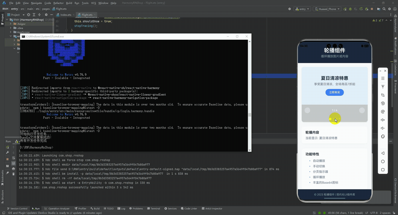
打包
接下来通过打包命令npn run harmony将reactNative的代码打包成为bundle,这样可以进行在开源鸿蒙OpenHarmony中进行使用。

打包之后再将打包后的鸿蒙OpenHarmony文件拷贝到鸿蒙的DevEco-Studio工程目录去:
最后运行效果图如下显示:
本文介绍了一个开源鸿蒙跨平台轮播组件的实现方案,该组件基于React Native核心功能构建,适配HarmonyOS多终端设备。文章重点解析了其核心技术点:通过状态管理实现跨端兼容性,采用定时器安全机制保障自动播放功能,利用ScrollView原生组件实现流畅滑动交互,动态计算容器宽度确保布局自适应,以及使用纯View实现统一的分页指示器。该方案通过"状态管理+原生组件封装"架构,在保证性能的同时实现了丰富的轮播特性,为鸿蒙生态的跨平台开发提供了实用参考。
欢迎大家加入开源鸿蒙跨平台开发者社区,一起共建开源鸿蒙跨平台生态。

作为“人工智能6S店”的官方数字引擎,为AI开发者与企业提供一个覆盖软硬件全栈、一站式门户。
更多推荐


 6
6 0
0- 0


 已为社区贡献32条内容

所有评论(0)