
Flutter for OpenHarmony 实战:Statistic 统计数值
在移动开发领域,我们总是面临着选择与适配。今天,你的Flutter应用在Android和iOS上跑得正欢,明天可能就需要考虑一个新的平台:HarmonyOS(鸿蒙)。这不是一道选答题,而是很多团队正在面对的现实。Flutter的优势很明确——写一套代码,就能在两个主要平台上运行,开发体验流畅。而鸿蒙代表的是下一个时代的互联生态,它不仅仅是手机系统,更着眼于未来全场景的体验。
欢迎加入开源鸿蒙跨平台社区: https://openharmonycrossplatform.csdn.net
前言:跨生态开发的新机遇
在移动开发领域,我们总是面临着选择与适配。今天,你的Flutter应用在Android和iOS上跑得正欢,明天可能就需要考虑一个新的平台:HarmonyOS(鸿蒙)。这不是一道选答题,而是很多团队正在面对的现实。
Flutter的优势很明确——写一套代码,就能在两个主要平台上运行,开发体验流畅。而鸿蒙代表的是下一个时代的互联生态,它不仅仅是手机系统,更着眼于未来全场景的体验。将现有的Flutter应用适配到鸿蒙,听起来像是一个“跨界”任务,但它本质上是一次有价值的技术拓展:让产品触达更多用户,也让技术栈覆盖更广。
不过,这条路走起来并不像听起来那么简单。Flutter和鸿蒙,从底层的架构到上层的工具链,都有着各自的设计逻辑。会遇到一些具体的问题:代码如何组织?原有的功能在鸿蒙上如何实现?那些平台特有的能力该怎么调用?更实际的是,从编译打包到上架部署,整个流程都需要重新摸索。
这篇文章想做的,就是把这些我们趟过的路、踩过的坑,清晰地摊开给你看。我们不会只停留在“怎么做”,还会聊到“为什么得这么做”,以及“如果出了问题该往哪想”。这更像是一份实战笔记,源自真实的项目经验,聚焦于那些真正卡住过我们的环节。
无论你是在为一个成熟产品寻找新的落地平台,还是从一开始就希望构建能面向多端的应用,这里的思路和解决方案都能提供直接的参考。理解了两套体系之间的异同,掌握了关键的衔接技术,不仅能完成这次迁移,更能积累起应对未来技术变化的能力。
混合工程结构深度解析
项目目录架构
当Flutter项目集成鸿蒙支持后,典型的项目结构会发生显著变化。以下是经过ohos_flutter插件初始化后的项目结构:
my_flutter_harmony_app/
├── lib/                          # Flutter业务代码(基本不变)
│   ├── main.dart                 # 应用入口
│   ├── home_page.dart           # 首页
│   └── utils/
│       └── platform_utils.dart  # 平台工具类
├── pubspec.yaml                  # Flutter依赖配置
├── ohos/                         # 鸿蒙原生层(核心适配区)
│   ├── entry/                    # 主模块
│   │   └── src/main/
│   │       ├── ets/              # ArkTS代码
│   │       │   ├── MainAbility/
│   │       │   │   ├── MainAbility.ts       # 主Ability
│   │       │   │   └── MainAbilityContext.ts
│   │       │   └── pages/
│   │       │       ├── Index.ets           # 主页面
│   │       │       └── Splash.ets          # 启动页
│   │       ├── resources/        # 鸿蒙资源文件
│   │       │   ├── base/
│   │       │   │   ├── element/  # 字符串等
│   │       │   │   ├── media/    # 图片资源
│   │       │   │   └── profile/  # 配置文件
│   │       │   └── en_US/        # 英文资源
│   │       └── config.json       # 应用核心配置
│   ├── ohos_test/               # 测试模块
│   ├── build-profile.json5      # 构建配置
│   └── oh-package.json5         # 鸿蒙依赖管理
└── README.md
展示效果图片
flutter 实时预览 效果展示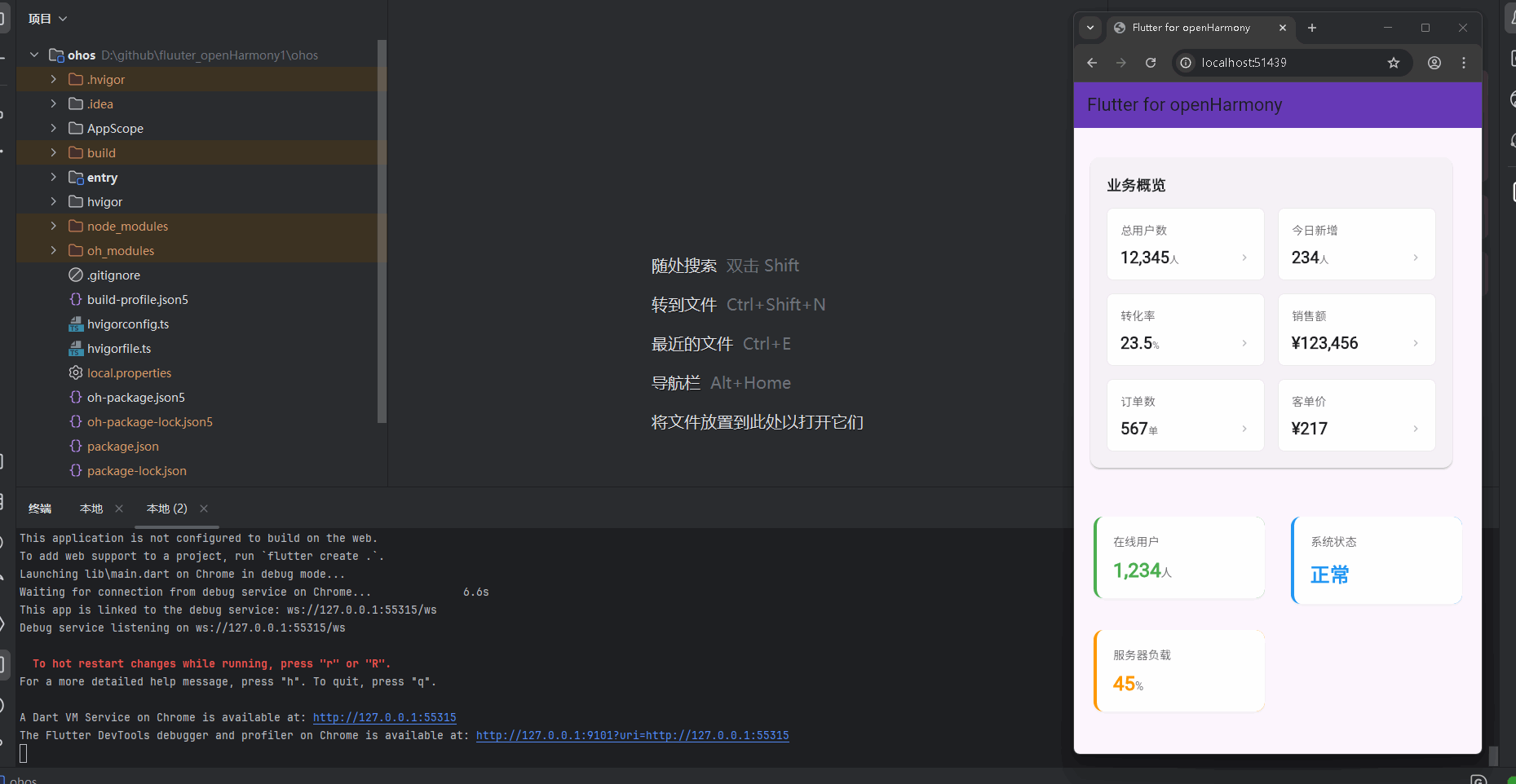
运行到鸿蒙虚拟设备中效果展示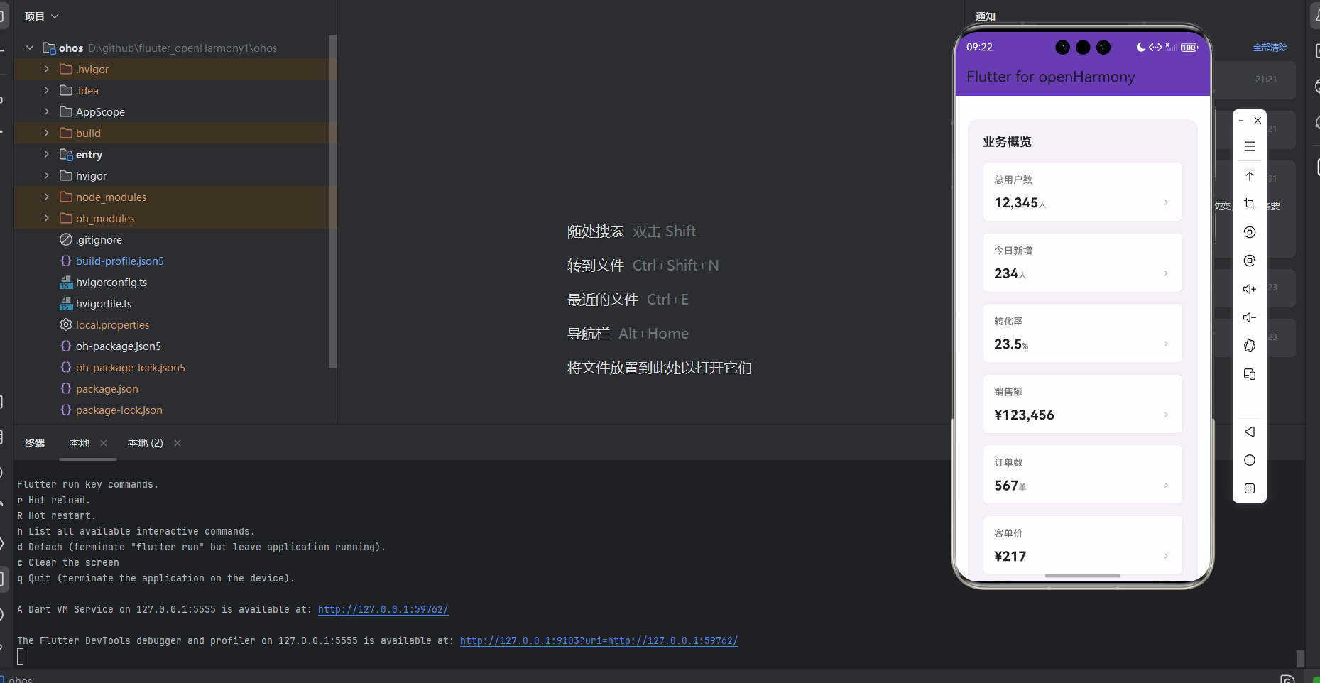
功能代码实现
Statistic 统计数值组件设计与实现
组件结构设计
Statistic 组件采用了组件化设计思想,将统计数值展示和交互功能完全封装,便于在不同页面复用。组件包含以下核心部分:
- 数据模型:定义了
StatisticItem类和StatisticType枚举来表示统计项和类型 - 核心组件:实现了
StatisticWidget和CardStatisticWidget两种样式的组件 - 交互处理:支持点击事件回调,提供直观的用户交互
- 响应式布局:适配不同屏幕尺寸,自动调整布局
- 样式类型:提供多种样式类型,如 primary、success、warning、danger、info
数据模型实现
首先,我们定义了 StatisticType 枚举和 StatisticItem 类来表示统计项:
// 统计数值组件
enum StatisticType {
  primary,  // 主要样式
  success,  // 成功样式
  warning,  // 警告样式
  danger,   // 危险样式
  info,     // 信息样式
}

// 统计数值组件数据模型
class StatisticItem {
  final String title;        // 标题
  final String value;        // 数值
  final String? suffix;      // 后缀
  final StatisticType type;  // 类型
  final Function()? onTap;   // 点击回调

  StatisticItem({
    required this.title,
    required this.value,
    this.suffix,
    this.type = StatisticType.primary,
    this.onTap,
  });
}
核心组件实现
StatisticWidget 组件
// 统计数值组件
class StatisticWidget extends StatelessWidget {
final List<StatisticItem> items; // 统计项列表
final bool showAnimation; // 是否显示动画效果
final EdgeInsets padding; // 内边距
const StatisticWidget({
Key? key,
required this.items,
this.showAnimation = true,
this.padding = const EdgeInsets.all(16.0),
}) : super(key: key);
// 获取对应类型的颜色
Color _getTypeColor(StatisticType type, BuildContext context) {
switch (type) {
case StatisticType.primary:
return Theme.of(context).primaryColor;
case StatisticType.success:
return Colors.green;
case StatisticType.warning:
return Colors.orange;
case StatisticType.danger:
return Colors.red;
case StatisticType.info:
return Colors.blue;
}
}
// 构建单个统计项
Widget _buildStatisticItem(StatisticItem item, BuildContext context) {
return GestureDetector(
onTap: item.onTap,
child: Container(
padding: EdgeInsets.all(20.0),
margin: EdgeInsets.symmetric(horizontal: 8.0, vertical: 8.0),
decoration: BoxDecoration(
color: Colors.white,
borderRadius: BorderRadius.circular(12.0),
boxShadow: [
BoxShadow(
color: Colors.grey.withOpacity(0.1),
spreadRadius: 1,
blurRadius: 5,
offset: Offset(0, 2),
),
],
border: Border(
left: BorderSide(
color: _getTypeColor(item.type, context),
width: 4.0,
),
),
),
child: Column(
crossAxisAlignment: CrossAxisAlignment.start,
children: [
Text(
item.title,
style: TextStyle(
fontSize: 14.0,
color: Colors.grey[600],
fontWeight: FontWeight.w500,
),
),
SizedBox(height: 12.0),
Row(
mainAxisAlignment: MainAxisAlignment.spaceBetween,
children: [
Flexible(
child: RichText(
text: TextSpan(
children: [
TextSpan(
text: item.value,
style: TextStyle(
fontSize: 24.0,
color: _getTypeColor(item.type, context),
fontWeight: FontWeight.bold,
),
),
if (item.suffix != null)
TextSpan(
text: item.suffix!,
style: TextStyle(
fontSize: 14.0,
color: Colors.grey[600],
fontWeight: FontWeight.normal,
),
),
],
),
),
),
if (item.onTap != null)
Icon(
Icons.chevron_right,
color: Colors.grey[400],
size: 20.0,
),
],
),
],
),
),
);
}
Widget build(BuildContext context) {
return Container(
padding: padding,
child: Column(
crossAxisAlignment: CrossAxisAlignment.start,
children: [
Wrap(
spacing: 16.0,
runSpacing: 16.0,
children: items.asMap().entries.map((entry) {
int index = entry.key;
StatisticItem item = entry.value;
return Container(
width: MediaQuery.of(context).size.width > 600
? (MediaQuery.of(context).size.width - 64) / 3
: MediaQuery.of(context).size.width > 400
? (MediaQuery.of(context).size.width - 48) / 2
: MediaQuery.of(context).size.width - 32,
child: _buildStatisticItem(item, context),
);
}).toList(),
),
],
),
);
}
}
CardStatisticWidget 组件
// 带卡片样式的统计数值组件
class CardStatisticWidget extends StatelessWidget {
final List<StatisticItem> items;
final String? title;
final EdgeInsets padding;
const CardStatisticWidget({
Key? key,
required this.items,
this.title,
this.padding = const EdgeInsets.all(16.0),
}) : super(key: key);
Widget build(BuildContext context) {
return Container(
padding: padding,
child: Card(
elevation: 2,
shape: RoundedRectangleBorder(
borderRadius: BorderRadius.circular(12.0),
),
child: Container(
padding: EdgeInsets.all(20.0),
child: Column(
crossAxisAlignment: CrossAxisAlignment.start,
children: [
if (title != null)
Padding(
padding: const EdgeInsets.only(bottom: 16.0),
child: Text(
title!,
style: TextStyle(
fontSize: 18.0,
fontWeight: FontWeight.bold,
color: Colors.black87,
),
),
),
Wrap(
spacing: 16.0,
runSpacing: 16.0,
children: items.asMap().entries.map((entry) {
int index = entry.key;
StatisticItem item = entry.value;
return Container(
width: MediaQuery.of(context).size.width > 600
? (MediaQuery.of(context).size.width - 128) / 3
: MediaQuery.of(context).size.width > 400
? (MediaQuery.of(context).size.width - 112) / 2
: MediaQuery.of(context).size.width - 72,
child: Container(
padding: EdgeInsets.all(16.0),
decoration: BoxDecoration(
color: Colors.white,
borderRadius: BorderRadius.circular(8.0),
border: Border.all(
color: Colors.grey.withOpacity(0.2),
width: 1.0,
),
),
child: Column(
crossAxisAlignment: CrossAxisAlignment.start,
children: [
Text(
item.title,
style: TextStyle(
fontSize: 14.0,
color: Colors.grey[600],
fontWeight: FontWeight.w500,
),
),
SizedBox(height: 12.0),
Row(
mainAxisAlignment: MainAxisAlignment.spaceBetween,
children: [
Flexible(
child: RichText(
text: TextSpan(
children: [
TextSpan(
text: item.value,
style: TextStyle(
fontSize: 20.0,
color: Colors.black87,
fontWeight: FontWeight.bold,
),
),
if (item.suffix != null)
TextSpan(
text: item.suffix!,
style: TextStyle(
fontSize: 12.0,
color: Colors.grey[600],
fontWeight: FontWeight.normal,
),
),
],
),
),
),
if (item.onTap != null)
Icon(
Icons.chevron_right,
color: Colors.grey[400],
size: 16.0,
),
],
),
],
),
),
);
}).toList(),
),
],
),
),
),
);
}
}
首页集成与使用
在首页中,我们集成了 Statistic 组件,并添加了示例数据和交互效果:
// 示例统计数据
final List<StatisticItem> _statisticItems = [
  StatisticItem(
    title: '总用户数',
    value: '12,345',
    suffix: '人',
    type: StatisticType.primary,
    onTap: () {
      print('点击了总用户数');
    },
  ),
  StatisticItem(
    title: '今日新增',
    value: '234',
    suffix: '人',
    type: StatisticType.success,
    onTap: () {
      print('点击了今日新增');
    },
  ),
  StatisticItem(
    title: '转化率',
    value: '23.5',
    suffix: '%',
    type: StatisticType.warning,
    onTap: () {
      print('点击了转化率');
    },
  ),
  StatisticItem(
    title: '销售额',
    value: '¥123,456',
    suffix: '',
    type: StatisticType.danger,
    onTap: () {
      print('点击了销售额');
    },
  ),
  StatisticItem(
    title: '订单数',
    value: '567',
    suffix: '单',
    type: StatisticType.info,
    onTap: () {
      print('点击了订单数');
    },
  ),
  StatisticItem(
    title: '客单价',
    value: '¥217',
    suffix: '',
    type: StatisticType.primary,
    onTap: () {
      print('点击了客单价');
    },
  ),
];

// 集成 CardStatisticWidget 组件
CardStatisticWidget(
  title: '业务概览',
  items: _statisticItems,
),

// 集成 StatisticWidget 组件
StatisticWidget(
  items: [
    StatisticItem(
      title: '在线用户',
      value: '1,234',
      suffix: '人',
      type: StatisticType.success,
    ),
    StatisticItem(
      title: '系统状态',
      value: '正常',
      suffix: '',
      type: StatisticType.info,
    ),
    StatisticItem(
      title: '服务器负载',
      value: '45',
      suffix: '%',
      type: StatisticType.warning,
    ),
  ],
),
开发要点与注意事项
-
数据结构设计
- 合理设计
StatisticItem数据模型,包含 title、value、suffix、type 和 onTap 字段 - 使用
StatisticType枚举统一管理样式类型,提高代码可读性
- 合理设计
-
组件设计
- 提供两种样式的组件:
StatisticWidget(独立卡片)和CardStatisticWidget(统一卡片) - 支持自定义内边距和标题,增强组件的灵活性
- 提供两种样式的组件:
-
响应式布局
- 使用
MediaQuery和Wrap组件实现响应式布局 - 根据屏幕尺寸自动调整统计项的宽度,适配不同设备
- 使用
-
交互设计
- 通过
GestureDetector实现点击交互效果 - 为可点击的统计项添加右侧箭头图标,提供视觉提示
- 实现
onTap回调函数,支持自定义点击行为
- 通过
-
样式设计
- 为不同类型的统计项设计不同的颜色,增强视觉区分度
- 使用阴影和边框效果,提升组件的立体感
- 合理设置字体大小和间距,确保视觉美观
-
性能优化
- 使用
const构造函数和SizedBox替代Container提升性能 - 避免在
build方法中创建不必要的对象 - 合理使用
Flexible和Wrap组件,避免布局溢出
- 使用
本次开发中容易遇到的问题
Statistic 组件开发中容易遇到的问题
1. 响应式布局适配问题
问题描述
在不同屏幕尺寸的设备上,Statistic 组件的布局可能出现适配问题,如统计项排列不当、文字溢出等。
解决方案
使用 MediaQuery 和 Wrap 组件实现响应式布局,根据屏幕尺寸自动调整统计项的宽度:
Container(
  width: MediaQuery.of(context).size.width > 600
      ? (MediaQuery.of(context).size.width - 64) / 3
      : MediaQuery.of(context).size.width > 400
          ? (MediaQuery.of(context).size.width - 48) / 2
          : MediaQuery.of(context).size.width - 32,
  child: _buildStatisticItem(item, context),
);
注意事项
- 确保在不同屏幕尺寸上测试布局效果
- 合理设置内边距和间距,避免布局拥挤
- 考虑横屏和竖屏模式的适配
2. 点击交互事件冲突问题
问题描述
在实现统计项点击交互时,可能出现事件冲突,导致点击效果不符合预期。
解决方案
使用 GestureDetector 组件实现点击交互,并合理设置点击区域:
GestureDetector(
  onTap: item.onTap,
  child: Container(
    // 组件内容
  ),
);
注意事项
- 确保
onTap回调函数不为 null 时才添加点击事件 - 为可点击的统计项添加视觉提示,如右侧箭头图标
- 测试不同设备上的触摸响应,确保交互体验一致
3. 样式一致性问题
问题描述
在不同类型的统计项之间,可能出现样式不一致的问题,影响整体视觉效果。
解决方案
使用 StatisticType 枚举统一管理样式类型,并通过 _getTypeColor 方法获取对应类型的颜色:
Color _getTypeColor(StatisticType type, BuildContext context) {
  switch (type) {
    case StatisticType.primary:
      return Theme.of(context).primaryColor;
    case StatisticType.success:
      return Colors.green;
    case StatisticType.warning:
      return Colors.orange;
    case StatisticType.danger:
      return Colors.red;
    case StatisticType.info:
      return Colors.blue;
  }
}
注意事项
- 确保颜色选择符合设计规范
- 考虑不同主题模式下的颜色适配
- 保持样式的一致性和统一性
总结本次开发中用到的技术点
Statistic 组件开发中用到的技术点
1. Flutter组件化开发
技术要点
- 采用组件化设计思想,将统计数值展示和交互功能完全封装
- 实现了
StatisticWidget和CardStatisticWidget两种样式的组件 - 支持通过参数配置组件行为,如内边距、标题等
- 提供回调函数
onTap与父组件通信
应用场景
- 适用于需要在多个页面复用统计数值展示的场景
- 便于后续功能扩展和维护
- 提高代码复用率和开发效率
2. 响应式布局技术
技术要点
- 使用
MediaQuery获取屏幕尺寸信息 - 通过
Wrap组件实现统计项的自动换行 - 根据屏幕尺寸动态调整统计项的宽度
- 适配不同设备的屏幕尺寸
应用场景
- 适用于需要在多种设备上展示的界面
- 确保在不同屏幕尺寸上的布局一致性
- 提高应用的可用性和用户体验
3. 数据模型设计
技术要点
- 设计
StatisticItem数据模型,包含 title、value、suffix、type 和 onTap 字段 - 使用
StatisticType枚举统一管理样式类型 - 支持自定义后缀和点击回调
应用场景
- 适用于需要展示多种类型统计数据的场景
- 便于与后端 API 数据对接
- 支持动态构建和修改统计数据
4. 交互设计与用户体验
技术要点
- 使用
GestureDetector实现点击交互效果 - 为可点击的统计项添加右侧箭头图标,提供视觉提示
- 实现
onTap回调函数,支持自定义点击行为 - 通过不同颜色区分不同类型的统计项
应用场景
- 适用于需要用户交互的统计数据展示
- 提高用户操作的直观性和流畅性
- 增强界面的交互性和用户体验
5. 样式设计与视觉效果
技术要点
- 使用
BoxDecoration实现卡片样式和阴影效果 - 通过
Border添加左侧边框,增强视觉区分度 - 使用
RichText实现数值和后缀的不同样式 - 合理设置字体大小和间距,确保视觉美观
应用场景
- 适用于需要美观视觉效果的统计数据展示
- 提高界面的专业性和美观度
- 增强用户的视觉体验
欢迎加入开源鸿蒙跨平台社区: https://openharmonycrossplatform.csdn.net

作为“人工智能6S店”的官方数字引擎,为AI开发者与企业提供一个覆盖软硬件全栈、一站式门户。
更多推荐
 6
6 0
0- 0


 已为社区贡献2条内容

所有评论(0)