
【开源鸿蒙跨平台开发先锋训练营】DAY15~DAY19为开源鸿蒙跨平台应用全面集成添加核心场景-登录页面
本文介绍了登录页面的开发实现,包含手机号/密码输入、隐私政策同意等核心功能模块。通过Flutter框架实现UI组件开发,包括带图标和状态控制的输入框、可切换显示/隐藏的密码框、隐私政策复选框等交互元素。代码展示了表单验证逻辑、API调用流程,以及登录成功后用户信息保存和页面跳转处理。整体采用绿色(#4CAF50)作为主色调,搭配灰色系文字。
还记得我们之前底部导航栏是我的,里面有一个功能卡片叫做退出登录。那既然有退出登录肯定是有登录页面页面啦,所以它来了。
登录页面UI借鉴和登录接口的接入的是我已经上架的纯血鸿蒙APP【老廖杂铺】,目前已经上架,希望大家能下载一下给我提提意见。
1.登录页面的开发先看截图效果
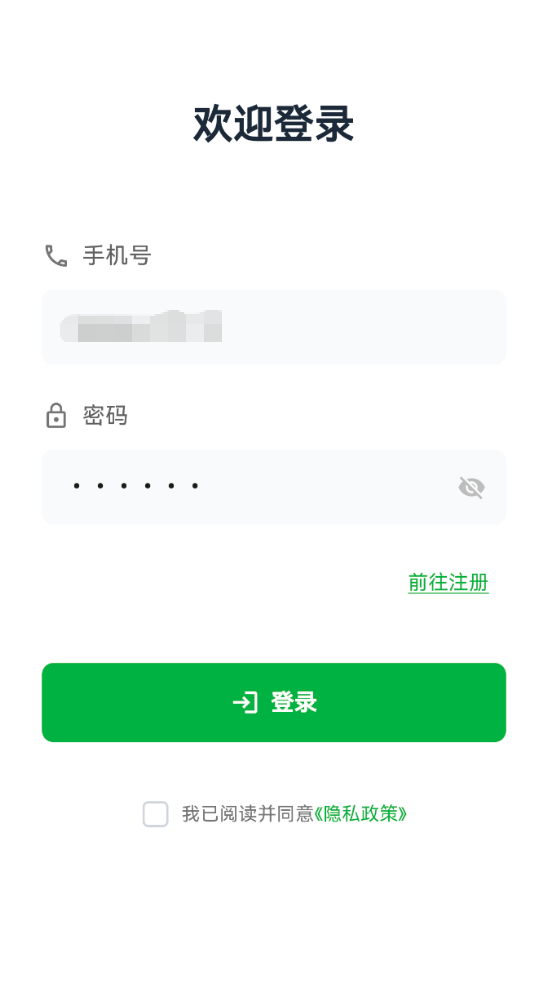
登录页面包含手机号和密码输入、表单验证、隐私政策同意、API 调用、用户信息保存并且跳转首页等核心功能。
2.功能部分
登录页面主要包含以下几个部分
欢迎标题:简洁的登录欢迎语
手机号输入框:带图标的手机号输入
密码输入框:支持显示/隐藏密码
前往注册:引导新用户注册
登录按钮:提交登录请求
隐私政策同意:复选框 + 隐私政策页面
3.核心功能
class LoginPage extends StatefulWidget {
  const LoginPage({super.key});

  @override
  State<LoginPage> createState() => _LoginPageState();
}

class _LoginPageState extends State<LoginPage> {
  // 输入控制器
  final TextEditingController _phoneController = TextEditingController(
    text: 'xxx',  // 默认值
  );
  final TextEditingController _passwordController = TextEditingController(
    text: 'xxx',  // 默认值
  );

  // 状态变量
  bool _obscurePassword = true;      // 密码是否隐藏
  bool _agreedToPrivacy = false;     // 是否同意隐私政策

  @override
  void dispose() {
    _phoneController.dispose();
    _passwordController.dispose();
    super.dispose();
  }
}
代码解释
第一步使用TextEditingController管理输入框内容
第二步在dispose中释放控制器资源,避免内存泄漏
第三步使用布尔值管理密码显示状态和隐私政策同意状态
4.手机号输入框
Widget _buildPhoneInput() {
  return Column(
    crossAxisAlignment: CrossAxisAlignment.start,
    children: [
      // 标签
      Row(
        children: [
          Icon(Icons.phone_outlined, color: Colors.grey[600], size: 20),
          const SizedBox(width: 8),
          Text(
            '手机号',
            style: TextStyle(
              fontSize: 16,
              color: Colors.grey[700],
              fontWeight: FontWeight.w500,
            ),
          ),
        ],
      ),
      const SizedBox(height: 12),
      // 输入框
      TextField(
        controller: _phoneController,
        keyboardType: TextInputType.phone,
        decoration: InputDecoration(
          hintText: '请输入手机号',
          hintStyle: TextStyle(color: Colors.grey[400]),
          filled: true,
          fillColor: const Color(0xFFF9FAFB),
          border: OutlineInputBorder(
            borderRadius: BorderRadius.circular(8),
            borderSide: BorderSide.none,
          ),
          contentPadding: const EdgeInsets.symmetric(
            horizontal: 16,
            vertical: 14,
          ),
        ),
      ),
    ],
  );
}
5.密码输入框(睁眼睛/闭眼睛)
Widget _buildPasswordInput() {
  return Column(
    crossAxisAlignment: CrossAxisAlignment.start,
    children: [
      // 标签
      Row(
        children: [
          Icon(Icons.lock_outline, color: Colors.grey[600], size: 20),
          const SizedBox(width: 8),
          Text(
            '密码',
            style: TextStyle(
              fontSize: 16,
              color: Colors.grey[700],
              fontWeight: FontWeight.w500,
            ),
          ),
        ],
      ),
      const SizedBox(height: 12),
      // 输入框
      TextField(
        controller: _passwordController,
        obscureText: _obscurePassword,
        decoration: InputDecoration(
          hintText: '请输入密码',
          hintStyle: TextStyle(color: Colors.grey[400]),
          filled: true,
          fillColor: const Color(0xFFF9FAFB),
          border: OutlineInputBorder(
            borderRadius: BorderRadius.circular(8),
            borderSide: BorderSide.none,
          ),
          contentPadding: const EdgeInsets.symmetric(
            horizontal: 16,
            vertical: 14,
          ),
          // 显示/隐藏密码按钮
          suffixIcon: IconButton(
            icon: Icon(
              _obscurePassword ? Icons.visibility_off : Icons.visibility,
              color: Colors.grey[400],
              size: 20,
            ),
            onPressed: () {
              setState(() {
                _obscurePassword = !_obscurePassword;
              });
            },
          ),
        ),
      ),
    ],
  );
}
解释一下代码
第一步obscureText控制密码是否显示为圆点
第二步suffixIcon添加眼睛图标按钮
第三步点击图标切换 _obscurePassword状态
第四步使用setState触发UI更新
6.前往注册
Align(
  alignment: Alignment.centerRight,
  child: TextButton(
    onPressed: () {
      Navigator.push(
        context,
        MaterialPageRoute(
          builder: (context) => const RegisterPage(),
        ),
      );
    },
    child: const Text(
      '前往注册',
      style: TextStyle(
        color: Color(0xFF4CAF50),
        fontSize: 14,
        fontWeight: FontWeight.w500,
        decoration: TextDecoration.underline,
        decorationColor: Color(0xFF4CAF50),
      ),
    ),
  ),
)
7.登录按钮
Widget _buildLoginButton() {
  return ElevatedButton(
    onPressed: _handleLogin,
    style: ElevatedButton.styleFrom(
      backgroundColor: const Color(0xFF4CAF50),
      foregroundColor: Colors.white,
      padding: const EdgeInsets.symmetric(vertical: 16),
      shape: RoundedRectangleBorder(
        borderRadius: BorderRadius.circular(8),
      ),
      elevation: 0,
    ),
    child: const Row(
      mainAxisAlignment: MainAxisAlignment.center,
      children: [
        Icon(Icons.login, size: 20),
        SizedBox(width: 8),
        Text(
          '登录',
          style: TextStyle(fontSize: 16, fontWeight: FontWeight.w600),
        ),
      ],
    ),
  );
}
8.隐私协议模块
Widget _buildPrivacyAgreement() {
  return Row(
    mainAxisAlignment: MainAxisAlignment.center,
    children: [
      // 复选框
      SizedBox(
        width: 20,
        height: 20,
        child: Checkbox(
          value: _agreedToPrivacy,
          onChanged: (value) {
            setState(() {
              _agreedToPrivacy = value ?? false;
            });
          },
          activeColor: const Color(0xFF4CAF50),
          side: BorderSide(
            color: _agreedToPrivacy
                ? const Color(0xFF4CAF50)
                : const Color(0xFFD1D5DB),
            width: 1.5,
          ),
          shape: RoundedRectangleBorder(
            borderRadius: BorderRadius.circular(4),
          ),
        ),
      ),
      const SizedBox(width: 8),
      Text(
        '我已阅读并同意',
        style: TextStyle(fontSize: 13, color: Colors.grey[600]),
      ),
      // 隐私政策链接
      TextButton(
        onPressed: () {
          Navigator.push(
            context,
            MaterialPageRoute(
              builder: (context) => const PrivacyPolicyPage(),
            ),
          );
        },
        style: TextButton.styleFrom(
          padding: EdgeInsets.zero,
          minimumSize: const Size(0, 0),
          tapTargetSize: MaterialTapTargetSize.shrinkWrap,
        ),
        child: const Text(
          '《隐私政策》',
          style: TextStyle(fontSize: 13, color: Color(0xFF4CAF50)),
        ),
      ),
    ],
  );
}
9.校验
void _handleLogin() async {
// 验证手机号
if (_phoneController.text.isEmpty) {
_showMessage('请输入手机号');
return;
}
// 验证密码
if (_passwordController.text.isEmpty) {
_showMessage('请输入密码');
return;
}
// 验证隐私政策
if (!_agreedToPrivacy) {
_showMessage('请先阅读并同意隐私政策');
return;
}
}
10.调用登录API
final result = await UserApi.login(
  phone: _phoneController.text,
  password: _passwordController.text,
);
11.登录成功之后的处理
if (result != null && result['success'] == true) {
  // 登录成功
  final data = result['data'];
  final userData = data?['user'];

  // 保存用户信息
  await userManager.saveUserInfo(
    username: userData?['username'],
    phone: _phoneController.text,
    userId: userData?['id']?.toString(),
    userImg: userData?['user_img'],
  );

  // 跳转到主页面
  if (mounted) {
    Navigator.pushReplacement(
      context,
      MaterialPageRoute(builder: (context) => const MainPage()),
    );
  }
} else {
  // 登录失败
  final message = result?['message'] ?? '登录失败,请检查手机号和密码';
  _showMessage(message);
}
12.颜色方案
| 颜色用途 | 颜色值 | 说明 |
| 主题色 | 0xFF4CAF50 | 按钮,复选框 |
| 主文本 | 0xFF1F2937 | 标题文字 |
| 次要文本 | Colors.grey[700] | 标签文字 |
| 提示文本 | Colors.grey[400] | 输入框占位符 |
| 输入框背景 | 0xFFF9FAFB | 浅灰色背景 |
12.最后
欢迎加入开源鸿蒙跨平台社区:
https://openharmonycrossplatform.csdn.net

作为“人工智能6S店”的官方数字引擎,为AI开发者与企业提供一个覆盖软硬件全栈、一站式门户。
更多推荐
 3
3 0
0- 0


 已为社区贡献7条内容

所有评论(0)