
React Native鸿蒙跨平台TouchableOpacity组件是RN跨端开发中常用的交互组件,用于实现“点击反馈”效果
该马赛克编辑器应用展示了一个功能完整、设计优雅的 React Native 应用实现,涵盖了状态管理、资源管理、布局设计、交互处理等多个方面的技术点。通过合理的组件架构和状态管理,以及对跨端兼容性的考虑,该应用不仅在 React Native 环境下运行良好,也为后续的鸿蒙系统适配奠定了基础。
该案例展示了RN在鸿蒙跨端开发中的实践技巧,包括组件复用、状态管理、布局适配等核心技术,为开发者提供了可复用的参考方案
在跨端应用开发领域,React Native(RN)凭借“一次编写,多端运行”的核心优势,成为连接前端与原生应用的重要桥梁,而鸿蒙系统作为新兴的分布式操作系统,其对RN跨端开发的兼容与适配,更是为开发者提供了更广阔的应用场景。本文将以一份完整的React Native马赛克编辑器代码为例,从跨端架构设计、核心功能实现、鸿蒙适配要点三个维度,进行全方位的技术解读,助力开发者快速掌握RN在鸿蒙跨端开发中的实践技巧。
这份代码实现了一个功能完善的马赛克编辑器,支持图片加载、马赛克/模糊/像素三种编辑模式切换、强度与画笔大小调节、预览、保存下载及基础设置等功能,整体架构遵循RN组件化开发规范,同时兼顾了鸿蒙系统的跨端适配特性,是一份非常适合入门RN鸿蒙跨端开发的实践案例。
一、跨端:
React Native的跨端能力核心在于“虚拟DOM映射原生组件”,而鸿蒙系统通过兼容RN的核心API,实现了RN代码在鸿蒙设备上的无缝运行——开发者无需大量修改RN代码,只需关注少数鸿蒙特有的适配细节,即可完成应用从iOS/Android到鸿蒙系统的迁移。这份马赛克编辑器代码,全程基于RN官方核心API开发,完美契合鸿蒙跨端适配的核心需求。
首先看代码入口的依赖引入部分,代码开篇引入了React的核心钩子(useState、useRef),以及RN官方提供的基础组件(SafeAreaView、View、Text、StyleSheet等),这些组件是RN跨端开发的基础,也是鸿蒙系统重点兼容的对象。其中需要重点关注的是SafeAreaView和Dimensions两个组件,这也是鸿蒙适配中的关键细节:
SafeAreaView用于适配不同设备的安全区域,避免内容被状态栏、导航栏遮挡,在鸿蒙系统中,RN的SafeAreaView会自动映射到鸿蒙的SafeArea组件,无需额外开发适配代码,只需保持组件使用规范即可;Dimensions组件用于获取设备屏幕尺寸,代码中通过const { width } = Dimensions.get(‘window’)获取屏幕宽度,进而实现组件的自适应布局——这一点在鸿蒙设备(手机、平板等多形态设备)中尤为重要,通过屏幕尺寸动态计算组件大小,可确保应用在不同鸿蒙设备上的显示一致性。
此外,代码中引入的Modal、Slider等组件,也是RN跨端开发中常用的交互组件,鸿蒙系统对这些组件的适配已相当成熟,开发者可直接使用,无需担心原生交互差异。值得注意的是,代码中未使用任何平台特定的原生模块(如iOS的UIKit、Android的Android SDK),全程基于RN跨端API开发,这为后续适配鸿蒙系统扫清了障碍,体现了“跨端优先”的开发思路。
二、组件化
这份马赛克编辑器的核心功能围绕“图片编辑”展开,整体采用React组件化开发模式,将编辑器拆分为头部、编辑区域、工具区、模态框、底部导航栏等多个独立组件,每个组件职责单一,既便于维护,也符合跨端开发中“组件复用”的核心需求。同时,通过React Hooks实现状态管理,确保组件之间的状态通信简洁高效,这也是RN鸿蒙跨端开发中推荐的状态管理方式(无需引入复杂的第三方状态管理库,降低跨端适配成本)。
2.1 状态管理:
代码中通过useState钩子定义了编辑器的核心状态,包括选中的图片(selectedImage)、马赛克强度(mosaicIntensity)、编辑状态(isEditing)、选中的工具(selectedTool)等,这些状态覆盖了编辑器的所有交互逻辑。在鸿蒙系统中,React Hooks的运行机制与RN原生环境完全一致,无需任何修改即可正常工作,这也是RN跨端开发的一大优势——状态管理逻辑可在多端复用,无需针对鸿蒙系统单独编写状态管理代码。
例如,马赛克强度的调节逻辑的实现:通过useState定义mosaicIntensity状态,初始值为5,然后通过Slider组件的onValueChange事件更新该状态,进而控制马赛克覆盖层的透明度(opacity: mosaicIntensity / 10)。这段逻辑在iOS、Android、鸿蒙系统中完全通用,Slider组件的滑动交互会自动适配鸿蒙设备的触摸事件,开发者无需关注不同平台的触摸事件差异,RN会自动完成映射。
2.2 图片渲染
图片渲染是马赛克编辑器的基础,代码中通过RN的Image组件加载网络图片(selectedImage的初始值为 Picsum 的随机图片链接),在鸿蒙系统中,Image组件支持的图片格式(jpg、png等)与RN原生环境一致,同时支持网络图片、本地图片的加载,只需确保图片路径的写法符合RN规范,即可在鸿蒙设备上正常显示。
马赛克效果的实现是编辑器的核心,代码采用“叠加层”思路:在Image组件上方添加一个mosaicOverlay覆盖层,覆盖层内部通过mosaicEffect视图实现马赛克效果,通过调节mosaicEffect的透明度(与马赛克强度绑定),控制马赛克效果的深浅。这种实现方式的优势在于无需修改原图,仅通过视图叠加即可实现效果,既简化了逻辑,也降低了跨端适配成本——叠加层的布局逻辑(绝对定位、宽高100%)在鸿蒙系统中与RN原生环境完全一致,View组件的样式(borderRadius、overflow等)也会自动适配鸿蒙设备的UI渲染规范。
需要注意的是,鸿蒙系统对RN的样式支持度非常高,代码中通过StyleSheet.create定义的所有样式(如容器样式、文本样式、组件布局样式等),均可在鸿蒙设备上正常渲染,包括阴影(shadowColor、shadowOffset等)、圆角(borderRadius)、渐变(本文未涉及,实际开发中可通过第三方组件适配)等样式,无需额外编写鸿蒙特有的样式代码。唯一需要注意的是,鸿蒙设备的屏幕密度与传统iOS/Android设备可能存在差异,建议使用相对单位(如百分比、flex布局),避免使用固定像素值,确保样式的自适应。
2.3 组件复用
代码中定义了三种编辑工具(马赛克、模糊、像素),通过tools数组存储工具信息,然后通过map方法渲染成工具按钮(TouchableOpacity组件)。TouchableOpacity组件是RN跨端开发中常用的交互组件,用于实现“点击反馈”效果,在鸿蒙系统中,该组件的点击反馈(透明度变化)会自动适配鸿蒙设备的交互规范,无需额外修改。
工具切换的逻辑:通过selectedTool状态记录当前选中的工具,点击工具按钮时,通过setSelectedTool更新状态,同时通过样式切换(selectedTool === tool.id && styles.selectedTool)高亮当前选中的工具。这段逻辑完全基于RN的组件渲染机制,在鸿蒙系统中可无缝复用,工具按钮的布局(flexDirection: 'row’实现横向排列)也会自动适配鸿蒙设备的屏幕宽度,体现了RN跨端布局的灵活性。
虽然RN代码可大部分复用,但鸿蒙系统作为新兴系统,仍有部分细节需要针对性适配,这份代码在开发过程中已考虑到鸿蒙跨端的核心适配要点,主要集中在以下几个方面,也是开发者在实际RN鸿蒙跨端开发中需要重点关注的内容。
3.1 屏幕适配:
鸿蒙系统支持多种形态的设备(手机、平板、智慧屏等),屏幕尺寸差异较大,因此自适应布局是鸿蒙跨端适配的核心。这份代码中,通过以下两种方式实现自适应布局,完全适配鸿蒙多设备场景:
-
使用Dimensions组件获取屏幕宽度,进而动态计算组件大小,例如模态框的宽度(width: width * 0.9),确保模态框在不同尺寸的鸿蒙设备上,始终占据屏幕90%的宽度,避免出现模态框过宽或过窄的问题;
-
采用flex布局,通过flex: 1、flexDirection等属性,实现组件的弹性布局,例如编辑区域(editorArea)的flex: 1,确保编辑区域始终占据屏幕剩余空间,图片容器(imageContainer)的flex: 1,确保图片始终填充编辑区域,无需关注具体的屏幕高度。
此外,代码中避免了使用固定像素值(如固定width: 300),大部分布局采用百分比或flex布局,这也是RN鸿蒙跨端适配的关键技巧——固定像素值在不同屏幕密度的鸿蒙设备上,可能会出现显示异常,而相对布局可确保组件在不同设备上的显示一致性。
3.2 模态框:
Modal组件是RN跨端开发中常用的弹窗组件,用于实现设置弹窗、预览弹窗等功能,这份代码中使用Modal组件实现了设置模态框(showSettings)和预览模态框(showPreview)。在鸿蒙系统中,Modal组件的核心属性(visible、transparent、animationType等)均可正常使用,但需要注意以下两点适配细节:
-
模态框的动画效果:代码中设置animationType为slide(设置模态框)和fade(预览模态框),鸿蒙系统对这两种动画效果的适配已相当成熟,可正常显示滑动、淡入淡出效果,无需额外开发;
-
模态框的关闭逻辑:通过onRequestClose属性设置模态框的关闭回调(如setShowSettings(false)),这一点在鸿蒙系统中尤为重要——鸿蒙系统要求模态框必须有明确的关闭逻辑,否则可能会出现弹窗无法关闭的异常,代码中已完善这一逻辑,确保在鸿蒙设备上的交互正常。
3.3 交互:
这份代码的一大亮点是:未引入任何第三方原生模块,全程基于RN官方API开发,所有交互逻辑(保存、下载、重置等)均通过RN的基础组件和JavaScript逻辑实现(如alert提示)。这种开发方式在鸿蒙跨端适配中具有极大的优势——第三方原生模块往往存在鸿蒙适配不完善的问题,而RN官方API的适配性已得到鸿蒙系统的全面支持,可避免因原生模块不兼容导致的应用崩溃。
例如,保存和下载功能的实现:代码中通过handleSave、handleDownload方法,调用alert提示用户操作结果,这种方式虽然简单,但在跨端开发中可确保多端兼容;如果需要实现真实的保存、下载功能,在鸿蒙系统中,可通过RN的NativeModules调用鸿蒙的原生API,实现与鸿蒙系统的文件系统交互,而无需修改前端的JavaScript逻辑,只需扩展原生模块即可,这也是RN鸿蒙跨端开发的核心思路——前端逻辑复用,原生能力按需扩展。
通过对这份马赛克编辑器代码的技术解读,我们可以总结出RN鸿蒙跨端开发的核心思路:以RN官方API为基础,遵循组件化、自适应布局原则,减少原生依赖,重点关注屏幕适配、模态框交互等细节,即可实现RN代码在鸿蒙系统上的无缝复用。这份代码虽然简单,但涵盖了RN鸿蒙跨端开发的核心技术点,包括组件使用、状态管理、布局适配、交互逻辑等,是一份非常适合入门的实践案例。
状态管理
MosaicEditor 组件采用了现代 React 函数组件架构,结合 useState 和 useRef Hooks 实现了复杂的状态管理。应用通过多个状态变量控制不同的 UI 状态:selectedImage 管理当前选中的图片,mosaicIntensity 控制马赛克效果的强度,isEditing 管理编辑状态,showSettings 和 showPreview 控制设置和预览模态框的显示,selectedTool 管理当前选中的编辑工具,brushSize 控制画笔大小。
这种状态分离设计使得组件逻辑清晰,易于维护和扩展。每个状态变量负责特定的功能,通过 useState Hook 进行管理,确保了状态更新的一致性和可靠性。
在将该应用适配到鸿蒙系统时,需要注意以下几点:
-
组件映射:将 React Native 的
SafeAreaView、ScrollView、TouchableOpacity、Image、Modal、Slider等组件映射到鸿蒙系统的对应组件。例如,Slider可以映射到鸿蒙的Slider组件,Modal可以映射到鸿蒙的Dialog组件。 -
样式转换:将 React Native 的
StyleSheet样式转换为鸿蒙系统支持的样式格式。例如,React Native 的flexDirection: 'row'对应鸿蒙的flexDirection: FlexDirection.Row。 -
状态管理:鸿蒙系统的状态管理机制与 React Native 不同,需要进行适当的调整。例如,可以使用鸿蒙的
@State装饰器替代useStateHook。 -
事件处理:鸿蒙系统的事件处理机制与 React Native 不同,需要进行适当的调整。例如,鸿蒙系统的滑块值变化事件处理方式与 React Native 不同。
-
布局系统:虽然 Flexbox 布局在鸿蒙系统中也得到支持,但具体的实现细节可能有所不同,需要进行适当的调整。
-
性能优化:根据鸿蒙系统的特性,进行针对性的性能优化,确保应用在鸿蒙设备上运行流畅。例如,合理使用鸿蒙的缓存机制和渲染优化策略。
-
API 适配:确保
alert等 API 在鸿蒙系统中有对应的实现。例如,可以使用鸿蒙的promptAction或自定义弹窗组件。
总结
该马赛克编辑器应用展示了一个功能完整、设计优雅的 React Native 应用实现,涵盖了状态管理、资源管理、布局设计、交互处理等多个方面的技术点。通过合理的组件架构和状态管理,以及对跨端兼容性的考虑,该应用不仅在 React Native 环境下运行良好,也为后续的鸿蒙系统适配奠定了基础。
真实演示案例代码:
// app.tsx
import React, { useState, useRef } from 'react';
import { SafeAreaView, View, Text, StyleSheet, TouchableOpacity, ScrollView, Image, Dimensions, Modal, Slider } from 'react-native';

// 图标库
const ICONS = {
  home: '🏠',
  search: '🔍',
  star: '⭐',
  heart: '❤️',
  user: '👤',
  settings: '⚙️',
  info: 'ℹ️',
  edit: '✏️',
  save: '💾',
  download: '📥',
  upload: '📤',
  trash: '🗑️',
  close: '❌',
  check: '✅',
  plus: '➕',
  minus: '➖',
  arrow_up: '⬆️',
  arrow_down: '⬇️',
  arrow_left: '⬅️',
  arrow_right: '➡️',
  gift: '🎁',
  celebration: '🎉',
  smile: '😊',
  sad: '😢',
  angry: '😠',
  surprised: '😲',
  thinking: '🤔',
  thumbs_up: '👍',
  thumbs_down: '👎',
  clap: '👏',
  wave: '👋',
  heart_eyes: '😍',
  laughing: '😂',
  crying: '😭',
  angry_face: '😡',
  neutral: '😐',
  confused: '😕',
  wink: '😉',
  tongue: '😛',
  sunglasses: '😎',
  money_mouth: '🤑',
  thinking_face: '🤔',
  sleeping: '😴',
  dizzy: '😵',
  sunglasses_face: '😎',
  heart_face: '🥰',
  kiss: '😘',
  hug: '🤗',
  pray: '🙏',
  handshake: '🤝',
  high_five: '🙌',
  peace: '✌️',
  ok: '👌',
  victory: '✌️',
  rock: '🤟',
  call_me: '🤙',
  point_up: '☝️',
  point_down: '👇',
  point_left: '👈',
  point_right: '👉',
  raised_hand: '✋',
  raised_fist: '✊',
  victory_hand: '✌️',
  metal: '🤘',
  vulcan: '🖖',
  wave_hand: '👋',
  clapping_hands: '👏',
  open_hands: '👐',
  palms_up: '🤲',
  handshake_hands: '🤝',
  pray_hands: '🙏',
  fold_hands: ' folded_hands',
  writing_hand: '✍️',
  nail_care: '💅',
  selfie: '🤳',
  flexed_biceps: '💪',
  muscle: '💪',
  selfie_tone1: ' selfie_tone1',
  selfie_tone2: ' selfie_tone2',
  selfie_tone3: ' selfie_tone3',
  selfie_tone4: ' selfie_tone4',
  selfie_tone5: ' selfie_tone5',
  selfie_tone6: ' selfie_tone6',
};

const { width } = Dimensions.get('window');

const MosaicEditor: React.FC = () => {
  const [selectedImage, setSelectedImage] = useState<string>('https://picsum.photos/400/600?random=1');
  const [mosaicIntensity, setMosaicIntensity] = useState<number>(5);
  const [isEditing, setIsEditing] = useState<boolean>(false);
  const [showSettings, setShowSettings] = useState<boolean>(false);
  const [selectedTool, setSelectedTool] = useState<string>('mosaic');
  const [brushSize, setBrushSize] = useState<number>(20);
  const [showPreview, setShowPreview] = useState<boolean>(false);

  const tools = [
    { id: 'mosaic', name: '马赛克', icon: '🔲' },
    { id: 'blur', name: '模糊', icon: '🌫️' },
    { id: 'pixel', name: '像素', icon: '⬜' },
  ];

  const handleSave = () => {
    alert('图片已保存!');
  };

  const handleDownload = () => {
    alert('图片已下载!');
  };

  const handleReset = () => {
    setMosaicIntensity(5);
    setBrushSize(20);
  };

  return (
    <SafeAreaView style={styles.container}>
      <View style={styles.header}>
        <Text style={styles.title}>马赛克编辑器</Text>
        <Text style={styles.subtitle}>给图片添加马赛克效果</Text>
      </View>

      <View style={styles.editorArea}>
        <View style={styles.imageContainer}>
          <Image source={{ uri: selectedImage }} style={styles.image} />

          {/* 马赛克覆盖层 */}
          <View style={styles.mosaicOverlay}>
            {/* 显示马赛克效果的区域 */}
            <View style={[styles.mosaicEffect, { opacity: mosaicIntensity / 10 }]} />
          </View>
        </View>

        <View style={styles.controls}>
          <View style={styles.intensityControl}>
            <Text style={styles.controlLabel}>马赛克强度: {mosaicIntensity}</Text>
            <Slider
              style={styles.slider}
              minimumValue={1}
              maximumValue={10}
              value={mosaicIntensity}
              onValueChange={setMosaicIntensity}
              minimumTrackTintColor="#3B82F6"
              maximumTrackTintColor="#d3d3d3"
              thumbStyle={{ backgroundColor: '#3B82F6' }}
            />
          </View>

          <View style={styles.brushControl}>
            <Text style={styles.controlLabel}>画笔大小: {brushSize}</Text>
            <Slider
              style={styles.slider}
              minimumValue={5}
              maximumValue={50}
              value={brushSize}
              onValueChange={setBrushSize}
              minimumTrackTintColor="#10B981"
              maximumTrackTintColor="#d3d3d3"
              thumbStyle={{ backgroundColor: '#10B981' }}
            />
          </View>
        </View>
      </View>

      <ScrollView style={styles.toolsSection}>
        <Text style={styles.sectionTitle}>编辑工具</Text>

        <View style={styles.toolRow}>
          {tools.map(tool => (
            <TouchableOpacity
              key={tool.id}
              style={[
                styles.toolButton,
                selectedTool === tool.id && styles.selectedTool
              ]}
              onPress={() => setSelectedTool(tool.id)}
            >
              <Text style={styles.toolIcon}>{tool.icon}</Text>
              <Text style={styles.toolText}>{tool.name}</Text>
            </TouchableOpacity>
          ))}
        </View>

        <View style={styles.actionButtons}>
          <TouchableOpacity style={styles.actionButton} onPress={() => setShowSettings(true)}>
            <Text style={styles.actionButtonText}>{ICONS.settings} 设置</Text>
          </TouchableOpacity>
          <TouchableOpacity style={styles.actionButton} onPress={handleReset}>
            <Text style={styles.actionButtonText}>{ICONS.trash} 重置</Text>
          </TouchableOpacity>
          <TouchableOpacity style={styles.actionButton} onPress={() => setShowPreview(true)}>
            <Text style={styles.actionButtonText}>{ICONS.eye} 预览</Text>
          </TouchableOpacity>
        </View>

        <View style={styles.saveButtons}>
          <TouchableOpacity style={styles.saveButton} onPress={handleSave}>
            <Text style={styles.saveButtonText}>{ICONS.save} 保存</Text>
          </TouchableOpacity>
          <TouchableOpacity style={styles.downloadButton} onPress={handleDownload}>
            <Text style={styles.downloadButtonText}>{ICONS.download} 下载</Text>
          </TouchableOpacity>
        </View>
      </ScrollView>

      {/* 设置模态框 */}
      <Modal
        visible={showSettings}
        transparent={true}
        animationType="slide"
        onRequestClose={() => setShowSettings(false)}
      >
        <View style={styles.modalOverlay}>
          <View style={styles.modalContent}>
            <View style={styles.modalHeader}>
              <Text style={styles.modalTitle}>编辑设置</Text>
              <TouchableOpacity onPress={() => setShowSettings(false)}>
                <Text style={styles.closeButton}>{ICONS.close}</Text>
              </TouchableOpacity>
            </View>

            <View style={styles.modalBody}>
              <View style={styles.settingItem}>
                <Text style={styles.settingLabel}>马赛克形状</Text>
                <View style={styles.optionRow}>
                  <TouchableOpacity style={styles.optionButton}>
                    <Text style={styles.optionText}>方形</Text>
                  </TouchableOpacity>
                  <TouchableOpacity style={[styles.optionButton, styles.activeOption]}>
                    <Text style={styles.optionText}>圆形</Text>
                  </TouchableOpacity>
                </View>
              </View>

              <View style={styles.settingItem}>
                <Text style={styles.settingLabel}>透明度</Text>
                <Slider
                  style={styles.slider}
                  minimumValue={0}
                  maximumValue={1}
                  value={0.7}
                  step={0.1}
                  minimumTrackTintColor="#8B5CF6"
                  maximumTrackTintColor="#d3d3d3"
                  thumbStyle={{ backgroundColor: '#8B5CF6' }}
                />
              </View>

              <View style={styles.settingItem}>
                <Text style={styles.settingLabel}>边缘羽化</Text>
                <View style={styles.optionRow}>
                  <TouchableOpacity style={styles.optionButton}>
                    <Text style={styles.optionText}>硬边</Text>
                  </TouchableOpacity>
                  <TouchableOpacity style={[styles.optionButton, styles.activeOption]}>
                    <Text style={styles.optionText}>柔边</Text>
                  </TouchableOpacity>
                </View>
              </View>
            </View>

            <View style={styles.modalFooter}>
              <TouchableOpacity style={styles.confirmButton} onPress={() => setShowSettings(false)}>
                <Text style={styles.confirmButtonText}>确定</Text>
              </TouchableOpacity>
            </View>
          </View>
        </View>
      </Modal>

      {/* 预览模态框 */}
      <Modal
        visible={showPreview}
        transparent={true}
        animationType="fade"
        onRequestClose={() => setShowPreview(false)}
      >
        <View style={styles.modalOverlay}>
          <View style={styles.previewModal}>
            <View style={styles.modalHeader}>
              <Text style={styles.modalTitle}>预览效果</Text>
              <TouchableOpacity onPress={() => setShowPreview(false)}>
                <Text style={styles.closeButton}>{ICONS.close}</Text>
              </TouchableOpacity>
            </View>

            <View style={styles.previewImageContainer}>
              <Image source={{ uri: selectedImage }} style={styles.previewImage} />
              <View style={[styles.mosaicEffect, { opacity: mosaicIntensity / 10 }]} />
            </View>

            <View style={styles.modalFooter}>
              <TouchableOpacity style={styles.confirmButton} onPress={() => setShowPreview(false)}>
                <Text style={styles.confirmButtonText}>关闭预览</Text>
              </TouchableOpacity>
            </View>
          </View>
        </View>
      </Modal>

      <View style={styles.bottomBar}>
        <TouchableOpacity style={styles.bottomButton}>
          <Text style={styles.bottomButtonText}>{ICONS.home} 首页</Text>
        </TouchableOpacity>
        <TouchableOpacity style={styles.bottomButton}>
          <Text style={styles.bottomButtonText}>{ICONS.edit} 编辑</Text>
        </TouchableOpacity>
        <TouchableOpacity style={styles.bottomButton}>
          <Text style={styles.bottomButtonText}>{ICONS.heart} 收藏</Text>
        </TouchableOpacity>
        <TouchableOpacity style={styles.bottomButton}>
          <Text style={styles.bottomButtonText}>{ICONS.user} 我的</Text>
        </TouchableOpacity>
      </View>
    </SafeAreaView>
  );
};

const styles = StyleSheet.create({
  container: {
    flex: 1,
    backgroundColor: '#f8f9fa',
  },
  header: {
    paddingTop: 40,
    paddingBottom: 20,
    paddingHorizontal: 20,
    backgroundColor: '#ffffff',
    borderBottomWidth: 1,
    borderBottomColor: '#e9ecef',
  },
  title: {
    fontSize: 24,
    fontWeight: 'bold',
    color: '#333',
    textAlign: 'center',
  },
  subtitle: {
    fontSize: 16,
    color: '#666',
    textAlign: 'center',
    marginTop: 8,
  },
  editorArea: {
    flex: 1,
    padding: 16,
  },
  imageContainer: {
    flex: 1,
    borderRadius: 12,
    overflow: 'hidden',
    position: 'relative',
    backgroundColor: '#e2e8f0',
  },
  image: {
    width: '100%',
    height: '100%',
  },
  mosaicOverlay: {
    position: 'absolute',
    top: 0,
    left: 0,
    right: 0,
    bottom: 0,
    justifyContent: 'center',
    alignItems: 'center',
  },
  mosaicEffect: {
    width: '100%',
    height: '100%',
    backgroundColor: 'rgba(0, 0, 0, 0.5)',
    position: 'absolute',
    top: 0,
    left: 0,
  },
  controls: {
    marginTop: 16,
    backgroundColor: '#ffffff',
    padding: 16,
    borderRadius: 12,
    elevation: 3,
    shadowColor: '#000',
    shadowOffset: { width: 0, height: 2 },
    shadowOpacity: 0.1,
    shadowRadius: 4,
  },
  intensityControl: {
    marginBottom: 16,
  },
  brushControl: {
    marginBottom: 0,
  },
  controlLabel: {
    fontSize: 16,
    fontWeight: 'bold',
    color: '#333',
    marginBottom: 8,
  },
  slider: {
    height: 40,
  },
  toolsSection: {
    padding: 16,
    backgroundColor: '#ffffff',
    borderTopWidth: 1,
    borderTopColor: '#e9ecef',
  },
  sectionTitle: {
    fontSize: 18,
    fontWeight: 'bold',
    color: '#333',
    marginBottom: 16,
  },
  toolRow: {
    flexDirection: 'row',
    justifyContent: 'space-between',
    marginBottom: 16,
  },
  toolButton: {
    flex: 1,
    backgroundColor: '#e2e8f0',
    padding: 16,
    borderRadius: 12,
    alignItems: 'center',
    marginRight: 8,
  },
  selectedTool: {
    backgroundColor: '#3B82F6',
  },
  toolIcon: {
    fontSize: 24,
    marginBottom: 8,
  },
  toolText: {
    fontSize: 14,
    color: '#475569',
  },
  selectedToolText: {
    color: '#ffffff',
  },
  actionButtons: {
    flexDirection: 'row',
    justifyContent: 'space-between',
    marginBottom: 16,
  },
  actionButton: {
    flex: 1,
    backgroundColor: '#e2e8f0',
    padding: 12,
    borderRadius: 8,
    alignItems: 'center',
    marginRight: 8,
  },
  actionButtonText: {
    fontSize: 14,
    color: '#475569',
    fontWeight: 'bold',
  },
  saveButtons: {
    flexDirection: 'row',
    justifyContent: 'space-between',
  },
  saveButton: {
    flex: 1,
    backgroundColor: '#3B82F6',
    padding: 16,
    borderRadius: 8,
    alignItems: 'center',
    marginRight: 8,
  },
  saveButtonText: {
    fontSize: 16,
    color: '#ffffff',
    fontWeight: 'bold',
  },
  downloadButton: {
    flex: 1,
    backgroundColor: '#10B981',
    padding: 16,
    borderRadius: 8,
    alignItems: 'center',
  },
  downloadButtonText: {
    fontSize: 16,
    color: '#ffffff',
    fontWeight: 'bold',
  },
  modalOverlay: {
    flex: 1,
    backgroundColor: 'rgba(0, 0, 0, 0.5)',
    justifyContent: 'center',
    alignItems: 'center',
  },
  modalContent: {
    backgroundColor: '#ffffff',
    width: width * 0.9,
    borderRadius: 16,
    padding: 20,
    maxHeight: '80%',
  },
  previewModal: {
    backgroundColor: '#ffffff',
    width: width * 0.9,
    borderRadius: 16,
    padding: 20,
    maxHeight: '80%',
  },
  modalHeader: {
    flexDirection: 'row',
    justifyContent: 'space-between',
    alignItems: 'center',
    marginBottom: 20,
  },
  modalTitle: {
    fontSize: 20,
    fontWeight: 'bold',
    color: '#333',
  },
  closeButton: {
    fontSize: 24,
  },
  modalBody: {
    flex: 1,
  },
  settingItem: {
    marginBottom: 20,
  },
  settingLabel: {
    fontSize: 16,
    fontWeight: 'bold',
    color: '#333',
    marginBottom: 10,
  },
  optionRow: {
    flexDirection: 'row',
  },
  optionButton: {
    backgroundColor: '#e2e8f0',
    paddingHorizontal: 16,
    paddingVertical: 8,
    borderRadius: 20,
    marginRight: 10,
  },
  activeOption: {
    backgroundColor: '#3B82F6',
  },
  optionText: {
    color: '#475569',
    fontSize: 14,
  },
  activeOptionText: {
    color: '#ffffff',
  },
  previewImageContainer: {
    flex: 1,
    marginBottom: 20,
    borderRadius: 12,
    overflow: 'hidden',
    backgroundColor: '#e2e8f0',
  },
  previewImage: {
    width: '100%',
    height: 200,
  },
  modalFooter: {
    marginTop: 20,
  },
  confirmButton: {
    backgroundColor: '#3B82F6',
    padding: 16,
    borderRadius: 8,
    alignItems: 'center',
  },
  confirmButtonText: {
    color: '#ffffff',
    fontWeight: 'bold',
    fontSize: 16,
  },
  bottomBar: {
    flexDirection: 'row',
    justifyContent: 'space-around',
    backgroundColor: '#ffffff',
    borderTopWidth: 1,
    borderTopColor: '#e9ecef',
    paddingVertical: 12,
  },
  bottomButton: {
    alignItems: 'center',
    paddingHorizontal: 12,
  },
  bottomButtonText: {
    fontSize: 12,
    color: '#666',
    marginTop: 4,
  },
});

export default MosaicEditor;
打包
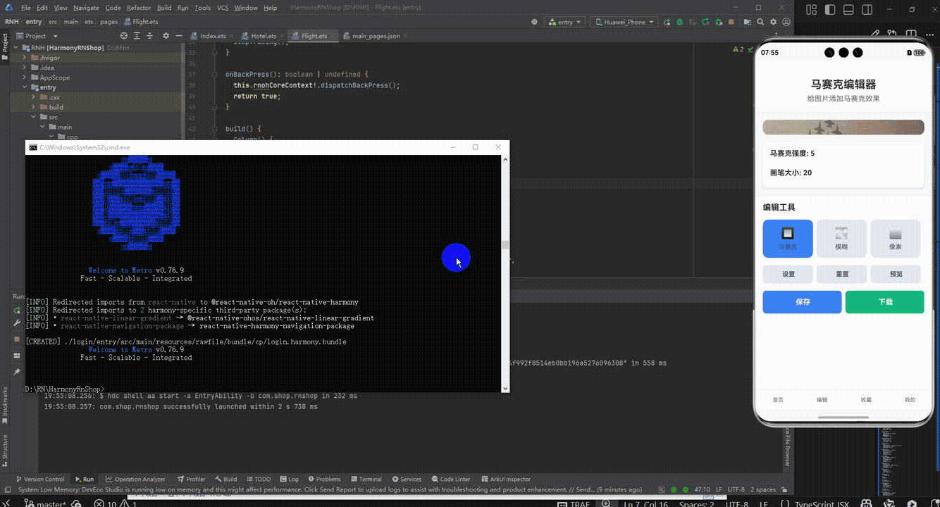
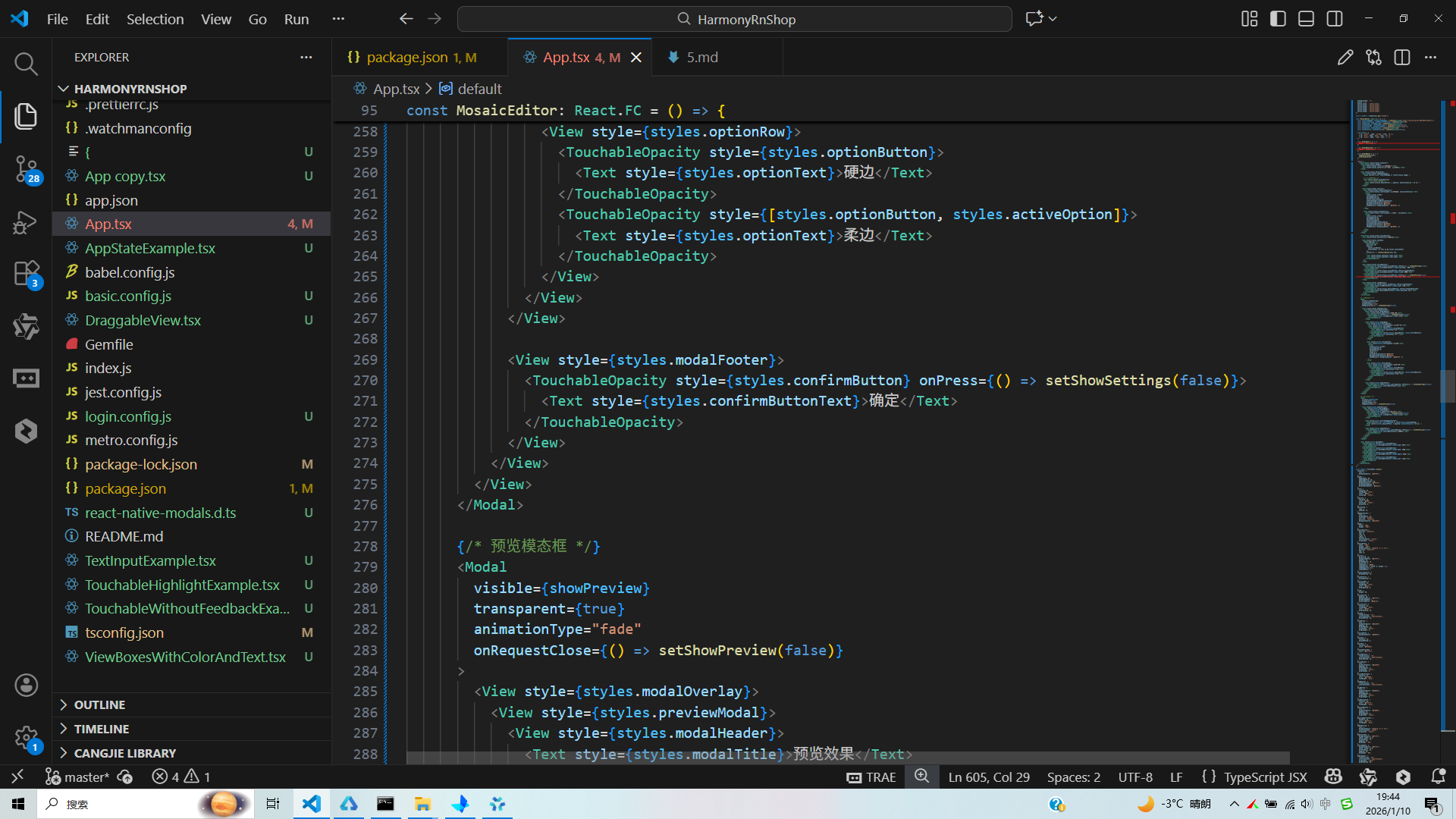
接下来通过打包命令npn run harmony将reactNative的代码打包成为bundle,这样可以进行在开源鸿蒙OpenHarmony中进行使用。

打包之后再将打包后的鸿蒙OpenHarmony文件拷贝到鸿蒙的DevEco-Studio工程目录去:

最后运行效果图如下显示:
React Native马赛克编辑器实现跨端开发与鸿蒙适配
本文通过一个React Native马赛克编辑器案例,详细解析了跨端开发的核心技术与鸿蒙系统适配要点。文章从三个方面展开:
- 跨端架构:基于React Native官方API开发,实现"一次编写,多端运行",鸿蒙系统通过兼容RN核心组件实现无缝运行
- 组件化开发:采用模块化设计,通过Hooks管理状态,实现图片加载、编辑工具切换、效果调节等功能
- 鸿蒙适配:重点关注屏幕自适应布局、模态框交互等细节,避免使用平台特定API
该案例展示了RN在鸿蒙跨端开发中的实践技巧,包括组件复用、状态管理、布局适配等核心技术,为开发者提供了可复用的参考方案。
欢迎大家加入开源鸿蒙跨平台开发者社区,一起共建开源鸿蒙跨平台生态。

作为“人工智能6S店”的官方数字引擎,为AI开发者与企业提供一个覆盖软硬件全栈、一站式门户。
更多推荐


 9
9 0
0- 0


 已为社区贡献15条内容

所有评论(0)