
Harmony鸿蒙开发应用沉浸式效果
Harmony鸿蒙开发应用沉浸式效果
概述
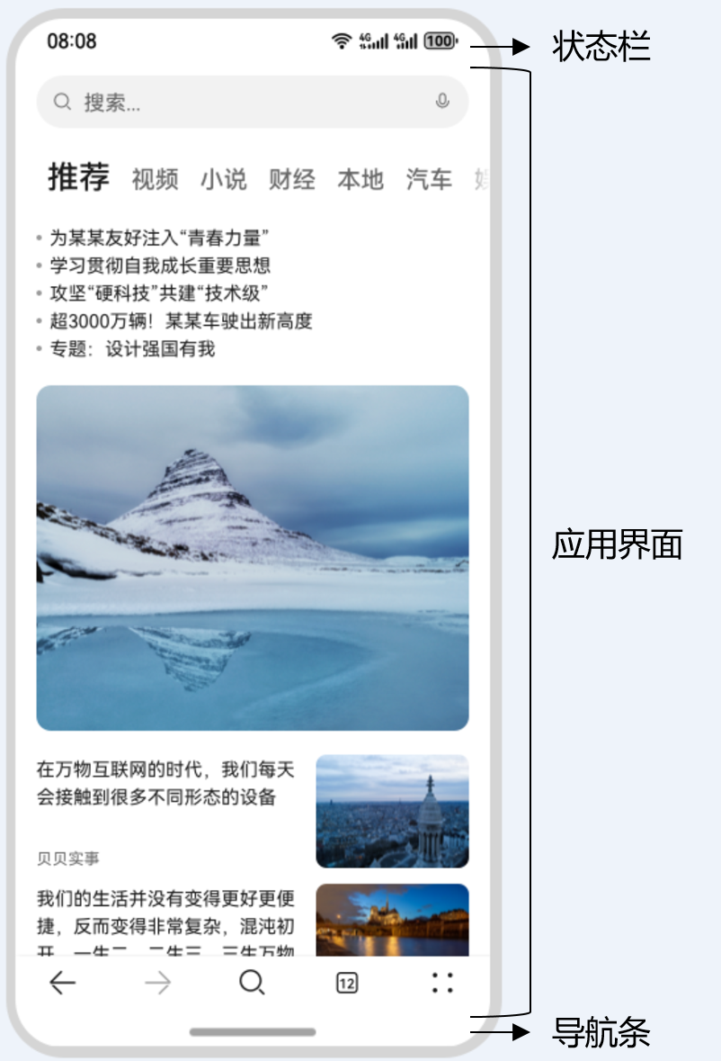
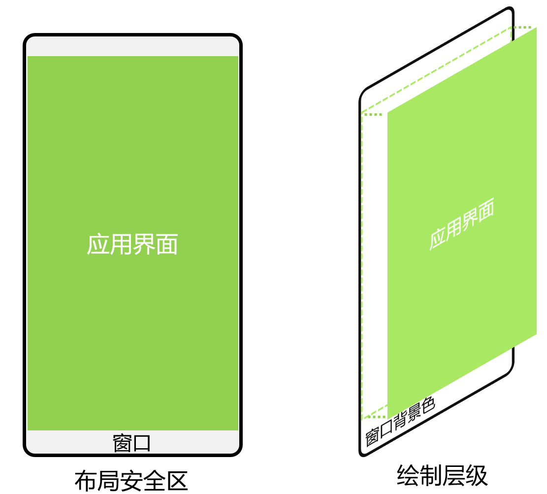
典型应用全屏窗口UI元素包括顶部状态栏、应用界面和底部导航区域(根据用户设置可表现为导航条或三键导航),其中状态栏和导航区域,通常在沉浸式布局下称为避让区;避让区之外的区域称为安全区。开发应用沉浸式效果主要指通过调整状态栏、应用界面和底部导航区域的显示效果来减少状态栏、导航条或三键导航等系统界面的突兀感,从而使用户获得最佳的UI体验。
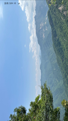
图1 界面元素示意图(此处以导航区域表现为导航条为例给出示意)
开发应用沉浸式效果主要要考虑如下几个设计要素:
- UI元素避让处理:底部导航区域可以响应点击事件,除此之外的可交互UI元素和应用关键信息不建议放到导航区域。状态栏显示系统信息,如果与界面元素有冲突,需要考虑避让状态栏。
- 沉浸式效果处理:设置状态栏的颜色和导航区域的显隐与界面元素颜色相匹配,不出现明显的突兀感。
针对上面的设计要求,可以通过如下两种方式实现应用沉浸式效果:
- 窗口全屏布局方案:调整布局系统为全屏布局,界面元素延伸到状态栏和导航区域实现沉浸式效果。当不隐藏避让区时,可通过接口查询状态栏和导航区域进行可交互元素避让处理,并设置状态栏或导航区域的颜色或显隐等属性与界面元素匹配。当隐藏避让区时,通过对应接口设置全屏布局即可。
- 组件安全区方案:布局系统保持安全区内布局,然后通过接口延伸绘制内容(如背景色,背景图)到状态栏和导航区域实现沉浸式效果。
该方案下,界面元素仅做绘制延伸,无法单独布局到状态栏和导航区域,针对需要单独布局UI元素到状态栏和导航区域的场景建议使用窗口全屏布局方案处理。
窗口全屏布局方案
窗口全屏布局方案主要涉及以下应用扩展布局,全屏显示,不隐藏避让区和应用扩展布局,隐藏避让区两个应用场景。
应用扩展布局,全屏显示,不隐藏避让区
可以通过调用窗口强制全屏布局接口setWindowLayoutFullScreen()实现界面元素延伸到状态栏和导航区域;然后通过接口getWindowAvoidArea()和on('avoidAreaChange')获取并动态监听避让区域的变更信息,页面布局根据避让区域信息进行动态调整;设置状态栏或导航区域的颜色或显隐等属性与界面元素进行匹配。
- 调用setWindowLayoutFullScreen()接口设置窗口全屏。
- // EntryAbility.ets
- import { AbilityConstant, UIAbility, Want } from '@kit.AbilityKit';
- import { window } from '@kit.ArkUI';
- import { BusinessError } from '@kit.BasicServicesKit';
- export default class EntryAbility extends UIAbility {
- // ...
- onWindowStageCreate(windowStage: window.WindowStage): void {
- windowStage.loadContent('pages/Index', (err, data) => {
- if (err.code) {
- return;
- }
- let windowClass: window.Window = windowStage.getMainWindowSync(); // 获取应用主窗口
- // 1. 设置窗口全屏
- let isLayoutFullScreen = true;
- windowClass.setWindowLayoutFullScreen(isLayoutFullScreen).then(() => {
- console.info('Succeeded in setting the window layout to full-screen mode.');
- }).catch((err: BusinessError) => {
- console.error(`Failed to set the window layout to full-screen mode. Code is ${err.code}, message is ${err.message}`);
- });
- // 进行后续步骤2-3中的操作
- });
- }
- }
- 使用getWindowAvoidArea()接口获取当前布局遮挡区域(此处以状态栏、导航区域为例)。
- // EntryAbility.ets
- // 2. 获取布局避让遮挡的区域
- let type = window.AvoidAreaType.TYPE_NAVIGATION_INDICATOR; // 此处以导航条避让为例
- let avoidArea = windowClass.getWindowAvoidArea(type);
- let bottomRectHeight = avoidArea.bottomRect.height; // 获取到导航区域的高度
- AppStorage.setOrCreate('bottomRectHeight', bottomRectHeight);
- type = window.AvoidAreaType.TYPE_SYSTEM; // 以状态栏避让为例
- avoidArea = windowClass.getWindowAvoidArea(type);
- let topRectHeight = avoidArea.topRect.height; // 获取状态栏区域高度
- AppStorage.setOrCreate('topRectHeight', topRectHeight);
- 注册监听函数,动态获取避让区域的实时数据。常见的触发避让区回调的场景如下:应用窗口在全屏模式、悬浮模式、分屏模式之间的切换;应用窗口旋转;多折叠设备在屏幕折叠态和展开态之间的切换;应用窗口在多设备之间的流转。
- // EntryAbility.ets
- // 3. 注册监听函数,动态获取避让区域数据
- windowClass.on('avoidAreaChange', (data) => {
- if (data.type === window.AvoidAreaType.TYPE_SYSTEM) {
- let topRectHeight = data.area.topRect.height;
- AppStorage.setOrCreate('topRectHeight', topRectHeight);
- } else if (data.type == window.AvoidAreaType.TYPE_NAVIGATION_INDICATOR) {
- let bottomRectHeight = data.area.bottomRect.height;
- AppStorage.setOrCreate('bottomRectHeight', bottomRectHeight);
- }
- });
- 布局中的UI元素需要避让状态栏和导航区域,否则可能产生UI元素重叠等情况。
说明
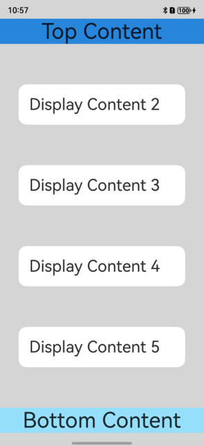
避让区域存在大小为0的情况,当获取到的避让区域为0时,开发者需注意针对性处理适配此时的页面区域和布局,避免贴边、内容裁剪等问题,影响应用界面正常显示或美观性。
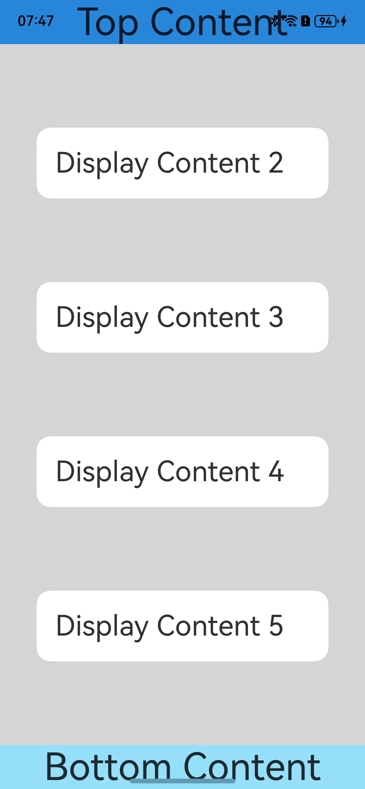
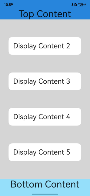
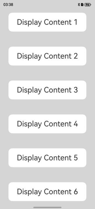
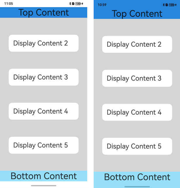
如下例子中,对控件顶部设置padding(具体数值与状态栏高度一致),实现对状态栏的避让;对底部设置padding(具体数值与底部导航区域高度一致),实现对导航条的避让。如果去掉顶部和底部的padding设置,即不避让状态栏和导航条,UI元素就会发生重叠。具体可见下文步骤中图2和图3的效果对比。
- // Index.ets
- @Entry
- @Component
- struct Index {
- @StorageProp('bottomRectHeight')
- bottomRectHeight: number = 0;
- @StorageProp('topRectHeight')
- topRectHeight: number = 0;
- build() {
- Column() {
- Row() {
- Text('Top Content').fontSize(40).textAlign(TextAlign.Center).width('100%')
- }.backgroundColor('#2786d9')
- Row() {
- Text('Display Content 2').fontSize(30)
- }.backgroundColor(Color.White).padding(20).borderRadius(15).width('80%')
- Row() {
- Text('Display Content 3').fontSize(30)
- }.backgroundColor(Color.White).padding(20).borderRadius(15).width('80%')
- Row() {
- Text('Display Content 4').fontSize(30)
- }.backgroundColor(Color.White).padding(20).borderRadius(15).width('80%')
- Row() {
- Text('Display Content 5').fontSize(30)
- }.backgroundColor(Color.White).padding(20).borderRadius(15).width('80%')
- Row() {
- Text('Bottom Content').fontSize(40).textAlign(TextAlign.Center).width('100%')
- }.backgroundColor('#96dffa')
- }
- .width('100%')
- .height('100%')
- .alignItems(HorizontalAlign.Center)
- .backgroundColor('#d5d5d5')
- .justifyContent(FlexAlign.SpaceBetween)
- // top数值与状态栏区域高度保持一致;bottom数值与导航区域高度保持一致
- .padding({
- top: this.getUIContext().px2vp(this.topRectHeight),
- bottom: this.getUIContext().px2vp(this.bottomRectHeight)
- })
- }
- }
- 根据实际的UI界面显示或相关UI元素背景颜色等,还可以按需设置状态栏的文字颜色、背景色或设置导航区域的显示或隐藏,以使UI界面效果呈现和谐。状态栏和导航区域默认是透明的,透传的是应用界面的背景色。
此例中UI颜色主要有两种,比较简单,故未对状态栏文字颜色、背景色进行设置,未对导航区域进行隐藏。
图2 布局避让状态栏和导航区域(此处以导航区域表现为导航条为例给出示意)
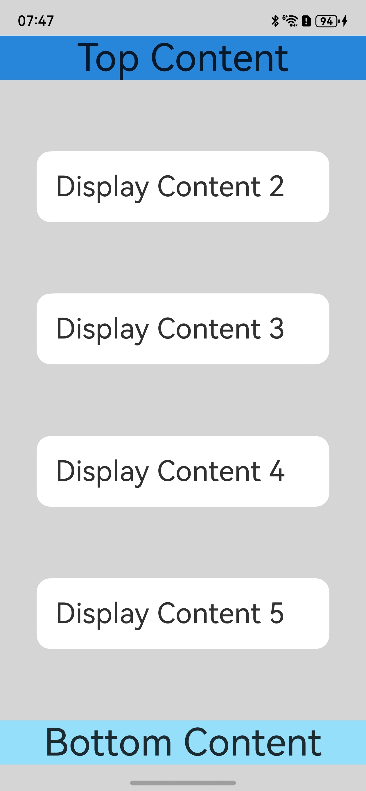
图3 布局未避让状态栏和导航区域,UI元素重叠(此处以导航区域表现为导航条为例给出示意)
应用扩展布局,隐藏避让区
此场景下状态栏和导航区域需要隐藏,适用于游戏、电影等应用场景。用户可以通过从底部上滑唤出导航条或三键导航。
- 调用setWindowLayoutFullScreen()接口设置窗口全屏。
- // EntryAbility.ets
- import { AbilityConstant, UIAbility, Want } from '@kit.AbilityKit';
- import { window } from '@kit.ArkUI';
- import { BusinessError } from '@kit.BasicServicesKit';
- export default class EntryAbility extends UIAbility {
- // ...
- onWindowStageCreate(windowStage: window.WindowStage): void {
- windowStage.loadContent('pages/Index', (err, data) => {
- if (err.code) {
- return;
- }
- let windowClass: window.Window = windowStage.getMainWindowSync(); // 获取应用主窗口
- // 1. 设置窗口全屏
- let isLayoutFullScreen = true;
- windowClass.setWindowLayoutFullScreen(isLayoutFullScreen).then(() => {
- console.info('Succeeded in setting the window layout to full-screen mode.');
- }).catch((err: BusinessError) => {
- console.error(`Failed to set the window layout to full-screen mode. Code is ${err.code}, message is ${err.message}`);
- });
- // 进行后续步骤2中的状态栏和导航区域的隐藏操作
- });
- }
- }
- 调用setSpecificSystemBarEnabled()接口设置状态栏和导航区域的具体显隐状态,此场景下将其设置为隐藏。
- // EntryAbility.ets
- // 2. 设置状态栏隐藏
- windowClass.setSpecificSystemBarEnabled('status', false).then(() => {
- console.info('Succeeded in setting the status bar to be invisible.');
- }).catch((err: BusinessError) => {
- console.error(`Failed to set the status bar to be invisible. Code is ${err.code}, message is ${err.message}`);
- });
- // 2. 设置导航区域隐藏
- windowClass.setSpecificSystemBarEnabled('navigationIndicator', false).then(() => {
- console.info('Succeeded in setting the navigation indicator to be invisible.');
- }).catch((err: BusinessError) => {
- console.error(`Failed to set the navigation indicator to be invisible. Code is ${err.code}, message is ${err.message}`);
- });
- 在界面中无需进行导航区域避让操作。
- // Index.ets
- @Entry()
- @Component
- struct Index {
- build() {
- Row() {
- Column() {
- Row() {
- Text('Top Content').fontSize(40).textAlign(TextAlign.Center).width('100%')
- }.backgroundColor('#2786d9')
- Row() {
- Text('Display Content 2').fontSize(30)
- }.backgroundColor(Color.White).padding(20).borderRadius(15).width('80%')
- Row() {
- Text('Display Content 3').fontSize(30)
- }.backgroundColor(Color.White).padding(20).borderRadius(15).width('80%')
- Row() {
- Text('Display Content 4').fontSize(30)
- }.backgroundColor(Color.White).padding(20).borderRadius(15).width('80%')
- Row() {
- Text('Display Content 5').fontSize(30)
- }.backgroundColor(Color.White).padding(20).borderRadius(15).width('80%')
- Row() {
- Text('Bottom Content').fontSize(40).textAlign(TextAlign.Center).width('100%')
- }.backgroundColor('#96dffa')
- }
- .width('100%')
- .height('100%')
- .alignItems(HorizontalAlign.Center)
- .justifyContent(FlexAlign.SpaceBetween)
- .backgroundColor('#d5d5d5')
- }
- }
- }
组件安全区方案
应用未使用setWindowLayoutFullScreen()接口设置窗口全屏布局时,默认采取组件安全区布局方案。
应用在默认情况下窗口背景绘制范围是全屏,但UI元素被限制在安全区内(自动排除状态栏和导航区域)进行布局,来避免界面元素被状态栏和导航区域遮盖。
图4 界面元素自动避让状态栏和导航区域示意图
针对状态栏和导航区域颜色与界面元素颜色不匹配问题,可以通过如下两种方式实现沉浸式效果:
- 状态栏和导航区域颜色相同场景,可以通过设置窗口的背景色来实现沉浸式效果。窗口背景色可通过setWindowBackgroundColor()进行设置。
- import { AbilityConstant, UIAbility, Want } from '@kit.AbilityKit';
- import { window } from '@kit.ArkUI';
- export default class EntryAbility extends UIAbility {
- //...
- onWindowStageCreate(windowStage: window.WindowStage): void {
- windowStage.loadContent('pages/Index', (err) => {
- if (err.code) {
- return;
- }
- // 设置全窗颜色和应用元素颜色一致
- windowStage.getMainWindowSync().setWindowBackgroundColor('#d5d5d5');
- });
- }
- }
界面状态栏和导航区域颜色相同场景。
- // xxx.ets
- @Entry
- @Component
- struct Example {
- build() {
- Column() {
- Row() {
- Text('Top Content').fontSize(40).textAlign(TextAlign.Center).width('100%')
- }.backgroundColor('#2786d9')
- Row() {
- Text('Display Content 2').fontSize(30)
- }.backgroundColor(Color.White).padding(20).borderRadius(15).width('80%')
- Row() {
- Text('Display Content 3').fontSize(30)
- }.backgroundColor(Color.White).padding(20).borderRadius(15).width('80%')
- Row() {
- Text('Display Content 4').fontSize(30)
- }.backgroundColor(Color.White).padding(20).borderRadius(15).width('80%')
- Row() {
- Text('Display Content 5').fontSize(30)
- }.backgroundColor(Color.White).padding(20).borderRadius(15).width('80%')
- Row() {
- Text('Bottom Content').fontSize(40).textAlign(TextAlign.Center).width('100%')
- }.backgroundColor('#96dffa')
- }
- .width('100%').height('100%')
- .alignItems(HorizontalAlign.Center)
- .backgroundColor('#d5d5d5')
- .justifyContent(FlexAlign.SpaceBetween)
- }
- }
- 状态栏和导航区域颜色不同时,可以使用expandSafeArea属性扩展安全区域属性进行调整。
- // xxx.ets
- @Entry
- @Component
- struct Example {
- build() {
- Column() {
- Row() {
- Text('Top Content').fontSize(40).textAlign(TextAlign.Center).width('100%')
- }.backgroundColor('#2786d9')
- // 设置顶部绘制延伸到状态栏
- .expandSafeArea([SafeAreaType.SYSTEM], [SafeAreaEdge.TOP])
- Row() {
- Text('Display Content 2').fontSize(30)
- }.backgroundColor(Color.White).padding(20).borderRadius(15).width('80%')
- Row() {
- Text('Display Content 3').fontSize(30)
- }.backgroundColor(Color.White).padding(20).borderRadius(15).width('80%')
- Row() {
- Text('Display Content 4').fontSize(30)
- }.backgroundColor(Color.White).padding(20).borderRadius(15).width('80%')
- Row() {
- Text('Display Content 5').fontSize(30)
- }.backgroundColor(Color.White).padding(20).borderRadius(15).width('80%')
- Row() {
- Text('Bottom Content').fontSize(40).textAlign(TextAlign.Center).width('100%')
- }.backgroundColor('#96dffa')
- // 设置底部绘制延伸到导航区域
- .expandSafeArea([SafeAreaType.SYSTEM], [SafeAreaEdge.BOTTOM])
- }
- .width('100%').height('100%')
- .alignItems(HorizontalAlign.Center)
- .backgroundColor('#d5d5d5')
- .justifyContent(FlexAlign.SpaceBetween)
- }
- }
扩展安全区域属性原理
- 布局阶段按照安全区范围大小进行UI元素布局。
- 布局完成后查看设置了expandSafeArea的组件边界(不包括margin)是否和安全区边界相交。
- 如果设置了expandSafeArea的组件和安全区边界相交,根据expandSafeArea传递的属性则进一步扩大组件绘制区域大小覆盖状态栏、导航区域这些非安全区域。
- 上述过程仅改变组件自身绘制大小,不进行二次布局,不影响子节点和兄弟节点的大小和位置。
- 子节点可以单独设置该属性,只需要自身边界和安全区域重合就可以延伸自身大小至非安全区域内,需要确保父组件未设置clip等裁剪属性。
- 配置expandSafeArea属性组件进行绘制扩展时,需要关注组件不能配置固定宽高尺寸,百分比除外。
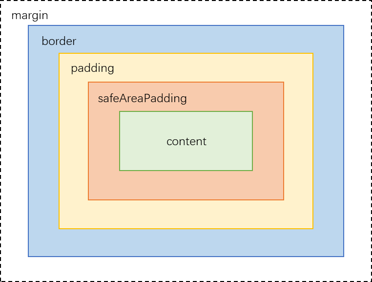
- 组件可以设置通用属性safeAreaPadding,给自身添加组件级安全区域。该属性作为一种特殊边距,在提供布局约束的同时作为安全区可以被一些系统组件利用。
- safeAreaPadding位于原有的padding内侧。容器自外向内各层分别为border、padding、safeAreaPadding、内容区。当border和padding确定后,若容器可用空间不足以满足safeAreaPadding的设置,则优先分配给左侧和上侧safeAreaPadding、其次分配给右侧和下侧safeAreaPadding。safeAreaPadding实际尺寸确定后,余下空间为内容区。
- 系统组件如Navigation、List、Scroll、Tabs等可以利用外层或容器自身safeAreaPadding实现扩大裁剪范围等能力。
- safeAreaPadding位于原有的padding内侧。容器自外向内各层分别为border、padding、safeAreaPadding、内容区。当border和padding确定后,若容器可用空间不足以满足safeAreaPadding的设置,则优先分配给左侧和上侧safeAreaPadding、其次分配给右侧和下侧safeAreaPadding。safeAreaPadding实际尺寸确定后,余下空间为内容区。
背景图和视频场景
设置背景图、视频组件大小为安全区域大小并配置expandSafeArea属性。
说明
Video组件在使用expandSafeArea扩展到安全区域时,组件视频显示内容区域不支持扩展。
- // xxx.ets
- @Entry
- @Component
- struct SafeAreaExample1 {
- build() {
- Stack() {
- Image($r('app.media.bg'))
- .height('100%').width('100%')
- .expandSafeArea([SafeAreaType.SYSTEM], [SafeAreaEdge.TOP, SafeAreaEdge.BOTTOM]) // 图片组件的绘制区域扩展至状态栏和导航区域。
- }.height('100%').width('100%')
- }
- }
滚动类场景
滚动容器设置expandSafeArea属性生效,但当父组件是滚动容器时,子组件设置expandSafeArea属性不生效。对于滚动容器的子组件,有两种方法实现沉浸式效果:
- 设置父组件滚动容器和子组件相同的背景色,给父组件设置expandSafeArea属性扩展安全区。
- // xxx.ets
- @Entry
- @Component
- struct ScrollExample {
- scroller: Scroller = new Scroller()
- private arr: number[] = [1, 2, 3, 4, 5, 6, 7, 8, 9]
- build() {
- Stack({ alignContent: Alignment.TopStart }) {
- Scroll(this.scroller) {
- Column() {
- ForEach(this.arr, (item: number) => {
- Stack() {
- Text('Display Content ' + item.toString()).fontSize(30)
- }
- .width('80%').padding(20).borderRadius(15).backgroundColor(Color.White).margin({ top:30, bottom:30 })
- }, (item: string) => item)
- }.width('100%').backgroundColor('rgb(213,213,213)')
- }.backgroundColor('rgb(213,213,213)')
- .expandSafeArea([SafeAreaType.SYSTEM], [SafeAreaEdge.TOP, SafeAreaEdge.BOTTOM])
- }.width('100%').height('100%')
- .expandSafeArea([SafeAreaType.SYSTEM], [SafeAreaEdge.TOP, SafeAreaEdge.BOTTOM])
- }
- }
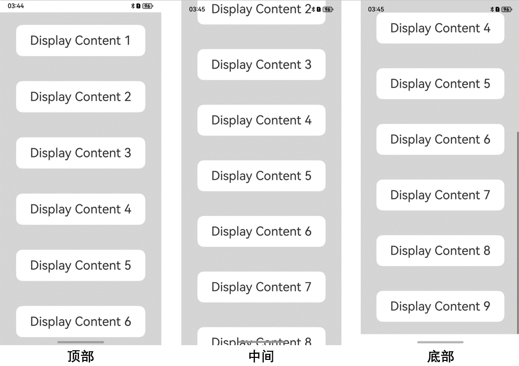
图5 滚动类容器设置expandSafeArea属性实现沉浸式效果
- 设置父组件滚动容器和子组件相同的背景色,设置滚动容器的内容裁剪属性clipContent(ContentClipMode.SAFE_AREA),将内容层裁剪区域扩展至避让区。
- // xxx.ets
- @Entry
- @Component
- struct ScrollExample {
- scroller: Scroller = new Scroller()
- private arr: number[] = [1, 2, 3, 4, 5, 6, 7, 8, 9]
- build() {
- Stack({ alignContent: Alignment.TopStart }) {
- Scroll(this.scroller) {
- Column() {
- ForEach(this.arr, (item: number) => {
- Stack() {
- Text('Display Content ' + item.toString()).fontSize(30)
- }
- .width('80%').padding(20).borderRadius(15).backgroundColor(Color.White).margin({ top:30, bottom:30 })
- }, (item: string) => item)
- }.width('100%').backgroundColor('rgb(213,213,213)')
- }.backgroundColor('rgb(213,213,213)')
- .clipContent(ContentClipMode.SAFE_AREA)
- }.width('100%').height('100%')
- }
- }
图6 滚动类容器设置clipContent属性实现沉浸式效果
底部页签场景
要求页签背景色能够延伸到导航区域(此处以导航区域表现为导航条为例给出示意),但页签内部可操作元素需要在导航区域之上。
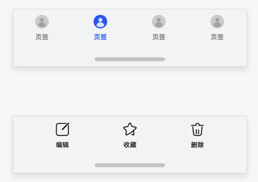
针对底部的页签部分,Navigation组件和Tabs组件默认实现了页签的延伸处理,开发者只需要保证Navigation和Tabs组件的底部边界和底部导航区域重合即可。若开发者显式调用expandSafeArea接口,则安全区效果由expandSafeArea参数指定。
如果未使用上述组件而是采用自定义方式实现页签的场景,可以针对底部元素设置expandSafeArea属性实现底部元素的背景扩展。
图7 顶部和底部UI元素未设置和设置expandSafeArea属性效果对比
- // xxx.ets
- @Entry
- @Component
- struct Example {
- build() {
- Column() {
- Row() {
- Text('Top Content').fontSize(40).textAlign(TextAlign.Center).width('100%')
- }.backgroundColor('#2786d9')
- // 设置顶部绘制延伸到状态栏
- .expandSafeArea([SafeAreaType.SYSTEM], [SafeAreaEdge.TOP])
- Row() {
- Text('Display Content 2').fontSize(30)
- }.backgroundColor(Color.White).padding(20).borderRadius(15).width('80%')
- Row() {
- Text('Display Content 3').fontSize(30)
- }.backgroundColor(Color.White).padding(20).borderRadius(15).width('80%')
- Row() {
- Text('Display Content 4').fontSize(30)
- }.backgroundColor(Color.White).padding(20).borderRadius(15).width('80%')
- Row() {
- Text('Display Content 5').fontSize(30)
- }.backgroundColor(Color.White).padding(20).borderRadius(15).width('80%')
- Row() {
- Text('Bottom Content').fontSize(40).textAlign(TextAlign.Center).width('100%')
- }.backgroundColor('#96dffa')
- // 设置底部绘制延伸到导航区域
- .expandSafeArea([SafeAreaType.SYSTEM], [SafeAreaEdge.BOTTOM])
- }
- .width('100%').height('100%')
- .alignItems(HorizontalAlign.Center)
- .backgroundColor('#d5d5d5')
- .justifyContent(FlexAlign.SpaceBetween)
- }
- }
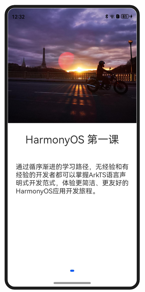
图文场景
当状态栏元素和底部导航区域元素不同时,无法单纯通过窗口背景色或者背景图组件延伸实现,此时需要对顶部元素和底部元素分别配置expandSafeArea属性,顶部元素配置expandSafeArea([SafeAreaType.SYSTEM],[SafeAreaEdge.TOP]),底部元素配置expandSafeArea([SafeAreaType.SYSTEM],[SafeAreaEdge.BOTTOM])。
- @Entry
- @Component
- struct Index {
- build() {
- Swiper() {
- Column() {
- Image($r('app.media.start'))
- .height('50%').width('100%')
- // 设置图片延伸到状态栏
- .expandSafeArea([SafeAreaType.SYSTEM], [SafeAreaEdge.TOP])
- Column() {
- Text('HarmonyOS 第一课')
- .fontSize(32)
- .margin(30)
- Text('通过循序渐进的学习路径,无经验和有经验的开发者都可以掌握ArkTS语言声明式开发范式,体验更简洁、更友好的HarmonyOS应用开发旅程。')
- .fontSize(20).margin(20)
- }.height('50%').width('100%')
- .backgroundColor(Color.White)
- // 设置文本内容区背景延伸到导航栏
- .expandSafeArea([SafeAreaType.SYSTEM], [SafeAreaEdge.BOTTOM])
- }
- }
- .width('100%')
- .height('100%')
- // 关闭Swiper组件默认的裁剪效果以便子节点可以绘制在Swiper外。
- .clip(false)
- }
- }

作为“人工智能6S店”的官方数字引擎,为AI开发者与企业提供一个覆盖软硬件全栈、一站式门户。
更多推荐


 0
0 0
0- 0


 已为社区贡献1条内容

所有评论(0)