
鸿蒙跨端Flutter开发:SnackBar提示组件详解
Image Widget的高级应用模式展示了Flutter在图片处理方面的强大能力。通过合理组合各种技术,可以构建出功能丰富、用户体验优秀的图片相关功能。记住要根据实际需求选择合适的方案,在功能和性能之间找到最佳平衡。持续学习和实践是掌握这些高级模式的关键。
一、SnackBar组件概述
SnackBar是Flutter中用于显示简短消息提示的组件,它通常出现在屏幕底部,用于向用户提供操作反馈、错误提示或状态通知。SnackBar会自动在几秒钟后消失,不会阻塞用户操作,是一种非侵入式的提示方式。
SnackBar的设计理念
SnackBar的优势在于它不会打断用户的操作流程,提供了一种轻量级的反馈机制。与AlertDialog不同,SnackBar不需要用户立即响应,而是作为辅助信息出现,让用户可以在合适的时间处理。
二、SnackBar的主要属性
核心属性详解表
| 属性名 | 类型 | 说明 | 必需 | 默认值 |
|---|---|---|---|---|
| content | Widget | 显示的内容(通常为Text) | 是 | null |
| duration | Duration | 显示时长 | 否 | Duration(seconds: 4) |
| action | SnackBarAction | 操作按钮 | 否 | null |
| backgroundColor | Color | 背景颜色 | 否 | 主题中的颜色 |
| elevation | double | 阴影高度 | 否 | 6.0 |
| margin | EdgeInsetsGeometry | 外边距 | 否 | null |
| padding | EdgeInsetsGeometry | 内边距 | 否 | null |
| width | double | 宽度 | 否 | null |
| shape | ShapeBorder | 形状 | 否 | null |
| behavior | SnackBarBehavior | 行为模式 | 否 | SnackBarBehavior.fixed |
| onVisible | VoidCallback | 显示时回调 | 否 | null |
SnackBarBehavior枚举
| 值 | 说明 | 使用场景 |
|---|---|---|
| fixed | 固定在底部 | 不会受BottomNavigationBar影响 |
| floating | 悬浮显示 | 会悬浮在其他元素之上 |
属性使用场景说明
content属性:这是SnackBar的核心内容,通常使用Text组件来显示消息。内容应该简洁明了,避免过长。如果需要显示复杂内容,可以考虑使用Row或Column等布局组件。
duration属性:控制SnackBar显示的时间长度。对于简单的成功提示,2-3秒就足够了;对于需要用户注意的重要信息,可以设置5秒或更长;对于需要用户主动操作的提示,应该设置更长的时间或不自动消失。
action属性:提供一个可点击的按钮,允许用户对SnackBar中的消息进行响应。最常见的操作是"撤销"功能,让用户可以撤回刚才的操作。
behavior属性:控制SnackBar的显示行为。fixed模式会将SnackBar固定在底部,可能被BottomNavigationBar遮挡;floating模式会让SnackBar悬浮显示,不会被其他元素遮挡。
三、基础SnackBar使用示例
简单的提示消息
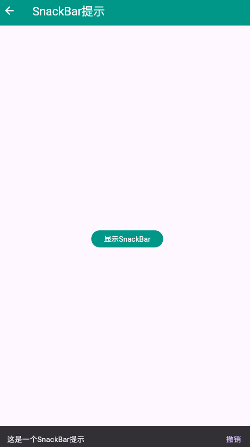
Scaffold(
  appBar: AppBar(
    title: const Text('SnackBar基础'),
    backgroundColor: Colors.blue,
    foregroundColor: Colors.white,
  ),
  body: Center(
    child: ElevatedButton(
      onPressed: () {
        ScaffoldMessenger.of(context).showSnackBar(
          const SnackBar(
            content: Text('操作成功完成'),
            duration: Duration(seconds: 2),
          ),
        );
      },
      style: ElevatedButton.styleFrom(
        backgroundColor: Colors.blue,
        foregroundColor: Colors.white,
        padding: const EdgeInsets.symmetric(horizontal: 24, vertical: 12),
      ),
      child: const Text('显示SnackBar'),
    ),
  ),
)
代码说明
这段代码展示了最基本的SnackBar用法。当用户点击按钮时,通过ScaffoldMessenger.of(context).showSnackBar()方法显示一个SnackBar。SnackBar包含一个Text组件作为内容,显示2秒后自动消失。
ScaffoldMessenger是Flutter中用于管理SnackBar、MaterialBanner等提示组件的工具。它确保提示消息能够正确地显示在最近的Scaffold中。
四、带操作按钮的SnackBar
实现撤销功能
class SnackBarWithActionPage extends StatefulWidget {
const SnackBarWithActionPage({super.key});
State<SnackBarWithActionPage> createState() => _SnackBarWithActionPageState();
}
class _SnackBarWithActionPageState extends State<SnackBarWithActionPage> {
final List<String> _items = ['项目 1', '项目 2', '项目 3'];
Widget build(BuildContext context) {
return Scaffold(
appBar: AppBar(
title: const Text('带操作的SnackBar'),
backgroundColor: Colors.green,
foregroundColor: Colors.white,
),
body: Column(
children: [
Expanded(
child: ListView.builder(
padding: const EdgeInsets.all(16),
itemCount: _items.length,
itemBuilder: (context, index) {
return Card(
margin: const EdgeInsets.only(bottom: 12),
child: ListTile(
leading: CircleAvatar(
child: Text('${index + 1}'),
),
title: Text(_items[index]),
trailing: IconButton(
icon: const Icon(Icons.delete, color: Colors.red),
onPressed: () {
final deletedItem = _items[index];
setState(() {
_items.removeAt(index);
});
ScaffoldMessenger.of(context).showSnackBar(
SnackBar(
content: Text('已删除:$deletedItem'),
action: SnackBarAction(
label: '撤销',
onPressed: () {
setState(() {
_items.insert(index, deletedItem);
});
},
),
duration: const Duration(seconds: 3),
),
);
},
),
),
);
},
),
),
],
),
floatingActionButton: FloatingActionButton(
onPressed: () {
setState(() {
_items.add('项目 ${_items.length + 1}');
});
ScaffoldMessenger.of(context).showSnackBar(
const SnackBar(
content: Text('已添加新项目'),
duration: Duration(seconds: 2),
),
);
},
backgroundColor: Colors.green,
foregroundColor: Colors.white,
child: const Icon(Icons.add),
),
);
}
}
撤销功能实现要点
这个示例展示了一个完整的删除-撤销场景:
- 用户点击删除按钮时,先从列表中移除该项
- 立即显示SnackBar,包含已删除项的信息
- SnackBar提供一个"撤销"按钮
- 如果用户点击"撤销",该项会重新插入到原来的位置
- 如果用户不操作,SnackBar会在3秒后消失
这种模式在很多应用中都有应用,比如邮件应用中的删除撤销、任务列表中的完成撤销等。它为用户提供了一种安全的操作体验,避免了误操作带来的损失。
五、自定义SnackBar样式
丰富的视觉设计
Scaffold(
  appBar: AppBar(
    title: const Text('自定义SnackBar'),
    backgroundColor: Colors.purple,
    foregroundColor: Colors.white,
  ),
  body: ListView(
    padding: const EdgeInsets.all(16),
    children: [
      _buildStyledButton(
        context,
        '成功提示',
        Colors.green,
        () {
          ScaffoldMessenger.of(context).showSnackBar(
            SnackBar(
              content: Row(
                children: const [
                  Icon(Icons.check_circle, color: Colors.white),
                  SizedBox(width: 12),
                  Text('操作成功完成'),
                ],
              ),
              backgroundColor: Colors.green,
              behavior: SnackBarBehavior.floating,
              shape: RoundedRectangleBorder(
                borderRadius: BorderRadius.circular(10),
              ),
            ),
          );
        },
      ),
      const SizedBox(height: 16),
      _buildStyledButton(
        context,
        '错误提示',
        Colors.red,
        () {
          ScaffoldMessenger.of(context).showSnackBar(
            SnackBar(
              content: Row(
                children: const [
                  Icon(Icons.error, color: Colors.white),
                  SizedBox(width: 12),
                  Text('操作失败,请重试'),
                ],
              ),
              backgroundColor: Colors.red,
              behavior: SnackBarBehavior.floating,
              shape: RoundedRectangleBorder(
                borderRadius: BorderRadius.circular(10),
              ),
              action: SnackBarAction(
                label: '重试',
                textColor: Colors.white,
                onPressed: () {},
              ),
            ),
          );
        },
      ),
      const SizedBox(height: 16),
      _buildStyledButton(
        context,
        '警告提示',
        Colors.orange,
        () {
          ScaffoldMessenger.of(context).showSnackBar(
            SnackBar(
              content: Row(
                children: const [
                  Icon(Icons.warning, color: Colors.white),
                  SizedBox(width: 12),
                  Text('请注意此操作'),
                ],
              ),
              backgroundColor: Colors.orange,
              behavior: SnackBarBehavior.floating,
              shape: RoundedRectangleBorder(
                borderRadius: BorderRadius.circular(10),
              ),
              duration: const Duration(seconds: 5),
            ),
          );
        },
      ),
    ],
  ),
)

Widget _buildStyledButton(
  BuildContext context,
  String label,
  Color color,
  VoidCallback onPressed,
) {
  return SizedBox(
    width: double.infinity,
    child: ElevatedButton(
      onPressed: onPressed,
      style: ElevatedButton.styleFrom(
        backgroundColor: color,
        foregroundColor: Colors.white,
        padding: const EdgeInsets.symmetric(vertical: 16),
        shape: RoundedRectangleBorder(
          borderRadius: BorderRadius.circular(10),
        ),
      ),
      child: Text(label, style: const TextStyle(fontSize: 16)),
    ),
  );
}
样式设计建议
通过自定义SnackBar的样式,可以让提示信息更加醒目和美观:
- 使用图标:在文字前添加图标,可以增强视觉效果,让用户更快理解提示的类型(成功、错误、警告等)
- 颜色编码:使用不同的颜色表示不同类型的消息,绿色表示成功,红色表示错误,橙色表示警告
- 圆角设计:设置合适的圆角半径,让SnackBar看起来更加现代和友好
- 浮动模式:使用SnackBarBehavior.floating让SnackBar悬浮显示,不会被其他元素遮挡
- 合适的时长:根据消息的重要性调整显示时长,重要消息显示时间更长
六、SnackBar与多个提示的队列管理
处理连续提示
class SnackBarQueuePage extends StatefulWidget {
const SnackBarQueuePage({super.key});
State<SnackBarQueuePage> createState() => _SnackBarQueuePageState();
}
class _SnackBarQueuePageState extends State<SnackBarQueuePage> {
Widget build(BuildContext context) {
return Scaffold(
appBar: AppBar(
title: const Text('SnackBar队列管理'),
backgroundColor: Colors.teal,
foregroundColor: Colors.white,
),
body: Center(
child: Column(
mainAxisAlignment: MainAxisAlignment.center,
children: [
ElevatedButton(
onPressed: () {
_showMultipleSnackBars();
},
style: ElevatedButton.styleFrom(
backgroundColor: Colors.teal,
foregroundColor: Colors.white,
padding: const EdgeInsets.symmetric(horizontal: 24, vertical: 12),
),
child: const Text('连续显示多个SnackBar'),
),
const SizedBox(height: 20),
const Text(
'点击按钮快速连续触发多个提示',
style: TextStyle(color: Colors.grey),
),
],
),
),
);
}
void _showMultipleSnackBars() {
final messages = [
'正在加载...',
'加载进度:50%',
'加载完成!',
];
for (int i = 0; i < messages.length; i++) {
Future.delayed(Duration(milliseconds: i * 100), () {
if (mounted) {
ScaffoldMessenger.of(context).showSnackBar(
SnackBar(
content: Row(
children: [
if (i == 2)
const Icon(Icons.check_circle, color: Colors.white)
else
const SizedBox(
width: 16,
height: 16,
child: CircularProgressIndicator(
strokeWidth: 2,
valueColor: AlwaysStoppedAnimation<Color>(Colors.white),
),
),
const SizedBox(width: 12),
Text(messages[i]),
],
),
backgroundColor: Colors.teal,
behavior: SnackBarBehavior.floating,
shape: RoundedRectangleBorder(
borderRadius: BorderRadius.circular(10),
),
duration: const Duration(milliseconds: 1500),
),
);
}
});
}
}
}
队列管理策略
当需要连续显示多个SnackBar时,Flutter的ScaffoldManager会自动管理提示队列,确保同一时间只显示一个SnackBar。新的提示会排队等待,当前提示消失后,下一个提示会自动显示。
在实际应用中,可以通过以下方式优化提示体验:
- 合理的间隔时间:使用Future.delayed设置适当的延迟,让提示有节奏地出现
- 进度反馈:对于加载过程,使用进度指示器让用户了解当前状态
- 最终确认:最后一个提示应该是完成确认,让用户知道操作已完成
- 避免过多提示:如果提示太多,可以考虑合并成一个提示,减少对用户的干扰
七、SnackBar的特殊场景应用
带有输入框的提示
class InputSnackBarPage extends StatefulWidget {
const InputSnackBarPage({super.key});
State<InputSnackBarPage> createState() => _InputSnackBarPageState();
}
class _InputSnackBarPageState extends State<InputSnackBarPage> {
final TextEditingController _controller = TextEditingController();
void dispose() {
_controller.dispose();
super.dispose();
}
Widget build(BuildContext context) {
return Scaffold(
appBar: AppBar(
title: const Text('特殊SnackBar应用'),
backgroundColor: Colors.indigo,
foregroundColor: Colors.white,
),
body: Center(
child: ElevatedButton(
onPressed: () {
_showInputSnackBar();
},
style: ElevatedButton.styleFrom(
backgroundColor: Colors.indigo,
foregroundColor: Colors.white,
padding: const EdgeInsets.symmetric(horizontal: 24, vertical: 12),
),
child: const Text('显示可交互提示'),
),
),
);
}
void _showInputSnackBar() {
ScaffoldMessenger.of(context).showSnackBar(
SnackBar(
content: TextField(
controller: _controller,
decoration: const InputDecoration(
hintText: '输入您的反馈',
border: InputBorder.none,
hintStyle: TextStyle(color: Colors.white70),
),
style: const TextStyle(color: Colors.white),
autofocus: true,
),
backgroundColor: Colors.indigo,
behavior: SnackBarBehavior.floating,
shape: RoundedRectangleBorder(
borderRadius: BorderRadius.circular(10),
),
action: SnackBarAction(
label: '发送',
textColor: Colors.white,
onPressed: () {
if (_controller.text.isNotEmpty) {
ScaffoldMessenger.of(context).showSnackBar(
SnackBar(
content: Text('已收到反馈:${_controller.text}'),
backgroundColor: Colors.green,
behavior: SnackBarBehavior.floating,
shape: RoundedRectangleBorder(
borderRadius: BorderRadius.circular(10),
),
),
);
_controller.clear();
}
},
),
),
);
}
}
特殊场景应用要点
SnackBar不仅可以显示简单的文本,还可以嵌入交互组件,如TextField、Checkbox等。这种用法需要特别注意:
- 避免过度复杂:SnackBar应该保持简洁,不要嵌入过于复杂的组件
- 自动聚焦:如果包含输入框,应该自动聚焦,方便用户输入
- 合理的高度:确保SnackBar的高度适中,不会遮挡重要内容
- 快速响应:用户操作后应该快速给出反馈,提升用户体验
八、SnackBar最佳实践
实践总结
关键实践要点
-
内容简洁明了:SnackBar的文本应该简短、清晰,避免冗长的描述。用户通常只需要知道"操作成功"或"操作失败",不需要详细的说明。
-
合理的显示时长:根据消息的重要性调整时长。简单的成功提示2秒足够,需要用户注意的消息可以设置3-5秒,重要消息可以更长或不自动消失。
-
提供必要的操作:如果消息需要用户响应,一定要提供操作按钮。最常见的操作是"撤销"和"重试"。
-
使用颜色编码:通过颜色让用户快速识别消息类型。绿色表示成功,红色表示错误,橙色表示警告,蓝色表示信息。
-
避免频繁提示:不要在短时间内显示过多SnackBar,这样会打断用户的操作流程。如果需要显示多个消息,考虑合并成一个。
-
支持暗色模式:确保SnackBar的文字颜色在暗色主题下仍然清晰可见。
-
考虑国际化:SnackBar中的文本应该支持多语言,避免硬编码文本。
通过遵循这些最佳实践,可以创建出既美观又实用的SnackBar,为用户提供良好的反馈体验。
欢迎加入开源鸿蒙跨平台社区:https://openharmonycrossplatform.csdn.net

作为“人工智能6S店”的官方数字引擎,为AI开发者与企业提供一个覆盖软硬件全栈、一站式门户。
更多推荐

 1
1 0
0- 0


 已为社区贡献3条内容

所有评论(0)