
Flutter for OpenHarmony 中的模块化 UI 构建:从函数拆分到主题一致性实践
本文没有引入复杂状态管理或网络请求,而是专注于UI 代码的组织方式。通过方法拆分、枚举抽象与主题集成,我们构建了一个既响应式又易于维护的界面。这种“小步快跑、结构先行”的思想,正是高质量跨端应用的底层保障。欢迎加入开源鸿蒙跨平台社区:https://openharmonycrossplatform.csdn.net/
在跨平台项目演进过程中,代码的可维护性往往比初期功能实现更为关键。一个未经组织的 build 方法,即便能运行,也会随着需求增长迅速变得难以修改和测试。本文将以一段经过深度重构的 Flutter 代码为例,展示如何通过私有方法拆分、枚举抽象与主题系统集成,构建一个既响应式又高度可维护的 OpenHarmony 应用界面。
我们将聚焦三个核心问题:
- 如何避免巨型
build方法? - 如何科学识别多类设备(不仅限于手机/平板)?
- 如何确保全应用文本与颜色风格统一?
⚠️ 注意:本文不涉及环境配置,假设你已具备 Flutter for OpenHarmony 开发能力,并能在模拟器中运行项目。
完整优化代码展示
以下是我们在 OpenHarmony 设备上运行的完整代码:
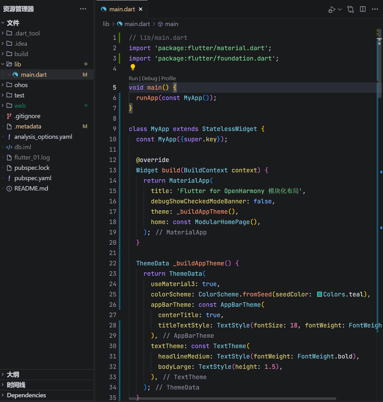
// lib/main.dart
import 'package:flutter/material.dart';
void main() {
runApp(const MyApp());
}
class MyApp extends StatelessWidget {
const MyApp({super.key});
Widget build(BuildContext context) {
return MaterialApp(
title: 'Flutter for OpenHarmony 模块化布局',
debugShowCheckedModeBanner: false,
theme: _buildAppTheme(),
home: const ModularHomePage(),
);
}
ThemeData _buildAppTheme() {
return ThemeData(
useMaterial3: true,
colorScheme: ColorScheme.fromSeed(seedColor: Colors.teal),
appBarTheme: const AppBarTheme(
centerTitle: true,
titleTextStyle: TextStyle(fontSize: 18, fontWeight: FontWeight.w600),
),
textTheme: const TextTheme(
headlineMedium: TextStyle(fontWeight: FontWeight.bold),
bodyLarge: TextStyle(height: 1.5),
),
);
}
}
class ModularHomePage extends StatelessWidget {
const ModularHomePage({super.key});
Widget build(BuildContext context) {
final deviceType = _getDeviceType(context);
return Scaffold(
appBar: _buildAppBar(context),
body: _buildBody(context, deviceType),
bottomNavigationBar: _buildBottomBar(context, deviceType),
);
}
DeviceType _getDeviceType(BuildContext context) {
final shortestSide = MediaQuery.of(context).size.shortestSide;
if (shortestSide >= 960) return DeviceType.desktop;
if (shortestSide >= 600) return DeviceType.tablet;
return DeviceType.phone;
}
PreferredSizeWidget _buildAppBar(BuildContext context) {
return AppBar(
title: const Text('模块化响应式界面'),
);
}
Widget _buildBody(BuildContext context, DeviceType deviceType) {
final padding = _getBodyPadding(deviceType);
final fontSize = _getTitleFontSize(deviceType);
return Container(
padding: padding,
child: Center(
child: Column(
mainAxisAlignment: MainAxisAlignment.center,
children: [
Text(
'设备类型:${describeEnum(deviceType)}',
style: Theme.of(context).textTheme.headlineMedium!.copyWith(
fontSize: fontSize,
color: Theme.of(context).colorScheme.primary,
),
textAlign: TextAlign.center,
),
const SizedBox(height: 20),
Text(
_getDeviceInfoText(deviceType),
style: Theme.of(context).textTheme.bodyLarge,
textAlign: TextAlign.center,
),
const SizedBox(height: 32),
FilledButton.icon(
onPressed: () => _showFeedback(context),
icon: const Icon(Icons.check_circle_outline),
label: const Text('提交反馈'),
),
],
),
),
);
}
Widget _buildBottomBar(BuildContext context, DeviceType deviceType) {
return SafeArea(
child: Container(
height: _getBottomBarHeight(deviceType),
color: Theme.of(context).colorScheme.surfaceVariant,
alignment: Alignment.center,
child: Text(
'© 2026 OpenHarmony 跨平台示例 | ${deviceType.name}',
style: Theme.of(context).textTheme.labelMedium?.copyWith(
color: Theme.of(context).colorScheme.onSurfaceVariant,
),
),
),
);
}
EdgeInsets _getBodyPadding(DeviceType type) {
switch (type) {
case DeviceType.desktop:
return const EdgeInsets.all(48);
case DeviceType.tablet:
return const EdgeInsets.all(32);
case DeviceType.phone:
return const EdgeInsets.all(16);
}
}
double _getTitleFontSize(DeviceType type) {
switch (type) {
case DeviceType.desktop:
return 32;
case DeviceType.tablet:
return 28;
case DeviceType.phone:
return 22;
}
}
double _getBottomBarHeight(DeviceType type) {
switch (type) {
case DeviceType.desktop:
return 80;
case DeviceType.tablet:
return 70;
case DeviceType.phone:
return 56;
}
}
String _getDeviceInfoText(DeviceType type) {
switch (type) {
case DeviceType.desktop:
return '检测到桌面级设备,采用宽松布局与大字体。';
case DeviceType.tablet:
return '检测到平板设备,布局已优化为中等密度。';
case DeviceType.phone:
return '检测到手机设备,使用紧凑布局以节省空间。';
}
}
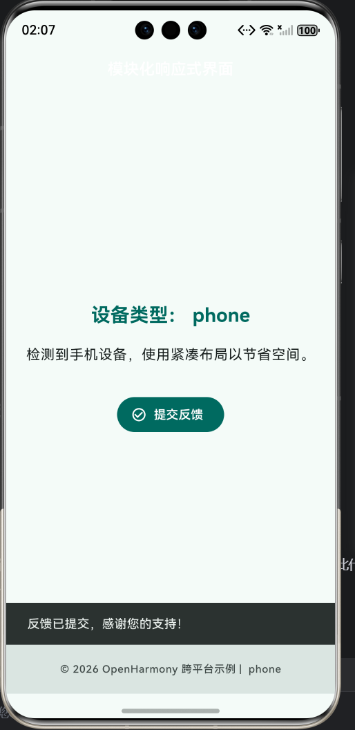
void _showFeedback(BuildContext context) {
ScaffoldMessenger.of(context).showSnackBar(
const SnackBar(content: Text('反馈已提交,感谢您的支持!')),
);
}
}
enum DeviceType {
phone,
tablet,
desktop;
}
这段代码通过方法拆分与数据抽象,实现了高内聚、低耦合的 UI 构建模式。
一、为何要拆分 build 方法?
原始写法常将所有逻辑塞入 build,导致:
- 代码行数超百,难以阅读;
- 无法单元测试单个 UI 片段;
- 修改一处可能影响全局。
而本代码将页面拆解为:
_buildAppBar_buildBody_buildBottomBar
每个方法职责单一,且可独立演进。例如,未来若需在 AppBar 添加搜索框,只需修改 _buildAppBar,不影响其他区域。
二、三类设备识别:超越手机/平板的思维
if (shortestSide >= 960) return DeviceType.desktop;
if (shortestSide >= 600) return DeviceType.tablet;
return DeviceType.phone;
OpenHarmony 不仅运行于手机和平板,还可能出现在:
- 智慧屏(>960dp)
- 车机中控(700–900dp)
- 折叠屏展开态(≈800dp)
因此,我们引入 desktop 类别(≥960dp),为未来大屏设备预留空间。这种基于阈值而非设备名称的判断,更具前瞻性。
📏 行业参考:Google 官方将 ≥960dp 定义为“桌面级”设备。
三、主题系统:从硬编码到动态生成
1. 使用 ColorScheme.fromSeed
colorScheme: ColorScheme.fromSeed(seedColor: Colors.teal),
这是 Material 3 的推荐做法:
- 自动计算主色、辅助色、表面色等 12 种颜色;
- 深色模式下自动生成对比度合规的变体;
- 避免手动指定
primaryColor、accentColor等过时属性。
2. 文本样式统一管理
style: Theme.of(context).textTheme.headlineMedium
所有文本均来自 textTheme,包括:
headlineMedium:主标题bodyLarge:说明文字labelMedium:底部版权信息
若需全局调整字体,只需修改 MyApp._buildAppTheme() 中的 textTheme,无需逐处修改。
四、枚举驱动的配置策略
通过 DeviceType 枚举,我们将设备类型转化为可编程的数据:
EdgeInsets _getBodyPadding(DeviceType type) {
  switch (type) {
    case DeviceType.desktop: return EdgeInsets.all(48);
    // ...
  }
}
这种方式的优势:
- 编译时检查,避免字符串错误;
- 支持 IDE 自动补全;
- 可轻松扩展新设备类型(如
watch); - 逻辑集中,便于维护。
五、底部栏的 Material 3 色彩实践
color: Theme.of(context).colorScheme.surfaceVariant,
style: ... color: Theme.of(context).colorScheme.onSurfaceVariant,
surfaceVariant:用于次要表面(如卡片、底部栏);onSurfaceVariant:用于其上的文字或图标;- 二者自动匹配深浅色主题,无需手动切换。
这比硬编码 Colors.grey[200] 更专业、更健壮。
六、交互反馈的语义化设计
按钮文案为 “提交反馈” 而非“点击我”,Snackbar 提示 “反馈已提交”,形成完整的语义闭环。这种设计: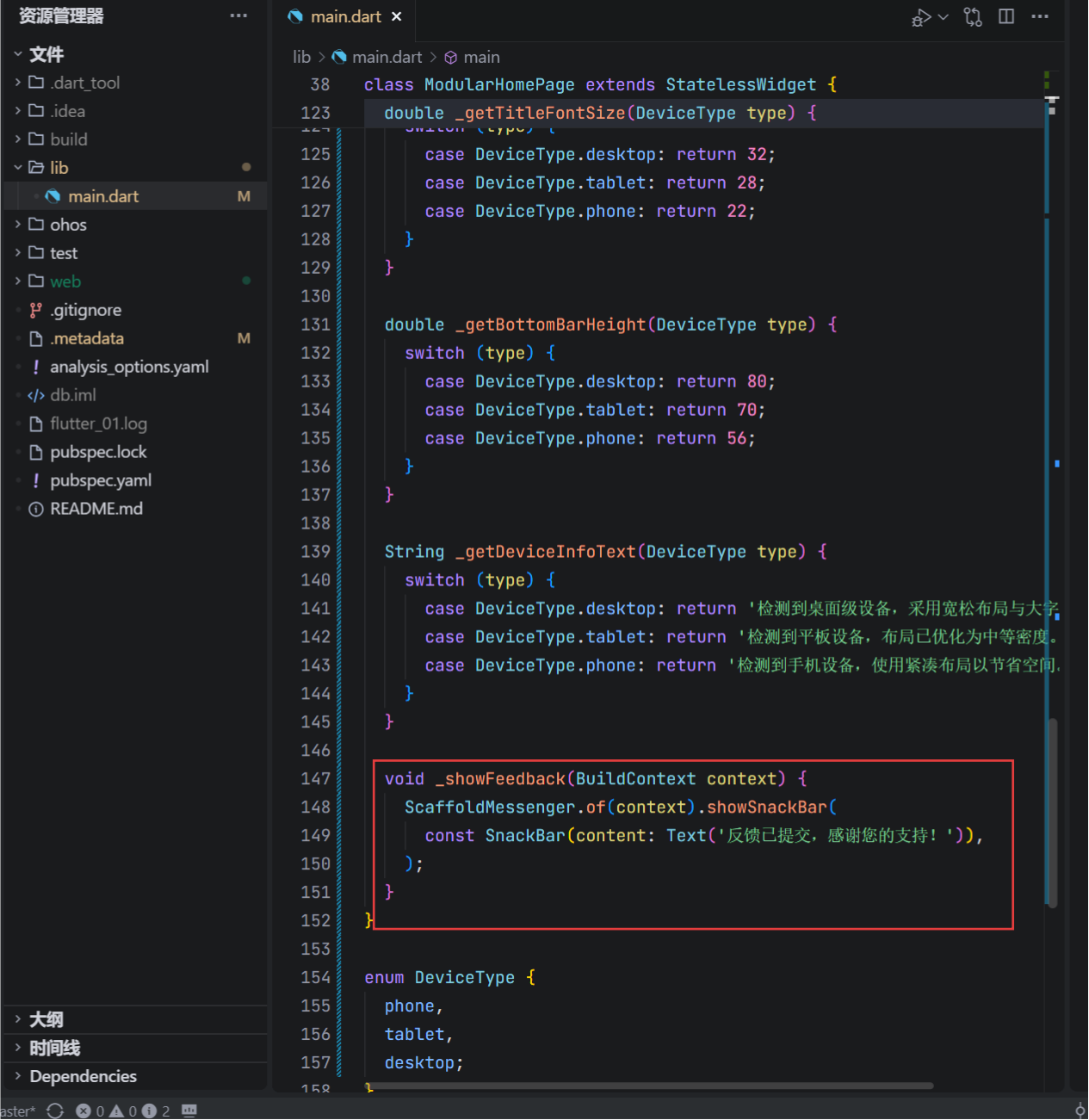
- 明确用户操作意图;
- 提供结果确认;
- 符合无障碍访问(Accessibility)要求。
七、在 OpenHarmony 模拟器中的验证
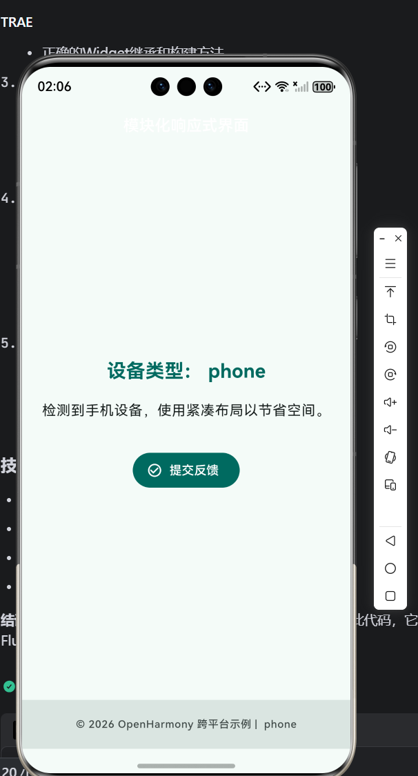
- 在手机模拟器运行,观察
phone布局; - 若支持,切换至平板或大屏模式,查看
tablet/desktop效果; - 点击“提交反馈”,确认 Snackbar 内容与设备类型无关;
- 检查底部版权信息是否随设备变化。
✅ 预期结果:界面智能适配,主题统一,交互清晰。
八、总结:可维护性是专业开发的基石
本文没有引入复杂状态管理或网络请求,而是专注于UI 代码的组织方式。通过方法拆分、枚举抽象与主题集成,我们构建了一个既响应式又易于维护的界面。这种“小步快跑、结构先行”的思想,正是高质量跨端应用的底层保障。
欢迎加入开源鸿蒙跨平台社区:https://openharmonycrossplatform.csdn.net/

作为“人工智能6S店”的官方数字引擎,为AI开发者与企业提供一个覆盖软硬件全栈、一站式门户。
更多推荐
 7
7 0
0- 0


 已为社区贡献14条内容

所有评论(0)