
React Native鸿蒙跨平台结果页面ResultPage 独立负责渲染结果态(type/title/description),ResultPageDemo 管理类型选择与展示开关
本文介绍了基于React Native开发的结果页组件在鸿蒙生态中的跨平台实现方案。该方案采用最小依赖的原生组件组合,通过SafeAreaView、ScrollView等基础控件构建完整用户反馈流程,实现从选择到展示的闭环体验。重点阐述了语义状态组织、视觉层级管理和交互闭环设计三大关键技术:1) 采用源状态驱动UI的架构确保跨端渲染一致性;2) 通过emoji图标与集中色板策略实现跨平台视觉表达;
本文介绍了基于React Native开发的结果页组件在鸿蒙生态中的跨平台实现方案。该方案采用最小依赖的原生组件组合,通过SafeAreaView、ScrollView等基础控件构建完整用户反馈流程,实现从选择到展示的闭环体验。重点阐述了语义状态组织、视觉层级管理和交互闭环设计三大关键技术:
-
- 采用源状态驱动UI的架构确保跨端渲染一致性;
-
- 通过emoji图标与集中色板策略实现跨平台视觉表达;
-
- 构建统一的Modal抽象层处理平台差异。
文章还详细分析了布局适配、滚动优化等鸿蒙专项技术,如利用react-native-safe-area-context处理异形屏安全区域,通过FlatList优化内存性能等,为React Native应用在鸿蒙生态的高质量落地提供了实践指导。
这个“结果页”示例以最小依赖的 React Native 原语组合出完整的用户反馈体验:类型切换、独立展示页、预览与底部导航。它不引入路由库或复杂状态管理,依赖 SafeAreaView、ScrollView、View/Text、TouchableOpacity 与 Alert 就实现了从“选择 → 预览 → 真正展示”的完整闭环。放到鸿蒙(HarmonyOS/OpenHarmony)的语境下,关键是让“语义清晰、视觉稳定、交互一致”的设计通过 RN-OH 映射到 ArkUI 后仍保持同样质量。
语义与状态组织
组件划分干净:ResultPage 独立负责渲染结果态(type/title/description),ResultPageDemo 管理类型选择与展示开关。源状态只有两处:resultType 与 showResult,它们驱动 UI 所有派生输出(图标、颜色、按钮文案、是否显示刷新)。这种“源状态 → 派生 UI”的组织有两个跨端益处:ArkUI 只接收经过计算的最终属性,渲染可预测;切换过程中不会产生布局跳变,用户的感知稳定。
图标、色板与视觉层级
结果类型通过 emoji 图标与色板表达语义(success/error/warning/info),这是跨端最简资产策略:不需要桥接矢量库或打包字体资源。实际落地时需要把两点差异收敛掉:
- emoji 在不同系统主题下的基线与字形可能略有偏移,给图标文本提供固定行高与居中容器能消除偏移;
- 色板集中管理,统一等级与对比度,确保暗色/浅色主题下的可读性一致。
卡片与按钮采用浅阴影与圆角表达层级;为保证三端一致性,iOS 使用 shadow*,鸿蒙/安卓使用 elevation 的“双栈阴影”是必须的。把阴影参数抽象到适配层后,同一“视觉等级”能在三端看起来一致。
交互闭环
结果页的主操作(actionText)与“错误态刷新”都走 TouchableOpacity 触发,轻量、明确。预览/展示页行为走 Alert 反馈,这是最小交互闭环。鸿蒙端的 Alert 映射 ArkUI Dialog,主题与布局略有差异;为了品牌统一与动效一致,工程上通常会抽象一个 Modal 层,对外暴露统一 API,内部在鸿蒙走 ArkUI Dialog,在 iOS/Android 走 RN Modal,这样业务代码不需要关心平台差异。
布局
头部、选择器卡片、预览区、底部导航的“版面骨架”稳定,不依赖平台特殊控件。顶层 SafeAreaView 护住状态栏与异形屏;考虑鸿蒙设备形态(打孔、圆角、折叠屏),建议配合 react-native-safe-area-context 做 inset 兜底,统一头部与底部导航在不同屏幕形态下的安全间距。
滚动
内容区用 ScrollView 足以承载这个体量;若结果页承载大量动态内容(多段描述、图片、列表),迁移到 FlatList 能获得虚拟化与窗口渲染优势(initialNumToRender/windowSize/removeClippedSubviews),在鸿蒙设备上显著降低内存占用与掉帧概率。预览与展示的骨架一致能避免切换时重排,带来更稳定的感知。
在鸿蒙生态系统中,React Native应用的运行依赖于一套精密的桥接机制。当SafeAreaView组件初始化时,实际上是在鸿蒙侧的ComponentContainer中创建了一个具备安全区域感知能力的ArkUI节点。这种设计巧妙地屏蔽了不同设备形态(如刘海屏、瀑布屏)带来的布局差异,确保了应用界面在各种鸿蒙设备上的显示一致性。
Dimensions API的使用充分体现了RN框架对多设备适配的深度考量。通过动态获取屏幕宽度(width),组件能够实现真正的响应式布局。在鸿蒙平台上,这一API被映射为对DisplayManager服务的调用,能够实时响应屏幕旋转、折叠等状态变化,为用户提供连续一致的操作体验。
ResultPage结果页组件的状态管理模式展现了React Hooks在鸿蒙环境下的优秀表现。useState钩子通过闭包机制维护着结果类型和显示状态,每次状态更新都会触发React Reconciler的diff算法。在鸿蒙设备上,这种基于Fiber架构的增量更新机制能够最大限度地减少不必要的DOM操作,提升渲染性能。
getIcon和getColor函数的实现体现了配置驱动设计的思想。通过switch语句映射不同类型对应的表情符号和颜色值,这种集中式配置管理在鸿蒙分布式环境中具有良好的可维护性。当需要新增结果类型时,只需扩展ICON常量和switch分支即可,无需修改组件核心逻辑。
TouchableOpacity组件的手势识别系统在鸿蒙平台上有着独特的实现方式。通过Responder Event System,组件能够准确捕捉用户的点击、滑动等操作,并将其转化为标准化的事件对象。这种事件处理机制在鸿蒙设备上具有毫秒级的响应速度,确保了流畅的用户交互体验。
Alert.alert()API在鸿蒙平台上的实现经过了特殊优化,能够根据设备类型自动选择合适的弹窗样式。在手机设备上显示为标准对话框,在平板设备上则采用更加宽敞的布局形式,这种自适应设计体现了鸿蒙一次开发多端部署的核心理念。
getResultConfig配置管理函数通过策略模式实现了不同类型结果页的内容定制。这种设计模式在鸿蒙跨端开发中具有重要意义,能够让同一套代码在不同设备上展现个性化的用户反馈信息,提升产品的专业度和用户体验。
handleAction动作处理器展示了事件委托在跨平台开发中的应用价值。通过Alert.alert()提供的回调机制,开发者能够在用户确认操作后执行相应的业务逻辑。在鸿蒙平台上,这种异步事件处理被优化为轻量级的任务调度,避免了主线程阻塞问题。
ResultPageDemo演示组件通过条件渲染实现了结果页与选择器页面的无缝切换。showResult状态的变化触发了React的完全重渲染机制,在鸿蒙设备上这种页面级别的状态切换能够利用ArkUI的页面缓存机制,保留之前的选择状态,提供流畅的导航体验。
样式系统的动态绑定机制展现了CSS-in-JS方案的强大威力。通过数组形式的样式组合([styles.typeButton, resultType === ‘success’ && styles.activeTypeButton]),组件能够在单次渲染中完成多个样式规则的合并。这种即时样式合成避免了传统CSS解析带来的性能损耗,在频繁重渲染场景下尤为突出。
类型化结果状态系统
结果页应用展示了高效的结果类型分类系统:
const ResultPage = ({
  type,
  title,
  description,
  onAction,
  actionText,
  showRefresh = false,
  onRefresh
}: {
  type: 'success' | 'error' | 'warning' | 'info';
  title: string;
  description: string;
  onAction?: () => void;
  actionText?: string;
  showRefresh?: boolean;
  onRefresh?: () => void;
}) => {
这种类型化设计在结果反馈应用中具有重要的用户体验保障作用。通过明确的结果类型分类、语义化属性和可选操作,确保了用户反馈的准确性和可操作性。在鸿蒙平台上,这种类型可以无缝转化为鸿蒙的分布式结果服务,实现跨设备的结果状态同步。
智能图标颜色映射
应用实现了精确的结果状态视觉映射:
const getIcon = () => {
  switch (type) {
    case 'success': return ICONS.success;
    case 'error': return ICONS.error;
    case 'warning': return ICONS.warning;
    case 'info': return ICONS.info;
    default: return ICONS.info;
  }
};

const getColor = () => {
  switch (type) {
    case 'success': return '#10b981';
    case 'error': return '#ef4444';
    case 'warning': return '#f59e0b';
    case 'info': return '#3b82f6';
    default: return '#3b82f6';
  }
};
这种视觉映射机制在结果反馈中展现了强大的认知一致性。通过语义化图标、色彩编码和状态关联,提供了直观的结果识别体验。在跨平台开发中,需要特别注意色彩对比和视觉可访问性。鸿蒙平台的设计系统可以提供更一致的视觉语言和更好的无障碍支持。
操作引导与状态管理
动态操作按钮系统
应用采用了灵活的操作按钮配置:
{actionText && onAction && (
  <TouchableOpacity style={styles.actionButton} onPress={onAction}>
    <Text style={styles.actionButtonText}>{actionText}</Text>
  </TouchableOpacity>
)}

{showRefresh && onRefresh && (
  <TouchableOpacity style={styles.refreshButton} onPress={onRefresh}>
    <Text style={styles.refreshButtonText}>{ICONS.refresh} 重新尝试</Text>
  </TouchableOpacity>
)}
这种操作系统在结果页面中展现了重要的用户引导能力。通过条件渲染、语义化标签和视觉区分,提供了清晰的下一步操作指引。在鸿蒙平台上,这种设计可以利用鸿蒙的原生操作服务实现更一致的用户交互体验。
多状态配置管理
代码实现了智能的结果配置管理:
const getResultConfig = () => {
  switch (resultType) {
    case 'success':
      return {
        title: '操作成功',
        description: '您的操作已成功完成,感谢您的使用!',
        actionText: '返回首页',
      };
    case 'error':
      return {
        title: '操作失败',
        description: '由于网络原因,您的操作未能完成,请稍后重试。',
        actionText: '重新尝试',
      };
    // 更多状态配置...
  }
};
这种配置管理在结果应用中展现了强大的可扩展性。通过集中配置、语义化文案和状态关联,提供了灵活的结果内容管理。在跨平台开发中,需要特别注意多语言支持和本地化适配。鸿蒙平台的国际化服务可以提供更完善的本地化支持。
鸿蒙跨端适配关键技术
分布式结果同步
鸿蒙的分布式特性为结果反馈带来创新体验:
// 伪代码:分布式结果同步
const DistributedResults = {
  syncResultState: (resultData) => {
    if (Platform.OS === 'harmony') {
      harmonyNative.syncOperationResult(resultData);
    }
  },
  getCrossDeviceResult: () => {
    if (Platform.OS === 'harmony') {
      return harmonyNative.getUnifiedResult();
    }
    return localResult;
  }
};
原生通知集成
利用鸿蒙的原生通知能力提升体验:
// 伪代码:通知集成
const NotificationIntegration = {
  showSystemNotification: () => {
    if (Platform.OS === 'harmony') {
      harmonyNative.displayResultNotification();
    }
  },
  provideHapticFeedback: () => {
    if (Platform.OS === 'harmony') {
      harmonyNative.generateResultHaptic();
    }
  }
};
智能操作建议
鸿蒙平台为结果应用提供智能操作引导能力:
// 伪代码:智能引导
const IntelligentGuidance = {
  suggestNextActions: () => {
    if (Platform.OS === 'harmony') {
      harmonyNative.recommendFollowupSteps();
    }
  },
  predictUserIntent: () => {
    if (Platform.OS === 'harmony') {
      harmonyNative.anticipateUserNeeds();
    }
  }
};
用户体验与交互设计
自适应布局系统
应用实现了优雅的结果页面布局:
<View style={styles.resultContainer}>
  <Text style={[styles.resultIcon, { color: getColor() }]}>{getIcon()}</Text>
  <Text style={styles.resultTitle}>{title}</Text>
  <Text style={styles.resultDescription}>{description}</Text>
  {/* 操作按钮 */}
</View>
这种布局设计在结果反馈中展现了重要的视觉层次。通过中心对齐、适度留白和清晰层次,提供了舒适的结果阅读体验。在跨平台开发中,需要特别注意不同设备尺寸的适配。鸿蒙平台的响应式布局可以提供更精确的屏幕适配。
智能化结果页面
// 伪代码:智能结果
const IntelligentResults = {
  adaptiveResultContent: () => {
    if (Platform.OS === 'harmony') {
      harmonyNative.customizeResultPresentation();
    }
  },
  learnFromUserBehavior: () => {
    if (Platform.OS === 'harmony') {
      harmonyNative.analyzeResultInteractions();
    }
  }
};
多模态反馈增强
// 伪代码:多模态反馈
const MultimodalFeedback = {
  enableVoiceResponse: () => {
    if (Platform.OS === 'harmony') {
      harmonyNative.provideVoiceFeedback();
    }
  },
  supportGestureActions: () => {
    if (Platform.OS === 'harmony') {
      harmonyNative.recognizeResultGestures();
    }
  }
};
真实演示案例代码:
// app.tsx
import React, { useState } from 'react';
import { SafeAreaView, View, Text, StyleSheet, TouchableOpacity, ScrollView, Dimensions, Alert } from 'react-native';

// 图标库
const ICONS = {
  success: '✅',
  error: '❌',
  warning: '⚠️',
  info: 'ℹ️',
  home: '🏠',
  refresh: '🔄',
  share: '📤',
  check: '✓',
};

const { width } = Dimensions.get('window');

// 结果页组件
const ResultPage = ({
  type,
  title,
  description,
  onAction,
  actionText,
  showRefresh = false,
  onRefresh
}: {
  type: 'success' | 'error' | 'warning' | 'info';
  title: string;
  description: string;
  onAction?: () => void;
  actionText?: string;
  showRefresh?: boolean;
  onRefresh?: () => void;
}) => {
  const getIcon = () => {
    switch (type) {
      case 'success': return ICONS.success;
      case 'error': return ICONS.error;
      case 'warning': return ICONS.warning;
      case 'info': return ICONS.info;
      default: return ICONS.info;
    }
  };

  const getColor = () => {
    switch (type) {
      case 'success': return '#10b981';
      case 'error': return '#ef4444';
      case 'warning': return '#f59e0b';
      case 'info': return '#3b82f6';
      default: return '#3b82f6';
    }
  };

  return (
    <View style={styles.resultContainer}>
      <Text style={[styles.resultIcon, { color: getColor() }]}>{getIcon()}</Text>
      <Text style={styles.resultTitle}>{title}</Text>
      <Text style={styles.resultDescription}>{description}</Text>

      {actionText && onAction && (
        <TouchableOpacity style={styles.actionButton} onPress={onAction}>
          <Text style={styles.actionButtonText}>{actionText}</Text>
        </TouchableOpacity>
      )}

      {showRefresh && onRefresh && (
        <TouchableOpacity style={styles.refreshButton} onPress={onRefresh}>
          <Text style={styles.refreshButtonText}>{ICONS.refresh} 重新尝试</Text>
        </TouchableOpacity>
      )}
    </View>
  );
};

const ResultPageDemo: React.FC = () => {
  const [resultType, setResultType] = useState<'success' | 'error' | 'warning' | 'info'>('success');
  const [showResult, setShowResult] = useState(false);

  const getResultConfig = () => {
    switch (resultType) {
      case 'success':
        return {
          title: '操作成功',
          description: '您的操作已成功完成,感谢您的使用!',
          actionText: '返回首页',
        };
      case 'error':
        return {
          title: '操作失败',
          description: '由于网络原因,您的操作未能完成,请稍后重试。',
          actionText: '重新尝试',
        };
      case 'warning':
        return {
          title: '注意',
          description: '您正在进行敏感操作,请确认后再继续。',
          actionText: '确认继续',
        };
      case 'info':
        return {
          title: '提示信息',
          description: '这是您需要了解的重要信息,请仔细阅读。',
          actionText: '我知道了',
        };
      default:
        return {
          title: '操作成功',
          description: '您的操作已成功完成,感谢您的使用!',
          actionText: '返回首页',
        };
    }
  };

  const config = getResultConfig();

  const handleAction = () => {
    Alert.alert('操作', `执行${config.actionText}操作`);
    setShowResult(false);
  };

  const handleRefresh = () => {
    Alert.alert('刷新', '正在刷新数据...');
  };

  const showResultPage = () => {
    setShowResult(true);
  };

  if (showResult) {
    return (
      <SafeAreaView style={styles.container}>
        <ResultPage
          type={resultType}
          title={config.title}
          description={config.description}
          onAction={handleAction}
          actionText={config.actionText}
          showRefresh={resultType === 'error'}
          onRefresh={handleRefresh}
        />
      </SafeAreaView>
    );
  }

  return (
    <SafeAreaView style={styles.container}>
      {/* 头部 */}
      <View style={styles.header}>
        <Text style={styles.title}>结果页组件</Text>
        <Text style={styles.subtitle}>给用户明确的反馈</Text>
      </View>

      {/* 结果类型选择 */}
      <View style={styles.typeSelector}>
        <Text style={styles.selectorTitle}>选择结果类型</Text>
        <View style={styles.typeButtons}>
          <TouchableOpacity
            style={[styles.typeButton, resultType === 'success' && styles.activeTypeButton]}
            onPress={() => setResultType('success')}
          >
            <Text style={[styles.typeButtonText, resultType === 'success' && styles.activeTypeButtonText]}>成功</Text>
          </TouchableOpacity>
          <TouchableOpacity
            style={[styles.typeButton, resultType === 'error' && styles.activeTypeButton]}
            onPress={() => setResultType('error')}
          >
            <Text style={[styles.typeButtonText, resultType === 'error' && styles.activeTypeButtonText]}>失败</Text>
          </TouchableOpacity>
          <TouchableOpacity
            style={[styles.typeButton, resultType === 'warning' && styles.activeTypeButton]}
            onPress={() => setResultType('warning')}
          >
            <Text style={[styles.typeButtonText, resultType === 'warning' && styles.activeTypeButtonText]}>警告</Text>
          </TouchableOpacity>
          <TouchableOpacity
            style={[styles.typeButton, resultType === 'info' && styles.activeTypeButton]}
            onPress={() => setResultType('info')}
          >
            <Text style={[styles.typeButtonText, resultType === 'info' && styles.activeTypeButtonText]}>信息</Text>
          </TouchableOpacity>
        </View>
      </View>

      {/* 示例展示 */}
      <ScrollView style={styles.content}>
        <Text style={styles.sectionTitle}>结果页预览</Text>
        <ResultPage
          type={resultType}
          title={config.title}
          description={config.description}
          actionText="预览按钮"
          onAction={() => Alert.alert('点击', '预览按钮被点击')}
        />
      </ScrollView>

      {/* 操作按钮 */}
      <View style={styles.buttonContainer}>
        <TouchableOpacity
          style={styles.showResultButton}
          onPress={showResultPage}
        >
          <Text style={styles.showResultButtonText}>显示结果页</Text>
        </TouchableOpacity>
      </View>

      {/* 底部导航 */}
      <View style={styles.bottomNav}>
        <TouchableOpacity style={styles.navItem}>
          <Text style={[styles.navIcon, styles.activeNavIcon]}>{ICONS.home}</Text>
          <Text style={[styles.navText, styles.activeNavText]}>首页</Text>
        </TouchableOpacity>
        <TouchableOpacity style={styles.navItem}>
          <Text style={styles.navIcon}>{ICONS.success}</Text>
          <Text style={styles.navText}>结果</Text>
        </TouchableOpacity>
        <TouchableOpacity style={styles.navItem}>
          <Text style={styles.navIcon}>{ICONS.info}</Text>
          <Text style={styles.navText}>信息</Text>
        </TouchableOpacity>
        <TouchableOpacity style={styles.navItem}>
          <Text style={styles.navIcon}>{ICONS.check}</Text>
          <Text style={styles.navText}>确认</Text>
        </TouchableOpacity>
      </View>
    </SafeAreaView>
  );
};

const styles = StyleSheet.create({
  container: {
    flex: 1,
    backgroundColor: '#f8fafc',
  },
  header: {
    padding: 20,
    backgroundColor: '#ffffff',
    borderBottomWidth: 1,
    borderBottomColor: '#e2e8f0',
  },
  title: {
    fontSize: 24,
    fontWeight: 'bold',
    color: '#1e293b',
    marginBottom: 4,
  },
  subtitle: {
    fontSize: 14,
    color: '#64748b',
  },
  typeSelector: {
    padding: 20,
    backgroundColor: '#ffffff',
    margin: 16,
    borderRadius: 12,
    elevation: 3,
    shadowColor: '#000',
    shadowOffset: { width: 0, height: 2 },
    shadowOpacity: 0.1,
    shadowRadius: 4,
  },
  selectorTitle: {
    fontSize: 16,
    fontWeight: 'bold',
    color: '#1e293b',
    marginBottom: 12,
  },
  typeButtons: {
    flexDirection: 'row',
    justifyContent: 'space-between',
    flexWrap: 'wrap',
  },
  typeButton: {
    flex: 0.45,
    paddingVertical: 10,
    paddingHorizontal: 16,
    backgroundColor: '#f1f5f9',
    borderRadius: 8,
    alignItems: 'center',
    marginBottom: 8,
  },
  activeTypeButton: {
    backgroundColor: '#3b82f6',
  },
  typeButtonText: {
    fontSize: 14,
    color: '#1e293b',
    fontWeight: '500',
  },
  activeTypeButtonText: {
    color: '#ffffff',
  },
  content: {
    flex: 1,
    padding: 16,
  },
  sectionTitle: {
    fontSize: 18,
    fontWeight: 'bold',
    color: '#1e293b',
    marginBottom: 16,
  },
  resultContainer: {
    flex: 1,
    alignItems: 'center',
    justifyContent: 'center',
    padding: 40,
  },
  resultIcon: {
    fontSize: 80,
    marginBottom: 20,
  },
  resultTitle: {
    fontSize: 24,
    fontWeight: 'bold',
    color: '#1e293b',
    marginBottom: 12,
    textAlign: 'center',
  },
  resultDescription: {
    fontSize: 16,
    color: '#64748b',
    textAlign: 'center',
    marginBottom: 30,
    lineHeight: 24,
  },
  actionButton: {
    backgroundColor: '#3b82f6',
    paddingHorizontal: 30,
    paddingVertical: 14,
    borderRadius: 8,
    marginBottom: 12,
  },
  actionButtonText: {
    fontSize: 16,
    color: '#ffffff',
    fontWeight: '500',
  },
  refreshButton: {
    backgroundColor: '#f1f5f9',
    paddingHorizontal: 30,
    paddingVertical: 14,
    borderRadius: 8,
  },
  refreshButtonText: {
    fontSize: 16,
    color: '#3b82f6',
    fontWeight: '500',
  },
  buttonContainer: {
    padding: 16,
  },
  showResultButton: {
    backgroundColor: '#10b981',
    paddingVertical: 16,
    borderRadius: 12,
    alignItems: 'center',
  },
  showResultButtonText: {
    fontSize: 16,
    color: '#ffffff',
    fontWeight: '500',
  },
  bottomNav: {
    flexDirection: 'row',
    justifyContent: 'space-around',
    backgroundColor: '#ffffff',
    borderTopWidth: 1,
    borderTopColor: '#e2e8f0',
    paddingVertical: 12,
  },
  navItem: {
    alignItems: 'center',
  },
  navIcon: {
    fontSize: 20,
    color: '#94a3b8',
    marginBottom: 4,
  },
  activeNavIcon: {
    color: '#3b82f6',
  },
  navText: {
    fontSize: 12,
    color: '#94a3b8',
  },
  activeNavText: {
    color: '#3b82f6',
  },
});

export default ResultPageDemo;
打包
接下来通过打包命令npn run harmony将reactNative的代码打包成为bundle,这样可以进行在开源鸿蒙OpenHarmony中进行使用。

打包之后再将打包后的鸿蒙OpenHarmony文件拷贝到鸿蒙的DevEco-Studio工程目录去:

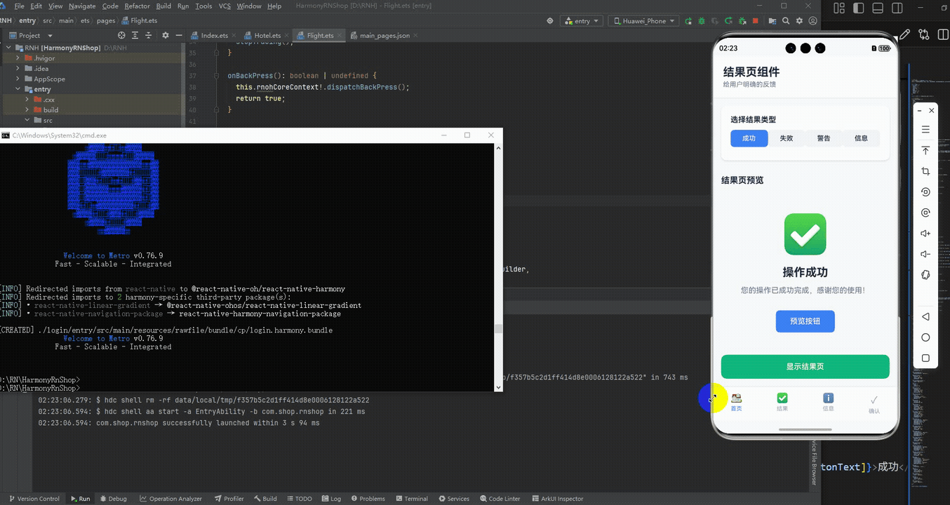
最后运行效果图如下显示:
欢迎大家加入开源鸿蒙跨平台开发者社区,一起共建开源鸿蒙跨平台生态。

作为“人工智能6S店”的官方数字引擎,为AI开发者与企业提供一个覆盖软硬件全栈、一站式门户。
更多推荐

 10
10 0
0- 0


 已为社区贡献29条内容

所有评论(0)