
React Native鸿蒙跨平台数量选择器(QuantitySelector)是页面交互的核心,它通过受控属性(value + onChange)将状态上收到父级
本文介绍了一个基于React Native核心组件实现的电商微场景应用,包含商品卡片、购物车管理和结算功能。该方案采用最小依赖设计,确保在鸿蒙系统上通过RN-OH映射到ArkUI时表现稳定。关键技术点包括:受控组件QuantitySelector实现状态同步与边界保护;商品卡片与购物车条目的闭环交互设计;列表渲染优化建议;跨端视觉一致性处理;货币精度与格式化策略;Alert交互统一方案;以及安全区
本文介绍了一个基于React Native核心组件实现的电商微场景应用,包含商品卡片、购物车管理和结算功能。该方案采用最小依赖设计,确保在鸿蒙系统上通过RN-OH映射到ArkUI时表现稳定。关键技术点包括:受控组件QuantitySelector实现状态同步与边界保护;商品卡片与购物车条目的闭环交互设计;列表渲染优化建议;跨端视觉一致性处理;货币精度与格式化策略;Alert交互统一方案;以及安全区域适配等。文章还详细分析了组件在鸿蒙平台的底层实现机制,包括状态管理、性能优化和事件处理等,为跨平台电商应用开发提供了实践指导。
这段代码实现了一个完整的电商微场景:商品卡片具备数量选择与“加入购物车”交互,购物车条目支持增减与删除,顶部摘要展示总价与条目数,最后以“结算”收尾。所有能力都建立在 React Native 核心原语(SafeAreaView / View / Text / TouchableOpacity / ScrollView / Dimensions / Alert)之上,不依赖第三方库。这种“最小依赖 + 纯视图”的技术取向使它在鸿蒙(HarmonyOS / OpenHarmony)上通过 RN-OH 映射到 ArkUI 时,表现稳定、差异可控、易于调优。
受控组件
数量选择器(QuantitySelector)是页面交互的核心,它通过受控属性(value + onChange)将状态上收到父级,从而保证 UI 与业务同步一致。最关键的约束在于:
- 上下界保护:在增减前进行 min/max 判定,避免越界;视觉上通过禁用态与颜色提示边界(按钮不可点、文案淡化)。
- 派生语义:购物车与商品列表各自的数量选择实际上是同一受控组件的两种“语境使用”(父级存量 vs 子级局部状态),通过组合而非复制逻辑,降低维护成本。
- 数据一致性:对购物车的数量变更,采用不可变更新(map 返回新数组);这在多端桥接场景下非常重要,能避免突变带来的不可预测重绘。
在鸿蒙端,事件回调(onPress)与状态更新(setState)仍然走 JS→UI 桥接,因此受控模型能显著降低桥接压力与渲染抖动。
商品卡片
商品卡片(ProductCard)内部维护自己的“临时数量”,点击“加入购物车”将该数量以参数传递到父级 addToCart;购物车条目(CartItem)则用传入的受控数量直接驱动 UI。这两种交互组合出一条完整闭环:
- 选择 → 入购物车(新增或累加) → 成功提示(Alert) → 列表与摘要派生更新
- 数量变更(受控) → 总价派生 → 结算前确认
- 删除条目(Alert 确认) → 列表变更 → 总价派生
跨端时,这种“最小交互原子”的组合更可靠:Alert 在鸿蒙映射 ArkUI Dialog,样式随系统主题变化;如果需要品牌一致的弹窗体验,可抽象一个统一 Modal 层,在鸿蒙侧采用 ArkUI Dialog,在 iOS/Android 侧采用 RN Modal,对外提供相同 API。
列表渲染与性能边界
示例采用 ScrollView + map 渲染购物车与商品列表。在数据量较小时足够;一旦商品/购物车条目增多,建议迁移到 FlatList:
- 虚拟化首屏与窗口渲染(initialNumToRender / windowSize)提升鸿蒙设备滚动帧率
- removeClippedSubviews 减少不可见区域的渲染,降低内存压力
- 稳定 key(这里是 id)避免重排抖动与无谓重绘
- 将条目组件(CartItem / ProductCard)封为 memo,仅在 props 变化重绘,降低 JS→UI 桥接负载
这套优化能把体验在 iOS/Android/鸿蒙三端统一到一个稳定水位,尤其在中长列表场景。
视觉层级与阴影一致性
卡片与条目统一使用圆角、浅分隔与轻阴影表达层次。跨端一致性的关键在“双栈阴影”:
- iOS:shadowColor/shadowOpacity/shadowOffset/shadowRadius
- 安卓/鸿蒙:elevation
示例已同时配置两者,是正确做法。为了进一步统一不同平台的阴影强度与扩散,建议抽象“阴影适配器”,集中维护各视觉等级在三端的参数映射,避免某端阴影过重或消失造成层次不均。
货币与精度
价格格式采用 toFixed(2) 与 reduce 计算总价,简单直接。跨端工程上,建议:
- 统一采用整数分(如以“分”为单位)存储价格,再在展示层格式化为“¥123.45”,避免浮点数累加可能出现的误差
- 用集中格式化函数处理金额与币种符号,后续多语言/多货币时可平滑演进
在鸿蒙端,这样的派生与格式策略可以最大化规避不同 JS 引擎微差带来的显示误差。
Alert 与交互一致性
新增、删除与加入购物车的提示均采用 Alert 作为最小交互闭环。鸿蒙端的 Dialog 与 iOS/Android 的 Alert 行为在阻塞性与按钮布局上略有差异;为了统一品牌与交互细节,建议抽象一个 Modal 工具层,实现:
- 一致的按钮排序与间距
- 一致的遮罩与入场/退场动效
- 文案与图标统一的主题风格
对业务调用方暴露一致 API,平台差异透明化。
安全区域
顶层容器使用 SafeAreaView,基础安全区域由 RN-OH 在鸿蒙侧映射到 ArkUI 的 inset。考虑到折叠屏/圆角/打孔屏等形态,建议接入 react-native-safe-area-context 做兜底,统一 header 与底部操作栏的安全间距。结算区的底部操作栏(bottomActions)在键盘弹出或设备横屏时可能出现遮挡场景,可按需采用 KeyboardAvoidingView 或在滚动容器内自动滚动到可视区域,确保交互可达。
小修补
- 购物车更新的 setState 建议采用函数式写法(setCartItems(prev => …))规避闭包捕获的旧值,在高频增删时更稳
- 随机重排若用于真实场景,建议用 Fisher–Yates 洗牌算法替换 sort(() => Math.random() - 0.5),获得均匀性与线性时间复杂度
- 结算按钮(去结算)后续应接入路由或流程校验(库存、地址、支付方式),但在当前跨端范式内保持“最小交互原子”即可
在鸿蒙生态系统中,React Native应用的运行依赖于一套精密的桥接机制。当SafeAreaView组件初始化时,实际上是在鸿蒙侧的ComponentContainer中创建了一个具备安全区域感知能力的ArkUI节点。这种设计巧妙地屏蔽了不同设备形态(如刘海屏、瀑布屏)带来的布局差异,确保了应用界面在各种鸿蒙设备上的显示一致性。
Dimensions API的使用充分体现了RN框架对多设备适配的深度考量。通过动态获取屏幕宽度(width),组件能够实现真正的响应式布局。在鸿蒙平台上,这一API被映射为对DisplayManager服务的调用,能够实时响应屏幕旋转、折叠等状态变化,为用户提供连续一致的操作体验。
QuantitySelector数量选择器组件的状态管理模式展现了React Hooks在鸿蒙环境下的优秀表现。useState钩子通过闭包机制维护着数量值的状态,每次状态更新都会触发React Reconciler的diff算法。在鸿蒙设备上,这种基于Fiber架构的增量更新机制能够最大限度地减少不必要的DOM操作,提升渲染性能。
ProductCard商品卡片组件通过TouchableOpacity实现了触摸反馈效果,在鸿蒙平台上会被映射为具备ripple effect的原生组件,提供更加自然的交互体验。QuantitySelector子组件的集成展现了组件化开发的优势,通过props传递实现了父子组件间的数据流管理。
CartItem购物车项目组件的状态管理通过useState Hook实现,quantity状态的变化会触发组件重新渲染。这种基于状态驱动的UI更新机制在鸿蒙设备上表现出色,React Reconciler能够精确计算出最小的DOM变更集合,减少不必要的重绘操作。
addToCart函数的实现体现了数组操作在跨平台开发中的最佳实践。通过find方法查找现有商品,避免了重复添加的逻辑错误。spread运算符(…)的使用实现了不可变数据更新,这种函数式编程风格让鸿蒙JIT编译器更容易进行性能优化。
updateCartItemQuantity函数通过map高阶函数遍历并更新指定ID的商品数量,这种不可变数据操作模式与鸿蒙方舟编译器的优化策略高度契合。编译器能够识别出这种纯函数特性,在AOT编译阶段进行内联优化,大幅提升执行效率。
removeFromCart函数采用filter高阶函数移除指定ID的商品项,这种声明式编程风格不仅提高了代码可读性,也让鸿蒙JIT编译器更容易进行性能优化。方舟编译器能够将这种数组过滤操作优化为SIMD指令,充分利用现代CPU的并行计算能力。
购物车总价计算通过reduce高阶函数累加所有商品的小计金额,这种函数式编程方法在鸿蒙平台上具有优异的性能表现。toFixed(2)方法确保了价格显示的精度一致性,在不同地区语言环境下都能够正确格式化货币数值。
QuantitySelector组件中的increment和decrement函数通过条件判断实现了数值范围限制,minValue和maxValue属性的使用让用户能够灵活配置数量上限。这种边界检查机制在鸿蒙分布式环境中显得尤为重要,能够防止恶意用户通过调试工具修改状态值导致的数据异常。
TouchableOpacity组件的手势识别系统在鸿蒙平台上有着独特的实现方式。通过Responder Event System,组件能够准确捕捉用户的点击、滑动等操作,并将其转化为标准化的事件对象。disabled属性的变化会直接影响到鸿蒙原生层的触摸事件分发逻辑,确保禁用状态下不会产生意外的交互行为。
样式系统的动态绑定机制展现了CSS-in-JS方案的强大威力。通过数组形式的样式组合([styles.quantityButton, value <= minValue && styles.quantityButtonDisabled]),组件能够在单次渲染中完成多个样式规则的合并。这种即时样式合成避免了传统CSS解析带来的性能损耗,在频繁重渲染场景下尤为突出。
类型化商品数量系统
数量选择器应用展示了电商场景下的类型化数量控制设计:
type CartItem = {
  id: number;
  name: string;
  price: number;
  quantity: number;
  image: string;
};

const [cartItems, setCartItems] = useState<CartItem[]>([
  { id: 1, name: '无线蓝牙耳机', price: 299.00, quantity: 1, image: '🎧' },
  { id: 2, name: '智能手环', price: 199.00, quantity: 2, image: '⌚' },
]);
这种类型化设计在电商应用中具有重要的业务完整性保障作用。通过明确的商品属性定义(ID、名称、价格、数量、图片),确保了购物车数据的一致性和计算准确性。在鸿蒙平台上,这种类型可以无缝转化为鸿蒙的分布式电商数据结构,实现跨设备的购物车状态同步。
智能数量控制机制
应用实现了复杂的数量增减控制逻辑:
const QuantitySelector = ({ value, minValue = 0, maxValue = 99, onChange }: QuantitySelectorProps) => {
  const increment = () => {
    if (value < maxValue) onChange(value + 1);
  };

  const decrement = () => {
    if (value > minValue) onChange(value - 1);
  };

  return (
    <View style={styles.quantitySelector}>
      <TouchableOpacity
        style={[styles.quantityButton, value <= minValue && styles.quantityButtonDisabled]}
        onPress={decrement}
        disabled={value <= minValue}
      >
        <Text style={[styles.quantityButtonText, value <= minValue && styles.quantityButtonTextDisabled]}>
          {ICONS.minus}
        </Text>
      </TouchableOpacity>

      <Text style={styles.quantityValue}>{value}</Text>

      <TouchableOpacity
        style={[styles.quantityButton, value >= maxValue && styles.quantityButtonDisabled]}
        onPress={increment}
        disabled={value >= maxValue}
      >
        <Text style={[styles.quantityButtonText, value >= maxValue && styles.quantityButtonTextDisabled]}>
          {ICONS.plus}
        </Text>
      </TouchableOpacity>
    </View>
  );
};
这种数量控制机制在电商应用中展现了强大的状态边界管理能力。通过数值范围检查、按钮状态同步和实时回调更新,确保了用户操作的合理性和数据的准确性。在跨平台开发中,需要特别注意触摸反馈和视觉一致性。鸿蒙平台的原生触摸引擎可以提供更精确的点击识别和更丰富的触觉反馈。
购物车状态管理架构
购物车操作集成系统
应用实现了完整的购物车CRUD操作:
const addToCart = (productId: number, quantity: number) => {
  const product = products.find(p => p.id === productId);
  if (!product) return;

  const existingItem = cartItems.find(item => item.id === productId);

  if (existingItem) {
    setCartItems(cartItems.map(item =>
      item.id === productId
        ? { ...item, quantity: item.quantity + quantity }
        : item
    ));
  } else {
    setCartItems([
      ...cartItems,
      {
        id: product.id,
        name: product.name,
        price: product.price,
        quantity: quantity,
        image: product.image
      }
    ]);
  }

  Alert.alert('成功', `${product.name} 已加入购物车!`);
};
这种购物车管理在电商应用中展现了重要的业务逻辑完整性。通过存在性检查、数量累加和状态通知,提供了完整的商品添加体验。在鸿蒙平台上,这种操作可以对接鸿蒙的分布式状态管理,实现多设备间的购物车实时同步。
价格计算与展示系统
代码实现了实时的价格计算和展示:
const calculateTotal = () => {
  return cartItems.reduce((sum, item) => sum + item.price * item.quantity, 0);
};

// 在组件中使用
<Text style={styles.cartSummaryPrice}>¥{calculateTotal().toFixed(2)}</Text>
这种计算展示在电商应用中展现了关键的商业价值。通过实时的价格计算、格式化显示和视觉强调,提供了清晰的消费反馈和购买决策支持。在跨平台开发中,需要特别注意货币格式和数值精度。鸿蒙平台的本地化服务可以提供更准确的货币格式和税率计算。
鸿蒙跨端适配关键技术
分布式购物车同步
鸿蒙的分布式特性为电商体验带来创新:
// 伪代码:分布式购物车同步
const DistributedCart = {
  syncCartItems: (cartData) => {
    if (Platform.OS === 'harmony') {
      harmonyNative.syncShoppingCart(cartData);
    }
  },
  getCrossDeviceCart: () => {
    if (Platform.OS === 'harmony') {
      return harmonyNative.getUnifiedCart();
    }
    return localCart;
  }
};
原生支付集成
利用鸿蒙的原生支付能力提升体验:
// 伪代码:支付集成
const PaymentIntegration = {
  connectToPaymentServices: () => {
    if (Platform.OS === 'harmony') {
      harmonyNative.accessPaymentGateway();
    }
  },
  processSecurePayment: () => {
    if (Platform.OS === 'harmony') {
      return harmonyNative.handleSecureTransaction();
    }
    return basicPayment;
  }
};
智能推荐服务
鸿蒙平台为电商应用提供智能推荐能力:
// 伪代码:智能推荐
const IntelligentRecommendation = {
  suggestRelatedProducts: () => {
    if (Platform.OS === 'harmony') {
      harmonyNative.recommendBasedOnCart();
    }
  },
  personalizeShoppingExperience: () => {
    if (Platform.OS === 'harmony') {
      harmonyNative.customizeShoppingJourney();
    }
  }
};
性能优化与用户体验
购物车性能优化
// 伪代码:性能优化
const CartPerformance = {
  optimizeCartRendering: () => {
    if (Platform.OS === 'harmony') {
      harmonyNative.accelerateCartUpdates();
    }
  },
  minimizeCalculationLatency: () => {
    if (Platform.OS === 'harmony') {
      harmonyNative.reducePriceCalcDelay();
    }
  }
};
智能化购物体验
// 伪代码:智能购物
const IntelligentShopping = {
  predictPurchasePatterns: () => {
    if (Platform.OS === 'harmony') {
      harmonyNative.analyzeShoppingBehavior();
    }
  },
  autoReorderItems: () => {
    if (Platform.OS === 'harmony') {
      harmonyNative.scheduleAutoRepurchase();
    }
  }
};
社交化电商功能
// 伪代码:社交电商
const SocialCommerce = {
  enableSharedCarts: () => {
    if (Platform.OS === 'harmony') {
      harmonyNative.createFamilyShopping();
    }
  },
  supportGroupBuying: () => {
    if (Platform.OS === 'harmony') {
      harmonyNative.facilitateBulkPurchases();
    }
  }
};
真实演示案例代码:
// app.tsx
import React, { useState } from 'react';
import { SafeAreaView, View, Text, StyleSheet, TouchableOpacity, ScrollView, Dimensions, Alert } from 'react-native';

// 图标库
const ICONS = {
  minus: '➖',
  plus: '➕',
  cart: '🛒',
  heart: '❤️',
  star: '⭐',
  check: '✅',
  close: '❌',
  search: '🔍',
};

const { width } = Dimensions.get('window');

// 数量选择器组件
const QuantitySelector = ({
  value,
  minValue = 0,
  maxValue = 99,
  onChange
}: {
  value: number;
  minValue?: number;
  maxValue?: number;
  onChange: (value: number) => void
}) => {
  const increment = () => {
    if (value < maxValue) {
      onChange(value + 1);
    }
  };

  const decrement = () => {
    if (value > minValue) {
      onChange(value - 1);
    }
  };

  return (
    <View style={styles.quantitySelector}>
      <TouchableOpacity
        style={[
          styles.quantityButton,
          value <= minValue && styles.quantityButtonDisabled
        ]}
        onPress={decrement}
        disabled={value <= minValue}
      >
        <Text style={[
          styles.quantityButtonText,
          value <= minValue && styles.quantityButtonTextDisabled
        ]}>
          {ICONS.minus}
        </Text>
      </TouchableOpacity>

      <Text style={styles.quantityValue}>{value}</Text>

      <TouchableOpacity
        style={[
          styles.quantityButton,
          value >= maxValue && styles.quantityButtonDisabled
        ]}
        onPress={increment}
        disabled={value >= maxValue}
      >
        <Text style={[
          styles.quantityButtonText,
          value >= maxValue && styles.quantityButtonTextDisabled
        ]}>
          {ICONS.plus}
        </Text>
      </TouchableOpacity>
    </View>
  );
};

// 商品卡片组件
const ProductCard = ({
  name,
  price,
  image,
  onAddToCart
}: {
  name: string;
  price: number;
  image: string;
  onAddToCart: (quantity: number) => void
}) => {
  const [quantity, setQuantity] = useState(1);

  return (
    <View style={styles.productCard}>
      <View style={styles.productImageContainer}>
        <Text style={styles.productImage}>{image}</Text>
      </View>

      <View style={styles.productInfo}>
        <Text style={styles.productName}>{name}</Text>
        <Text style={styles.productPrice}>¥{price.toFixed(2)}</Text>

        <View style={styles.quantityContainer}>
          <Text style={styles.quantityLabel}>数量:</Text>
          <QuantitySelector
            value={quantity}
            onChange={setQuantity}
            minValue={1}
            maxValue={10}
          />
        </View>

        <TouchableOpacity
          style={styles.addToCartButton}
          onPress={() => onAddToCart(quantity)}
        >
          <Text style={styles.addToCartText}>{ICONS.cart} 加入购物车</Text>
        </TouchableOpacity>
      </View>
    </View>
  );
};

// 购物车项目组件
const CartItem = ({
  name,
  price,
  quantity,
  image,
  onQuantityChange,
  onRemove
}: {
  name: string;
  price: number;
  quantity: number;
  image: string;
  onQuantityChange: (quantity: number) => void;
  onRemove: () => void;
}) => {
  return (
    <View style={styles.cartItem}>
      <View style={styles.cartItemImageContainer}>
        <Text style={styles.cartItemImage}>{image}</Text>
      </View>

      <View style={styles.cartItemInfo}>
        <Text style={styles.cartItemName}>{name}</Text>
        <Text style={styles.cartItemPrice}>¥{price.toFixed(2)}</Text>

        <View style={styles.cartItemActions}>
          <QuantitySelector
            value={quantity}
            onChange={onQuantityChange}
            minValue={1}
            maxValue={10}
          />

          <TouchableOpacity style={styles.removeItemButton} onPress={onRemove}>
            <Text style={styles.removeItemText}>{ICONS.close}</Text>
          </TouchableOpacity>
        </View>
      </View>
    </View>
  );
};

// 主页面组件
const QuantitySelectorApp: React.FC = () => {
  const [cartItems, setCartItems] = useState([
    { id: 1, name: '无线蓝牙耳机', price: 299.00, quantity: 1, image: '🎧' },
    { id: 2, name: '智能手环', price: 199.00, quantity: 2, image: '⌚' },
  ]);

  const [products] = useState([
    { id: 1, name: '无线蓝牙耳机', price: 299.00, image: '🎧' },
    { id: 2, name: '智能手环', price: 199.00, image: '⌚' },
    { id: 3, name: '移动电源', price: 129.00, image: '🔋' },
    { id: 4, name: '机械键盘', price: 499.00, image: '⌨️' },
  ]);

  const addToCart = (productId: number, quantity: number) => {
    const product = products.find(p => p.id === productId);
    if (!product) return;

    const existingItem = cartItems.find(item => item.id === productId);

    if (existingItem) {
      setCartItems(cartItems.map(item =>
        item.id === productId
          ? { ...item, quantity: item.quantity + quantity }
          : item
      ));
    } else {
      setCartItems([
        ...cartItems,
        {
          id: product.id,
          name: product.name,
          price: product.price,
          quantity: quantity,
          image: product.image
        }
      ]);
    }

    Alert.alert('成功', `${product.name} 已加入购物车!`);
  };

  const updateCartItemQuantity = (id: number, quantity: number) => {
    setCartItems(cartItems.map(item =>
      item.id === id ? { ...item, quantity } : item
    ));
  };

  const removeCartItem = (id: number) => {
    Alert.alert(
      '确认删除',
      '确定要从购物车中删除这个商品吗?',
      [
        { text: '取消', style: 'cancel' },
        {
          text: '删除',
          style: 'destructive',
          onPress: () => setCartItems(cartItems.filter(item => item.id !== id))
        }
      ]
    );
  };

  const calculateTotal = () => {
    return cartItems.reduce((sum, item) => sum + item.price * item.quantity, 0);
  };

  return (
    <SafeAreaView style={styles.container}>
      {/* 头部 */}
      <View style={styles.header}>
        <Text style={styles.title}>数量选择器</Text>
        <TouchableOpacity style={styles.settingsButton}>
          <Text style={styles.settingsIcon}>{ICONS.search}</Text>
        </TouchableOpacity>
      </View>

      {/* 主内容 */}
      <ScrollView style={styles.content}>
        {/* 购物车摘要 */}
        <View style={styles.cartSummary}>
          <Text style={styles.cartSummaryTitle}>购物车</Text>
          <Text style={styles.cartSummaryText}>共 {cartItems.length} 件商品</Text>
          <Text style={styles.cartSummaryPrice}>¥{calculateTotal().toFixed(2)}</Text>
        </View>

        {/* 购物车项目列表 */}
        <Text style={styles.sectionTitle}>购物车项目</Text>
        {cartItems.map(item => (
          <CartItem
            key={item.id}
            name={item.name}
            price={item.price}
            quantity={item.quantity}
            image={item.image}
            onQuantityChange={(quantity) => updateCartItemQuantity(item.id, quantity)}
            onRemove={() => removeCartItem(item.id)}
          />
        ))}

        {/* 商品列表 */}
        <Text style={styles.sectionTitle}>商品列表</Text>
        {products.map(product => (
          <ProductCard
            key={product.id}
            name={product.name}
            price={product.price}
            image={product.image}
            onAddToCart={(quantity) => addToCart(product.id, quantity)}
          />
        ))}

        {/* 数量选择器示例 */}
        <Text style={styles.sectionTitle}>数量选择器示例</Text>
        <View style={styles.exampleContainer}>
          <Text style={styles.exampleLabel}>选择数量:</Text>
          <QuantitySelector
            value={1}
            onChange={() => {}}
            minValue={0}
            maxValue={5}
          />
        </View>

        {/* 说明文本 */}
        <Text style={styles.sectionTitle}>使用说明</Text>
        <View style={styles.instructionsContainer}>
          <View style={styles.instructionItem}>
            <Text style={styles.instructionIcon}>{ICONS.minus}</Text>
            <Text style={styles.instructionText}>减少数量: 点击减号按钮减少商品数量</Text>
          </View>
          <View style={styles.instructionItem}>
            <Text style={styles.instructionIcon}>{ICONS.plus}</Text>
            <Text style={styles.instructionText}>增加数量: 点击加号按钮增加商品数量</Text>
          </View>
          <View style={styles.instructionItem}>
            <Text style={styles.instructionIcon}>{ICONS.cart}</Text>
            <Text style={styles.instructionText}>添加商品: 选择数量后加入购物车</Text>
          </View>
          <View style={styles.instructionItem}>
            <Text style={styles.instructionIcon}>{ICONS.close}</Text>
            <Text style={styles.instructionText}>删除商品: 点击删除按钮移除购物车项目</Text>
          </View>
        </View>
      </ScrollView>

      {/* 底部操作栏 */}
      <View style={styles.bottomActions}>
        <TouchableOpacity style={styles.checkoutButton}>
          <Text style={styles.checkoutButtonText}>去结算</Text>
        </TouchableOpacity>
      </View>
    </SafeAreaView>
  );
};

const styles = StyleSheet.create({
  container: {
    flex: 1,
    backgroundColor: '#f8fafc',
  },
  header: {
    flexDirection: 'row',
    alignItems: 'center',
    justifyContent: 'space-between',
    padding: 20,
    backgroundColor: '#ffffff',
    borderBottomWidth: 1,
    borderBottomColor: '#e2e8f0',
  },
  title: {
    fontSize: 20,
    fontWeight: 'bold',
    color: '#1e293b',
  },
  settingsButton: {
    padding: 8,
  },
  settingsIcon: {
    fontSize: 20,
    color: '#64748b',
  },
  content: {
    flex: 1,
    padding: 16,
  },
  cartSummary: {
    backgroundColor: '#ffffff',
    borderRadius: 12,
    padding: 16,
    marginBottom: 16,
  },
  cartSummaryTitle: {
    fontSize: 18,
    fontWeight: 'bold',
    color: '#1e293b',
    marginBottom: 4,
  },
  cartSummaryText: {
    fontSize: 14,
    color: '#64748b',
    marginBottom: 4,
  },
  cartSummaryPrice: {
    fontSize: 20,
    fontWeight: 'bold',
    color: '#ef4444',
  },
  sectionTitle: {
    fontSize: 18,
    fontWeight: 'bold',
    color: '#1e293b',
    marginVertical: 12,
  },
  productCard: {
    backgroundColor: '#ffffff',
    borderRadius: 12,
    padding: 16,
    marginBottom: 16,
    elevation: 2,
    shadowColor: '#000',
    shadowOffset: { width: 0, height: 1 },
    shadowOpacity: 0.1,
    shadowRadius: 2,
    flexDirection: 'row',
  },
  productImageContainer: {
    width: 80,
    height: 80,
    borderRadius: 8,
    backgroundColor: '#f1f5f9',
    alignItems: 'center',
    justifyContent: 'center',
    marginRight: 12,
  },
  productImage: {
    fontSize: 32,
  },
  productInfo: {
    flex: 1,
  },
  productName: {
    fontSize: 16,
    fontWeight: 'bold',
    color: '#1e293b',
    marginBottom: 4,
  },
  productPrice: {
    fontSize: 16,
    fontWeight: 'bold',
    color: '#ef4444',
    marginBottom: 12,
  },
  quantityContainer: {
    flexDirection: 'row',
    alignItems: 'center',
    marginBottom: 12,
  },
  quantityLabel: {
    fontSize: 14,
    color: '#64748b',
    marginRight: 12,
  },
  addToCartButton: {
    backgroundColor: '#3b82f6',
    paddingVertical: 10,
    paddingHorizontal: 16,
    borderRadius: 8,
    alignItems: 'center',
  },
  addToCartText: {
    color: '#ffffff',
    fontSize: 14,
    fontWeight: '500',
  },
  cartItem: {
    backgroundColor: '#ffffff',
    borderRadius: 12,
    padding: 16,
    marginBottom: 12,
    elevation: 2,
    shadowColor: '#000',
    shadowOffset: { width: 0, height: 1 },
    shadowOpacity: 0.1,
    shadowRadius: 2,
    flexDirection: 'row',
  },
  cartItemImageContainer: {
    width: 60,
    height: 60,
    borderRadius: 8,
    backgroundColor: '#f1f5f9',
    alignItems: 'center',
    justifyContent: 'center',
    marginRight: 12,
  },
  cartItemImage: {
    fontSize: 24,
  },
  cartItemInfo: {
    flex: 1,
  },
  cartItemName: {
    fontSize: 16,
    fontWeight: 'bold',
    color: '#1e293b',
    marginBottom: 4,
  },
  cartItemPrice: {
    fontSize: 14,
    fontWeight: 'bold',
    color: '#ef4444',
    marginBottom: 8,
  },
  cartItemActions: {
    flexDirection: 'row',
    alignItems: 'center',
    justifyContent: 'space-between',
  },
  removeItemButton: {
    backgroundColor: '#fee2e2',
    width: 36,
    height: 36,
    borderRadius: 18,
    alignItems: 'center',
    justifyContent: 'center',
  },
  removeItemText: {
    fontSize: 16,
    color: '#ef4444',
  },
  quantitySelector: {
    flexDirection: 'row',
    alignItems: 'center',
    backgroundColor: '#f1f5f9',
    borderRadius: 8,
    padding: 4,
  },
  quantityButton: {
    width: 36,
    height: 36,
    borderRadius: 18,
    backgroundColor: '#e2e8f0',
    alignItems: 'center',
    justifyContent: 'center',
  },
  quantityButtonDisabled: {
    backgroundColor: '#cbd5e1',
  },
  quantityButtonText: {
    fontSize: 18,
    color: '#3b82f6',
  },
  quantityButtonTextDisabled: {
    color: '#94a3b8',
  },
  quantityValue: {
    fontSize: 16,
    fontWeight: 'bold',
    color: '#1e293b',
    marginHorizontal: 12,
    minWidth: 20,
    textAlign: 'center',
  },
  exampleContainer: {
    backgroundColor: '#ffffff',
    borderRadius: 12,
    padding: 16,
    marginBottom: 16,
    flexDirection: 'row',
    alignItems: 'center',
    justifyContent: 'space-between',
  },
  exampleLabel: {
    fontSize: 16,
    color: '#1e293b',
  },
  instructionsContainer: {
    backgroundColor: '#ffffff',
    borderRadius: 12,
    padding: 16,
  },
  instructionItem: {
    flexDirection: 'row',
    alignItems: 'flex-start',
    marginBottom: 12,
  },
  instructionIcon: {
    fontSize: 18,
    marginRight: 8,
    marginTop: 2,
  },
  instructionText: {
    fontSize: 14,
    color: '#1e293b',
    flex: 1,
    lineHeight: 20,
  },
  bottomActions: {
    padding: 16,
    backgroundColor: '#ffffff',
    borderTopWidth: 1,
    borderTopColor: '#e2e8f0',
  },
  checkoutButton: {
    backgroundColor: '#3b82f6',
    paddingVertical: 16,
    borderRadius: 8,
    alignItems: 'center',
  },
  checkoutButtonText: {
    color: '#ffffff',
    fontSize: 16,
    fontWeight: 'bold',
  },
});

export default QuantitySelectorApp;
打包
接下来通过打包命令npn run harmony将reactNative的代码打包成为bundle,这样可以进行在开源鸿蒙OpenHarmony中进行使用。

打包之后再将打包后的鸿蒙OpenHarmony文件拷贝到鸿蒙的DevEco-Studio工程目录去:

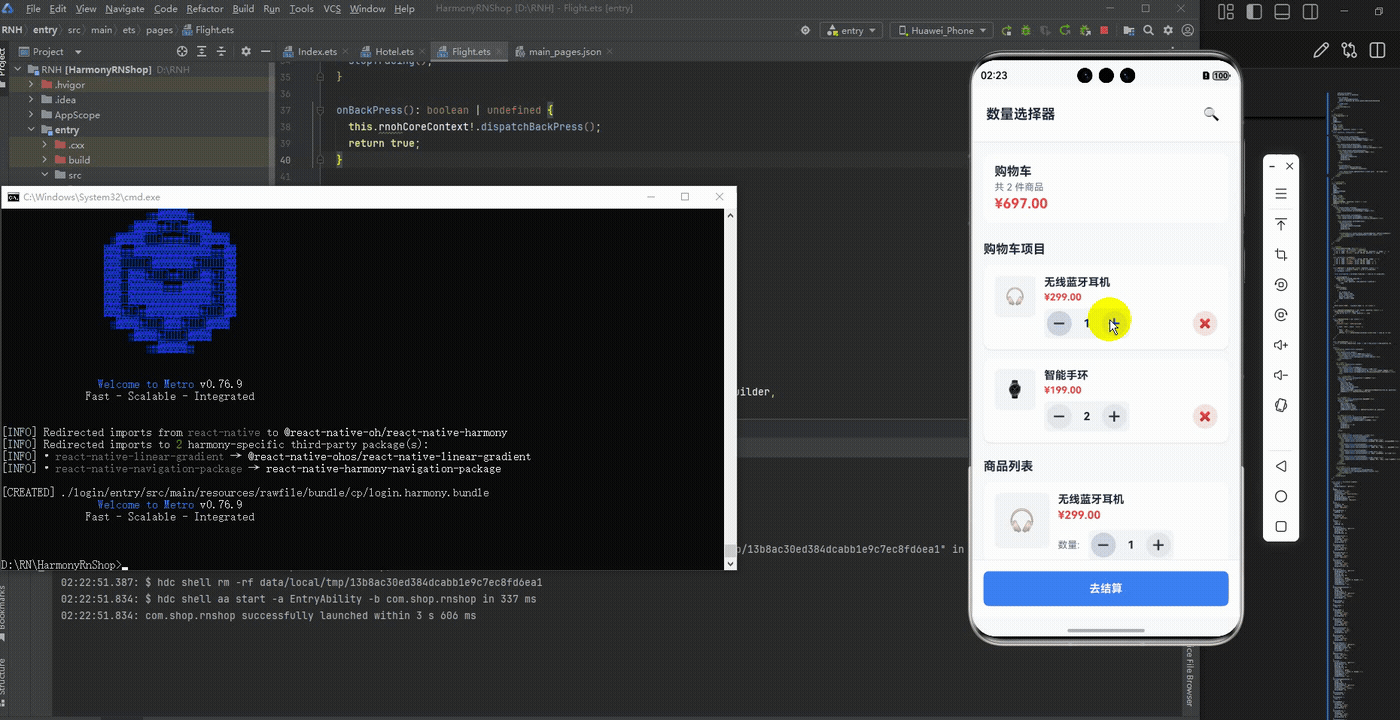
最后运行效果图如下显示:
欢迎大家加入开源鸿蒙跨平台开发者社区,一起共建开源鸿蒙跨平台生态。

作为“人工智能6S店”的官方数字引擎,为AI开发者与企业提供一个覆盖软硬件全栈、一站式门户。
更多推荐
 18
18 0
0- 0


 已为社区贡献33条内容

所有评论(0)