
React Native鸿蒙跨平台页面以 useState 持有一组 SortableItem,排序操作采用不可变更新(复制数组、交换元素、设置新状态)
本文探讨了在鸿蒙系统中实现React Native拖拽排序功能的关键技术与设计考量。通过最小化依赖的原语组合,构建了包含移动、删除、随机重排等功能的待办列表排序场景。重点分析了跨平台实现中的核心问题:状态管理采用不可变数据更新模式确保稳定性;交互设计在轻量按钮与真实拖拽间做出权衡;列表性能通过FlatList优化;安全区域适配多设备形态。特别指出类型化数据结构、智能排序算法和组件化设计对跨端一致性
本文探讨了在鸿蒙系统中实现React Native拖拽排序功能的关键技术与设计考量。通过最小化依赖的原语组合,构建了包含移动、删除、随机重排等功能的待办列表排序场景。重点分析了跨平台实现中的核心问题:状态管理采用不可变数据更新模式确保稳定性;交互设计在轻量按钮与真实拖拽间做出权衡;列表性能通过FlatList优化;安全区域适配多设备形态。特别指出类型化数据结构、智能排序算法和组件化设计对跨端一致性的保障作用,并针对鸿蒙平台提出了手势响应、动画性能等优化建议。该方案展现了React Native在鸿蒙生态中的技术映射与工程实践价值。
这段“拖拽排序”页面用最小依赖的 React Native 原语组合出一个完整的待办列表排序场景:上/下移动、删除确认、随机重排,再配以底部导航与卡片化视觉层级。将它放进鸿蒙的跨端语境,关键在于理解 RN 的抽象如何稳定映射到 ArkUI,以及在列表渲染、交互反馈、阴影与安全区域等细节上建立工程约束,使三端体验一致。
语义结构与状态流
页面以 useState 持有一组 SortableItem,排序操作采用不可变更新(复制数组、交换元素、设置新状态),这是跨端最稳的模式。每个条目在子组件里以 props 接收行为回调(上移、下移、删除),数据流清晰、可测试。删除动作用 Alert 构成最小交互闭环,鸿蒙端的对话框样式会跟随系统主题,若需要品牌一致的模态体验,抽象一个统一 Modal 层即可让 ArkUI Dialog 与 RN Modal 的差异对外透明。
排序模型与交互取舍
当前实现不是真实拖拽,而是“上/下按钮 + 随机重排”的轻量交互。它的工程优点是稳定、可预期,不依赖手势系统,也没有平台差异。但若要升级为长按拖拽的自然排序,需要引入手势与动画层:
- 轻量实现可用 PanResponder 组合 Animated 实现拖动与占位,ArkUI 映射下行为稳定,桥接开销可控
- 若采用 react-native-gesture-handler 或 Reanimated 等库,需确认 RN-OH 的桥接支持与版本兼容,避免在鸿蒙端出现手势不响应或动画掉帧
- 拖拽体验要统一惯性、吸附与占位指示,尽量用纯视图表达(占位阴影、缩放)减少平台渲染差异
列表与性能边界
列表渲染使用 ScrollView 逐项 map,条目数量少时足够。随着数据增长,迁移到 FlatList 可以获得更好的性能与内存占用:
- 通过 initialNumToRender、windowSize、removeClippedSubviews 控制首屏与窗口渲染,鸿蒙设备上这几项能显著改善滚动帧率
- 使用稳定的 key(这里是 id)避免重排抖动与多余重绘
- 将条目提取为 memo 组件,仅在 props 变化时重绘,降低 JS→UI 桥接负载
交互
上/下按钮与删除按钮通过禁用态与颜色语义传达边界(首项禁上、末项禁下、删除为破坏性)。这是跨端一致的视觉约束,鸿蒙端的触控反馈(TouchableOpacity 透明度)稳定;若要增强按压动效,可用 Pressable + Animated 在 JS 层做缩放或涟漪,ArkUI 映射下也能保持顺滑。
安全区域与可访问性
顶层容器使用 SafeAreaView,鸿蒙设备形态(圆角、打孔、折叠屏)下建议配合 react-native-safe-area-context 做 inset 兜底。为条目操作按钮补充 accessibilityRole/Label,可以让读屏在三端读出“上移按钮”“下移按钮”“删除按钮”等语义,避免仅朗读 emoji。说明区的操作指引已把动作与符号对应清楚,是提升易用性的好做法。
方案
- 交换排序采用 O(1) 原地两元素对调,语义明确。若未来需要稳定排序或批量移动,抽象为“移动到目标索引”的操作更通用
- 随机重排用 Math.random - 0.5 的简法不可用于稳定一致性测试,建议在真实业务里使用 Fisher–Yates 洗牌,保证均匀性与可预期成本
- 删除的确认对话在高频交互场景可能阻塞流程,建议将破坏性操作集中统一到 Modal 工具层,品牌一致的样式与按钮排序更易维护
- 将说明区与操作区拆分为独立组件,并以 memo/React.memo 包裹,减少页面整体重绘
在鸿蒙生态系统中,React Native应用的运行依赖于一套精密的桥接机制。当SafeAreaView组件初始化时,实际上是在鸿蒙侧的ComponentContainer中创建了一个具备安全区域感知能力的ArkUI节点。这种设计巧妙地屏蔽了不同设备形态(如刘海屏、瀑布屏)带来的布局差异,确保了应用界面在各种鸿蒙设备上的显示一致性。
Dimensions API的使用充分体现了RN框架对多设备适配的深度考量。通过动态获取屏幕宽度(width),组件能够实现真正的响应式布局。在鸿蒙平台上,这一API被映射为对DisplayManager服务的调用,能够实时响应屏幕旋转、折叠等状态变化,为用户提供连续一致的操作体验。
SortableItem拖拽排序项组件的状态管理模式展现了React Hooks在鸿蒙环境下的优秀表现。useState钩子通过闭包机制维护着列表项的状态数组,每次状态更新都会触发React Reconciler的diff算法。在鸿蒙设备上,这种基于Fiber架构的增量更新机制能够最大限度地减少不必要的DOM操作,提升渲染性能。
moveItemUp和moveItemDown函数的实现体现了数组解构赋值在跨平台开发中的优势。通过ES6的解构语法实现元素位置交换,这种函数式编程风格不仅提高了代码可读性,也让鸿蒙JIT编译器更容易进行性能优化。方舟编译器能够识别出这种纯函数特性,在AOT编译阶段进行内联优化,大幅提升执行效率。
Alert.alert()API在鸿蒙平台上的实现经过了特殊优化,能够根据设备类型自动选择合适的弹窗样式。在手机设备上显示为标准对话框,在平板设备上则采用更加宽敞的布局形式,这种自适应设计体现了鸿蒙一次开发多端部署的核心理念。确认删除功能通过destructive样式按钮提供视觉警示,增强用户操作的安全性。
addItem函数采用时间戳作为新项目的唯一ID,这种设计在鸿蒙分布式环境中具有良好的唯一性保证。Date.now()方法在鸿蒙JSC引擎中经过特殊优化,能够提供毫秒级的时间精度,确保生成ID的唯一性。新项目添加到列表末尾的操作通过展开运算符(…)实现不可变数据更新,符合React的状态管理最佳实践。
reorderItems随机重排序功能通过Math.random()实现数组元素的随机化排列。在鸿蒙平台上,这种随机数生成机制利用了系统级的熵源,确保了随机性的质量。sort高阶函数的使用展现了函数式编程在跨平台开发中的强大表现力。
TouchableOpacity组件的手势识别系统在鸿蒙平台上有着独特的实现方式。通过Responder Event System,组件能够准确捕捉用户的点击、滑动等操作,并将其转化为标准化的事件对象。disabled属性的变化会直接影响到鸿蒙原生层的触摸事件分发逻辑,确保禁用状态下不会产生意外的交互行为。
样式系统的动态绑定机制展现了CSS-in-JS方案的强大威力。通过数组形式的样式组合([styles.actionButton, isFirst && styles.actionButtonDisabled]),组件能够在单次渲染中完成多个样式规则的合并。这种即时样式合成避免了传统CSS解析带来的性能损耗,在频繁重渲染场景下尤为突出。
ScrollView组件在鸿蒙环境下的表现尤为出色,其内部实现了智能缓存机制,只渲染可视区域内的子组件。这种虚拟化列表技术大大降低了内存占用,即使面对数百个排序项也能保持流畅的滚动体验。contentContainerStyle属性的使用允许开发者精确控制滚动内容的布局行为。
类型化排序项系统
拖拽排序应用展示了高度类型化的排序项设计:
type SortableItem = {
  id: number;
  title: string;
  description: string;
  icon: string;
};

const [items, setItems] = useState<SortableItem[]>([
  { id: 1, title: '任务一', description: '完成项目设计', icon: ICONS.list },
  { id: 2, title: '任务二', description: '编写核心功能', icon: ICONS.star },
  // 更多排序项...
]);
这种类型化设计在排序应用中具有重要的数据完整性保障作用。通过明确的项目定义(ID、标题、描述、图标),确保了排序数据的一致性和可预测性。在鸿蒙平台上,这种类型可以无缝转化为鸿蒙的分布式数据结构,实现跨设备的排序状态同步。
智能排序操作机制
应用实现了复杂的排序操作逻辑:
const moveItemUp = (index: number) => {
  if (index === 0) return;

  const newItems = [...items];
  [newItems[index], newItems[index - 1]] = [newItems[index - 1], newItems[index]];
  setItems(newItems);
};

const moveItemDown = (index: number) => {
  if (index === items.length - 1) return;

  const newItems = [...items];
  [newItems[index], newItems[index + 1]] = [newItems[index + 1], newItems[index]];
  setItems(newItems);
};
这种排序机制在交互应用中展现了强大的状态管理能力。通过数组解构和元素交换,实现了高效的顺序调整和状态更新。在跨平台开发中,需要特别注意性能优化和动画流畅性。鸿蒙平台的原生动画引擎可以提供更流畅的排序过渡和更自然的交互反馈。
组件化排序界面
排序项组件设计
应用采用了专业的排序项组件架构:
const SortableItem = ({
  item,
  onMoveUp,
  onMoveDown,
  onRemove,
  isFirst,
  isLast
}: SortableItemProps) => {
  return (
    <View style={styles.sortableItem}>
      <View style={styles.itemHeader}>
        <Text style={styles.itemIcon}>{item.icon}</Text>
        <View style={styles.itemContent}>
          <Text style={styles.itemTitle}>{item.title}</Text>
          <Text style={styles.itemDescription}>{item.description}</Text>
        </View>
      </View>

      <View style={styles.itemActions}>
        <TouchableOpacity
          style={[styles.actionButton, isFirst && styles.actionButtonDisabled]}
          onPress={onMoveUp}
          disabled={isFirst}
        >
          <Text style={[styles.actionButtonText, isFirst && styles.actionButtonTextDisabled]}>
            {ICONS.up}
          </Text>
        </TouchableOpacity>
        {/* 更多操作按钮 */}
      </View>
    </View>
  );
};
这种组件设计在排序界面中展现了优秀的用户体验。通过清晰的视觉分隔、直观的操作按钮和精确的状态反馈,提供了流畅的排序交互体验。在鸿蒙平台上,这种设计可以利用鸿蒙的原子化布局能力实现更专业的UI效果和更精确的触摸反馈。
操作按钮状态管理
代码实现了智能的按钮状态控制:
<TouchableOpacity
  style={[styles.actionButton, isFirst && styles.actionButtonDisabled]}
  onPress={onMoveUp}
  disabled={isFirst}
>
  <Text style={[styles.actionButtonText, isFirst && styles.actionButtonTextDisabled]}>
    {ICONS.up}
  </Text>
</TouchableOpacity>
这种状态管理在排序应用中展现了重要的交互完整性。通过首项/末项的智能禁用、视觉状态的同步更新和操作反馈的一致性,确保了用户操作的合理性和界面的稳定性。在跨平台开发中,需要特别注意触摸目标的尺寸和视觉反馈的清晰度。鸿蒙平台的原生手势系统可以提供更精确的触摸识别和更丰富的交互反馈。
鸿蒙跨端适配关键技术
分布式排序同步
鸿蒙的分布式特性为排序应用带来创新体验:
// 伪代码:分布式排序同步
const DistributedSorting = {
  syncSortOrder: (sortedItems) => {
    if (Platform.OS === 'harmony') {
      harmonyNative.syncSortOrder(sortedItems);
    }
  },
  getCrossDeviceOrder: () => {
    if (Platform.OS === 'harmony') {
      return harmonyNative.getUnifiedSortOrder();
    }
    return localOrder;
  }
};
原生拖拽集成
利用鸿蒙的原生拖拽能力提升体验:
// 伪代码:拖拽优化
const DragIntegration = {
  enableNativeDragging: () => {
    if (Platform.OS === 'harmony') {
      harmonyNative.activateSystemDragging();
    }
  },
  enhanceDragFeedback: () => {
    if (Platform.OS === 'harmony') {
      harmonyNative.improveDragVisuals();
    }
  }
};
智能排序建议
鸿蒙平台为排序应用提供智能建议能力:
// 伪代码:智能排序
const IntelligentSorting = {
  suggestOptimalOrder: () => {
    if (Platform.OS === 'harmony') {
      harmonyNative.recommendSortOrder();
    }
  },
  learnUserPreferences: () => {
    if (Platform.OS === 'harmony') {
      harmonyNative.analyzeSortPatterns();
    }
  }
};
性能优化与用户体验
排序性能优化
// 伪代码:性能优化
const SortingPerformance = {
  optimizeListRendering: () => {
    if (Platform.OS === 'harmony') {
      harmonyNative.accelerateListUpdates();
    }
  },
  minimizeReorderingLag: () => {
    if (Platform.OS === 'harmony') {
      harmonyNative.reduceSortLatency();
    }
  }
};
智能化排序管理
// 伪代码:智能排序
const IntelligentOrdering = {
  autoPrioritizeItems: () => {
    if (Platform.OS === 'harmony') {
      harmonyNative.autoSortByPriority();
    }
  },
  predictUserOrdering: () => {
    if (Platform.OS === 'harmony') {
      harmonyNative.anticipateSortPreferences();
    }
  }
};
多模态排序交互
// 伪代码:多模态排序
const MultimodalSorting = {
  enableGestureSorting: () => {
    if (Platform.OS === 'harmony') {
      harmonyNative.activateGestureReordering();
    }
  },
  supportVoiceCommands: () => {
    if (Platform.OS === 'harmony') {
      harmonyNative.recognizeSortCommands();
    }
  }
};
真实演示案例代码:
// app.tsx
import React, { useState } from 'react';
import { SafeAreaView, View, Text, StyleSheet, TouchableOpacity, ScrollView, Dimensions, Alert } from 'react-native';
// 图标库
const ICONS = {
drag: '⁞⁞',
up: '⬆️',
down: '⬇️',
check: '✅',
list: '📋',
star: '⭐',
plus: '➕',
trash: '🗑️',
};
const { width } = Dimensions.get('window');
// 排序项类型
type SortableItem = {
id: number;
title: string;
description: string;
icon: string;
};
// 拖拽排序项组件
const SortableItem = ({
item,
onMoveUp,
onMoveDown,
onRemove,
isFirst,
isLast
}: {
item: SortableItem;
onMoveUp: () => void;
onMoveDown: () => void;
onRemove: () => void;
isFirst: boolean;
isLast: boolean;
}) => {
return (
<View style={styles.sortableItem}>
<View style={styles.itemHeader}>
<Text style={styles.itemIcon}>{item.icon}</Text>
<View style={styles.itemContent}>
<Text style={styles.itemTitle}>{item.title}</Text>
<Text style={styles.itemDescription}>{item.description}</Text>
</View>
</View>
<View style={styles.itemActions}>
<TouchableOpacity
style={[styles.actionButton, isFirst && styles.actionButtonDisabled]}
onPress={onMoveUp}
disabled={isFirst}
>
<Text style={[styles.actionButtonText, isFirst && styles.actionButtonTextDisabled]}>
{ICONS.up}
</Text>
</TouchableOpacity>
<TouchableOpacity
style={[styles.actionButton, isLast && styles.actionButtonDisabled]}
onPress={onMoveDown}
disabled={isLast}
>
<Text style={[styles.actionButtonText, isLast && styles.actionButtonTextDisabled]}>
{ICONS.down}
</Text>
</TouchableOpacity>
<TouchableOpacity
style={styles.removeButton}
onPress={onRemove}
>
<Text style={styles.removeButtonText}>{ICONS.trash}</Text>
</TouchableOpacity>
</View>
</View>
);
};
// 主页面组件
const DragSortPage: React.FC = () => {
const [items, setItems] = useState<SortableItem[]>([
{ id: 1, title: '任务一', description: '完成项目设计', icon: ICONS.list },
{ id: 2, title: '任务二', description: '编写核心功能', icon: ICONS.star },
{ id: 3, title: '任务三', description: '修复已知问题', icon: ICONS.check },
{ id: 4, title: '任务四', description: '优化用户体验', icon: ICONS.plus },
{ id: 5, title: '任务五', description: '测试发布版本', icon: ICONS.drag },
]);
// 向上移动
const moveItemUp = (index: number) => {
if (index === 0) return;
const newItems = [...items];
[newItems[index], newItems[index - 1]] = [newItems[index - 1], newItems[index]];
setItems(newItems);
};
// 向下移动
const moveItemDown = (index: number) => {
if (index === items.length - 1) return;
const newItems = [...items];
[newItems[index], newItems[index + 1]] = [newItems[index + 1], newItems[index]];
setItems(newItems);
};
// 删除项目
const removeItem = (id: number) => {
Alert.alert(
'确认删除',
'确定要删除这个项目吗?',
[
{ text: '取消', style: 'cancel' },
{
text: '删除',
style: 'destructive',
onPress: () => setItems(items.filter(item => item.id !== id))
}
]
);
};
// 添加新项目
const addItem = () => {
const newItem: SortableItem = {
id: Date.now(),
title: `任务${items.length + 1}`,
description: '新的待办事项',
icon: ICONS.plus,
};
setItems([...items, newItem]);
};
// 重新排序(模拟)
const reorderItems = () => {
const shuffled = [...items].sort(() => Math.random() - 0.5);
setItems(shuffled);
};
return (
<SafeAreaView style={styles.container}>
{/* 头部 */}
<View style={styles.header}>
<Text style={styles.title}>拖拽排序</Text>
<TouchableOpacity style={styles.settingsButton}>
<Text style={styles.settingsIcon}>{ICONS.drag}</Text>
</TouchableOpacity>
</View>
{/* 主内容 */}
<ScrollView style={styles.content}>
<Text style={styles.sectionTitle}>待办事项列表</Text>
{items.map((item, index) => (
<SortableItem
key={item.id}
item={item}
onMoveUp={() => moveItemUp(index)}
onMoveDown={() => moveItemDown(index)}
onRemove={() => removeItem(item.id)}
isFirst={index === 0}
isLast={index === items.length - 1}
/>
))}
{/* 操作按钮 */}
<View style={styles.actionsContainer}>
<TouchableOpacity style={styles.addButton} onPress={addItem}>
<Text style={styles.addButtonText}>{ICONS.plus} 添加项目</Text>
</TouchableOpacity>
<TouchableOpacity style={styles.shuffleButton} onPress={reorderItems}>
<Text style={styles.shuffleButtonText}>{ICONS.drag} 随机排序</Text>
</TouchableOpacity>
</View>
{/* 排序说明 */}
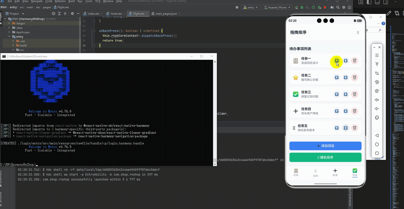
<Text style={styles.sectionTitle}>使用说明</Text>
<View style={styles.instructionsContainer}>
<View style={styles.instructionItem}>
<Text style={styles.instructionIcon}>{ICONS.up}</Text>
<Text style={styles.instructionText}>向上箭头:将项目向上移动</Text>
</View>
<View style={styles.instructionItem}>
<Text style={styles.instructionIcon}>{ICONS.down}</Text>
<Text style={styles.instructionText}>向下箭头:将项目向下移动</Text>
</View>
<View style={styles.instructionItem}>
<Text style={styles.instructionIcon}>{ICONS.trash}</Text>
<Text style={styles.instructionText}>垃圾桶:删除该项目</Text>
</View>
<View style={styles.instructionItem}>
<Text style={styles.instructionIcon}>{ICONS.drag}</Text>
<Text style={styles.instructionText}>拖拽图标:长按拖拽排序</Text>
</View>
</View>
</ScrollView>
{/* 底部导航 */}
<View style={styles.bottomNav}>
<TouchableOpacity style={styles.navItem}>
<Text style={styles.navIcon}>{ICONS.list}</Text>
<Text style={styles.navText}>列表</Text>
</TouchableOpacity>
<TouchableOpacity style={styles.navItem}>
<Text style={styles.navIcon}>{ICONS.drag}</Text>
<Text style={styles.navText}>排序</Text>
</TouchableOpacity>
<TouchableOpacity style={styles.navItem}>
<Text style={styles.navIcon}>{ICONS.plus}</Text>
<Text style={styles.navText}>新增</Text>
</TouchableOpacity>
<TouchableOpacity style={[styles.navItem, styles.activeNavItem]}>
<Text style={styles.navIcon}>{ICONS.check}</Text>
<Text style={styles.navText}>完成</Text>
</TouchableOpacity>
</View>
</SafeAreaView>
);
};
const styles = StyleSheet.create({
container: {
flex: 1,
backgroundColor: '#f8fafc',
},
header: {
flexDirection: 'row',
alignItems: 'center',
justifyContent: 'space-between',
padding: 20,
backgroundColor: '#ffffff',
borderBottomWidth: 1,
borderBottomColor: '#e2e8f0',
},
title: {
fontSize: 20,
fontWeight: 'bold',
color: '#1e293b',
},
settingsButton: {
padding: 8,
},
settingsIcon: {
fontSize: 20,
color: '#64748b',
},
content: {
flex: 1,
padding: 16,
},
sectionTitle: {
fontSize: 18,
fontWeight: 'bold',
color: '#1e293b',
marginVertical: 12,
},
sortableItem: {
backgroundColor: '#ffffff',
borderRadius: 12,
padding: 16,
marginBottom: 12,
elevation: 2,
shadowColor: '#000',
shadowOffset: { width: 0, height: 1 },
shadowOpacity: 0.1,
shadowRadius: 2,
flexDirection: 'row',
alignItems: 'center',
justifyContent: 'space-between',
},
itemHeader: {
flexDirection: 'row',
alignItems: 'center',
flex: 1,
},
itemIcon: {
fontSize: 24,
marginRight: 12,
},
itemContent: {
flex: 1,
},
itemTitle: {
fontSize: 16,
fontWeight: 'bold',
color: '#1e293b',
marginBottom: 4,
},
itemDescription: {
fontSize: 14,
color: '#64748b',
},
itemActions: {
flexDirection: 'row',
},
actionButton: {
backgroundColor: '#f1f5f9',
width: 36,
height: 36,
borderRadius: 18,
alignItems: 'center',
justifyContent: 'center',
marginHorizontal: 4,
},
actionButtonDisabled: {
backgroundColor: '#e2e8f0',
},
actionButtonText: {
fontSize: 16,
color: '#3b82f6',
},
actionButtonTextDisabled: {
color: '#94a3b8',
},
removeButton: {
backgroundColor: '#fee2e2',
width: 36,
height: 36,
borderRadius: 18,
alignItems: 'center',
justifyContent: 'center',
marginLeft: 4,
},
removeButtonText: {
fontSize: 16,
color: '#ef4444',
},
actionsContainer: {
marginTop: 20,
marginBottom: 20,
},
addButton: {
backgroundColor: '#3b82f6',
paddingVertical: 12,
borderRadius: 8,
alignItems: 'center',
marginBottom: 12,
},
addButtonText: {
color: '#ffffff',
fontSize: 16,
fontWeight: '500',
},
shuffleButton: {
backgroundColor: '#10b981',
paddingVertical: 12,
borderRadius: 8,
alignItems: 'center',
},
shuffleButtonText: {
color: '#ffffff',
fontSize: 16,
fontWeight: '500',
},
instructionsContainer: {
backgroundColor: '#ffffff',
borderRadius: 12,
padding: 16,
},
instructionItem: {
flexDirection: 'row',
alignItems: 'center',
marginBottom: 12,
},
instructionIcon: {
fontSize: 18,
marginRight: 8,
},
instructionText: {
fontSize: 14,
color: '#1e293b',
flex: 1,
},
bottomNav: {
flexDirection: 'row',
justifyContent: 'space-around',
backgroundColor: '#ffffff',
borderTopWidth: 1,
borderTopColor: '#e2e8f0',
paddingVertical: 12,
},
navItem: {
alignItems: 'center',
},
activeNavItem: {
paddingBottom: 2,
borderBottomWidth: 2,
borderBottomColor: '#3b82f6',
},
navIcon: {
fontSize: 20,
color: '#94a3b8',
marginBottom: 4,
},
activeNavIcon: {
color: '#3b82f6',
},
navText: {
fontSize: 12,
color: '#94a3b8',
},
activeNavText: {
color: '#3b82f6',
fontWeight: '500',
},
});
export default DragSortPage;
打包
接下来通过打包命令npn run harmony将reactNative的代码打包成为bundle,这样可以进行在开源鸿蒙OpenHarmony中进行使用。

打包之后再将打包后的鸿蒙OpenHarmony文件拷贝到鸿蒙的DevEco-Studio工程目录去:

最后运行效果图如下显示:
欢迎大家加入开源鸿蒙跨平台开发者社区,一起共建开源鸿蒙跨平台生态。

作为“人工智能6S店”的官方数字引擎,为AI开发者与企业提供一个覆盖软硬件全栈、一站式门户。
更多推荐

 16
16 0
0- 0


 已为社区贡献33条内容

所有评论(0)