
鸿蒙应用开发UI基础第二十七节:样式复用三剑客@Styles/@Extend/stateStyles示例演示
Styles用于提炼通用样式片段只允许写通用属性,不能写任何组件专属属性。可在组件内或全局定义,编译期直接内联展开,是无状态、轻量级的样式复用方案。不支持导出样式,仅限于当前文件。组件内置方法,根据组件运行时状态normal:默认pressed:按压focused:焦点disabled:禁用selected:选中@Styles:仅支持通用属性、无参数、可组件内/全局,适合多组件共用基础布局样式。@
·
鸿蒙应用开发UI基础第二十七节:样式复用三剑客@Styles/@Extend/stateStyles示例演示
【学习目标】
- 掌握 @Styles 装饰器核心用法,理解其“通用样式复用”的设计初衷;
- 掌握 @Extend 装饰器高级用法,解决组件专属属性样式复用痛点;
- 掌握 stateStyles 多态样式原理,实现组件不同状态的样式自动切换;
- 明确三者核心差异、适用场景与限制,规避开发中的常见错误;
- 掌握 @Styles 与 stateStyles 联合使用技巧,提升样式复用效率;
- 能够在实际开发中根据需求精准选型,写出简洁、高效、可维护的UI样式代码。
一、样式复用核心
1.1 为什么需要样式复用?
开发中大量组件会重复使用相同的样式组合(如统一的宽高、背景色、内外边距),直接复制粘贴会导致:
- 代码冗余,维护成本高(修改样式需逐个调整);
- 样式不统一,视觉体验不一致;
- 组件专属属性无法高效复用(如Text的fontColor、Button的buttonStyle);
- 组件状态切换样式逻辑分散(如按压、获焦、禁用态样式)。
因此 ArkTS 提供三种互补的样式复用方案:@Styles(通用样式复用)、@Extend(组件专属样式扩展)、stateStyles(多状态样式切换),覆盖从简单到复杂的所有样式复用场景。
1.2 先明确两个关键概念
- 通用属性:所有组件都能使用的属性。
例如:width、height、backgroundColor、padding、margin、borderRadius、opacity、shadow、scale 等。 - 组件专属属性:只有特定组件才能使用的属性。
例如:Text的fontSize、fontColor;Button的buttonStyle;TextInput的placeholderColor等。
1.3 三者核心定位对比
| 特性 | @Styles | @Extend | stateStyles |
|---|---|---|---|
| 核心定位 | 通用样式片段复用 | 特定组件专属样式扩展 | 组件状态化样式自动切换 |
| 支持属性 | 仅通用属性 | 通用属性 + 组件专属属性 | 仅通用属性 |
| 参数支持 | ❌ 不支持 | ✅ 支持动态参数 | ❌ 不支持(可绑定状态变量) |
| 定义位置 | 组件内/全局 | 仅全局 | 组件内使用 |
| 能否访问this | 组件内可以,全局不可以 | 不可以 | 可以 |
| 核心优势 | 轻量、无额外开销 | 组件专属、样式可动态调整 | 状态联动、自动切换样式 |
| 适用场景 | 多组件共享基础布局样式 | 单一组件的多变体样式 | 按压/获焦/禁用/选中状态 |
1.4 工程目录
适配 API 12+ 核心目录如下:
StyleReuseDemo/
├── AppScope/
├── entry/
│   ├── src/main/ets
│   │   ├── entryability/EntryAbility.ets
│   │   ├── pages/
│   │   │   ├── Index.ets                     # 入口页面
│   │   │   ├── StylesPage.ets                # 组件内+全局@Styles
│   │   │   ├── ExtendPage.ets                # @Extend基础+高级用法
│   │   │   ├── StateStylesPage.ets           # stateStyles基础+联合复用
│   │   │   └── GoodsCardCombinePage.ets      # 三剑客综合实战
二、Index.ets 入口页面
import { router } from '@kit.ArkUI';
interface PageConfig {
title: string;
url: string;
}
@Entry
@Component
struct Index {
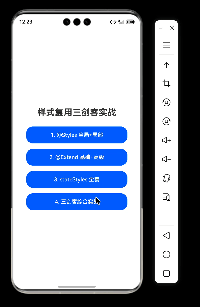
pageList: PageConfig[] = [
{ title: "1. @Styles 全局+局部", url: "pages/StylesPage" },
{ title: "2. @Extend 基础+高级", url: "pages/ExtendPage" },
{ title: "3. stateStyles 全套", url: "pages/StateStylesPage" },
{ title: "4. 三剑客综合实战", url: "pages/GoodsCardCombinePage" }
];
build() {
Column({ space: 16 }) {
Text("样式复用三剑客实战")
.fontSize(26)
.fontWeight(FontWeight.Bold)
.margin({ top: 30, bottom: 10 });
ForEach(this.pageList, (item: PageConfig) => {
Button(item.title)
.width(300)
.height(50)
.backgroundColor($r('sys.color.brand'))
.fontColor(Color.White)
.onClick(() => {
router.pushUrl({ url: item.url });
});
})
}
.width('100%')
.height('100%')
.justifyContent(FlexAlign.Center);
}
}
三、@Styles:通用样式的轻量复用
3.1 什么是 @Styles?
@Styles 用于提炼通用样式片段,只允许写通用属性,不能写任何组件专属属性。
可在组件内或全局定义,编译期直接内联展开,是无状态、轻量级的样式复用方案。不支持导出样式,仅限于当前文件。
3.2 StylesPage.ets(组件内 + 全局)
// 全局 @Styles:只写通用属性
@Styles
function sectionTitleStyle() {
  .width('100%')
  .margin({ bottom: 16 })
}

@Styles
function emptyTipStyle() {
  .width('100%')
  .margin({ top: 20 })
}

@Entry
@Component
struct StylesPage {
  @State radiusValue: number = 12;
  // 组件内 @Styles
  @Styles buttonBoxStyle() {
    .width(220)
    .height(50)
    .backgroundColor($r('sys.color.brand'))
    .borderRadius(this.radiusValue)
    .onClick(() => {
      this.radiusValue = this.radiusValue === 12 ? 25 : 12;
    })
  }

  build() {
    Column({ space: 25 }) {
      Text("@Styles 全局+组件内 合并演示")
        .fontSize(22)
        .fontWeight(FontWeight.Bold)
        .sectionTitleStyle();

      // 全局样式
      Text('商品列表')
        .fontSize(20)
        .fontWeight(FontWeight.Bold)
        .fontColor('#1D2129')
        .sectionTitleStyle()

      Text('暂无商品数据')
        .fontSize(14)
        .fontColor('#86909C')
        .emptyTipStyle()

      // 组件内样式
      Text("组件内动态样式按钮").fontSize(18)
      Button('提交表单')
        .buttonBoxStyle()
        .fontSize(18)
        .fontColor(Color.White)

      Button('确认支付')
        .buttonBoxStyle()
        .fontSize(18)
        .fontColor(Color.White)
    }
    .width('100%')
    .padding(30)
  }
}
3.3 @Styles 规则与限制
- 仅支持通用属性,不支持组件专属属性;
- 不支持参数传递;
- 不支持 if/else 逻辑;
- 全局样式不能跨文件使用;
- 组件内 @Styles 优先级 > 全局 @Styles。
四、@Extend:组件专属的样式扩展
4.1 为什么需要 @Extend?
- @Styles 只能用通用属性,不能使用组件专属属性;
- @Styles 不支持传参;
- @Extend 是组件专属、支持传参、支持组件专属属性的增强方案。
4.2 ExtendPage.ets(基础 + 高级)
// 基础用法:给Text扩展专属属性
@Extend(Text)
function textStyle(fontSize: number, color: string | Color, isBold: boolean = false) {
  // 通用属性
  .margin({ bottom: 8 })
  // 组件专属属性
  .fontSize(fontSize)
  .fontColor(color)
  .fontWeight(isBold ? FontWeight.Bold : FontWeight.Normal)
}


@Extend(Button)
function baseBtnStyle() {
  .width(220)
  .height(48)
  .borderRadius(8)
  .fontSize(16)
}
// 高级用法:样式继承+事件绑定
@Extend(Button)
function customBtnStyle(bgColor: string | Color, callback: () => void) {
  .baseBtnStyle()
  .backgroundColor(bgColor)
  .fontColor(Color.White)
  .onClick(callback)
}

@Entry
@Component
struct ExtendPage {
  @State msg: string = "等待点击按钮";

  build() {
    Column({ space: 22 }) {
      Text("@Extend 基础+高级 合并演示")
        .fontSize(24)
        .fontWeight(FontWeight.Bold)
        .margin({ bottom: 10 });

      // 基础用法
      Text("基础:参数+专属属性").textStyle(18, "#1D2129", true)
      Text("一级标题").textStyle(22, "#007DFF", true)
      Text("二级描述").textStyle(16, "#4E5969")

      Divider().width('80%')

      // 高级用法
      Text("高级:继承+事件").textStyle(18, "#1D2129", true)
      Text(this.msg).fontSize(16).fontColor("#007DFF")

      Button("蓝色主按钮").customBtnStyle("#007DFF", () => {
        this.msg = "蓝色按钮被点击";
      })

      Button("橙色警告按钮").customBtnStyle("#FF7D00", () => {
        this.msg = "橙色按钮被点击";
      })
    }
    .width('100%')
    .padding(25)
  }
}
4.3 @Extend 规则
- 必须全局定义,不能写在组件内部;
- 必须指定组件:
@Extend(Text)、@Extend(Button); - 支持参数、支持事件、支持组件专属属性;
- 不能在 @Extend 内部调用 @Styles;
- 仅当前文件可用。
五、stateStyles:组件多态状态样式
5.1 什么是 stateStyles
组件内置方法,根据组件运行时状态自动切换样式:
- normal:默认
- pressed:按压
- focused:焦点
- disabled:禁用
- selected:选中
5.2 StateStylesPage.ets(基础 + 联合复用)
@Entry
@Component
struct StateStylesPage {
  @State isDisabled: boolean = false;

  // 联合复用:组件内@Styles,只写通用属性
  @Styles normalTagStyle() {
    .backgroundColor('#E5E6EB')
    .padding({left:12,right:12, top: 6,bottom:6 })
    .borderRadius(16)
  }

  @Styles pressedTagStyle() {
    .backgroundColor('#E8F3FF')
    .padding({left:12,right:12, top: 6,bottom:6 })
    .borderRadius(16)
    .scale({x:0.95,y:0.95})
  }

  build() {
    Column({ space: 25 }) {
      Text("stateStyles 基础+联合复用 合并演示")
        .fontSize(24)
        .fontWeight(FontWeight.Bold)
        .margin({ top: 20 });

      // 基础用法:多状态按钮
      Text("1. 基础多状态样式").fontSize(18).fontWeight(FontWeight.Bold)

      Button('可交互按钮')
        .stateStyles({
          normal: {
            .backgroundColor($r('sys.color.brand'))
            .width(200)
            .height(48)
            .borderRadius(8)
          },
          pressed: {
            .backgroundColor('#005ADB')
            .scale({ x: 0.96, y: 0.96 })
          },
          disabled: {
            .backgroundColor('#C9CDD4')
          }
        })
        .fontColor(Color.White)

      Button('禁用按钮')
        .stateStyles({
          normal: {
            .backgroundColor($r('sys.color.brand'))
          },
          disabled: {
            .backgroundColor('#C9CDD4')
          }
        })
        .enabled(this.isDisabled)
        .fontColor(Color.White)

      Button('切换禁用状态').onClick(() => {
        this.isDisabled = !this.isDisabled;
      })

      Divider().width('80%')

      // 联合用法:stateStyles+@Styles
      Text("2. 联合@Styles 复用").fontSize(18).fontWeight(FontWeight.Bold)
      Text('标签按压效果').fontSize(16)

      Text('前端开发')
        .fontColor('#4E5969')
        .stateStyles({ normal: this.normalTagStyle, pressed: this.pressedTagStyle })

      Text('后端开发')
        .fontColor('#4E5969')
        .stateStyles({ normal: this.normalTagStyle, pressed: this.pressedTagStyle })

      Text('鸿蒙开发')
        .fontColor('#4E5969')
        .stateStyles({ normal: this.normalTagStyle, pressed: this.pressedTagStyle })
    }
    .width('100%')
    .padding(25)
  }
}
5.3 stateStyles 注意事项
- 只支持通用属性,不支持组件专属属性;
- 优先级高于普通样式;
- focused 一般只在键盘导航时生效;
- 可绑定状态变量实现动态样式。
六、综合实战:电商卡片(三剑客一起用)
// Extend:组件专属属性
@Extend(Text)
function goodsTextStyle(fontSize: number, color: string | Color, isBold: boolean = false) {
  .fontSize(fontSize)
  .fontColor(color)
  .fontWeight(isBold ? FontWeight.Bold : FontWeight.Normal)
}

// Styles:通用属性
@Styles
function goodsCardStyle() {
  .width('100%')
  .padding(16)
  .backgroundColor(Color.White)
  .borderRadius(12)
  .shadow({ radius: 4, color: '#00000010', offsetY: 2 })
}

@Entry
@Component
struct GoodsCardCombinePage {
  @State isCollected: boolean = false;

  @Styles collectBtnStyle() {
    .width(36)
    .height(36)
    .backgroundColor(this.isCollected ? Color.Red : Color.White)
    .borderWidth(1)
    .borderColor(Color.Gray)
    .borderRadius(18)
  }

  build() {
    Column({ space: 16 }) {
      Row()
        .goodsCardStyle()
        .stateStyles({ pressed: { opacity: 0.9 }, normal: { opacity: 1 } })
        Image($r('app.media.startIcon'))
          .width(80)
          .height(80)
          .borderRadius(8)

        Column({ space: 8 }) {
          Text('鸿蒙生态智能手表').goodsTextStyle(16, '#1D2129', true)
          Text('超长续航 · 心率监测').goodsTextStyle(14, '#86909C')
          Text('¥1299').goodsTextStyle(16, '#F53F3F', true)
        }

        Button('')
          .collectBtnStyle()
          .onClick(() => {
            this.isCollected = !this.isCollected;
          })
    }
    .backgroundColor('#F7F8FA')
    .padding(12)
  }
}
整体运行效果
七、常见错误与避坑
- 在 @Styles 里写 fontSize、fontColor 等专属属性 → 报错
- 给 @Styles 传参 → 报错,改用 @Extend
- 把 @Extend 写在组件内部 → 报错,必须全局
- 在 stateStyles 里使用组件专属属性 → 不生效
- @Extend 内部调用 @Styles → 报错
- 优先级:组件内@Styles > 全局@Styles > 组件自身样式
八、内容总结
- @Styles:仅支持通用属性、无参数、可组件内/全局,适合多组件共用基础布局样式。
- @Extend:组件专属,支持参数+组件专属属性,必须全局,适合做文本、按钮等多变体样式。
- stateStyles:仅支持通用属性,按组件状态自动切换样式,用于按压、禁用、选中交互。
实际开发中三者互补使用,代码最少、样式统一、极易维护。
九、代码仓库
- 工程名称:StyleReuseDemo
- 仓库地址:https://gitee.com/HarmonyOS-UI-Basics/harmony-os-ui-basics.git
十、下节预告
下一节我们将学习鸿蒙应用页面跳转与导航:
- Navigator 组件使用
- 页面跳转、返回、传参、接收返回值
- 页面栈管理:push、replace、clear
- 路由常见问题与优化

作为“人工智能6S店”的官方数字引擎,为AI开发者与企业提供一个覆盖软硬件全栈、一站式门户。
更多推荐


 1
1 0
0- 0


 已为社区贡献34条内容

所有评论(0)