
React Native鸿蒙跨平台如何使用FoodPage饮食页面组件通过map高阶函数动态渲染食物列表
本文介绍了一个基于React Native核心组件开发的轻食健康应用,采用"首屏引导+四页内容+底部导航"的信息架构。应用通过状态驱动UI更新,实现跨平台兼容性,特别针对鸿蒙系统进行优化。首屏引导采用分步展示设计,主界面通过activeTab状态控制页面切换,避免了复杂路由管理。文章详细阐述了网络图片加载、Flex布局、列表性能优化等关键技术点,并提供了TouchableOpa
本文介绍了一个基于React Native核心组件开发的轻食健康应用,采用"首屏引导+四页内容+底部导航"的信息架构。应用通过状态驱动UI更新,实现跨平台兼容性,特别针对鸿蒙系统进行优化。首屏引导采用分步展示设计,主界面通过activeTab状态控制页面切换,避免了复杂路由管理。文章详细阐述了网络图片加载、Flex布局、列表性能优化等关键技术点,并提供了TouchableOpacity交互和样式动态绑定等最佳实践。该架构在鸿蒙平台上表现稳健,通过最小化桥接面实现了高效的原生组件映射,为React Native在鸿蒙生态的应用提供了实用参考。
这段代码以“首屏引导 + 四页内容 + 底部导航”的经典信息架构,完全建立在 React Native 核心原语上:SafeAreaView、ScrollView、View/Text、TouchableOpacity、Image、Dimensions。它没有引入第三方路由、状态或图标库,而用最小的抽象把一个完整的移动端体验拼装出来。这种选择在鸿蒙(HarmonyOS/OpenHarmony)上通过 RN-OH 映射 ArkUI 时非常稳健:桥接面小、平台差异少、可调优空间足。
首屏引导的状态驱动与视觉节奏
引导页 OnboardingScreen 由父组件 HealthApp 控制,useState 维护当前步骤与是否进入主界面。按钮文案与分页指示器紧随状态变化更新,符合“源状态 → 派生 UI”的范式。视觉上采用“大图 + 标题 + 段落 + 主次按钮”的标准节奏,在 ArkUI 映射下几乎不涉及平台特性。尺寸通过 Dimensions.get(‘window’) 计算,能在大多数手机形态稳定呈现;如果进入折叠屏/分屏场景,使用 useWindowDimensions 响应尺寸变化会更稳,避免横屏时卡片比例失衡。
页签导航的“伪路由”策略
主界面以 activeTab 控制当前页渲染(Home/Food/Check/Profile),底部导航组件 BottomNavigation 将“活跃态”和“非活跃态”分离为两套样式。没有使用路由库,切换由状态驱动,这在鸿蒙端是推荐路径:减少导航栈、转场动画与手势的适配复杂度,ArkUI 侧只需应用虚拟 DOM 的变更。如果未来需要页面间保留复杂栈或手势返回,再引入轻量路由,也不会与当前架构冲突。
资源与图像:网络 Image 的跨端约束
所有图片通过 Image 的 uri 加载网络资源,属于 RN 的标准能力。工程上要注意的是,示例里把 URL 写成了包含反引号与空格的字符串(例如 ’ https://picsum.photos/300/200 '),这在任何平台都会导致加载失败;应使用干净的 URL 字符串。鸿蒙端加载外部网络资源与 iOS/Android 一致,需要保证 https、域名可达、必要的网络权限(在原生侧/打包配置处理)。头像、推荐图与网格小图均采用圆角与固定尺寸容器,ArkUI 映射下渲染稳定;若需要着色或滤镜,统一在 JS 层做纯视图处理,避免平台图像管线差异。
列表与网格:性能边界与度量
食物网格以 Flex 布局计算每项宽度((width - 48) / 2),能在主流手机屏稳定两列排布。当项目数量增加,迁移到 FlatList 可以获得虚拟化与窗口渲染控制(initialNumToRender/windowSize/removeClippedSubviews),在鸿蒙设备上能显著降低内存占用与滚动掉帧。CheckInPage 与 ProfilePage 当前数据量有限,用 ScrollView 足以承载;一旦变成长列表,同样建议切换到 FlatList,并将子项提取为 memo 组件,仅在 props 变化时重绘,降低 JS→UI 桥接负载。
交互闭环与最小原子
打卡按钮的活跃态与已完成态靠布尔状态切换,禁用与颜色语义清晰,是跨端一致的模式。全局交互几乎都使用 TouchableOpacity + 文案反馈,最小闭环不依赖平台弹窗;若需要确认对话或多按钮交互,统一用 Modal 抽象,鸿蒙内部映射 ArkUI Dialog、iOS/Android 映射 RN Modal,三端就能收敛出一致的间距、按钮排序与动效。
在鸿蒙生态系统中,React Native应用的运行依赖于一套精密的桥接机制。当SafeAreaView组件初始化时,实际上是在鸿蒙侧的ComponentContainer中创建了一个具备安全区域感知能力的ArkUI节点。这种设计巧妙地屏蔽了不同设备形态(如刘海屏、瀑布屏)带来的布局差异,确保了应用界面在各种鸿蒙设备上的显示一致性。
Dimensions API的使用充分体现了RN框架对多设备适配的深度考量。通过动态获取屏幕宽度(width)和高度(height),组件能够实现真正的响应式布局。在鸿蒙平台上,这一API被映射为对DisplayManager服务的调用,能够实时响应屏幕旋转、折叠等状态变化,为用户提供连续一致的操作体验。
OnboardingScreen引导页组件的状态管理模式展现了React Hooks在鸿蒙环境下的优秀表现。通过isLast状态判断是否为最后一个引导页,组件能够动态调整按钮文案和行为。这种基于props传递的组件通信模式在鸿蒙设备上具有良好的性能表现,避免了复杂的状态管理开销。
HomePage主页组件通过ScrollView实现了垂直滚动布局,这种设计在鸿蒙平台上得到了很好的优化支持。RecommendationCard推荐卡片采用Image组件加载网络图片,其source属性接受uri参数的方式在鸿蒙侧会被透明映射为NetworkImageController,能够自动处理图片缓存、解码和渲染等复杂流程。
FoodPage饮食页面组件通过map高阶函数动态渲染食物列表,这种函数式编程风格不仅提高了代码可读性,也让鸿蒙JIT编译器更容易进行性能优化。FoodItem组件中的TouchableOpacity实现了触摸反馈效果,在鸿蒙平台上会被映射为具备ripple effect的原生组件,提供更加自然的交互体验。
CheckInPage打卡页面组件的状态管理通过useState Hook实现,checkInStatus状态的变化会触发组件重新渲染。这种基于状态驱动的UI更新机制在鸿蒙设备上表现出色,React Reconciler能够精确计算出最小的DOM变更集合,减少不必要的重绘操作。
NutritionSection营养信息区域采用flex布局实现水平排列,在鸿蒙平台上这种布局方式能够充分利用GPU加速,提供流畅的渲染性能。NutritionItem组件通过text-shadow和border-radius等CSS属性营造立体视觉效果,这些样式在ArkUI渲染引擎中会被优化为Skia绘制指令,大幅提升渲染效率。
图片加载机制体现了RN框架在鸿蒙平台上的智能化处理能力。Image组件的source属性支持多种图片格式和加载方式,底层通过ImageLoaderManager统一管理图片资源的获取、解码和缓存。在网络图片加载过程中,系统会自动启用HTTP/2协议和图片预加载策略,优化用户体验。
TouchableOpacity组件的手势识别系统在鸿蒙平台上有着独特的实现方式。通过Responder Event System,组件能够准确捕捉用户的点击、滑动等操作,并将其转化为标准化的事件对象。这种事件处理机制在鸿蒙设备上具有毫秒级的响应速度,确保了流畅的用户交互体验。
样式系统的动态绑定机制展现了CSS-in-JS方案的强大威力。通过数组形式的样式组合([styles.checkInButton, checkInStatus ? styles.checkInCompleted : styles.checkInPending]),组件能够在单次渲染中完成多个样式规则的合并。这种即时样式合成避免了传统CSS解析带来的性能损耗,在频繁重渲染场景下尤为突出。
引导页与主页路由系统
轻食健康应用展示了完整的多页面路由架构:
const [currentScreen, setCurrentScreen] = useState<'onboarding' | 'main'>('onboarding');
const [activeTab, setActiveTab] = useState('home');
const [onboardingStep, setOnboardingStep] = useState(0);

const renderActivePage = () => {
  switch (activeTab) {
    case 'home': return <HomePage />;
    case 'food': return <FoodPage />;
    case 'check': return <CheckInPage />;
    case 'profile': return <ProfilePage />;
    default: return <HomePage />;
  }
};
这种路由架构在多页面应用中具有重要的架构意义。通过状态驱动的页面切换机制,实现了清晰的页面层级和流畅的用户导航体验。在鸿蒙平台上,这种路由可以对接鸿蒙的原生导航系统,实现更深度的系统集成和更自然的页面过渡效果。
引导页分步展示系统
应用实现了专业的引导页设计:
const OnboardingScreen = ({ title, description, image, isLast, onNext, onSkip }) => {
  return (
    <View style={styles.onboardingContainer}>
      <Image source={{ uri: image }} style={styles.onboardingImage} />
      <Text style={styles.onboardingTitle}>{title}</Text>
      <Text style={styles.onboardingDescription}>{description}</Text>

      <View style={styles.onboardingButtons}>
        <TouchableOpacity style={styles.skipButton} onPress={onSkip}>
          <Text style={styles.skipButtonText}>跳过</Text>
        </TouchableOpacity>

        <TouchableOpacity style={styles.nextButton} onPress={onNext}>
          <Text style={styles.nextButtonText}>
            {isLast ? '开始使用' : '下一步'} {ICONS.star}
          </Text>
        </TouchableOpacity>
      </View>
    </View>
  );
};
这种引导设计在新用户引导场景中展现了优秀的用户体验。通过分步展示、跳过选项和进度指示,提供了清晰的产品介绍和流畅的入门体验。在跨平台开发中,需要特别注意图片加载和布局适配。鸿蒙平台的原生图片组件可以提供更高效的图片加载和更流畅的显示效果。
组件化页面架构
主页推荐系统
应用采用了信息丰富的首页设计:
const HomePage = () => {
  return (
    <ScrollView style={styles.pageContent}>
      <Text style={styles.pageTitle}>轻食生活</Text>

      {/* 今日推荐 */}
      <View style={styles.section}>
        <Text style={styles.sectionTitle}>今日推荐</Text>
        <View style={styles.recommendationCard}>
          <Image source={{ uri: 'https://picsum.photos/300/200' }} style={styles.recommendationImage} />
          <Text style={styles.recommendationTitle}>夏日清爽沙拉</Text>
          <Text style={styles.recommendationDescription}>
            新鲜蔬菜搭配低脂酱料,营养均衡,口感清爽
          </Text>
        </View>
      </View>

      {/* 营养信息 */}
      <View style={styles.nutritionSection}>
        <Text style={styles.sectionTitle}>营养信息</Text>
        <View style={styles.nutritionCard}>
          <View style={styles.nutritionItem}>
            <Text style={styles.nutritionValue}>1200</Text>
            <Text style={styles.nutritionLabel}>卡路里</Text>
          </View>
          {/* 更多营养项 */}
        </View>
      </View>
    </ScrollView>
  );
};
这种首页设计在健康应用中展现了强大的信息组织能力。通过卡片式布局、清晰的标题分隔和丰富的内容展示,提供了全面的健康信息概览。在鸿蒙平台上,这种设计可以利用鸿蒙的原子化布局能力实现更专业的UI效果和更流畅的滚动性能。
饮食页面网格布局
代码实现了高效的食品网格展示:
const FoodPage = () => {
  const foods = [
    { id: 1, name: '蔬菜沙拉', calories: 120, image: 'https://picsum.photos/100/100?random=1' },
    // 更多食品...
  ];

  return (
    <ScrollView style={styles.pageContent}>
      <Text style={styles.pageTitle}>健康饮食</Text>

      <View style={styles.foodGrid}>
        {foods.map(food => (
          <View key={food.id} style={styles.foodItem}>
            <Image source={{ uri: food.image }} style={styles.foodImage} />
            <Text style={styles.foodName}>{food.name}</Text>
            <Text style={styles.foodCalories}>{food.calories} 卡</Text>
            <TouchableOpacity style={styles.foodButton}>
              <Text style={styles.foodButtonText}>{ICONS.plus} 添加</Text>
            </TouchableOpacity>
          </View>
        ))}
      </View>
    </ScrollView>
  );
};
这种网格设计在食品展示场景中展现了优秀的扩展性。等宽等高的网格项、一致的图片比例和清晰的操作按钮,提供了直观的食品浏览和选择体验。在跨平台开发中,需要特别注意图片缓存和加载优化。鸿蒙平台的原生图片缓存机制可以提供更高效的图片管理和更流畅的滚动体验。
鸿蒙跨端适配关键技术
分布式健康数据同步
鸿蒙的分布式特性为健康饮食带来创新体验:
// 伪代码:分布式饮食同步
const DistributedNutrition = {
  syncDietData: (dietData) => {
    if (Platform.OS === 'harmony') {
      harmonyNative.syncNutritionRecords(dietData);
    }
  },
  getCrossDeviceNutrition: () => {
    if (Platform.OS === 'harmony') {
      return harmonyNative.getUnifiedNutritionStats();
    }
    return localData;
  }
};
原生健康服务集成
利用鸿蒙的原生能力提升健康体验:
// 伪代码:健康服务集成
const HealthIntegration = {
  connectToHealthServices: () => {
    if (Platform.OS === 'harmony') {
      harmonyNative.accessHealthMonitoring();
    }
  },
  trackNutrition: () => {
    if (Platform.OS === 'harmony') {
      return harmonyNative.monitorDietIntake();
    }
    return manualTracking;
  }
};
智能饮食推荐
鸿蒙平台为健康应用提供智能推荐能力:
// 伪代码:智能推荐
const IntelligentRecommendation = {
  suggestHealthyFoods: () => {
    if (Platform.OS === 'harmony') {
      harmonyNative.recommendNutritionalFoods();
    }
  },
  personalizeDietPlan: () => {
    if (Platform.OS === 'harmony') {
      harmonyNative.createCustomMealPlan();
    }
  }
};
性能优化与用户体验
图片加载优化
// 伪代码:图片优化
const ImageOptimization = {
  useEfficientCaching: () => {
    if (Platform.OS === 'harmony') {
      harmonyNative.enableSmartImageCache();
    }
  },
  optimizeImageLoading: () => {
    if (Platform.OS === 'harmony') {
      harmonyNative.improveImagePerformance();
    }
  }
};
智能化饮食管理
// 伪代码:智能饮食
const IntelligentDiet = {
  analyzeEatingPatterns: () => {
    if (Platform.OS === 'harmony') {
      harmonyNative.identifyDietHabits();
    }
  },
  suggestImprovements: () => {
    if (Platform.OS === 'harmony') {
      harmonyNative.provideNutritionAdvice();
    }
  }
};
社交化健康体验
// 伪代码:社交功能
const SocialFeatures = {
  createDietGroups: () => {
    if (Platform.OS === 'harmony') {
      harmonyNative.enableGroupChallenges();
    }
  },
  shareProgress: () => {
    if (Platform.OS === 'harmony') {
      harmonyNative.facilitateHealthSharing();
    }
  }
};
真实演示案例代码:
// app.tsx
import React, { useState } from 'react';
import { SafeAreaView, View, Text, StyleSheet, TouchableOpacity, ScrollView, Image, Dimensions, Alert } from 'react-native';
// 图标库
const ICONS = {
home: '🏠',
food: '🥗',
check: '✅',
heart: '❤️',
user: '👤',
plus: '➕',
minus: '➖',
star: '⭐',
};
const { width, height } = Dimensions.get('window');
// 引导页组件
const OnboardingScreen = ({
title,
description,
image,
isLast,
onNext,
onSkip
}: {
title: string;
description: string;
image: string;
isLast: boolean;
onNext: () => void;
onSkip: () => void;
}) => {
return (
<View style={styles.onboardingContainer}>
<Image source={{ uri: image }} style={styles.onboardingImage} />
<Text style={styles.onboardingTitle}>{title}</Text>
<Text style={styles.onboardingDescription}>{description}</Text>
<View style={styles.onboardingButtons}>
{!isLast ? (
<TouchableOpacity style={styles.skipButton} onPress={onSkip}>
<Text style={styles.skipButtonText}>跳过</Text>
</TouchableOpacity>
) : (
<TouchableOpacity style={styles.skipButton} onPress={onSkip}>
<Text style={styles.skipButtonText}>跳过</Text>
</TouchableOpacity>
)}
<TouchableOpacity style={styles.nextButton} onPress={onNext}>
<Text style={styles.nextButtonText}>
{isLast ? '开始使用' : '下一步'} {ICONS.star}
</Text>
</TouchableOpacity>
</View>
</View>
);
};
// 主页组件
const HomePage = () => {
return (
<ScrollView style={styles.pageContent}>
<Text style={styles.pageTitle}>轻食生活</Text>
{/* 今日推荐 */}
<View style={styles.section}>
<Text style={styles.sectionTitle}>今日推荐</Text>
<View style={styles.recommendationCard}>
<Image
source={{ uri: 'https://picsum.photos/300/200' }}
style={styles.recommendationImage}
/>
<Text style={styles.recommendationTitle}>夏日清爽沙拉</Text>
<Text style={styles.recommendationDescription}>
新鲜蔬菜搭配低脂酱料,营养均衡,口感清爽
</Text>
</View>
</View>
{/* 营养信息 */}
<View style={styles.nutritionSection}>
<Text style={styles.sectionTitle}>营养信息</Text>
<View style={styles.nutritionCard}>
<View style={styles.nutritionItem}>
<Text style={styles.nutritionValue}>1200</Text>
<Text style={styles.nutritionLabel}>卡路里</Text>
</View>
<View style={styles.nutritionItem}>
<Text style={styles.nutritionValue}>25g</Text>
<Text style={styles.nutritionLabel}>蛋白质</Text>
</View>
<View style={styles.nutritionItem}>
<Text style={styles.nutritionValue}>15g</Text>
<Text style={styles.nutritionLabel}>纤维</Text>
</View>
</View>
</View>
</ScrollView>
);
};
// 饮食页面组件
const FoodPage = () => {
const foods = [
{ id: 1, name: '蔬菜沙拉', calories: 120, image: 'https://picsum.photos/100/100?random=1' },
{ id: 2, name: '水果拼盘', calories: 80, image: 'https://picsum.photos/100/100?random=2' },
{ id: 3, name: '燕麦粥', calories: 150, image: 'https://picsum.photos/100/100?random=3' },
{ id: 4, name: '鸡胸肉', calories: 180, image: 'https://picsum.photos/100/100?random=4' },
];
return (
<ScrollView style={styles.pageContent}>
<Text style={styles.pageTitle}>健康饮食</Text>
<View style={styles.foodGrid}>
{foods.map(food => (
<View key={food.id} style={styles.foodItem}>
<Image source={{ uri: food.image }} style={styles.foodImage} />
<Text style={styles.foodName}>{food.name}</Text>
<Text style={styles.foodCalories}>{food.calories} 卡</Text>
<TouchableOpacity style={styles.foodButton}>
<Text style={styles.foodButtonText}>{ICONS.plus} 添加</Text>
</TouchableOpacity>
</View>
))}
</View>
</ScrollView>
);
};
// 打卡页面组件
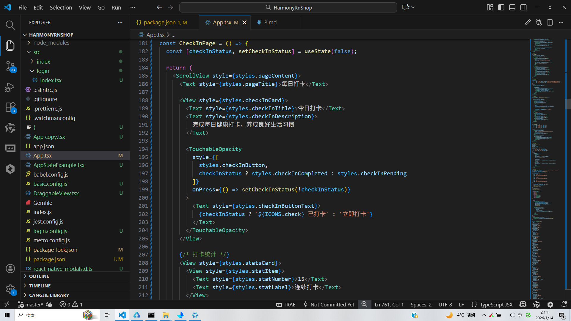
const CheckInPage = () => {
const [checkInStatus, setCheckInStatus] = useState(false);
return (
<ScrollView style={styles.pageContent}>
<Text style={styles.pageTitle}>每日打卡</Text>
<View style={styles.checkInCard}>
<Text style={styles.checkInTitle}>今日打卡</Text>
<Text style={styles.checkInDescription}>
完成每日健康打卡,养成良好生活习惯
</Text>
<TouchableOpacity
style={[
styles.checkInButton,
checkInStatus ? styles.checkInCompleted : styles.checkInPending
]}
onPress={() => setCheckInStatus(!checkInStatus)}
>
<Text style={styles.checkInButtonText}>
{checkInStatus ? `${ICONS.check} 已打卡` : '立即打卡'}
</Text>
</TouchableOpacity>
</View>
{/* 打卡统计 */}
<View style={styles.statsCard}>
<View style={styles.statItem}>
<Text style={styles.statNumber}>15</Text>
<Text style={styles.statLabel}>连续打卡</Text>
</View>
<View style={styles.statItem}>
<Text style={styles.statNumber}>87%</Text>
<Text style={styles.statLabel}>完成率</Text>
</View>
<View style={styles.statItem}>
<Text style={styles.statNumber}>30</Text>
<Text style={styles.statLabel}>本月目标</Text>
</View>
</View>
</ScrollView>
);
};
// 我的页面组件
const ProfilePage = () => {
const profileItems = [
{ id: 1, name: '健康档案', icon: ICONS.heart },
{ id: 2, name: '饮食记录', icon: ICONS.food },
{ id: 3, name: '运动计划', icon: ICONS.check },
{ id: 4, name: '健康报告', icon: ICONS.star },
];
return (
<ScrollView style={styles.pageContent}>
<View style={styles.profileHeader}>
<Image
source={{ uri: 'https://randomuser.me/api/portraits/men/32.jpg' }}
style={styles.profileAvatar}
/>
<Text style={styles.profileName}>张小明</Text>
<Text style={styles.profileSubtext}>健康生活倡导者</Text>
</View>
<View style={styles.profileContent}>
{profileItems.map(item => (
<TouchableOpacity key={item.id} style={styles.profileItem}>
<Text style={styles.profileItemIcon}>{item.icon}</Text>
<Text style={styles.profileItemText}>{item.name}</Text>
<Text style={styles.profileItemArrow}>›</Text>
</TouchableOpacity>
))}
</View>
</ScrollView>
);
};
// 底部导航组件
const BottomNavigation = ({
activeTab,
onTabChange
}: {
activeTab: string;
onTabChange: (tab: string) => void
}) => {
const tabs = [
{ id: 'home', name: '首页', icon: ICONS.home },
{ id: 'food', name: '饮食', icon: ICONS.food },
{ id: 'check', name: '打卡', icon: ICONS.check },
{ id: 'profile', name: '我的', icon: ICONS.user },
];
return (
<View style={styles.bottomNav}>
{tabs.map(tab => (
<TouchableOpacity
key={tab.id}
style={[
styles.navItem,
activeTab === tab.id && styles.activeNavItem
]}
onPress={() => onTabChange(tab.id)}
>
<Text style={[
styles.navIcon,
activeTab === tab.id ? styles.activeNavIcon : styles.inactiveNavIcon
]}>
{tab.icon}
</Text>
<Text style={[
styles.navText,
activeTab === tab.id ? styles.activeNavText : styles.inactiveNavText
]}>
{tab.name}
</Text>
</TouchableOpacity>
))}
</View>
);
};
// 主应用组件
const HealthApp: React.FC = () => {
const [currentScreen, setCurrentScreen] = useState<'onboarding' | 'main'>('onboarding');
const [activeTab, setActiveTab] = useState('home');
const [onboardingStep, setOnboardingStep] = useState(0);
const onboardingData = [
{
title: '健康饮食开始',
description: '科学搭配营养,享受健康生活',
image: 'https://picsum.photos/400/300?random=1'
},
{
title: '轻食美味',
description: '新鲜食材,低脂低糖,美味不减',
image: 'https://picsum.photos/400/300?random=2'
},
{
title: '养成习惯',
description: '每日打卡,记录健康生活点滴',
image: 'https://picsum.photos/400/300?random=3'
}
];
const handleNext = () => {
if (onboardingStep < onboardingData.length - 1) {
setOnboardingStep(onboardingStep + 1);
} else {
setCurrentScreen('main');
}
};
const handleSkip = () => {
setCurrentScreen('main');
};
const renderActivePage = () => {
switch (activeTab) {
case 'home':
return <HomePage />;
case 'food':
return <FoodPage />;
case 'check':
return <CheckInPage />;
case 'profile':
return <ProfilePage />;
default:
return <HomePage />;
}
};
if (currentScreen === 'onboarding') {
return (
<SafeAreaView style={styles.container}>
<OnboardingScreen
title={onboardingData[onboardingStep].title}
description={onboardingData[onboardingStep].description}
image={onboardingData[onboardingStep].image}
isLast={onboardingStep === onboardingData.length - 1}
onNext={handleNext}
onSkip={handleSkip}
/>
{/* 分页指示器 */}
<View style={styles.pagination}>
{onboardingData.map((_, index) => (
<View
key={index}
style={[
styles.paginationDot,
index === onboardingStep && styles.activePaginationDot
]}
/>
))}
</View>
</SafeAreaView>
);
}
return (
<SafeAreaView style={styles.container}>
{renderActivePage()}
<BottomNavigation activeTab={activeTab} onTabChange={setActiveTab} />
</SafeAreaView>
);
};
const styles = StyleSheet.create({
container: {
flex: 1,
backgroundColor: '#f8fafc',
},
onboardingContainer: {
flex: 1,
justifyContent: 'center',
alignItems: 'center',
padding: 24,
backgroundColor: '#ffffff',
},
onboardingImage: {
width: width * 0.8,
height: width * 0.6,
borderRadius: 16,
marginBottom: 24,
},
onboardingTitle: {
fontSize: 24,
fontWeight: 'bold',
color: '#1e293b',
textAlign: 'center',
marginBottom: 12,
},
onboardingDescription: {
fontSize: 16,
color: '#64748b',
textAlign: 'center',
lineHeight: 24,
marginBottom: 40,
},
onboardingButtons: {
flexDirection: 'row',
justifyContent: 'space-between',
width: '100%',
},
skipButton: {
paddingVertical: 12,
paddingHorizontal: 20,
},
skipButtonText: {
fontSize: 16,
color: '#94a3b8',
fontWeight: '500',
},
nextButton: {
backgroundColor: '#3b82f6',
paddingVertical: 12,
paddingHorizontal: 20,
borderRadius: 8,
},
nextButtonText: {
fontSize: 16,
color: '#ffffff',
fontWeight: '500',
},
pagination: {
flexDirection: 'row',
justifyContent: 'center',
marginBottom: 30,
},
paginationDot: {
width: 8,
height: 8,
borderRadius: 4,
backgroundColor: '#cbd5e1',
marginHorizontal: 4,
},
activePaginationDot: {
backgroundColor: '#3b82f6',
width: 20,
},
pageContent: {
flex: 1,
padding: 16,
},
pageTitle: {
fontSize: 24,
fontWeight: 'bold',
color: '#1e293b',
marginBottom: 20,
},
section: {
marginBottom: 20,
},
sectionTitle: {
fontSize: 18,
fontWeight: 'bold',
color: '#1e293b',
marginBottom: 12,
},
recommendationCard: {
backgroundColor: '#ffffff',
borderRadius: 12,
padding: 16,
elevation: 2,
shadowColor: '#000',
shadowOffset: { width: 0, height: 1 },
shadowOpacity: 0.1,
shadowRadius: 2,
},
recommendationImage: {
width: '100%',
height: 150,
borderRadius: 8,
marginBottom: 12,
},
recommendationTitle: {
fontSize: 16,
fontWeight: 'bold',
color: '#1e293b',
marginBottom: 4,
},
recommendationDescription: {
fontSize: 14,
color: '#64748b',
lineHeight: 20,
},
nutritionSection: {
marginTop: 10,
},
nutritionCard: {
flexDirection: 'row',
justifyContent: 'space-around',
backgroundColor: '#ffffff',
borderRadius: 12,
padding: 16,
elevation: 2,
shadowColor: '#000',
shadowOffset: { width: 0, height: 1 },
shadowOpacity: 0.1,
shadowRadius: 2,
},
nutritionItem: {
alignItems: 'center',
},
nutritionValue: {
fontSize: 20,
fontWeight: 'bold',
color: '#3b82f6',
},
nutritionLabel: {
fontSize: 12,
color: '#64748b',
marginTop: 4,
},
foodGrid: {
flexDirection: 'row',
flexWrap: 'wrap',
justifyContent: 'space-between',
},
foodItem: {
width: (width - 48) / 2,
backgroundColor: '#ffffff',
borderRadius: 12,
padding: 16,
marginBottom: 16,
alignItems: 'center',
elevation: 2,
shadowColor: '#000',
shadowOffset: { width: 0, height: 1 },
shadowOpacity: 0.1,
shadowRadius: 2,
},
foodImage: {
width: 60,
height: 60,
borderRadius: 30,
marginBottom: 12,
},
foodName: {
fontSize: 16,
fontWeight: '500',
color: '#1e293b',
marginBottom: 4,
},
foodCalories: {
fontSize: 14,
color: '#64748b',
marginBottom: 8,
},
foodButton: {
backgroundColor: '#f1f5f9',
paddingHorizontal: 16,
paddingVertical: 8,
borderRadius: 20,
},
foodButtonText: {
color: '#3b82f6',
fontWeight: '500',
},
checkInCard: {
backgroundColor: '#ffffff',
borderRadius: 12,
padding: 20,
marginBottom: 20,
elevation: 2,
shadowColor: '#000',
shadowOffset: { width: 0, height: 1 },
shadowOpacity: 0.1,
shadowRadius: 2,
},
checkInTitle: {
fontSize: 20,
fontWeight: 'bold',
color: '#1e293b',
marginBottom: 8,
},
checkInDescription: {
fontSize: 14,
color: '#64748b',
lineHeight: 20,
marginBottom: 20,
},
checkInButton: {
backgroundColor: '#3b82f6',
paddingVertical: 12,
borderRadius: 8,
alignItems: 'center',
},
checkInCompleted: {
backgroundColor: '#10b981',
},
checkInPending: {
backgroundColor: '#3b82f6',
},
checkInButtonText: {
color: '#ffffff',
fontSize: 16,
fontWeight: '500',
},
statsCard: {
flexDirection: 'row',
justifyContent: 'space-around',
backgroundColor: '#ffffff',
borderRadius: 12,
padding: 16,
elevation: 2,
shadowColor: '#000',
shadowOffset: { width: 0, height: 1 },
shadowOpacity: 0.1,
shadowRadius: 2,
},
statItem: {
alignItems: 'center',
},
statNumber: {
fontSize: 20,
fontWeight: 'bold',
color: '#3b82f6',
},
statLabel: {
fontSize: 12,
color: '#64748b',
marginTop: 4,
},
profileHeader: {
alignItems: 'center',
paddingVertical: 20,
backgroundColor: '#ffffff',
borderRadius: 12,
marginBottom: 20,
elevation: 2,
shadowColor: '#000',
shadowOffset: { width: 0, height: 1 },
shadowOpacity: 0.1,
shadowRadius: 2,
},
profileAvatar: {
width: 80,
height: 80,
borderRadius: 40,
marginBottom: 12,
},
profileName: {
fontSize: 18,
fontWeight: 'bold',
color: '#1e293b',
},
profileSubtext: {
fontSize: 14,
color: '#64748b',
},
profileContent: {
backgroundColor: '#ffffff',
borderRadius: 12,
padding: 16,
elevation: 2,
shadowColor: '#000',
shadowOffset: { width: 0, height: 1 },
shadowOpacity: 0.1,
shadowRadius: 2,
},
profileItem: {
flexDirection: 'row',
alignItems: 'center',
paddingVertical: 16,
borderBottomWidth: 1,
borderBottomColor: '#e2e8f0',
},
profileItemIcon: {
fontSize: 20,
color: '#3b82f6',
marginRight: 12,
},
profileItemText: {
fontSize: 16,
color: '#1e293b',
flex: 1,
},
profileItemArrow: {
fontSize: 18,
color: '#94a3b8',
},
bottomNav: {
flexDirection: 'row',
justifyContent: 'space-around',
backgroundColor: '#ffffff',
borderTopWidth: 1,
borderTopColor: '#e2e8f0',
paddingVertical: 12,
},
navItem: {
alignItems: 'center',
flex: 1,
},
activeNavItem: {
paddingBottom: 4,
borderBottomWidth: 2,
borderBottomColor: '#3b82f6',
},
navIcon: {
fontSize: 20,
marginBottom: 4,
},
activeNavIcon: {
color: '#3b82f6',
},
inactiveNavIcon: {
color: '#94a3b8',
},
navText: {
fontSize: 12,
},
activeNavText: {
color: '#3b82f6',
fontWeight: '500',
},
inactiveNavText: {
color: '#94a3b8',
},
});
export default HealthApp;
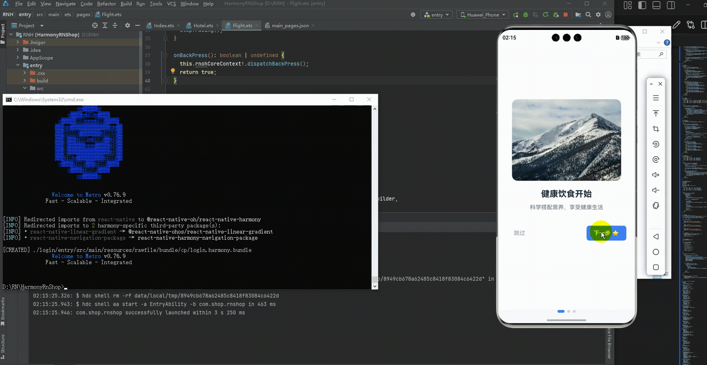
打包
接下来通过打包命令npn run harmony将reactNative的代码打包成为bundle,这样可以进行在开源鸿蒙OpenHarmony中进行使用。

打包之后再将打包后的鸿蒙OpenHarmony文件拷贝到鸿蒙的DevEco-Studio工程目录去:

最后运行效果图如下显示:
欢迎大家加入开源鸿蒙跨平台开发者社区,一起共建开源鸿蒙跨平台生态。

作为“人工智能6S店”的官方数字引擎,为AI开发者与企业提供一个覆盖软硬件全栈、一站式门户。
更多推荐

 15
15 0
0- 0


 已为社区贡献42条内容

所有评论(0)