
React Native鸿蒙跨平台实现表单由受控组件承载,字段状态用 useState 管理;校验集中在 validateForm,提交流程通过 Alert 进行二次确认
本文介绍了跨平台注册页面的开发实践,重点分析了复合组件设计、表单验证和鸿蒙平台适配等关键技术。采用React的受控组件模式构建了可复用的InputField组件,通过集中式验证体系确保各平台行为一致。在样式系统方面,Flexbox布局和平台特定适配保证了界面兼容性。针对鸿蒙平台,讨论了输入法兼容处理和分布式能力集成等优化点,如调用原生API调整输入法、利用分布式特性实现多设备协同注册等。这些实践既
复合组件设计模式
注册页面采用了经典的复合组件设计模式,将输入字段抽象为独立的 InputField 组件:
const InputField = ({
  label,
  placeholder,
  value,
  onChangeText,
  secureTextEntry = false,
  keyboardType = 'default'
}: {
  label: string;
  placeholder: string;
  value: string;
  onChangeText: (text: string) => void;
  secureTextEntry?: boolean;
  keyboardType?: 'default' | 'email-address' | 'numeric' | 'phone-pad';
}) => {
  // 组件实现
};
这种设计在跨平台开发中具有显著优势。通过将输入字段的标签、占位符、值绑定和键盘类型等属性通过 props 接口暴露,组件可以在不同平台上保持一致的 API,同时内部实现可以根据平台特性进行优化。在鸿蒙平台上,这样的组件设计可以轻松适配鸿蒙的输入控件特性,如分布式输入法支持等。
受控组件与状态管理
所有输入字段都实现了完整的受控组件模式:
const [name, setName] = useState('');
const [email, setEmail] = useState('');
const [phone, setPhone] = useState('');
const [password, setPassword] = useState('');
const [confirmPassword, setConfirmPassword] = useState('');

<InputField
  label="姓名"
  placeholder="请输入您的真实姓名"
  value={name}
  onChangeText={setName}
/>
这种单向数据流的设计是 React 的核心哲学,在跨平台场景下尤为重要。当应用需要运行在鸿蒙平台时,这种明确的数据流向可以简化状态同步逻辑,特别是在鸿蒙的分布式场景中,状态需要在多个设备间同步时,清晰的受控组件设计可以大大降低复杂度。
表单验证体系构建
正则表达式验证引擎
代码中构建了完整的表单验证体系:
const validateForm = () => {
  if (!name.trim()) {
    Alert.alert('提示', '请输入姓名');
    return false;
  }

  const emailRegex = /^[^\s@]+@[^\s@]+\.[^\s@]+$/;
  if (!emailRegex.test(email)) {
    Alert.alert('提示', '请输入有效的邮箱地址');
    return false;
  }

  const phoneRegex = /^1[3-9]\d{9}$/;
  if (!phoneRegex.test(phone)) {
    Alert.alert('提示', '请输入有效的手机号');
    return false;
  }

  if (password.length < 6) {
    Alert.alert('提示', '密码至少需要6位字符');
    return false;
  }

  if (password !== confirmPassword) {
    Alert.alert('提示', '两次输入的密码不一致');
    return false;
  }

  return true;
};
这种验证模式将业务规则集中管理,避免了分散在各处的验证逻辑。在跨平台开发中,这种集中式的验证体系可以确保不同平台上的验证行为一致。值得注意的是,在鸿蒙平台上实现时,开发者需要考虑鸿蒙特有的输入法行为和系统限制,例如某些鸿蒙设备可能对密码输入有额外的安全限制。
密码可见性切换机制
代码实现了密码可见性的动态切换:
const [showPassword, setShowPassword] = useState(false);
<TextInput
style={[styles.input, styles.passwordInput]}
placeholder="请输入密码"
value={password}
onChangeText={setPassword}
secureTextEntry={!showPassword}
/>
<TouchableOpacity
style={styles.eyeButton}
onPress={() => setShowPassword(!showPassword)}
>
<Text style={styles.eyeText}>{showPassword ? '👁️' : '👁️🗨️'}</Text>
</TouchableOpacity>
这种交互模式在移动端表单中非常常见,但在跨平台实现时需要考虑各平台的差异。在鸿蒙平台上,密码输入的安全机制可能与 Android/iOS 有所不同,开发者需要测试确认 secureTextEntry 属性在鸿蒙上的表现是否与预期一致。
样式系统与布局架构
响应式布局设计
代码中充分运用了 Flexbox 布局系统:
const styles = StyleSheet.create({
  container: {
    flex: 1,
    backgroundColor: '#f8fafc',
  },
  header: {
    flexDirection: 'row',
    alignItems: 'center',
    justifyContent: 'space-between',
    padding: 20,
  },
  content: {
    flex: 1,
    padding: 16,
  },
  // ...
});
Flexbox 布局是 React Native 的核心布局系统,其表现与 Web 端的 Flexbox 规范基本一致。在鸿蒙平台上,由于方舟框架也支持类似的声明式布局语法,这些样式定义通常可以直接复用,只需要针对鸿蒙特有的设备尺寸和屏幕比例进行微调。
平台特定样式适配
虽然当前代码中没有显式的平台判断,但在实际跨平台开发中,经常需要处理平台样式差异:
import { Platform } from 'react-native';

const styles = StyleSheet.create({
  input: {
    borderWidth: 1,
    borderColor: '#cbd5e1',
    borderRadius: 8,
    padding: Platform.OS === 'ios' ? 14 : 12,
    fontSize: 16,
    backgroundColor: '#ffffff',
  },
});
在鸿蒙平台上,开发者需要评估哪些样式属性需要特殊处理。例如,鸿蒙的文本输入框可能有不同的默认内边距或边框样式,需要通过平台判断进行针对性调整。
交互设计与用户体验
多步骤弹窗交互流程
注册流程采用了分步确认的交互设计:
const handleRegister = () => {
  if (validateForm()) {
    Alert.alert(
      '注册确认',
      `您即将注册账户:\n姓名:${name}\n邮箱:${email}\n手机号:${phone}`,
      [
        { text: '取消', style: 'cancel' },
        {
          text: '注册',
          onPress: () => {
            Alert.alert('注册成功', '您的账户已成功创建!', [
              { text: '确定', onPress: () => console.log('返回登录页面') }
            ]);
          }
        }
      ]
    );
  }
};
这种多步骤的弹窗交互在移动端非常常见,但在跨平台实现时需要注意各平台在 Alert API 表现上的差异。在鸿蒙平台上,Alert 的按钮排列方式、动画效果等可能与 iOS/Android 有所不同,开发者需要通过实际测试确保用户体验的一致性。
底部导航栏设计
代码实现了典型的移动端底部导航:
<View style={styles.bottomNav}>
  <TouchableOpacity style={styles.navItem}>
    <Text style={styles.navIcon}>{ICONS.home}</Text>
    <Text style={styles.navText}>首页</Text>
  </TouchableOpacity>
  {/* 其他导航项 */}
</View>
底部导航是移动应用的核心导航模式,在跨平台开发中需要特别注意各平台的交互习惯差异。在鸿蒙平台上,底部导航可能需要考虑鸿蒙特有的手势导航系统,确保导航操作不会与系统手势冲突。
鸿蒙跨端适配关键技术
输入法兼容性处理
鸿蒙平台的输入法系统有其独特之处:
// 伪代码:鸿蒙输入法适配层
const HarmonyKeyboard = {
  adjustInputMethod: (inputRef) => {
    if (Platform.OS === 'harmony') {
      // 调用鸿蒙输入法调整API
      harmonyNative.adjustInputMethod(inputRef);
    }
  }
};
在实际开发中,开发者需要测试各种输入场景在鸿蒙平台上的表现,特别是:
- 密码输入的安全键盘
- 邮箱地址输入的特殊字符支持
- 手机号输入的数字键盘自动切换
分布式能力集成
鸿蒙的分布式特性可以为注册流程带来创新体验:
// 伪代码:分布式注册流程
const DistributedRegister = {
  startOnPhone: () => {
    if (Platform.OS === 'harmony') {
      // 在手机开始注册流程
      harmonyNative.startRegisterFlow('phone');
    }
  },
  continueOnPad: () => {
    if (Platform.OS === 'harmony') {
      // 在平板上继续注册
      harmonyNative.continueRegisterFlow('pad');
    }
  }
};
这种分布式注册体验可以让用户在多个设备间无缝切换,提升注册流程的便捷性。
性能优化策略
注册页面的性能优化需要特别关注:
- 渲染性能:避免不必要的重渲染
- 内存占用:优化表单状态的内存使用
- 启动时间:减少首屏渲染时间
在鸿蒙平台上,可以通过方舟编译器的优化能力进一步提升性能:
// 伪代码:鸿蒙性能优化配置
const HarmonyPerformance = {
  enableOptimization: () => {
    if (Platform.OS === 'harmony') {
      harmonyNative.enableAOTCompilation();
      harmonyNative.enableMemoryOptimization();
    }
  }
};
安全与合规考量
数据加密策略
注册页面涉及敏感用户信息,需要严格的安全措施:
// 伪代码:跨平台加密模块
const SecureData = {
  encrypt: (data) => {
    if (Platform.OS === 'harmony') {
      return harmonyNative.encrypt(data);
    } else {
      return reactNativeEncrypt(data);
    }
  }
};
在鸿蒙平台上,可以利用鸿蒙的安全框架提供更高级别的数据保护。
隐私合规设计
注册流程需要符合各地区的隐私法规:
// 伪代码:隐私合规检查
const PrivacyCompliance = {
  checkGDPR: () => {
    if (Platform.OS === 'harmony') {
      return harmonyNative.checkPrivacyCompliance();
    }
    return true;
  }
};
鸿蒙平台提供了专门的隐私保护API,开发者应当充分利用这些API确保应用合规。
架构演进建议
表单管理库集成
对于复杂表单,建议引入专业表单管理库:
// 使用 Formik 管理表单状态
import { Formik } from 'formik';

<Formik
  initialValues={{ name: '', email: '', phone: '', password: '' }}
  onSubmit={values => handleRegister(values)}
  validate={values => {
    // 验证逻辑
  }}
>
  {({ handleChange, handleBlur, handleSubmit, values }) => (
    <View>
      <InputField
        label="姓名"
        placeholder="请输入姓名"
        value={values.name}
        onChangeText={handleChange('name')}
      />
      {/* 其他字段 */}
      <Button onPress={handleSubmit} title="注册" />
    </View>
  )}
</Formik>
这种架构可以更好地组织复杂表单逻辑,提高代码的可维护性。
组件库抽象与复用
建议构建跨平台表单组件库:
// 跨平台表单组件工厂
const FormComponentFactory = {
  createInput: (platform) => {
    switch (platform) {
      case 'harmony':
        return HarmonyInput;
      case 'ios':
        return IOSInput;
      default:
        return DefaultInput;
    }
  }
};
通过这种方式,可以在保持统一API的同时,充分利用各平台的特性。
概览
- 表单由受控组件承载,字段状态用 useState 管理;校验集中在 validateForm,提交流程通过 Alert 进行二次确认
- 交互包含明文/密文切换、邮箱/手机号格式校验、错误提示与注册成功提示;页面以 ScrollView 组织,底部导航为占位
- 跨端落点在输入治理(IME 合成态)、对话框桥接、键盘与滚动的适配、可访问性与错误语义的一致化
表单组件与输入治理
- InputField 抽象常见输入,统一 label/placeholder/value/onChangeText/secureTextEntry/keyboardType;在鸿蒙端映射 ArkUI TextField 时保持相同语义
- 邮箱输入建议禁用自动大小写与自动更正,保证跨端一致(autoCapitalize=‘none’,autoCorrect={false});手机号输入建议限制为数字字符集并做长度约束
- 中文 IME 需双缓冲策略:合成态只更新 UI,提交态才更新业务值;避免边输入边触发校验或提交导致打断体验
- 明文/密文切换依赖 secureTextEntry,部分端切换时光标可能跳转;在切换后主动保持焦点与光标位置,鸿蒙桥接侧需验证焦点与光标行为一致
校验与错误语义
- validateForm 将必填、格式、长度、一致性等同步校验集中处理;错误提示用统一的文案语义,避免各字段分散弹窗
- 邮箱正则适配通用场景即可;手机号正则当前针对中国大陆号段,跨区域需抽象地区规则表
- 建议将校验抽象为“表单服务”,同时支持异步校验(邮箱占用、手机号拉黑),统一错误码与提示文案,RN 与鸿蒙端共享协议
密码显隐与焦点管理
- 密码与确认密码分别维护 showPassword/showConfirmPassword 切换;建议在切换后保持输入焦点,减少视觉抖动
- 密码要求在 UI 层提示为静态文案;生产中建议在提交前进行复杂度检测(长度、字符集、重复字符、字典弱口令),并用统一规则返回可读错误
交互与路由
- 返回按钮目前无 onPress;应统一到“路由服务”,映射 RN 导航与鸿蒙 ArkUI 路由,保证返回手势一致
- 注册确认与成功提示使用 Alert;鸿蒙端建议桥接到 Dialog/CustomDialog,统一遮罩、焦点顺序与返回手势,不用平台特有 prompt
键盘与滚动适配
- ScrollView 容纳长表单需避免键盘遮挡;RN 端建议加入 KeyboardAvoidingView 或手动滚动到焦点输入区;鸿蒙端桥接需确保键盘弹出时布局安全区与滚动行为一致
- 输入项多时,进入错误状态后自动滚动定位到第一个错误输入项,跨端统一滚动动画与节流,提升可用性
状态管理与性能
- 所有 setState 建议用 useCallback 包裹,减少子树重渲染;InputField 可用 React.memo 防止无关变更导致重复绘制
- 派生逻辑(例如是否允许提交)用 useMemo 计算,依赖字段值集合;避免在渲染路径中重复执行校验
- 明文/密文切换与输入变更属于高频事件,建议对 onChangeText 做轻量去抖(例如 100–200ms),同时确保受控输入不卡顿
跨端映射要点(React Native → 鸿蒙 ArkUI)
- TextInput → ArkUI TextField:保持 secureTextEntry、keyboardType、composition 事件一致;禁用自动更正/大小写差异
- Alert → ArkUI Dialog:统一交互语义、无障碍描述与返回手势;错误、确认与成功提示走对话框服务
- ScrollView → ArkUI 列表/容器:键盘弹出时的安全区与滚动适配一致;需要时用“轻路由覆盖层”承载弹窗表单
- TouchableOpacity → ArkUI Button/手势区域:点击反馈与禁用态由语义层控制,不直接耦合样式
完整实例代码:
// app.tsx
import React, { useState } from 'react';
import { SafeAreaView, View, Text, StyleSheet, TouchableOpacity, ScrollView, TextInput, Dimensions, Alert } from 'react-native';
// 图标库
const ICONS = {
user: '👤',
email: '📧',
phone: '📞',
lock: '🔒',
eye: '👁️',
home: '🏠',
register: '📝',
back: '↩️',
};
const { width } = Dimensions.get('window');
// 输入字段组件
const InputField = ({
label,
placeholder,
value,
onChangeText,
secureTextEntry = false,
keyboardType = 'default'
}: {
label: string;
placeholder: string;
value: string;
onChangeText: (text: string) => void;
secureTextEntry?: boolean;
keyboardType?: 'default' | 'email-address' | 'numeric' | 'phone-pad';
}) => {
return (
<View style={styles.inputGroup}>
<Text style={styles.inputLabel}>{label}</Text>
<TextInput
style={styles.input}
placeholder={placeholder}
value={value}
onChangeText={onChangeText}
secureTextEntry={secureTextEntry}
keyboardType={keyboardType}
/>
</View>
);
};
// 注册页面组件
const RegisterPage: React.FC = () => {
const [name, setName] = useState('');
const [email, setEmail] = useState('');
const [phone, setPhone] = useState('');
const [password, setPassword] = useState('');
const [confirmPassword, setConfirmPassword] = useState('');
const [showPassword, setShowPassword] = useState(false);
const [showConfirmPassword, setShowConfirmPassword] = useState(false);
const validateForm = () => {
if (!name.trim()) {
Alert.alert('提示', '请输入姓名');
return false;
}
if (!email.trim()) {
Alert.alert('提示', '请输入邮箱');
return false;
}
const emailRegex = /^[^\s@]+@[^\s@]+\.[^\s@]+$/;
if (!emailRegex.test(email)) {
Alert.alert('提示', '请输入有效的邮箱地址');
return false;
}
if (!phone.trim()) {
Alert.alert('提示', '请输入手机号');
return false;
}
const phoneRegex = /^1[3-9]\d{9}$/;
if (!phoneRegex.test(phone)) {
Alert.alert('提示', '请输入有效的手机号');
return false;
}
if (password.length < 6) {
Alert.alert('提示', '密码至少需要6位字符');
return false;
}
if (password !== confirmPassword) {
Alert.alert('提示', '两次输入的密码不一致');
return false;
}
return true;
};
const handleRegister = () => {
if (validateForm()) {
Alert.alert(
'注册确认',
`您即将注册账户:\n姓名:${name}\n邮箱:${email}\n手机号:${phone}`,
[
{ text: '取消', style: 'cancel' },
{
text: '注册',
onPress: () => {
Alert.alert('注册成功', '您的账户已成功创建!', [
{ text: '确定', onPress: () => console.log('返回登录页面') }
]);
}
}
]
);
}
};
return (
<SafeAreaView style={styles.container}>
{/* 头部 */}
<View style={styles.header}>
<TouchableOpacity style={styles.backButton}>
<Text style={styles.backButtonText}>{ICONS.back}</Text>
</TouchableOpacity>
<Text style={styles.title}>用户注册</Text>
<View style={styles.placeholder} />
</View>
{/* 注册表单 */}
<ScrollView style={styles.content}>
<Text style={styles.subtitle}>创建您的商城账户</Text>
<InputField
label="姓名"
placeholder="请输入您的真实姓名"
value={name}
onChangeText={setName}
/>
<InputField
label="邮箱"
placeholder="请输入邮箱地址"
value={email}
onChangeText={setEmail}
keyboardType="email-address"
/>
<InputField
label="手机号"
placeholder="请输入手机号码"
value={phone}
onChangeText={setPhone}
keyboardType="phone-pad"
/>
<View style={styles.inputGroup}>
<Text style={styles.inputLabel}>密码</Text>
<View style={styles.passwordContainer}>
<TextInput
style={[styles.input, styles.passwordInput]}
placeholder="请输入密码"
value={password}
onChangeText={setPassword}
secureTextEntry={!showPassword}
/>
<TouchableOpacity
style={styles.eyeButton}
onPress={() => setShowPassword(!showPassword)}
>
<Text style={styles.eyeText}>{showPassword ? '👁️' : '👁️🗨️'}</Text>
</TouchableOpacity>
</View>
</View>
<View style={styles.inputGroup}>
<Text style={styles.inputLabel}>确认密码</Text>
<View style={styles.passwordContainer}>
<TextInput
style={[styles.input, styles.passwordInput]}
placeholder="请再次输入密码"
value={confirmPassword}
onChangeText={setConfirmPassword}
secureTextEntry={!showConfirmPassword}
/>
<TouchableOpacity
style={styles.eyeButton}
onPress={() => setShowConfirmPassword(!showConfirmPassword)}
>
<Text style={styles.eyeText}>{showConfirmPassword ? '👁️' : '👁️🗨️'}</Text>
</TouchableOpacity>
</View>
</View>
{/* 密码要求提示 */}
<View style={styles.passwordRequirements}>
<Text style={styles.requirementsTitle}>密码要求:</Text>
<Text style={styles.requirement}>• 至少6位字符</Text>
<Text style={styles.requirement}>• 包含字母和数字</Text>
<Text style={styles.requirement}>• 区分大小写</Text>
</View>
</ScrollView>
{/* 注册按钮 */}
<View style={styles.buttonContainer}>
<TouchableOpacity style={styles.registerButton} onPress={handleRegister}>
<Text style={styles.registerButtonText}>立即注册</Text>
</TouchableOpacity>
<View style={styles.loginLinkContainer}>
<Text style={styles.loginText}>已有账户?</Text>
<TouchableOpacity onPress={() => Alert.alert('跳转到登录页面')}>
<Text style={styles.loginLink}>立即登录</Text>
</TouchableOpacity>
</View>
</View>
{/* 底部导航 */}
<View style={styles.bottomNav}>
<TouchableOpacity style={styles.navItem}>
<Text style={styles.navIcon}>{ICONS.home}</Text>
<Text style={styles.navText}>首页</Text>
</TouchableOpacity>
<TouchableOpacity style={styles.navItem}>
<Text style={styles.navIcon}>{ICONS.user}</Text>
<Text style={styles.navText}>我的</Text>
</TouchableOpacity>
<TouchableOpacity style={styles.navItem}>
<Text style={styles.navIcon}>{ICONS.register}</Text>
<Text style={styles.navText}>注册</Text>
</TouchableOpacity>
<TouchableOpacity style={styles.navItem}>
<Text style={styles.navIcon}>{ICONS.phone}</Text>
<Text style={styles.navText}>客服</Text>
</TouchableOpacity>
</View>
</SafeAreaView>
);
};
const styles = StyleSheet.create({
container: {
flex: 1,
backgroundColor: '#f8fafc',
},
header: {
flexDirection: 'row',
alignItems: 'center',
justifyContent: 'space-between',
padding: 20,
backgroundColor: '#ffffff',
borderBottomWidth: 1,
borderBottomColor: '#e2e8f0',
},
backButton: {
padding: 8,
},
backButtonText: {
fontSize: 18,
color: '#3b82f6',
},
title: {
fontSize: 18,
fontWeight: 'bold',
color: '#1e293b',
},
placeholder: {
width: 30,
},
content: {
flex: 1,
padding: 16,
},
subtitle: {
fontSize: 14,
color: '#64748b',
marginBottom: 20,
textAlign: 'center',
},
inputGroup: {
marginBottom: 16,
},
inputLabel: {
fontSize: 14,
fontWeight: '500',
color: '#1e293b',
marginBottom: 8,
},
input: {
borderWidth: 1,
borderColor: '#cbd5e1',
borderRadius: 8,
padding: 12,
fontSize: 16,
backgroundColor: '#ffffff',
},
passwordContainer: {
flexDirection: 'row',
alignItems: 'center',
},
passwordInput: {
flex: 1,
},
eyeButton: {
position: 'absolute',
right: 12,
padding: 8,
},
eyeText: {
fontSize: 18,
},
passwordRequirements: {
backgroundColor: '#f1f5f9',
padding: 12,
borderRadius: 8,
marginTop: 16,
},
requirementsTitle: {
fontSize: 14,
fontWeight: 'bold',
color: '#1e293b',
marginBottom: 8,
},
requirement: {
fontSize: 12,
color: '#64748b',
marginBottom: 4,
marginLeft: 8,
},
buttonContainer: {
padding: 16,
backgroundColor: '#ffffff',
},
registerButton: {
backgroundColor: '#3b82f6',
paddingVertical: 16,
borderRadius: 8,
alignItems: 'center',
marginBottom: 12,
},
registerButtonText: {
color: '#ffffff',
fontSize: 16,
fontWeight: 'bold',
},
loginLinkContainer: {
flexDirection: 'row',
justifyContent: 'center',
},
loginText: {
fontSize: 14,
color: '#64748b',
},
loginLink: {
fontSize: 14,
color: '#3b82f6',
fontWeight: '500',
marginLeft: 4,
},
bottomNav: {
flexDirection: 'row',
justifyContent: 'space-around',
backgroundColor: '#ffffff',
borderTopWidth: 1,
borderTopColor: '#e2e8f0',
paddingVertical: 12,
},
navItem: {
alignItems: 'center',
},
navIcon: {
fontSize: 20,
color: '#94a3b8',
marginBottom: 4,
},
navText: {
fontSize: 12,
color: '#94a3b8',
},
});
export default RegisterPage;
打包
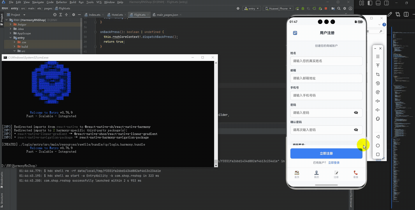
接下来通过打包命令npn run harmony将reactNative的代码打包成为bundle,这样可以进行在开源鸿蒙OpenHarmony中进行使用。

打包之后再将打包后的鸿蒙OpenHarmony文件拷贝到鸿蒙的DevEco-Studio工程目录去:

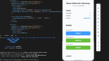
最后运行效果图如下显示:
欢迎大家加入开源鸿蒙跨平台开发者社区,一起共建开源鸿蒙跨平台生态。

作为“人工智能6S店”的官方数字引擎,为AI开发者与企业提供一个覆盖软硬件全栈、一站式门户。
更多推荐


 12
12 0
0- 0


 已为社区贡献5条内容

所有评论(0)