
React Native 鸿蒙跨平台开发:HorizontalScroll 横向滚动代码指南
itemWidth?: number;spacing?: number;: boolean;autoPlay?: boolean;: number;renderItem?items是必需的,其他都是可选的renderItem允许自定义渲染逻辑,提高组件灵活性提供点击事件回调。
·
一、核心原理:横向滚动的设计与实现
1.1 为什么需要横向滚动?
横向滚动是移动应用中常见的交互模式,主要用于:
- 内容展示:展示大量卡片、图片等横向排列的内容
- 节省空间:在有限的垂直空间内展示更多内容
- 提升体验:提供流畅的滑动交互,符合用户习惯
1.2 横向滚动的核心要素
实现横向滚动需要考虑:
- 滚动容器:使用
ScrollView组件,设置horizontal属性 - 滚动项:每个可滚动的元素,需要固定宽度
- 间距控制:使用
marginRight或padding控制项之间的间距 - 指示器:显示当前滚动位置(可选)
- 性能优化:避免渲染过多不可见项
1.3 实现原理
横向滚动的核心实现原理:
- 使用
ScrollView的horizontal属性启用横向滚动 - 使用
pagingEnabled实现整页滚动效果 - 使用
onScroll监听滚动事件,更新指示器状态 - 使用
useRef存储 ScrollView 引用,实现滚动控制 - 使用
useCallback优化回调函数,避免不必要的重新渲染
二、基础横向滚动实现
2.1 基础实现
最简单的横向滚动实现,使用 ScrollView 的 horizontal 属性。
const HorizontalScroll = memo<HorizontalScrollProps>(({
  items,
  itemWidth = 120,
  spacing = 12,
  showIndicator = true,
  renderItem,
  onItemPress,
}) => {
  const [currentIndex, setCurrentIndex] = useState(0);
  const scrollViewRef = useRef<ScrollView>(null);

  const handleScroll = useCallback((event: any) => {
    const contentOffsetX = event.nativeEvent.contentOffset.x;
    const index = Math.round(contentOffsetX / (itemWidth + spacing));
    setCurrentIndex(index);
  }, [itemWidth, spacing]);

  const scrollToIndex = useCallback((index: number) => {
    const offset = index * (itemWidth + spacing);
    scrollViewRef.current?.scrollTo({ x: offset, animated: true });
  }, [itemWidth, spacing]);

  const defaultRenderItem = useCallback((item: any, index: number) => (
    <TouchableOpacity
      key={index}
      style={[styles.scrollItem, { width: itemWidth, marginRight: index < items.length - 1 ? spacing : 0 }]}
      onPress={() => onItemPress?.(item, index)}
    >
      <Text style={styles.scrollItemText}>{item.title}</Text>
    </TouchableOpacity>
  ), [itemWidth, onItemPress, spacing, items.length]);

  return (
    <View style={styles.scrollWrapper}>
      <ScrollView
        ref={scrollViewRef}
        horizontal
        showsHorizontalScrollIndicator={false}
        onScroll={handleScroll}
        scrollEventThrottle={16}
        contentContainerStyle={styles.scrollContainer}
      >
        {items.map((item, index) =>
          renderItem ? renderItem(item, index) : defaultRenderItem(item, index)
        )}
      </ScrollView>
      {showIndicator && (
        <View style={styles.indicatorContainer}>
          {items.map((_, index) => (
            <TouchableOpacity
              key={index}
              onPress={() => scrollToIndex(index)}
              activeOpacity={0.7}
              style={{ marginRight: index < items.length - 1 ? 8 : 0 }}
            >
              <View
                style={[
                  styles.indicator,
                  index === currentIndex && styles.activeIndicator,
                ]}
              />
            </TouchableOpacity>
          ))}
        </View>
      )}
    </View>
  );
});
为什么这样设计?
- spacing 参数:控制滚动项之间的间距,而不是使用
gap(React Native 不支持) - marginRight 计算:只在非最后一项添加右边距,避免末尾多余空白
- scrollEventThrottle:设置为 16ms(约 60fps),平衡性能和流畅度
- currentIndex 状态:跟踪当前滚动位置,用于更新指示器
2.2 TypeScript 类型定义
interface HorizontalScrollProps {
  items: any[];
  itemWidth?: number;
  spacing?: number;
  showIndicator?: boolean;
  autoPlay?: boolean;
  autoPlayInterval?: number;
  renderItem?: (item: any, index: number) => React.ReactNode;
  onItemPress?: (item: any, index: number) => void;
}
类型设计要点:
items是必需的,其他都是可选的renderItem允许自定义渲染逻辑,提高组件灵活性onItemPress提供点击事件回调
2.3 样式实现
const styles = StyleSheet.create({
  scrollWrapper: {
    position: 'relative',
  },
  scrollContainer: {
    paddingHorizontal: 16,
  },
  scrollItem: {
    backgroundColor: '#409EFF',
    borderRadius: 12,
    justifyContent: 'center',
    alignItems: 'center',
    height: 80,
  },
  scrollItemText: {
    color: '#FFFFFF',
    fontSize: 14,
    fontWeight: '500',
  },
});
样式说明:
scrollWrapper:相对定位容器,为指示器提供定位参考scrollContainer:设置水平内边距,避免内容贴边scrollItem:固定高度,宽度由 props 控制scrollItemText:白色文字,提高对比度
三、自动轮播实现
3.1 基础实现
使用定时器实现自动轮播效果。
const HorizontalScroll = memo<HorizontalScrollProps>(({
  items,
  itemWidth = 120,
  spacing = 12,
  showIndicator = true,
  autoPlay = false,
  autoPlayInterval = 3000,
  renderItem,
  onItemPress,
}) => {
  const [currentIndex, setCurrentIndex] = useState(0);
  const scrollViewRef = useRef<ScrollView>(null);

  const scrollToNext = useCallback(() => {
    const nextIndex = (currentIndex + 1) % items.length;
    scrollToIndex(nextIndex);
  }, [currentIndex, items.length, scrollToIndex]);

  // 自动轮播
  useEffect(() => {
    if (autoPlay) {
      const timer = setInterval(scrollToNext, autoPlayInterval);
      return () => clearInterval(timer);
    }
  }, [autoPlay, scrollToNext, autoPlayInterval]);

  // ... 其他代码
});
为什么这样设计?
- 条件渲染定时器:只有
autoPlay为 true 时才创建定时器 - 清理定时器:在 useEffect 的清理函数中清除定时器,避免内存泄漏
- 循环逻辑:使用
(currentIndex + 1) % items.length实现循环轮播 - 独立控制:每个滚动组件可以独立控制是否自动轮播
3.2 性能优化
自动轮播需要注意性能问题:
// 优化滚动事件处理
const handleScroll = useCallback((event: any) => {
  const contentOffsetX = event.nativeEvent.contentOffset.x;
  const index = Math.round(contentOffsetX / (itemWidth + spacing));
  setCurrentIndex(index);
}, [itemWidth, spacing]);

// 优化滚动方法
const scrollToIndex = useCallback((index: number) => {
  const offset = index * (itemWidth + spacing);
  scrollViewRef.current?.scrollTo({ x: offset, animated: true });
}, [itemWidth, spacing]);
优化要点:
- 使用
useCallback缓存函数,避免每次渲染都创建新函数 - 使用
scrollEventThrottle限制滚动事件触发频率 - 使用
animated: true实现平滑滚动动画
四、卡片滚动实现
4.1 基础实现
卡片滚动是横向滚动的一种常见应用场景。
const CardHorizontalScroll = memo<CardHorizontalScrollProps>(({
  items,
  cardWidth = 200,
  spacing = 12,
  onCardPress,
}) => {
  const renderCard = useCallback((item: any, index: number) => (
    <TouchableOpacity
      key={index}
      style={[styles.cardItem, { width: cardWidth, marginRight: index < items.length - 1 ? spacing : 0 }]}
      onPress={() => onCardPress?.(item, index)}
      activeOpacity={0.8}
    >
      <Image source={{ uri: item.image }} style={styles.cardImage} />
      <View style={styles.cardContent}>
        <Text style={styles.cardTitle} numberOfLines={1}>
          {item.title}
        </Text>
        <Text style={styles.cardDescription} numberOfLines={2}>
          {item.description}
        </Text>
      </View>
    </TouchableOpacity>
  ), [cardWidth, onCardPress, spacing, items.length]);

  return (
    <ScrollView
      horizontal
      showsHorizontalScrollIndicator={false}
      contentContainerStyle={styles.cardContainer}
    >
      {items.map((item, index) => renderCard(item, index))}
    </ScrollView>
  );
});
为什么这样设计?
- 固定卡片宽度:确保每个卡片宽度一致,布局整齐
- 图片 + 文字布局:上面显示图片,下面显示标题和描述
- numberOfLines:限制文本行数,避免卡片高度不一致
- activeOpacity:提供点击反馈,提升用户体验
4.2 样式实现
const styles = StyleSheet.create({
  cardContainer: {
    paddingHorizontal: 16,
  },
  cardItem: {
    backgroundColor: '#FFFFFF',
    borderRadius: 12,
    overflow: 'hidden',
    shadowColor: '#000000',
    shadowOffset: { width: 0, height: 2 },
    shadowOpacity: 0.08,
    shadowRadius: 8,
    elevation: 4,
  },
  cardImage: {
    width: '100%',
    height: 120,
  },
  cardContent: {
    padding: 12,
  },
  cardTitle: {
    fontSize: 16,
    fontWeight: '600',
    color: '#303133',
    marginBottom: 8,
  },
  cardDescription: {
    fontSize: 14,
    color: '#909399',
    lineHeight: 20,
  },
});
样式说明:
overflow: 'hidden':确保图片不会超出圆角边界shadowColor和elevation:添加阴影效果,提升视觉层次padding: 12:为内容提供内边距,避免文字贴边lineHeight: 20:提高多行文本的可读性
五、性能优化
5.1 使用 memo 优化
所有滚动组件都使用 memo 包装,避免不必要的重新渲染。
const HorizontalScroll = memo<HorizontalScrollProps>(({ items, ...props }) => {
  // ...
});

HorizontalScroll.displayName = 'HorizontalScroll';
为什么使用 memo?
- 滚动组件通常是纯展示组件,props 相同时渲染结果相同
- 在列表中使用时,避免每次父组件更新都重新渲染所有滚动项
- 提升应用性能,特别是在大量使用滚动的场景
5.2 使用 StyleSheet
使用 StyleSheet.create 创建样式对象,而不是内联样式。
const styles = StyleSheet.create({
  scrollItem: {
    backgroundColor: '#409EFF',
    borderRadius: 12,
  },
});
为什么使用 StyleSheet?
- 样式对象只创建一次,避免重复创建
- React Native 可以优化样式对象的传递
- 代码更清晰,易于维护
5.3 优化滚动事件
使用 scrollEventThrottle 限制滚动事件触发频率。
<ScrollView
  onScroll={handleScroll}
  scrollEventThrottle={16}
>
为什么需要优化?
- 滚动事件会频繁触发,可能导致性能问题
scrollEventThrottle: 16约为 60fps,平衡性能和流畅度- 过高的值会导致指示器更新不及时,过低的值会影响性能
5.4 使用 useCallback 优化
使用 useCallback 缓存回调函数。
const handleScroll = useCallback((event: any) => {
  // ...
}, [itemWidth, spacing]);
为什么使用 useCallback?
- 避免每次渲染都创建新函数
- 减少子组件的重新渲染
- 提升整体性能
六、常见问题与解决方案
6.1 滚动不流畅
问题现象: 滚动时有卡顿或延迟
可能原因:
- 渲染过多不可见项
- 滚动事件处理过于复杂
- 使用了复杂的样式或动画
解决方案:
// 1. 限制渲染数量
const visibleItems = items.slice(0, 10);

// 2. 优化滚动事件处理
const handleScroll = useCallback((event: any) => {
  // 简化处理逻辑
}, []);

// 3. 使用 scrollEventThrottle
<ScrollView scrollEventThrottle={16} />
6.2 间距不生效
问题现象: 滚动项之间没有间距
可能原因:
- 使用了
gap属性(React Native 不支持) marginRight计算错误spacing参数未正确传递
解决方案:
// 使用 marginRight 而不是 gap
<View style={{ marginRight: index < items.length - 1 ? spacing : 0 }} />

// 确保 spacing 参数正确传递
<HorizontalScroll items={items} spacing={12} />
6.3 指示器不准确
问题现象: 指示器显示的位置与实际滚动位置不符
可能原因:
- 计算索引的公式错误
itemWidth或spacing参数不正确- 滚动事件未正确处理
解决方案:
// 正确的索引计算
const index = Math.round(contentOffsetX / (itemWidth + spacing));

// 确保参数正确
const itemWidth = 120;
const spacing = 12;
6.4 自动轮播不工作
问题现象: 自动轮播功能失效
可能原因:
- 定时器未正确创建
- 定时器未正确清理
autoPlay参数未设置
解决方案:
useEffect(() => {
  if (autoPlay) {
    const timer = setInterval(scrollToNext, autoPlayInterval);
    return () => clearInterval(timer);
  }
}, [autoPlay, scrollToNext, autoPlayInterval]);
七、完整代码示例
import React, { useState, useRef, useCallback, useEffect, memo } from 'react';
import {
View,
Text,
StyleSheet,
ScrollView,
TouchableOpacity,
Image,
Dimensions,
SafeAreaView,
} from 'react-native';
const { width } = Dimensions.get('window');
// 横向滚动组件 Props 类型
interface HorizontalScrollProps {
items: any[];
itemWidth?: number;
spacing?: number;
showIndicator?: boolean;
autoPlay?: boolean;
autoPlayInterval?: number;
renderItem?: (item: any, index: number) => React.ReactNode;
onItemPress?: (item: any, index: number) => void;
}
// 横向滚动组件
const HorizontalScroll = memo<HorizontalScrollProps>(({
items,
itemWidth = 120,
spacing = 12,
showIndicator = true,
autoPlay = false,
autoPlayInterval = 3000,
renderItem,
onItemPress,
}) => {
const [currentIndex, setCurrentIndex] = useState(0);
const scrollViewRef = useRef<ScrollView>(null);
const handleScroll = useCallback((event: any) => {
const contentOffsetX = event.nativeEvent.contentOffset.x;
const index = Math.round(contentOffsetX / (itemWidth + spacing));
setCurrentIndex(index);
}, [itemWidth, spacing]);
const scrollToIndex = useCallback((index: number) => {
const offset = index * (itemWidth + spacing);
scrollViewRef.current?.scrollTo({ x: offset, animated: true });
}, [itemWidth, spacing]);
const scrollToNext = useCallback(() => {
const nextIndex = (currentIndex + 1) % items.length;
scrollToIndex(nextIndex);
}, [currentIndex, items.length, scrollToIndex]);
// 自动轮播
useEffect(() => {
if (autoPlay) {
const timer = setInterval(scrollToNext, autoPlayInterval);
return () => clearInterval(timer);
}
}, [autoPlay, scrollToNext, autoPlayInterval]);
const defaultRenderItem = useCallback((item: any, index: number) => (
<TouchableOpacity
key={index}
style={[styles.scrollItem, { width: itemWidth, marginRight: index < items.length - 1 ? spacing : 0 }]}
onPress={() => onItemPress?.(item, index)}
>
<Text style={styles.scrollItemText}>{item.title}</Text>
</TouchableOpacity>
), [itemWidth, onItemPress, spacing, items.length]);
return (
<View style={styles.scrollWrapper}>
<ScrollView
ref={scrollViewRef}
horizontal
showsHorizontalScrollIndicator={false}
onScroll={handleScroll}
scrollEventThrottle={16}
contentContainerStyle={styles.scrollContainer}
>
{items.map((item, index) =>
renderItem ? renderItem(item, index) : defaultRenderItem(item, index)
)}
</ScrollView>
{showIndicator && (
<View style={styles.indicatorContainer}>
{items.map((_, index) => (
<TouchableOpacity
key={index}
onPress={() => scrollToIndex(index)}
activeOpacity={0.7}
style={{ marginRight: index < items.length - 1 ? 8 : 0 }}
>
<View
style={[
styles.indicator,
index === currentIndex && styles.activeIndicator,
]}
/>
</TouchableOpacity>
))}
</View>
)}
</View>
);
});
HorizontalScroll.displayName = 'HorizontalScroll';
// 卡片横向滚动组件 Props 类型
interface CardHorizontalScrollProps {
items: any[];
cardWidth?: number;
spacing?: number;
onCardPress?: (item: any, index: number) => void;
}
// 卡片横向滚动组件
const CardHorizontalScroll = memo<CardHorizontalScrollProps>(({
items,
cardWidth = 200,
spacing = 12,
onCardPress,
}) => {
const renderCard = useCallback((item: any, index: number) => (
<TouchableOpacity
key={index}
style={[styles.cardItem, { width: cardWidth, marginRight: index < items.length - 1 ? spacing : 0 }]}
onPress={() => onCardPress?.(item, index)}
activeOpacity={0.8}
>
<Image source={{ uri: item.image }} style={styles.cardImage} />
<View style={styles.cardContent}>
<Text style={styles.cardTitle} numberOfLines={1}>
{item.title}
</Text>
<Text style={styles.cardDescription} numberOfLines={2}>
{item.description}
</Text>
</View>
</TouchableOpacity>
), [cardWidth, onCardPress, spacing, items.length]);
return (
<ScrollView
horizontal
showsHorizontalScrollIndicator={false}
contentContainerStyle={styles.cardContainer}
>
{items.map((item, index) => renderCard(item, index))}
</ScrollView>
);
});
CardHorizontalScroll.displayName = 'CardHorizontalScroll';
// 模拟数据
const mockItems = [
{ id: '1', title: '推荐1', description: '这是第一个推荐项的描述' },
{ id: '2', title: '推荐2', description: '这是第二个推荐项的描述' },
{ id: '3', title: '推荐3', description: '这是第三个推荐项的描述' },
{ id: '4', title: '推荐4', description: '这是第四个推荐项的描述' },
{ id: '5', title: '推荐5', description: '这是第五个推荐项的描述' },
];
const mockCards = [
{
id: '1',
title: '商品1',
description: '这是商品1的详细描述',
image: 'https://picsum.photos/200/120?random=1',
},
{
id: '2',
title: '商品2',
description: '这是商品2的详细描述',
image: 'https://picsum.photos/200/120?random=2',
},
{
id: '3',
title: '商品3',
description: '这是商品3的详细描述',
image: 'https://picsum.photos/200/120?random=3',
},
{
id: '4',
title: '商品4',
description: '这是商品4的详细描述',
image: 'https://picsum.photos/200/120?random=4',
},
];
const App = () => {
const handleItemPress = (item: any, index: number) => {
console.log('点击项:', item, index);
};
const handleCardPress = (item: any, index: number) => {
console.log('点击卡片:', item, index);
};
return (
<SafeAreaView style={styles.container}>
<ScrollView style={styles.scrollView} showsVerticalScrollIndicator={false}>
{/* 标题区域 */}
<View style={styles.header}>
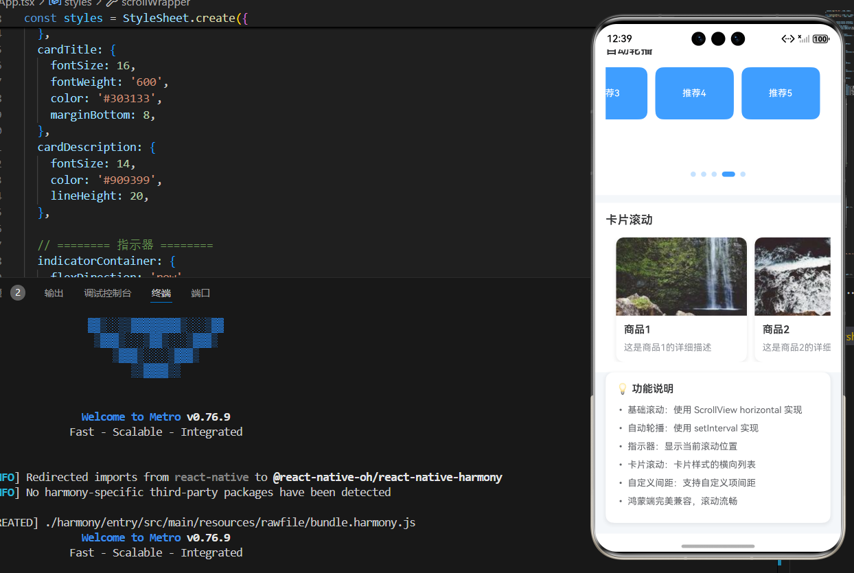
<Text style={styles.pageTitle}>React Native for Harmony</Text>
<Text style={styles.subtitle}>横向滚动组件</Text>
</View>
{/* 基础横向滚动 */}
<View style={styles.section}>
<Text style={styles.sectionTitle}>基础横向滚动</Text>
<HorizontalScroll
items={mockItems}
itemWidth={120}
spacing={12}
showIndicator={true}
onItemPress={handleItemPress}
/>
</View>
{/* 自动轮播 */}
<View style={styles.section}>
<Text style={styles.sectionTitle}>自动轮播</Text>
<HorizontalScroll
items={mockItems}
itemWidth={120}
spacing={12}
showIndicator={true}
autoPlay={true}
autoPlayInterval={2000}
onItemPress={handleItemPress}
/>
</View>
{/* 卡片滚动 */}
<View style={styles.section}>
<Text style={styles.sectionTitle}>卡片滚动</Text>
<CardHorizontalScroll
items={mockCards}
cardWidth={200}
spacing={12}
onCardPress={handleCardPress}
/>
</View>
{/* 说明区域 */}
<View style={styles.infoCard}>
<Text style={styles.infoTitle}>💡 功能说明</Text>
<Text style={styles.infoText}>• 基础滚动:使用 ScrollView horizontal 实现</Text>
<Text style={styles.infoText}>• 自动轮播:使用 setInterval 实现</Text>
<Text style={styles.infoText}>• 指示器:显示当前滚动位置</Text>
<Text style={styles.infoText}>• 卡片滚动:卡片样式的横向列表</Text>
<Text style={styles.infoText}>• 自定义间距:支持自定义项间距</Text>
<Text style={styles.infoText}>• 鸿蒙端完美兼容,滚动流畅</Text>
</View>
</ScrollView>
</SafeAreaView>
);
};
const styles = StyleSheet.create({
container: {
flex: 1,
backgroundColor: '#F5F7FA',
},
scrollView: {
flex: 1,
},
// ======== 标题区域 ========
header: {
padding: 20,
backgroundColor: '#FFFFFF',
borderBottomWidth: 1,
borderBottomColor: '#EBEEF5',
},
pageTitle: {
fontSize: 24,
fontWeight: '700',
color: '#303133',
textAlign: 'center',
marginBottom: 8,
},
subtitle: {
fontSize: 16,
fontWeight: '500',
color: '#909399',
textAlign: 'center',
},
// ======== 区域 ========
section: {
marginTop: 12,
backgroundColor: '#FFFFFF',
padding: 16,
},
sectionTitle: {
fontSize: 18,
fontWeight: '600',
color: '#303133',
marginBottom: 16,
},
// ======== 横向滚动容器 ========
scrollWrapper: {
position: 'relative',
},
scrollContainer: {
paddingHorizontal: 16,
},
// ======== 滚动项 ========
scrollItem: {
backgroundColor: '#409EFF',
borderRadius: 12,
justifyContent: 'center',
alignItems: 'center',
height: 80,
},
scrollItemText: {
color: '#FFFFFF',
fontSize: 14,
fontWeight: '500',
},
// ======== 卡片项 ========
cardContainer: {
paddingHorizontal: 16,
},
cardItem: {
backgroundColor: '#FFFFFF',
borderRadius: 12,
overflow: 'hidden',
shadowColor: '#000000',
shadowOffset: { width: 0, height: 2 },
shadowOpacity: 0.08,
shadowRadius: 8,
elevation: 4,
},
cardImage: {
width: '100%',
height: 120,
},
cardContent: {
padding: 12,
},
cardTitle: {
fontSize: 16,
fontWeight: '600',
color: '#303133',
marginBottom: 8,
},
cardDescription: {
fontSize: 14,
color: '#909399',
lineHeight: 20,
},
// ======== 指示器 ========
indicatorContainer: {
flexDirection: 'row',
justifyContent: 'center',
paddingVertical: 12,
},
indicator: {
width: 8,
height: 8,
borderRadius: 4,
backgroundColor: 'rgba(64, 158, 255, 0.3)',
},
activeIndicator: {
backgroundColor: '#409EFF',
width: 20,
},
// ======== 信息卡片 ========
infoCard: {
backgroundColor: '#FFFFFF',
borderRadius: 12,
padding: 16,
margin: 16,
marginTop: 0,
shadowColor: '#000000',
shadowOffset: { width: 0, height: 2 },
shadowOpacity: 0.08,
shadowRadius: 8,
elevation: 4,
},
infoTitle: {
fontSize: 16,
fontWeight: '600',
color: '#303133',
marginBottom: 12,
},
infoText: {
fontSize: 14,
color: '#606266',
lineHeight: 22,
marginBottom: 6,
},
});
export default App;

欢迎加入开源鸿蒙跨平台社区:https://openharmonycrossplatform.csdn.net

作为“人工智能6S店”的官方数字引擎,为AI开发者与企业提供一个覆盖软硬件全栈、一站式门户。
更多推荐
 4
4 0
0- 0


 已为社区贡献16条内容

所有评论(0)