
Flutter for OpenHarmony移动数据使用监管助手App实战 - 流量限额实现
流量限额功能帮助用户控制每日流量消耗,避免超额使用。通过直观的滑块设置、实时的使用量显示、灵活的应用限额管理,用户可以精细化控制自己的流量使用。欢迎加入开源鸿蒙跨平台社区:https://openharmonycrossplatform.csdn.net。
流量限额功能让用户可以设置每日流量上限,当使用量接近或超过限额时收到提醒。这个功能对于流量套餐有限的用户特别有用,可以有效避免超额使用导致的额外费用。通过合理设置限额,用户可以更好地规划每天的流量使用,确保月底不会出现流量不足的尴尬情况。
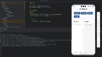
功能设计
流量限额页面需要实现以下核心功能:
- 全局每日流量限额设置,控制整体的流量消耗上限
- 单个应用的流量限额设置,针对高流量应用进行精细化管理
- 限额开关和阈值调整,用户可以灵活控制限额策略
- 当前使用量和剩余额度显示,让用户实时了解流量消耗情况
页面整体结构
class UsageLimitView extends GetView<UsageLimitController> {
const UsageLimitView({super.key});
Widget build(BuildContext context) {
return Scaffold(
backgroundColor: AppTheme.backgroundColor,
appBar: AppBar(
UsageLimitView继承GetView,通过controller属性访问控制器。Scaffold提供页面基础结构。
backgroundColor设置统一的背景色,AppBar是顶部导航栏。
        title: const Text('流量限额'),
        actions: [
          IconButton(
            icon: Icon(Icons.history),
            onPressed: () => _showLimitHistory(),
          ),
        ],
      ),
title设置页面标题。actions添加历史记录按钮,点击显示限额触发的历史记录。
用户可以回顾哪些时候超过了限额,帮助调整限额设置。
      body: SingleChildScrollView(
        padding: EdgeInsets.all(16.w),
        child: Column(
          children: [
            _buildDailyLimitCard(),
            SizedBox(height: 16.h),
            _buildCurrentUsage(),
body使用SingleChildScrollView支持滚动,padding设置16.w内边距。
Column垂直排列三个区域:每日限额卡片、当前使用情况、应用限额列表。
            SizedBox(height: 16.h),
            _buildAppLimitsSection(),
          ],
        ),
      ),
    );
  }
}
SizedBox添加16.h的垂直间距分隔各区域。_buildAppLimitsSection构建应用限额列表。
页面从上到下:全局设置、当前状态、细分控制,符合从整体到局部的认知习惯。
每日限额卡片
Widget _buildDailyLimitCard() {
  return Container(
    padding: EdgeInsets.all(20.w),
    decoration: BoxDecoration(
      color: Colors.white,
      borderRadius: BorderRadius.circular(16.r),
      boxShadow: [
Container创建卡片容器,内边距20.w,白色背景,圆角16.r。
boxShadow添加阴影效果,让卡片有悬浮感。
        BoxShadow(
          color: Colors.black.withOpacity(0.03),
          blurRadius: 10.r,
          offset: Offset(0, 4.h),
        ),
      ],
    ),
    child: Column(
      crossAxisAlignment: CrossAxisAlignment.start,
阴影使用3%透明度黑色,模糊半径10,向下偏移4像素,形成自然的投影。
Column垂直排列内容,crossAxisAlignment设置左对齐。
      children: [
        Row(
          mainAxisAlignment: MainAxisAlignment.spaceBetween,
          children: [
            Text('每日流量限额', style: TextStyle(fontSize: 18.sp, fontWeight: FontWeight.bold)),
            Obx(() => Switch(
Row横向排列标题和开关,spaceBetween让它们分居两端。
标题18sp粗体,是卡片的主标题。Obx包裹Switch响应状态变化。
              value: controller.dailyLimitEnabled.value,
              onChanged: (v) => controller.dailyLimitEnabled.value = v,
              activeColor: AppTheme.primaryColor,
            )),
          ],
        ),
        SizedBox(height: 8.h),
        Text('开启后,当日流量超过限额时会收到提醒', style: TextStyle(fontSize: 13.sp, color: AppTheme.textSecondary)),
Switch绑定dailyLimitEnabled状态,onChanged更新状态值。activeColor设置开启时的颜色。
说明文字13sp次要颜色,解释功能作用。
        SizedBox(height: 20.h),
        _buildLimitSlider(),
        SizedBox(height: 16.h),
        _buildQuickOptions(),
      ],
    ),
  );
}
SizedBox添加间距。_buildLimitSlider构建限额滑块,_buildQuickOptions构建快捷选项按钮。
卡片结构:标题+开关、说明文字、滑块、快捷选项。
限额滑块
Widget _buildLimitSlider() {
  return Obx(() {
    final isEnabled = controller.dailyLimitEnabled.value;
    return Column(
      children: [
        Row(
          mainAxisAlignment: MainAxisAlignment.center,
Obx包裹整个滑块区域,响应dailyLimitEnabled和dailyLimit的变化。
isEnabled缓存启用状态,避免重复访问。Column垂直排列数字显示和滑块。
          children: [
            Text(
              '${controller.dailyLimit.value.toStringAsFixed(1)}',
              style: TextStyle(fontSize: 48.sp, fontWeight: FontWeight.bold,
                color: isEnabled ? AppTheme.primaryColor : Colors.grey),
            ),
            SizedBox(width: 8.w),
限额数值用48sp超大字号显示,是视觉焦点。toStringAsFixed(1)保留一位小数。
颜色根据启用状态变化:启用时蓝色,禁用时灰色。SizedBox添加间距。
            Text('GB/天', style: TextStyle(fontSize: 16.sp,
              color: isEnabled ? AppTheme.primaryColor : Colors.grey)),
          ],
        ),
        SizedBox(height: 16.h),
        Slider(
          value: controller.dailyLimit.value,
单位"GB/天"16sp,颜色同样根据状态变化。SizedBox添加16.h间距。
Slider是Flutter的滑块组件,value绑定dailyLimit值。
          min: 0.5, max: 5.0, divisions: 9,
          onChanged: isEnabled ? (v) => controller.dailyLimit.value = v : null,
        ),
      ],
    );
  });
}
min和max设置滑块范围0.5-5GB,divisions分成9档,每档0.5GB。
onChanged在启用时更新值,禁用时传null使滑块不可操作。
快捷选项
Widget _buildQuickOptions() {
  final options = [0.5, 1.0, 2.0, 3.0];
  return Row(
    mainAxisAlignment: MainAxisAlignment.spaceEvenly,
    children: options.map((value) {
      return Obx(() => GestureDetector(
options定义四个常用限额值。Row横向排列,spaceEvenly均匀分布。
map遍历生成按钮,Obx响应状态变化,GestureDetector处理点击。
        onTap: controller.dailyLimitEnabled.value
            ? () => controller.dailyLimit.value = value : null,
        child: Container(
          padding: EdgeInsets.symmetric(horizontal: 16.w, vertical: 8.h),
          decoration: BoxDecoration(
onTap在启用时设置限额值,禁用时传null不响应点击。
Container创建按钮容器,水平内边距16.w,垂直内边距8.h。
            color: controller.dailyLimit.value == value
                ? AppTheme.primaryColor : Colors.grey.shade100,
            borderRadius: BorderRadius.circular(20.r),
          ),
          child: Text('${value.toStringAsFixed(1)} GB',
            style: TextStyle(fontSize: 13.sp, fontWeight: FontWeight.w500,
背景色根据是否选中变化:选中时主色调,未选中时浅灰色。圆角20.r形成药丸形状。
文字显示限额值,13sp字号,中等粗细。
              color: controller.dailyLimit.value == value ? Colors.white : AppTheme.textSecondary)),
        ),
      ));
    }).toList(),
  );
}
文字颜色:选中时白色,未选中时次要颜色。toList()将map结果转为列表。
快捷选项让用户一键设置常用值,比拖动滑块更快捷。
当前使用情况
Widget _buildCurrentUsage() {
  return Container(
    padding: EdgeInsets.all(16.w),
    decoration: BoxDecoration(
      gradient: LinearGradient(colors: [AppTheme.primaryColor, AppTheme.primaryColor.withOpacity(0.8)]),
      borderRadius: BorderRadius.circular(16.r),
    ),
Container使用渐变背景,从主色调到80%透明度,形成从左到右变浅的效果。
圆角16.r,内边距16.w。渐变背景让这个卡片更突出。
    child: Obx(() {
      final used = controller.todayUsed.value;
      final limit = controller.dailyLimit.value;
      final percentage = controller.dailyLimitEnabled.value ? (used / limit * 100).clamp(0, 100) : 0.0;
      return Column(
Obx响应数据变化。计算使用百分比,clamp限制在0-100范围内。
如果限额未启用,百分比显示为0。Column垂直排列内容。
        children: [
          Row(
            mainAxisAlignment: MainAxisAlignment.spaceBetween,
            children: [
              Text('今日已使用', style: TextStyle(fontSize: 14.sp, color: Colors.white70)),
              Text('${percentage.toStringAsFixed(1)}%', style: TextStyle(fontSize: 14.sp, fontWeight: FontWeight.bold, color: Colors.white)),
            ],
          ),
Row显示标签和百分比,spaceBetween分居两端。标签用70%白色,百分比用纯白粗体。
在深色背景上,白色文字清晰可见。
          SizedBox(height: 12.h),
          LinearProgressIndicator(
            value: percentage / 100,
            backgroundColor: Colors.white.withOpacity(0.3),
            valueColor: AlwaysStoppedAnimation(percentage >= 90 ? Colors.red : Colors.white),
          ),
SizedBox添加间距。LinearProgressIndicator显示进度条,value需要0-1的值。
背景色30%白色,进度色根据百分比变化:超过90%显示红色警告,否则白色。
          SizedBox(height: 12.h),
          Row(
            mainAxisAlignment: MainAxisAlignment.spaceBetween,
            children: [
              Text('${used.toStringAsFixed(2)} GB', style: TextStyle(fontSize: 20.sp, fontWeight: FontWeight.bold, color: Colors.white)),
              Text('剩余 ${(limit - used).clamp(0, limit).toStringAsFixed(2)} GB', style: TextStyle(fontSize: 14.sp, color: Colors.white70)),
            ],
          ),
        ],
      );
    }),
  );
}
底部Row显示已使用量和剩余量。已使用20sp大字号粗体白色,剩余14sp次要白色。
clamp确保剩余量不会显示负数。双数据展示让用户同时了解两个维度。
应用限额区域
Widget _buildAppLimitsSection() {
  return Container(
    decoration: BoxDecoration(color: Colors.white, borderRadius: BorderRadius.circular(16.r)),
    child: Column(
      children: [
        Padding(
          padding: EdgeInsets.all(16.w),
Container创建白色圆角卡片。Column垂直排列标题区域和列表。
Padding为标题区域添加16.w内边距。
          child: Row(
            mainAxisAlignment: MainAxisAlignment.spaceBetween,
            children: [
              Text('应用流量限额', style: TextStyle(fontSize: 16.sp, fontWeight: FontWeight.w600)),
              TextButton(onPressed: () => _showAddAppDialog(), child: Text('添加应用')),
            ],
          ),
        ),
Row横向排列标题和添加按钮。标题16sp半粗体,TextButton是文字按钮。
点击"添加应用"弹出对话框选择要设置限额的应用。
        Divider(height: 1),
        _buildAppLimitsList(),
      ],
    ),
  );
}
Divider添加1像素高的分隔线。_buildAppLimitsList构建应用限额列表。
分隔线将标题区域和列表区域视觉上分开。
Controller实现
class UsageLimitController extends GetxController {
  final dailyLimitEnabled = false.obs;
  final dailyLimit = 1.0.obs;
  final todayUsed = 0.0.obs;
  final appLimits = <Map<String, dynamic>>[].obs;
  final availableApps = ['微信', 'QQ', '抖音', '哔哩哔哩', '淘宝', '支付宝'];
声明响应式变量:dailyLimitEnabled是开关状态,dailyLimit是限额值,todayUsed是今日使用量。
appLimits是应用限额列表,availableApps是可选择的应用列表。.obs转为响应式。
  void addAppLimit(String name, int limit) {
    appLimits.add({'name': name, 'limit': limit, 'enabled': true});
    saveSettings();
  }

  void updateAppLimit(String name, int limit) {
    final index = appLimits.indexWhere((app) => app['name'] == name);
addAppLimit添加应用限额,创建包含name、limit、enabled的Map并添加到列表。
updateAppLimit更新应用限额,indexWhere查找应用在列表中的索引。
    if (index != -1) {
      appLimits[index]['limit'] = limit;
      appLimits.refresh();
    }
  }

  void removeAppLimit(String name) {
    appLimits.removeWhere((app) => app['name'] == name);
  }
}
找到后更新limit值,调用refresh()通知GetX数据变化。removeAppLimit删除指定应用的限额。
removeWhere删除满足条件的元素。每个操作后都应调用saveSettings保存到本地。
写在最后
流量限额功能帮助用户控制每日流量消耗,避免超额使用。通过直观的滑块设置、实时的使用量显示、灵活的应用限额管理,用户可以精细化控制自己的流量使用。
欢迎加入开源鸿蒙跨平台社区:https://openharmonycrossplatform.csdn.net

作为“人工智能6S店”的官方数字引擎,为AI开发者与企业提供一个覆盖软硬件全栈、一站式门户。
更多推荐

 6
6 0
0- 0


 已为社区贡献3条内容

所有评论(0)