
Flutter 框架跨平台鸿蒙开发 —— ElevatedButton 与 TextButton 详解
ElevatedButton 和 TextButton 是 Flutter 中最常用的两种按钮类型,分别用于主要操作和次要操作。本篇文章深入讲解这两种按钮的详细用法和样式定制。),),child: Text('圆角按钮'),// 胶囊形按钮),child: Text('胶囊按钮'),),),child: Text('带背景和边框'),:主要操作,带阴影和填充,使用styleFrom定制样式Text
·
示例代码
import 'package:flutter/material.dart';
void main() => runApp(const ElevatedTextButtonApp());
class ElevatedTextButtonApp extends StatelessWidget {
const ElevatedTextButtonApp({Key? key}) : super(key: key);
Widget build(BuildContext context) {
return MaterialApp(
debugShowCheckedModeBanner: false,
home: Scaffold(
appBar: AppBar(title: const Text('ElevatedButton 与 TextButton')),
body: const SingleChildScrollView(
padding: EdgeInsets.all(16),
child: Column(
crossAxisAlignment: CrossAxisAlignment.start,
children: [
ElevatedButtonStylesExample(),
SizedBox(height: 20),
ElevatedButtonWithIconExample(),
SizedBox(height: 20),
TextButtonStylesExample(),
SizedBox(height: 20),
TextButtonWithIconExample(),
],
),
),
),
);
}
}
class ElevatedButtonStylesExample extends StatelessWidget {
const ElevatedButtonStylesExample({Key? key}) : super(key: key);
Widget build(BuildContext context) {
return Card(
child: Column(
crossAxisAlignment: CrossAxisAlignment.start,
children: [
Padding(
padding: const EdgeInsets.all(12),
child: Text(
'示例1:ElevatedButton 样式',
style: TextStyle(fontWeight: FontWeight.bold, fontSize: 16),
),
),
const Padding(
padding: EdgeInsets.all(16),
child: Column(
children: [
ElevatedButton(
onPressed: () {},
child: Text('默认样式'),
),
SizedBox(height: 12),
ElevatedButton(
onPressed: () {},
style: ElevatedButton.styleFrom(
backgroundColor: Colors.green,
),
child: Text('绿色按钮'),
),
SizedBox(height: 12),
ElevatedButton(
onPressed: () {},
style: ElevatedButton.styleFrom(
backgroundColor: Colors.orange,
),
child: Text('橙色按钮'),
),
],
),
),
const SizedBox(height: 12),
],
),
);
}
}
class ElevatedButtonWithIconExample extends StatelessWidget {
const ElevatedButtonWithIconExample({Key? key}) : super(key: key);
Widget build(BuildContext context) {
return Card(
child: Column(
crossAxisAlignment: CrossAxisAlignment.start,
children: [
Padding(
padding: const EdgeInsets.all(12),
child: Text(
'示例2:ElevatedButton 带图标',
style: TextStyle(fontWeight: FontWeight.bold, fontSize: 16),
),
),
const Padding(
padding: EdgeInsets.all(16),
child: Column(
children: [
ElevatedButton.icon(
onPressed: () {},
icon: Icon(Icons.save),
label: Text('保存'),
),
SizedBox(height: 12),
ElevatedButton.icon(
onPressed: () {},
icon: Icon(Icons.cloud_upload),
label: Text('上传'),
style: ElevatedButton.styleFrom(
backgroundColor: Colors.blue,
),
),
SizedBox(height: 12),
ElevatedButton.icon(
onPressed: () {},
icon: Icon(Icons.delete),
label: Text('删除'),
style: ElevatedButton.styleFrom(
backgroundColor: Colors.red,
),
),
],
),
),
const SizedBox(height: 12),
],
),
);
}
}
class TextButtonStylesExample extends StatelessWidget {
const TextButtonStylesExample({Key? key}) : super(key: key);
Widget build(BuildContext context) {
return Card(
child: Column(
crossAxisAlignment: CrossAxisAlignment.start,
children: [
Padding(
padding: const EdgeInsets.all(12),
child: Text(
'示例3:TextButton 样式',
style: TextStyle(fontWeight: FontWeight.bold, fontSize: 16),
),
),
const Padding(
padding: EdgeInsets.all(16),
child: Column(
children: [
TextButton(
onPressed: () {},
child: Text('默认样式'),
),
SizedBox(height: 12),
TextButton(
onPressed: () {},
style: TextButton.styleFrom(
foregroundColor: Colors.green,
),
child: Text('绿色文本'),
),
SizedBox(height: 12),
TextButton(
onPressed: () {},
style: TextButton.styleFrom(
foregroundColor: Colors.purple,
),
child: Text('紫色文本'),
),
],
),
),
const SizedBox(height: 12),
],
),
);
}
}
class TextButtonWithIconExample extends StatelessWidget {
const TextButtonWithIconExample({Key? key}) : super(key: key);
Widget build(BuildContext context) {
return Card(
child: Column(
crossAxisAlignment: CrossAxisAlignment.start,
children: [
Padding(
padding: const EdgeInsets.all(12),
child: Text(
'示例4:TextButton 带图标',
style: TextStyle(fontWeight: FontWeight.bold, fontSize: 16),
),
),
const Padding(
padding: EdgeInsets.all(16),
child: Column(
children: [
TextButton.icon(
onPressed: () {},
icon: Icon(Icons.cancel),
label: Text('取消'),
),
SizedBox(height: 12),
TextButton.icon(
onPressed: () {},
icon: Icon(Icons.help_outline),
label: Text('帮助'),
),
SizedBox(height: 12),
TextButton.icon(
onPressed: () {},
icon: Icon(Icons.info_outline),
label: Text('更多信息'),
),
],
),
),
const SizedBox(height: 12),
],
),
);
}
}
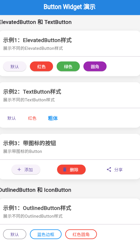
🚀 快速运行
示例应用
本篇文章的示例项目:flutter_examples/button_widget_demo_06
运行步骤
# 进入示例项目目录
cd flutter_examples/button_widget_demo_06

# 运行应用(鸿蒙虚拟机)
flutter run -d 127.0.0.1:5555

# 或运行应用(其他设备)
flutter run
演示内容
运行应用后,您将看到本篇文章的示例:
- 示例1:ElevatedButton 样式 - 展示不同颜色的 ElevatedButton
- 示例2:ElevatedButton 带图标 - 展示带图标的 ElevatedButton
- 示例3:TextButton 样式 - 展示不同颜色的 TextButton
- 示例4:TextButton 带图标 - 展示带图标的 TextButton
一、 前言
ElevatedButton 和 TextButton 是 Flutter 中最常用的两种按钮类型,分别用于主要操作和次要操作。本篇文章深入讲解这两种按钮的详细用法和样式定制。
二、 ElevatedButton 详解
2.1 ElevatedButton 构造函数
ElevatedButton({
  Key? key,
  required VoidCallback? onPressed,
  VoidCallback? onLongPress,
  ButtonStyle? style,
  FocusNode? focusNode,
  bool autofocus = false,
  Clip clipBehavior = Clip.none,
  required Widget child,
})
2.2 主要属性
| 属性 | 类型 | 说明 |
|---|---|---|
onPressed |
VoidCallback? | 点击回调,null 表示禁用 |
onLongPress |
VoidCallback? | 长按回调 |
style |
ButtonStyle? | 按钮样式 |
child |
Widget | 按钮内容(通常为 Text) |
autofocus |
bool | 是否自动聚焦 |
2.3 ElevatedButton.icon 构造函数
ElevatedButton.icon({
  Key? key,
  required VoidCallback? onPressed,
  VoidCallback? onLongPress,
  ButtonStyle? style,
  FocusNode? focusNode,
  bool autofocus = false,
  Clip clipBehavior = Clip.none,
  required Widget icon,
  required Widget label,
})
三、 ElevatedButton 样式定制
3.1 使用 styleFrom 方法
styleFrom 是设置按钮样式最简单的方法。
ElevatedButton(
  onPressed: () {},
  style: ElevatedButton.styleFrom(
    backgroundColor: Colors.green,  // 背景色
    foregroundColor: Colors.white,  // 文字颜色
    padding: EdgeInsets.symmetric(horizontal: 24, vertical: 12),
    textStyle: TextStyle(fontSize: 16),
  ),
  child: Text('自定义样式'),
)
3.2 styleFrom 参数说明
| 参数 | 类型 | 说明 | 默认值 |
|---|---|---|---|
backgroundColor |
MaterialStateProperty? | 背景色 | 主题色 |
foregroundColor |
MaterialStateProperty? | 前景色 | 白色 |
disabledBackgroundColor |
MaterialStateProperty? | 禁用背景色 | 灰色 |
disabledForegroundColor |
MaterialStateProperty? | 禁用前景色 | 灰色 |
elevation |
MaterialStateProperty? | 阴影高度 | 1.0 |
shadowColor |
MaterialStateProperty? | 阴影颜色 | 黑色 |
padding |
MaterialStateProperty? | 内边距 | (16, 24, 16, 24) |
minimumSize |
MaterialStateProperty? | 最小尺寸 | (88, 36) |
fixedSize |
MaterialStateProperty? | 固定尺寸 | null |
maximumSize |
MaterialStateProperty? | 最大尺寸 | infinity |
side |
MaterialStateProperty? | 边框 | null |
shape |
MaterialStateProperty? | 形状 | 圆角矩形 |
textStyle |
MaterialStateProperty? | 文本样式 | null |
3.3 不同状态的样式
ElevatedButton(
  onPressed: () {},
  style: ButtonStyle(
    backgroundColor: MaterialStateProperty.resolveWith((states) {
      if (states.contains(MaterialState.pressed)) {
        return Colors.blue.shade700;  // 按下时
      }
      if (states.contains(MaterialState.disabled)) {
        return Colors.grey.shade300;  // 禁用时
      }
      return Colors.blue;  // 默认
    }),
  ),
  child: Text('按下变色'),
)
3.4 自定义形状
ElevatedButton(
  onPressed: () {},
  style: ElevatedButton.styleFrom(
    shape: RoundedRectangleBorder(
      borderRadius: BorderRadius.circular(20),
    ),
  ),
  child: Text('圆角按钮'),
)

// 胶囊形按钮
ElevatedButton(
  onPressed: () {},
  style: ElevatedButton.styleFrom(
    shape: StadiumBorder(),
  ),
  child: Text('胶囊按钮'),
)
3.5 设置阴影
ElevatedButton(
  onPressed: () {},
  style: ElevatedButton.styleFrom(
    elevation: 8,  // 阴影高度
    shadowColor: Colors.blue.shade200,
  ),
  child: Text('高阴影按钮'),
)
四、 TextButton 详解
4.1 TextButton 构造函数
TextButton({
  Key? key,
  required VoidCallback? onPressed,
  VoidCallback? onLongPress,
  ButtonStyle? style,
  FocusNode? focusNode,
  bool autofocus = false,
  Clip clipBehavior = Clip.none,
  required Widget child,
})
4.2 主要属性
| 属性 | 类型 | 说明 |
|---|---|---|
onPressed |
VoidCallback? | 点击回调 |
onLongPress |
VoidCallback? | 长按回调 |
style |
ButtonStyle? | 按钮样式 |
child |
Widget | 按钮内容 |
4.3 TextButton.icon 构造函数
TextButton.icon({
  Key? key,
  required VoidCallback? onPressed,
  VoidCallback? onLongPress,
  ButtonStyle? style,
  FocusNode? focusNode,
  bool autofocus = false,
  Clip clipBehavior = Clip.none,
  required Widget icon,
  required Widget label,
})
五、 TextButton 样式定制
5.1 使用 styleFrom 方法
TextButton(
  onPressed: () {},
  style: TextButton.styleFrom(
    foregroundColor: Colors.green,
    padding: EdgeInsets.symmetric(horizontal: 16, vertical: 8),
    textStyle: TextStyle(fontSize: 16),
  ),
  child: Text('自定义样式'),
)
5.2 设置下划线
TextButton(
  onPressed: () {},
  style: TextButton.styleFrom(
    foregroundColor: Colors.blue,
  ),
  child: Text(
    '带下划线',
    style: TextStyle(decoration: TextDecoration.underline),
  ),
)
5.3 自定义形状和边框
TextButton(
  onPressed: () {},
  style: TextButton.styleFrom(
    backgroundColor: Colors.blue.shade50,
    shape: RoundedRectangleBorder(
      borderRadius: BorderRadius.circular(8),
      side: BorderSide(color: Colors.blue),
    ),
  ),
  child: Text('带背景和边框'),
)
六、 实战示例
6.1 表单提交按钮
Padding(
  padding: EdgeInsets.all(16),
  child: Row(
    children: [
      Expanded(
        child: TextButton(
          onPressed: () {},
          child: Text('取消'),
        ),
      ),
      SizedBox(width: 16),
      Expanded(
        child: ElevatedButton(
          onPressed: () {},
          child: Text('提交'),
        ),
      ),
    ],
  ),
)
6.2 带加载状态的按钮
class LoadingButton extends StatefulWidget {
_LoadingButtonState createState() => _LoadingButtonState();
}
class _LoadingButtonState extends State<LoadingButton> {
bool _isLoading = false;
void _submit() async {
setState(() => _isLoading = true);
await Future.delayed(Duration(seconds: 2));
setState(() => _isLoading = false);
}
Widget build(BuildContext context) {
return ElevatedButton(
onPressed: _isLoading ? null : _submit,
child: _isLoading
? SizedBox(
width: 20,
height: 20,
child: CircularProgressIndicator(strokeWidth: 2),
)
: Text('提交'),
);
}
}
6.3 危险操作按钮
ElevatedButton.icon(
  onPressed: () {
    // 显示确认对话框
    showDialog(
      context: context,
      builder: (context) => AlertDialog(
        title: Text('确认删除'),
        content: Text('此操作无法撤销'),
        actions: [
          TextButton(
            onPressed: () => Navigator.pop(context),
            child: Text('取消'),
          ),
          ElevatedButton(
            onPressed: () {
              Navigator.pop(context);
              // 执行删除
            },
            style: ElevatedButton.styleFrom(backgroundColor: Colors.red),
            child: Text('删除'),
          ),
        ],
      ),
    );
  },
  icon: Icon(Icons.delete),
  label: Text('删除'),
  style: ElevatedButton.styleFrom(backgroundColor: Colors.red),
)
七、 最佳实践
7.1 使用语义化颜色
// ✅ 推荐
ElevatedButton(
  style: ElevatedButton.styleFrom(backgroundColor: Colors.green),
  child: Text('成功'),
)

// ❌ 不推荐
ElevatedButton(
  style: ElevatedButton.styleFrom(backgroundColor: Colors.red),
  child: Text('成功'),
)
7.2 提供禁用状态
// ✅ 推荐
ElevatedButton(
  onPressed: _isValid ? () {} : null,
  child: Text('提交'),
)

// ❌ 不推荐
ElevatedButton(
  onPressed: _isValid ? () : null,
  child: Text('提交'),
)
7.3 合理使用图标
// ✅ 推荐:图标增强语义
ElevatedButton.icon(
  onPressed: () {},
  icon: Icon(Icons.save),
  label: Text('保存'),
)

// ❌ 不推荐:图标冗余
ElevatedButton.icon(
  onPressed: () {},
  icon: Icon(Icons.check),
  label: Text('确定'),
)
八、 总结
ElevatedButton 和 TextButton 是 Flutter 中最重要的按钮类型:
- ElevatedButton:主要操作,带阴影和填充,使用
styleFrom定制样式 - TextButton:次要操作,扁平透明,适合取消、帮助等操作
- 样式定制:使用
styleFrom方法轻松设置颜色、形状、阴影等 - 带图标:使用
.icon构造函数添加图标 - 最佳实践:使用语义化颜色、提供禁用状态、合理使用图标
记住,正确的按钮使用和样式定制可以显著提升用户体验。
参考资源
欢迎加入开源鸿蒙跨平台社区https://openharmonycrossplatform.csdn.net

作为“人工智能6S店”的官方数字引擎,为AI开发者与企业提供一个覆盖软硬件全栈、一站式门户。
更多推荐

 7
7 0
0- 0


 已为社区贡献2条内容

所有评论(0)