
鸿蒙应用开发之Tabs选项卡:仿微信底部导航全面解析,建议收藏
选项卡(Tabs)
Tabs组件可以在一个页面内快速实现视图内容的切换。Tabs组件的页面组成包含两个部分,分别是TabContent和TabBar,TabContent是内容页,TabBar是导航页签栏。
Tabs组件根据不同的导航类型,布局会有区别,可以分为底部导航、顶部导航、侧边导航。如下图所示
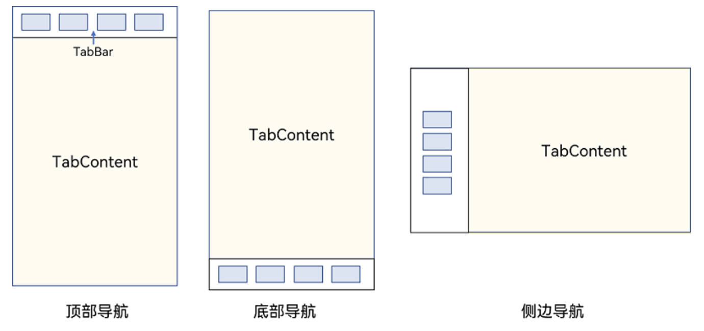
需要注意的是⚠️,TabContent组件不支持设置通用宽高属性,其宽度默认撑满Tabs父组件,其高度由Tabs父组件高度与TabBar组件高度决定。
基本使用
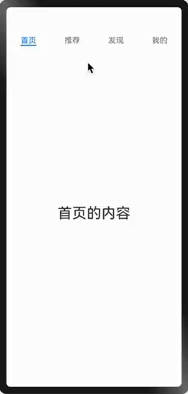
Tabs使用花括号包裹多个TabContent,表示多个内容页;每一个TabContent对应的内容需要有一个页签,可以通过TabContent的tabBar属性进行配置。
如下图所示
代码如下
@Entry
@Component
struct Index {
  build() {
    Column() {
      Tabs() {
        TabContent() {
          Text('首页的内容').fontSize(30)
        }
        .tabBar('首页')

        TabContent() {
          Text('推荐的内容').fontSize(30)
        }
        .tabBar('推荐')

        TabContent() {
          Text('发现的内容').fontSize(30)
        }
        .tabBar('发现')

        TabContent() {
          Text('我的内容').fontSize(30)
        }
        .tabBar("我的")
      }
    }
    .width("100%")
    .height("100%")
  }
}
设置导航栏位置
导航栏位置使用Tabs的barPosition属性和vertical属性共同决定,规则如下:
- 头部导航:
vertical值为false,barPosition值为Start - 底部导航:
vertical值为false,barPosition值为End - 左侧导航:
vertical值为true,barPosition值为Start - 右侧导航:
vertical值为true,barPosition值为End
[!Warning]
⚠️ 如果不配置
vertical属性和barPosition属性,默认为头部导航。
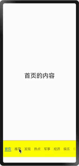
示例:将导航条显示在底部
Tabs() {
        //...
}
.vertical(false)
.barPosition(BarPosition.End)
导航条样式
导航条除了设置位置之外还可以设置其他样式,如宽度、背景颜色、是否可滚动等。Tabs组件提供了下列属性来设置TabBar样式。
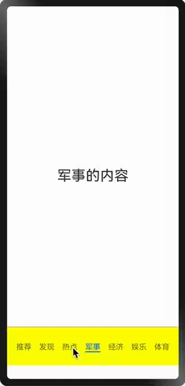
.barBackgroundColor(Color.Yellow)导航条背景颜色.barHeight(80)导航条高度.barWeight(80)导航条宽度.barMode(BarMode.Scrollable)导航条可滚动,默认可滚动.divider({strokeWidth:1, color:Color.Red})内容页与导航条之间的分割线
示例代码:
@Entry
@Component
struct Index {
  private tabBars:string[] = ["首页","推荐","发现","热点","军事","经济","娱乐","体育","生活","旅游","游戏","音乐"]

  build() {
    Column() {

      Tabs() {
        ForEach(this.tabBars,(item:string)=>{
          TabContent() {
            Text(item+'的内容').fontSize(30)
          }
          .tabBar(item)
        })
      }
      .vertical(false)
      .barPosition(BarPosition.End)
      .barBackgroundColor(Color.Yellow) //导航条背景颜色
      .barHeight(80)  //导航条高度
      .barMode(BarMode.Scrollable)  //导航条可滚动
      .divider({                    //TabContent与TabBar的分割线
        strokeWidth:1,
        color:Color.Red
      })
    }
    .width("100%")
    .height("100%")
  }
}
效果如下图
切换动画
通过.animationDuration属性用于设置Tabs切换内容页的动画持续时间,当值为0时表示无动画。
Tabs{
	//...
}.animationDuration(0) //无切换动画
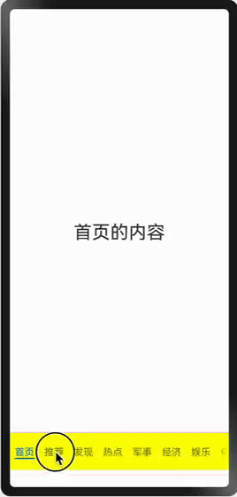
监听页签点击
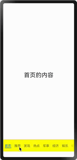
通过onTabBarClick(event: Callback<number>)事件监听TabBar页签点击。
Tabs() {
	//...
}
.onTabBarClick((index: number) => {
	promptAction.openToast({ message: `点击了第${index}个页签` })
}
效果如下图所示
监听页面切换
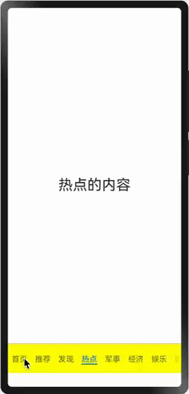
添加onChange()事件监听页面切换,可以是滑动切换,也可以是点击页签切换。
Tabs(){
	//...
}
.onChange((index: number) => {	//监听页面切换(滑动、点击页签)
	promptAction.openToast({ message: "第" + index + "页" })
})
[!Warning]
如果想要
Tabs禁止滑动,可以添加.scrollable(false)属性。
页面切换拦截
添加onContentWillChange(handler: OnTabsContentWillChangeCallback)事件,使Tabs具备切换拦截能力,新页面即将显示时触发该回调。该回调执行在onChange之前
满足以下任一条件,即可触发该事件:
- 滑动
TabContent切换新页面时触发。 - 通过
TabsController.changeIndex接口切换新页面时触发。 - 通过动态修改
index属性值切换新页面时触发。 - 通过点击
TabBar页签切换新页面时触发。 TabBar页签获焦后,通过键盘左右方向键等切换新页面时触发。
OnTabsContentWillChangeCallback
/*
参数:
- currentIndex: 当前页面索引
- comingIndex:  将要显示的新页面的index索引
返回:返回值为true时,可以切换到新页面;返回值为false,无法切换到新页面
*/
type OnTabsContentWillChangeCallback =
	(currentIndex: number, comingIndex: number) => boolean
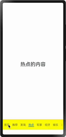
示例:从第3页切换到第4页时阻止切换
Tabs(){
    //...
}
.onContentWillChange((currentIndex: number, comingIndex: number) => {
    if (currentIndex==3 && comingIndex===4) {
      console.log("从第3页滑到第4页")
      return false //阻止滑动
    }
    return true
})
效果如下图所示
监听切换动画
如果需要在切换动画开始或者结束时设置监听,可以给Tabs添加onAnimationStart()和onAnimationEnd()回调。动画监听回调函数执行在onContentWillChange()回调之后onChange()回调之前。
Tabs(){
    //...
}
.onChange((index: number) => {
	console.log("已经切换到" + index + "页面")
})
.onContentWillChange((currentIndex: number, comingIndex: number) => {
    console.log("准备从第" + currentIndex + "页面到" + comingIndex + "页面")
    return true
})
.onAnimationStart((currentIndex: number, targetIndex: number) => {
	console.log("从第" + currentIndex + "页面到" + targetIndex + "页面动画开始")
})
.onAnimationEnd((currentIndex: number) => {
	console.log(currentIndex + "页面动画开始")
})
假设从index为0切换到index为1的页面时,打印结果如下:
准备从第0页面到1页面
从第0页面到1页面动画开始
1页面动画开始
已经切换到1页面
自定义导航
很多时候导航页签是图片、文本组成,并且需要根据选中的页签改变图片和文本的颜色,此时就需要使用自定义导航。
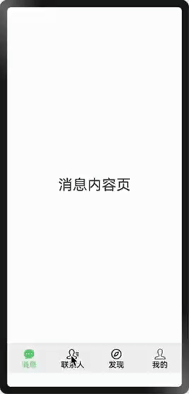
如下图,模仿微信底部导航效果

1. 自定义导航页签
按照需求设计导航页签的布局结构,每一个页签包含选中图片、未选中图片、文本、索引四个参数,如果Tabs当前索引等于页签索引,则显示选中图片,并且改变文本颜色。
/*
title: 页签标题
targetIndex: 页签的索引
selectedImg: 选中时图标
normalImg: 未选中时
*/
//当前选中页签索引
@State currentIndex: number = 0
@Builder
tabBarItem(title: string, targetIndex: number, selectedImg: Resource, normalImg: Resource) {
  Column() {
    Image(this.currentIndex == targetIndex ? selectedImg : normalImg)
      .size({ width: 25, height: 25 })
    Text(title)
      .fontColor(this.currentIndex === targetIndex ? '#1698CE' : '#6B6B6B')
  }.width('100%').height(50).justifyContent(FlexAlign.Center)
  .onClick(() => {
    this.currentIndex = targetIndex
  })
}
2. 给内容页添加自定义页签
给TabContent添加.tabBar(this.tabBarItem(....)),传入页签文本、索引、选中图片、未选中图片。
代码如下
import { promptAction } from '@kit.ArkUI'


@Entry
@Component
struct Index {
  @State currentIndex: number = 0

  build() {
    Column() {
      Tabs({ index: $$this.currentIndex }) {
        TabContent() {
          Text("消息内容页").fontSize(30)
        }.tabBar(this.tabBarItem("消息", 0, $r('app.media.message_selected'), $r('app.media.message')))

        TabContent() {
          Text("联系人").fontSize(30)
        }.tabBar(this.tabBarItem("联系人", 1, $r('app.media.contacts_selected'), $r('app.media.contacts')))


        TabContent() {
          Text("发现").fontSize(30)
        }.tabBar(this.tabBarItem("发现", 2, $r('app.media.discover_selected'), $r('app.media.discover')))


        TabContent() {
          Text("我的").fontSize(30)
        }.tabBar(this.tabBarItem("我的", 3, $r('app.media.me_selected'), $r('app.media.me')))

      }
      .vertical(false)
      .barPosition(BarPosition.End)
      .barBackgroundColor("#F2F2F2") //导航条背景颜色
      .barHeight(60) //导航条高度
      .divider({ strokeWidth: 1 }) //分割线
      .animationDuration(0) //动画持续时间(0表示无动画)
      .onTabBarClick((index: number) => {
        promptAction.openToast({ message: `点击了第${index}个页签` })
      })
    }
    .width("100%")
    .height("100%")
  }

  @Builder
  tabBarItem(title: string, index: number, selectedImg: ResourceStr, normalImg: ResourceStr) {
    Column() {
      Image(this.currentIndex == index ? selectedImg : normalImg)
        .size({ width: 25, height: 25 })
        .fillColor(this.currentIndex === index ? '#5FCF73' : '#000000')
      Text(title)
        .fontColor(this.currentIndex === index ? '#5FCF73' : '#000000')
    }
    .width("100%")
    .height("100%")
    .alignItems(HorizontalAlign.Center)
    .justifyContent(FlexAlign.Center)
  }
}
对鸿蒙感兴趣的同学,可以考免费取鸿蒙开发者认证

作为“人工智能6S店”的官方数字引擎,为AI开发者与企业提供一个覆盖软硬件全栈、一站式门户。
更多推荐


 22
22 0
0- 0


 已为社区贡献8条内容

所有评论(0)