
鸿蒙学习实战之路-RelativeLayout相对布局全攻略
如果想让某个子元素和其他元素对齐方式不一样怎么办?比如其他元素都左对齐,就它右对齐?鸿蒙提供了alignSelf.alignSelf(HorizontalAlign.End) // 单独设置这个元素右对齐线性布局的基本概念(Row/Column、主轴/交叉轴)子元素间距设置(space 属性)主轴对齐(justifyContent)交叉轴对齐(alignItems/alignSelf)自适应布局技
鸿蒙学习实战之路-线性布局 Row_Column 全攻略
最近好多朋友问我:“鸿蒙开发的布局咋这么难?写个页面调来调去总是不对齐,是不是我没天赋?” o(╯□╰)o
今天这篇,我就手把手带你搞定鸿蒙最基础也是最常用的线性布局(Row/Column),相当于给你配齐鸿蒙布局的"锅碗瓢盆",以后写页面就像炒菜一样顺手!
一、啥是线性布局?
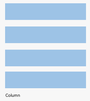
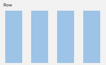
线性布局是鸿蒙开发中最常用的布局方式,就像咱们排队买奶茶,要么竖排(Column)要么横排(Row),简单直接!
- Column:子元素垂直排列,主轴是上下方向
- Row:子元素水平排列,主轴是左右方向
(Column 垂直排列示意图)
(Row 水平排列示意图)
二、基础概念先搞懂
在开始写代码之前,咱们先把几个关键概念搞清楚,不然写起来像无头苍蝇:
- 布局容器:就是 Row/Column 这些能装其他元素的"容器",负责计算子元素尺寸和排列
- 布局子元素:容器里面的各种元素,比如 Text、Image、Button 这些
- 主轴:布局的主要方向,Row 的主轴是水平,Column 的主轴是垂直
- 交叉轴:和主轴垂直的方向,Row 的交叉轴是垂直,Column 的交叉轴是水平
🥦 西兰花小贴士:
这些概念其实和 CSS 的 Flex 布局很像,前端同学可以直接类比理解,学起来更快!
三、实战演练:从简单到复杂
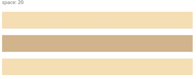
1. 第一步:设置子元素间距
写布局第一件事,就是给子元素留点呼吸空间!鸿蒙提供了space属性,一行代码搞定等间距排列:
Column 垂直间距示例:
Column({ space: 20 }) {  // 设置子元素垂直间距为20
  Text('space: 20').fontSize(15).fontColor(Color.Gray).width('90%')
  Row().width('90%').height(50).backgroundColor(0xF5DEB3)  // 西兰花色的方块^_^
  Row().width('90%').height(50).backgroundColor(0xD2B48C)  // 花菜色的方块^_^
  Row().width('90%').height(50).backgroundColor(0xF5DEB3)
}.width('100%')
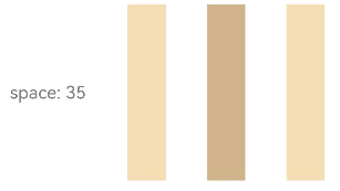
Row 水平间距示例:
Row({ space: 35 }) {  // 设置子元素水平间距为35
  Text('space: 35').fontSize(15).fontColor(Color.Gray)
  Row().width('10%').height(150).backgroundColor(0xF5DEB3)
  Row().width('10%').height(150).backgroundColor(0xD2B48C)
  Row().width('10%').height(150).backgroundColor(0xF5DEB3)
}.width('90%')
2. 第二步:主轴对齐方式
子元素在主轴上怎么排列?是靠左还是靠右?还是均匀分布?这就需要justifyContent属性了:
Column 垂直排列示例:
// 居中对齐
Column({}) {
  Column() {}.width('80%').height(50).backgroundColor(0xF5DEB3)
  Column() {}.width('80%').height(50).backgroundColor(0xD2B48C)
  Column() {}.width('80%').height(50).backgroundColor(0xF5DEB3)
}.width('100%').height(300).backgroundColor('rgb(242,242,242)')
.justifyContent(FlexAlign.Center)  // 垂直居中
常见的主轴对齐值:
| 值 | 效果 |
|---|---|
FlexAlign.Start |
主轴起始对齐(默认) |
FlexAlign.Center |
主轴居中对齐 |
FlexAlign.End |
主轴结束对齐 |
FlexAlign.SpaceBetween |
两端对齐,中间均匀分布 |
FlexAlign.SpaceAround |
每个元素两侧间距相等 |
FlexAlign.SpaceEvenly |
所有间距(包括首尾)都相等 |
3. 第三步:交叉轴对齐方式
主轴搞完了,交叉轴怎么对齐?比如 Row 里面的元素是顶部对齐还是垂直居中?这就需要alignItems属性:
Row 垂直对齐示例:
// 垂直居中对齐
Row({}) {
  Column() {}.width('20%').height(30).backgroundColor(0xF5DEB3)
  Column() {}.width('20%').height(30).backgroundColor(0xD2B48C)
  Column() {}.width('20%').height(30).backgroundColor(0xF5DEB3)
}.width('100%').height(200).backgroundColor('rgb(242,242,242)')
.alignItems(VerticalAlign.Center)  // 垂直居中
常见的交叉轴对齐值:
- Column 容器(交叉轴是水平):
HorizontalAlign.Start/Center/End - Row 容器(交叉轴是垂直):
VerticalAlign.Top/Center/Bottom
🥦 西兰花警告:
别搞混主轴和交叉轴!很多新手一开始写不对布局,就是因为把这两个轴的对齐属性搞反了,一定要记住:justifyContent管主轴,alignItems管交叉轴!
4. 第四步:单个元素自定义对齐
如果想让某个子元素和其他元素对齐方式不一样怎么办?比如其他元素都左对齐,就它右对齐?
鸿蒙提供了alignSelf属性,专门用来覆盖单个元素的交叉轴对齐方式:
Column({}) {
  Column() {}.width('80%').height(50).backgroundColor(0xF5DEB3)
  Column() {}.width('80%').height(50).backgroundColor(0xD2B48C)
  .alignSelf(HorizontalAlign.End)  // 单独设置这个元素右对齐
  Column() {}.width('80%').height(50).backgroundColor(0xF5DEB3)
}.width('100%').alignItems(HorizontalAlign.Start).backgroundColor('rgb(242,242,242)')
5. 第五步:自适应布局
在不同尺寸的设备上,布局要能自适应调整,鸿蒙提供了几种常用的自适应方式:
自适应拉伸
使用flexGrow属性,让子元素自动拉伸填充剩余空间:
Row({}) {
  Column() {}.width('20%').height(30).backgroundColor(0xF5DEB3)
  Column() {}.width('20%').height(30).backgroundColor(0xD2B48C)
  .flexGrow(1)  // 这个元素自动拉伸填充剩余空间
  Column() {}.width('20%').height(30).backgroundColor(0xF5DEB3)
}.width('100%').height(100).backgroundColor('rgb(242,242,242)')
自适应延伸
当内容太多一屏放不下时,我们可以用滚动条来展示:
Column() {
  Text('自适应延伸示例').fontSize(20).margin({ bottom: 20 })
  Column({ space: 10 }) {
    // 假设有很多内容
    ForEach(new Array(20), (_, index) => {
      Row().width('100%').height(50).backgroundColor(index % 2 === 0 ? 0xF5DEB3 : 0xD2B48C)
    })
  }
  .width('100%')
  .height(200)
  .scrollable(true)  // 开启滚动
}
.width('100%')
.padding(20)
四、常见布局场景实战
1. 登录页面布局
Column() {
  Text('用户登录').fontSize(30).margin({ bottom: 50 })

  Column({ space: 20 }) {
    TextInput({ placeholder: '请输入用户名' })
      .width('80%')
      .height(50)
      .backgroundColor(Color.White)
      .borderRadius(8)

    TextInput({ placeholder: '请输入密码' })
      .width('80%')
      .height(50)
      .backgroundColor(Color.White)
      .borderRadius(8)
      .type(InputType.Password)

    Button('登录')
      .width('80%')
      .height(50)
      .backgroundColor(0x3366FF)
      .fontColor(Color.White)
      .borderRadius(8)
  }
}
.width('100%')
.height('100%')
.backgroundColor('rgb(242,242,242)')
.justifyContent(FlexAlign.Center)
2. 底部导航栏布局
Row() {
  Column({ space: 5 }) {
    Image($r('app.media.home')).width(24).height(24)
    Text('首页').fontSize(12)
  }.flexGrow(1).alignItems(HorizontalAlign.Center)

  Column({ space: 5 }) {
    Image($r('app.media.category')).width(24).height(24)
    Text('分类').fontSize(12)
  }.flexGrow(1).alignItems(HorizontalAlign.Center)

  Column({ space: 5 }) {
    Image($r('app.media.cart')).width(24).height(24)
    Text('购物车').fontSize(12)
  }.flexGrow(1).alignItems(HorizontalAlign.Center)

  Column({ space: 5 }) {
    Image($r('app.media.mine')).width(24).height(24)
    Text('我的').fontSize(12)
  }.flexGrow(1).alignItems(HorizontalAlign.Center)
}
.width('100%')
.height(60)
.backgroundColor(Color.White)
.borderTop({ width: 1, color: 0xF0F0F0 })
五、性能优化小技巧
- 避免嵌套过深:布局嵌套不要超过 3 层,不然渲染性能会下降
- 合理设置宽高:尽量使用百分比或固定值,避免不必要的计算
- 使用 flexGrow 代替固定宽度:在需要自适应的场景下,flexGrow 比计算百分比更高效
- 减少重排重绘:避免频繁修改布局属性,尽量使用状态管理来控制
🥦 西兰花小贴士:
DevEco Studio 有个布局边界工具,可以帮助你查看布局的渲染边界,优化性能!
六、总结与下一步
今天咱们学会了:
- 线性布局的基本概念(Row/Column、主轴/交叉轴)
- 子元素间距设置(space 属性)
- 主轴对齐(justifyContent)
- 交叉轴对齐(alignItems/alignSelf)
- 自适应布局技巧
- 实际布局场景应用
现在你已经掌握了鸿蒙布局的基础技能,就像学会了切菜、炒菜的基本动作,接下来可以开始做更复杂的"菜品"了!
👉 预告:《鸿蒙学习实战之路-弹性布局 Flex 全攻略》
📚 推荐资料:
- 官方文档:线性布局开发指南
- 视频教程:开发者学堂-布局开发
我是盐焗西兰花,
不教理论,只给你能跑的代码和避坑指南。
下期见!🥦

作为“人工智能6S店”的官方数字引擎,为AI开发者与企业提供一个覆盖软硬件全栈、一站式门户。
更多推荐

 12
12 0
0- 0


 已为社区贡献26条内容

所有评论(0)