
鸿蒙学习实战之路-样式&结构重用全攻略
样式&结构重用是提高代码质量和开发效率的关键技巧,就像厨房的各种工具,用好它们可以让你的开发过程更加顺畅!
鸿蒙学习实战之路-样式&结构重用全攻略
最近在写鸿蒙页面时,发现代码里重复的样式和结构越来越多,就像炒西兰花时每次都要重新切、重新洗,真的太麻烦了 o(╯□╰)o
今天这篇,我就手把手带你搞定鸿蒙中的样式&结构重用技巧,让你的代码像预制菜一样,随用随取,高效又整洁!
一、为什么需要样式&结构重用?
想象一下,你正在做一个电商首页,里面有 10 个功能入口,每个入口都是"图标+文字"的结构,样式也都差不多。如果每个都写一遍相同的代码,不仅浪费时间,后期维护也会疯掉!
这时候,样式&结构重用就像是厨房的预制菜——提前准备好,要用的时候直接下锅,省时又省力!
二、@Styles:抽取公共样式和事件
@Styles 就像是一把"通用菜刀",可以把公共的样式和事件抽取出来,让多个组件共享。
2.1 基本用法
// 全局定义
@Styles function globalSize() {
  .width(100)
  .height(100)
}

@Entry
@Component
struct StyleReuseExample {
  @State bgColor: ResourceColor = Color.Gray

  build() {
    Column({ space: 10 }) {
      Text('@Styles 示例')
        .fontSize(20)
        .fontWeight(900)
        .padding(10)

      // 使用全局@Styles
      Column() {
      }
      .globalSize()
      .setBgColor()

      // 使用组件内@Styles
      Button('按钮')
        .globalSize()
        .setBgColor()
    }
    .width('100%')
    .height('100%')
  }

  // 组件内定义
  @Styles setBgColor() {
    .backgroundColor(this.bgColor)
    .onClick(() => {
      this.bgColor = Color.Yellow
    })
  }
}
🥦 西兰花警告
- @Styles 不支持传递参数,只能固定样式
- 组件内的@Styles 可以通过
this访问组件状态- 可以继续添加样式覆盖@Styles 中定义的内容
三、@Extend:扩展特定组件的样式
@Extend 就像是一把"专用菜刀",专门为某个组件扩展样式和事件,还支持传递参数!
3.1 基本用法
// 全局定义,只能用于Text组件
@Extend(Text) function textExtend(color: ResourceColor, message: string) {
  .textAlign(TextAlign.Center)
  .backgroundColor(color)
  .fontColor(Color.White)
  .fontSize(30)
  .onClick(() => {
    AlertDialog.show({ message: message })
  })
}

@Entry
@Component
struct ExtendExample {
  build() {
    Column() {
      Text('@Extend 示例')
        .fontSize(20)
        .fontWeight(900)
        .padding(10)

      Swiper() {
        Text('0').textExtend(Color.Red, '轮播图 1')
        Text('1').textExtend(Color.Green, '轮播图 2')
        Text('2').textExtend(Color.Blue, '轮播图 3')
      }
      .width('100%')
      .height(160)
    }
    .width('100%')
    .height('100%')
  }
}
🥦 西兰花小贴士
@Extend 只能定义在全局,扩展的组件和使用的组件必须同名,比如@Extend(Text)只能用于 Text 组件!
四、@Builder:结构、样式、事件一起抽
如果连结构也需要重用,那@Builder 就是你的"全能料理机"!它可以抽取完整的组件结构,包括样式和事件,还支持传递参数。
4.1 全局@Builder
// 全局定义
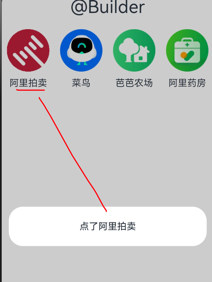
@Builder function globalNavItem(icon: ResourceStr, title: string) {
Column({ space: 10 }) {
Image(icon)
.width('80%')
Text(title)
}
.width('25%')
.onClick(() => {
AlertDialog.show({ message: '点了 ' + title })
})
}
@Entry
@Component
struct BuilderExample {
build() {
Column({ space: 20 }) {
Text('@Builder 示例')
.fontSize(20)
.fontWeight(900)
.padding(10)
Row() {
globalNavItem($r('app.media.ic_reuse_01'), '阿里拍卖')
globalNavItem($r('app.media.ic_reuse_02'), '菜鸟')
this.localNavItem($r('app.media.ic_reuse_03'), '芭芭农场')
this.localNavItem($r('app.media.ic_reuse_04'), '阿里药房')
}
}
.width('100%')
.height('100%')
}
// 组件内定义
@Builder localNavItem(icon: ResourceStr, title: string) {
Column({ space: 10 }) {
Image(icon)
.width('80%')
Text(title)
}
.width('25%')
.onClick(() => {
AlertDialog.show({ message: '点了 ' + title })
})
}
}
4.2 @LocalBuilder:组件内的构建函数
@LocalBuilder 是@Builder 的组件内版本,功能和@Builder 类似,但只能在组件内部使用。
@Entry
@Component
struct LocalBuilderExample {
  @State count: number = 0

  build() {
    Column({ space: 20 }) {
      Text('@LocalBuilder 示例')
        .fontSize(20)
        .fontWeight(900)
        .padding(10)

      // 使用本地构建函数
      this.countCard()

      Button('增加计数')
        .onClick(() => {
          this.count++
        })
    }
    .width('100%')
    .height('100%')
  }

  // 本地构建函数,只能在组件内部使用
  @LocalBuilder countCard() {
    Column() {
      Text('当前计数')
        .fontSize(18)
      Text(this.count.toString())
        .fontSize(30)
        .fontColor(Color.Red)
    }
    .width(200)
    .height(150)
    .backgroundColor(Color.White)
    .borderRadius(10)
    .shadow({ radius: 5 })
    .justifyContent(FlexAlign.Center)
  }
}
🥦 西兰花小贴士
@Builder 和@LocalBuilder 的区别:
- @Builder 可以全局定义和使用
- @LocalBuilder 只能在组件内部定义和使用
- 两者都可以传递参数,都能访问组件的状态
五、四种重用方式对比
| 名称 | 适合场景 | 是否支持参数 | 作用范围 |
|---|---|---|---|
| @Styles | 抽取公共样式、事件 | ❌ 不支持 | 全局或组件内 |
| @Extend | 抽取特定组件样式、事件 | ✅ 支持 | 只能全局 |
| @Builder | 抽取结构+样式+事件 | ✅ 支持 | 全局或组件内 |
| @LocalBuilder | 抽取组件内结构+样式+事件 | ✅ 支持 | 只能组件内 |
🥦 西兰花警告
@Styles 和@Extend 了解即可,@Builder 是重点!因为后期很多组件的参数必须结合@Builder 使用,比如 List 组件的 itemGenerator!
六、实战案例:电商首页功能入口
我们来用@Builder 实现一个电商首页的功能入口网格,就像淘宝首页那样的效果。
图片大伙可以自行替换为自己喜欢的
6.1 效果展示
6.2 参考代码
// 定义功能入口的数据结构
interface NavItemData {
  icon: ResourceStr
  title: string
}

@Entry
@Component
struct ECommerceHome {
  // 功能入口数据
  navItems: NavItemData[] = [
    { icon: $r('app.media.ic_reuse_01'), title: '阿里拍卖' },
    { icon: $r('app.media.ic_reuse_02'), title: '菜鸟' },
    { icon: $r('app.media.ic_reuse_03'), title: '芭芭农场' },
    { icon: $r('app.media.ic_reuse_04'), title: '阿里药房' },
    { icon: $r('app.media.ic_reuse_05'), title: '淘宝直播' },
    { icon: $r('app.media.ic_reuse_06'), title: '天猫超市' },
    { icon: $r('app.media.ic_reuse_07'), title: '飞猪旅行' },
    { icon: $r('app.media.ic_reuse_08'), title: '饿了么' }
  ]

  build() {
    Column() {
      Text('电商首页功能入口')
        .fontSize(20)
        .fontWeight(900)
        .padding(10)

      // 使用Grid布局展示功能入口
      Grid() {
        ForEach(this.navItems, (item: NavItemData) => {
          GridItem() {
            // 使用@Builder抽取的组件
            this.navItemBuilder(item.icon, item.title)
          }
        })
      }
      .columnsTemplate('1fr 1fr 1fr 1fr')
      .rowsTemplate('1fr 1fr')
      .width('100%')
      .height(200)
      .padding(10)
    }
    .width('100%')
    .height('100%')
  }

  // 抽取功能入口组件
  @Builder navItemBuilder(icon: ResourceStr, title: string) {
    Column({ space: 10 }) {
      Image(icon)
        .width('80%')
      Text(title)
        .fontSize(14)
    }
    .width('100%')
    .height('100%')
    .justifyContent(FlexAlign.Center)
    .onClick(() => {
      AlertDialog.show({ message: '您点击了:' + title })
    })
  }
}
🥦 西兰花小贴士
这个案例中,我们用@Builder 抽取了功能入口的组件,然后用 Grid 布局展示。这样不仅代码更整洁,而且如果以后要修改功能入口的样式,只需要改一处地方!
七、总结
样式&结构重用是提高代码质量和开发效率的关键技巧,就像厨房的各种工具,用好它们可以让你的开发过程更加顺畅!
核心知识点回顾
- @Styles:抽取公共样式和事件,不支持参数
- @Extend:扩展特定组件的样式和事件,支持参数
- @Builder:抽取结构+样式+事件,支持全局和局部使用
- @LocalBuilder:组件内的构建函数,只能在组件内部使用
实战技巧
- 简单样式重用用@Styles
- 特定组件样式重用用@Extend
- 复杂结构重用用@Builder 或@LocalBuilder
- 优先使用@Builder,因为它的功能最强大,适用场景最广
📚 推荐资料
- 官方文档:ArkTS 样式开发
- 官方文档:ArkTS 扩展样式
- 官方文档:ArkTS 构建函数
我是盐焗西兰花,
不教理论,只给你能跑的代码和避坑指南。
下期见!🥦

作为“人工智能6S店”的官方数字引擎,为AI开发者与企业提供一个覆盖软硬件全栈、一站式门户。
更多推荐

 8
8 0
0- 0


 已为社区贡献26条内容

所有评论(0)