
鸿蒙学习实战之路-Swiper 轮播组件全攻略
位置属性left/top/right/bottom:设置导航点距离 Swiper 边缘的距离样式属性itemWidth/itemHeight:默认指示器的宽高selectedItemWidth/selectedItemHeight:选中指示器的宽高color:默认指示器颜色selectedColor:选中指示器颜色@Entry@Componentbuild() {Column() {Text('S
🥦 鸿蒙学习实战之路-Swiper 轮播组件全攻略
最近好多朋友问我:“鸿蒙里的轮播图怎么搞啊?是不是和前端的 Swiper 差不多?” 哎,这你可问对人了!作为一个把 npm install 炒成 ohpm install 的前端厨子_,今天我就手把手带你搞定 HarmonyOS 里的 Swiper 轮播组件!
咱们今天的目标很明确:从 Swiper 的基本用法到高级定制,再到实际案例,包教包会!全程实操,没有虚的~
一、Swiper 组件是什么?
Swiper 组件提供滑动轮播显示的能力,本身是一个容器组件,当设置了多个子组件后,可以对这些子组件进行轮播显示。
你可以把它理解为前端的 Swiper 插件,但更原生、更贴合 HarmonyOS 的声明式 UI 体系。
看看这些常见的使用场景:

二、Swiper 基本用法
1. 设置轮播内容和尺寸
轮播内容很简单,直接作为 Swiper 的子组件即可。尺寸有两种设置方式:
- 设置 Swiper 的尺寸:内容会拉伸为和 Swiper 一致(优先级高)
- 设置内容尺寸:会将 Swiper 撑开
@Entry
@Component
struct SwiperBasic {
  build() {
    Column() {
      Text('Swiper基本使用')
        .fontSize(20)
        .fontWeight(900)
        .padding(10)
      Swiper() {
        Text('🥦 西兰花')
          .textAlign(TextAlign.Center)
          .backgroundColor(Color.Red)
          .fontColor(Color.White)
          .fontSize(30)
        Text('🍅 西红柿')
          .textAlign(TextAlign.Center)
          .backgroundColor(Color.Green)
          .fontColor(Color.White)
          .fontSize(30)
        Text('🥕 胡萝卜')
          .textAlign(TextAlign.Center)
          .backgroundColor(Color.Blue)
          .fontColor(Color.White)
          .fontSize(30)
      }
      .width('100%')
      .height(100)
    }
    .width('100%')
    .height('100%')
  }
}
运行效果就是这样滴:

🥦 西兰花小贴士:
建议优先设置 Swiper 的尺寸,这样可以更好地控制轮播区域的大小,避免内容撑开导致的布局问题。
三、Swiper 常用属性
设置了基础内容后,咱们来看看一些高频使用的属性:
| 属性名 | 类型 | 说明 | 默认值 |
|---|---|---|---|
| loop | boolean | 是否开启循环。在 LazyForEach 模式下,建议组件数量大于 5 个 | true |
| autoPlay | boolean | 是否自动播放 | false |
| interval | number | 自动播放时间间隔(毫秒) | 3000 |
| vertical | boolean | 是否纵向滑动 | false |
咱们来试试这些属性的效果,把轮播图调整为:自动播放、4 秒间隔、纵向滑动:
@Entry
@Component
struct SwiperAttributes {
  build() {
    Column() {
      Text('Swiper常用属性')
        .fontSize(20)
        .fontWeight(900)
        .padding(10)
      Swiper() {
        Text('0')
          .textAlign(TextAlign.Center)
          .backgroundColor(Color.Red)
          .fontColor(Color.White)
          .fontSize(30)
        Text('1')
          .textAlign(TextAlign.Center)
          .backgroundColor(Color.Green)
          .fontColor(Color.White)
          .fontSize(30)
        Text('2')
          .textAlign(TextAlign.Center)
          .backgroundColor(Color.Blue)
          .fontColor(Color.White)
          .fontSize(30)
      }
      .width('100%')
      .height(160)
      .loop(false) // 是否开启循环
      .autoPlay(true) // 自动播放
      .interval(4000) // 4秒切换一次
      .vertical(true) // 纵向滑动
    }
    .width('100%')
    .height('100%')
  }
}
效果如下:
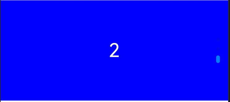
🥦 西兰花警告:
当 loop 为 false 时,自动轮播到最后一页会停止;但如果用户手动滑动后,只要不是最后一页,就会继续自动播放哦!别问我怎么知道的,都是泪…
四、导航点的调整
默认的导航点可能不符合你的设计需求,没关系,咱们可以自定义!
导航点的调整主要分两类:
- 显示或隐藏
- 导航点类型:
- 圆点指示器(重点掌握)
- 数字指示器(了解即可)
1. 基础控制
Swiper() {
  // 轮播内容
}
// .indicator(false) // 关闭导航点
// .indicator(Indicator.dot()) // 圆点指示器(默认)
// .indicator(Indicator.digit()) // 数字指示器
2. 自定义圆点导航点
日常开发中最常用的就是圆点指示器,咱们重点掌握如何调整它:
位置属性:
- left/top/right/bottom:设置导航点距离 Swiper 边缘的距离
样式属性:
- itemWidth/itemHeight:默认指示器的宽高
- selectedItemWidth/selectedItemHeight:选中指示器的宽高
- color:默认指示器颜色
- selectedColor:选中指示器颜色
来个实际例子:
@Entry
@Component
struct SwiperIndicator {
  build() {
    Column() {
      Text('Swiper导航点自定义')
        .fontSize(20)
        .fontWeight(900)
        .padding(10)
      Swiper() {
        Text('0')
          .textAlign(TextAlign.Center)
          .backgroundColor(Color.Red)
          .fontColor(Color.White)
          .fontSize(30)
        Text('1')
          .textAlign(TextAlign.Center)
          .backgroundColor(Color.Green)
          .fontColor(Color.White)
          .fontSize(30)
        Text('2')
          .textAlign(TextAlign.Center)
          .backgroundColor(Color.Blue)
          .fontColor(Color.White)
          .fontSize(30)
      }
      .width('100%')
      .height(160)
      .indicator(
        Indicator.dot()
          .left(10) // 左侧距离
          .bottom(10) // 底部距离
          .itemWidth(20) // 默认指示器宽度
          .itemHeight(20) // 默认指示器高度
          .selectedItemWidth(30) // 选中指示器宽度
          .selectedItemHeight(30) // 选中指示器高度
          .selectedColor(Color.Yellow) // 选中颜色
          .color(Color.Blue) // 默认颜色
      )
    }
    .width('100%')
    .height('100%')
  }
}
调整后的效果:
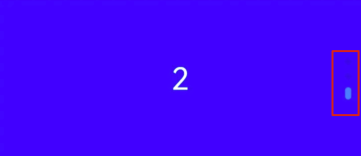
🥦 西兰花小贴士:
导航点的位置属性可以组合使用,不需要全部设置。比如想把导航点放在右下角,只需要设置.right(10)和.bottom(10)就可以啦!
五、实战案例-小米有品轮播图
光说不练假把式,咱们来实现一个小米有品首页的轮播效果:
代码中的图片素材可以替换为任意的内容
需求分析
- 宽高:100%、160
- 循环播放、自动轮播,间隔 4 秒
- 圆点指示器:
- 选中颜色:白色
- 选中宽高:30、4
- 默认宽高:10、4
实现代码
@Entry
@Component
struct SwiperXiaomiCase {
  build() {
    Column() {
      Text('Swiper案例-小米有品')
        .fontSize(20)
        .fontWeight(900)
        .padding(10)
      Swiper() {
        // 注意:这里的图片资源需要在你的项目中添加
        Image($r('app.media.ic_swiper_xmyp01'))
        Image($r('app.media.ic_swiper_xmyp02'))
        Image($r('app.media.ic_swiper_xmyp03'))
        Image($r('app.media.ic_swiper_xmyp04'))
      }
      .width('100%')
      .height(160)
      .loop(true) // 开启循环
      .autoPlay(true) // 自动播放
      .interval(4000) // 4秒间隔
      .indicator(
        Indicator.dot()
          .bottom(10) // 距离底部10vp
          .selectedColor(Color.White) // 选中颜色白色
          .selectedItemWidth(30) // 选中宽度30vp
          .selectedItemHeight(4) // 选中高度4vp
          .itemWidth(10) // 默认宽度10vp
          .itemHeight(4) // 默认高度4vp
          .color('#88FFFFFF') // 默认颜色半透明白色
      )
    }
    .width('100%')
    .height('100%')
  }
}
实现效果:

🥦 西兰花警告:
别忘记在你的项目资源文件夹里添加对应的轮播图片哦!可以去小米有品官网找几张样图,或者用自己的图片代替。
六、总结与技巧
重点回顾
- 基本用法:Swiper 作为容器组件,子组件即为轮播内容
- 核心属性:loop(循环)、autoPlay(自动播放)、interval(间隔)、vertical(方向)
- 导航点:支持圆点和数字两种类型,可自定义位置和样式
- 实战案例:通过小米有品轮播图掌握综合应用
高级技巧
- 懒加载:结合 LazyForEach 使用,可以高效加载大量轮播内容
- 事件监听:可以监听 change 事件,实现轮播切换时的联动效果
- 手势控制:支持触摸滑动,用户体验更好
🥦 西兰花小贴士:
当轮播内容很多时,记得使用 LazyForEach 懒加载,这样可以提高性能,避免一次性加载所有内容导致的卡顿!
👉 下一步行动
今天咱们搞定了 Swiper 轮播组件,是不是超简单?o(╯□╰)o 其实鸿蒙里的很多组件都和前端有相似之处,只要掌握了规律,学习起来并不难~
📚 推荐资料:
- 官方文档:Swiper 组件
- 组件参考:Swiper API
我是盐焗西兰花,
不教理论,只给你能跑的代码和避坑指南。
下期见!🥦

作为“人工智能6S店”的官方数字引擎,为AI开发者与企业提供一个覆盖软硬件全栈、一站式门户。
更多推荐

 8
8 0
0- 0


 已为社区贡献26条内容

所有评论(0)