
【精通篇】打造React Native鸿蒙跨平台开发高级复合组件库开发系列:Slider 滑块(用于在给定的范围内选择一个值)
本文介绍了在华为鸿蒙系统(HarmonyOS)上开发滑动条(Slider)组件的两种方法。首先需要安装HarmonyOS DevEco Studio开发环境并创建项目,然后可通过XML布局文件或JavaScript代码添加Slider组件。XML方式通过定义DirectionalLayout和Slider标签实现,而代码方式则使用@ohos.ui.Slider模块创建实例并设置参数。文章详细说明了
鸿蒙(HarmonyOS)是华为公司开发的一款面向全场景的分布式操作系统,旨在为各种设备提供一致的用户体验。如果你想在鸿蒙操作系统上开发一个包含滑动条(Slider)组件的应用,你可以使用华为提供的HarmonyOS SDK和开发工具。以下是使用鸿蒙开发环境创建和使用Slider组件的详细步骤:
- 环境准备
首先,确保你的开发环境已经安装了HarmonyOS SDK。你可以从华为开发者网站下载并安装HarmonyOS DevEco Studio。
-
创建项目
-
打开HarmonyOS DevEco Studio。
-
选择“File” > “New” > “Project…”。
-
在弹出的窗口中选择“HarmonyOS”选项卡,然后选择“Empty Ability”或根据你的需求选择合适的模板,点击“Next”。
-
填写项目名称、位置等信息,点击“Finish”创建项目。
-
添加Slider组件
在项目中,你可以通过XML布局文件或使用代码的方式来添加Slider组件。
使用XML布局文件
- 打开
pages/index目录下的index.xml文件。 - 在XML布局文件中添加Slider组件:
<DirectionalLayout
    ohos:height="match_parent"
    ohos:width="match_parent"
    ohos:orientation="vertical">

    <Slider
        ohos:id="$+id:slider"
        ohos:height="match_content"
        ohos:width="match_parent"
        ohos:max="100"
        ohos:min="0"
        ohos:value="50" />
</DirectionalLayout>
使用代码添加Slider组件
-
打开
pages/index目录下的index.js文件。 -
在
onInit方法中添加Slider组件:import slider from '@ohos.ui.Slider'; import abilityUI from '@ohos.app.ability.UIAbility'; import layoutConfig from '@ohos.app.ability.LayoutConfig'; export default { onCreate(want, launchParam) { console.log('onCreate'); }, onWindowStageCreate(windowStage) { // Get the window on which to place the UI content. let window = this.context.ability.getWindow(); window.addDrawTask((component) => { // Create a Slider component. let slider = slider.create(); slider.setProgressValue(50); // Set initial value slider.setProgressColor('FF0000'); // Set progress color slider.setTrackColor('CCCCCC'); // Set track color slider.setTrackHeight(30); // Set track height in pixels slider.setProgressHeight(30); // Set progress height in pixels slider.setRange(0, 100); // Set min and max values // Add the Slider to the layout. component.addComponent(slider); // Adjust the layout configuration of the Slider component. let layoutConfig = layoutConfig.create(); layoutConfig.setSizeSpec(layoutConfig.MATCH_PARENT, layoutConfig.MATCH_CONTENT); // Set width and height to match parent and content respectively slider.setLayoutConfig(layoutConfig); }); } } -
运行和测试应用
-
在HarmonyOS DevEco Studio中,选择“Run” > “Run ‘app’”。
-
选择目标设备或模拟器,然后点击“OK”开始编译和运行应用。
-
应用启动后,你应该能看到Slider组件,并可以拖动它来改变值。
-
调试和优化
如果Slider组件的行为不符合预期,你可以通过查看日志、调整参数或在代码中添加断点来进行调试。确保你的应用在不同设备和屏幕尺寸上都能正确运行。
以上就是在鸿蒙操作系统上开发包含Slider组件的详细步骤。希望这能帮助你开始你的鸿蒙应用开发!
import React, { useState } from 'react';
import { View, Text, StyleSheet, ScrollView, Dimensions, TouchableOpacity, PanResponder, Animated } from 'react-native';
// Simple Icon Component using Unicode symbols
interface IconProps {
name: string;
size?: number;
color?: string;
style?: object;
}
const Icon: React.FC<IconProps> = ({
name,
size = 24,
color = '#333333',
style
}) => {
const getIconSymbol = () => {
switch (name) {
case 'volume-low': return '🔈';
case 'volume-high': return '🔊';
case 'brightness-low': return '🔅';
case 'brightness-high': return '🔆';
case 'temperature-low': return '🧊';
case 'temperature-high': return '🔥';
case 'min': return '➖';
case 'max': return '➕';
case 'slider': return '🎚️';
default: return '🎚️';
}
};
return (
<View style={[{ width: size, height: size, justifyContent: 'center', alignItems: 'center' }, style]}>
<Text style={{ fontSize: size * 0.8, color, includeFontPadding: false, textAlign: 'center' }}>
{getIconSymbol()}
</Text>
</View>
);
};
// Slider Component
interface SliderProps {
value: number;
onValueChange: (value: number) => void;
min?: number;
max?: number;
step?: number;
disabled?: boolean;
showLabels?: boolean;
showValue?: boolean;
minIcon?: string;
maxIcon?: string;
color?: string;
trackHeight?: number;
}
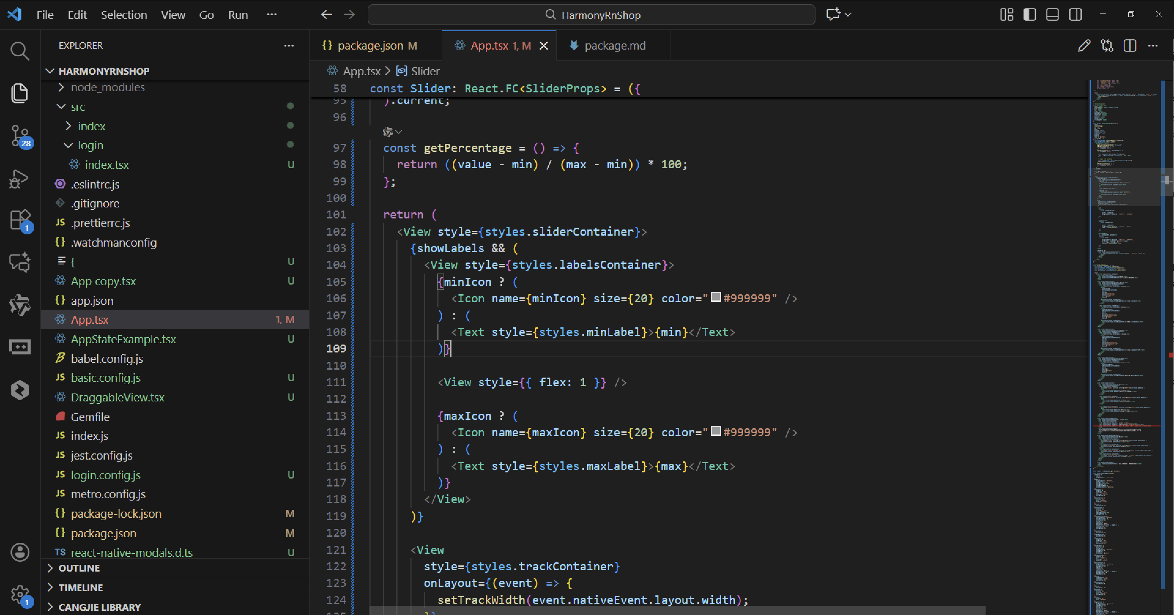
const Slider: React.FC<SliderProps> = ({
value,
onValueChange,
min = 0,
max = 100,
step = 1,
disabled = false,
showLabels = true,
showValue = true,
minIcon,
maxIcon,
color = '#1890ff',
trackHeight = 6
}) => {
const [trackWidth, setTrackWidth] = useState(0);
const panResponder = React.useRef(
PanResponder.create({
onStartShouldSetPanResponder: () => true,
onMoveShouldSetPanResponder: () => true,
onPanResponderGrant: () => {
if (disabled) return;
},
onPanResponderMove: (_, gestureState) => {
if (disabled) return;
const newValue = Math.min(max, Math.max(min,
min + ((gestureState.dx / trackWidth) * (max - min))
));
// Apply step rounding
const steppedValue = Math.round(newValue / step) * step;
onValueChange(steppedValue);
},
onPanResponderRelease: () => {
if (disabled) return;
},
})
).current;
const getPercentage = () => {
return ((value - min) / (max - min)) * 100;
};
return (
<View style={styles.sliderContainer}>
{showLabels && (
<View style={styles.labelsContainer}>
{minIcon ? (
<Icon name={minIcon} size={20} color="#999999" />
) : (
<Text style={styles.minLabel}>{min}</Text>
)}
<View style={{ flex: 1 }} />
{maxIcon ? (
<Icon name={maxIcon} size={20} color="#999999" />
) : (
<Text style={styles.maxLabel}>{max}</Text>
)}
</View>
)}
<View
style={styles.trackContainer}
onLayout={(event) => {
setTrackWidth(event.nativeEvent.layout.width);
}}
>
<View
style={[
styles.trackBackground,
{
height: trackHeight,
backgroundColor: disabled ? '#f0f0f0' : '#e8e8e8'
}
]}
/>
<Animated.View
style={[
styles.trackProgress,
{
height: trackHeight,
backgroundColor: disabled ? '#cccccc' : color,
width: `${getPercentage()}%`
}
]}
/>
<Animated.View
{...panResponder.panHandlers}
style={[
styles.thumb,
{
backgroundColor: disabled ? '#cccccc' : '#ffffff',
borderColor: disabled ? '#cccccc' : color,
left: `${getPercentage()}%`,
transform: [{ translateX: -12 }]
}
]}
/>
</View>
{showValue && (
<View style={styles.valueContainer}>
<Text style={[styles.valueText, { color: disabled ? '#999999' : color }]}>
{value}
</Text>
</View>
)}
</View>
);
};
// Main App Component
const SliderComponentApp = () => {
const [volume, setVolume] = useState(50);
const [brightness, setBrightness] = useState(75);
const [temperature, setTemperature] = useState(22);
const [priceRange, setPriceRange] = useState(1500);
return (
<ScrollView style={styles.container}>
<View style={styles.header}>
<Text style={styles.headerTitle}>滑块组件</Text>
<Text style={styles.headerSubtitle}>美观实用的滑动调节控件</Text>
</View>
<View style={styles.section}>
<Text style={styles.sectionTitle}>基础用法</Text>
<View style={styles.sliderGroupsContainer}>
<View style={styles.sliderGroup}>
<Text style={styles.sliderLabel}>音量调节</Text>
<Slider
value={volume}
onValueChange={setVolume}
min={0}
max={100}
minIcon="volume-low"
maxIcon="volume-high"
color="#1890ff"
showValue
/>
<View style={styles.valueDisplay}>
<Text style={styles.valueDisplayText}>当前音量: {volume}%</Text>
</View>
</View>
<View style={styles.sliderGroup}>
<Text style={styles.sliderLabel}>亮度调节</Text>
<Slider
value={brightness}
onValueChange={setBrightness}
min={0}
max={100}
minIcon="brightness-low"
maxIcon="brightness-high"
color="#faad14"
showValue
/>
<View style={styles.valueDisplay}>
<Text style={styles.valueDisplayText}>当前亮度: {brightness}%</Text>
</View>
</View>
</View>
</View>
<View style={styles.section}>
<Text style={styles.sectionTitle}>温度调节</Text>
<View style={styles.sliderGroupsContainer}>
<View style={styles.sliderGroup}>
<Text style={styles.sliderLabel}>空调温度</Text>
<Slider
value={temperature}
onValueChange={setTemperature}
min={16}
max={30}
step={0.5}
minIcon="temperature-low"
maxIcon="temperature-high"
color="#ff4d4f"
showValue
/>
<View style={styles.valueDisplay}>
<Text style={styles.valueDisplayText}>当前温度: {temperature}°C</Text>
</View>
</View>
</View>
</View>
<View style={styles.section}>
<Text style={styles.sectionTitle}>价格区间</Text>
<View style={styles.sliderGroupsContainer}>
<View style={styles.sliderGroup}>
<Text style={styles.sliderLabel}>预算范围</Text>
<Slider
value={priceRange}
onValueChange={setPriceRange}
min={0}
max={5000}
step={100}
color="#52c41a"
showValue
/>
<View style={styles.valueDisplay}>
<Text style={styles.valueDisplayText}>预算上限: ¥{priceRange}</Text>
</View>
</View>
</View>
</View>
<View style={styles.section}>
<Text style={styles.sectionTitle}>功能演示</Text>
<View style={styles.demosContainer}>
<View style={styles.demoItem}>
<Icon name="slider" size={24} color="#1890ff" style={styles.demoIcon} />
<View>
<Text style={styles.demoTitle}>滑动调节</Text>
<Text style={styles.demoDesc}>支持连续滑动调节数值</Text>
</View>
</View>
<View style={styles.demoItem}>
<Icon name="volume-high" size={24} color="#52c41a" style={styles.demoIcon} />
<View>
<Text style={styles.demoTitle}>步长控制</Text>
<Text style={styles.demoDesc}>支持自定义调节步长</Text>
</View>
</View>
<View style={styles.demoItem}>
<Icon name="temperature-high" size={24} color="#fa8c16" style={styles.demoIcon} />
<View>
<Text style={styles.demoTitle}>范围设定</Text>
<Text style={styles.demoDesc}>支持最小值和最大值设定</Text>
</View>
</View>
</View>
</View>
<View style={styles.usageSection}>
<Text style={styles.sectionTitle}>使用方法</Text>
<View style={styles.codeBlock}>
<Text style={styles.codeText}>{'<Slider'}</Text>
<Text style={styles.codeText}> value={'{sliderValue}'}</Text>
<Text style={styles.codeText}> onValueChange={'{setSliderValue}'}</Text>
<Text style={styles.codeText}> min={'{0}'} max={'{100}'} step={'{1}'}{'\n'}/></Text>
</View>
<Text style={styles.description}>
Slider组件提供了完整的滑块功能,包括连续滑动、步长控制、范围设定等。
通过value控制当前值,onValueChange处理值变化,支持自定义样式和图标。
</Text>
</View>
<View style={styles.featuresSection}>
<Text style={styles.sectionTitle}>功能特性</Text>
<View style={styles.featuresList}>
<View style={styles.featureItem}>
<Icon name="slider" size={20} color="#1890ff" style={styles.featureIcon} />
<Text style={styles.featureText}>连续滑动</Text>
</View>
<View style={styles.featureItem}>
<Icon name="volume-high" size={20} color="#52c41a" style={styles.featureIcon} />
<Text style={styles.featureText}>步长控制</Text>
</View>
<View style={styles.featureItem}>
<Icon name="temperature-high" size={20} color="#fa8c16" style={styles.featureIcon} />
<Text style={styles.featureText}>范围设定</Text>
</View>
<View style={styles.featureItem}>
<Icon name="brightness-high" size={20} color="#722ed1" style={styles.featureIcon} />
<Text style={styles.featureText}>自定义样式</Text>
</View>
</View>
</View>
<View style={styles.footer}>
<Text style={styles.footerText}>© 2023 滑块组件 | 现代化UI组件库</Text>
</View>
</ScrollView>
);
};
const { width } = Dimensions.get('window');
const styles = StyleSheet.create({
container: {
flex: 1,
backgroundColor: '#f6f8fa',
},
header: {
backgroundColor: '#ffffff',
paddingVertical: 30,
paddingHorizontal: 20,
marginBottom: 10,
borderBottomWidth: 1,
borderBottomColor: '#e1e4e8',
},
headerTitle: {
fontSize: 28,
fontWeight: '700',
color: '#24292e',
textAlign: 'center',
marginBottom: 5,
},
headerSubtitle: {
fontSize: 16,
color: '#586069',
textAlign: 'center',
},
section: {
marginBottom: 25,
},
sectionTitle: {
fontSize: 20,
fontWeight: '700',
color: '#24292e',
paddingHorizontal: 20,
paddingBottom: 15,
},
sliderGroupsContainer: {
backgroundColor: '#ffffff',
marginHorizontal: 15,
borderRadius: 12,
padding: 20,
elevation: 3,
shadowColor: '#000',
shadowOffset: { width: 0, height: 2 },
shadowOpacity: 0.08,
shadowRadius: 4,
marginBottom: 10,
},
sliderGroup: {
marginBottom: 25,
},
sliderGroupLast: {
marginBottom: 0,
},
sliderLabel: {
fontSize: 16,
fontWeight: '500',
color: '#24292e',
marginBottom: 15,
},
valueDisplay: {
marginTop: 15,
padding: 12,
backgroundColor: '#f1f8ff',
borderRadius: 8,
borderWidth: 1,
borderColor: '#c8e1ff',
},
valueDisplayText: {
fontSize: 16,
color: '#1890ff',
fontWeight: '500',
textAlign: 'center',
},
demosContainer: {
backgroundColor: '#ffffff',
marginHorizontal: 15,
borderRadius: 15,
padding: 20,
elevation: 3,
shadowColor: '#000',
shadowOffset: { width: 0, height: 2 },
shadowOpacity: 0.08,
shadowRadius: 4,
},
demoItem: {
flexDirection: 'row',
alignItems: 'center',
marginBottom: 20,
},
demoItemLast: {
marginBottom: 0,
},
demoIcon: {
marginRight: 15,
},
demoTitle: {
fontSize: 16,
fontWeight: '600',
color: '#24292e',
marginBottom: 3,
},
demoDesc: {
fontSize: 14,
color: '#586069',
},
usageSection: {
backgroundColor: '#ffffff',
marginHorizontal: 15,
borderRadius: 15,
padding: 20,
marginBottom: 20,
elevation: 3,
shadowColor: '#000',
shadowOffset: { width: 0, height: 2 },
shadowOpacity: 0.08,
shadowRadius: 4,
},
codeBlock: {
backgroundColor: '#24292e',
borderRadius: 8,
padding: 15,
marginBottom: 15,
},
codeText: {
fontFamily: 'monospace',
color: '#e1e4e8',
fontSize: 14,
lineHeight: 22,
},
description: {
fontSize: 15,
color: '#24292e',
lineHeight: 22,
},
featuresSection: {
backgroundColor: '#ffffff',
marginHorizontal: 15,
borderRadius: 15,
padding: 20,
marginBottom: 20,
elevation: 3,
shadowColor: '#000',
shadowOffset: { width: 0, height: 2 },
shadowOpacity: 0.08,
shadowRadius: 4,
},
featuresList: {
paddingLeft: 10,
},
featureItem: {
flexDirection: 'row',
alignItems: 'center',
marginBottom: 15,
},
featureIcon: {
marginRight: 15,
},
featureText: {
fontSize: 16,
color: '#24292e',
},
footer: {
paddingVertical: 20,
alignItems: 'center',
},
footerText: {
color: '#6a737d',
fontSize: 14,
},
// Slider Styles
sliderContainer: {
marginBottom: 10,
},
labelsContainer: {
flexDirection: 'row',
justifyContent: 'space-between',
marginBottom: 10,
},
minLabel: {
fontSize: 14,
color: '#999999',
},
maxLabel: {
fontSize: 14,
color: '#999999',
},
trackContainer: {
height: 30,
justifyContent: 'center',
},
trackBackground: {
position: 'absolute',
left: 0,
right: 0,
borderRadius: 3,
},
trackProgress: {
position: 'absolute',
left: 0,
top: 0,
bottom: 0,
borderRadius: 3,
},
thumb: {
position: 'absolute',
width: 24,
height: 24,
borderRadius: 12,
borderWidth: 2,
elevation: 3,
shadowColor: '#000',
shadowOffset: { width: 0, height: 2 },
shadowOpacity: 0.2,
shadowRadius: 2,
},
valueContainer: {
alignItems: 'center',
marginTop: 10,
},
valueText: {
fontSize: 16,
fontWeight: '600',
},
});
export default SliderComponentApp;
这段 React Native 滑块组件在鸿蒙系统上的技术实现涉及与鸿蒙 ACE 引擎的深度集成。
从 Icon 组件的 Unicode 符号映射机制来看,在鸿蒙的方舟编译器中,字符串常量经过深度优化,Unicode 符号的直接渲染比传统图标资源具有更好的内存管理效率。鸿蒙的渲染管线中,Text 组件针对 Emoji 和特殊符号进行了专门处理,这确保了在不同分辨率鸿蒙设备上图标显示的清晰度和一致性。
在 PanResponder 手势响应系统的实现中,代码通过 onPanResponderMove 事件监听用户拖拽操作。当用户在鸿蒙设备上进行拖拽时,gestureState.dx 参数捕获水平位移,结合 trackWidth 计算出新的数值。这种手势处理机制在鸿蒙的多点触控框架中需要与系统的触摸事件分发机制进行协调。
数值计算算法采用了边界检查和步进舍入的双重保障。Math.min(max, Math.max(min, …)) 确保结果始终在有效范围内,而 Math.round(newValue / step) * step 实现了步进值的精确控制。
在鸿蒙的弹性布局系统中,滑块组件的尺寸自适应需要特别关注。trackHeight 参数不仅影响轨道高度,还需要与鸿蒙的屏幕密度缩放机制进行匹配,确保在不同设备上获得一致的视觉效果。
getPercentage 函数通过简单的数学运算将当前值转换为百分比,这种算法在鸿蒙的分布式UI框架中能够保持计算的一致性。
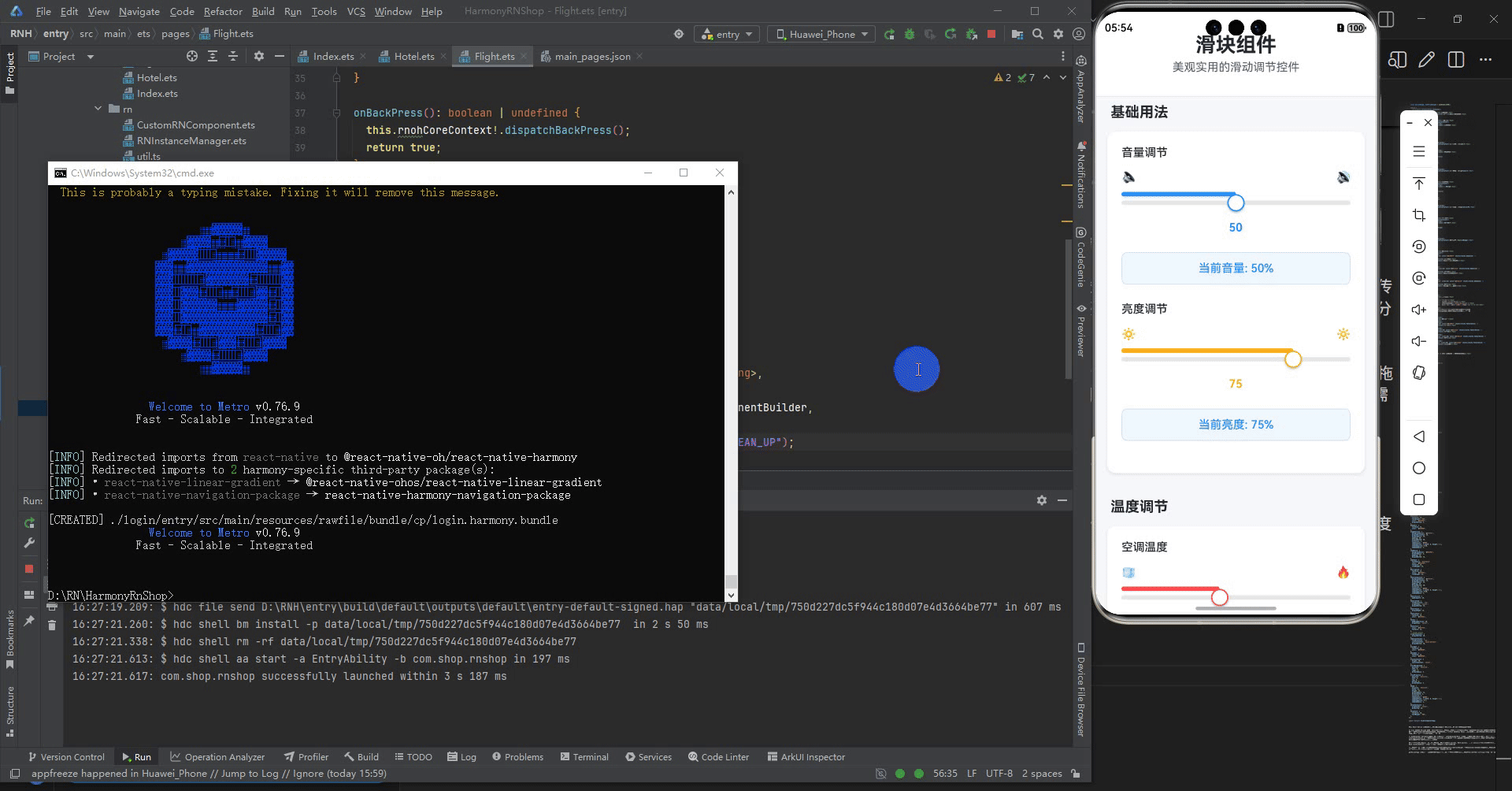
打包
接下来通过打包命令npn run harmony将reactNative的代码打包成为bundle,这样可以进行在开源鸿蒙OpenHarmony中进行使用。

打包之后再将打包后的鸿蒙OpenHarmony文件拷贝到鸿蒙的DevEco-Studio工程目录去:

最后运行效果图如下显示:

作为“人工智能6S店”的官方数字引擎,为AI开发者与企业提供一个覆盖软硬件全栈、一站式门户。
更多推荐


 11
11 0
0- 0


 已为社区贡献10条内容

所有评论(0)