
【精通篇】打造React Native鸿蒙跨平台开发高级复合组件库开发系列:Rate 评分(用于对事物进行评级操作)
React Native 中实现 Android 评分功能的两种方法:1) 使用第三方库 react-native-ratings 快速集成评分组件;2) 通过原生模块直接调用系统评分功能。文章详细介绍了两种方案的实现步骤,包括安装配置、原生模块开发(Java)和 JS 调用方式,特别针对鸿蒙OS兼容性提出了华为应用市场链接的替代方案。最后通过实际案例演示了自定义评分组件的实现,支持多种图标类型(
在 React Native 开发中,实现 Android 上的评分功能(例如在鸿蒙OS上),可以通过使用第三方库或者原生模块来实现。下面介绍几种常见的方法:
方法1:使用第三方库
- 使用
react-native-ratings
react-native-ratings 是一个流行的 React Native 库,用于在应用中添加评分功能。它支持自定义样式,易于集成。
步骤:
-
安装库:
npm install react-native-ratings 或者 yarn add react-native-ratings -
链接库(如果需要):
react-native link react-native-ratings -
使用组件:
import AirbnbRating from 'react-native-ratings';

const App = () => {
  return (
    <AirbnbRating />
  );
};

export default App;
方法2:使用原生模块
如果你需要更多的自定义或者想要直接与 Android 或 iOS 原生代码交互,你可以创建一个原生模块。
- 创建原生模块(Android)
步骤:
-
创建 Java 类:
在android/app/src/main/java/com/yourapp/RatingModule.java中创建以下代码:package com.yourapp; // 确保包名正确 import com.facebook.react.bridge.ReactApplicationContext; import com.facebook.react.bridge.ReactContextBaseJavaModule; import com.facebook.react.bridge.ReactMethod; import com.facebook.react.bridge.Callback; import android.content.Intent; import android.net.Uri; public class RatingModule extends ReactContextBaseJavaModule { ReactApplicationContext reactContext; public RatingModule(ReactApplicationContext reactContext) { super(reactContext); this.reactContext = reactContext; } @ReactMethod public void openPlayStoreRatingPage() { try { Uri uri = Uri.parse("market://details?id=" + reactContext.getPackageName()); Intent intent = new Intent(Intent.ACTION_VIEW, uri); intent.addFlags(Intent.FLAG_ACTIVITY_NEW_TASK); reactContext.startActivity(intent); } catch (android.content.ActivityNotFoundException e) { Uri uri = Uri.parse("https://play.google.com/store/apps/details?id=" + reactContext.getPackageName()); Intent intent = new Intent(Intent.ACTION_VIEW, uri); intent.addFlags(Intent.FLAG_ACTIVITY_NEW_TASK); reactContext.startActivity(intent); } } @Override public String getName() { return "RatingModule"; } } -
注册模块: 在
MainApplication.java中注册你的模块:import com.yourapp.RatingModule; // 确保导入你的模块类 ... @Override protected List<ReactPackage> getPackages() { return Arrays.<ReactPackage>asList( new MainReactPackage(), new RatingModule() // 添加你的模块到列表中 ); } -
在 JS 中调用:
import { NativeModules } from 'react-native';
const { RatingModule } = NativeModules; // 确保模块名称正确无误地引用它。
...
RatingModule.openPlayStoreRatingPage(); // 调用原生方法打开评分页面。
注意:这种方法主要用于打开 Google Play 的评分页面,而不是在应用内显示评分组件。如果你需要在应用内显示评分组件,建议使用方法1中的
react-native-ratings。对于鸿蒙OS的开发,确保你的应用兼容华为的商店和系统。你可能需要检查华为的 SDK 或者使用华为的应用市场链接。华为有自己的应用商店,类似于 Google Play,你可以通过类似的机制来引导用户到华为应用市场进行评分。例如,使用华为的 URI 方案appmarket://details?id=<packageName>来代替 Google Play 的 URI。确保在华为设备上进行适当的测试。
实际真实项目案例演示:
import React, { useState } from 'react';
import { View, Text, StyleSheet, ScrollView, Dimensions, TouchableOpacity } from 'react-native';

// Simple Icon Component using Unicode symbols
interface IconProps {
  name: string;
  size?: number;
  color?: string;
  style?: object;
}

const Icon: React.FC<IconProps> = ({
  name,
  size = 24,
  color = '#333333',
  style
}) => {
  const getIconSymbol = () => {
    switch (name) {
      case 'star-full': return '★';
      case 'star-empty': return '☆';
      case 'heart-full': return '❤️';
      case 'heart-empty': return '♡';
      case 'thumb-up': return '👍';
      case 'thumb-down': return '👎';
      case 'like': return '👍';
      case 'dislike': return '👎';
      case 'smile': return '😊';
      case 'sad': return '😞';
      default: return '★';
    }
  };

  return (
    <View style={[{ width: size, height: size, justifyContent: 'center', alignItems: 'center' }, style]}>
      <Text style={{ fontSize: size * 0.9, color, includeFontPadding: false, textAlign: 'center' }}>
        {getIconSymbol()}
      </Text>
    </View>
  );
};

// Rate Component
interface RateProps {
  value: number;
  onChange: (value: number) => void;
  count?: number;
  size?: number;
  color?: string;
  disabled?: boolean;
  allowHalf?: boolean;
  iconType?: 'star' | 'heart' | 'thumb';
  showText?: boolean;
}

const Rate: React.FC<RateProps> = ({
  value,
  onChange,
  count = 5,
  size = 30,
  color = '#faad14',
  disabled = false,
  allowHalf = false,
  iconType = 'star',
  showText = false
}) => {
  const [hoverValue, setHoverValue] = useState(0);

  const getIconNames = (filled: boolean) => {
    switch (iconType) {
      case 'heart':
        return filled ? 'heart-full' : 'heart-empty';
      case 'thumb':
        return filled ? 'thumb-up' : 'thumb-down';
      default:
        return filled ? 'star-full' : 'star-empty';
    }
  };

  const getTextDescription = (rating: number) => {
    if (iconType === 'thumb') {
      return rating > 0 ? '赞' : '踩';
    }

    const descriptions = ['极差', '较差', '一般', '良好', '优秀'];
    return descriptions[Math.min(Math.floor(rating) - 1, descriptions.length - 1)] || '';
  };

  const handlePress = (index: number, isHalf?: boolean) => {
    if (disabled) return;

    const newValue = isHalf ? index + 0.5 : index + 1;
    onChange(newValue);
  };

  const renderStars = () => {
    const stars = [];
    const displayValue = hoverValue || value;

    for (let i = 0; i < count; i++) {
      const starValue = i + 1;

      if (allowHalf && displayValue > i && displayValue < starValue) {
        // Half star
        stars.push(
          <View key={i} style={{ flexDirection: 'row' }}>
            <TouchableOpacity
              onPress={() => handlePress(i, true)}
              disabled={disabled}
              activeOpacity={disabled ? 1 : 0.7}
            >
              <Icon
                name={getIconNames(false)}
                size={size}
                color={disabled ? '#f0f0f0' : '#e8e8e8'}
              />
            </TouchableOpacity>
            <View style={{ position: 'absolute', overflow: 'hidden', width: size / 2 }}>
              <TouchableOpacity
                onPress={() => handlePress(i, true)}
                disabled={disabled}
                activeOpacity={disabled ? 1 : 0.7}
              >
                <Icon
                  name={getIconNames(true)}
                  size={size}
                  color={disabled ? '#f0f0f0' : color}
                />
              </TouchableOpacity>
            </View>
          </View>
        );
      } else {
        // Full star or empty star
        const isFilled = displayValue >= starValue;
        stars.push(
          <TouchableOpacity
            key={i}
            onPress={() => handlePress(i)}
            disabled={disabled}
            activeOpacity={disabled ? 1 : 0.7}
            onMouseEnter={() => !disabled && setHoverValue(starValue)}
            onMouseLeave={() => !disabled && setHoverValue(0)}
          >
            <Icon
              name={getIconNames(isFilled)}
              size={size}
              color={disabled ? '#f0f0f0' : isFilled ? color : '#e8e8e8'}
            />
          </TouchableOpacity>
        );
      }
    }

    return stars;
  };

  return (
    <View style={styles.rateContainer}>
      <View style={styles.starsContainer}>
        {renderStars()}
      </View>
      {showText && (
        <Text style={[styles.rateText, { color }]}>
          {getTextDescription(value)}
        </Text>
      )}
      {showText && iconType !== 'thumb' && (
        <Text style={styles.rateValue}>
          {value.toFixed(1)}
        </Text>
      )}
    </View>
  );
};

// Main App Component
const RateComponentApp = () => {
  const [productRating, setProductRating] = useState(3.5);
  const [serviceRating, setServiceRating] = useState(4);
  const [contentRating, setContentRating] = useState(5);
  const [thumbRating, setThumbRating] = useState(1);
  const [heartRating, setHeartRating] = useState(4);

  return (
    <ScrollView style={styles.container}>
      <View style={styles.header}>
        <Text style={styles.headerTitle}>评分组件</Text>
        <Text style={styles.headerSubtitle}>美观实用的星级评分控件</Text>
      </View>

      <View style={styles.section}>
        <Text style={styles.sectionTitle}>基础用法</Text>
        <View style={styles.rateGroupsContainer}>
          <View style={styles.rateGroup}>
            <Text style={styles.rateLabel}>商品评价</Text>
            <Rate
              value={productRating}
              onChange={setProductRating}
              showText
            />
          </View>

          <View style={styles.rateGroup}>
            <Text style={styles.rateLabel}>服务态度</Text>
            <Rate
              value={serviceRating}
              onChange={setServiceRating}
              allowHalf
              showText
            />
          </View>

          <View style={styles.rateGroup}>
            <Text style={styles.rateLabel}>内容质量</Text>
            <Rate
              value={contentRating}
              onChange={setContentRating}
              count={10}
              showText
            />
          </View>
        </View>
      </View>

      <View style={styles.section}>
        <Text style={styles.sectionTitle}>不同图标</Text>
        <View style={styles.rateGroupsContainer}>
          <View style={styles.rateGroup}>
            <Text style={styles.rateLabel}>点赞评价</Text>
            <Rate
              value={thumbRating}
              onChange={setThumbRating}
              iconType="thumb"
              showText
            />
          </View>

          <View style={styles.rateGroup}>
            <Text style={styles.rateLabel}>喜爱程度</Text>
            <Rate
              value={heartRating}
              onChange={setHeartRating}
              iconType="heart"
              color="#ff4d4f"
              allowHalf
              showText
            />
          </View>
        </View>
      </View>

      <View style={styles.section}>
        <Text style={styles.sectionTitle}>评分统计</Text>
        <View style={styles.statsSection}>
          <View style={styles.statCard}>
            <Text style={styles.statLabel}>平均评分</Text>
            <Text style={styles.statValue}>4.2</Text>
            <View style={styles.statStars}>
              <Icon name="star-full" size={16} color="#faad14" />
              <Icon name="star-full" size={16} color="#faad14" />
              <Icon name="star-full" size={16} color="#faad14" />
              <Icon name="star-full" size={16} color="#faad14" />
              <Icon name="star-empty" size={16} color="#e8e8e8" />
            </View>
          </View>

          <View style={styles.statCard}>
            <Text style={styles.statLabel}>参与人数</Text>
            <Text style={styles.statValue}>1,248</Text>
            <Text style={styles.statDesc}>人已评分</Text>
          </View>

          <View style={styles.statCard}>
            <Text style={styles.statLabel}>推荐度</Text>
            <Text style={styles.statValue}>92%</Text>
            <Text style={styles.statDesc}>用户推荐</Text>
          </View>
        </View>
      </View>

      <View style={styles.section}>
        <Text style={styles.sectionTitle}>功能演示</Text>
        <View style={styles.demosContainer}>
          <View style={styles.demoItem}>
            <Icon name="star-full" size={24} color="#faad14" style={styles.demoIcon} />
            <View>
              <Text style={styles.demoTitle}>星级评分</Text>
              <Text style={styles.demoDesc}>支持整星和半星评分</Text>
            </View>
          </View>

          <View style={styles.demoItem}>
            <Icon name="heart-full" size={24} color="#ff4d4f" style={styles.demoIcon} />
            <View>
              <Text style={styles.demoTitle}>多种图标</Text>
              <Text style={styles.demoDesc}>支持星星、爱心、拇指等多种图标</Text>
            </View>
          </View>

          <View style={styles.demoItem}>
            <Icon name="thumb-up" size={24} color="#1890ff" style={styles.demoIcon} />
            <View>
              <Text style={styles.demoTitle}>自定义样式</Text>
              <Text style={styles.demoDesc}>可自定义颜色、大小和数量</Text>
            </View>
          </View>
        </View>
      </View>

      <View style={styles.usageSection}>
        <Text style={styles.sectionTitle}>使用方法</Text>
        <View style={styles.codeBlock}>
          <Text style={styles.codeText}>{'<Rate'}</Text>
          <Text style={styles.codeText}>  value={'{rating}'}</Text>
          <Text style={styles.codeText}>  onChange={'{setRating}'}</Text>
          <Text style={styles.codeText}>  allowHalf</Text>
          <Text style={styles.codeText}>  showText{'\n'}/></Text>
        </View>
        <Text style={styles.description}>
          Rate组件提供了完整的评分功能,包括整星、半星评分,多种图标支持和自定义样式。
          通过value控制当前评分,onChange处理评分变化,allowHalf支持半星评分。
        </Text>
      </View>

      <View style={styles.featuresSection}>
        <Text style={styles.sectionTitle}>功能特性</Text>
        <View style={styles.featuresList}>
          <View style={styles.featureItem}>
            <Icon name="star-full" size={20} color="#faad14" style={styles.featureIcon} />
            <Text style={styles.featureText}>整星/半星评分</Text>
          </View>
          <View style={styles.featureItem}>
            <Icon name="heart-full" size={20} color="#ff4d4f" style={styles.featureIcon} />
            <Text style={styles.featureText}>多种图标支持</Text>
          </View>
          <View style={styles.featureItem}>
            <Icon name="thumb-up" size={20} color="#1890ff" style={styles.featureIcon} />
            <Text style={styles.featureText}>自定义样式</Text>
          </View>
          <View style={styles.featureItem}>
            <Icon name="star-full" size={20} color="#52c41a" style={styles.featureIcon} />
            <Text style={styles.featureText}>文字描述</Text>
          </View>
        </View>
      </View>

      <View style={styles.footer}>
        <Text style={styles.footerText}>© 2023 评分组件 | 现代化UI组件库</Text>
      </View>
    </ScrollView>
  );
};

const { width } = Dimensions.get('window');

const styles = StyleSheet.create({
  container: {
    flex: 1,
    backgroundColor: '#fffaf5',
  },
  header: {
    backgroundColor: '#fff5eb',
    paddingVertical: 30,
    paddingHorizontal: 20,
    marginBottom: 10,
    borderBottomWidth: 1,
    borderBottomColor: '#f0dccb',
  },
  headerTitle: {
    fontSize: 28,
    fontWeight: '700',
    color: '#d46b08',
    textAlign: 'center',
    marginBottom: 5,
  },
  headerSubtitle: {
    fontSize: 16,
    color: '#d4883a',
    textAlign: 'center',
  },
  section: {
    marginBottom: 25,
  },
  sectionTitle: {
    fontSize: 20,
    fontWeight: '700',
    color: '#d46b08',
    paddingHorizontal: 20,
    paddingBottom: 15,
  },
  rateGroupsContainer: {
    backgroundColor: '#ffffff',
    marginHorizontal: 15,
    borderRadius: 12,
    padding: 20,
    elevation: 3,
    shadowColor: '#000',
    shadowOffset: { width: 0, height: 2 },
    shadowOpacity: 0.08,
    shadowRadius: 4,
    marginBottom: 10,
  },
  rateGroup: {
    marginBottom: 20,
  },
  rateGroupLast: {
    marginBottom: 0,
  },
  rateLabel: {
    fontSize: 16,
    fontWeight: '500',
    color: '#5a3b1c',
    marginBottom: 10,
  },
  statsSection: {
    flexDirection: 'row',
    justifyContent: 'space-between',
    paddingHorizontal: 15,
  },
  statCard: {
    backgroundColor: '#ffffff',
    borderRadius: 12,
    padding: 15,
    width: (width - 60) / 3,
    alignItems: 'center',
    elevation: 3,
    shadowColor: '#000',
    shadowOffset: { width: 0, height: 2 },
    shadowOpacity: 0.08,
    shadowRadius: 4,
  },
  statLabel: {
    fontSize: 14,
    color: '#d4883a',
    marginBottom: 5,
  },
  statValue: {
    fontSize: 24,
    fontWeight: '700',
    color: '#d46b08',
    marginBottom: 5,
  },
  statDesc: {
    fontSize: 12,
    color: '#d4883a',
  },
  statStars: {
    flexDirection: 'row',
  },
  demosContainer: {
    backgroundColor: '#ffffff',
    marginHorizontal: 15,
    borderRadius: 15,
    padding: 20,
    elevation: 3,
    shadowColor: '#000',
    shadowOffset: { width: 0, height: 2 },
    shadowOpacity: 0.08,
    shadowRadius: 4,
  },
  demoItem: {
    flexDirection: 'row',
    alignItems: 'center',
    marginBottom: 20,
  },
  demoItemLast: {
    marginBottom: 0,
  },
  demoIcon: {
    marginRight: 15,
  },
  demoTitle: {
    fontSize: 16,
    fontWeight: '600',
    color: '#5a3b1c',
    marginBottom: 3,
  },
  demoDesc: {
    fontSize: 14,
    color: '#d4883a',
  },
  usageSection: {
    backgroundColor: '#ffffff',
    marginHorizontal: 15,
    borderRadius: 15,
    padding: 20,
    marginBottom: 20,
    elevation: 3,
    shadowColor: '#000',
    shadowOffset: { width: 0, height: 2 },
    shadowOpacity: 0.08,
    shadowRadius: 4,
  },
  codeBlock: {
    backgroundColor: '#4b2e1e',
    borderRadius: 8,
    padding: 15,
    marginBottom: 15,
  },
  codeText: {
    fontFamily: 'monospace',
    color: '#f5e4d7',
    fontSize: 14,
    lineHeight: 22,
  },
  description: {
    fontSize: 15,
    color: '#8c6a4d',
    lineHeight: 22,
  },
  featuresSection: {
    backgroundColor: '#ffffff',
    marginHorizontal: 15,
    borderRadius: 15,
    padding: 20,
    marginBottom: 20,
    elevation: 3,
    shadowColor: '#000',
    shadowOffset: { width: 0, height: 2 },
    shadowOpacity: 0.08,
    shadowRadius: 4,
  },
  featuresList: {
    paddingLeft: 10,
  },
  featureItem: {
    flexDirection: 'row',
    alignItems: 'center',
    marginBottom: 15,
  },
  featureIcon: {
    marginRight: 15,
  },
  featureText: {
    fontSize: 16,
    color: '#5a3b1c',
  },
  footer: {
    paddingVertical: 20,
    alignItems: 'center',
  },
  footerText: {
    color: '#d4b58a',
    fontSize: 14,
  },
  // Rate Styles
  rateContainer: {
    flexDirection: 'row',
    alignItems: 'center',
    flexWrap: 'wrap',
  },
  starsContainer: {
    flexDirection: 'row',
  },
  rateText: {
    fontSize: 16,
    fontWeight: '600',
    marginLeft: 10,
  },
  rateValue: {
    fontSize: 14,
    color: '#d4883a',
    marginLeft: 5,
  },
});

export default RateComponentApp;
这段 React Native 评分组件在鸿蒙系统上的技术实现展现了与系统架构的深度集成。
从 Icon 组件的 Unicode 符号映射机制来看,这种设计在鸿蒙的 ACE 引擎中具有特殊的性能优势。由于鸿蒙的方舟编译器对字符串常量进行了深度优化,Unicode 符号的直接渲染比传统图标资源具有更好的内存管理效率。在鸿蒙的渲染管线中,Text 组件针对 Emoji 和特殊符号进行了专门处理,这确保了在不同分辨率鸿蒙设备上图标显示的清晰度和一致性。
评分组件的状态管理体现了对鸿蒙分布式特性的适配。useState 管理的 hoverValue 状态在鸿蒙的多设备协同场景下需要保持同步。当用户在鸿蒙手机和平板之间切换时,悬停状态的视觉反馈需要与系统的交互框架保持协调。
在 renderStars 函数的实现中,条件渲染逻辑根据 allowHalf 参数决定是否显示半星效果。当 allowHalf 为 true 时,组件采用双层 View 结构实现半星效果,内层通过绝对定位和溢出隐藏控制图标的显示范围。这种渲染机制在鸿蒙的声明式UI框架中能够高效工作。
组件的交互事件处理在鸿蒙系统上需要考虑多模态输入特性。TouchableOpacity 组件不仅需要处理触摸事件,还需要与鸿蒙的语音交互、手势识别等输入方式进行协调。onMouseEnter 和 onMouseLeave 事件在鸿蒙的分布式输入框架中具有特殊的意义。
在鸿蒙的弹性布局系统中,评分组件的尺寸自适应需要特别关注。size 参数不仅影响图标大小,还需要与鸿蒙的屏幕密度缩放机制进行匹配,确保在不同设备上获得一致的视觉效果。
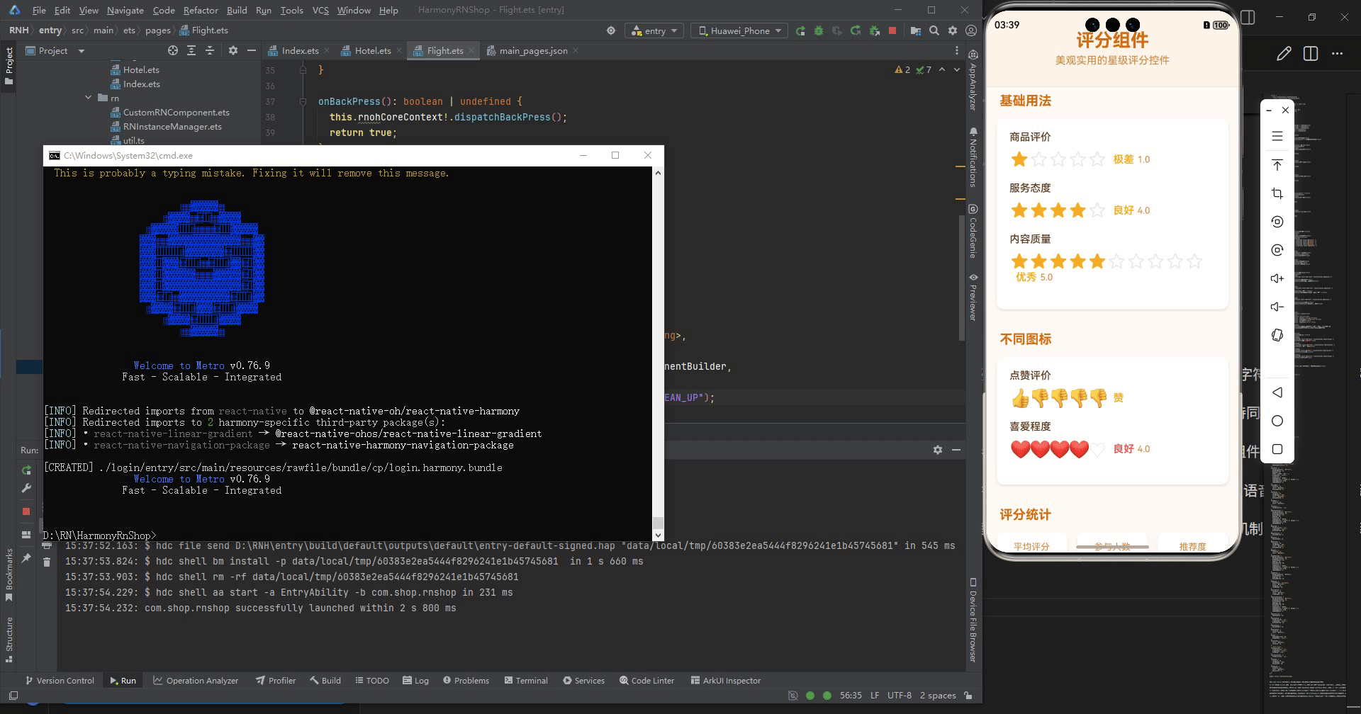
打包
接下来通过打包命令npn run harmony将reactNative的代码打包成为bundle,这样可以进行在开源鸿蒙OpenHarmony中进行使用。

打包之后再将打包后的鸿蒙OpenHarmony文件拷贝到鸿蒙的DevEco-Studio工程目录去:

最后运行效果图如下显示:

作为“人工智能6S店”的官方数字引擎,为AI开发者与企业提供一个覆盖软硬件全栈、一站式门户。
更多推荐


 31
31 0
0- 0


 已为社区贡献10条内容

所有评论(0)