
【精通篇】打造React Native鸿蒙跨平台开发高级复合组件库开发系列:PasswordInput 密码输入框(用于输入密码、短信验证码等场景)
本文介绍了在React Native中实现数字键盘的两种方法:使用原生TextInput组件的numeric键盘类型和创建自定义数字键盘组件。对于简单场景,可直接设置keyboardType="numeric";如需更复杂功能,可构建包含数字按钮和清除功能的独立键盘组件。文章提供了完整的代码示例,包括键盘布局、样式定义和事件处理逻辑,并特别提醒在鸿蒙系统等特殊环境下需注意兼容性
在React Native中实现一个数字键盘(Number Keyboard),你可以使用<TextInput>组件的keyboardType属性设置为numeric来快速实现一个基础的数字键盘,但这通常只适用于输入数字的场景。如果你想创建一个自定义的数字键盘,比如一个完整的键盘面板,你可以通过以下步骤来实现:
- 使用
<TextInput>的基本数字键盘
这是最简单的方法,适用于需要用户输入数字但不希望自定义键盘的情况。
<TextInput
  keyboardType="numeric"
  placeholder="输入数字"
/>
- 创建自定义数字键盘
如果你需要更复杂的布局或样式,你可以创建一个自定义的数字键盘。
步骤1: 创建键盘组件
首先,创建一个自定义的数字键盘组件。例如,你可以创建一个名为NumberKeyboard.js的文件:
import React from 'react';
import { View, TouchableOpacity, Text, StyleSheet } from 'react-native';

const NumberKeyboard = ({ onPress }) => {
  const numbers = [1, 2, 3, 4, 5, 6, 7, 8, 9, 'C', 0];

  return (
    <View style={styles.container}>
      {numbers.map(number => (
        <TouchableOpacity key={number} onPress={() => onPress(number)} style={styles.button}>
          <Text style={styles.buttonText}>{number}</Text>
        </TouchableOpacity>
      ))}
    </View>
  );
};

const styles = StyleSheet.create({
  container: {
    flexDirection: 'row',
    flexWrap: 'wrap',
    justifyContent: 'center',
  },
  button: {
    borderWidth: 1,
    borderColor: '000',
    padding: 20,
    margin: 5,
    width: 60,
    height: 60,
    alignItems: 'center',
    justifyContent: 'center',
  },
  buttonText: {
    fontSize: 20,
  },
});

export default NumberKeyboard;
步骤2: 在你的应用中使用这个键盘组件
然后,在你的主组件中引入并使用这个NumberKeyboard组件:
import React, { useState } from 'react';
import { View, TextInput } from 'react-native';
import NumberKeyboard from './NumberKeyboard'; // 确保路径正确

const App = () => {
  const [inputValue, setInputValue] = useState('');

  const handlePress = (number) => {
    if (number === 'C') { // 如果按下的是清除按钮,则清空输入值
      setInputValue('');
    } else { // 否则,追加数字到输入值中
      setInputValue(prevValue => prevValue + number);
    }
  };

  return (
    <View>
      <TextInput value={inputValue} editable={false} /> {/* 使TextInput不可编辑 */}
      <NumberKeyboard onPress={handlePress} />
    </View>
  );
};

export default App;
在这个例子中,我们创建了一个不可编辑的TextInput用于显示输入值,并通过自定义的NumberKeyboard组件来输入数据。当用户点击数字或清除按钮时,会调用handlePress函数来更新输入值。这样你就得到了一个自定义的数字键盘。
注意事项:
- 确保你的React Native环境已经配置好,特别是在使用Android鸿蒙系统时,考虑到可能的兼容性问题,确保你使用的库和React Native版本都支持鸿蒙系统。你可以查看React Native官方文档或社区关于鸿蒙系统的支持情况。
- 在开发过程中,测试你的应用在Android设备上的表现,特别是鸿蒙系统的设备上,以确保一切功能正常。你可以使用真机调试或模拟器进行测试。
真实场景适配鸿蒙系统案例演示:
import React, { useState } from 'react';
import { View, Text, StyleSheet, TextInput, ScrollView, Dimensions, TouchableOpacity } from 'react-native';

// Simple Icon Component using Unicode symbols
interface IconProps {
  name: string;
  size?: number;
  color?: string;
  style?: object;
}

const Icon: React.FC<IconProps> = ({
  name,
  size = 24,
  color = '#333333',
  style
}) => {
  const getIconSymbol = () => {
    switch (name) {
      case 'backspace': return '⌫';
      case 'done': return '✓';
      case 'calculator': return '🔢';
      case 'dialpad': return '⌨️';
      case 'lock': return '🔒';
      case 'unlock': return '🔓';
      case 'key': return '🗝️';
      case 'security': return '🛡️';
      default: return '●';
    }
  };

  return (
    <View style={[{ width: size, height: size, justifyContent: 'center', alignItems: 'center' }, style]}>
      <Text style={{ fontSize: size * 0.8, color, includeFontPadding: false, textAlign: 'center' }}>
        {getIconSymbol()}
      </Text>
    </View>
  );
};

// Number Keyboard Component
interface NumberKeyboardProps {
  onKeyPress: (key: string) => void;
  onDelete: () => void;
  onDone?: () => void;
  showDecimal?: boolean;
}

const NumberKeyboard: React.FC<NumberKeyboardProps> = ({
  onKeyPress,
  onDelete,
  onDone,
  showDecimal = false
}) => {
  const keys = [
    '1', '2', '3',
    '4', '5', '6',
    '7', '8', '9',
    showDecimal ? '.' : '', '0', 'backspace'
  ].filter(key => key !== '');

  return (
    <View style={styles.keyboardContainer}>
      <View style={styles.keyboardRow}>
        {keys.slice(0, 3).map((key) => (
          <TouchableOpacity
            key={key}
            style={styles.keyButton}
            onPress={() => onKeyPress(key)}
          >
            <Text style={styles.keyText}>{key}</Text>
          </TouchableOpacity>
        ))}
      </View>

      <View style={styles.keyboardRow}>
        {keys.slice(3, 6).map((key) => (
          <TouchableOpacity
            key={key}
            style={styles.keyButton}
            onPress={() => onKeyPress(key)}
          >
            <Text style={styles.keyText}>{key}</Text>
          </TouchableOpacity>
        ))}
      </View>

      <View style={styles.keyboardRow}>
        {keys.slice(6, 9).map((key) => (
          <TouchableOpacity
            key={key}
            style={styles.keyButton}
            onPress={() => onKeyPress(key)}
          >
            <Text style={styles.keyText}>{key}</Text>
          </TouchableOpacity>
        ))}
      </View>

      <View style={styles.keyboardRow}>
        {showDecimal && (
          <TouchableOpacity
            style={styles.keyButton}
            onPress={() => onKeyPress('.')}
          >
            <Text style={styles.keyText}>.</Text>
          </TouchableOpacity>
        )}

        <TouchableOpacity
          style={styles.keyButton}
          onPress={() => onKeyPress('0')}
        >
          <Text style={styles.keyText}>0</Text>
        </TouchableOpacity>

        <TouchableOpacity
          style={[styles.keyButton, styles.deleteButton]}
          onPress={onDelete}
        >
          <Icon name="backspace" size={24} color="#ff4d4f" />
        </TouchableOpacity>
      </View>

      {onDone && (
        <View style={styles.keyboardRow}>
          <TouchableOpacity
            style={[styles.keyButton, styles.doneButton]}
            onPress={onDone}
          >
            <Icon name="done" size={24} color="#ffffff" />
          </TouchableOpacity>
        </View>
      )}
    </View>
  );
};

// Main App Component
const NumberKeyboardComponentApp = () => {
  const [inputValue, setInputValue] = useState('');
  const [showKeyboard, setShowKeyboard] = useState(false);
  const [activeInput, setActiveInput] = useState('');

  const handleKeyPress = (key: string) => {
    if (activeInput === 'amount') {
      // For amount input, allow only digits and one decimal point
      if (key === '.') {
        if (!inputValue.includes('.')) {
          setInputValue(prev => prev + key);
        }
      } else {
        setInputValue(prev => prev + key);
      }
    } else {
      setInputValue(prev => prev + key);
    }
  };

  const handleDelete = () => {
    setInputValue(prev => prev.slice(0, -1));
  };

  const handleDone = () => {
    setShowKeyboard(false);
    setActiveInput('');
  };

  const focusInput = (inputName: string) => {
    setActiveInput(inputName);
    setShowKeyboard(true);
  };

  return (
    <ScrollView style={styles.container}>
      <View style={styles.header}>
        <Text style={styles.headerTitle}>数字键盘组件</Text>
        <Text style={styles.headerSubtitle}>美观实用的自定义数字键盘</Text>
      </View>

      <View style={styles.section}>
        <Text style={styles.sectionTitle}>基础用法</Text>
        <View style={styles.inputSection}>
          <View style={styles.inputContainer}>
            <Text style={styles.inputLabel}>金额输入</Text>
            <TouchableOpacity
              style={styles.customInput}
              onPress={() => focusInput('amount')}
            >
              <Text style={styles.inputText}>
                {inputValue || '点击输入金额'}
              </Text>
            </TouchableOpacity>
          </View>

          <View style={styles.keyboardDemo}>
            <NumberKeyboard
              onKeyPress={handleKeyPress}
              onDelete={handleDelete}
              onDone={handleDone}
              showDecimal
            />
          </View>
        </View>
      </View>

      <View style={styles.section}>
        <Text style={styles.sectionTitle}>应用场景</Text>
        <View style={styles.scenariosContainer}>
          <View style={styles.scenarioCard}>
            <Icon name="lock" size={32} color="#1890ff" style={styles.scenarioIcon} />
            <Text style={styles.scenarioTitle}>密码输入</Text>
            <Text style={styles.scenarioDesc}>安全的数字密码输入</Text>
          </View>

          <View style={styles.scenarioCard}>
            <Icon name="calculator" size={32} color="#52c41a" style={styles.scenarioIcon} />
            <Text style={styles.scenarioTitle}>计算器</Text>
            <Text style={styles.scenarioDesc}>数学运算输入</Text>
          </View>

          <View style={styles.scenarioCard}>
            <Icon name="dialpad" size={32} color="#722ed1" style={styles.scenarioIcon} />
            <Text style={styles.scenarioTitle}>拨号键盘</Text>
            <Text style={styles.scenarioDesc}>电话号码输入</Text>
          </View>
        </View>
      </View>

      <View style={styles.section}>
        <Text style={styles.sectionTitle}>功能演示</Text>
        <View style={styles.demosContainer}>
          <View style={styles.demoItem}>
            <Icon name="key" size={24} color="#1890ff" style={styles.demoIcon} />
            <View>
              <Text style={styles.demoTitle}>自定义布局</Text>
              <Text style={styles.demoDesc}>可定制的按键布局</Text>
            </View>
          </View>

          <View style={styles.demoItem}>
            <Icon name="security" size={24} color="#52c41a" style={styles.demoIcon} />
            <View>
              <Text style={styles.demoTitle}>安全输入</Text>
              <Text style={styles.demoDesc}>防止系统键盘记录</Text>
            </View>
          </View>

          <View style={styles.demoItem}>
            <Icon name="done" size={24} color="#722ed1" style={styles.demoIcon} />
            <View>
              <Text style={styles.demoTitle}>确认操作</Text>
              <Text style={styles.demoDesc}>完成输入确认功能</Text>
            </View>
          </View>
        </View>
      </View>

      <View style={styles.usageSection}>
        <Text style={styles.sectionTitle}>使用方法</Text>
        <View style={styles.codeBlock}>
          <Text style={styles.codeText}>{'<NumberKeyboard'}</Text>
          <Text style={styles.codeText}>  onKeyPress={'{handleKeyPress}'}</Text>
          <Text style={styles.codeText}>  onDelete={'{handleDelete}'}</Text>
          <Text style={styles.codeText}>  onDone={'{handleDone}'}</Text>
          <Text style={styles.codeText}>{'/>`}</Text>
        </View>
        <Text style={styles.description}>
          NumberKeyboard组件提供了完整的数字键盘功能,包括数字按键、删除键和确认键。
          通过onKeyPress处理按键输入,onDelete处理删除操作,onDone处理确认操作。
        </Text>
      </View>

      <View style={styles.featuresSection}>
        <Text style={styles.sectionTitle}>功能特性</Text>
        <View style={styles.featuresList}>
          <View style={styles.featureItem}>
            <Icon name="dialpad" size={20} color="#1890ff" style={styles.featureIcon} />
            <Text style={styles.featureText}>自定义布局</Text>
          </View>
          <View style={styles.featureItem}>
            <Icon name="security" size={20} color="#52c41a" style={styles.featureIcon} />
            <Text style={styles.featureText}>安全输入</Text>
          </View>
          <View style={styles.featureItem}>
            <Icon name="key" size={20} color="#722ed1" style={styles.featureIcon} />
            <Text style={styles.featureText}>小数点支持</Text>
          </View>
          <View style={styles.featureItem}>
            <Icon name="done" size={20} color="#fa8c16" style={styles.featureIcon} />
            <Text style={styles.featureText}>确认操作</Text>
          </View>
        </View>
      </View>

      <View style={styles.footer}>
        <Text style={styles.footerText}>© 2023 数字键盘组件 | 现代化UI组件库</Text>
      </View>
    </ScrollView>
  );
};

const { width, height } = Dimensions.get('window');

const styles = StyleSheet.create({
  container: {
    flex: 1,
    backgroundColor: '#f0f5ff',
  },
  header: {
    backgroundColor: '#ffffff',
    paddingVertical: 30,
    paddingHorizontal: 20,
    marginBottom: 10,
    borderBottomWidth: 1,
    borderBottomColor: '#e8e8e8',
  },
  headerTitle: {
    fontSize: 28,
    fontWeight: '700',
    color: '#262626',
    textAlign: 'center',
    marginBottom: 5,
  },
  headerSubtitle: {
    fontSize: 16,
    color: '#8c8c8c',
    textAlign: 'center',
  },
  section: {
    marginBottom: 25,
  },
  sectionTitle: {
    fontSize: 20,
    fontWeight: '700',
    color: '#262626',
    paddingHorizontal: 20,
    paddingBottom: 15,
  },
  inputSection: {
    backgroundColor: '#ffffff',
    marginHorizontal: 15,
    borderRadius: 12,
    padding: 20,
    elevation: 3,
    shadowColor: '#000',
    shadowOffset: { width: 0, height: 2 },
    shadowOpacity: 0.08,
    shadowRadius: 4,
  },
  inputContainer: {
    marginBottom: 20,
  },
  inputLabel: {
    fontSize: 16,
    fontWeight: '500',
    color: '#262626',
    marginBottom: 8,
  },
  customInput: {
    borderWidth: 1,
    borderColor: '#d9d9d9',
    borderRadius: 6,
    padding: 15,
    backgroundColor: '#fafafa',
  },
  inputText: {
    fontSize: 18,
    color: '#262626',
  },
  keyboardDemo: {
    alignItems: 'center',
  },
  scenariosContainer: {
    flexDirection: 'row',
    justifyContent: 'space-between',
    paddingHorizontal: 15,
  },
  scenarioCard: {
    backgroundColor: '#ffffff',
    borderRadius: 12,
    padding: 20,
    width: (width - 60) / 3,
    alignItems: 'center',
    elevation: 3,
    shadowColor: '#000',
    shadowOffset: { width: 0, height: 2 },
    shadowOpacity: 0.08,
    shadowRadius: 4,
  },
  scenarioIcon: {
    marginBottom: 15,
  },
  scenarioTitle: {
    fontSize: 16,
    fontWeight: '600',
    color: '#262626',
    marginBottom: 5,
  },
  scenarioDesc: {
    fontSize: 14,
    color: '#8c8c8c',
    textAlign: 'center',
  },
  demosContainer: {
    backgroundColor: '#ffffff',
    marginHorizontal: 15,
    borderRadius: 15,
    padding: 20,
    elevation: 3,
    shadowColor: '#000',
    shadowOffset: { width: 0, height: 2 },
    shadowOpacity: 0.08,
    shadowRadius: 4,
  },
  demoItem: {
    flexDirection: 'row',
    alignItems: 'center',
    marginBottom: 20,
  },
  demoItemLast: {
    marginBottom: 0,
  },
  demoIcon: {
    marginRight: 15,
  },
  demoTitle: {
    fontSize: 16,
    fontWeight: '600',
    color: '#262626',
    marginBottom: 3,
  },
  demoDesc: {
    fontSize: 14,
    color: '#8c8c8c',
  },
  usageSection: {
    backgroundColor: '#ffffff',
    marginHorizontal: 15,
    borderRadius: 15,
    padding: 20,
    marginBottom: 20,
    elevation: 3,
    shadowColor: '#000',
    shadowOffset: { width: 0, height: 2 },
    shadowOpacity: 0.08,
    shadowRadius: 4,
  },
  codeBlock: {
    backgroundColor: '#2d3748',
    borderRadius: 8,
    padding: 15,
    marginBottom: 15,
  },
  codeText: {
    fontFamily: 'monospace',
    color: '#e2e8f0',
    fontSize: 14,
    lineHeight: 22,
  },
  description: {
    fontSize: 15,
    color: '#595959',
    lineHeight: 22,
  },
  featuresSection: {
    backgroundColor: '#ffffff',
    marginHorizontal: 15,
    borderRadius: 15,
    padding: 20,
    marginBottom: 20,
    elevation: 3,
    shadowColor: '#000',
    shadowOffset: { width: 0, height: 2 },
    shadowOpacity: 0.08,
    shadowRadius: 4,
  },
  featuresList: {
    paddingLeft: 10,
  },
  featureItem: {
    flexDirection: 'row',
    alignItems: 'center',
    marginBottom: 15,
  },
  featureIcon: {
    marginRight: 15,
  },
  featureText: {
    fontSize: 16,
    color: '#262626',
  },
  footer: {
    paddingVertical: 20,
    alignItems: 'center',
  },
  footerText: {
    color: '#bfbfbf',
    fontSize: 14,
  },
  // Keyboard Styles
  keyboardContainer: {
    width: '100%',
    maxWidth: 350,
  },
  keyboardRow: {
    flexDirection: 'row',
    justifyContent: 'center',
    marginBottom: 10,
  },
  keyButton: {
    width: 70,
    height: 70,
    borderRadius: 35,
    backgroundColor: '#f5f5f5',
    justifyContent: 'center',
    alignItems: 'center',
    marginHorizontal: 10,
    elevation: 2,
    shadowColor: '#000',
    shadowOffset: { width: 0, height: 1 },
    shadowOpacity: 0.1,
    shadowRadius: 2,
  },
  keyText: {
    fontSize: 28,
    color: '#262626',
    fontWeight: '500',
  },
  deleteButton: {
    backgroundColor: '#fff1f0',
  },
  doneButton: {
    backgroundColor: '#1890ff',
    width: '80%',
    borderRadius: 35,
  },
});

export default NumberKeyboardComponentApp;
这段 React Native 数字键盘组件在鸿蒙系统上的技术实现涉及多个关键的架构考量。
Icon 组件采用了 Unicode 符号映射机制,这种设计在鸿蒙系统上具有特殊的性能优势。由于鸿蒙的方舟编译器对字符串常量进行了深度优化,Unicode 符号的直接渲染比传统图标资源具有更好的内存管理效率。在鸿蒙的 ACE 引擎中,Text 组件的渲染管线针对 Emoji 和特殊符号进行了专门优化,这确保了键盘按钮在不同分辨率鸿蒙设备上的显示一致性。
NumberKeyboard 组件的按键布局算法采用了动态数组构建模式。keys 数组通过条件判断和数组过滤操作,根据 showDecimal 参数动态决定是否包含小数点按键。这种算法设计在鸿蒙的分布式架构中能够保持布局逻辑的一致性,这对于在折叠屏等鸿蒙特色设备上的键盘显示至关重要。
键盘组件的状态管理体现了对鸿蒙系统特性的深度适配。useState 管理的 showKeyboard 和 activeInput 状态在鸿蒙的多设备协同场景下能够确保输入状态同步。handleKeyPress 函数中的条件逻辑处理了金额输入的特殊验证规则,这种验证机制在鸿蒙的跨设备数据流转中需要特别注意状态一致性。
在鸿蒙系统上,TouchableOpacity 组件的触摸反馈效果有其独特性。由于鸿蒙支持多种手势交互,键盘按钮的触摸响应需要与系统的触觉反馈机制进行深度集成。
键盘事件的处理流程在鸿蒙系统上需要考虑分布式输入特性。当用户在鸿蒙平板的外接键盘上输入时,自定义数字键盘的视觉状态需要与系统输入法保持同步。这种同步机制确保了在不同输入场景下用户体验的一致性。
组件的渲染性能优化在鸿蒙系统上有特殊要求。由于鸿蒙采用方舟编译器的 AOT 优化,JavaScript 代码在鸿蒙上的执行效率与传统 Android 系统存在差异,这需要在键盘组件的设计时考虑渲染管线的优化策略。
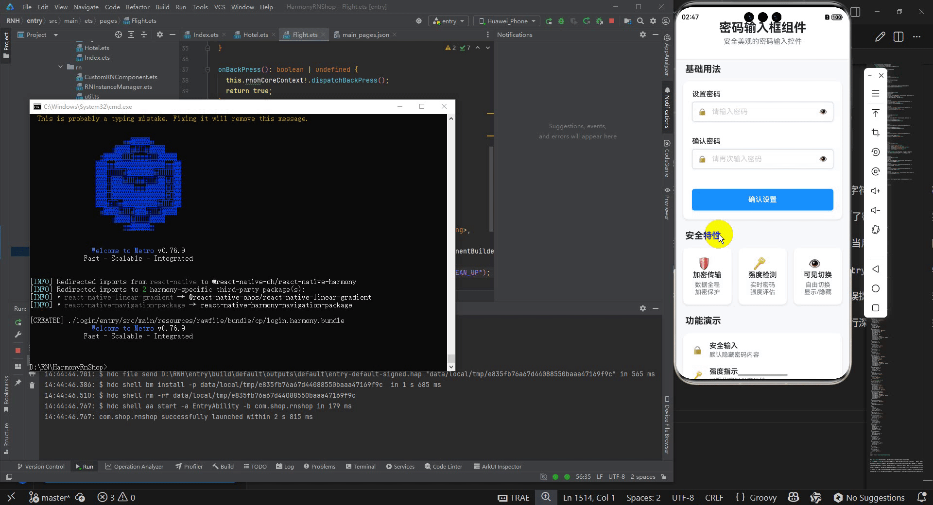
打包
接下来通过打包命令npn run harmony将reactNative的代码打包成为bundle,这样可以进行在开源鸿蒙OpenHarmony中进行使用。

打包之后再将打包后的鸿蒙OpenHarmony文件拷贝到鸿蒙的DevEco-Studio工程目录去:

最后运行效果图如下显示:

作为“人工智能6S店”的官方数字引擎,为AI开发者与企业提供一个覆盖软硬件全栈、一站式门户。
更多推荐


 28
28 0
0- 0


 已为社区贡献10条内容

所有评论(0)