
鸿蒙中 元服务开发流程(二)
本文详细介绍了元服务工程的创建与开发流程。首先说明了工程创建步骤,包括选择模板、账号登录、APPID配置等关键环节,并解析了工程目录结构。接着讲解了页面构建方法,包括基本结构、布局组件选择和页面间跳转实现。然后介绍了元服务卡片的创建、开发实现和规格适配。最后强调了开发注意事项,包括账号认证要求、开发规范限制和性能优化建议。整个流程涵盖了从工程初始化到页面开发、卡片实现以及发布准备的全套开发指引。
本文同步发表于微信公众号,微信搜索 程语新视界 即可关注,每个工作日都有文章更新
一、元服务工程创建
1.1 创建工程步骤
1.1.1 启动创建
-
首次打开:选择
Create Project -
已有工程:
File > New > Create Project
1.1.2 选择模板
选择 Atomic Service(元服务) 开发,支持模板:
| 模板类型 | 适用设备 | 主要功能 | 说明 |
|---|---|---|---|
| Empty Ability | Phone、Tablet | 基础 Hello World 功能 | 标准元服务开发模板 |
| [CloudDev]Empty Ability | 跨设备 | 端云一体化开发 | 集成云开发能力 |
| Embeddable Ability | 支持嵌入的应用 | 嵌入式运行 | 可被其他应用嵌入的元服务 |
注意:元服务不支持 Native 开发方式,无法选择 Native 工程模板。
1.1.3 账号登录
-
华为开发者账号登录:正式开发必须登录
-
访客模式:仅用于体验开发功能
-
在真机运行时需在
app.json5中补充真实存在的包名
-
1.1.4 APP ID 配置
-
选择 APP ID:从已登录账号下的 APP ID 列表中选择
-
注册新 APP ID:如未注册,点击
Register APP ID-
应用类型必须选择"元服务"
-
-
刷新列表:注册后点击
Refresh显示新 APP ID
1.1.5 Bundle Name 规则
-
固定格式:
com.atomicservice.[appid] -
自动生成:开发者无法手动修改
-
命名规范:不符合规范的包名不会在列表中显示
1.1.6 工程配置
-
Project name:填写工程名称
-
其他参数:保持默认设置
-
点击 Finish:自动生成示例代码和资源
1.2 元服务工程目录结构
元服务工程/
├── AppScope/
│   └── app.json5                 # 元服务全局配置信息
├── entry/                        # HarmonyOS工程模块(编译生成HAP)
│   ├── src/
│   │   ├── main/
│   │   │   ├── ets/
│   │   │   │   ├── entryability/  # 元服务入口
│   │   │   │   └── pages/        # 元服务页面
│   │   │   ├── resources/        # 资源文件(图形、字符串、布局等)
│   │   │   └── module.json5      # 模块配置文件
│   │   └── build-profile.json5  # 模块级编译配置
│   └── hvigorfile.ts            # 模块级构建脚本
├── oh_modules/                  # 三方库依赖信息
├── build-profile.json5         # 工程级配置(签名、产品配置)
└── hvigorfile.ts              # 工程级构建脚本
1.2.1 文件说明
-
app.json5:元服务的全局配置信息
-
module.json5:模块配置文件,包含HAP配置、设备配置等
-
build-profile.json5:编译构建配置
-
hvigorfile.ts:编译构建任务脚本,支持自定义
二、构建元服务页面
2.1 页面基本结构
2.1.1 默认页面(Index.ets)
import { hilog } from '@kit.PerformanceAnalysisKit';
import { router } from '@kit.ArkUI';

@Entry
@Component
struct MainPage {
  @State welcomeText: string = '欢迎使用';

  build() {
    Row() {
      Column() {
        // 文本组件
        Text(this.welcomeText)
          .fontSize(50)
          .fontWeight(FontWeight.Bold)
          .fontColor('#333333')

        // 按钮组件
        Button('进入详情')
          .type(ButtonType.Capsule)
          .margin({ top: 40 })
          .backgroundColor('#007DFF')
          .width('60%')
          .height(55)
          .fontSize(20)
          .fontWeight(FontWeight.Medium)
          .onClick(() => {
            // 页面跳转逻辑
            router.pushUrl({ url: 'pages/DetailPage' });
          })
      }
      .width('100%')
    }
    .height('100%')
    .backgroundColor('#F5F5F5')
  }

  aboutToAppear() {
    // 页面显示时的初始化逻辑
    hilog.info(0x0000, 'pageTag', '主页面准备显示');
  }
}
2.1.2 布局组件选择
| 布局场景 | 推荐组件 | 特点 |
|---|---|---|
| 线性排列 | Row、Column |
简单直观的线性布局 |
| 复杂对齐 | RelativeContainer |
灵活的相对位置控制 |
| 层叠显示 | Stack |
元素重叠显示 |
| 网格布局 | Grid |
规整的网格排列 |
2.2 创建第二个页面
2.2.1 新建页面文件
-
右键
pages文件夹 →New > ArkTS File -
输入文件名:如
DetailPage -
自动生成文件结构
快捷方式:选择 New > Page 可自动配置路由
2.2.2 配置页面路由
main_pages.json 配置:
{
  "src": [
    "pages/MainPage",
    "pages/DetailPage",
    "pages/SettingPage"  // 可继续添加更多页面
  ]
}
2.2.3 第二个页面实现
import { router } from '@kit.ArkUI';

@Entry
@Component
struct DetailPage {
  @State detailInfo: string = '详情页面';
  @State dataCount: number = 0;

  build() {
    Row() {
      Column({ space: 15 }) {
        Text(this.detailInfo)
          .fontSize(45)
          .fontWeight(FontWeight.Bold)
          .fontColor('#1A1A1A')

        Text(`数据数量: ${this.dataCount}`)
          .fontSize(18)
          .fontColor('#666666')
          .margin({ top: 10 })

        Button('增加数据')
          .type(ButtonType.Normal)
          .backgroundColor('#34C759')
          .width('70%')
          .height(48)
          .fontSize(18)
          .onClick(() => {
            this.dataCount++;
          })

        Button('返回首页')
          .type(ButtonType.Capsule)
          .margin({ top: 30 })
          .backgroundColor('#007DFF')
          .width('50%')
          .height(48)
          .fontSize(18)
          .onClick(() => {
            router.back();
          })
      }
      .width('100%')
      .padding(20)
    }
    .height('100%')
    .backgroundColor('#FFFFFF')
  }
}
2.3 页面间跳转实现
2.3.1 导入路由模块
import { router } from '@kit.ArkUI';2.3.2 页面跳转方法
// 1. 普通跳转(推入堆栈)
router.pushUrl({
  url: 'pages/DetailPage'
});

// 2. 替换当前页面
router.replaceUrl({
  url: 'pages/NewPage'
});

// 3. 跳转并清空堆栈
router.clearStackAndPushUrl({
  url: 'pages/HomePage'
});

// 4. 带参数跳转
router.pushUrl({
  url: 'pages/DetailPage',
  params: {
    userId: 'user123',
    productId: 'p456',
    timestamp: Date.now()
  }
});

// 5. 返回上一页
router.back();

// 6. 返回指定页面
router.back({
  url: 'pages/MainPage'
});
2.3.3 接收页面参数
@Entry
@Component
struct DetailPage {
  @State productId: string = '';
  @State userId: string = '';

  aboutToAppear() {
    // 获取传递的参数
    const params = router.getParams() as Record<string, any>;
    this.productId = params['productId'] || '';
    this.userId = params['userId'] || '';

    // 使用参数加载数据
    this.loadProductDetail(this.productId);
  }

  private loadProductDetail(id: string) {
    // 根据ID加载商品详情
    console.info(`加载商品 ${id} 的详情信息`);
  }
}
三、新建元服务卡片
3.1 创建卡片步骤
3.1.1 创建卡片
-
右键
entry模块 →New > Service Widget > Dynamic Widget -
选择模板:
Hello World卡片模板 -
点击 Next 进入配置页面
3.1.2 卡片配置参数
| 配置项 | 说明 | 要求/限制 |
|---|---|---|
| Service widget name | 卡片名称 | 同应用内不能重复,仅含字母、数字、下划线 |
| Display name | 预览面板显示的名称 | API 11+ Stage 工程支持 |
| Description | 卡片描述信息 | 可选 |
| Language | 开发语言 | 元服务只支持 ArkTS,不支持 JS |
| Support dimension | 支持的卡片规格 | 可多选,首次创建生成 EntryCard 目录 |
| Default dimension | 默认卡片规格 | 下拉选择 |
| Ability name | 挂靠的 Form Ability | 选择已有或新建 |
| Module name | 所属模块 | 默认当前模块 |
3.1.3 完成创建
-
点击
Finish完成卡片创建 -
生成卡片文件和快照目录
3.2 卡片开发实现
3.2.1 基础卡片代码
@Entry
@Component
struct ServiceCard {
  @State scaleValue: number = 1.0
  @State cardTitle: string = '快捷入口'

  build() {
    Column({ space: 12 }) {
      // 卡片标题
      Text(this.cardTitle)
        .fontSize(18)
        .fontWeight(FontWeight.Bold)
        .fontColor('#1A1A1A')
        .width('100%')
        .textAlign(TextAlign.Center)

      // 功能按钮
      Button('快速启动')
        .width('85%')
        .height(45)
        .backgroundColor('#007DFF')
        .fontColor(Color.White)
        .fontSize(16)
        .onClick(() => {
          // 点击动画效果
          this.scaleValue = 1.15
        })
        .scale({ x: this.scaleValue, y: this.scaleValue })
        .animation({
          curve: Curve.EaseInOut,
          playMode: PlayMode.AlternateReverse,
          duration: 180,
          onFinish: () => {
            this.scaleValue = 1.0
          }
        })

      // 状态信息
      Text('点击上方按钮体验')
        .fontSize(12)
        .fontColor('#666666')
        .width('100%')
        .textAlign(TextAlign.Center)
        .margin({ top: 8 })
    }
    .padding(16)
    .width('100%')
    .height('100%')
    .backgroundColor('#FFFFFF')
    .borderRadius(16)
    .shadow({ radius: 8, color: '#1A000000', offsetX: 0, offsetY: 2 })
  }
}
3.2.2 卡片点击跳转到元服务
@Entry
@Component
struct ServiceCard {
  @State scaleValue: number = 1.0

  build() {
    Column({ space: 12 }) {
      // 卡片内容...
    }
    .onClick(() => {
      // 点击整个卡片跳转到元服务
      postCardAction(this, {
        "action": "router",
        "abilityName": "EntryAbility",
        "params": {
          "source": "card",
          "timestamp": Date.now(),
          "targetPage": "MainPage"
        }
      });
    })
  }
}
3.2.3 卡片动作处理
| 事件类型 | 触发目标 | 使用场景 | 核心限制 |
|---|---|---|---|
router |
跳转至指定 UIAbility |
页面跳转、参数传递 | 非系统应用仅支持同应用内跳转 |
message |
通知 FormExtensionAbility |
消息通知、卡片内容更新 | 需在静态卡片中使用 FormLink |
call |
后台运行 UIAbility |
后台任务(如音乐播放、数据同步) | 需单实例模式 + 后台权限 |
// 支持多种卡片动作类型
postCardAction(this, {
  "action": "router",           // 路由跳转
  "abilityName": "EntryAbility",
  "params": { /* 参数 */ }
});

postCardAction(this, {
  "action": "message",          // 发送消息
  "params": { "type": "refresh" }
});

postCardAction(this, {
  "action": "call",             // 调用服务
  "params": { "service": "update" }
});
3.3 卡片快照自定义
3.3.1 快照文件位置
EntryCard/
└── entry/
    └── base/
        └── snapshot/
            ├── widget-2x2.png    # 2x2规格快照
            ├── widget-2x4.png    # 2x4规格快照
            └── widget-4x4.png    # 4x4规格快照
3.3.2 替换快照图片
-
准备图片:符合尺寸要求的PNG图片
-
替换文件:覆盖对应规格的快照文件
-
保持命名:确保文件名一致
-
刷新预览:重新编译查看效果
3.4 卡片规格与适配
3.4.1 常用卡片规格
| 规格 | 尺寸(vp) | 适用场景 |
|---|---|---|
| 2x2 | 120×120 | 小工具、快捷入口 |
| 2x4 | 120×255 | 信息展示、简单列表 |
| 4x4 | 255×255 | 详细视图、复杂交互 |
3.4.2 响应式卡片设计
@Entry
@Component
struct AdaptiveCard {
  @Prop cardSize: { width: number, height: number } = { width: 120, height: 120 }

  build() {
    // 根据卡片尺寸调整布局
    const isSmall = this.cardSize.width <= 120;

    Column() {
      if (isSmall) {
        // 小尺寸布局
        Text('简版')
          .fontSize(14)
      } else {
        // 大尺寸布局
        Column({ space: 8 }) {
          Text('完整版')
            .fontSize(18)
          Text('更多信息')
            .fontSize(12)
        }
      }
    }
  }
}
四、开发注意事项
4.1 账号与认证
// 华为账号静默登录示例(Index页面中)
private loginWithHuaweiID() {
  const loginRequest = new authentication.HuaweiIDProvider()
    .createLoginWithHuaweiIDRequest();

  loginRequest.forceLogin = false;  // 非强制登录

  const controller = new authentication.AuthenticationController();
  controller.executeRequest(loginRequest)
    .then((data) => {
      const response = data as authentication.LoginWithHuaweiIDResponse;
      const authCode = response.data?.authorizationCode;
      // 将 authCode 发送到后端换取 unionID
    })
    .catch((error: BusinessError) => {
      if (error.code === authentication.AuthenticationErrorCode.ACCOUNT_NOT_LOGGED_IN) {
        // 华为账号未登录,建议跳转到登录引导页
        console.warn('华为账号未登录');
      }
    });
}审核要求:如果元服务有账号系统,必须提供华为账号登录选项。
4.2 开发规范
-
语言限制:只支持 ArkTS,不支持 JS
-
模型限制:只支持 Stage 模型
-
API限制:只能使用元服务 API 集
-
版本要求:需要 HarmonyOS NEXT 及以上系统
4.3 性能优化
-
卡片轻量化:避免复杂计算和大量数据
4.4 调试
-
预览器调试:使用预览器实时查看效果
-
真机测试:配置签名后在真机运行
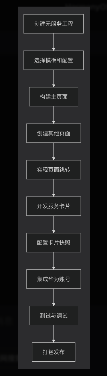
五、完整开发流程
发布准备
-
完善应用信息:图标、名称、描述
-
配置签名证书:申请发布证书
-
测试兼容性:多设备、多场景测试
-
准备素材:截图、演示视频、文档

作为“人工智能6S店”的官方数字引擎,为AI开发者与企业提供一个覆盖软硬件全栈、一站式门户。
更多推荐


 10
10 0
0- 0


 已为社区贡献40条内容

所有评论(0)