
鸿蒙Text和Span文本显示
本文介绍了Text和Span组件的使用方法。Text组件用于显示文本内容,支持自定义文本选择菜单和资源引用;Span作为Text的子组件,可设置装饰线、颜色、大小写等样式。文章还演示了文本对齐、超长处理(省略号、跑马灯)、行高设置等功能,通过代码示例展示了各类文本样式的实现方式,包括下划线、删除线等装饰效果。
Text是文本组件,用于展示用户视图,如显示文章的文字内容。该组件支持绑定自定义文本选择菜单,用户可根据需要选择不同功能。此外,还可以扩展自定义菜单,丰富可用选项,进一步提升用户体验。Span则用于展示行内文本。
创建文本
Text可直接显示字符串,也可以显示一个字符串Resource资源
@Entry
@Component
struct Index {
  build() {
    Column(){
      Text('我是一段文本')
      Text($r('app.string.text'))
    }.width('100%').height('100%')
  }
}
添加子组件
Span只能作为Text和RichEditor组件的子组件显示文本内容。可以在一个Text内添加多个Span来显示一段信息。
创建Span
Span组件需嵌入在Text组件中才能显示,单独使用时不会显示任何内容。Text与Span同时配置文本内容时,Span内容将覆盖Text内容。
@Entry
@Component
struct Index {
  build() {
    Column(){
      Text('我是Text') {
        Span('我是Span')
      }
    }.width('100%').height('100%')
  }
}
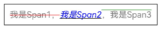
设置文本装饰线及颜色
通过decoration设置文本装饰线及颜色
@Entry
@Component
struct Index {
  build() {
    Column(){
      Text() {
        Span('我是Span1,').fontSize(16).fontColor(Color.Grey)
          .decoration({ type: TextDecorationType.LineThrough, color: Color.Red })
        Span('我是Span2').fontColor(Color.Blue).fontSize(16)
          .fontStyle(FontStyle.Italic)
          .decoration({ type: TextDecorationType.Underline, color: Color.Black })
        Span(',我是Span3').fontSize(16).fontColor(Color.Grey)
          .decoration({ type: TextDecorationType.Overline, color: Color.Green })
      }
    }.width('100%').height('100%')
  }
}
设置大小写
通过textCase设置文字一直保持大写或者小写状态。例如设置全大写
@Entry
@Component
struct Index {
  build() {
    Column(){
      Text() {
        Span('I am Upper-span').fontSize(12)
          .textCase(TextCase.UpperCase)
      }
    }.width('100%').height('100%')
  }
}
创建自定义文本样式
设置文本对齐样式
通过textAlign属性设置文本对齐样式
@Entry
@Component
struct Index {
  build() {
    Column(){
      Text('左对齐')
        .width(300)
        .textAlign(TextAlign.Start)
        .border({ width: 1 })
        .padding(10)
      Text('中间对齐')
        .width(300)
        .textAlign(TextAlign.Center)
        .border({ width: 1 })
        .padding(10)
      Text('右对齐')
        .width(300)
        .textAlign(TextAlign.End)
        .border({ width: 1 })
        .padding(10)
    }.width('100%').height('100%')
  }
}
控制文本超长处理
通过textOverflow属性控制文本超长处理,textOverflow需配合maxLines一起使用(默认情况下文本自动折行)。从API version 18开始,文本超长时设置跑马灯的方式展示时,支持设置跑马灯的配置项,比如开关、步长、循环次数、方向等。
@Entry
@Component
struct Index {
  build() {
    Column(){
      Text('This is the setting of textOverflow to Clip text content This is the setting of textOverflow to None text content. This is the setting of textOverflow to Clip text content This is the setting of textOverflow to None text content.')
        .width(250)
        .textOverflow({ overflow: TextOverflow.None })
        .maxLines(1)
        .fontSize(12)
        .border({ width: 1 })
        .padding(10)
      Text('我是超长文本,超出的部分显示省略号。I am an extra long text, with ellipses displayed for any excess.')
        .width(250)
        .textOverflow({ overflow: TextOverflow.Ellipsis })
        .maxLines(1)
        .fontSize(12)
        .border({ width: 1 })
        .padding(10)
      Text('当文本溢出其尺寸时,文本将滚动显示。When the text overflows its dimensions, the text will scroll for displaying.')
        .width(250)
        .textOverflow({ overflow: TextOverflow.MARQUEE })
        .maxLines(1)
        .fontSize(12)
        .border({ width: 1 })
        .padding(10)
      Text('当文本溢出其尺寸时,文本将滚动显示,支持设置跑马灯配置项。When the text overflows its dimensions, the text will scroll for displaying.')
        .width(250)
        .textOverflow({ overflow: TextOverflow.MARQUEE })
        .maxLines(1)
        .fontSize(12)
        .border({ width: 1 })
        .padding(10)
        .marqueeOptions({
          start: true,
          fromStart: true,
          step: 6,
          loop: -1,
          delay: 0,
          fadeout: false,
          marqueeStartPolicy: MarqueeStartPolicy.DEFAULT
        })
    }.width('100%').height('100%')
  }
}
设置文本行高
通过lineHeight属性设置文本行高
设置文本装饰线
通过decoration属性设置文本装饰线样式、颜色及其粗细。
@Entry
@Component
struct Index {
  build() {
    Column(){
      Text('This is the text')
        .decoration({
          type: TextDecorationType.LineThrough,
          color: Color.Red
        })
        .borderWidth(1).padding(15).margin(5)
      Text('This is the text')
        .decoration({
          type: TextDecorationType.Overline,
          color: Color.Red
        })
        .borderWidth(1).padding(15).margin(5)
      Text('This is the text')
        .decoration({
          type: TextDecorationType.Underline,
          color: Color.Red
        })
        .borderWidth(1).padding(15).margin(5)
      Text('This is the text')
        .decoration({
          type: TextDecorationType.Underline,
          color: Color.Blue,
          style: TextDecorationStyle.DASHED
        })
        .borderWidth(1).padding(15).margin(5)
      Text('This is the text')
        .decoration({
          type: TextDecorationType.Underline,
          color: Color.Blue,
          style: TextDecorationStyle.DOTTED
        })
        .borderWidth(1).padding(15).margin(5)
      Text('This is the text')
        .decoration({
          type: TextDecorationType.Underline,
          color: Color.Blue,
          style: TextDecorationStyle.DOUBLE
        })
        .borderWidth(1).padding(15).margin(5)
      Text('This is the text')
        .decoration({
          type: TextDecorationType.Underline,
          color: Color.Blue,
          style: TextDecorationStyle.WAVY,
          thicknessScale: 4
        })
        .borderWidth(1).padding(15).margin(5)
    }.width('100%').height('100%')
  }
}

字体大小自适应
通过minFontSize与maxFontSize自适应字体大小。minFontSize用于设置文本的最小显示字号,maxFontSize用于设置文本的最大显示字号。这两个属性必须同时设置才能生效,并且需要与maxLines属性或布局大小限制配合使用,单独设置任一属性将不会产生效果。
@Entry
@Component
struct Index {
  build() {
    Column(){
      Text('我的最大字号为30,最小字号为5,宽度为250,maxLines为1')
        .width(250)
        .maxLines(1)
        .maxFontSize(30)
        .minFontSize(5)
        .border({ width: 1 })
        .padding(10)
        .margin(5)
      Text('我的最大字号为30,最小字号为5,宽度为250,maxLines为2')
        .width(250)
        .maxLines(2)
        .maxFontSize(30)
        .minFontSize(5)
        .border({ width: 1 })
        .padding(10)
        .margin(5)
      Text('我的最大字号为30,最小字号为15,宽度为250,高度为50')
        .width(250)
        .height(50)
        .maxFontSize(30)
        .minFontSize(15)
        .border({ width: 1 })
        .padding(10)
        .margin(5)
      Text('我的最大字号为30,最小字号为15,宽度为250,高度为100')
        .width(250)
        .height(100)
        .maxFontSize(30)
        .minFontSize(15)
        .border({ width: 1 })
        .padding(10)
        .margin(5)
    }.width('100%').height('100%')
  }
}

设置复制粘贴
通过copyOption属性设置文本是否可复制粘贴。
@Entry
@Component
struct Index {
  build() {
    Column(){
      Text("这是一段可复制文本")
        .fontSize(30)
        .copyOption(CopyOptions.InApp)
    }.width('100%').height('100%')
  }
}

设置自定义字体
通过fontFamily属性设置字体列表。应用当前支持’HarmonyOS Sans’字体和注册自定义字体。
@Entry
@Component
struct Index {
  build() {
    Column(){
      Text("This is the text content with fontFamily")
        .fontSize(30)
        .fontFamily('HarmonyOS Sans')
    }.width('100%').height('100%')
  }
}
设置数字翻牌效果
从API version 20开始,支持通过contentTransition属性设置数字翻牌效果。
@Entry
@Component
struct Index {
  @State number: number = 98;
  @State numberTransition: NumericTextTransition =
    new NumericTextTransition({ flipDirection: FlipDirection.DOWN, enableBlur: false });

  build() {
    Column() {
      Text(this.number + "")
        .borderWidth(1)
        .fontSize(40)
        .contentTransition(this.numberTransition)
      Button("chang number")
        .onClick(() => {
          this.number++
        })
        .margin(10)
    }.width('100%').height('100%')
  }
}

设置中西文自动间距
从API version 20开始,支持通过enableAutoSpacing设置是否开启中文与西文的自动间距。
@Entry
@Component
struct Index {
  @State enableSpacing: boolean = false;

  build() {
    Column() {
      Row({ space: 20 }) {
        Button("开启自动间距")
          .onClick(() => this.enableSpacing = true)
          .backgroundColor(this.enableSpacing ? '#4CAF50' : '#E0E0E0')
          .fontColor(this.enableSpacing ? Color.White : Color.Black)

        Button("关闭自动间距")
          .onClick(() => this.enableSpacing = false)
          .backgroundColor(!this.enableSpacing ? '#F44336' : '#E0E0E0')
          .fontColor(!this.enableSpacing ? Color.White : Color.Black)
      }
      .width('100%')
      .justifyContent(FlexAlign.Center)
      .margin({ top: 30, bottom: 20 })

      Text(this.enableSpacing ? "当前状态:已开启自动间距" : "当前状态:已关闭自动间距")
        .fontSize(16)
        .fontColor(this.enableSpacing ? '#4CAF50' : '#F44336')
        .margin({ bottom: 20 })

      // 设置是否应用中西文自动间距
      Text('中西文Auto Spacing自动间距')
        .fontSize(24)
        .padding(15)
        .backgroundColor('#F5F5F5')
        .width('90%')
        .enableAutoSpacing(this.enableSpacing)
    }
    .width('100%')
    .height('100%')
    .padding(20)
  }
}

设置渐变色
从API version 20开始,支持通过shaderStyle设置渐变色。
@Entry
@Component
struct Index {
  @State message: string = 'Hello World';
  @State linearGradientOptions: LinearGradientOptions =
    {
      direction: GradientDirection.LeftTop,
      colors: [[Color.Red, 0.0], [Color.Blue, 0.3], [Color.Green, 0.5]],
      repeating: true,
    };

  build() {
    Column({ space: 5 }) {
      Text('direction为LeftTop的线性渐变').fontSize(18).width('90%').fontColor(0xCCCCCC)
        .margin({ top: 40, left: 40 })
      Text(this.message)
        .fontSize(50)
        .width('80%')
        .height(50)
        .shaderStyle(this.linearGradientOptions)
    }
    .height('100%')
    .width('100%')
  }
}

添加事件
Text组件可以添加通用事件,可以绑定onClick、onTouch等事件来响应操作。
@Entry
@Component
struct Index {
  @State textStr1: string = '';
  @State textStr2: string = '';

  build() {
    Row() {
      Column() {
        Text('This is a text component.')
          .fontSize(30)
          .onClick(() => {
            console.info('Text onClick is triggering');
            this.textStr1 = 'Text onClick is triggering';
          })
          .onTouch(() => {
            console.info('Text onTouch is triggering');
            this.textStr2 = 'Text onTouch is triggering';
          })
        Text('onClick:' + this.textStr1)
          .fontSize(20)
        Text('onTouch:' + this.textStr2)
          .fontSize(20)
      }.width('100%')
    }
    .height('100%')
  }
}

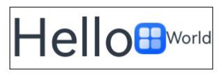
设置垂直居中
从API version 20开始,Text组件支持通过textVerticalAlign属性实现文本段落在垂直方向的对齐。以下示例展示了如何通过textVerticalAlign属性设置文本垂直居中对齐效果。
@Entry
@Component
struct Index {
  @State textStr1: string = '';
  @State textStr2: string = '';

  build() {
    Row() {
      Column() {
        Text() {
          Span("Hello")
            .fontSize(50)
          // $r('app.media.startIcon')需要替换为开发者所需的图像资源文件。
          ImageSpan($r('app.media.startIcon'))
            .width(30).height(30)
            .verticalAlign(ImageSpanAlignment.FOLLOW_PARAGRAPH)
          Span("World")
        }
        .textVerticalAlign(TextVerticalAlign.CENTER)
      }.width('100%')
    }
    .height('100%')
  }
}
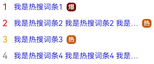
实现热搜榜
该示例通过maxLines、textOverflow、textAlign、constraintSize属性展示了热搜榜的效果。
@Entry
@Component
struct Index {
  build() {
    Column() {
      Row() {
        Text("1").fontSize(14).fontColor(Color.Red).margin({ left: 10, right: 10 })
        Text("我是热搜词条1")
          .fontSize(12)
          .fontColor(Color.Blue)
          .maxLines(1)
          .textOverflow({ overflow: TextOverflow.Ellipsis })
          .fontWeight(300)
        Text("爆")
          .margin({ left: 6 })
          .textAlign(TextAlign.Center)
          .fontSize(10)
          .fontColor(Color.White)
          .fontWeight(600)
          .backgroundColor(0x770100)
          .borderRadius(5)
          .width(15)
          .height(14)
      }.width('100%').margin(5)

      Row() {
        Text("2").fontSize(14).fontColor(Color.Red).margin({ left: 10, right: 10 })
        Text("我是热搜词条2 我是热搜词条2 我是热搜词条2 我是热搜词条2 我是热搜词条2")
          .fontSize(12)
          .fontColor(Color.Blue)
          .fontWeight(300)
          .constraintSize({ maxWidth: 200 })
          .maxLines(1)
          .textOverflow({ overflow: TextOverflow.Ellipsis })
        Text("热")
          .margin({ left: 6 })
          .textAlign(TextAlign.Center)
          .fontSize(10)
          .fontColor(Color.White)
          .fontWeight(600)
          .backgroundColor(0xCC5500)
          .borderRadius(5)
          .width(15)
          .height(14)
      }.width('100%').margin(5)

      Row() {
        Text("3").fontSize(14).fontColor(Color.Orange).margin({ left: 10, right: 10 })
        Text("我是热搜词条3")
          .fontSize(12)
          .fontColor(Color.Blue)
          .fontWeight(300)
          .maxLines(1)
          .constraintSize({ maxWidth: 200 })
          .textOverflow({ overflow: TextOverflow.Ellipsis })
        Text("热")
          .margin({ left: 6 })
          .textAlign(TextAlign.Center)
          .fontSize(10)
          .fontColor(Color.White)
          .fontWeight(600)
          .backgroundColor(0xCC5500)
          .borderRadius(5)
          .width(15)
          .height(14)
      }.width('100%').margin(5)

      Row() {
        Text("4").fontSize(14).fontColor(Color.Grey).margin({ left: 10, right: 10 })
        Text("我是热搜词条4 我是热搜词条4 我是热搜词条4 我是热搜词条4 我是热搜词条4")
          .fontSize(12)
          .fontColor(Color.Blue)
          .fontWeight(300)
          .constraintSize({ maxWidth: 200 })
          .maxLines(1)
          .textOverflow({ overflow: TextOverflow.Ellipsis })
      }.width('100%').margin(5)
    }.width('100%')
  }
}

作为“人工智能6S店”的官方数字引擎,为AI开发者与企业提供一个覆盖软硬件全栈、一站式门户。
更多推荐


 10
10 0
0- 0


 已为社区贡献7条内容

所有评论(0)