
鸿蒙5:HarmonyOS应用开发-自适应布局
注意:博主有个鸿蒙专栏,里面从上到下有关于鸿蒙next的教学文档,大家感兴趣可以学习下
如果大家觉得博主文章写的好的话,可以点下关注,博主会一直更新鸿蒙next相关知识
目录
3.1. 自适应布局
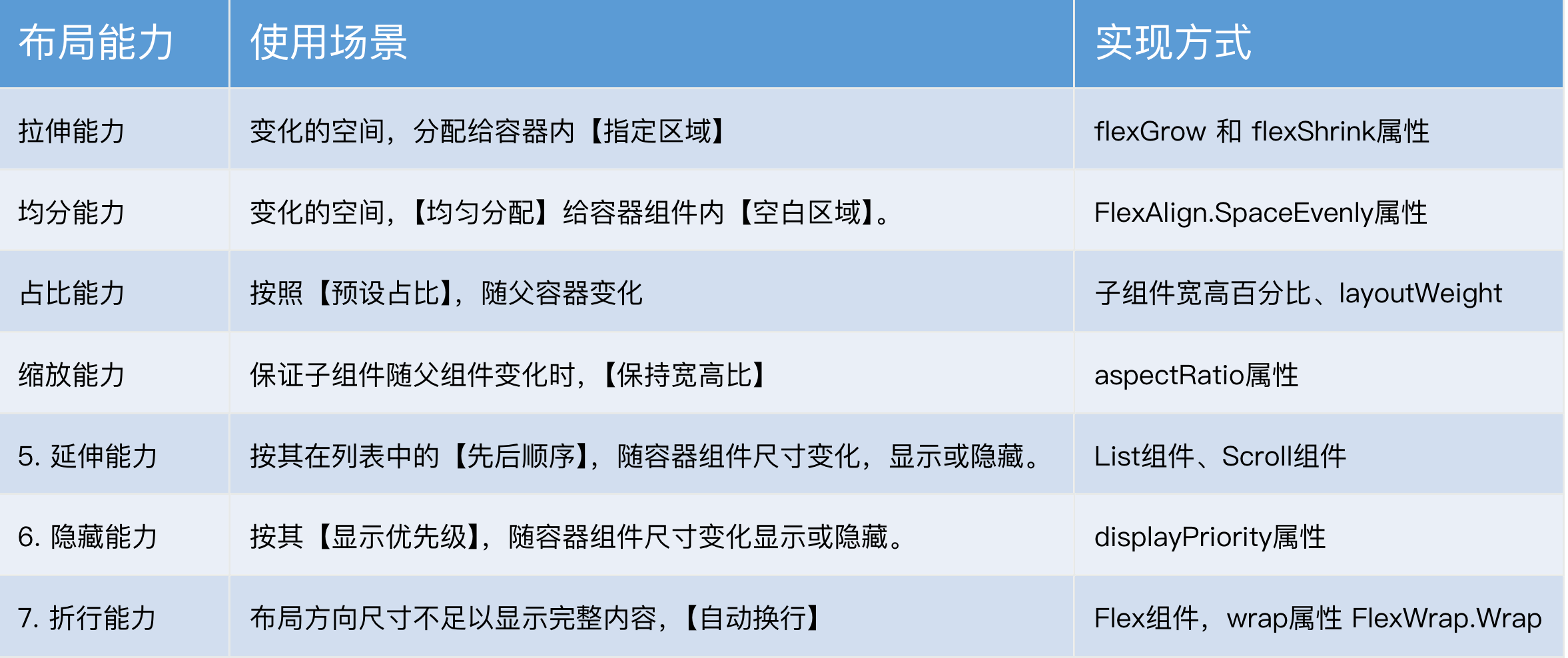
自适应布局的能力有 7 种,主要解决的是:窗口尺寸在【一定范围内】变化时,页面能够正常显示
|
自适应布局能力 |
使用场景 |
实现方式 |
|
容器组件尺寸发生变化时,增加或减小的空间全部分配给容器组件内指定区域。 |
的flexGrow和flexShrink属性 |
|
|
容器组件尺寸发生变化时,增加或减小的空间均匀分配给容器组件内所有空白区域。 |
的justifyContent属性设置为FlexAlign.SpaceEvenly |
|
|
子组件的宽或高按照预设的比例,随容器组件发生变化。 |
基于通用属性的两种实现方式: |
|
|
子组件的宽高按照预设的比例,随容器组件发生变化,且变化过程中子组件的宽高比不变。 |
的aspectRatio属性 |
|
|
容器组件内的子组件,按照其在列表中的先后顺序,随容器组件尺寸变化显示或隐藏。 |
基于容器组件的两种实现方式: 实现 配合Row组件 实现 |
|
|
容器组件内的子组件,按照其预设的显示优先级,随容器组件尺寸变化显示或隐藏。相同显示优先级的子组件同时显示或隐藏。 |
的displayPriority属性 |
|
|
容器组件尺寸发生变化时,如果布局方向尺寸不足以显示完整内容,自动换行。 |
的wrap属性设置为FlexWrap.Wrap |
3.1.1. 拉伸能力

拉伸能力指的是容器尺寸发生变化时:将变化的空间,分配给容器内的【指定区域】。利用的是 2 个属性:
|
属性名 |
类型 |
必填 |
说明 |
|
flexGrow |
number |
是 |
设置父容器在主轴方向上的剩余空间分配给此属性所在组件的比例。 |
|
flexShrink |
number |
是 |
设置父容器压缩尺寸分配给此属性所在组件的比例。 |
需求:
1. 空间不足时:分配给左右,1:1
2. 空间富余时:分配给中间
测试代码:
@Entry
  @Component
  struct Demo01 {
    // 绑定的宽度-默认 600
    @State containerWidth: number = 600

    // 底部滑块,可以通过拖拽滑块改变容器尺寸。
    @Builder
    sliderBuilder() {
      Slider({
        value: this.containerWidth, // 绑定的值
        min: 400, // 最小值
        max: 1000, // 最大值
        style: SliderStyle.OutSet // 滑块在滑轨上
      })
        .blockColor(Color.White)
        .width('60%')
        .position({ x: '20%', y: '80%' })
        .onChange((value)=>{
          this.containerWidth = value
        })
    }

    build() {
      Stack({ alignContent: Alignment.TopStart }) {
        // 标记现在的宽度
        Text('宽度:' + this.containerWidth)
          .zIndex(2)
          .translate({ x: 20, y: 20 })
          .fontColor(Color.Orange)

        // 核心区域
        Column() {
          Column() {
            Row() {
              // 布局能l力 1:拉伸能力:
              // 容器组件尺寸发生改变时,将变化的部分分配给容器内的【指定区域】
              //

              // 涉及属性:
              // flexShrink:压缩比例,默认值:Column,Row 时(0),Flex 时(1)
              // flexGrow:拉伸比例,默认值 0

              // 需求:
              // 1. 空间不足时:分配给左右,1:1
              // 2. 空间富余时:分配给中间

              // 左
              Row() {
                Text('左')
                  .fontSize(20)
                  .fontColor(Color.White)
              }
              .justifyContent(FlexAlign.Center)
                .width(150)
                .height(290)
                .backgroundColor('#c2baa6')

              // 中
              Row() {
                Text('中')
                  .fontSize(30)
                  .fontColor(Color.White)
              }
              .width(300)
                .height(290)
                .backgroundColor('#68a67d')
                .justifyContent(FlexAlign.Center)


              // 右
              Row() {
                Text('右')
                  .fontSize(20)
                  .fontColor(Color.White)
              }
              .justifyContent(FlexAlign.Center)
                .width(150)
                .height(290)
                .backgroundColor('#c2baa6')

            }
            .width(this.containerWidth)
              .justifyContent(FlexAlign.Center)
              .alignItems(VerticalAlign.Center)
              .border({ width: 2, color: Color.Orange })
              .backgroundColor(Color.Black)
          }

          // 底部滑块
          this.sliderBuilder()
        }
        .width('100%')
          .height('100%')
          .backgroundColor(Color.Pink)
          .justifyContent(FlexAlign.Center)
          .alignItems(HorizontalAlign.Center)
          .expandSafeArea([SafeAreaType.SYSTEM], [SafeAreaEdge.TOP, SafeAreaEdge.BOTTOM])
      }
    }
  }
@Entry
@Component
struct Demo01 {
// 绑定的宽度-默认 600
@State containerWidth: number = 600
// 底部滑块,可以通过拖拽滑块改变容器尺寸。
@Builder
sliderBuilder() {
Slider({
value: this.containerWidth, // 绑定的值
min: 400, // 最小值
max: 1000, // 最大值
style: SliderStyle.OutSet // 滑块在滑轨上
})
.blockColor(Color.White)
.width('60%')
.position({ x: '20%', y: '80%' })
.onChange((value)=>{
this.containerWidth = value
})
}
build() {
Stack({ alignContent: Alignment.TopStart }) {
// 标记现在的宽度
Text('宽度:' + this.containerWidth)
.zIndex(2)
.translate({ x: 20, y: 20 })
.fontColor(Color.Orange)
// 核心区域
Column() {
Column() {
Row() {
// 左
Row() {
Text('左')
.fontSize(20)
.fontColor(Color.White)
}
.justifyContent(FlexAlign.Center)
.width(150)
.height(290)
.backgroundColor('#c2baa6')
.flexShrink(1)
// 中
Row() {
Text('中')
.fontSize(30)
.fontColor(Color.White)
}
.width(300)
.height(290)
.backgroundColor('#68a67d')
.justifyContent(FlexAlign.Center)
.flexGrow(1)
// 右
Row() {
Text('右')
.fontSize(20)
.fontColor(Color.White)
}
.justifyContent(FlexAlign.Center)
.width(150)
.height(290)
.backgroundColor('#c2baa6')
.flexShrink(1)
}
.width(this.containerWidth)
.justifyContent(FlexAlign.Center)
.alignItems(VerticalAlign.Center)
.border({ width: 2, color: Color.Orange })
.backgroundColor(Color.Black)
}
// 底部滑块
this.sliderBuilder()
}
.width('100%')
.height('100%')
.backgroundColor(Color.Pink)
.justifyContent(FlexAlign.Center)
.alignItems(HorizontalAlign.Center)
.expandSafeArea([SafeAreaType.SYSTEM], [SafeAreaEdge.TOP, SafeAreaEdge.BOTTOM])
}
}
}3.1.2. 均分能力
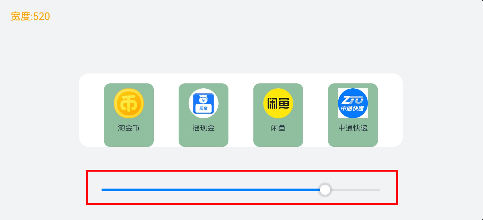
均分能力指的是容器尺寸发生变化时:将变化的空间,【均匀分配】给容器组件内【空白区域】。利用的是一个属性justifyContent,只能用在容器:Flex、Column、Row 上,将他设置为 SpaceEvenly即可
|
枚举名称 |
描述 |
|
Start |
元素在主轴方向首端对齐,第一个元素与行首对齐,同时后续的元素与前一个对齐。 |
|
Center |
元素在主轴方向中心对齐,第一个元素与行首的距离与最后一个元素与行尾距离相同。 |
|
End |
元素在主轴方向尾部对齐,最后一个元素与行尾对齐,其他元素与后一个对齐。 |
|
SpaceBetween |
Flex主轴方向均匀分配弹性元素,相邻元素之间距离相同。第一个元素与行首对齐,最后一个元素与行尾对齐。 |
|
SpaceAround |
Flex主轴方向均匀分配弹性元素,相邻元素之间距离相同。第一个元素到行首的距离和最后一个元素到行尾的距离是相邻元素之间距离的一半。 |
|
SpaceEvenly |
Flex主轴方向均匀分配弹性元素,相邻元素之间的距离、第一个元素与行首的间距、最后一个元素到行尾的间距都完全一样。 |
测试代码:
export interface NavItem {
  id: number
  icon: ResourceStr
  title: string
}

@Entry
  @Component
  struct Demo02 {
    readonly list: NavItem [] = [
      { id: 1, icon: $r('app.media.ic_nav_01'), title: '淘金币' },
      { id: 2, icon: $r('app.media.ic_nav_02'), title: '摇现金' },
      { id: 3, icon: $r('app.media.ic_nav_03'), title: '闲鱼' },
      { id: 4, icon: $r('app.media.ic_nav_04'), title: '中通快递' },
    ]
    @State rate: number = 600

    // 底部滑块,可以通过拖拽滑块改变容器尺寸
    @Builder
    sliderBuilder() {
      Slider({
        value: this.rate,
        min: 200,
        max: 600,
        style: SliderStyle.OutSet
      })
        .blockColor(Color.White)
        .width('60%')
        .position({ x: '20%', y: '80%' })
        .onChange((value)=>{
          this.rate = value
        })
    }

    build() {
      Stack({ alignContent: Alignment.TopStart }) {
        // 标记现在的宽度
        Text('宽度:' + this.rate.toFixed(0))
          .zIndex(2)
          .translate({ x: 20, y: 20 })
          .fontColor(Color.Orange)

        Column() {
          Column() {
            // 布局能力 2:均分能力
            // 指容器组件尺寸发生变化时,增加或减小的空间均匀分配给容器组件内所有【空白区域】。
            // 常用于内容数量固定、均分显示的场景,比如工具栏、底部菜单栏、导航栏等

            // 涉及属性:
            // Row、Column、Flex 组件的 justifyContent 属性
            // justifyContent设置为 FlexAlign.SpaceEvenly即可
            Row() {
              ForEach(this.list, (item: NavItem) => {
                Column() {
                  Image(item.icon)
                    .width(48)
                    .height(48)
                    .margin({ top: 8 })
                  Text(item.title)
                    .width(64)
                    .height(30)
                    .lineHeight(15)
                    .fontSize(12)
                    .textAlign(TextAlign.Center)
                    .margin({ top: 8 })
                    .padding({ bottom: 15 })
                }
                .width(80)
                      .height(102)
                      .backgroundColor('#8FBF9F')
                      .borderRadius(10)
                      })
            }
            .width('100%')
              .justifyContent(FlexAlign.SpaceEvenly)

          }
          .width(this.rate) // 绑定滑块改变的尺寸
            .padding({ top: 16 })
            .backgroundColor(Color.Pink)
            .borderRadius(16)


          this.sliderBuilder()
        }
        .width('100%')
          .height('100%')
          .backgroundColor('#F1F3F5')
          .justifyContent(FlexAlign.Center)
          .alignItems(HorizontalAlign.Center)
      }
    }
  }
3.1.3. 占比能力
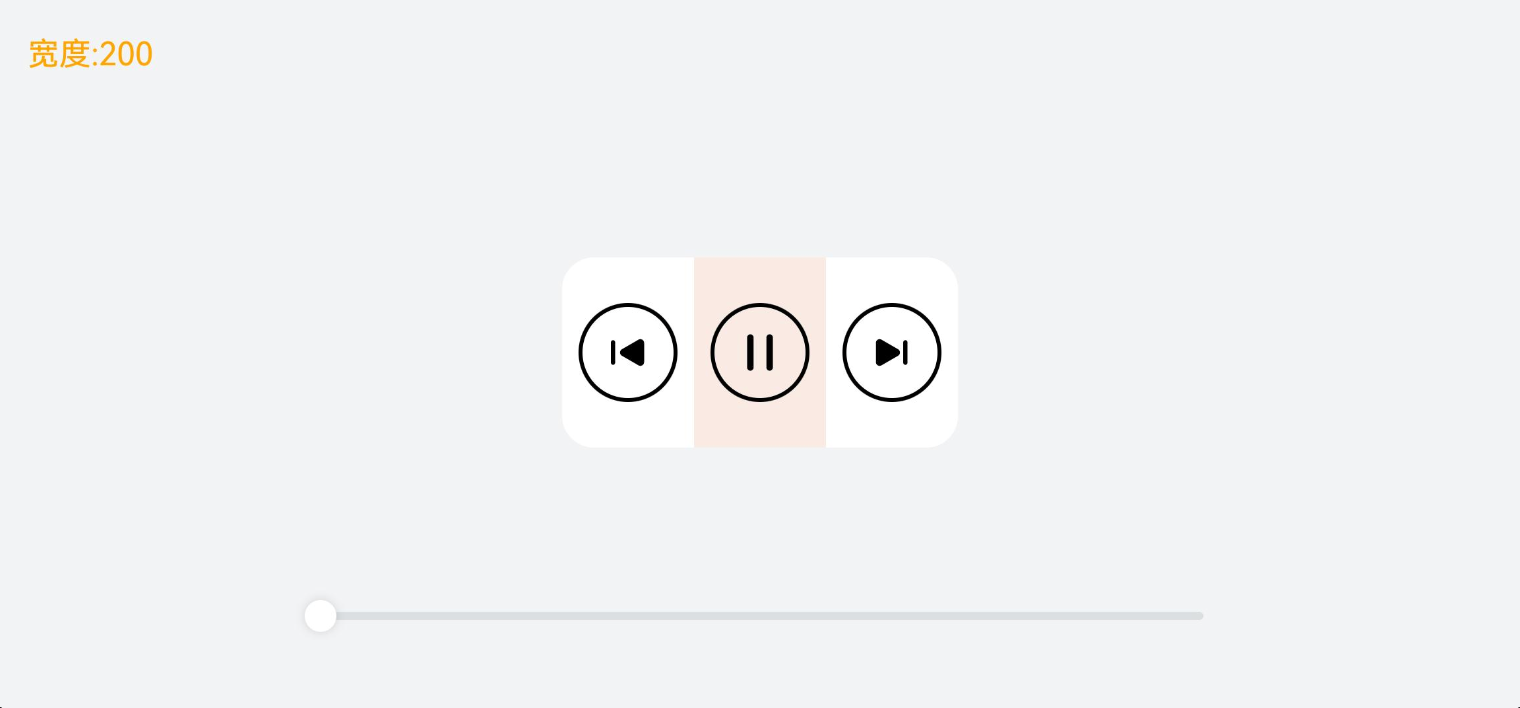
占比能力是指子组件的【宽高】按照【预设的比例】,随父容器组件发生变化。实现的方式有 2 种:
- 宽高设置为百分比
- 设置layoutWeight
|
属性名 |
类型 |
必填 |
说明 |
|
width |
是 |
要设置的组件宽度。 |
|
|
height |
是 |
要设置的组件高度。 |
|
|
layoutWeight |
number | string |
是 |
父容器尺寸确定时,设置了layoutWeight属性的子元素与兄弟元素占主轴尺寸按照权重进行分配,忽略元素本身尺寸设置,表示自适应占满剩余空间。 |
测试代码:
@Entry
  @Component
  struct Demo03 {
    @State rate: number = 200

    // 底部滑块,可以通过拖拽滑块改变容器尺寸
    @Builder
    slider() {
      Slider({
        value: this.rate,
        min: 200,
        max: 500,
        style: SliderStyle.OutSet
      })
        .blockColor(Color.White)
        .width('60%')
        .height(50)
        .position({ x: '20%', y: '80%' })
        .onChange((value)=>{
          this.rate = value
        })
    }

    build() {
      Stack({ alignContent: Alignment.TopStart }) {
        // 显示目前容器的宽度
        Text('宽度:' + this.rate.toFixed(0))
          .zIndex(2)
          .translate({ x: 20, y: 20 })
          .fontColor(Color.Orange)


        Column() {
          // 布局能力 3:占比能力
          // 子组件的宽高按照预设的比例,随父容器组件发生变化

          // 实现方式:
          // 1. 子组件的【宽高】设置为父组件宽高的【百分比】
          // 2. 通过 layoutWeight 属性设置主轴方向【布局权重】(比例)


          // 容器 主轴横向
          Row() {
            // 上一首
            Column() {
              Image($r("app.media.ic_public_play_last"))
                .width(50)
                .height(50)
                .border({ width: 2 })
                .borderRadius(30)
                .padding(10)

            }
            .height(96)
              .justifyContent(FlexAlign.Center)
              .alignItems(HorizontalAlign.Center)
              // .width('34%')
              .layoutWeight(1)


            // 播放&暂停
            Column() {
              Image($r("app.media.ic_public_pause"))
                .width(50)
                .height(50)
                .border({ width: 2 })
                .borderRadius(30)
                .padding(10)
            }
            .height(96)
              .backgroundColor(Color.Red)
              .justifyContent(FlexAlign.Center)
              .alignItems(HorizontalAlign.Center)
              // .width('34%')
              .layoutWeight(1)


            // 下一首
            Column() {
              Image($r("app.media.ic_public_play_next"))
                .width(50)
                .height(50)
                .border({ width: 2 })
                .borderRadius(30)
                .padding(10)
            }
            .height(96)
              .justifyContent(FlexAlign.Center)
              .alignItems(HorizontalAlign.Center)
              // .width('34%')
              .layoutWeight(1)

          }
          .width(this.rate) // 绑定宽度给 容器
            .height(96)
            .borderRadius(16)
            .backgroundColor(Color.Pink)

          // 调整宽度的滑块
          this.slider()
        }
        .width('100%')
          .height('100%')
          .backgroundColor('#F1F3F5')
          .justifyContent(FlexAlign.Center)
          .alignItems(HorizontalAlign.Center)
      }
    }
  }
3.1.4. 缩放能力
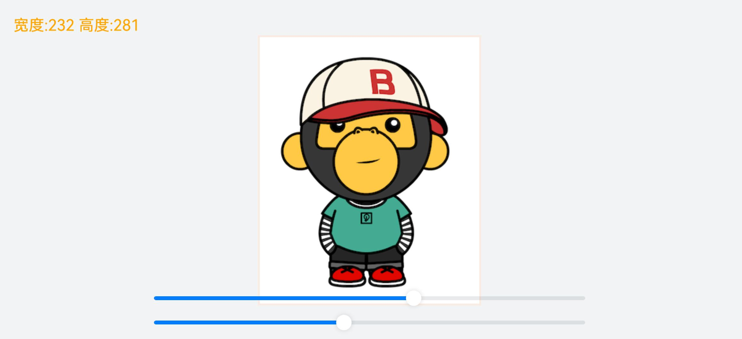
缩放能力是指子组件的【宽高】按照预设的比例,随容器组件发生变化,变化过程中子组件的【宽高比不变】。使用的属性是 aspectRatio
|
属性名 |
类型 |
必填 |
说明 |
|
aspectRatio |
number |
是 |
指定当前组件的宽高比,aspectRatio = width/height。 |
测试代码:
@Entry
  @Component
  struct Demo04 {
    @State sliderWidth: number = 400
    @State sliderHeight: number = 400

    // 底部滑块,可以通过拖拽滑块改变容器尺寸
    @Builder
    slider() {

      Slider({
        value: this.sliderHeight,
        min: 100,
        max: 400,
        style: SliderStyle.OutSet
      })
        .blockColor(Color.White)
        .width('60%')
        .height(50)
        .position({ x: '20%', y: '80%' })
        .onChange((value)=>{
          this.sliderHeight = value
        })

      Slider({
        value: this.sliderWidth,
        min: 100,
        max: 400,
        style: SliderStyle.OutSet
      })
        .blockColor(Color.White)
        .width('60%')
        .height(50)
        .position({ x: '20%', y: '87%' })
        .onChange((value)=>{
          this.sliderWidth = value
        })
    }

    build() {
      Stack({ alignContent: Alignment.TopStart }) {
        Text('宽度:' + this.sliderWidth.toFixed(0) + ' 高度:' + this.sliderHeight.toFixed(0))
          .zIndex(2)
          .translate({ x: 20, y: 20 })
          .fontColor(Color.Orange)
        Column() {
          // 动态修改该容器的宽高
          Column() {
            Column() {
              Image($r("app.media.avatar"))
                .width('100%')
                .height('100%')
            }
            .border({ width: 2, color: Color.Red }) // 边框,仅用于展示效果
            // 布局能力 4:缩放能力
            // 子组件的宽高按照预设的比例,随容器组件发生变化,且变化过程中子组件的【宽高比】不变。

            // 实现方式:
            // 给子组件设置 aspectRatio即可 设置的值是 宽度/高度

          }
          .backgroundColor(Color.Gray)
            .height(this.sliderHeight)
            .width(this.sliderWidth)
            .justifyContent(FlexAlign.Center)
            .alignItems(HorizontalAlign.Center)

          this.slider()
        }
        .width('100%')
          .height('100%')
          .backgroundColor("#F1F3F5")
          .justifyContent(FlexAlign.Center)
          .alignItems(HorizontalAlign.Center)
      }

    }
  }
3.1.5. 延伸能力
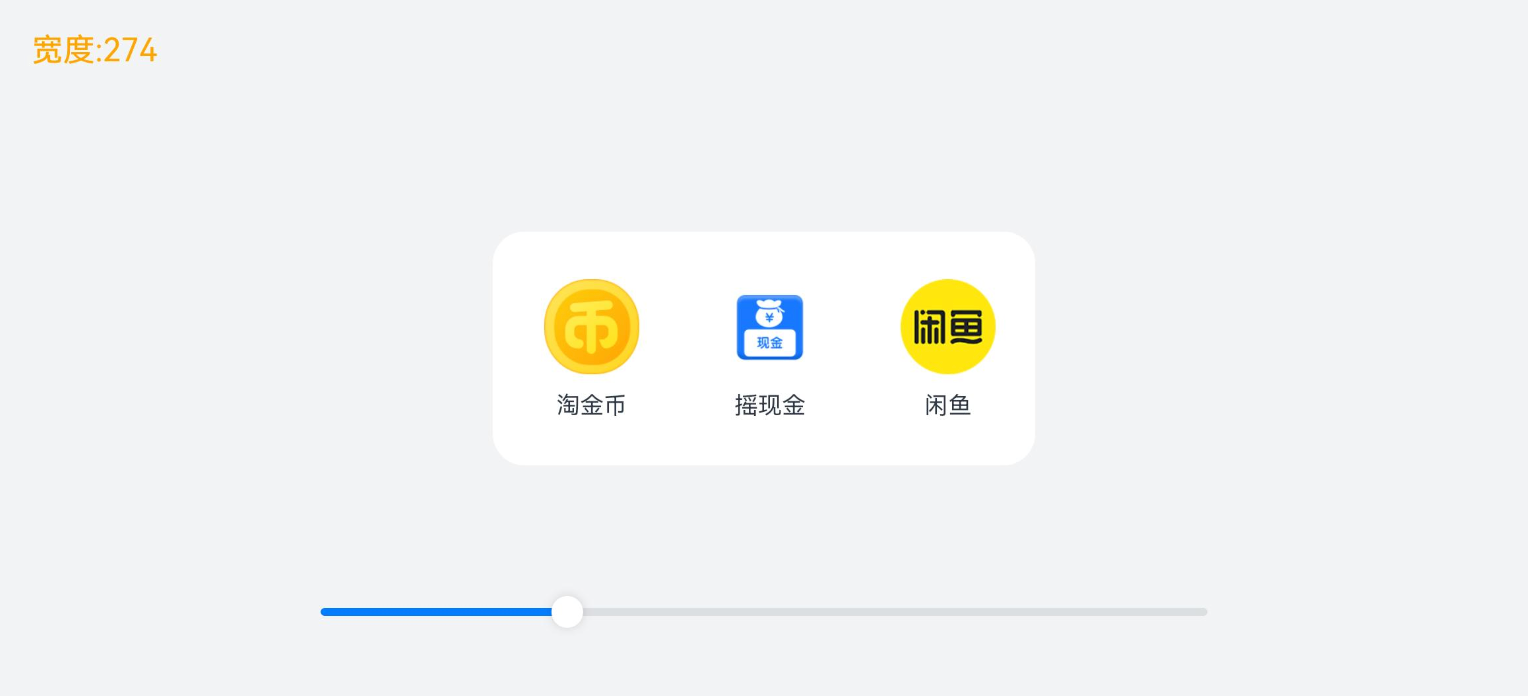
延伸能力是指容器组件内的子组件,按照其在列表中的先后顺序,随容器组件尺寸变化【显示或隐藏】,隐藏时可以通过滑动切换显示。实现的方式是通过 List 组件或 Scroll 组件
测试代码:
import { NavItem } from './Demo02'


@Entry
  @Component
  struct Demo05 {
    @State rate: number = 100
    // 数组
    readonly appList: NavItem [] = [
      { id: 1, icon: $r('app.media.ic_nav_01'), title: '淘金币' },
      { id: 2, icon: $r('app.media.ic_nav_02'), title: '摇现金' },
      { id: 3, icon: $r('app.media.ic_nav_03'), title: '闲鱼' },
      { id: 4, icon: $r('app.media.ic_nav_04'), title: '中通快递' },
      { id: 5, icon: $r('app.media.ic_nav_05'), title: '芭芭农场' },
      { id: 6, icon: $r('app.media.ic_nav_06'), title: '淘宝珍库' },
      { id: 7, icon: $r('app.media.ic_nav_07'), title: '阿里拍卖' },
      { id: 8, icon: $r('app.media.ic_nav_08'), title: '阿里药房' },
    ]

    // 底部滑块,可以通过拖拽滑块改变容器尺寸
    @Builder
    slider() {
      Slider({
        value: this.rate,
        min: 100,
        max: 730,
        style: SliderStyle.OutSet
      })
        .blockColor(Color.White)
        .width('60%')
        .height(50)
        .position({ x: '20%', y: '80%' })
        .onChange((value)=>{
          this.rate = value
        })
    }

    build() {
      Stack({ alignContent: Alignment.TopStart }) {
        // 展示宽度
        Text('宽度:' + this.rate.toFixed(0))
          .zIndex(2)
          .translate({ x: 20, y: 20 })
          .fontColor(Color.Orange)

        Column() {
          Row({ space: 10 }) {
            // 布局能力 5:延伸能力
            // 容器组件内的子组件,按照其在列表中的先后顺序,随容器组件尺寸变化【显示或隐藏】

            // 实现方式:
            // 1.List 组件
            // 2.Scroll 配合 Row 或者 Column
            // 核心:调整父容器的尺寸,让页面中显示的组件数量发生改变

            // 通过List组件实现隐藏能力
            List({ space: 10 }) {
              ForEach(this.appList, (item: NavItem) => {
                ListItem() {
                  Column() {
                    Image(item.icon)
                      .width(48)
                      .height(48)
                      .margin({ top: 8 })
                    Text(item.title)
                      .width(64)
                      .height(30)
                      .lineHeight(15)
                      .fontSize(12)
                      .textAlign(TextAlign.Center)
                      .margin({ top: 8 })
                      .padding({ bottom: 15 })
                  }
                  .width(80)
                    .height(102)
                }
                .width(80)
                      .height(102)
                      })
            }
            .padding({ top: 16, left: 10 })
              .listDirection(Axis.Horizontal)
              .width('100%')
              .height(118)
              .borderRadius(16)
              .backgroundColor(Color.White)

              // 通过Scroll 组件实现隐藏能力
              // Scroll() {
              //   Row({ space: 10 }) {
              //     ForEach(this.appList, (item: NavItem, index: number) => {
              //       Column() {
              //         Image(item.icon)
              //           .width(48)
              //           .height(48)
              //           .margin({ top: 8 })
              //         Text(item.title)
              //           .width(64)
              //           .height(30)
              //           .lineHeight(15)
              //           .fontSize(12)
              //           .textAlign(TextAlign.Center)
              //           .margin({ top: 8 })
          //           .padding({ bottom: 15 })
          //       }
          //       .width(80)
          //       .height(102)
          //     })
          //   }
          // }
          // .scrollable(ScrollDirection.Horizontal) // 设置横向滚动
          // .padding({ top: 16, left: 10 })
          // .height(118)
          // .borderRadius(16)
          // .backgroundColor(Color.White)
        }
        .width(this.rate)

        this.slider()
      }
      .width('100%')
      .height('100%')
      .backgroundColor(Color.Pink)
      .justifyContent(FlexAlign.Center)
      .alignItems(HorizontalAlign.Center)
    }

  }
}
3.1.6. 隐藏能力
隐藏能力指的是:按其【显示优先级】,随容器组件尺寸变化显示或隐藏。通过displayPriority属性来实现
|
属性名 |
类型 |
必填 |
说明 |
|
displayPriority |
number |
是 |
设置当前组件在布局容器中显示的优先级,当父容器空间不足时,低优先级的组件会被隐藏。 |
测试代码:
@Entry
  @Component
  struct Demo06 {
    @State rate: number = 48

    // 底部滑块,可以通过拖拽滑块改变容器尺寸
    @Builder
    slider() {
      Slider({
        value: this.rate,
        min: 0,
        max: 400,
        style: SliderStyle.OutSet
      })
        .blockColor(Color.White)
        .width('60%')
        .height(50)
        .position({ x: '20%', y: '80%' })
        .onChange((value)=>{
          this.rate = value
        })
    }

    build() {
      Stack({ alignContent: Alignment.TopStart }) {
        Text('宽度:' + this.rate.toFixed(0))
          .zIndex(2)
          .translate({ x: 20, y: 20 })
          .fontColor(Color.Orange)

        Column() {
          // 布局能力 6:隐藏能力
          // 容器组件内的子组件,按照其预设的显示优先级,随容器组件尺寸变化显示或隐藏

          // 实现方式:
          // displayPriority属性:设置布局优先级来控制显隐
          // 当主轴方向剩余尺寸不足以满足全部元素时,按照布局优先级,从[小到大]依次隐藏


          Row({ space: 10 }) {
            Image($r("app.media.ic_public_favor"))
              .width(48)
              .height(48)


            Image($r("app.media.ic_public_play_last"))
              .width(48)
              .height(48)


            Image($r("app.media.ic_public_pause"))
              .width(48)
              .height(48)


            Image($r("app.media.ic_public_play_next"))
              .width(48)
              .height(48)
              .objectFit(ImageFit.Contain)


            Image($r("app.media.ic_public_view_list"))
              .width(48)
              .height(48)
              .objectFit(ImageFit.Contain)

          }
          .width(this.rate)
            .height(96)
            .borderRadius(16)
            .backgroundColor(Color.Gray)
            .justifyContent(FlexAlign.Center)
            .padding(10)

          this.slider()
        }
        .width('100%')
          .height('100%')
          .backgroundColor('#F1F3F5')
          .justifyContent(FlexAlign.Center)
          .alignItems(HorizontalAlign.Center)
      }

    }
  }
@Entry
@Component
struct DisplayCase {
@State message: string = 'Hello World';
build() {
Row() {
Image($r("sys.media.waveform_folder_fill"))
.width(100)
.aspectRatio(1)
.displayPriority(1)
Image($r("sys.media.rectangle_filled_and_line_horizontal_and_rectangle"))
.width(100)
.aspectRatio(1)
.displayPriority(2)
Image($r("sys.media.ohos_user_auth_icon_face"))
.width(100)
.aspectRatio(1)
.displayPriority(3)
Image($r("sys.media.phone_arrow_down_left_circle_fill"))
.width(100)
.aspectRatio(1)
.displayPriority(2)
Image($r("sys.media.ohos_save_button_filled"))
.width(100)
.aspectRatio(1)
.displayPriority(1)
}
.justifyContent(FlexAlign.SpaceEvenly)
.height('100%')
.width('100%')
}
}3.1.7. 折行能力
折行能力是指容器组件尺寸发生变化,当布局方向尺寸不足以显示完整内容时自动换行。折行能力通过使用 Flex折行布局 (将wrap属性设置为FlexWrap.Wrap)实现。
|
名称 |
描述 |
|
NoWrap |
Flex容器的元素单行/列布局,子项不允许超出容器。 |
|
Wrap |
Flex容器的元素多行/列排布,子项允许超出容器。 |
|
WrapReverse |
Flex容器的元素反向多行/列排布,子项允许超出容器。 |
测试代码:
import { NavItem } from './Demo02'

@Entry
  @Component
  struct Demo07 {
    @State rate: number = 0.7
    readonly imageList: NavItem [] = [
      { id: 1, icon: $r('app.media.ic_nav_01'), title: '淘金币' },
      { id: 2, icon: $r('app.media.ic_nav_02'), title: '摇现金' },
      { id: 3, icon: $r('app.media.ic_nav_03'), title: '闲鱼' },
      { id: 4, icon: $r('app.media.ic_nav_04'), title: '中通快递' },
      { id: 5, icon: $r('app.media.ic_nav_05'), title: '芭芭农场' },
      { id: 6, icon: $r('app.media.ic_nav_06'), title: '淘宝珍库' },
    ]

    // 底部滑块,可以通过拖拽滑块改变容器尺寸
    @Builder
    slider() {
      Slider({
        value: this.rate * 100,
        min: 10,
        max: 100,
        style: SliderStyle.OutSet
      })
        .blockColor(Color.White)
        .width('60%')
        .position({ x: '20%', y: '87%' })
        .onChange((value: number) => {
          this.rate = value / 100
        })
    }

    build() {
      Stack({ alignContent: Alignment.TopStart }) {
        Text('宽度:' + (this.rate * 100).toFixed(0) + '%')
          .zIndex(2)
          .translate({ x: 20, y: 20 })
          .fontColor(Color.Orange)
        Flex({ justifyContent: FlexAlign.Center, direction: FlexDirection.Column }) {
          Column() {
            // 布局能力 7:折行能力
            // 容器组件尺寸发生变化,当布局方向尺寸不足以显示完整内容时自动换行

            // 实现方式:
            // Flex组件将 wrp 设置为FlexWrap.Wrap即可


            // 通过Flex组件warp参数实现自适应折行
            Flex({
              direction: FlexDirection.Row,
              alignItems: ItemAlign.Center,
              justifyContent: FlexAlign.Center,
            }) {
              ForEach(this.imageList, (item: NavItem) => {
                Column() {
                  Image(item.icon)
                    .width(80)
                    .height(80)
                  Text(item.title)
                }
                .margin(10)
                      })
            }
            .backgroundColor(Color.Gray)
              .padding(20)
              .width(this.rate * 100 + '%')
              .borderRadius(16)

          }
          .width('100%')

          this.slider()
        }
        .width('100%')
          .height('100%')
          .backgroundColor('#F1F3F5')
          .expandSafeArea([SafeAreaType.SYSTEM], [SafeAreaEdge.TOP, SafeAreaEdge.BOTTOM])
      }
    }
  }
3.1.8. 小结
参考的话术:
什么是一多开发?
- 鸿蒙开发体系中, 主打的是1(HarmonyOS)+8(手机/平板/...)+N(其它的智能设备)
- 一套代码, 多端部署, 按需适配
一多开发要解决哪些问题?
- 界面级一多(界面的适配问题)
-
- 自适应布局 (小范围布局)
-
-
- 拉伸/均分/占比/缩放/延伸/隐藏/折行
-
-
- 响应式布局 (大的界面改变)
-
-
- 断点
- 媒体查询
-
- 功能级一多(所有功能不可能在所有设备都使用
-
- canIUse
- 工程级一多(项目的组织和管理)
-
- 三层架构 + hsp
-----------------------------------
- 一多开发中,提供了 2 种能力实现页面适配:
-
- 自适应布局:
-
-
- 核心就是利用一些组件及属性实现适配效果
- 比如 layoutWeight实现占比,比如 aspectRatio可以实现缩放
- 隐藏可以用 displayPriority
- 一共有 7 个,一下子可能想不起来那么多,核心就是一些属性而已
- 只能解决小屏幕手机到大屏幕手机的适配
-
-
- 响应式布局
- 不同终端设备的变化需要使用响应式布局
HarmonyOS赋能资源丰富度建设(第四期)-吴东林

作为“人工智能6S店”的官方数字引擎,为AI开发者与企业提供一个覆盖软硬件全栈、一站式门户。
更多推荐

 17
17 0
0- 0


 已为社区贡献8条内容

所有评论(0)