
鸿蒙5:HarmonyOS应用开发-使用原生动画
注意:博主有个鸿蒙专栏,里面从上到下有关于鸿蒙next的教学文档,大家感兴趣可以学习下
如果大家觉得博主文章写的好的话,可以点下关注,博主会一直更新鸿蒙next相关知识
目录
1. 使用动画
1.1 属性动画
1.1.1 简单介绍
属性接口(以下简称属性)包含尺寸属性、布局属性、位置属性等多种类型,用于控制组件的行为。针对当前界面上的组件,其部分属性(如位置属性)的变化会引起UI的变化。添加动画可以让属性值从起点逐渐变化到终点,从而产生连续的动画效果。根据变化时是否能够添加动画,可以将属性分为可动画属性和不可动画属性。
1.1.2 动画属性
可动画属性:
|
分类 |
说明 |
|
布局属性 |
位置、大小、内边距、外边距、对齐方式、权重等。 |
|
仿射变换 |
平移、旋转、缩放、锚点等。 |
|
背景 |
背景颜色、背景模糊等。 |
|
内容 |
文字大小、文字颜色,图片对齐方式、模糊等。 |
|
前景 |
前景颜色等。 |
|
Overlay |
Overlay属性等。 |
|
外观 |
透明度、圆角、边框、阴影等。 |
|
... |
... |
1.1.3 属性动画的实现方式有三种
- animation属性
- animateTo函数
- @animator工具类
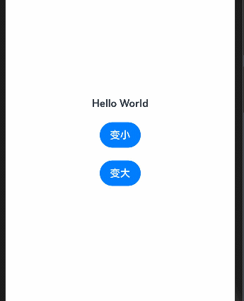
1.1.4 通过animation属性
识别组件的可动画属性变化,自动添加动画
@Entry
  @Component
  struct AnimationCase {
    @State message: string = 'Hello World';
    @State textSize: number = 50

    build() {
      Row() {
        Column({ space: 20 }) {
          Text(this.message)
            .fontSize(this.textSize)
            .fontWeight(FontWeight.Bold)
            .animation({
              // 动画时间
              duration: 1000,
              // 重复次数,-1代表不重复
              iterations: 3,
              // 动画曲线
              curve: Curve.Smooth,
              // 延迟时间
              delay: 1000,
              // 播放模式
              playMode: PlayMode.Alternate
            })
          Button('变小')
            .onClick(() => {
              this.textSize = 16
            })
          Button('变大')
            .onClick(() => {
              this.textSize = 50
            })
        }
        .width('100%')
      }
      .height('100%')
    }
  }
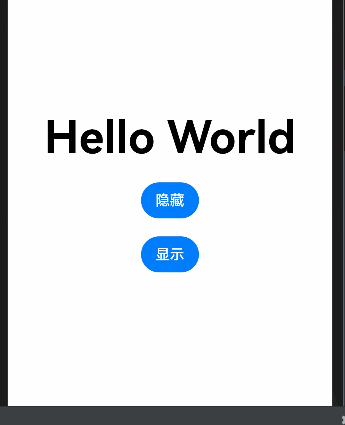
1.1.5 使用animateTo函数
animateTo(value: AnimateParam, event: () => void): void
原理
通用函数,对闭包前界面和闭包中的状态变量引起的界面之间的差异做动画。支持多次调用,支持嵌套。
解释: 不论是组件的显示隐藏还是属性的变化,使用animateTo都可以实现动画
@Entry
  @Component
  struct AnimateToCase2 {
    @State message: string = 'Hello World';
    @State textSize: number = 50
    @State textColor: string = '#000'
    @State textOpacity: number = 1

    build() {
      Row() {
        Column({ space: 20 }) {
          Text(this.message)
            .fontSize(this.textSize)
            .fontWeight(FontWeight.Bold)
            .fontColor(this.textColor)
            .opacity(this.textOpacity)
          Button('隐藏')
            .onClick(() => {
              animateTo({ duration:1000 },()=>{
                this.message = 'World Hello'
                this.textSize = 16
                this.textColor = '#ff4400'
                this.textOpacity = 0
              })
            })
          Button('显示')
            .onClick(() => {
              animateTo({duration:2000},()=>{
                this.message = 'Hello World'
                this.textSize = 50
                this.textColor = '#ff00f0'
                this.textOpacity = 1
              })
            })
        }
        .width('100%')
      }
      .height('100%')
    }
  }
1.1.6 通过@animator
之前两种方式都使用于单次执行动画,如果有一个动画需要重复执行,并且还需要开关控制,这种复杂的动画,更适合交给animator类来实现,我们实现一个播放状态CD旋转,暂停状态CD停止旋转的效果

animator使用步骤:
- 1.手动引入animator
- 2.准备AnimatorOptions的动画参数
- 3.创建AnimatorResult类型的动画类
- 4.监听动画的结果更新UI
// 只能手动引入animator
import animator, { AnimatorOptions, AnimatorResult } from '@ohos.animator'

@Entry
  @Component
  struct AnimateToCase4 {
    // 1.准备动画参数
    CDAnimatorOption: AnimatorOptions = {
      duration: 10 * 1000,
      easing: "linear",
      delay: 0,
      fill: "forwards",
      direction: "normal",
      iterations: -1,
      // 上面的参数一个不能少
      // 下面的参数是动画的核心
      // 这里的起始只有一个值,但是你可以自己定义这个值用在哪里,比如我们用在旋转角度
      // 那么起始角度是0
      begin: 0,
      // 那么终止角度是360
      end: 360
    }
    // 2.准备动画类
    CDAnimator: AnimatorResult = animator.create(this.CDAnimatorOption)

    // 3.监听动画的值,动态改变@State的值引起UI更新从而产生动画
    aboutToAppear(): void {
      this.CDAnimator.onframe = (value) => {
        this.rotateAngle = value
      }
    }

    @State
    rotateAngle: number = 0
    @State
    isPlay: boolean = false

    build() {
      Row() {
        Column({ space: 20 }) {
          Image($r('app.media.img'))
            .width(200)
            .aspectRatio(1)
            .borderRadius(100)
            .rotate({
              angle: this.rotateAngle
            })
          Button('播放/暂停')
            .onClick(() => {
              this.isPlay = !this.isPlay
              this.isPlay ? this.CDAnimator.play() : this.CDAnimator.pause()
            })
        }
        .width('100%')
      }
      .height('100%')
    }
  }
使用@AnitateableExtend装饰器自定义动画
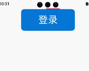
@AnimatableExtend(Row)
  function rotateExtend(angle: number) {
    .rotate({
      angle,
      centerX: 0,
      centerY: 0
    });
  }

@Entry
  @Component
  struct AnimatableExtendCase {
    @State
    angle: number = 0;
    @State
    bgColor: ResourceColor = '#be1c5d';

    build() {
      Column() {
        Row() {
          // 边
          Row()
            .width(150)
            .height(70)
            .position({
              left: '50%',
              top: '50%'
            })
            .rotateExtend(this.angle)
            .backgroundColor(this.bgColor)
            .animation({
              duration: 1000,
              iterations: -1,
              curve: Curve.Linear
            });
          // 内容
          Row() {
            Text('登录')
              .fontSize(32)
              .fontColor(Color.White);
          }
          .width(200)
            .height(80)
            .backgroundColor('#0877d4')
            .borderRadius(8)
            .justifyContent(FlexAlign.Center)
            .onClick(() => {
              this.angle = 360;
            });
        }
        .width(204)
          .height(84)
          .borderRadius(8)
          .backgroundColor(Color.Transparent)
          .justifyContent(FlexAlign.Center)
          .clip(true);

      }
      .height('100%')
        .width('100%');
    }
  }
1.1.7 练习:做一个心跳的案例吧

1.2 图片帧动画
通过使用ImageAnimator组件实现逐帧播放图片的能力,可以配置需要播放的图片列表,每张图片可以配置时长
(图片找老师要)
@Entry
  @Component
  struct ImageAnimatorCase {

    build() {
      Row() {
        Column() {
          ImageAnimator()
            .images(Array.from(Array(37),(item:string,index:number)=>{
              // 图片路径不能含中文
              return {src:`/assets/JDLoading/loading_${index}.png`} as ImageFrameInfo
            }))
            .duration(3000)
            .state(AnimationStatus.Running)
            .fillMode(FillMode.None)
            .iterations(-1)
            // 必须有宽高
            .width(340)
            .aspectRatio(1)
        }
        .width('100%')
      }
      .height('100%')
    }
  }
通过state属性可以控制图片的动画的执行方式
AnimationStatus.Initial 初始化 - 不播放动画
AnimationStatus.Running 播放中 - 播放动画
AnimationStatus.Paused 暂停 - 暂停动画至当前帧
生成一个长度为10的数组:
Array(10)
设置数组每一项的内容:
Array.form(Array(10),(item,index)=>{
return `${index}`
})
1.3 转场动画
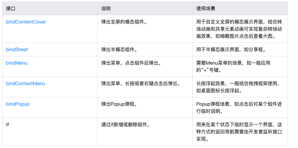
- 共享元素转场
- 出现/消失转场
- 模态转场 bindSheet 半模态/bindContentCover 全模态
- 组件内转场 transition属性
- 页面专场(不推荐)
- 导航动画(新增)使用navigation组件跳转路由的动画
- 旋转屏动画增强(新增)一行配置,旋转进场(应用场景较少,不能灵活配置)参考链接
1.3.1 共享元素转场

页面间元素共享转场动画实现:sharedTrasition('共享标识')
同一共享标识的组件在页面间切换时会形成动画
页面1跳转页面2共享同一组件
页面1
import { router } from '@kit.ArkUI';

@Entry
  @Component
  struct SharedElementCase01 {
    @State message: string = 'SharedElementCase01';

    build() {
      Column() {
        Text(this.message)
          .fontSize(50)
          .fontWeight(FontWeight.Bold)
        Image($r('app.media.img'))
          .width(200)
          .sharedTransition('sharedId')
        Button('登录')
          .onClick(() => {
            router.pushUrl({
              url: 'pages/SharedElementCase02'
            })
          })
      }
      .width('100%')
        .height('100%')
    }
  }
页面2
@Entry
  @Component
  struct SharedElementCase02 {
    @State message: string = 'SharedElementCase02';

    build() {
      Column() {
        Text(this.message)
          .fontSize(50)
          .fontWeight(FontWeight.Bold)
        Image($r('app.media.img'))
          .width(50)
          .position({
            x: 20,
            y: 20
          })
          .sharedTransition('sharedId', {
            duration: 2*1000
          })

      }
      .justifyContent(FlexAlign.Center)
        .width('100%')
        .height('100%')
    }
  }
1.3.2 出现/消失专场
直接使用animateTo函数即可
@Entry
  @Component
  struct ShowOrHideCase {
    @State message: string = 'Hello World';
    @State
    showMessage: boolean = false
    build() {
      Row() {
        Column() {
          Column() {
            if(this.showMessage) {
              Text(this.message)
                .fontSize(50)
                .fontWeight(FontWeight.Bold)
            }
          }
          .height(50)

          Button("显示/隐藏")
            .onClick(() => {
              animateTo({ duration: 1000 },  () => {
                this.showMessage = !this.showMessage
              })
            })

        }
        .width('100%')
      }
      .height('100%')
    }
  }
1.3.3 模态专场
模态转场是新的界面覆盖在旧的界面上,旧的界面不消失的一种转场方式。
和之前选择图片Case使用的效果一样
@Entry
  @Component
  struct BindSheetCase {
    // 半模态转场显示隐藏控制
    @State isShowSheet: boolean = false;

    // 通过@Builder构建半模态展示界面
    @Builder
    mySheet() {
      Column() {
        Text('我是SheetBuilder')
          .fontSize(30)
      }
      .padding(20)
        .width('100%')
        .height('100%')
        .backgroundColor(Color.White)
    }

    build() {
      Column({ space: 20 }) {
        Text('BindSheetCase')
          .fontSize(28)
          .padding({ top: 30, bottom: 30 })
        Button('打开Sheet')
          .onClick(() => {
            this.isShowSheet = true
          })
      }
      .width('100%')
        .height('100%')
        .backgroundColor('#f5f7f8')
        .bindSheet(this.isShowSheet, this.mySheet(), {
          height: 300,
          // 如果使用内置关闭按钮,手动改变开关
          onDisappear:()=>{
            this.isShowSheet = !this.isShowSheet
          }
        })
    }
  }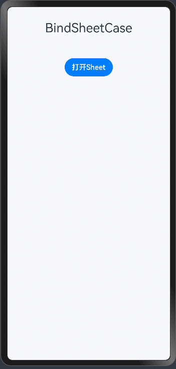
全模态和半模态弹层使用方式一样,第三个参数可以设置弹层的 modalTransition 显示模式
1.3.4 组件内元素专场transition
组件内转场主要通过transition属性配置转场参数,在组件插入和删除时显示过渡动效,主要用于容器组件中的子组件插入和删除时,提升用户体验。
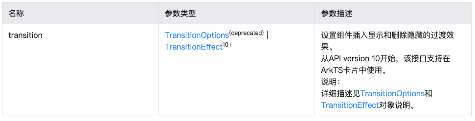
4.0中的我们使用的transitionOption的属性被废弃了,新增了TransitionEffect的属性设置方式
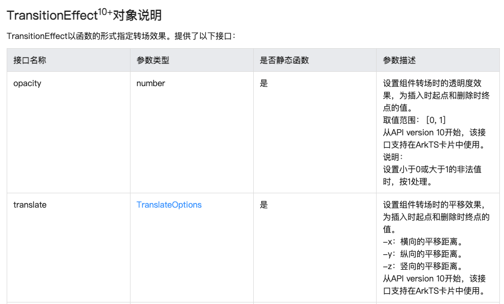

语法
.transition(TransitionEffect.SLIDE.animation({
duration: 1000
}).combine(TransitionEffect.rotate({
angle: -180
})).combine(TransitionEffect.translate({
x: '-100%'
})))
有三种模式可选

  TransitionEffect.translate({x:'-100%'}).animation({duration:2000})
                .combine(TransitionEffect.rotate({angle:360}).animation({duration:1000}))
@Entry
@Component
struct ComAnCase {
@State
showImage: boolean = false
build() {
Row() {
Column({ space: 20 }) {
Column() {
if(this.showImage) {
Image($r("app.media.img"))
.width(100)
.height(100)
.borderRadius(50)
.transition(
TransitionEffect.translate({x:'-100%'}).animation({duration:2000})
.combine(TransitionEffect.rotate({angle:360}).animation({duration:1000}))
)
}
}
.height(100)
Button("显示/隐藏")
.onClick(() => {
this.showImage = !this.showImage
})
}
.width('100%')
}
.height('100%')
}
}
依赖于一个模式才能触发,不如自定义动画灵活,了解即可
1.3.5 页面转场动画(不推荐)
使用方法为:
声明转场动画,包含入场和离场两个函数,进行样式的控制即可
page1
import { router } from '@kit.ArkUI';
@Entry
@Component
struct PageTransitionPage1 {
@State message: string = 'PageTransitionPage1';
build() {
Row() {
Column() {
Text(this.message)
.fontSize(50)
.fontWeight(FontWeight.Bold)
Image($r('app.media.img'))
.width(200)
.onClick(()=>{
router.pushUrl({
url:'pages/PageTransitionPage2'
})
})
}
.width('100%')
}
.height('100%')
}
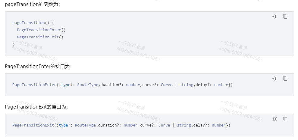
pageTransition() {
// 定义页面进入时的效果,从右侧滑入,时长为1000ms,页面栈发生push操作时该效果才生效
PageTransitionEnter({ type: RouteType.Push, duration: 3000 })
.slide(SlideEffect.Right)
// 定义页面进入时的效果,从左侧滑入,时长为1000ms,页面栈发生pop操作时该效果才生效
PageTransitionEnter({ type: RouteType.Pop, duration: 1000 })
.slide(SlideEffect.Left)
// 定义页面退出时的效果,向左侧滑出,时长为1000ms,页面栈发生push操作时该效果才生效
PageTransitionExit({ type: RouteType.Push, duration: 3000 })
.slide(SlideEffect.Left)
// 定义页面退出时的效果,向右侧滑出,时长为1000ms,页面栈发生pop操作时该效果才生效
PageTransitionExit({ type: RouteType.Pop, duration: 1000 })
.slide(SlideEffect.Right)
}
}page2
import { router } from '@kit.ArkUI';

@Entry
  @Component
  struct PageTransitionPage2 {
    @State message: string = 'PageTransitionPage2';

    build() {
      Row() {
        Column() {
          Text(this.message)
            .fontSize(50)
            .fontWeight(FontWeight.Bold)
          Button('push进入1')
            .onClick(()=>{
              router.pushUrl({
                url:'pages/PageTransitionPage1'
              })
            })
          Button('pop进入1')
            .onClick(()=>{
              router.back()
            })
        }
        .width('100%')
      }
      .height('100%')
    }
  }
HarmonyOS赋能资源丰富度建设(第四期)-吴东林

作为“人工智能6S店”的官方数字引擎,为AI开发者与企业提供一个覆盖软硬件全栈、一站式门户。
更多推荐

 30
30 0
0- 0


 已为社区贡献8条内容

所有评论(0)