
React Native for OpenHarmony 实战:三方库 react-native-switch-selector 的鸿蒙化适配指南
本文记录把 react-native-switch-selector(二选一开关 / 分段开关)适配到 HarmonyOS 的完整过程。
它是一个纯 JS class 组件(index.js 336 行),用一个会滑动的色块表示当前选中项,还支持左右滑动切换。它带来一个很容易让人以为"组件坏了"的默认值:
defaultProps.initial = -1,而源码里getBgColor() { const { selected } = this.state; if (selected === -1) { return 'transparent'; } // ← 滑块变透明 return options[selected]?.activeColor || buttonColor; }⇒ 不传
initial(也不传value)时,滑块是透明的 —— 屏慕上只看得到文字和边框,看不到那个会动的色块,而且不报错、不警告。
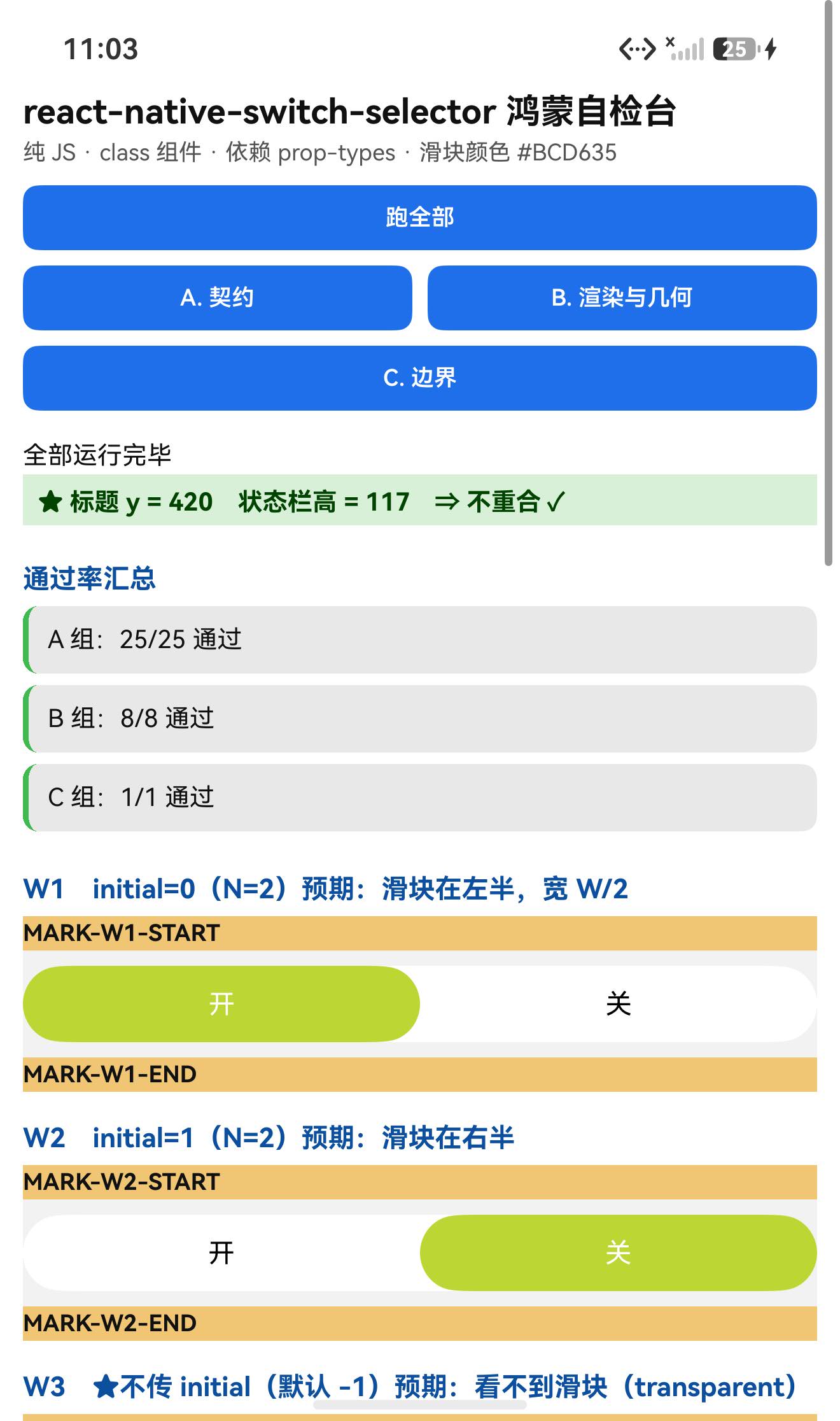
实测(滑块颜色是 buttonColor: '#BCD635',黄绿):不传 initial 的实例,按该颜色扫全屏是 0 个像素 ✓
另一个很适合做量化验证的点:滑块的几何可以精确算出来。hasPadding=false、buttonMargin=0 时:
滑块宽度 = width / options.length
translateX = (k / options.length) · width      ← animatedValue = k/N 插值到 [0, width]
⇒ 滑块左边界 = (k/N)·width,宽 = width/N ⇒ 正好覆盖第 k 格
实测(容器宽 1248px、N=2)三个实例:
| 实例 | 配置 | 预期滑块 x | 实测滑块 x |
|---|---|---|---|
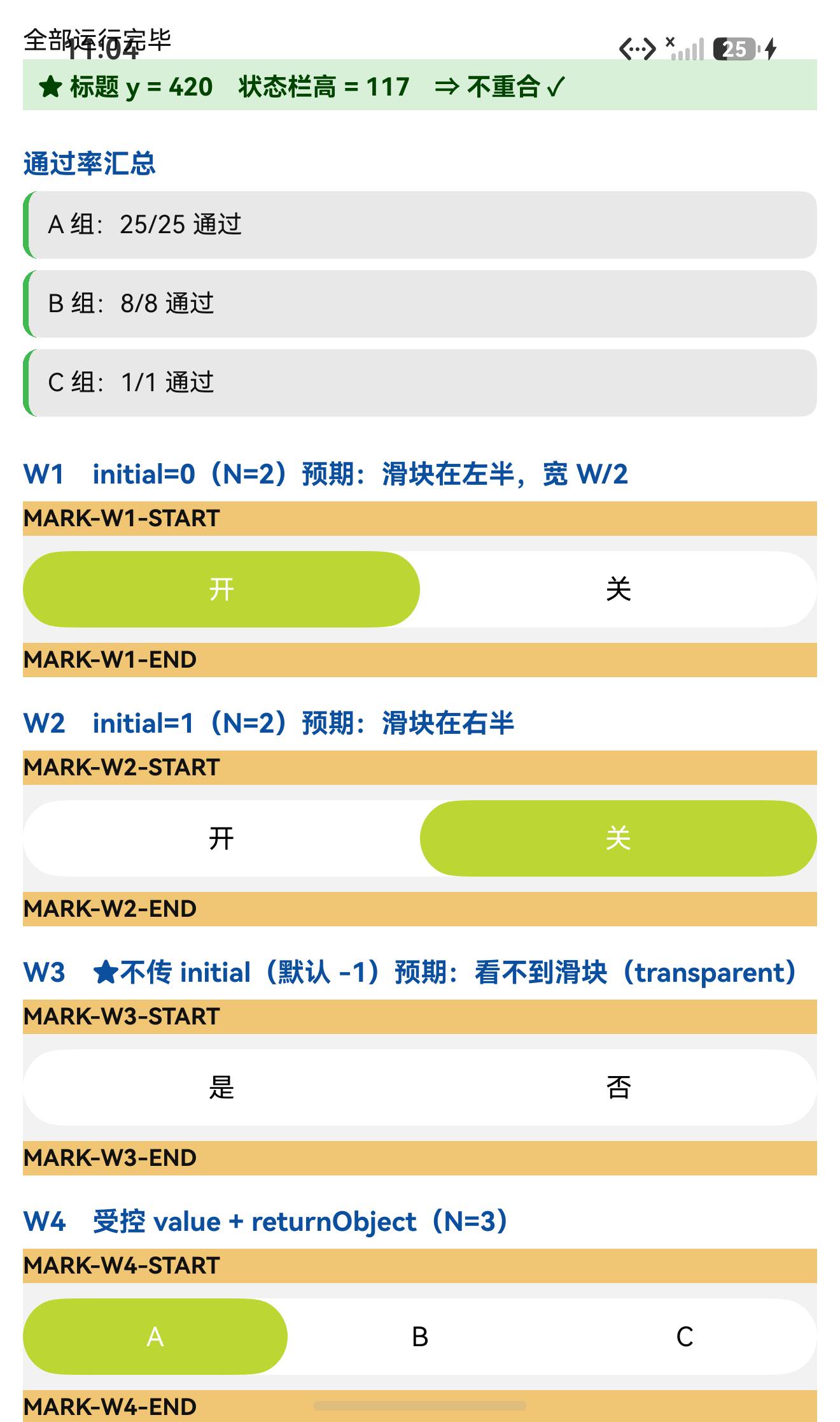
| W1 | initial={0} | 36…660(左半) | 37…658 ✓ |
| W2 | initial={1} | 660…1284(右半) | 661…1282 ✓ |
| W3 | 不传 initial | 无滑块 | 0 像素匹配 ✓✓ |
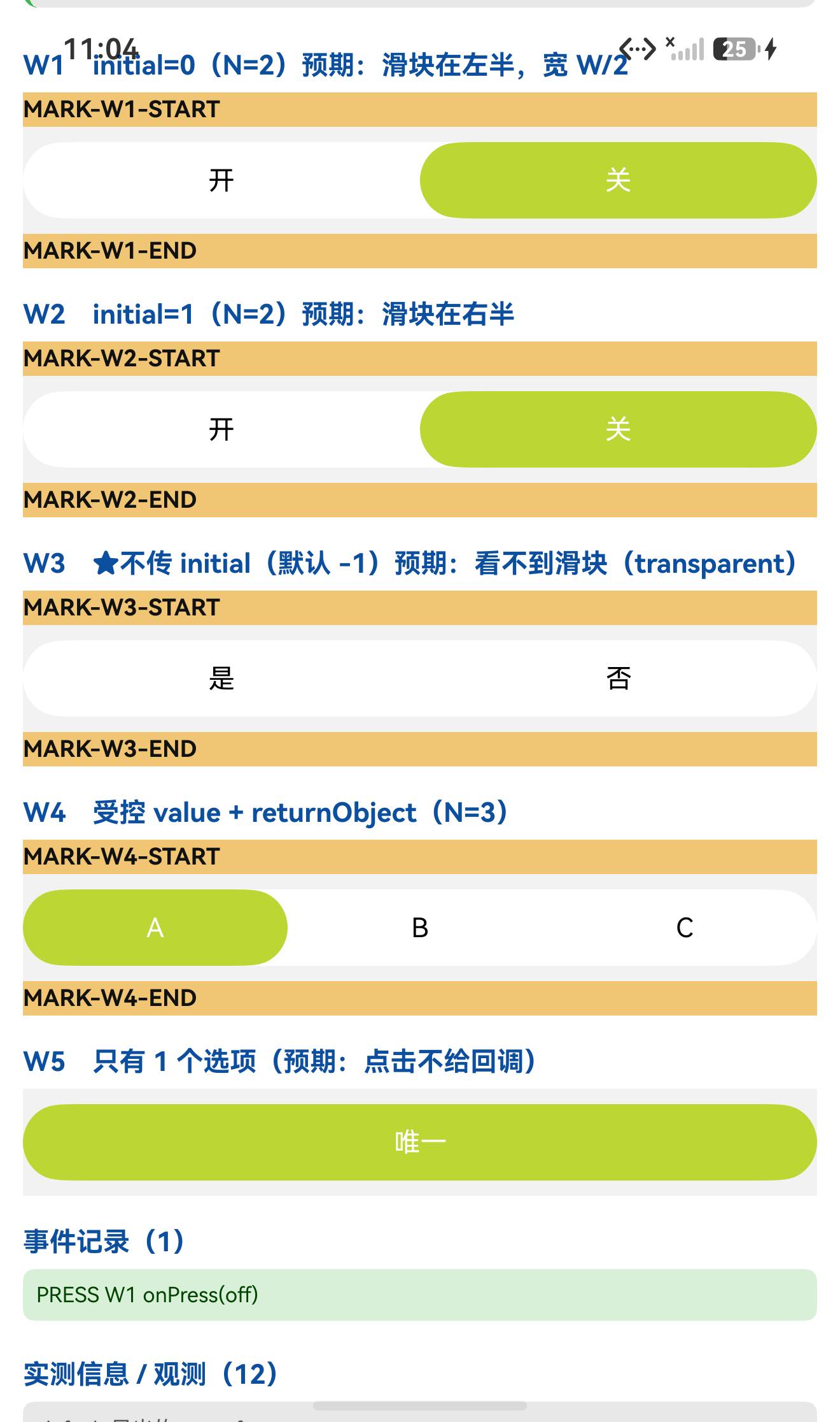
而且交互也一并验到了:点右侧选项 ⇒ PRESS W1 onPress(off)(拿到的是该选项的 value)✓
设备侧断言 34 / 34 全部通过。
一、先说结论
| 项 | 结果 |
|---|---|
| 上游最新版 | 2.3.0;license: MIT;上游 star 46 |
| 库类型 | 纯 JS 单组件库:SwitchSelector(class 组件) |
| 是否需要原生适配 | 不需要(无 harmony/、无 NativeModules;import 图只有 prop-types / react / react-native) |
| 运行时依赖 | ⚠️ 有:prop-types@^15.7.2 ⇒ 目录/file: 接入不会自动装它(本轮宿主里恰好已有 15.8.1,所以没被咬到;换干净宿主会直接崩) |
prepare / prepublish | 都没有(只有 lint / test)⇒ 安装路径干净 |
main | index.js(源码,不是产物) |
| 导出形态 | export default class SwitchSelector ⇒ 有 default 导出,是 class |
| 需要 HAR / 权限 / ohpm | ❌ 都不需要 |
| 设备侧断言 | ✅ 34 / 34 全部通过(A 25 + B 8 + C 1) |
| ★★ 最重要的坑 | initial 默认 -1 ⇒ 滑块颜色 transparent ⇒ 屏上完全看不到滑块(不报错) |
| ★ 像素判据 | ✅ 滑块 #BCD635:W1 左半 37…658、W2 右半 661…1282、W3 无 |
| ★ 交互 | ✅ 点选项 ⇒ onPress(off)(拿到 value) |
二、判定与接入
| 步 | 做法 | 结果 |
|---|---|---|
| ① | package.json 里有没有 harmony.autolinking | 没有 |
| ② | 仓库里有没有 harmony/ | 没有 |
| ③ | 代码里有没有 NativeModules / requireNativeComponent | 全无 |
| ④ | import 图体检 | 只有 prop-types / react / react-native ✓ |
| ⑤ | scripts 扫 prepare 家族 | 没有 ✓ |
npm install "git+https://atomgit.com/oh-react-native/react-native-switch-selector.git#2.3.0-ohos-1.0.0" --ignore-scripts

# ⚠️ 它自带运行时依赖 prop-types,目录/软链接入不会自动装
npm install prop-types --ignore-scripts
// metro.config.js
watchFolders: [ path.resolve(__dirname, '../react-native-switch-selector') ],
import SwitchSelectorTestApp from './SwitchSelectorTestApp';
AppRegistry.registerComponent('SwitchSelectorTestApp', () => SwitchSelectorTestApp);
hdc shell aa force-stop com.rnoh084.demo
hdc shell aa start -b com.rnoh084.demo -a EntryAbility --ps rnAppKey SwitchSelectorTestApp
不需要 HAR、权限、ohpm、link-harmony。
三、读源码取到的真值(index.js,336 行)
3.1 组件形态
export default class SwitchSelector extends Component {
  …
  // ⚠️ 下面三个是【箭头函数的类字段】⇒ 挂在【实例】上,不在 prototype 上
  responderEnd = (evt, gestureState) => { … };
  animate = (value, last) => { … };
  toggleItem = (index, callOnPress = true) => { … };
}
SwitchSelector.defaultProps = { … 30 个键 … };
SwitchSelector.propTypes    = { … 30 个键 … };
要点:
- class 组件(
render在prototype上)⇒defaultProps在 React 19 下仍然生效 ✓ 而且它有propTypes(30 键); - ⚠️
responderEnd/animate/toggleItem是箭头函数类字段 ⇒SwitchSelector.prototype.toggleItem === undefined(本轮我在这里写错过断言,见第六节); - 默认导出是 class,可以直接
import SwitchSelector from '…'。
3.2 ★★ defaultProps 里的两个"陷阱默认值"
SwitchSelector.defaultProps = {
  options: [],
  textColor: '#000000',
  selectedColor: '#FFFFFF',
  fontSize: 14,
  backgroundColor: '#FFFFFF',
  borderColor: '#C9C9C9',
  borderRadius: 50,
  borderWidth: 1,
  hasPadding: false,
  valuePadding: 1,
  height: 40,
  bold: false,
  buttonMargin: 0,
  buttonColor: '#BCD635',      // ★ 滑块的默认颜色
  returnObject: false,
  animationDuration: 100,
  disabled: false,
  disableValueChangeOnPress: false,
  initial: -1,                 // ★★ 默认 -1 ⇒ 滑块透明!
  value: 1,                    // ⚠️ 它还有个 value 默认值(受控用)
  onPress: null,
  accessibilityLabel: null,
  testID: null,
  touchableProps: {},
  …
};
| 陷阱 | 表现 |
|---|---|
initial: -1 | state.selected = -1 ⇒ getBgColor() 返回 'transparent' ⇒ 滑块不可见(实测:该颜色 0 像素) |
value: 1 | componentDidUpdate 里 if (prevProps.value !== value) toggleItem(value, …) ⇒ 首帧后如果 value 变化会驱动选中项;不传 value 时它是 1,与 initial 未必一致 |
3.3 ★ 滑块几何(可精确预言)
// 轨道 onLayout:
this.setState({ sliderWidth: width - (hasPadding ? 2 : 0) });

// 滑块:
width: sliderWidth / options.length - ((hasPadding ? valuePadding : 0) + buttonMargin * 2),
transform: [{ translateX: this.animatedValue.interpolate({
  inputRange: [0, 1],
  outputRange: [hasPadding ? valuePadding : 0, sliderWidth - (hasPadding ? valuePadding : 0)],
})}],

// 动画:
this.animatedValue = new Animated.Value(initial ? initial / options.length : 0);
animate = (value, last) => { this.animatedValue.setValue(last);
  Animated.timing(this.animatedValue, { toValue: value, duration: animationDuration,
    easing: Easing.cubic, useNativeDriver: true }).start(); };
// toggleItem 里:this.animate(index / options.length, selected / options.length)
⇒ hasPadding=false, buttonMargin=0 时:滑块宽度 = width/N、左边界 = (k/N)·width ⇒ 正好覆盖第 k 格。
⚠️ useNativeDriver: true ⇒ 滑块位移是 transform + 原生驱动 ⇒ 布局 dump 读不到 ⇒ 必须走像素。
3.4 交互与边界
toggleItem = (index, callOnPress = true) => {
  if (options.length <= 1 || index === null || isNaN(index)) return;    // ★ 边界①
  this.animate(…);
  if (callOnPress && onPress) { onPress(returnObject ? options[index] : options[index].value); }
  else { console.log('Call onPress with value: ', options[index].value); }   // ★ 没 onPress 时打日志
  this.setState({ selected: index });
};

// ★ 边界②:value 变化时
componentDidUpdate(prevProps) {
  const { value, disableValueChangeOnPress } = this.props;
  if (prevProps.value !== value) { this.toggleItem(value, !disableValueChangeOnPress); }
}

// ★ 边界③:拖动切换(PanResponder)
shouldSetResponder = (evt, g) => evt.nativeEvent.touches.length === 1
  && !(Math.abs(g.dx) < 5 && Math.abs(g.dy) < 5);          // 需要真的拖动
getSwipeDirection = (g) => (Math.abs(g.vx) > 0.1 && Math.abs(g.dy) < 80)
  ? (g.dx > 0 ? 'RIGHT' : 'LEFT') : null;                  // 0.1 速度阈值
四、验证设计
| 判据 | 内容 |
|---|---|
| ① 滑块位置 | 扫描滑块颜色 #BCD635,其 x 区间应为 [容器左 + (k/N)·W, 容器左 + ((k+1)/N)·W] |
| ② 滑块有无 | 不传 initial 时,该颜色应完全扫不到 |
| ③ 选项命中区 | 每个选项的 TouchableOpacity 应各占 W/N |
五、实测结果
5.1 断言 34 / 34
| 组 | 内容 | 结果 |
|---|---|---|
| A 契约 | class / render 在 prototype、三个箭头函数类字段不在 prototype、defaultProps 30 键与关键值(initial -1、buttonColor #BCD635…)、propTypes 30 键、prop-types 可加载 | 25/25 |
| B 渲染与几何 | 5 个实例渲染未抛错、标题不与状态栏重合、实例尺寸、判据说明 | 8/8 |
| C 边界 | 事件记录格式 + 四条边界说明 | 1/1 |
| 合计 | 34/34 |
5.2 ★★ 滑块像素判据(本轮核心)
容器宽 1248px、左边界 36px、N=2 ⇒ 每格 624px:
| 实例 | 预期 | 实测(#BCD635 扫描) | 判定 |
|---|---|---|---|
W1(initial=0) | 滑块 x = 36…660 | 37…658 | ✓ |
W2(initial=1) | 滑块 x = 660…1284 | 661…1282 | ✓ |
W3(不传 initial) | 无滑块 | 0 像素匹配(连续 5 行都是 0) | ✓✓ |
⇒ “传 initial 就有滑块、位置正确;不传就完全没有” 两个结论都成立。
5.3 ★ 交互与选项命中区
从布局 dump 量 W1 的两个选项:
y=901..950  x=36..660  (w=624)   ← 左侧选项
y=901..950  x=660..1284 (w=624)  ← 右侧选项
⇒ 各占 624px = W/2 ✓(与滑块宽度预言一致)。
点击右侧选项(75% 处,坐标 (990, 925))⇒ 日志:
PRESS W1 onPress(off)
⇒ onPress 触发,且拿到的是该选项的 value('off') ✓(returnObject 为 false 时的行为)
5.4 UI:标题不与状态栏重合
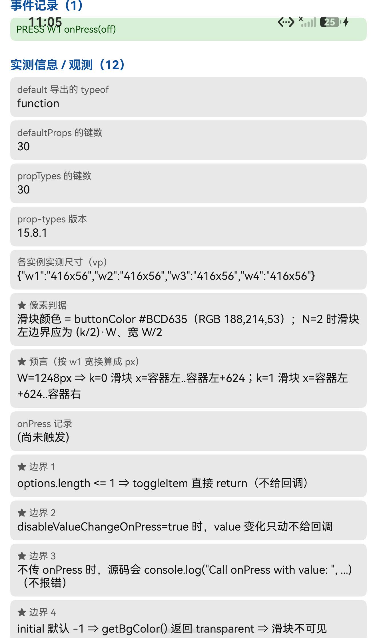
TITLE measureInWindow y=420 (状态栏高 117) ⇒ 420 > 117,不重合 ✓
六、我自己的一个失误
我把 toggleItem / animate / responderEnd 当成原型方法去断言,结果三条全挂:
✗ [A] 原型上有 toggleItem|期望 function|实际 undefined
✗ [A] 原型上有 animate|期望 function|实际 undefined
✗ [A] 原型上有 responderEnd|期望 function|实际 undefined
读源码后确认:它们是箭头函数的类字段(toggleItem = (index, callOnPress = true) => {…})—— 经 Babel 的 class-properties 转换后,它们被赋值到实例上,而不在 prototype 上。
纠正:断言改为 typeof SS.prototype.toggleItem === 'undefined'(并保留 prototype.render === 'function' 作为"它确实是 class"的证据)。
教训:"写在 class 体里的方法"未必在 prototype 上 —— 箭头函数形式的类字段挂在实例上。⇒ 要判断"是不是原型方法",得看写法(method() {} vs field = () => {}),或者干脆用 typeof proto.x 实测。
七、已知限制与本次验证边界
7.1 用这个库要知道的
| 事项 | 说明 |
|---|---|
不传 initial ⇒ 看不到滑块 | 默认 -1 ⇒ 颜色 transparent;不报错。想有滑块就传 initial(或受控传 value) |
value 默认是 1 | componentDidUpdate 里 value 变化会驱动选中项;与 initial 不是一回事 |
onPress 拿到的是 value | 传 returnObject 才拿到整个选项对象 |
没传 onPress 时会打 console.log | Call onPress with value: …(不是报错,但日志里会看到) |
options.length <= 1 时点击无效 | toggleItem 直接 return |
| 拖动切换有阈值 | 需 |dx|≥5 或 |dy|≥5 才接管手势;|vx|>0.1 && |dy|<80 才算左右滑动 |
滑块用 useNativeDriver: true | 位移是 transform ⇒ 布局 dump 读不到 ⇒ 只能像素验 |
有运行时依赖 prop-types | 目录/file: 接入要手动补装 |
7.2 本次验证的边界
- 拖动/滑动切换(PanResponder)未验证:只验证了点击选项给回调;
getSwipeDirection的|vx|>0.1 && |dy|<80阈值行为未实测; disableValueChangeOnPress边界未实测(只从源码确认语义:value变化时只动不给回调);options.length <= 1的边界未实测(只渲染了 1 选项实例,没有去点它);returnObject未实测(W4 传了returnObject但没点它回读对象);options[].activeColor(每项独立激活色)未测;hasPadding/valuePadding/buttonMargin非默认值的几何未测(只验证了hasPadding=false, buttonMargin=0这一组);animationDuration的中间态未验证(只在动画结束后测量);RTL(I18nManager.isRTL)分支未测;imageIcon/customIcon图标渲染未测(assets/*.gif只是文档资源);- 只在一台模拟器上验证(
Pura X View,density 3,1320×2232),没有真机;未做跨平台对照。
未改动库代码。
八、常见问题
Q1:我用了这个组件,但看不到那个会滑动的色块?
大概率是没传 initial。 它的默认值是 -1,而源码里:
getBgColor() {
  const { selected } = this.state;
  if (selected === -1) { return 'transparent'; }
  return options[selected]?.activeColor || buttonColor;
}
⇒ 滑块被设成透明。传 initial={0}(或受控地传 value)即可:
<SwitchSelector initial={0} options={[{label:'开',value:'on'},{label:'关',value:'off'}]} />
实测:不传 initial 的实例,按滑块颜色 #BCD635 扫全屏 0 像素。
Q2:滑块颜色/位置怎么算?
- 颜色:
buttonColor(默认#BCD635),或某个选项的activeColor; - 位置(
hasPadding=false, buttonMargin=0):左边界 =(k/N)·width、宽 =width/N,正好覆盖第 k 格(实测 N=2 时 37…658 与 661…1282)。
Q3:onPress 给的是什么?
默认给该选项的 value(returnObject: false)。传 returnObject 则给整个选项对象。
onPress={(v) => console.log(v)}            // 'off'
onPress={(v) => console.log(v.label)}      // 需要 returnObject
⚠️ 不传 onPress 时源码会 console.log('Call onPress with value: ', …)(不是报错)。
Q4:为什么我改 value 之后界面动了,但 onPress 没触发?
因为 componentDidUpdate 是:this.toggleItem(value, !disableValueChangeOnPress) —— disableValueChangeOnPress: true 时第二个参数是 false,于是只做动画 + setState,不给回调。
Q5:为什么点第 1 个选项没反应?
如果 options.length <= 1,toggleItem 会直接 return(源码第一行守卫)。另外 disabled 或 options[i].disabled 也会让该选项不可点。
Q6:能左右滑动切换吗?
能(PanResponder)。但要注意阈值:shouldSetResponder 要求位移 ≥5,getSwipeDirection 要求 |vx| > 0.1 且 |dy| < 80 ⇒ 轻轻一碰不会切,得是有点速度的横向拖动。(本轮未实测这条。)
Q7:npm install 之后报找不到 prop-types?
因为它带了运行时依赖 prop-types@^15.7.2,而目录/file: 接入不会安装目标包自己的 dependencies:
npm install prop-types --ignore-scripts
(走 .tgz 安装会被自动带上。)
Q8:这个库需要鸿蒙侧做什么特殊处理吗?
不需要。 纯 JS、无原生模块、不需要 HAR / 权限 / ohpm。唯一要注意的是上文那条 initial 默认值和 prop-types 依赖。
小结
react-native-switch-selector 是纯 JS class 组件(index.js 336 行),零原生接线。设备侧 34 / 34 断言通过。
最值得记下来的是这几条:
-
★★ "默认值"本身可能就是坑。
initial默认-1⇒getBgColor()返回transparent⇒ 滑块完全不可见,而且不报错。⇒ 接一个组件时,把defaultProps逐个过一遍,特别是有"哨兵值"(-1/null/'')的字段 —— 它们往往代表"未初始化"状态,会改变渲染结果。(这与"某类依赖缺失导致效果静默消失"属于同一族问题:共同点是不报错。) -
★ 滑块几何有闭式公式 ⇒ 直接当判据。 滑块左边界 =
(k/N)·width、宽 =width/N⇒ 实测 N=2 时 37…658 / 661…1282,第三个实例 0 像素(因为不传initial)。⇒ 三个实例一次把"位置对不对"和"有没有"都验掉了。 -
★ "写在 class 里的方法"未必在 prototype 上。
toggleItem = (...) => {}这种箭头函数类字段被赋到实例上 ⇒prototype.toggleItem === undefined。我按原型方法写断言,一次挂三条。⇒ 判断要看写法(m(){}vsf = () => {}),或用typeof proto.x实测。 -
选项命中区也能当免费判据。 从 dump 量到两个选项各占 624px = W/2,与滑块宽度预言互相印证;再加一次点击拿到
onPress(off),就同时覆盖了"布局"和"交互"。
本篇用到的库
| 项 | 内容 |
|---|---|
| 三方库 | react-native-switch-selector(上游 2.3.0 的鸿蒙适配版) |
| 适配仓库 | https://atomgit.com/oh-react-native/react-native-switch-selector |
| 适配 TAG | 2.3.0-ohos-1.0.0 |
| 需要 HAR / 权限 / ohpm | 都不需要(纯 JS) |
| 库类型 | 纯 JS 单组件库:二选一开关 / 分段开关(带滑动切换) |
| 运行时依赖 | ⚠️ prop-types@^15.7.2 ⇒ 目录/file: 接入须手动补装 |
prepare / prepublish | 都没有 |
| 许可证 | MIT |
| 上游仓库 | https://github.com/jkdrangel/react-native-switch-selector(★46) |
| 宿主工程 | RNOH084Demo(测试页 rnAppKey = SwitchSelectorTestApp) |
# 从适配仓库安装
npm install "git+https://atomgit.com/oh-react-native/react-native-switch-selector.git#2.3.0-ohos-1.0.0" --ignore-scripts

# 本地目录接入(开发常用):必须补 prop-types
npm install ../react-native-switch-selector --ignore-scripts
npm install prop-types --ignore-scripts
// metro.config.js
watchFolders: [ path.resolve(__dirname, '../react-native-switch-selector') ],
import SwitchSelector from 'react-native-switch-selector';

// ✅ 正确:传 initial(否则滑块透明,屏上看不到)
<SwitchSelector
  initial={0}
  options={[
    {label: '开', value: 'on'},
    {label: '关', value: 'off'},
  ]}
  onPress={(value) => console.log('选中', value)}      // 默认拿到 value
/>

// 受控 + 想要整个选项对象
const [v, setV] = useState(0);
<SwitchSelector
  initial={0}
  value={v}
  returnObject
  options={[{label:'A',value:'a'},{label:'B',value:'b'},{label:'C',value:'c'}]}
  onPress={(opt) => setV(opt.value === 'b' ? 1 : opt.value === 'c' ? 2 : 0)}
/>

// 自定义外观(含滑块颜色)
<SwitchSelector
  initial={1}
  options={[{label:'是',value:'y'},{label:'否',value:'n'}]}
  buttonColor="#BCD635"          // 滑块颜色
  selectedColor="#FFFFFF"        // 选中项文字色
  textColor="#000000"
  backgroundColor="#FFFFFF"
  borderColor="#C9C9C9"
  borderRadius={50}
  height={40}
  animationDuration={100}
/>
# 换页启动测试页(force-stop 不能省,换页参数只在冷启动生效)
hdc shell aa force-stop com.rnoh084.demo
hdc shell aa start -b com.rnoh084.demo -a EntryAbility --ps rnAppKey SwitchSelectorTestApp
像素判据的复现方式
# 滑块颜色 = buttonColor(默认 #BCD635 = RGB 188,214,53)
Add-Type -AssemblyName System.Drawing
$b = New-Object System.Drawing.Bitmap('shot.jpeg')
$xs = @()
for ($x = 0; $x -lt $b.Width; $x++) {
  $p = $b.GetPixel($x, $trackMidY)
  if ([Math]::Abs($p.R-188) -lt 26 -and [Math]::Abs($p.G-214) -lt 26 -and [Math]::Abs($p.B-53) -lt 26) { $xs += $x }
}
# N=2 时:k=0 ⇒ 左半;k=1 ⇒ 右半;不传 initial ⇒ 一个像素都扫不到
验证环境
| 项 | 版本 |
|---|---|
| React Native | 0.84.1 |
| React | 19.2.3 |
| RNOH(npm / ohpm) | @react-native-oh/react-native-harmony / @rnoh/react-native-openharmony 0.84.3 |
| Node.js / npm | v24.14.0 / 11.9.0 |
| DevEco Studio | 26.0.0.621 |
| HarmonyOS SDK | API 26(26.0.0.32) |
| 设备 | HarmonyOS 7.0.0(26.0.0) Beta2 模拟器 Pura X View(ohos-x64),1320×2232,density 3 |
| 本机状态栏高度 | 117px(页面留白取 48vp) |
宿主 prop-types | 15.8.1(已存在 ⇒ 本轮未被依赖坑咬到) |
| 宿主 HAP 产物 | entry-default-signed.hap |
| 本次构建 | assembleHap 3 分 37 秒;改断言后重编 3 分 52 秒 |
| 验证规模 | 设备侧 34 / 34 断言;滑块像素判据 3 个实例(左半 37…658 / 右半 661…1282 / 不传 initial 为 0 像素);选项命中区 2 处(各 624px);交互 1 次(onPress(off));UI 安全区 1 项 |
相关社区与项目地址
| 项目 | 地址 |
|---|---|
| React Native 鸿蒙官方社区(CPF-RN) | https://atomgit.com/CPF-RN |
| RNOH 框架仓库 | https://atomgit.com/openharmony-RN/ohos_react_native |
| RNOH 三方库使用文档 | https://atomgit.com/OpenHarmony-RN/usage-docs |
| React Native for OpenHarmony 组织 | https://atomgit.com/oh-react-native |
| RN 三方库鸿蒙适配清单 | https://atomgit.com/oh-react-native/rn-ohos-adaptation-overview |
欢迎加入 CPF-RN 鸿蒙社区:https://atomgit.com/CPF-RN
React Native for OpenHarmony 组织:https://atomgit.com/oh-react-native
RN 三方库鸿蒙适配清单:https://atomgit.com/oh-react-native/rn-ohos-adaptation-overview

作为“人工智能6S店”的官方数字引擎,为AI开发者与企业提供一个覆盖软硬件全栈、一站式门户。
更多推荐


 0
0 0
0- 0


 已为社区贡献14条内容

所有评论(0)