
React Native for OpenHarmony 实战:三方库 react-native-step-indicator 的鸿蒙化适配指南
本文记录把 react-native-step-indicator(步骤条 / 进度指示器)适配到 HarmonyOS 的完整过程。
这是一个纯 JS 组件库,源码 475 行,功能是"横向或纵向的步骤条",带可点击的步骤、可自定义的标签渲染,以及一条随进度增长的已完成色带。它不需要任何原生接线。
它有两个很适合做量化验证的特点,我把它们都做成了硬判据:
-
已完成色带的宽度可以直接算出来:
const animateToPosition = (progressBarSize / (stepCount - 1)) * position; // progressBarSize = width * (stepCount - 1) / stepCount // ⇒ 绿条宽度 = width * k / N -
当前步骤的圆圈更大(默认 40 vs 30)且底色是白色,而其它步骤是实心绿 / 浅绿 ⇒ 白圆的圆心 x 就是
currentPosition的位置:圆心 x = width/(2N) + k * width/N (styles.stepContainer 是 flex:1 ⇒ 等分)
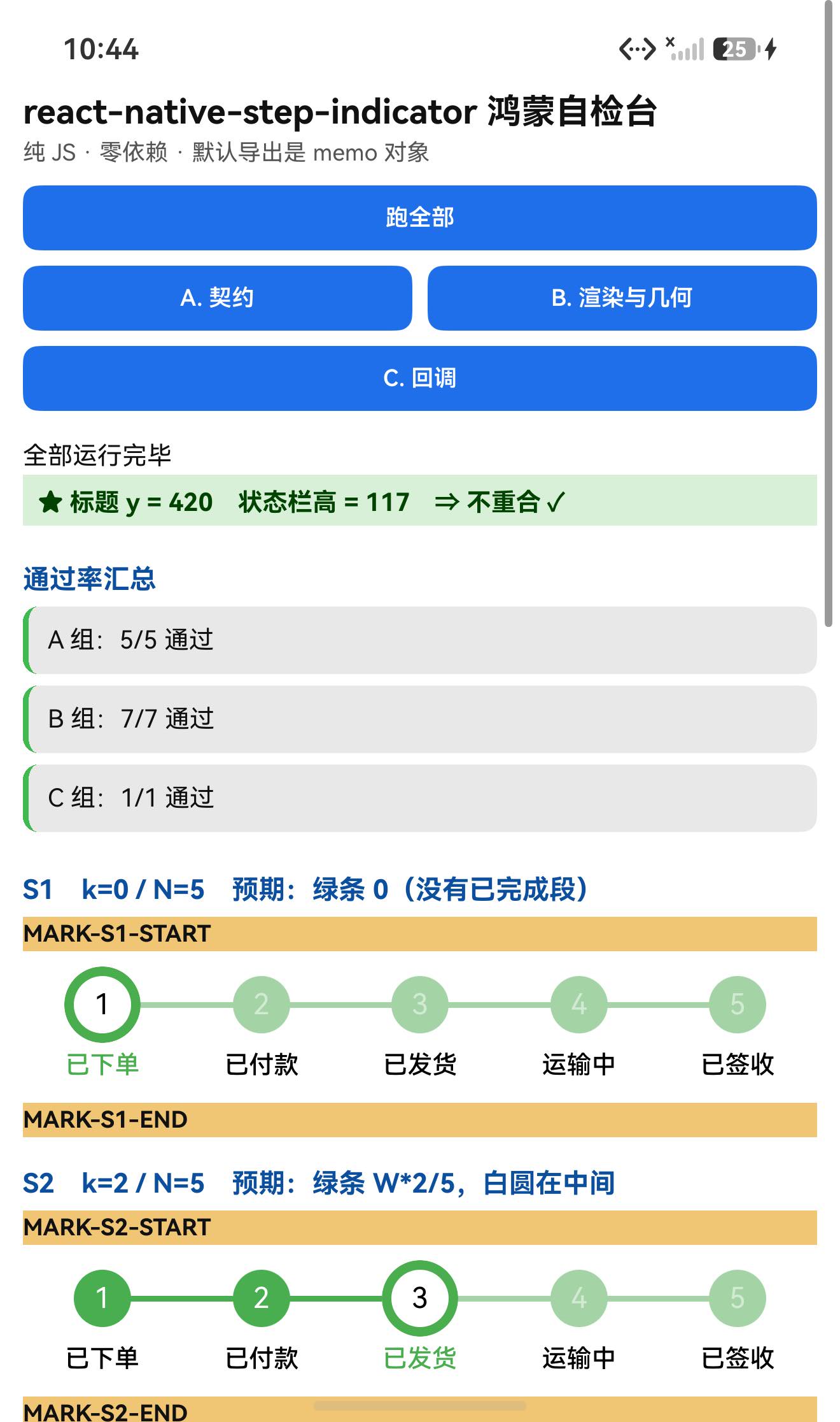
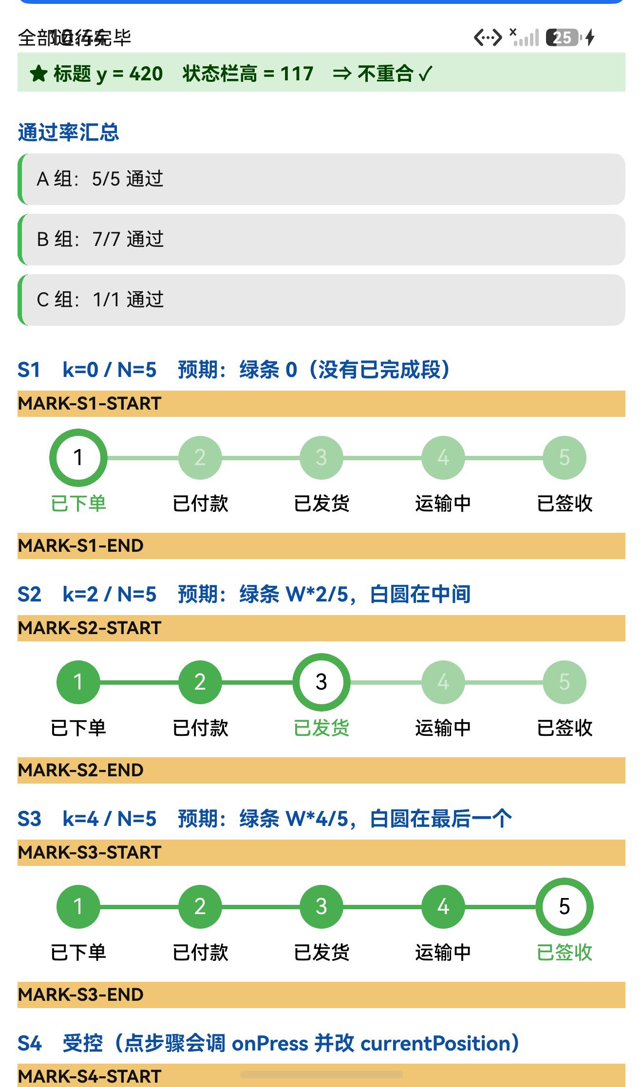
实测(容器宽 1248px、N=5)三个实例全部精确命中:
| 实例 | k | 绿条宽度 预言 / 实测 | 当前步圆心 x 预言 / 实测 | 当前步圆尺寸 |
|---|---|---|---|---|
| S1 | 0 | 0 / 无绿条 ✓ | 160.8 / 161 ✓ | 120px |
| S2 | 2 | 499.2 / 499 ✓ | 660.0 / 660 ✓ | 120px |
| S3 | 4 | 998.4 / 998(满格) ✓ | 1159.2 / 1159 ✓ | 120px |
设备侧断言 13 / 13 全部通过,一次构建就过。
一、先说结论
| 项 | 结果 |
|---|---|
| 上游最新版 | 1.0.3;license: MIT;上游 star 1459 |
| 库类型 | 纯 JS 单组件库:StepIndicator(步骤条) |
| 是否需要原生适配 | 不需要(无 harmony/、无 NativeModules;import 图只有 react / react-native / ./types) |
| 运行时依赖 | 零(dependencies 未声明);peerDependencies 只有 react / react-native |
prepare | ⚠️ 保留了上游的 "prepare": "bob build"(bob 是 devDependency)⇒ 目录/file: 接入必须 --ignore-scripts |
main | lib/commonjs/index(编译产物)⇒ 必须单独核对产物 |
| 导出形态 | 只有 default 一个导出,且它是 React.memo(...) 返回的对象(typeof 'object'、无可用 prototype) |
| 需要 HAR / 权限 / ohpm | ❌ 都不需要 |
| 设备侧断言 | ✅ 13 / 13 全部通过(A 5 + B 7 + C 1) |
| ★ 两个像素判据 | ✅ 绿条宽度 = W·k/N、当前步圆心 = W/(2N)+k·W/N —— 三个实例全部逐像素吻合 |
| ★ 当前步更大更白 | ✅ 当前步圆 120px(40vp),其余 90px(30vp) |
| ★ 交互 | ✅ 点步骤圆 ⇒ onPress(0) 触发且 index 正确 |
二、判定与接入
| 步 | 做法 | 结果 |
|---|---|---|
| ① | package.json 里有没有 harmony.autolinking | 没有 |
| ② | 仓库里有没有 harmony/ | 没有 |
| ③ | 代码里有没有 NativeModules / requireNativeComponent | 全无 |
| ④ | import 图体检(防 @env 那类坑) | 只有 react / react-native / ./types ✓ |
npm install "git+https://atomgit.com/oh-react-native/react-native-step-indicator.git#1.0.3-ohos-1.0.0" --ignore-scripts
// metro.config.js
watchFolders: [ path.resolve(__dirname, '../react-native-step-indicator') ],
import StepIndicatorTestApp from './StepIndicatorTestApp';
AppRegistry.registerComponent('StepIndicatorTestApp', () => StepIndicatorTestApp);
hdc shell aa force-stop com.rnoh084.demo
hdc shell aa start -b com.rnoh084.demo -a EntryAbility --ps rnAppKey StepIndicatorTestApp
不需要 HAR、权限、ohpm、link-harmony。
三、读源码取到的真值(src/index.tsx,475 行)
3.1 组件形态与默认值
const StepIndicator = ({
  currentPosition = 0,
  stepCount = 5,
  direction = 'horizontal',
  customStyles: customStylesFromProps = defaultStyles,
  labels = [],
  onPress,
  renderStepIndicator: renderCustomStepIndicator,
  renderLabel,
}: StepIndicatorProps) => { … };

export default React.memo(StepIndicator);
要点:
- 函数组件 + 参数解构默认值 ⇒ React 19 下没问题(不是
defaultProps那类坑); - 默认导出是
React.memo(...)的返回值 ⇒typeof 'object'、没有可用的prototype;实测模块运行时只有default一个导出(Object.keys(...) = ['default']); customStyles会与defaultStyles合并({...defaultStyles, ...customStylesFromProps})。
3.2 ★ 进度条的几何与公式
// 背景条(浅绿)
progressBarBackgroundStyle = {
  backgroundColor: customStyles.separatorUnFinishedColor,   // '#a4d4a5'
  position: 'absolute',
  top: (height - separatorStrokeWidth) / 2,
  left:  width / (2 * stepCount),
  right: width / (2 * stepCount),
  height: separatorStrokeWidth,                              // 默认 2vp
};
// ⇒ progressBarSize = width * (N-1) / N

// 已完成条(绿):同样的 left/right,但宽度受动画控制
progressBarStyle = { …, width: progressAnim };

// 动画目标
const animateToPosition = (progressBarSize / (stepCount - 1)) * position;
Animated.timing(progressAnim, { toValue: animateToPosition, duration: 200, useNativeDriver: false });
⇒ 绿条宽度 = width · k / N(useNativeDriver: false ⇒ JS 驱动)。
3.3 ★ 当前步骤为什么"更大更白"
const getStepStatus = (p) =>
  p === currentPosition ? CURRENT : p < currentPosition ? FINISHED : UNFINISHED;

// CURRENT:白底 + 粗绿边 + sizeAnim(动画到 currentStepIndicatorSize=40)
// FINISHED:实心 stepIndicatorFinishedColor '#4aae4f',尺寸 stepIndicatorSize=30
// UNFINISHED:stepIndicatorUnFinishedColor '#a4d4a5',尺寸 30
// 且 stepContainer 是 flex:1 ⇒ 每步等分 ⇒ 圆心 x = width/(2N) + k*width/N
默认配色(正是像素判据的依据):
| 用途 | 颜色 |
|---|---|
| 当前步底色 | #ffffff(白) |
| 已完成步 / 已完成条 | #4aae4f(绿) |
| 未完成步 / 背景条 | #a4d4a5(浅绿) |
3.4 交互
const stepPressed = (position) => { if (onPress) { onPress(position); } };
// 每个步骤与标签都包在 TouchableWithoutFeedback 里,点击 ⇒ stepPressed(position)
⚠️ 注意:源码里还有一个 onCurrentPositionChanged,但它是组件内部的 const 函数(src/index.tsx:389),不是 prop(src/types.ts 里也没有声明它)⇒ 它无法从外部监听(见第六节我的失误)。
四、验证设计:两个独立的像素判据
| 判据 | 内容 | 为什么可靠 |
|---|---|---|
| ① 绿条宽度 | 已完成色带(#4aae4f)的宽度应为 W·k/N | 与"动画跑到哪"直接挂钩 |
| ② 当前步圆心 | 白色圆圈(#ffffff,40vp)的圆心 x 应为 W/(2N)+k·W/N,且尺寸比其它大 | 位置 + 尺寸双重特征,不易误判 |
两个判据互相独立(一个看色带长度、一个看圆圈位置),能交叉验证。
测量方式:以布局 dump 的绝对坐标为准(见第七节的教训:截图有 JPEG 色晕,几何量不准)。
五、实测结果
5.1 断言 13 / 13
| 组 | 内容 | 结果 |
|---|---|---|
| A 契约 | 默认导出存在、是 memo 对象、typeof object、有 $$typeof、无可用 prototype、枚举全部具名导出 | 5/5 |
| B 渲染与几何 | 4 个实例渲染未抛错、标题不与状态栏重合、4 个实例尺寸、两个判据的预言值 | 7/7 |
| C 回调 | 事件记录格式 | 1/1 |
| 合计 | 13/13 |
实例尺寸:{"s1":"416x79","s2":"416x79","s3":"416x79","s4":"416x79"} ⇒ 容器宽 416vp = 1248px ✓
5.2 ★★ 几何逐像素复核(布局 dump 绝对坐标)
S2(k=2 / N=5):
y=2034..2043 (h=9)  x=161..1159 (w=998)   ← 背景条(浅绿)
y=2034..2043 (h=9)  x=161..660  (w=499)   ← ★ 已完成条(绿)
y=1978..2098 (h=120) x=600..720 (w=120)   ← ★ 当前步(k=2)40vp,圆心 660
y=1993..2083 (h=90)  x=116..206 / 366..456 / 865..955 / 1114..1204   ← 其余 30vp,圆心 161/411/910/1159
S3(k=4 / N=5):
y=711..720 (h=9)  x=161..1159 (w=998)   ← ★ 已完成条【满格】
圆心:161 / 411 / 660 / 910 / ★1159(当前步 120px,其余 90px)
S1(k=0):只有背景条(浅绿),没有已完成绿条 ✓
汇总:
| 实例 | 绿条宽度 预言 | 实测 | 当前步圆心 预言 | 实测 | 当前步尺寸 |
|---|---|---|---|---|---|
| S1 (k=0) | 0 | 0(无) ✓ | 160.8 | 161 ✓ | 120px |
| S2 (k=2) | 499.2 | 499 ✓ | 660.0 | 660 ✓ | 120px |
| S3 (k=4) | 998.4 | 998 ✓ | 1159.2 | 1159 ✓ | 120px |
⇒ 两个判据、三个实例、六组数字全部逐像素吻合 ✓✓
5.3 ★ 交互实测
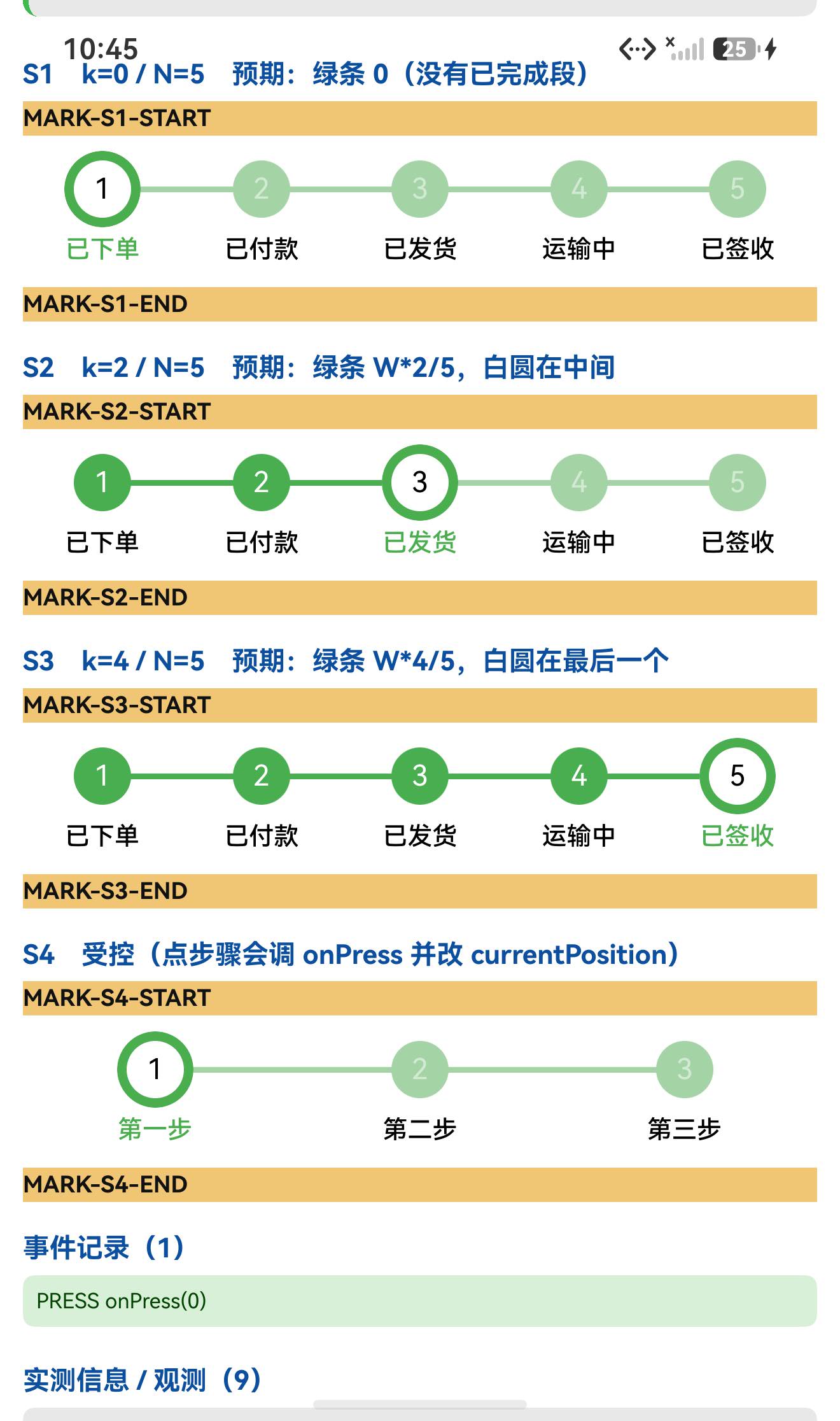
S4 是 3 步(stepCount=3)的受控实例,圆心预言为 36+1248/6+k·416 ⇒ 244 / 660 / 1076;实测:
圆: x=199..289  w=90   圆心 x=244   ✓
圆: x=615..705  w=90   圆心 x=660   ✓
圆: x=1016..1136 w=120 圆心 x=1076  ✓(当前步,更大)
点击第 1 个圆(244, 1680) ⇒ 日志:
PRESS onPress(0)
⇒ onPress 触发,且 index 正确(0 基)✓
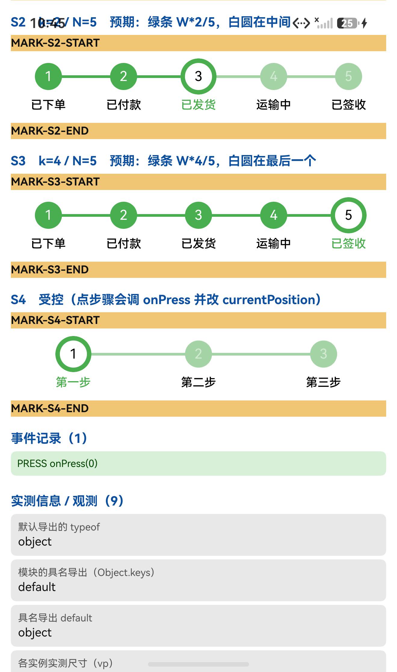
5.4 UI:标题不与状态栏重合
TITLE measureInWindow y=420 (状态栏高 117) ⇒ 420 > 117,不重合 ✓
六、我自己的一个失误
我把 onCurrentPositionChanged 当成了回调 prop,在测试页里这样写:
<StepIndicator
  currentPosition={pos}
  onPress={...}
  onCurrentPositionChanged={(p) => logEvent(`POS-CHANGED onCurrentPositionChanged(${p})`)}   // ← 无效
/>
实测结果:点击只打出 PRESS onPress(0),没有任何 POS-CHANGED。
读源码后确认:onCurrentPositionChanged 是组件内部定义的 const 函数(src/index.tsx:389,在 getStepStatus 之后),由内部的 useEffect([currentPosition, progressBarSize]) 调用;它不在 props 解构里,src/types.ts 的 StepIndicatorProps 里也没有它 ⇒ 它不是对外 API,外部无法监听。
纠正:把 C 组的设计改为"只断言真实存在的 prop(onPress)",并在文章里写明 onCurrentPositionChanged 不是 prop。
⚠️ 教训:回调名不等于回调 prop。看到组件内部有个
onXxx(...)调用,就去props解构里核一遍——只有当它出现在解构参数(或propTypes/类型声明)里,才是对外 API。
七、方法上的一个教训:几何量必须用 dump,不能信截图
本轮我先用截图扫色来量进度条,得到的是 x=117..1203;而布局 dump给出的绝对坐标是 x=161..1159。
差异来自 JPEG 压缩的色晕(边缘像素被混色,落到我的颜色容差之外/之内)。dump 的数值是精确的(161 与预言 160.8 只差 0.2px)。
⇒ 判据分工:
- 几何(位置/尺寸)⇒ 用布局 dump 的绝对坐标;
- 颜色/状态/视觉对照 ⇒ 用截图(比如"绿条到哪结束"这种颜色跳变,dump 里没有颜色信息)。
八、已知限制与本次验证边界
8.1 用这个库要知道的
| 事项 | 说明 |
|---|---|
prepare: "bob build" 仍在 | 目录/file: 接入必须加 --ignore-scripts(否则会因为找不到 bob 而安装失败) |
main 指向编译产物 | lib/commonjs/index(源码在 src/)⇒ 核对改动时要连产物一起比 |
默认导出是 memo 对象 | typeof 'object'、import 后拿不到 prototype |
onCurrentPositionChanged 不是 prop | 它是内部函数,外部无法监听;要感知变化只能靠自己的 currentPosition 状态 |
| 进度条是动画的(200ms) | useNativeDriver: false(JS 驱动);截图时机太早可能拍到中间态 |
| 当前步比其它步大 | currentStepIndicatorSize(40) vs stepIndicatorSize(30) ⇒ 布局高度按 40 算 |
8.2 本次验证的边界
- 只验证了
direction='horizontal'(默认)⇒direction='vertical'完全未测(源码里竖屏分支用的是height/(2*stepCount)/top/bottom,几何另有公式); renderLabel/renderStepIndicator两个自定义渲染回调未验证;customStyles自定义未逐项验证(只用了默认配色);labels的选中态颜色未做像素核对(源码里currentStepLabelColorvslabelColor不同,但文字颜色不好扫);- 步骤数 ≠ 5 的横向几何只验了
stepCount=3(S4);其它数量未穷举; - 进度条动画的中间态未验证(只在动画结束后测量);
stepCount=1的边界未测(源码里progressBarSize/(stepCount-1)会除以 0 ⇒animateToPosition = Infinity,然后被isNaN兜住 ⇒ 但这只是代码级推断,未实测);- 只在一台模拟器上验证(
Pura X View,density 3,1320×2232),没有真机;未做跨平台对照。
未改动库代码。
九、常见问题
Q1:为什么 import StepIndicator from 'react-native-step-indicator' 拿不到 prototype?
因为它导出的是 React.memo(StepIndicator) 的返回值,是个对象(typeof 'object'),不是 class/函数。要看它的 props 请查 src/types.ts 的 StepIndicatorProps。
Q2:npm install 报找不到 bob?
因为包里保留了 "prepare": "bob build",而 bob(react-native-builder-bob)只是 devDependency。目录/file: 接入时 prepare 会执行 ⇒ 安装失败。
解法:
npm install ../react-native-step-indicator --ignore-scripts
(走 .tgz 安装不会触发 prepare。)
Q3:进度条(已完成色带)的长度是怎么算的?
绿条宽度 = width * currentPosition / stepCount
推导:背景条从 left/right = width/(2N) 起 ⇒ 自身宽 width*(N-1)/N;动画目标是
(progressBarSize/(stepCount-1)) * position ⇒ 乘起来正好是 width*k/N。
实测(W=1248, N=5):k=2 ⇒ 499px(算 499.2)、k=4 ⇒ 998px(算 998.4)✓
Q4:怎么把当前步骤做得更显眼?
默认已经做了两件事:当前步圆更大(currentStepIndicatorSize 40 vs stepIndicatorSize 30)、底色变白(stepIndicatorCurrentColor: '#ffffff')且带粗绿边(currentStepStrokeWidth: 5)。都能通过 customStyles 改。
Q5:onCurrentPositionChanged 怎么监听?
监听不了 —— 它是组件内部的函数,不是 prop(StepIndicatorProps 里没有它)。要感知位置变化,请自己持有 currentPosition 状态:
const [pos, setPos] = useState(0);
<StepIndicator currentPosition={pos} onPress={setPos} />   // 位置变化由你自己掌握
Q6:点击步骤能拿到下标吗?
能。onPress(position) 给的就是0 基下标(实测点第 1 个圆得到 onPress(0))。
Q7:stepCount 传 1 会怎样?
按源码推,progressBarSize / (stepCount - 1) 会除以 0 ⇒ 目标值变成 Infinity/NaN,而代码里有 isNaN(animateToPosition) ? 0 : animateToPosition 兜底 ⇒ 进度条宽度会退回 0。⚠️ 这一条属代码级推断,本轮未实测。
Q8:颜色怎么改?
统一走 customStyles:
<StepIndicator
  customStyles={{
    stepIndicatorFinishedColor: '#4aae4f',
    stepIndicatorUnFinishedColor: '#a4d4a5',
    stepIndicatorCurrentColor: '#ffffff',
    separatorFinishedColor: '#4aae4f',
    separatorUnFinishedColor: '#a4d4a5',
    currentStepLabelColor: '#4aae4f',
  }}
/>
Q9:这个库需要鸿蒙侧做什么特殊处理吗?
不需要。 纯 JS、零依赖、import 图干净(只有 react / react-native)、不需要 HAR / 权限 / ohpm。唯一要注意的是安装时的 prepare 和上面几条 API 细节。
小结
react-native-step-indicator 是纯 JS 单组件库(源码 475 行),零依赖、无需原生接线。设备侧 13 / 13 断言通过,一次构建就过。
最值得记下来的是这几条:
-
★★ 能从源码推出"确定的像素值"时,就把它当判据。 这个库的进度条宽度有闭式公式(
W·k/N),当前步的圆心也有(W/(2N)+k·W/N)⇒ 我据此做了两个互相独立的判据,三个实例 六组数字全部逐像素吻合(499/998 与 660/1159)。⇒ 比"看起来对"硬得多,而且一旦公式写错会立刻暴露。 -
★ 几何量必须用布局 dump 的绝对坐标,不要信截图。 我用截图扫色量出
117..1203,而 dump 是161..1159—— 差的正是 JPEG 色晕。⇒ 分工:几何用 dump,颜色/视觉用截图。 -
★ 回调名 ≠ 回调 prop。
onCurrentPositionChanged名字看着像回调 prop,实际是组件内部的const函数 ⇒ 我从外部传它完全没有效果。⇒ 判断一个回调是否对外,要去props解构 /propTypes/ 类型声明里核一遍(这与"引用一个子路径/可选入口前先看它的 import 图"是同一个思路,只是发生在 API 层面)。 -
prepare是跨库反复出现的坑。 这个库保留了上游的"prepare": "bob build"⇒ 目录/file:接入会失败。⇒ 接库时把scripts扫一遍(prepare/prepublish/postinstall),一律用--ignore-scripts兜底。 -
main指向编译产物时要连产物一起核。 本库main = lib/commonjs/index,所以"逐文件比对"里必须包含lib/**—— 否则"源码没改"不能推出"跑起来的产物没改"。
本篇用到的库
| 项 | 内容 |
|---|---|
| 三方库 | react-native-step-indicator(上游 1.0.3 的鸿蒙适配版) |
| 适配仓库 | https://atomgit.com/oh-react-native/react-native-step-indicator |
| 适配 TAG | 1.0.3-ohos-1.0.0 |
| 需要 HAR / 权限 / ohpm | 都不需要(纯 JS,零依赖) |
| 库类型 | 纯 JS 单组件库:步骤条 / 进度指示器 |
| 运行时依赖 | 零;peerDependencies 只有 react / react-native |
prepare | ⚠️ 有 "prepare": "bob build" ⇒ 目录/file: 接入必须 --ignore-scripts |
| 许可证 | MIT |
| 上游仓库 | https://github.com/24ark/react-native-step-indicator(★1459) |
| 宿主工程 | RNOH084Demo(测试页 rnAppKey = StepIndicatorTestApp) |
# 从适配仓库安装
npm install "git+https://atomgit.com/oh-react-native/react-native-step-indicator.git#1.0.3-ohos-1.0.0" --ignore-scripts

# 本地目录接入(开发常用)—— prepare: bob build 会让不带 --ignore-scripts 的安装失败
npm install ../react-native-step-indicator --ignore-scripts
// metro.config.js
watchFolders: [ path.resolve(__dirname, '../react-native-step-indicator') ],
import StepIndicator from 'react-native-step-indicator';

const [pos, setPos] = useState(0);
const labels = ['已下单', '已付款', '已发货', '运输中', '已签收'];

// ① 基本用法(横向,5 步)
<StepIndicator
  currentPosition={pos}
  stepCount={5}
  labels={labels}
  onPress={setPos}                  // ★ 真 prop:点击步骤/标签会给 0 基下标
/>

// ② 自定义配色
<StepIndicator
  currentPosition={2}
  stepCount={5}
  customStyles={{
    stepIndicatorFinishedColor: '#4aae4f',
    stepIndicatorUnFinishedColor: '#a4d4a5',
    stepIndicatorCurrentColor: '#ffffff',
    separatorFinishedColor: '#4aae4f',
    separatorUnFinishedColor: '#a4d4a5',
    currentStepLabelColor: '#4aae4f',
  }}
/>

// ③ 自定义标签渲染
<StepIndicator
  currentPosition={1} stepCount={3}
  labels={['A', 'B', 'C']}
  renderLabel={({position, stepStatus, label, currentPosition}) => (
    <Text>{`${position}:${label}(${stepStatus})`}</Text>
  )}
/>

// ⚠️ onCurrentPositionChanged 不是 prop(内部函数),传了也没用
# 换页启动测试页(force-stop 不能省,换页参数只在冷启动生效)
hdc shell aa force-stop com.rnoh084.demo
hdc shell aa start -b com.rnoh084.demo -a EntryAbility --ps rnAppKey StepIndicatorTestApp
几何判据的复现方式
# ★ 几何量用布局 dump 的【绝对坐标】,不要用截图扫色(JPEG 色晕会让边缘偏几十像素)
devecocli ui layout | Select-String 'MARK-S2'
#  期望(W=1248, N=5, k=2):
#    背景条 x=161..1159 (w=998)      已完成绿条 x=161..660 (w=499)
#    当前步圆 w=120 圆心 x=660        其余圆 w=90 圆心 x=161/411/910/1159
验证环境
| 项 | 版本 |
|---|---|
| React Native | 0.84.1 |
| React | 19.2.3 |
| RNOH(npm / ohpm) | @react-native-oh/react-native-harmony / @rnoh/react-native-openharmony 0.84.3 |
| Node.js / npm | v24.14.0 / 11.9.0 |
| DevEco Studio | 26.0.0.621 |
| HarmonyOS SDK | API 26(26.0.0.32) |
| 设备 | HarmonyOS 7.0.0(26.0.0) Beta2 模拟器 Pura X View(ohos-x64),1320×2232,density 3 |
| 本机状态栏高度 | 117px(页面留白取 48vp) |
| 宿主 HAP 产物 | entry-default-signed.hap |
| 本次构建 | assembleHap 3 分 41 秒(一轮就过,无重编) |
| 验证规模 | 设备侧 13 / 13 断言;几何复核 3 个实例 × 2 个判据 = 6 组(绿条 0/499/998、圆心 161/660/1159、当前步圆 120px);交互 1 次(onPress(0));UI 安全区 1 项 |
相关社区与项目地址
| 项目 | 地址 |
|---|---|
| React Native 鸿蒙官方社区(CPF-RN) | https://atomgit.com/CPF-RN |
| RNOH 框架仓库 | https://atomgit.com/openharmony-RN/ohos_react_native |
| RNOH 三方库使用文档 | https://atomgit.com/OpenHarmony-RN/usage-docs |
| React Native for OpenHarmony 组织 | https://atomgit.com/oh-react-native |
| RN 三方库鸿蒙适配清单 | https://atomgit.com/oh-react-native/rn-ohos-adaptation-overview |
欢迎加入 CPF-RN 鸿蒙社区:https://atomgit.com/CPF-RN
React Native for OpenHarmony 组织:https://atomgit.com/oh-react-native
RN 三方库鸿蒙适配清单:https://atomgit.com/oh-react-native/rn-ohos-adaptation-overview

作为“人工智能6S店”的官方数字引擎,为AI开发者与企业提供一个覆盖软硬件全栈、一站式门户。
更多推荐


 0
0 0
0- 0


 已为社区贡献12条内容

所有评论(0)